Somna | Design of Sleep Pattern Interface
Taras Oliinyk
Your sleep knows more than you do. Sub: A calm interface that watches your patterns — and tells you what they mean.
Design decisions
Visual language
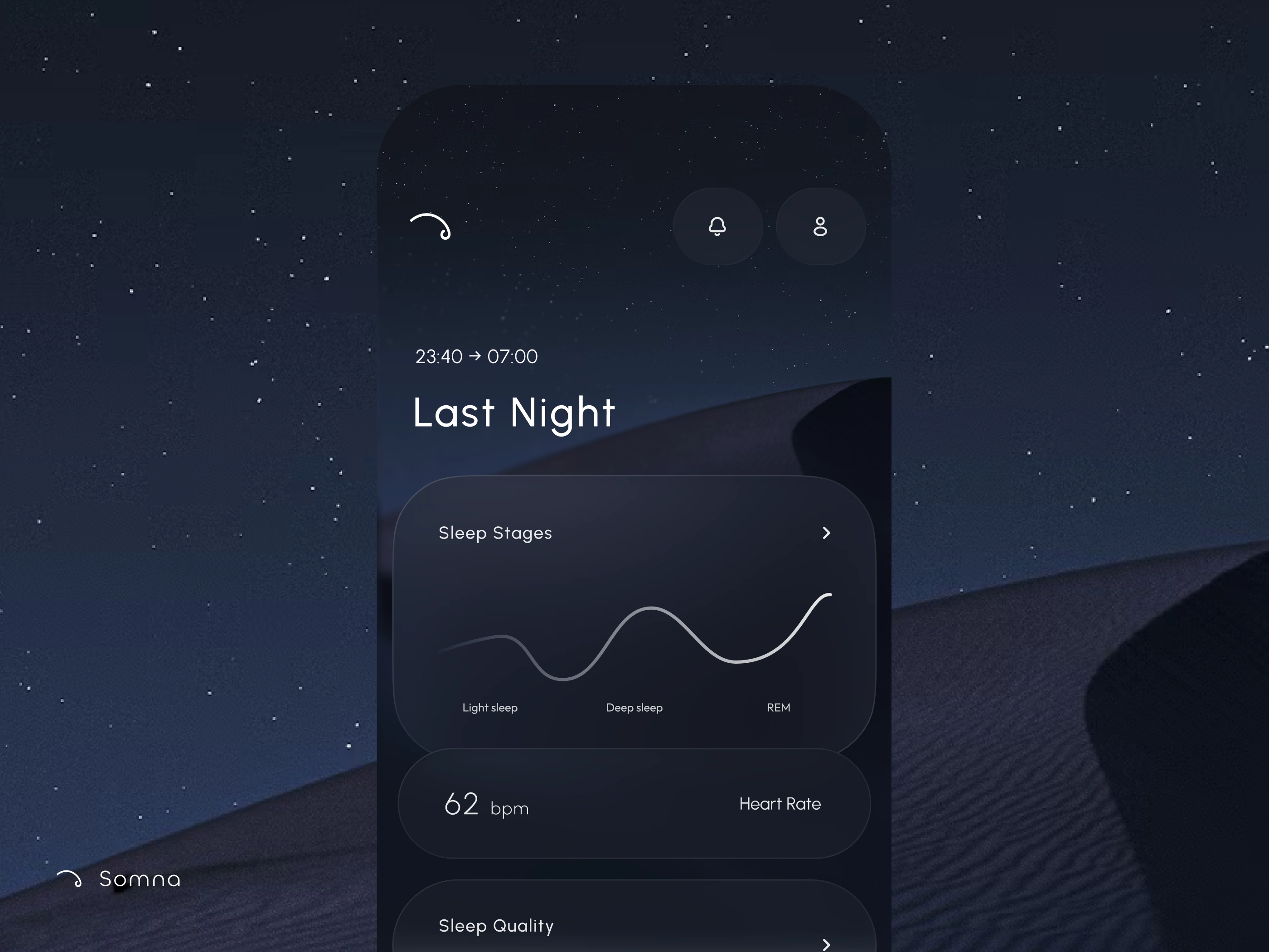
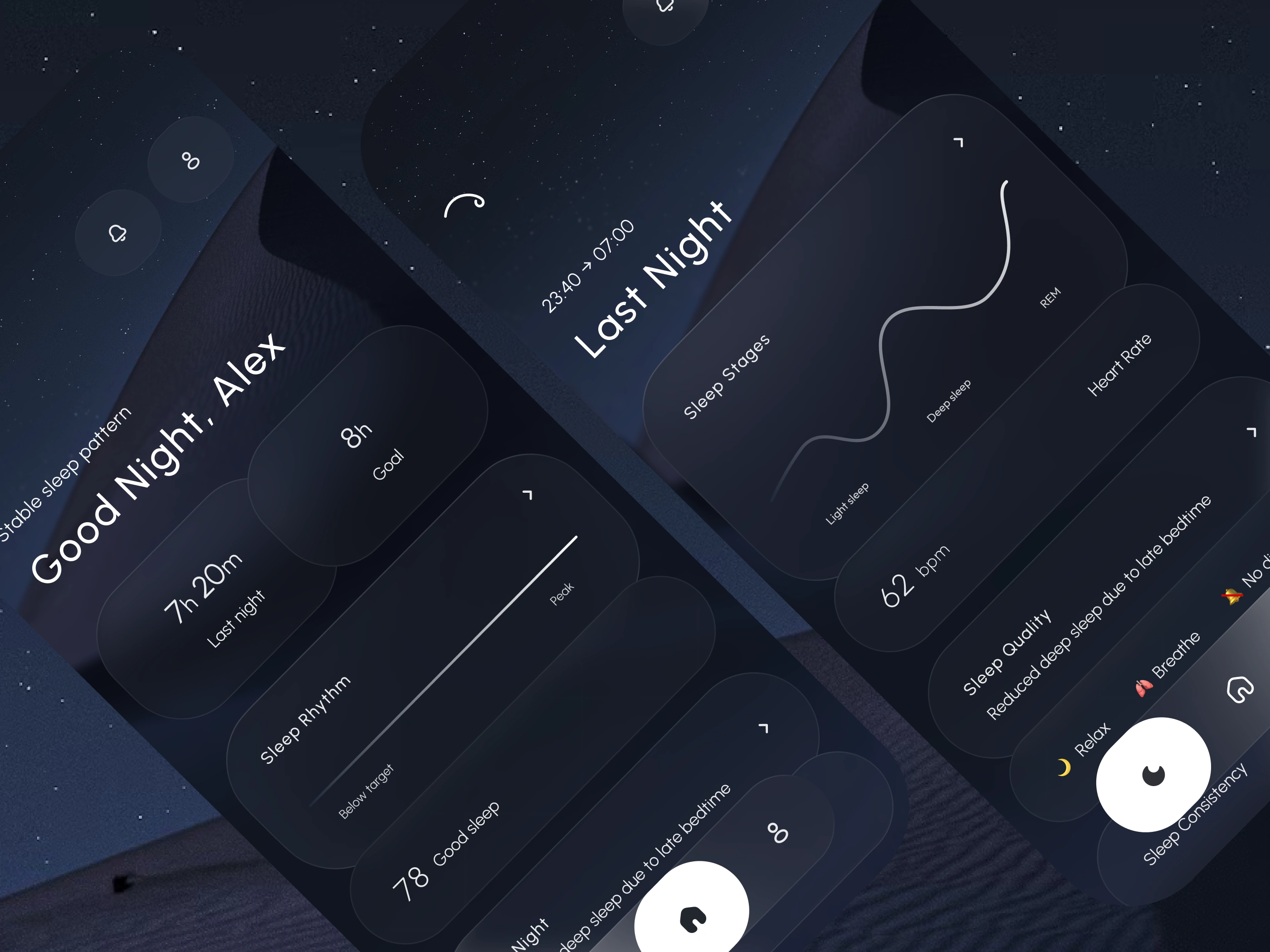
Dark navy palette. No gradients. Starfield texture kept as atmosphere, not decoration. Pill-shaped components to signal softness without sentimentality.
Typography
Serif display for emotional weight. Monospaced labels for data precision. The contrast between the two carries the brand voice — warm but exact.
Microcopy
Written as a quiet observer, not a coach. "Third time this week" lands harder than any alert badge. Copy does the UX work that colour usually does.
Information hierarchy
One number per card. One action per screen. The bottom nav stays invisible until you need it.
Like this project
Posted Apr 28, 2026
The visual language draws from the night itself — deep navy surfaces, restrained typography, and a palette that stays out of your way at 1am.
Likes
0
Views
10
Timeline
Mar 5, 2026 - Apr 27, 2026