Ember | Habit and Focus App Design

Taras Oliinyk


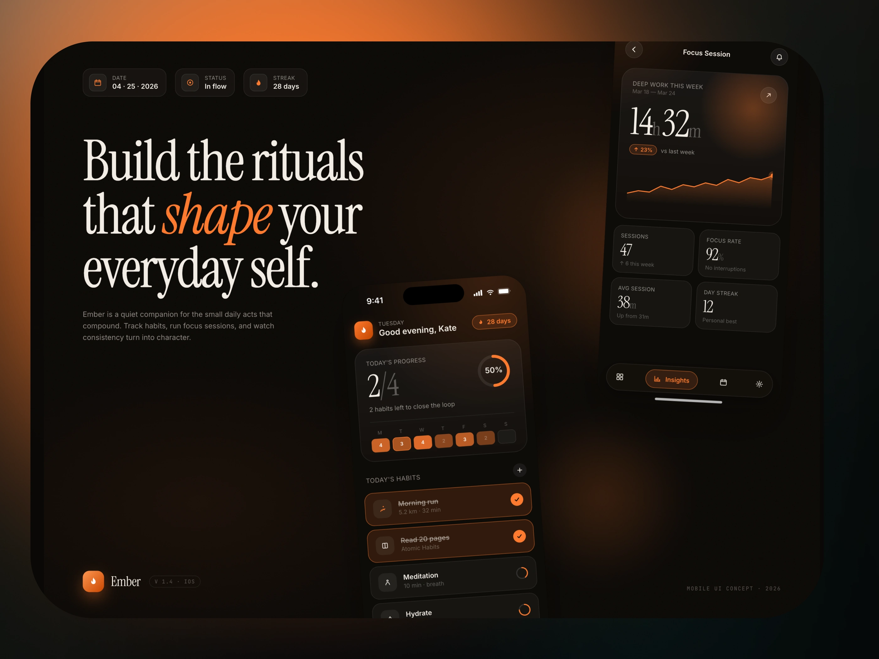
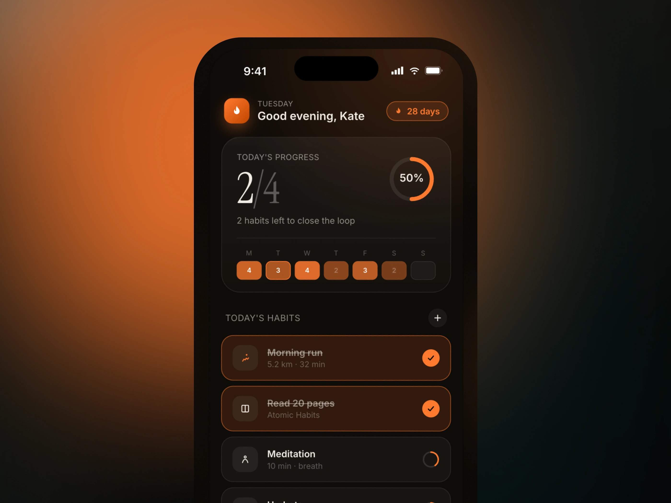
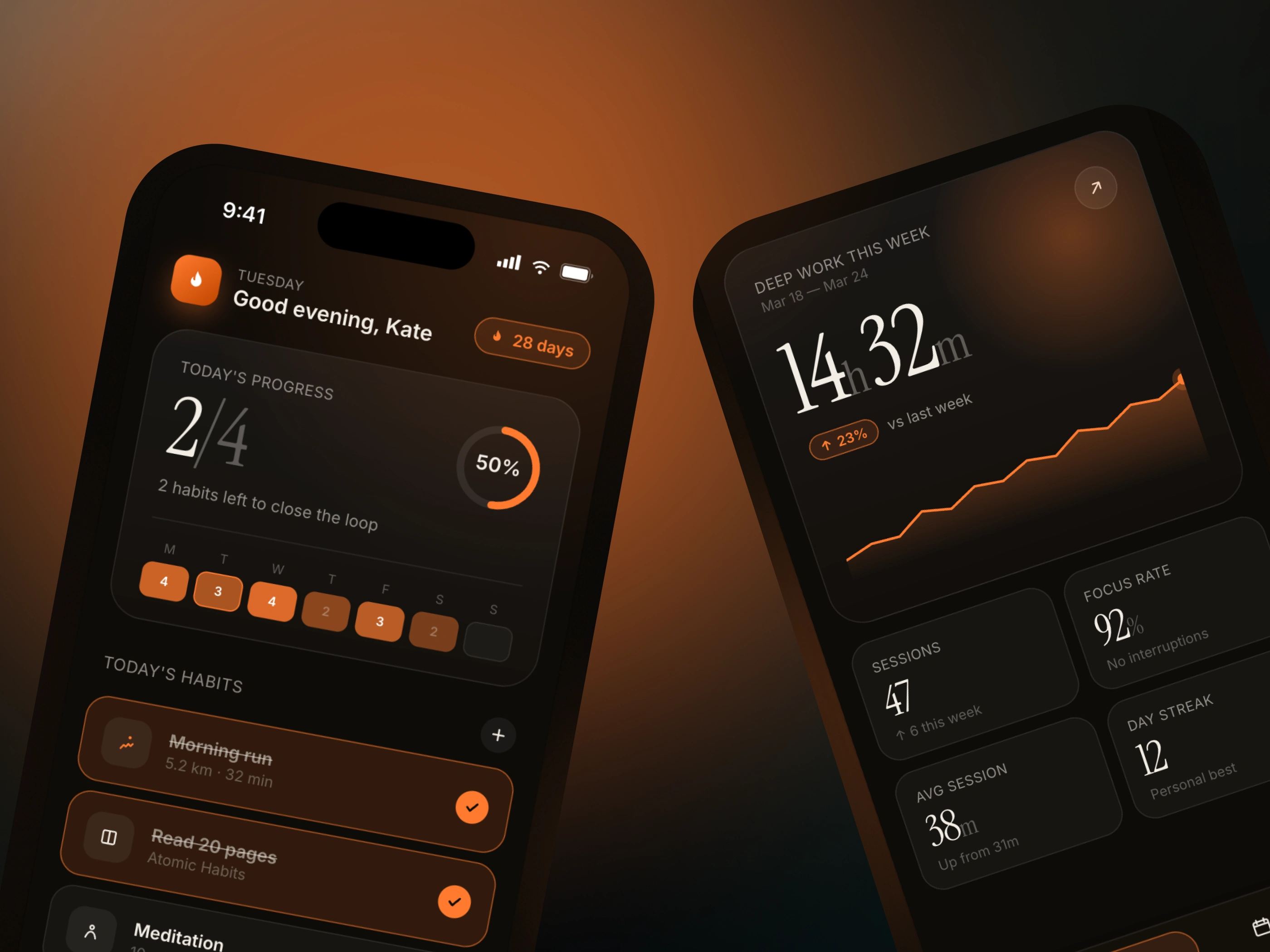
Ember is a habit and focus app built for people who take their days seriously. We designed a cross-platform experience — iOS and desktop — around one conviction: the tools you return to every day should feel like they were made for you specifically.
The visual language is warm and cinematic. A deep charcoal base with ember highlights — amber, burnt sienna, low-saturation gold — that glow just enough to feel alive without pulling attention. Dark mode isn't a feature here. It's the default state of a mind ready to focus.
The app lives in three modes. Rituals: your daily habits, sequenced the way you actually live them. Streaks: a quiet record of consistency, never punishing, always honest. Reflection: a focused end-of-day prompt that asks one question and means it.
Typography leans into the cinematic reference — a heavy serif for headers, a clean sans for interface text. The combination reads like a journal that also happens to run your morning. Motion is slow and deliberate. Transitions don't rush you. The app matches the pace you're trying to build.
On desktop the layout opens up into a split canvas — habits on the left, deep work timer and today's reflection on the right. On iOS it collapses into a single scroll with the same hierarchy intact. One system, two surfaces, no compromises.
Ember doesn't celebrate you loudly. It keeps the record. And that quiet consistency is exactly the point.
Like this project
Posted Apr 28, 2026
Designed Ember, a cross-platform focus and habit-tracking app created to help users build better routines and stay consistent.
Likes
1
Views
18
Timeline
Mar 5, 2026 - Apr 16, 2026