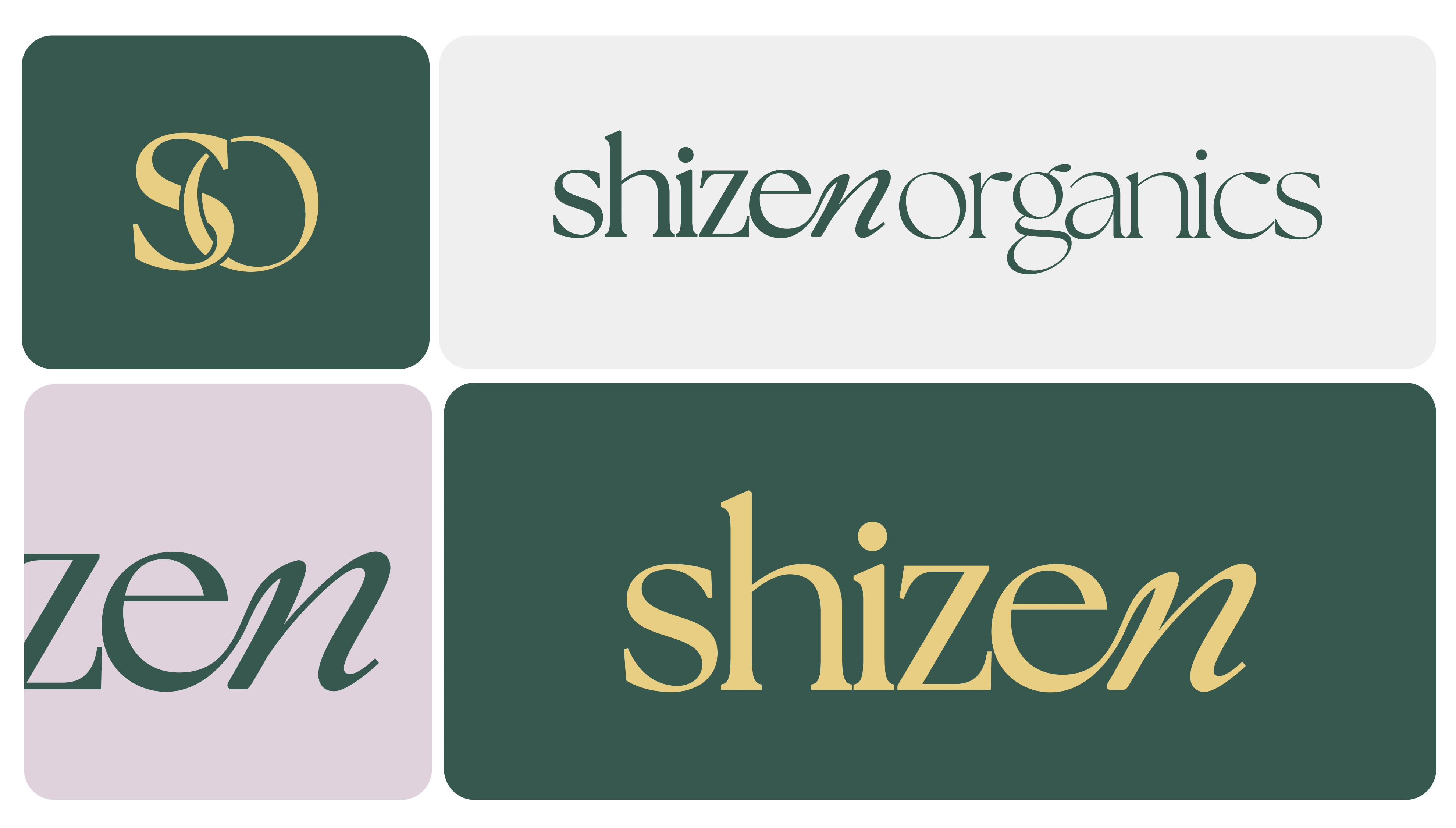
Shizen Organics Logo
Anita Autorino
$800 earned

Color Palette
This color palette reflects the natural lifecycle of plants and their deep connection to the environment. A soft green serves as the foundation, symbolizing life and growth, while a warm yellow adds vitality and warmth, representing the energy of the sun. A neutral off-white conveys purity and cleanliness, evoking fresh air, and a light purple captures the beauty of blooming flowers and nature’s transformation. Together, these hues blend subtle vibrancy with an organic feel, highlighting the nurturing and mindful qualities that define Shizen Organics.

Like this project
What the client had to say
Talented, friendly, professional, timely, great communicator, and artistic -- I look forward to working with Ani again and recommend to anyone who needs help with their designs.
Tim Atkins
Jan 29, 2025, Client
Posted Mar 21, 2025
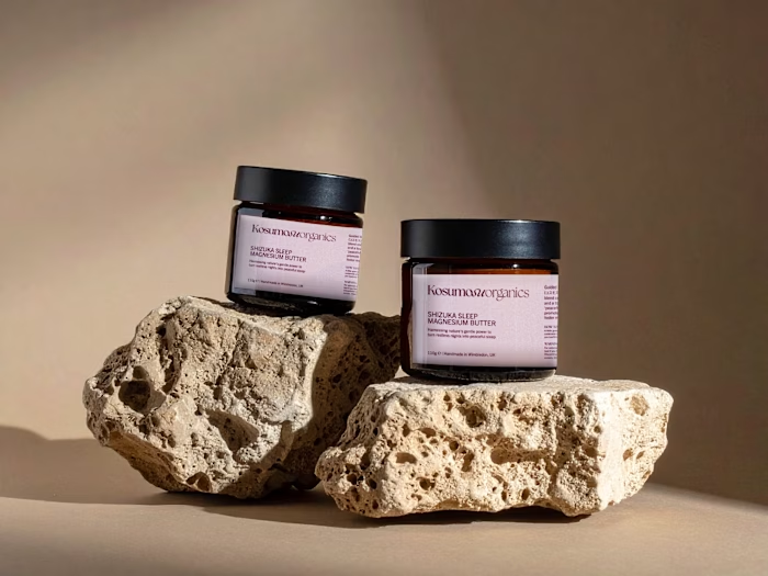
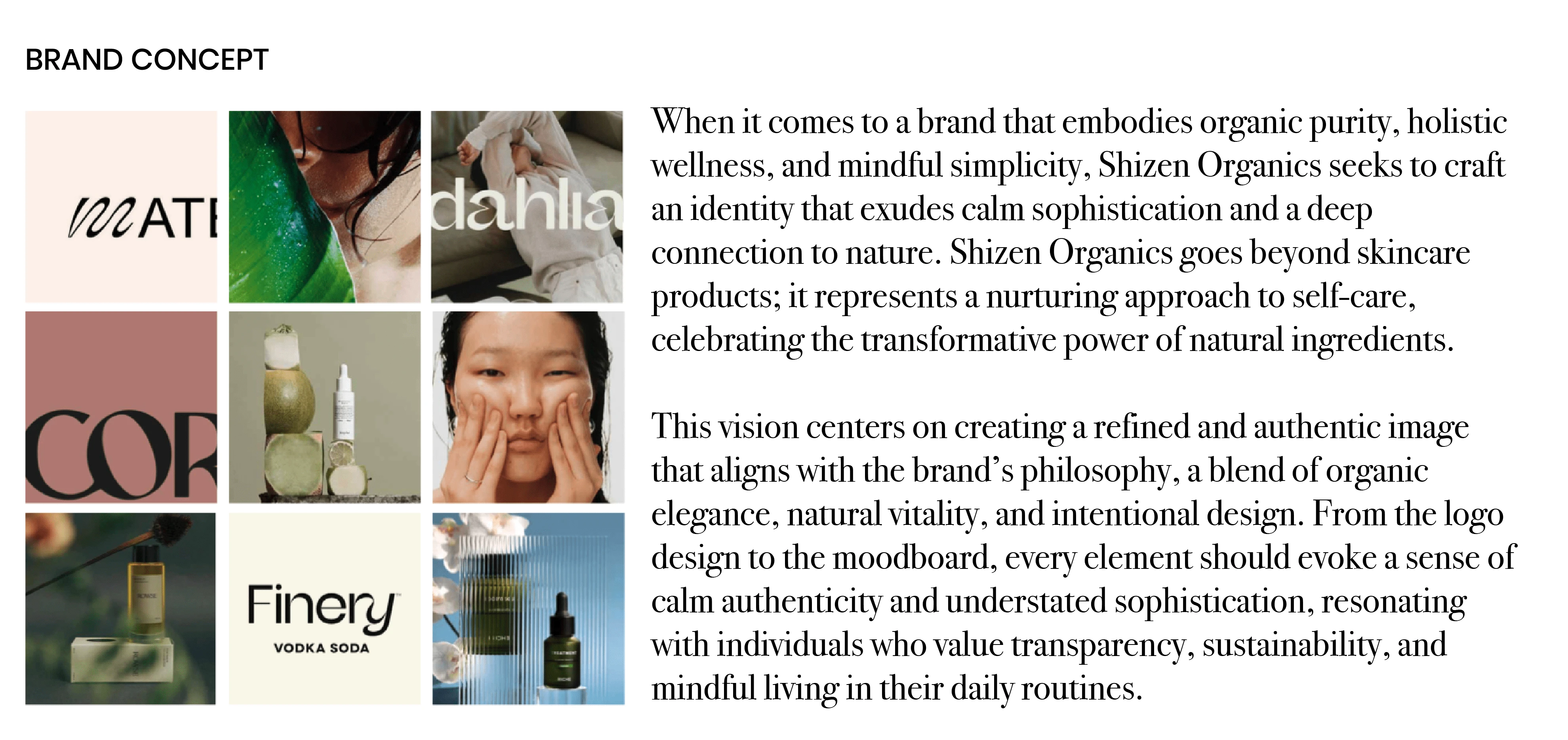
Minimal, typographic and organic logo for Shizen Organics. Inspired by the flow and shapes present in nature.
Likes
6
Views
138
Earned
$800
Timeline
Jan 27, 2025 - Jan 29, 2025