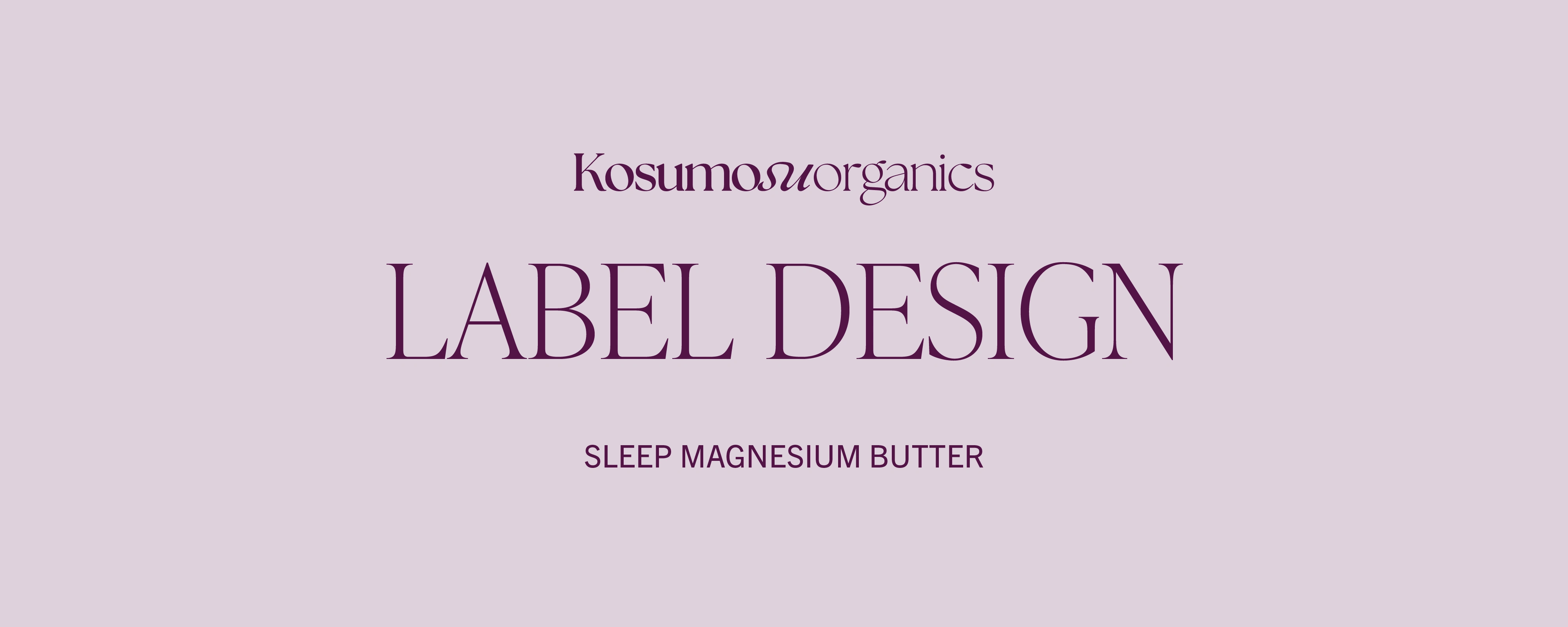
Kosumosu Organics Logo and Label Design
Approve request to show earnings
View
Anita Autorino
Verified
Behind the Label: Kosumosu Organics 🌿
Kosumosu Organics is a wellness brand inspired by nature, Japanese minimalism, and the balance between beauty and functionality. Originally launched under the name Shizen Organics, I first collaborated with the client to design a custom typographic logo that embodied calm, elegance, and authenticity. You can view the original logo design process here.
However, due to trademark restrictions, the brand name was changed to Kosumosu Organics. I adapted the original logo concept to the new name, maintaining the serene, organic feel and the custom serif structure of the identity.
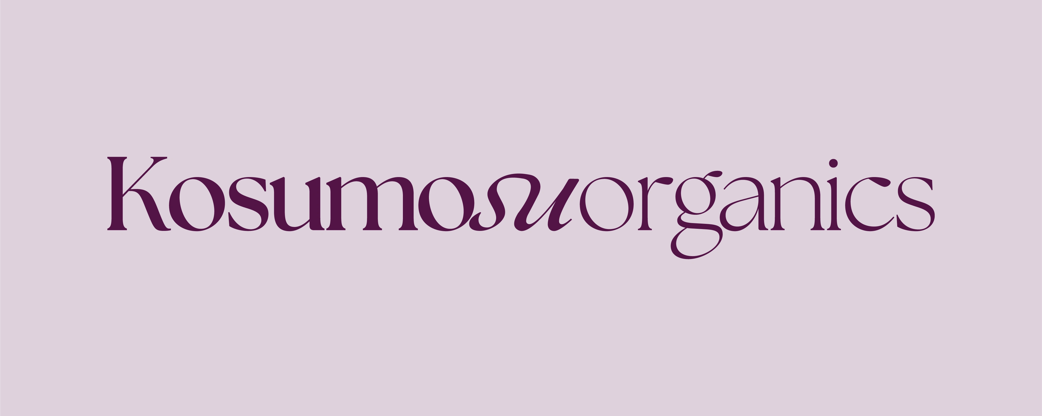
Updated logo design for Kosumosu Organics
Following this update, I was tasked with designing the product label for their Sleep Magnesium Butter. The goal was to create a clean and minimal layout that communicates the natural and soothing essence of the product. Inspired by Japanese ingredients and botanical simplicity, I explored soft color palettes and structured typography, keeping the information clear while highlighting the product’s calming function.
The final result is a refined and elegant label that reflects Kosumosu Organics’ mindful approach to wellness and their focus on natural, handcrafted self-care.
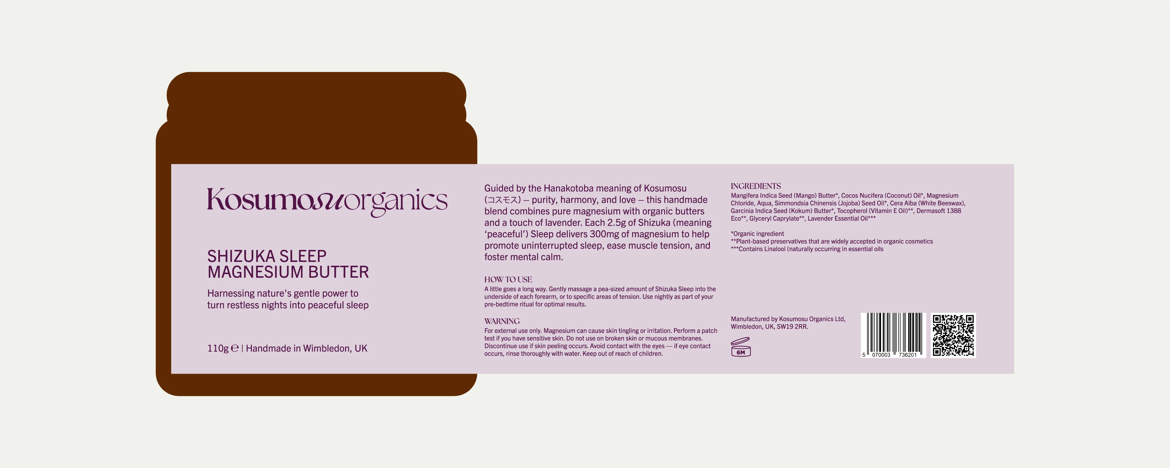
Label design
This label features a clean, structured layout designed to guide the reader through product details with ease. The typographic system combines a custom serif logotype with modern sans serif text, creating a refined balance between elegance and clarity. Varying font weights and sizes establish a clear information hierarchy, enhancing both readability and visual flow across the front and back of the label.
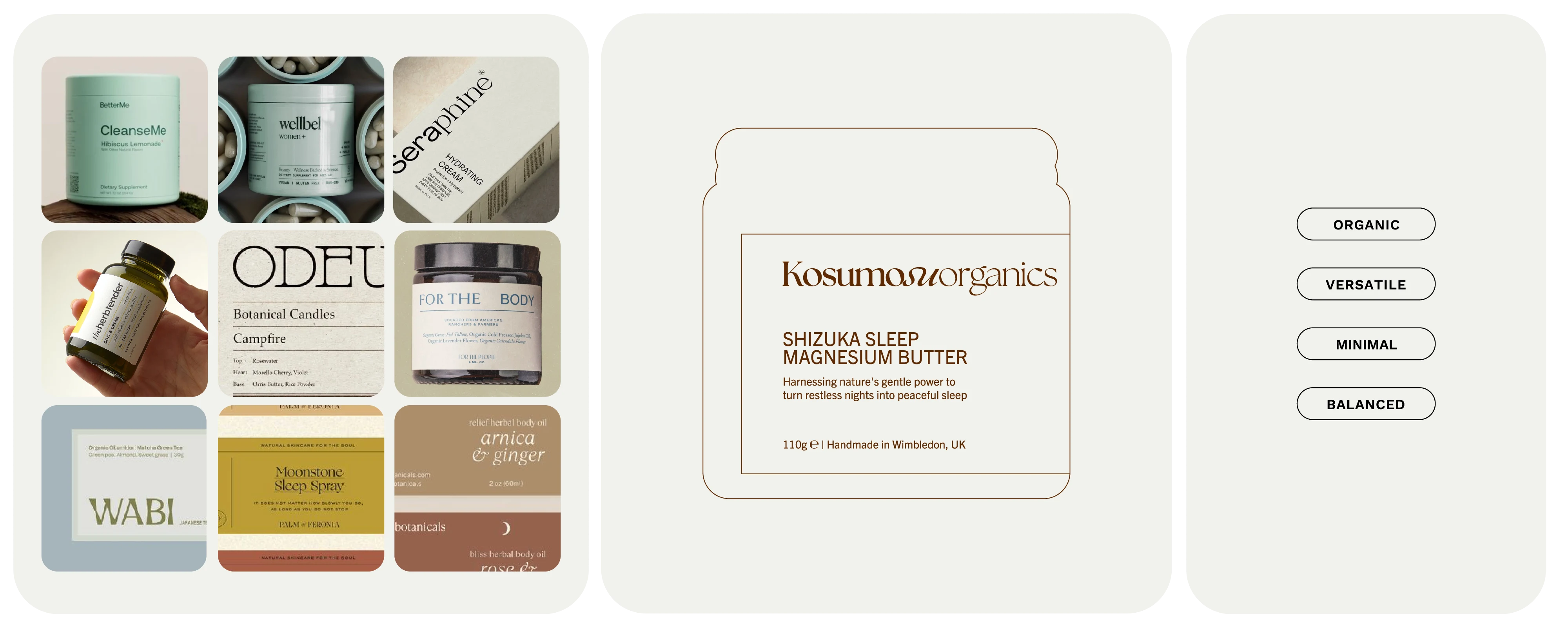
Moodboard & Visual Direction
When it comes to a brand that reflects natural elegance, quiet strength, and intentional simplicity, Kosumosu Organics is inspired by the beauty of nature and the timeless principles of Japanese minimalism. More than just an organic skincare line, Kosumosu embodies a holistic philosophy centered on balance, purity, and mindful living.
Its visual identity draws from the delicate harmony found in nature, graceful yet grounded, minimal yet meaningful. From logo design to packaging, every element is crafted to evoke calm, trust, and authenticity, supporting a lifestyle rooted in wellness and conscious care.
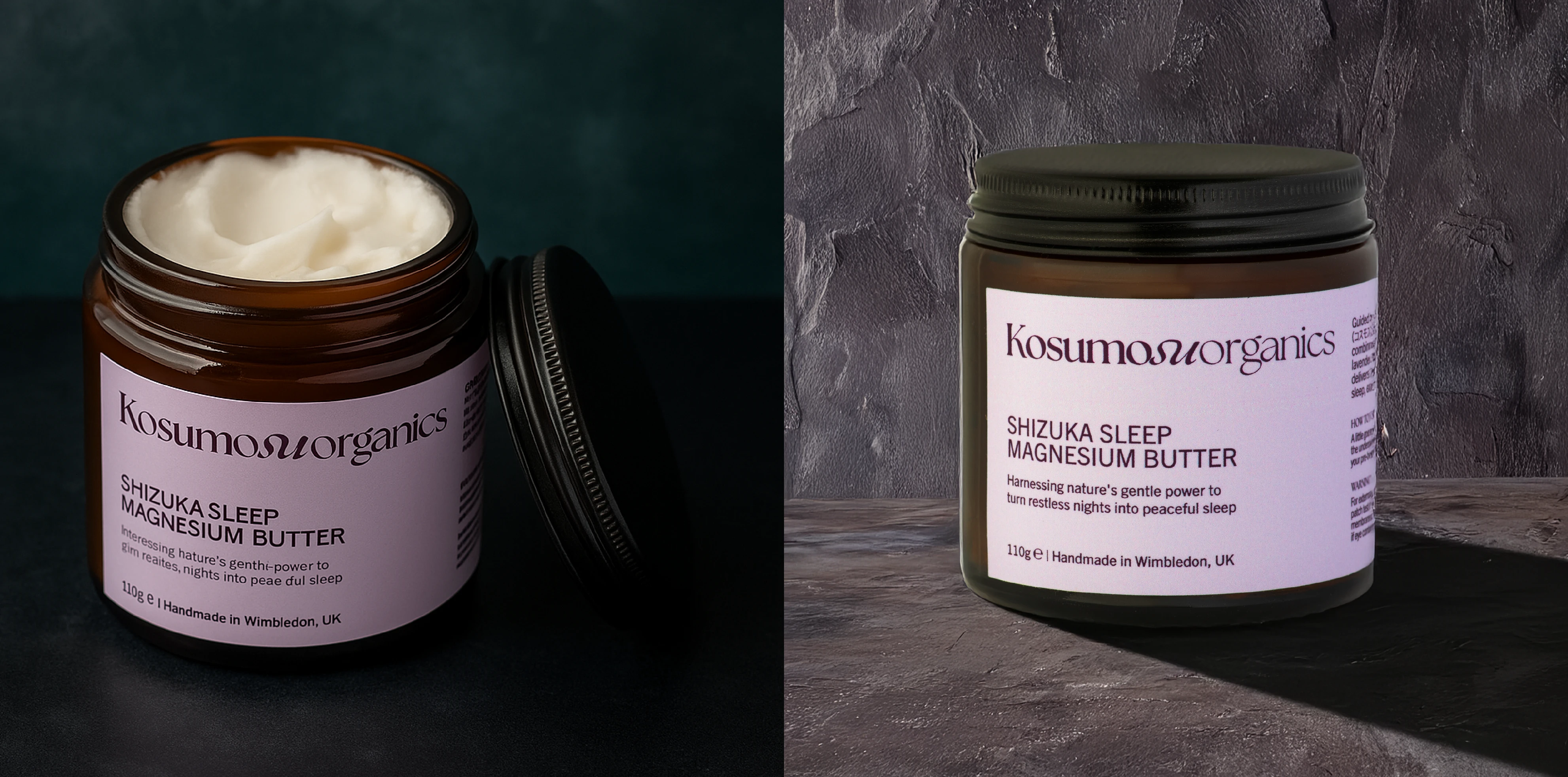
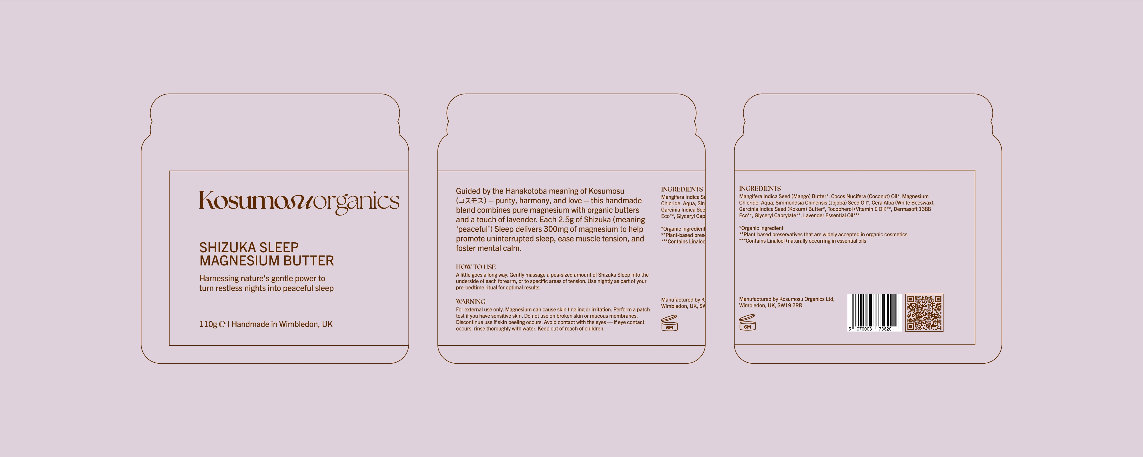
A closer look at the label in context: the structured layout and custom typography are designed to balance elegance with functionality. The serif logo brings sophistication, while the supporting sans serif typography ensures clarity and hierarchy across product details.
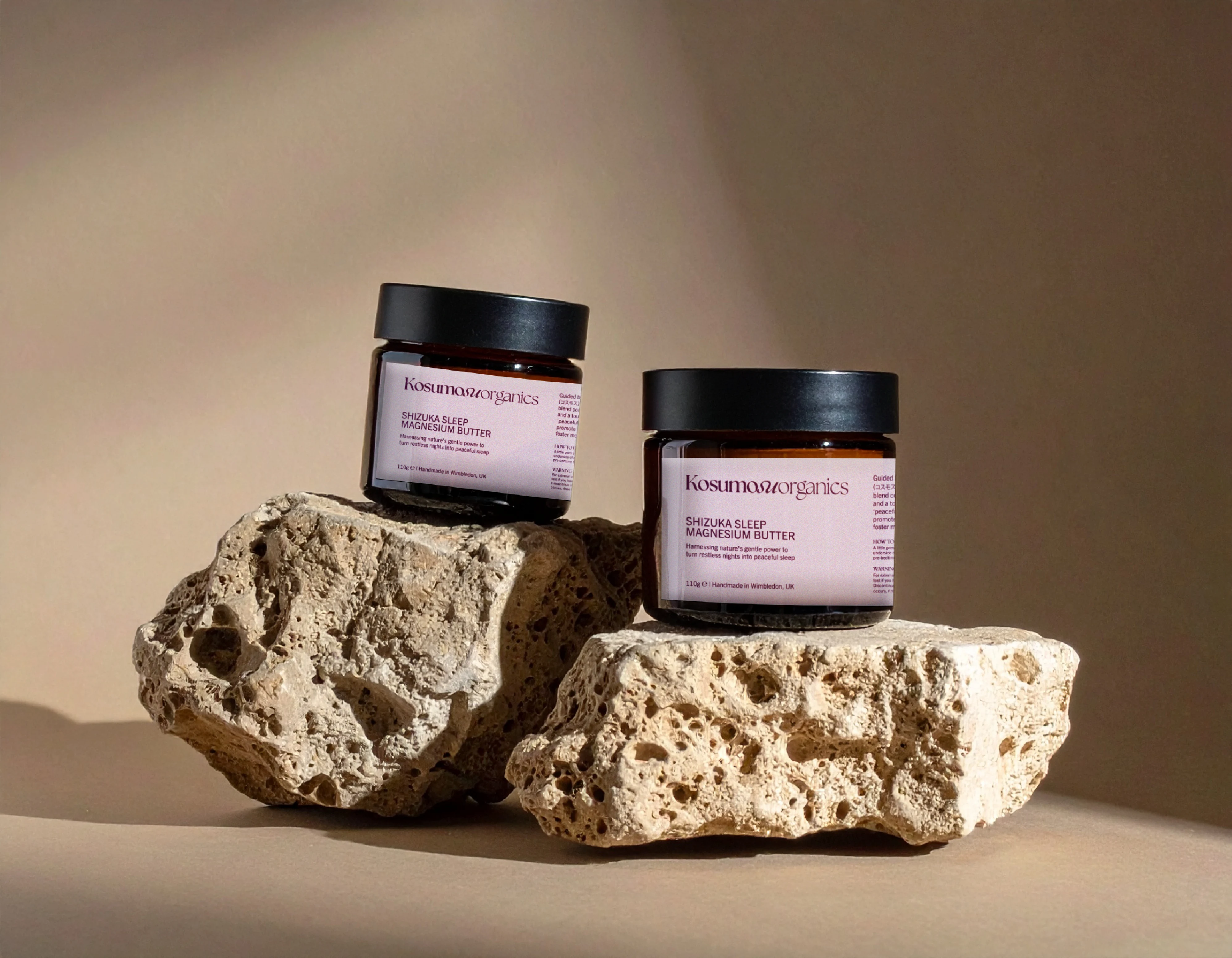
Minimal, grounded, and balanced. This lifestyle presentation highlights the versatility of the layout and typographic structure in natural settings, allowing the product to visually align with the brand’s core values of simplicity and calm.
Like this project
What the client had to say
Great work, great communication, great attention to detail -- what's not to love?! I recommend Anita for any design work you need.
Tim Atkins
Jun 3, 2025, Client
Posted Jul 15, 2025
Logo update and minimal label design logo for Kosumosu Organics, reflecting natural elegance and Japanese minimalism.
Likes
2
Views
67
Timeline
May 1, 2025 - Jun 2, 2025