Sojuro Skincare branding
Anita Autorino
SOJURO Premium Body Care
Skincare branding
About the brand
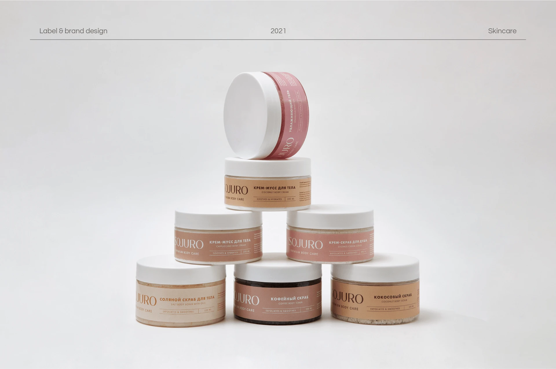
Transforming Skincare, Enriching Lives: Sojuro Body Care, a distinguished premium Russian brand hailing from Moscow, has mastered the art of turning ordinary ingredients into extraordinary skincare products. Their commitment lies in providing customers with a complete and indulgent skincare routine that revitalizes and nourishes their skin. By harnessing the power of monochromatic labels, each product in their range exudes its unique personality, making Sojuro Body Care a standout choice among conventional brands.
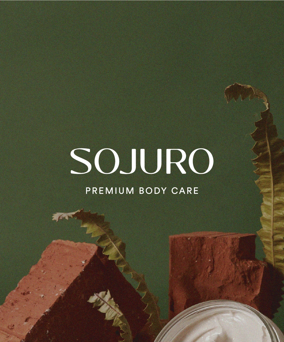
The Logo
Crafting the logo for Sojuro Body Care was an artistic journey that merged the names of the brand's visionary owners. By meticulously customizing the font, I created a typographic masterpiece that embodies versatility and timelessness. Additionally, a captivating monogram was meticulously designed for smaller applications, encapsulating the essence of the brand.
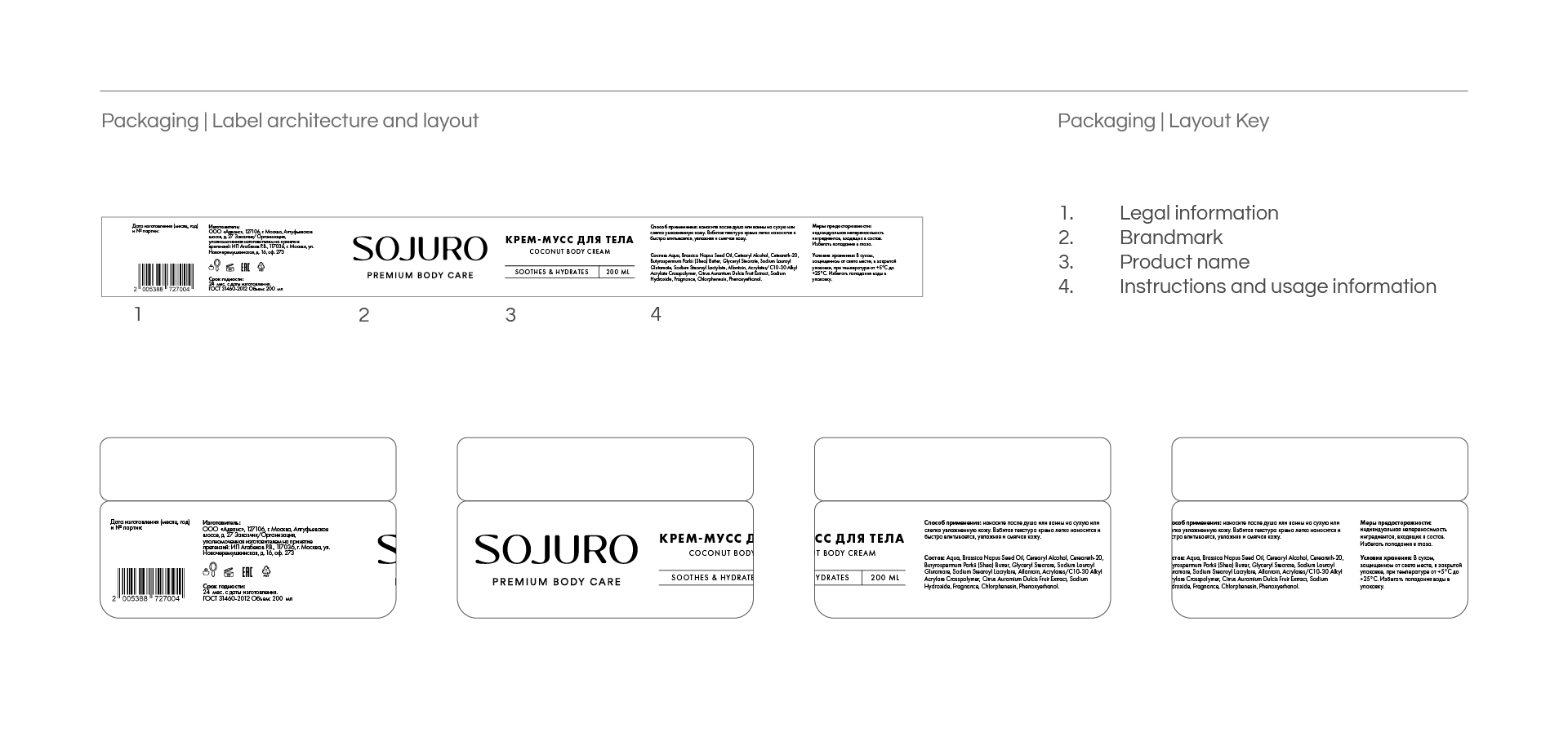
Label design architecture and structure
Label Design
The label design for Sojuro Body Care posed an intriguing challenge, particularly for jars and limited design spaces. To overcome this, I devised a solution that optimized resources and eliminated contamination concerns. By ingeniously incorporating all brand and product information into a single label, we reduced costs and enhanced sustainability.
Furthermore, creating a consistent typographic design that would be legible in both Russian and English languages presented an exciting opportunity for seamless communication. With invaluable assistance from the client, who provided translations, we successfully developed a labeling system that enables buyers to identify products based on their core ingredients, fostering a truly immersive experience.
Color Palette
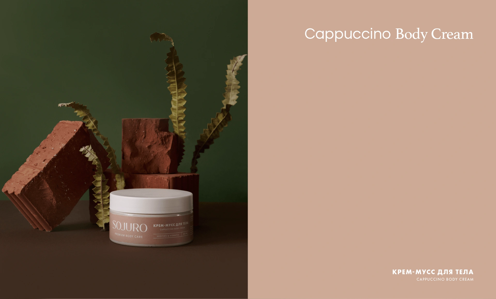
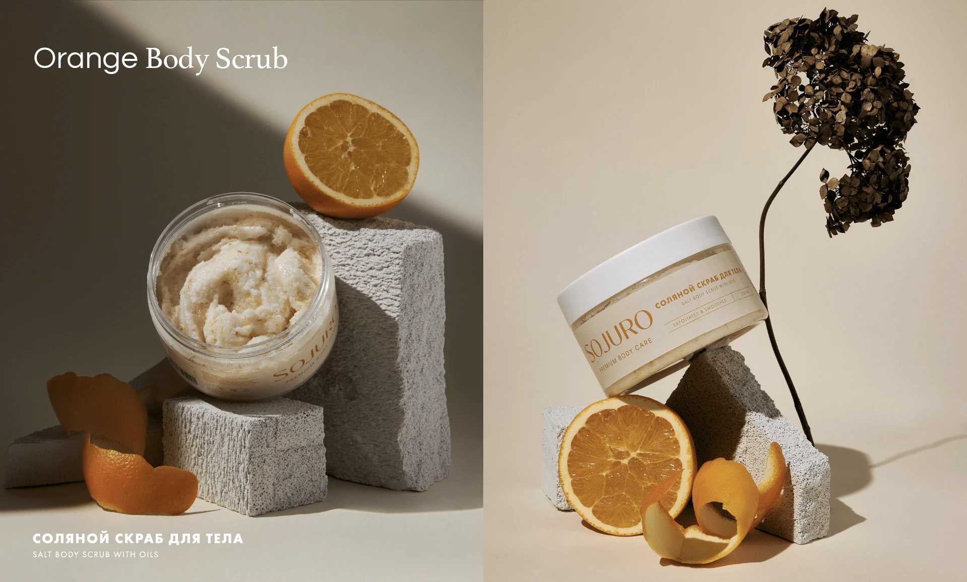
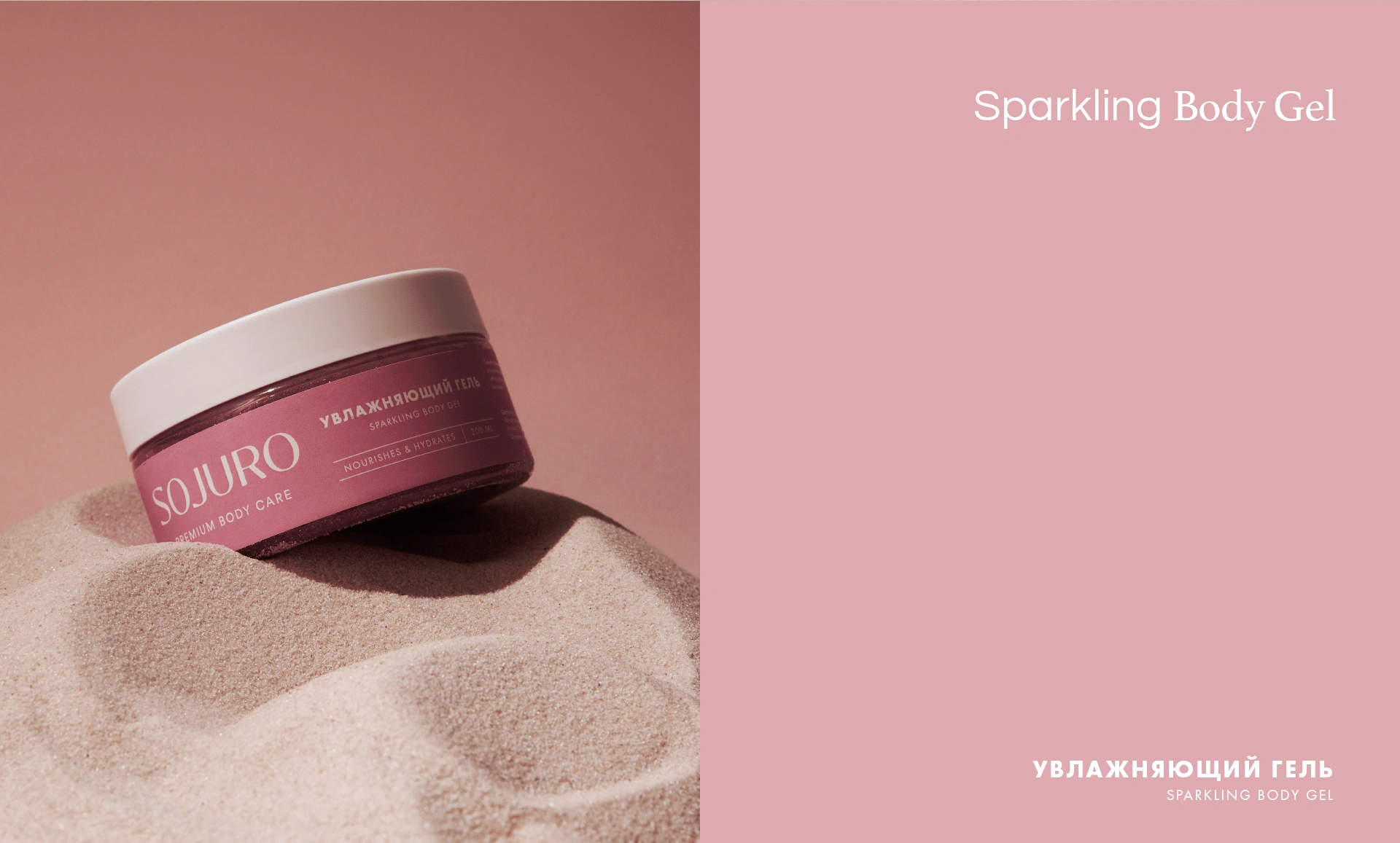
The palette for Sojuro Body Care was meticulously crafted to match the flavors and key ingredients of each product. Our primary focus was to ensure that customers could effortlessly identify and connect with each offering. The result is a harmonious palette that not only captivates the senses but also facilitates easy product recognition.
Like this project
Posted Jan 23, 2023
Branding and label design for a premium Russian skincare brand that seamlessly merges elegance, sophistication, and minimalism.
Likes
2
Views
147