Heritage Premium Oil Branding & Packaging Design
Anita Autorino
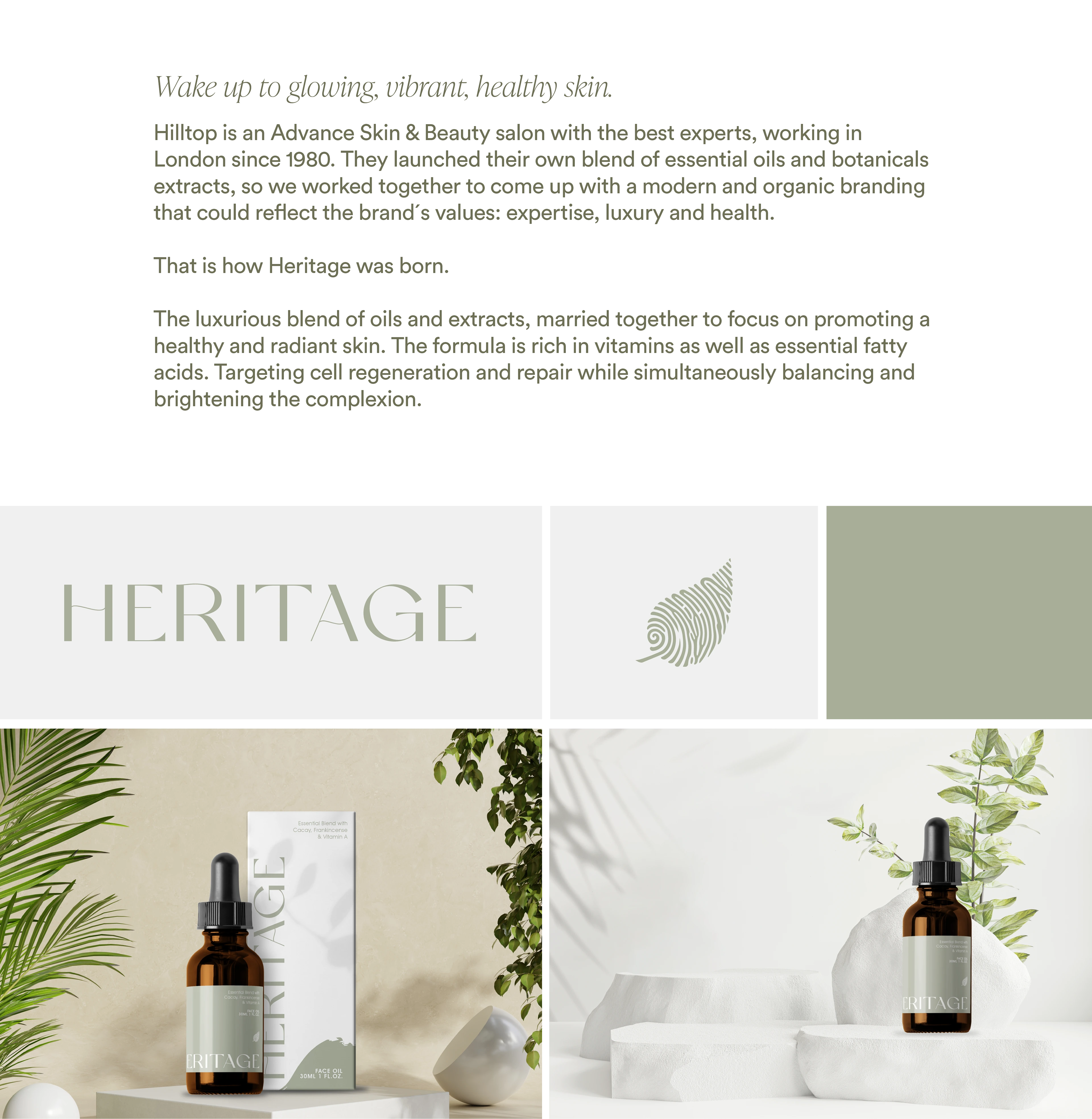
Heritage
Branding & Packaging design
Chore brand elements: logo & palette
While Hilltop already possessed a logo, I developed a distinctive sub-brand called Heritage within the Hilltop brand, emphasizing its freshness. The logo needed to convey the expertise of the owners while maintaining an organic essence, distinguishing it from other skincare brands' more minimal, sans serif logos that often exude seriousness.
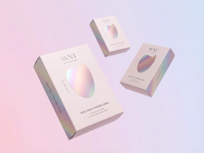
The carefully curated palette revolves around neutral and green hues, aligning seamlessly with the brand's natural ingredients and versatile identity. These colors embody the harmonious fusion of nature and science that defines the brand.
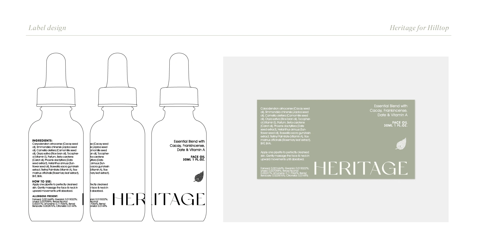
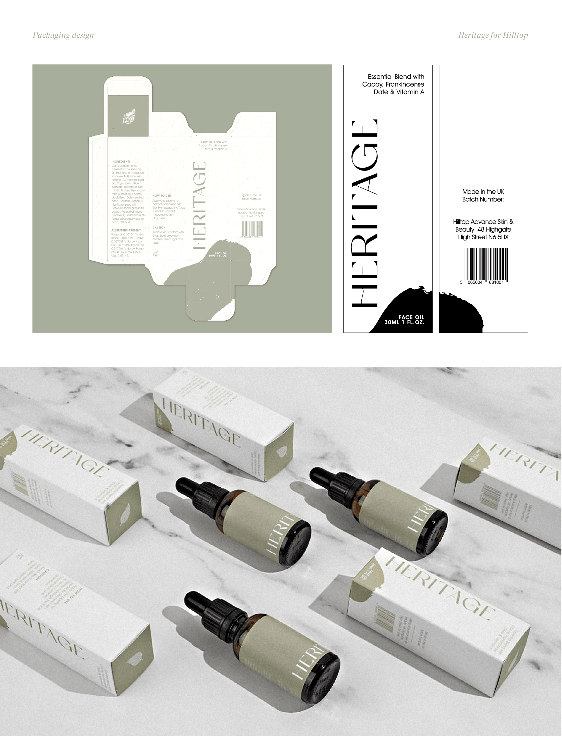
Materializing the brand: packaging & labels
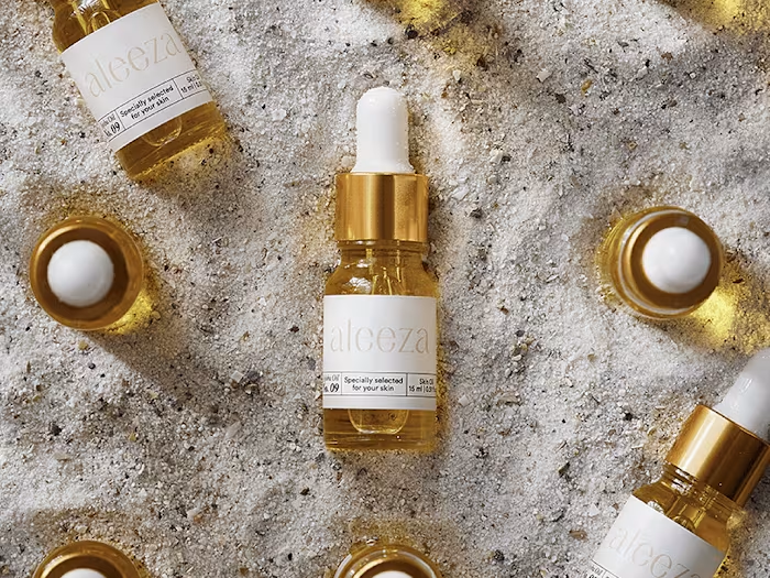
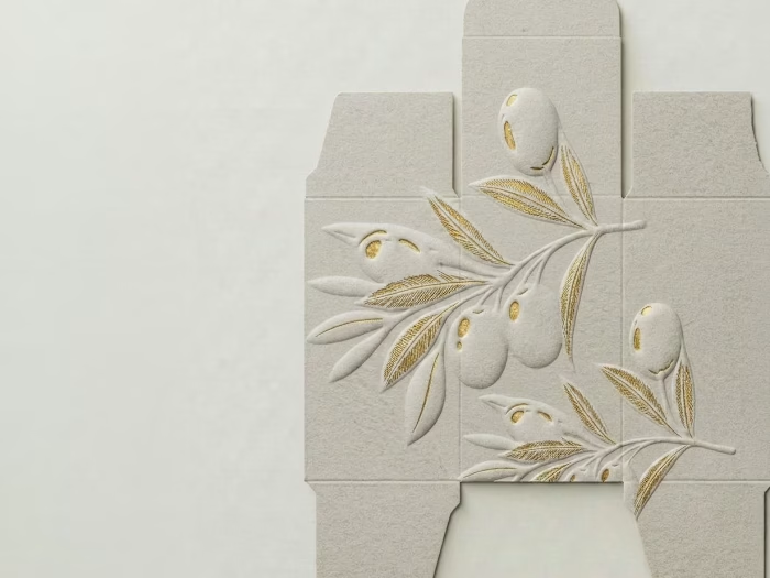
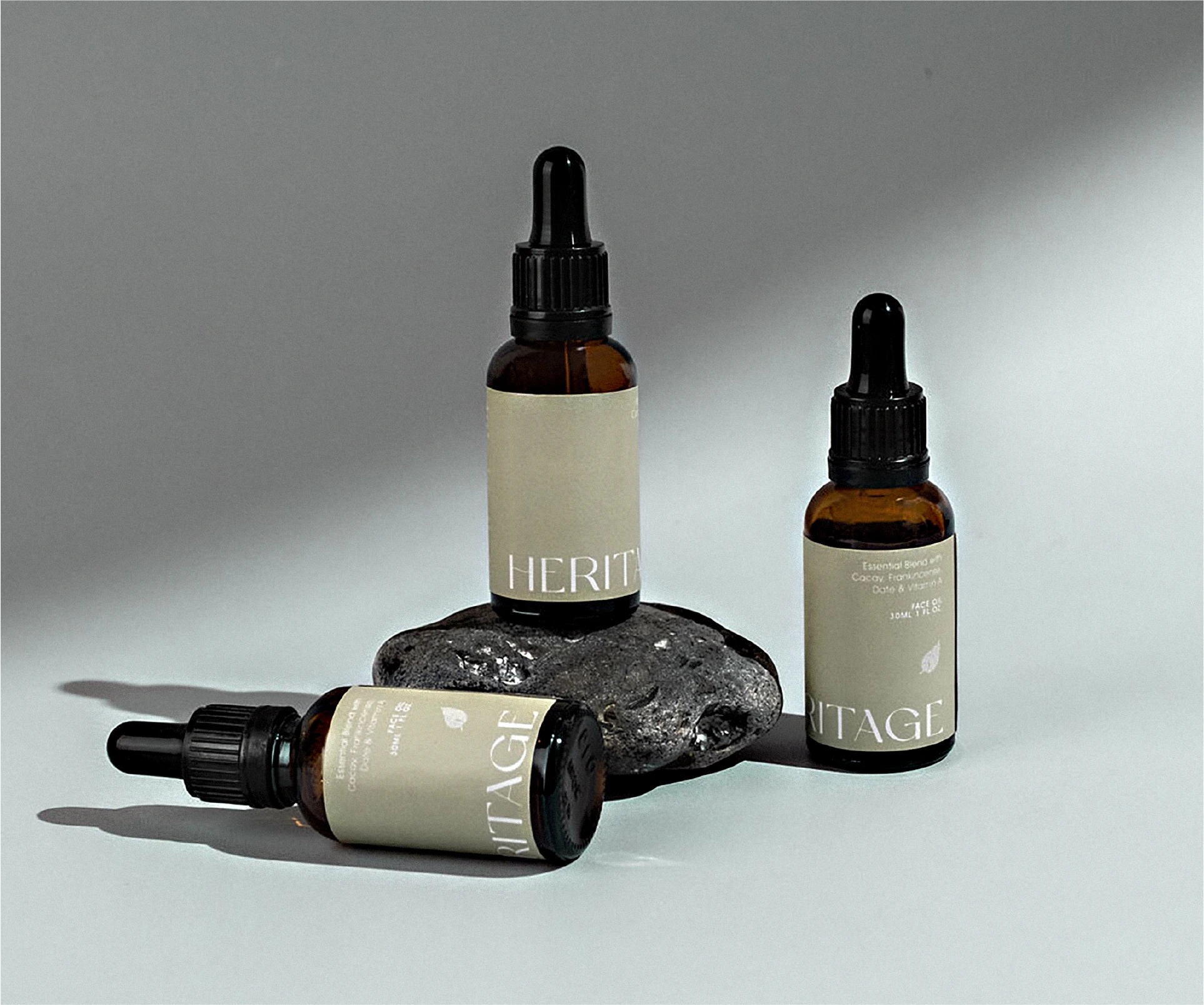
My primary focus was designing labels and packaging for Hilltop's exquisite range of natural skincare oils. Balancing luxury and expertise was crucial in capturing the essence of this brand. The packaging needed to communicate accessibility while exuding a sense of scientific knowledge. To achieve this, we incorporated organic hand-dpainted shapes, reflecting the natural ingredients that empower the products.
Like this project
Posted Jan 23, 2023
Crafted a modern and organic branding, label and packaging for Heritage part of Hilltop-a prestigious London skincare salon.
Likes
0
Views
83