ULUSOLEIL | Sustainable Packaging
Anita Autorino
About the brand
UluSoleil is a vibrant and inclusive skincare brand that celebrates individuality and the beauty of diverse skin. Inspired by the island lifestyle and driven by a passion for effective body-care, they strive to create products that nourish and empower. The brand concept revolves around the idea of embracing the glow of uniqueness, encouraging everyone to love and care for their skin, just as it is.
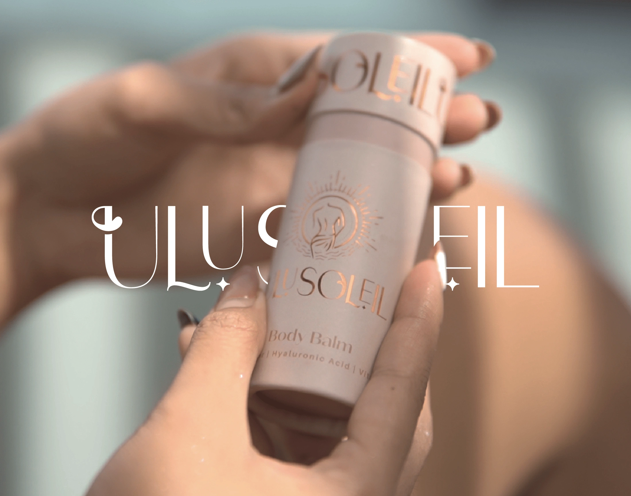
ULUSOLEIL, a brand born from a serendipitous meeting, embraces all things beautiful while acknowledging the impact of our choices. With a commitment to sustainability, they have introduced 100% biodegradable packaging crafted from recycled paper. This conscious step towards a sustainable future reflects their dedication to reducing the environmental impact of consumerism.
With these brand chore values, Ulu Soleil positions itself as a brand that not only provides effective body-care solutions but also fosters a sense of self-acceptance, inclusivity, and empowerment within its community.
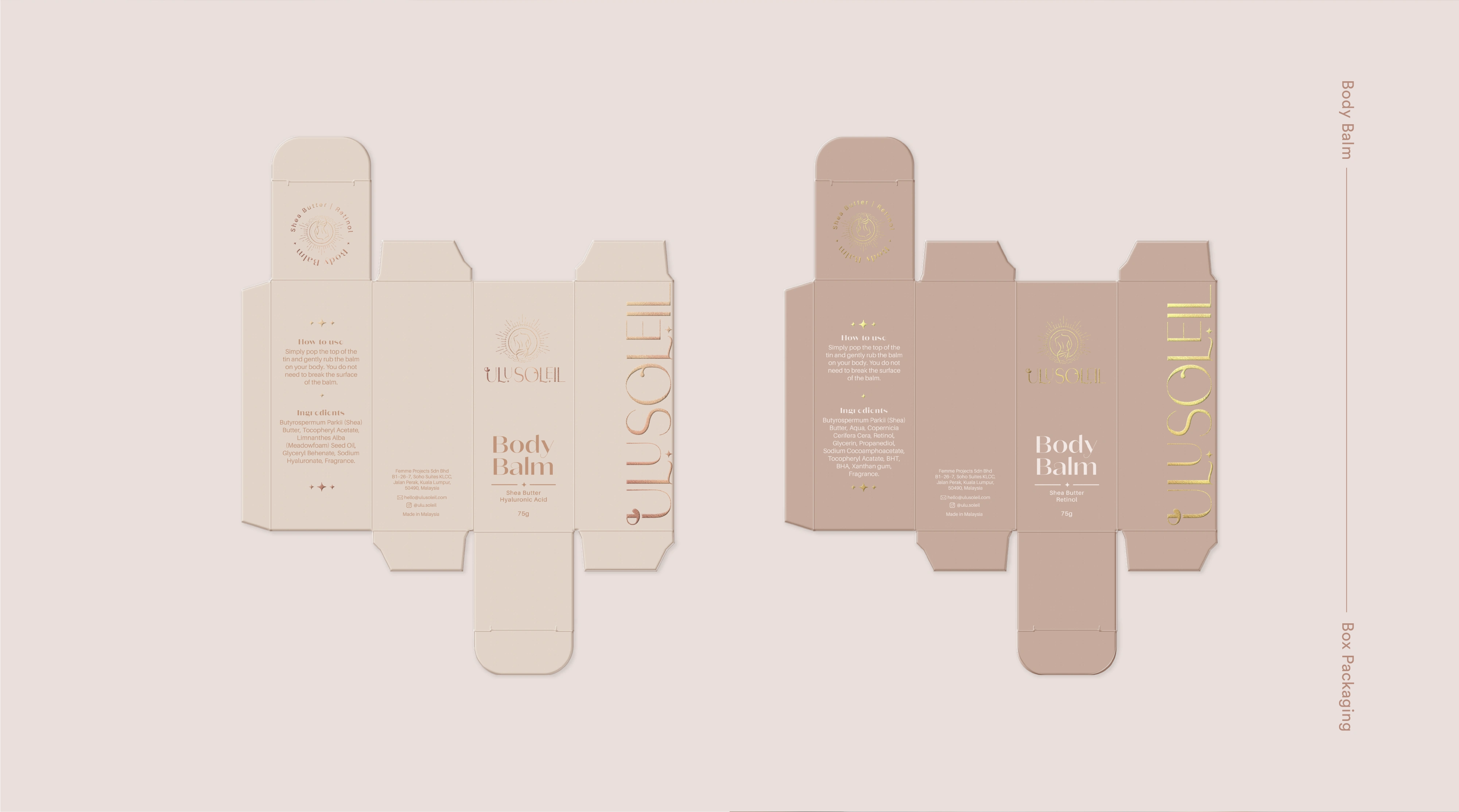
Packaging Design
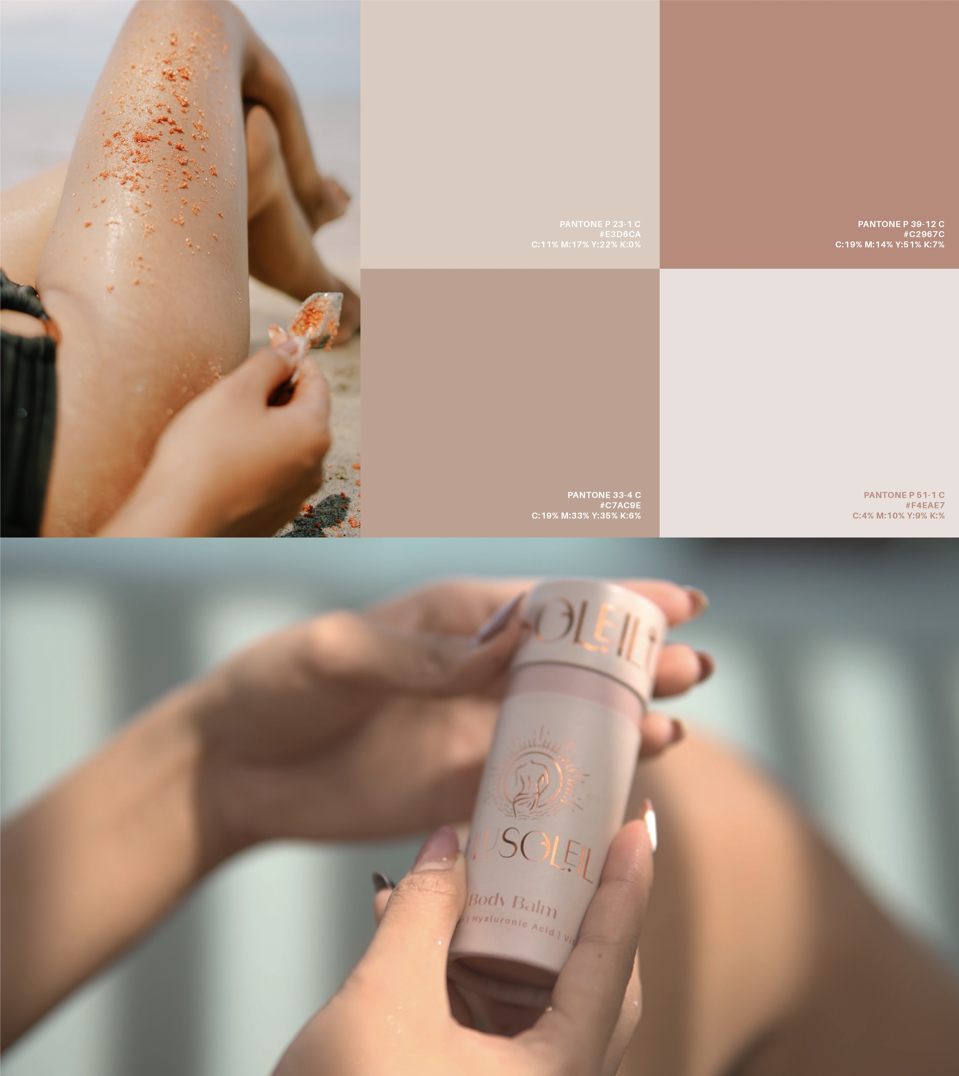
Color Palette
Earth and nude tones form the foundation of Ulu Soleil's brand identity, reflecting the brand's connection with nature and its commitment to embracing the essence of human skin. While these tones serve as essential elements, Ulu Soleil allows for the creation of new colors within the same range to accommodate new product launches.
Generating New Color Palettes
When generating new colors, it is crucial to maintain consistency and adhere to the brand's established color system. By aligning the new tones with existing earth and nude shades, a cohesive brand system is established, enabling seamless integration of new products while preserving the brand's overall aesthetic. This approach ensures that the new colors harmonize with the existing palette, enhancing visual coherence and reinforcing the brand's identity.
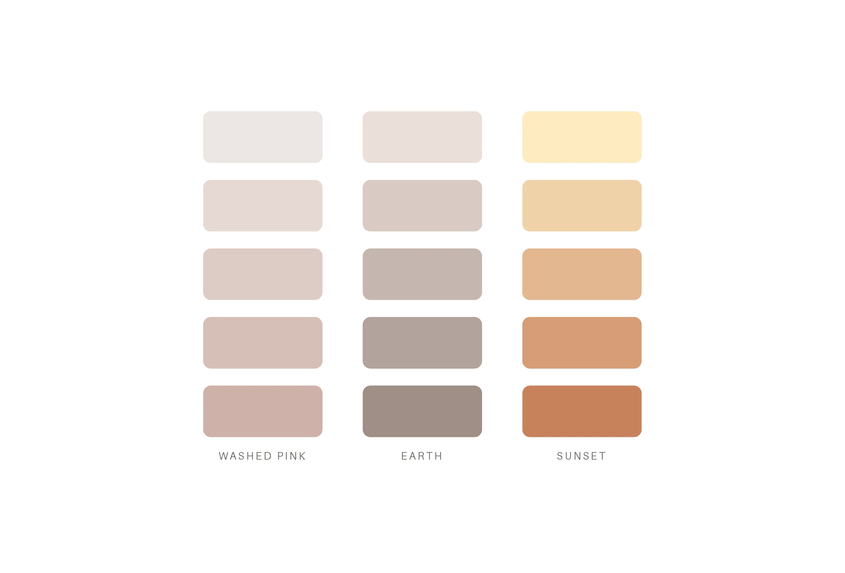
Color progression and examples on how to create
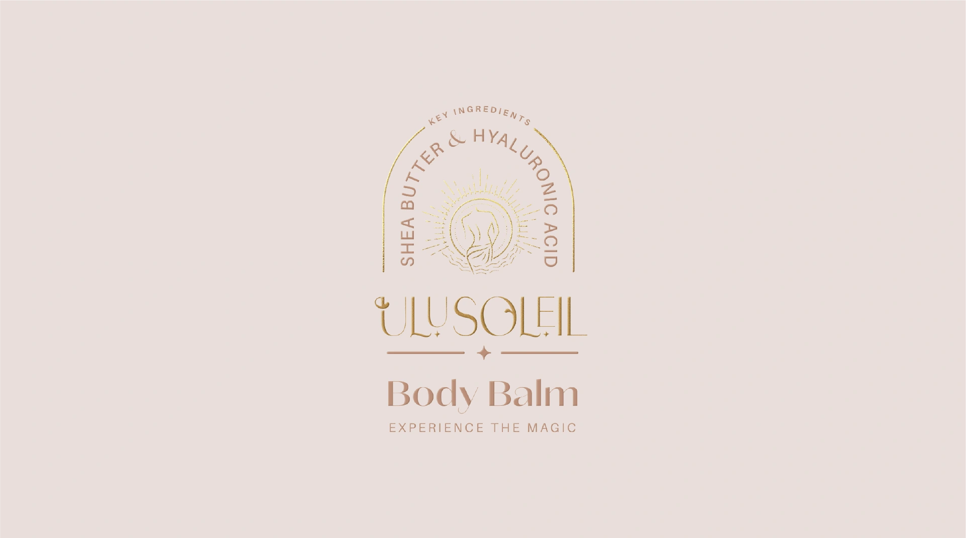
Color palette and application on packaging design
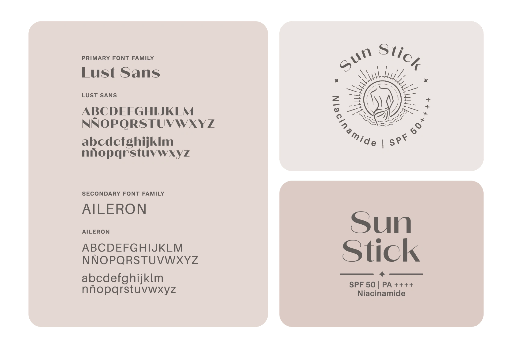
Font families and usage
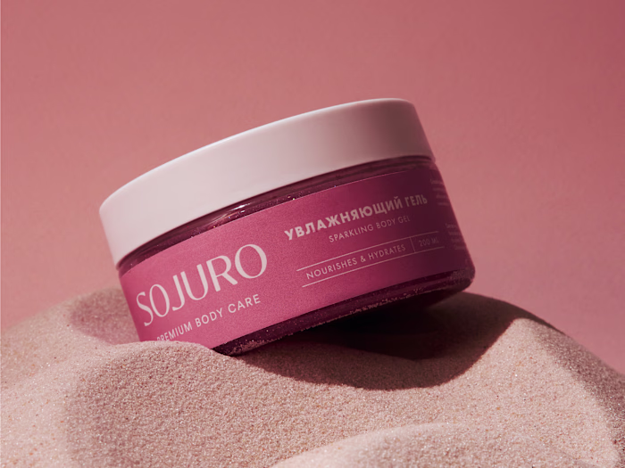
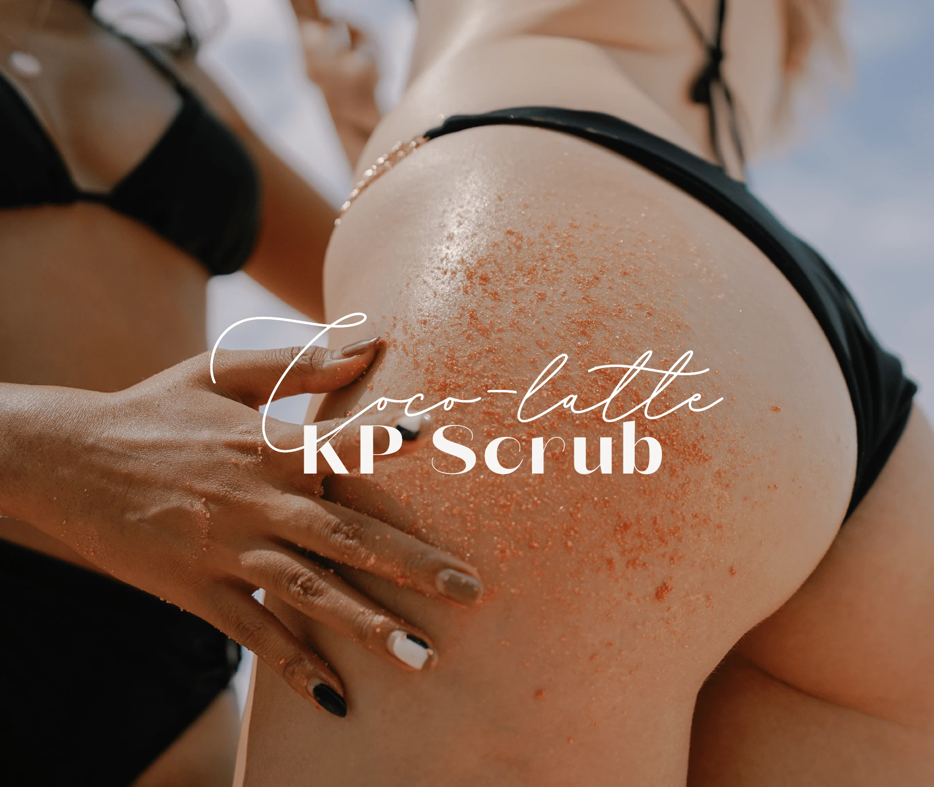
Body Scrubs
Give your skin a hit of goodness with our Glisten Body Scrub!
The packaging design for the ULUSOLEIL Body Scrubs was approached with the brand's concept of glorifying skin and promoting sustainability in mind. While the packaging materials themselves may not be recyclable due to the need to contain greasy and oily ingredients, a thoughtful packaging system was created to align with the brand's values. Shiny materials were incorporated to evoke a sense of radiance and the sun's glow, elevating the brand image. This design choice aimed to convey a connection to the brand's concept while maintaining a balance between functionality and visual appeal.
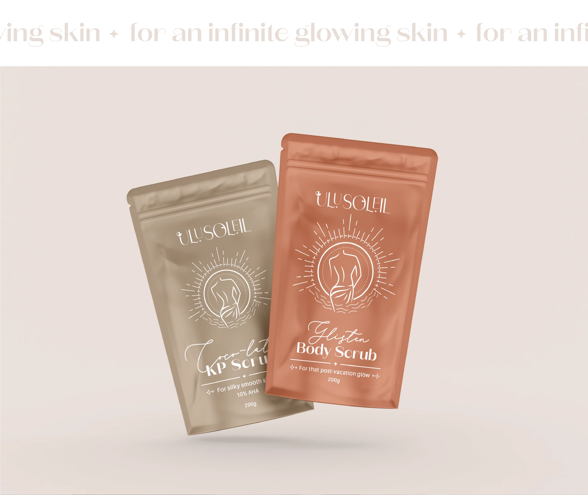
Mocks for body scrubs
Font combination
You can also check the project on Behance and visit UluSoleil's website
Like this project
Posted Apr 16, 2023
A vibrant and inclusive skincare brand inspired by the island lifestyle, celebrates individuality and diverse skin beauty and sustainability.
Likes
0
Views
127