Jennifer Shyu — Holistic Medicine Branding & Website

Alessandro Alpago


Overview
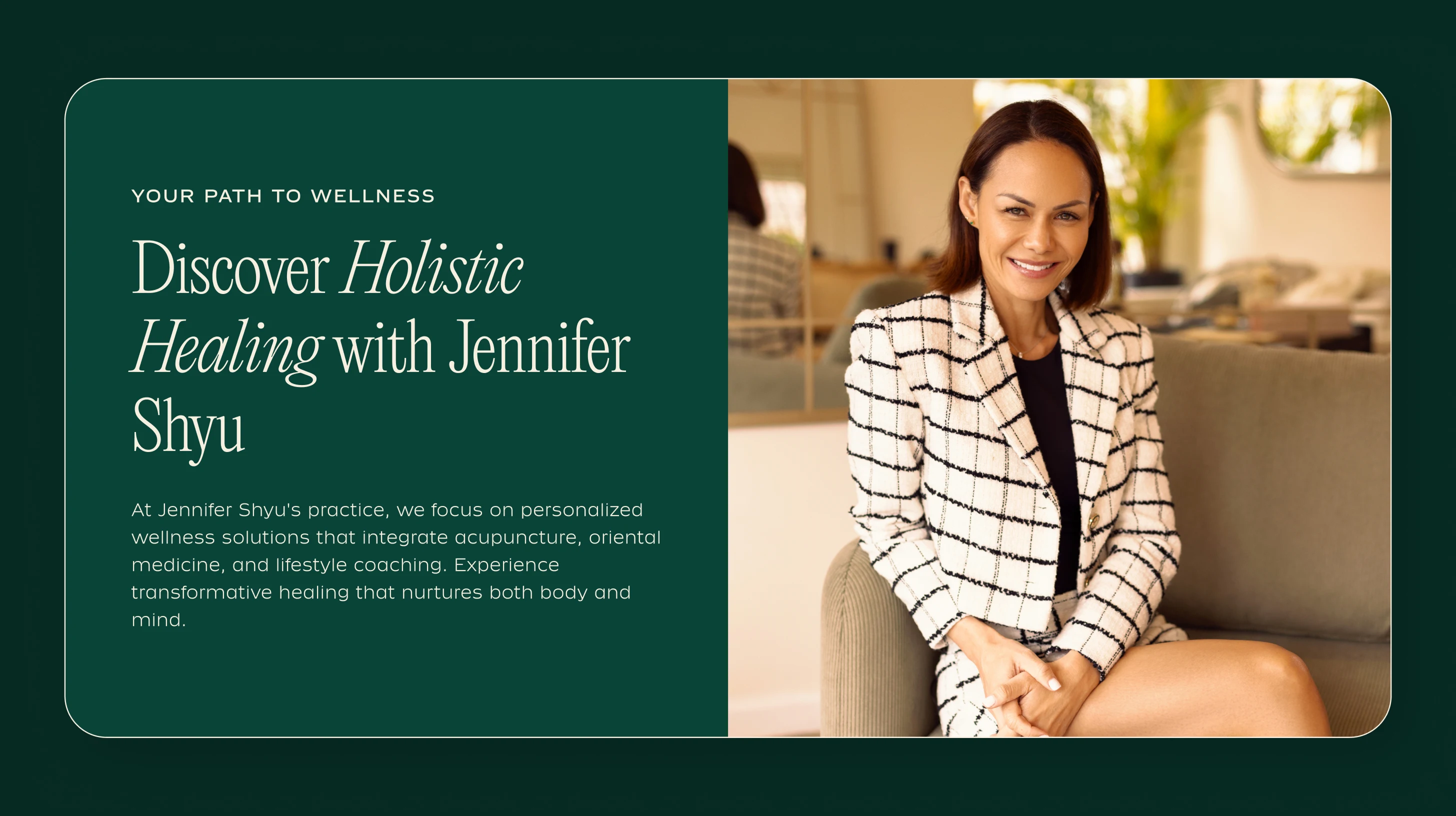
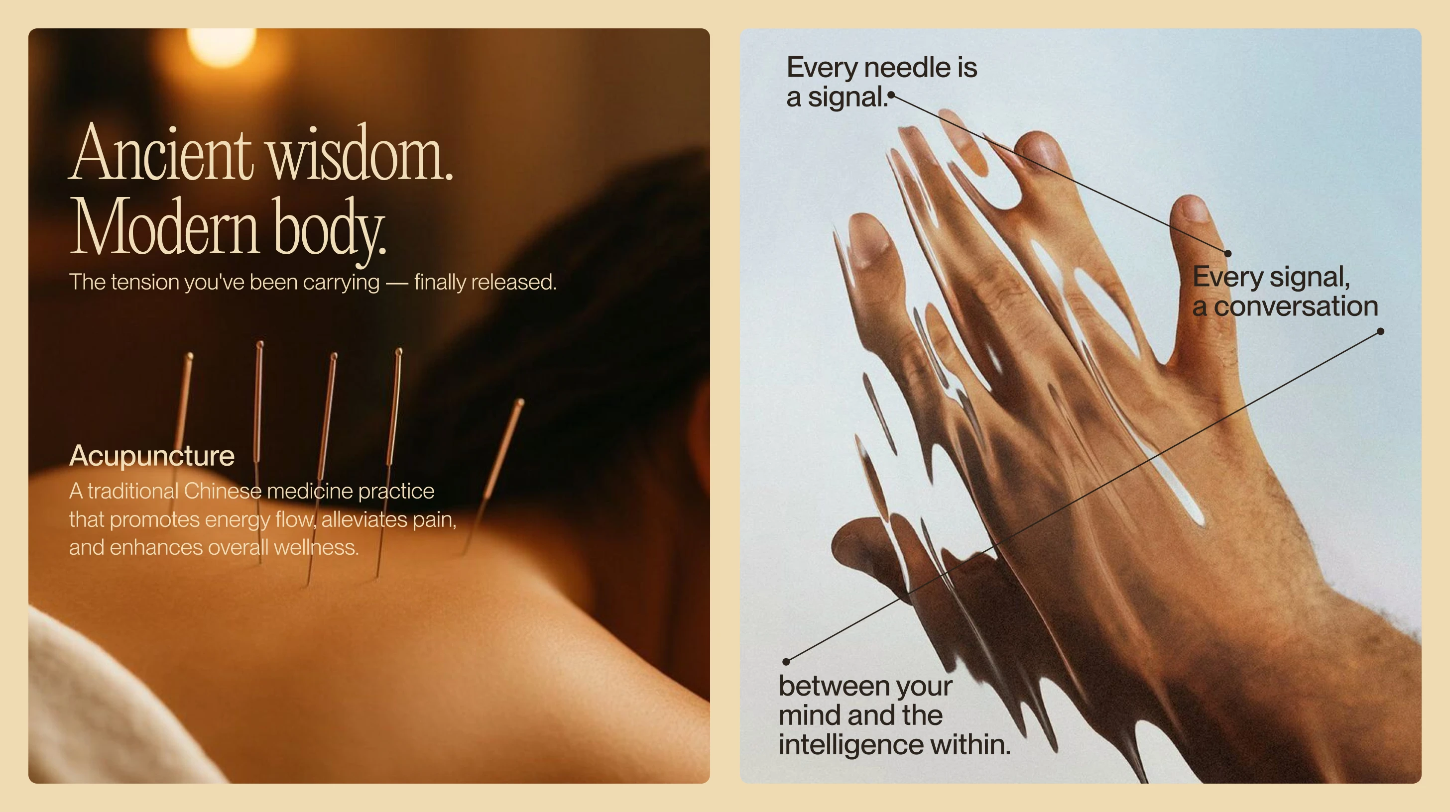
Dr. Jennifer Shyu is a Miami-based integrative medicine practitioner whose work sits at the intersection of Colombian heritage and Eastern healing traditions. Her practice offers acupuncture, auriculotherapy, cupping, homeopathy, epigenetics, and functional medicine, all grounded in a single philosophy: true well-being originates from within. She needed a complete brand identity, printed brochures, and a website that could communicate the depth of her expertise while feeling warm, grounded, and approachable. The goal was to build a digital home that mirrors Jennifer herself: knowledgeable, calm, and deeply rooted in both her cultural background and her dedication to holistic care.

The Challenge
Holistic medicine branding tends to fall into two traps. Either it leans too clinical (sterile whites, stock photos of stethoscopes, generic health iconography) or it goes too far in the other direction (dreamcatcher aesthetics, overused lotus flowers, vague spirituality). Jennifer's practice didn't belong in either camp. She's a licensed doctor with serious credentials, but her approach to healing is personal, cultural, and rooted in traditions that span continents. The brand needed to honor that duality: professional enough to build trust with new patients, expressive enough to reflect the warmth and intentionality behind every treatment. On top of that, her services range from acupuncture and cupping to epigenetics and functional medicine, so the website had to organize a wide scope of offerings without overwhelming visitors.
The Strategy
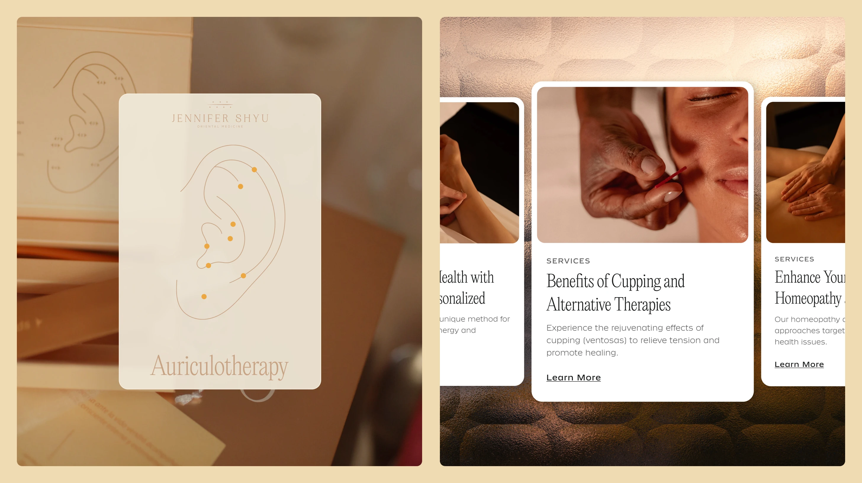
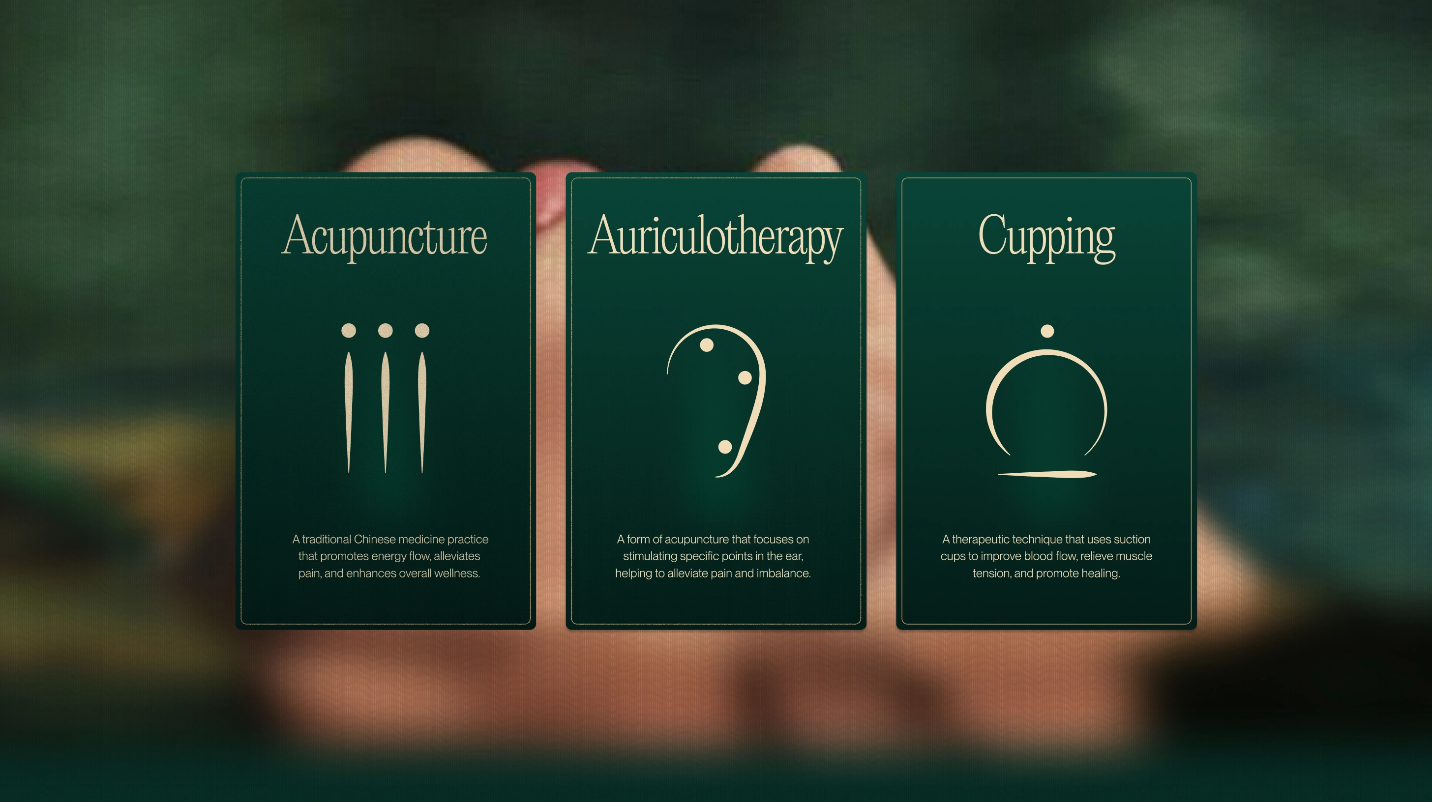
We started by studying Jennifer's story and the cultural threads that run through her practice. Her Colombian upbringing and her training in Eastern medicine aren't separate influences; they're woven together in how she treats patients and how she talks about health. That became the foundation for every visual decision. We built a brand language that feels organic and grounded, using earthy tones, natural textures, and typography that balances editorial refinement with accessibility. The visual system was designed to work across print and digital: from brochures that patients take home after a first visit to a website that converts curious visitors into booked appointments.
The Solution
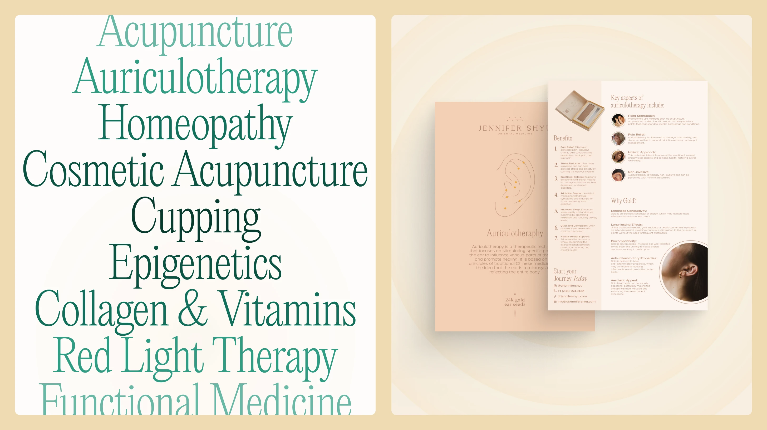
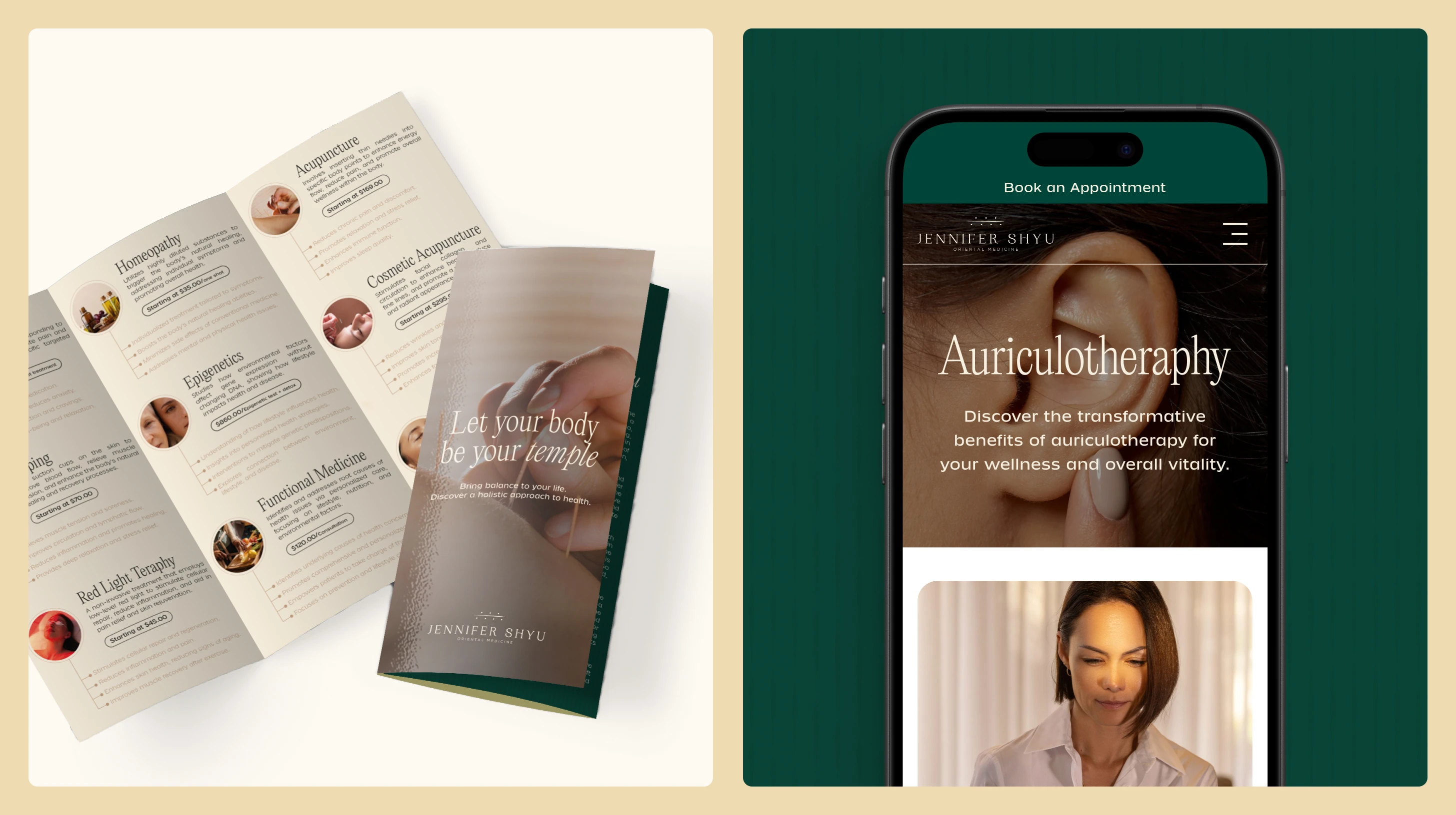
The brand identity centers on a visual language that feels both rooted and refined. We developed a color palette drawn from natural, earthy tones that reflect the organic nature of Jennifer's treatments. Typography was chosen to feel clean and modern while maintaining warmth. The brochure system was designed to give patients a tangible takeaway: clear explanations of each service, the philosophy behind the practice, and practical next steps, all laid out in a format that feels considered rather than clinical.
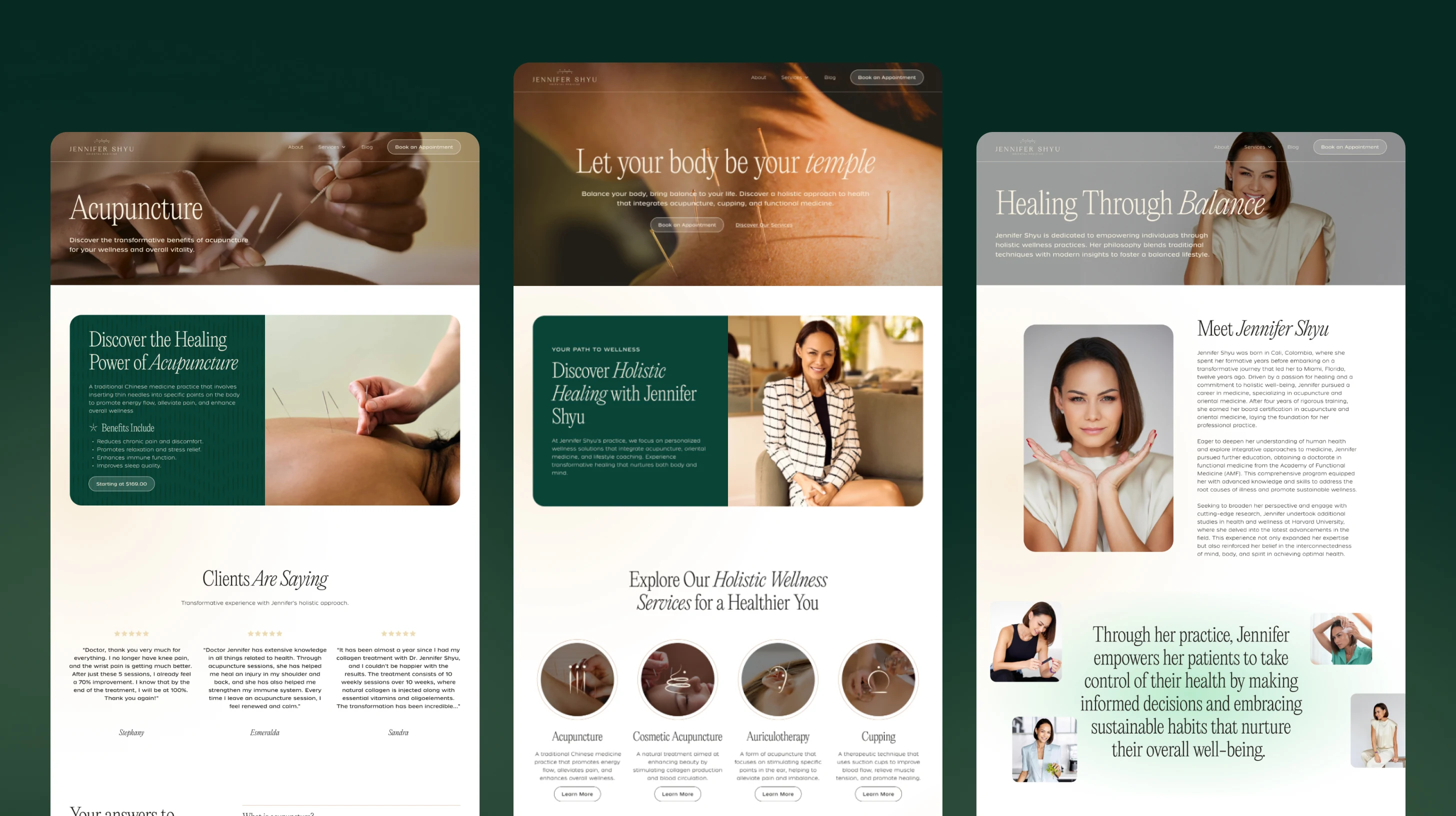
The website was built in WordPress with Elementor, structured around clarity and conversion. Each service gets its own dedicated page with enough detail to educate without overwhelming. The homepage guides visitors from Jennifer's philosophy to her services to patient testimonials to booking, all in a natural flow. The design carries the same visual language across every page: consistent color, consistent typography, consistent feeling. Mobile experience was a priority since most patients find practitioners on their phones first.
The Results
A Cohesive Brand Identity — Jennifer went from having no visual system to owning a complete brand that communicates her expertise and her philosophy in equal measure. Every touchpoint, from the website header to a printed brochure, speaks the same visual language.
A Website That Works as Hard as She Does — The site organizes eight distinct services into a clear, navigable structure. Patients can find what they need, understand what each treatment involves, and book an appointment through WhatsApp without friction.
Print Materials That Extend the Experience — The brochures give Jennifer a professional, tangible asset for her practice. They reinforce the brand in a context where digital can't reach: the waiting room, the consultation, the referral from a friend.
Final Thoughts
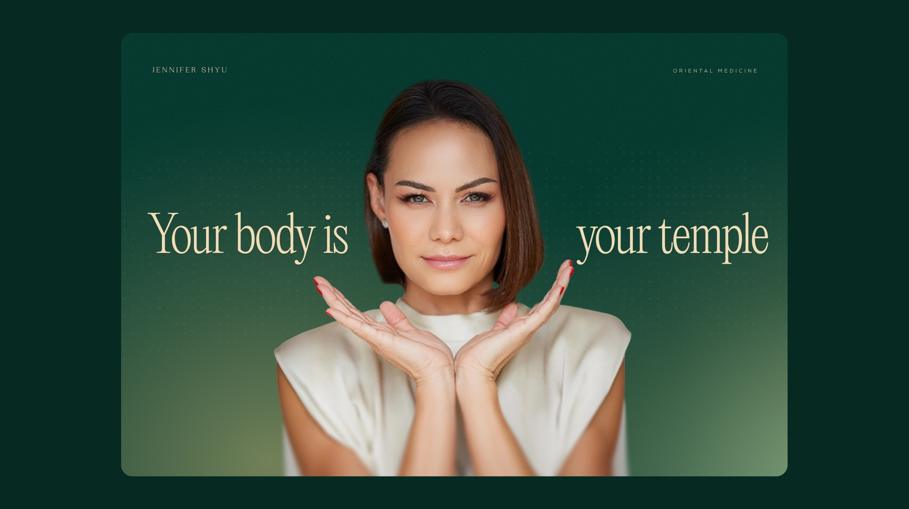
This project was about translating something deeply personal into a visual system that could scale. Jennifer's practice isn't a franchise or a startup; it's an extension of who she is, her heritage, her training, her belief that medicine should bring you back to yourself. The brand needed to carry that same energy without reducing it to a mood board. What we built gives her a foundation that works today and grows with her: a website that books appointments, brochures that educate patients, and a visual identity that feels as intentional as the care she provides.


Like this project
Posted Jul 23, 2026
Branding and website for Dr. Jennifer Shyu, a Miami-based integrative medicine practitioner blending Colombian heritage with Eastern healing traditions.
Likes
0
Views
14
Timeline
Feb 9, 2025 - Ongoing
Clients
Dr. Jennifer Shyu