Tiny Minds — Homeschooling Brand Identity

Alessandro Alpago


Tiny Minds Brand Overview
The Setup
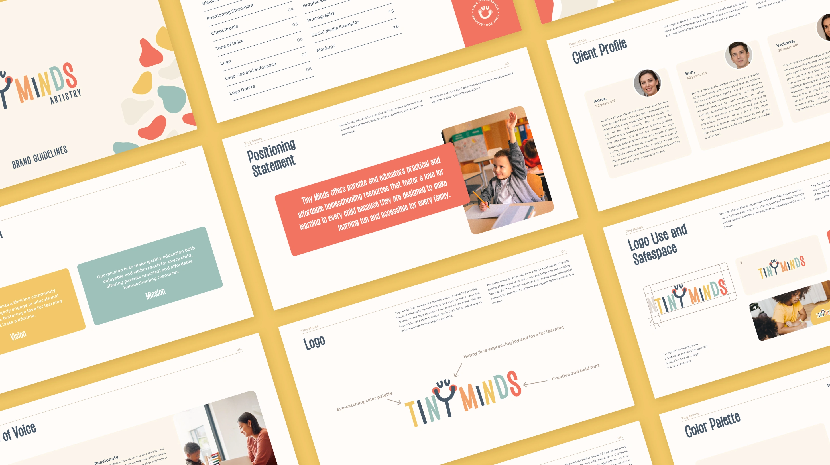
Tiny Minds offers parents and educators practical, affordable homeschooling resources designed to make learning fun and accessible for every family. The vision: a thriving community where children eagerly engage in educational activities at home, fostering a love for learning that lasts a lifetime.
The education resource market skews in two directions. Either it's sterile and institutional (worksheets that look like tax forms) or it's so overstimulating that the design competes with the content. Tiny Minds needed a visual identity that felt warm, inviting, and genuinely playful without sacrificing the credibility parents need when choosing learning materials for their kids.
The Tension
Homeschooling brands face a trust problem. Parents are making a significant choice by taking education into their own hands, and the resources they choose need to feel both joyful and legitimate. Most competitors solve for one or the other: either they look like a classroom supply catalog, or they look like a children's party invitation.
The gap: there was no visual language in the space that said "your kids will love this and they'll actually learn something." Tiny Minds needed to occupy that middle ground, where education feels like play and play feels purposeful.
The Decision
The core strategic choice was to build the entire identity around the idea that learning is inherently joyful, not something you have to trick kids into doing. Every design decision flows from that principle.
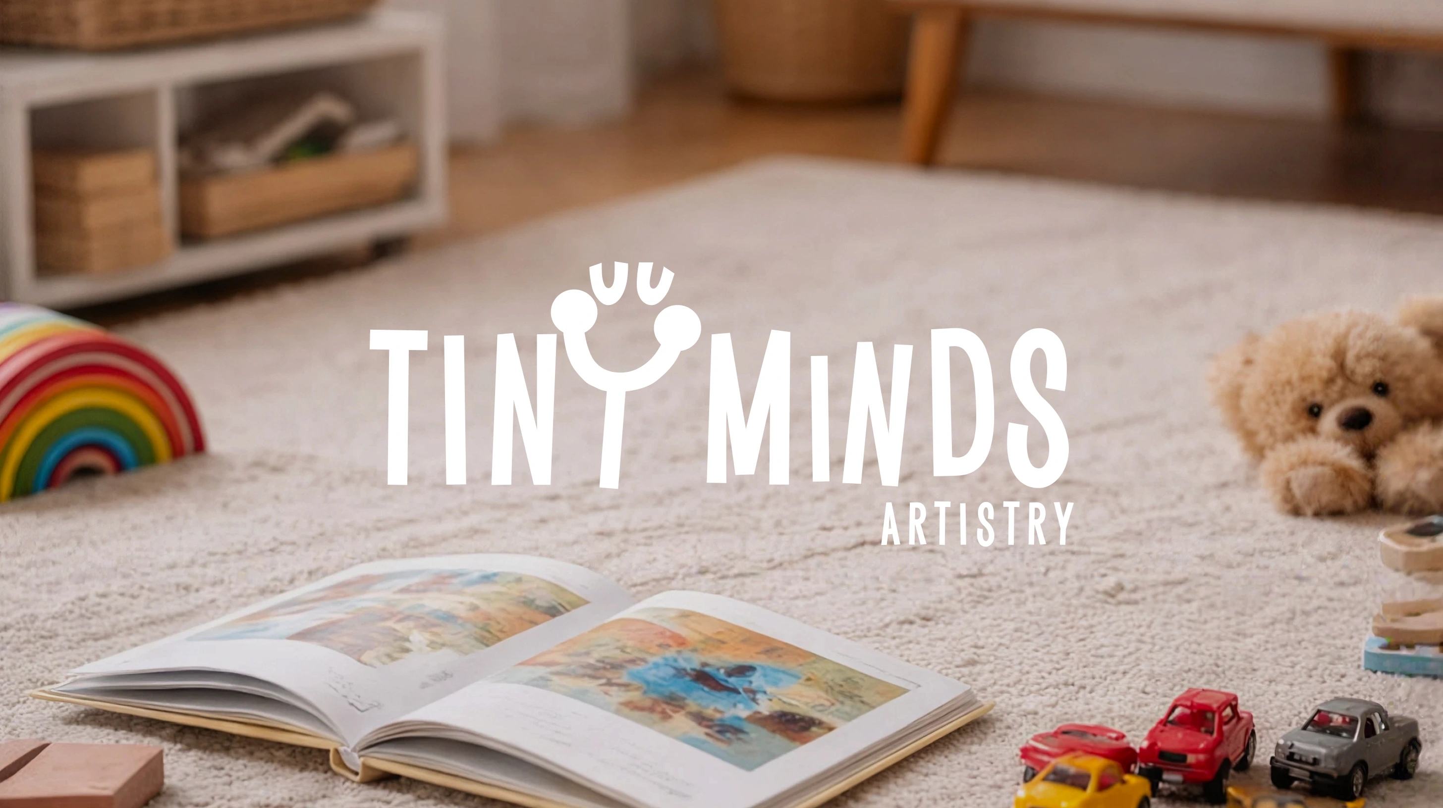
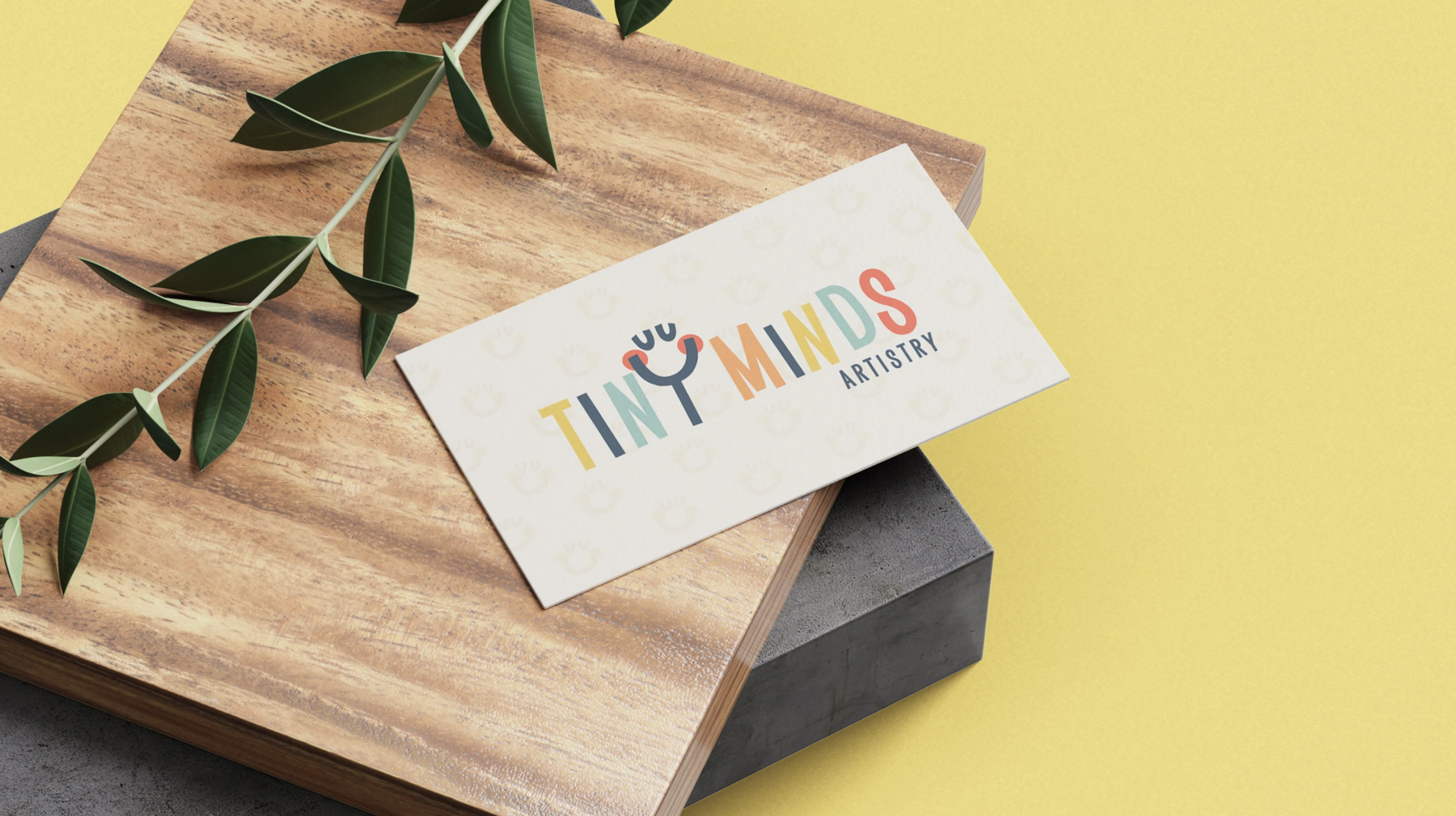
The logo consists of the brand name in colorful, bold letters with a custom happy face integrated into the "Y," expressing the joy and enthusiasm for learning that Tiny Minds wants every child to feel. It's not a mascot. It's a punctuation mark: the exclamation point at the end of every lesson.
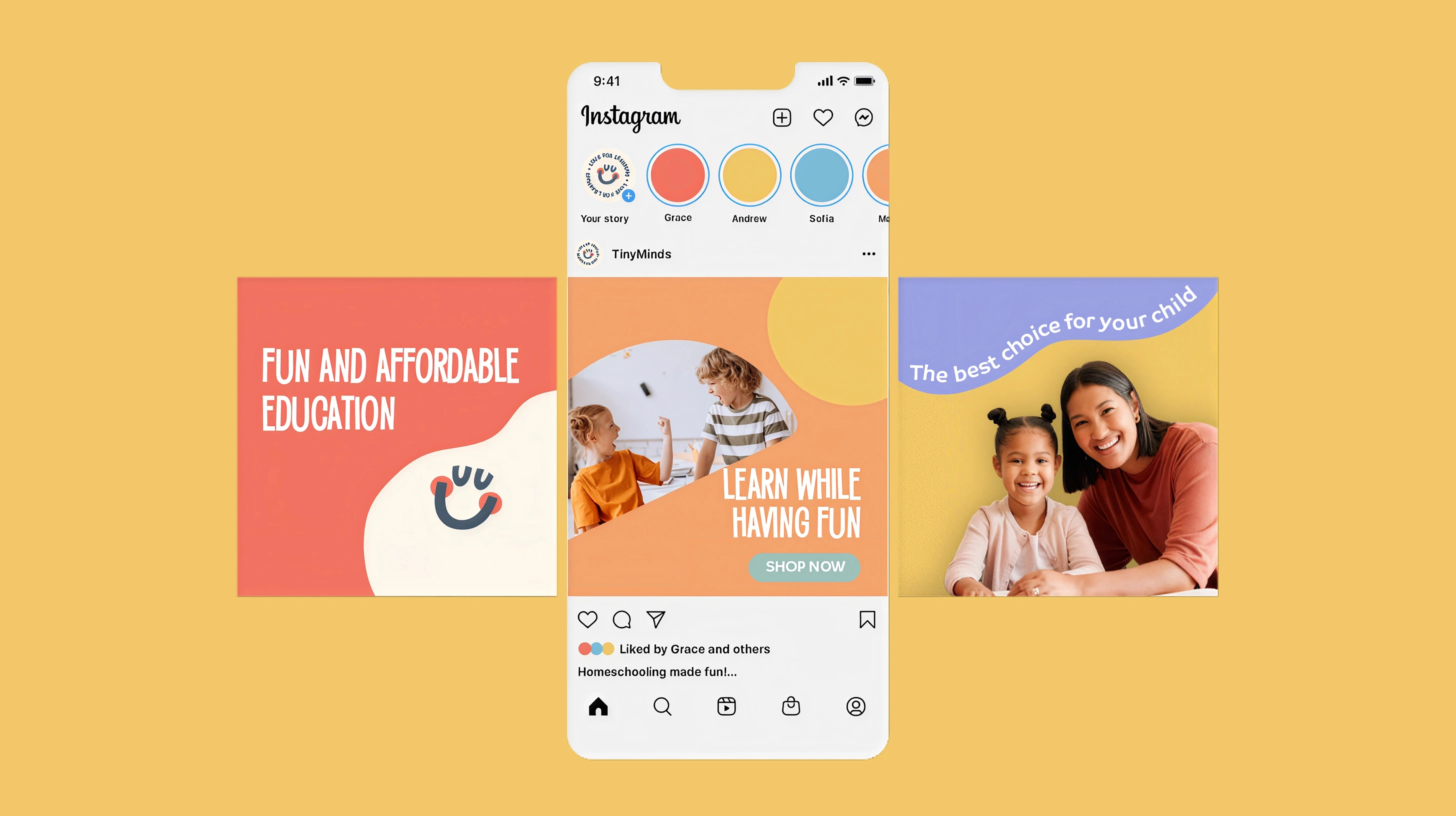
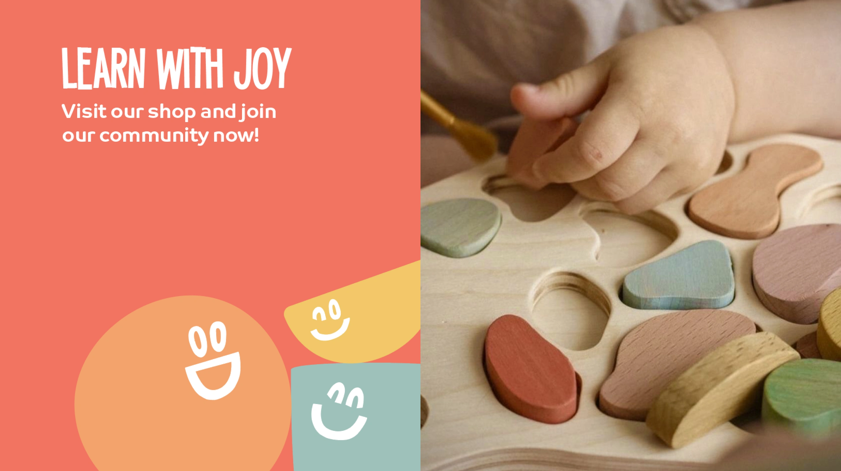
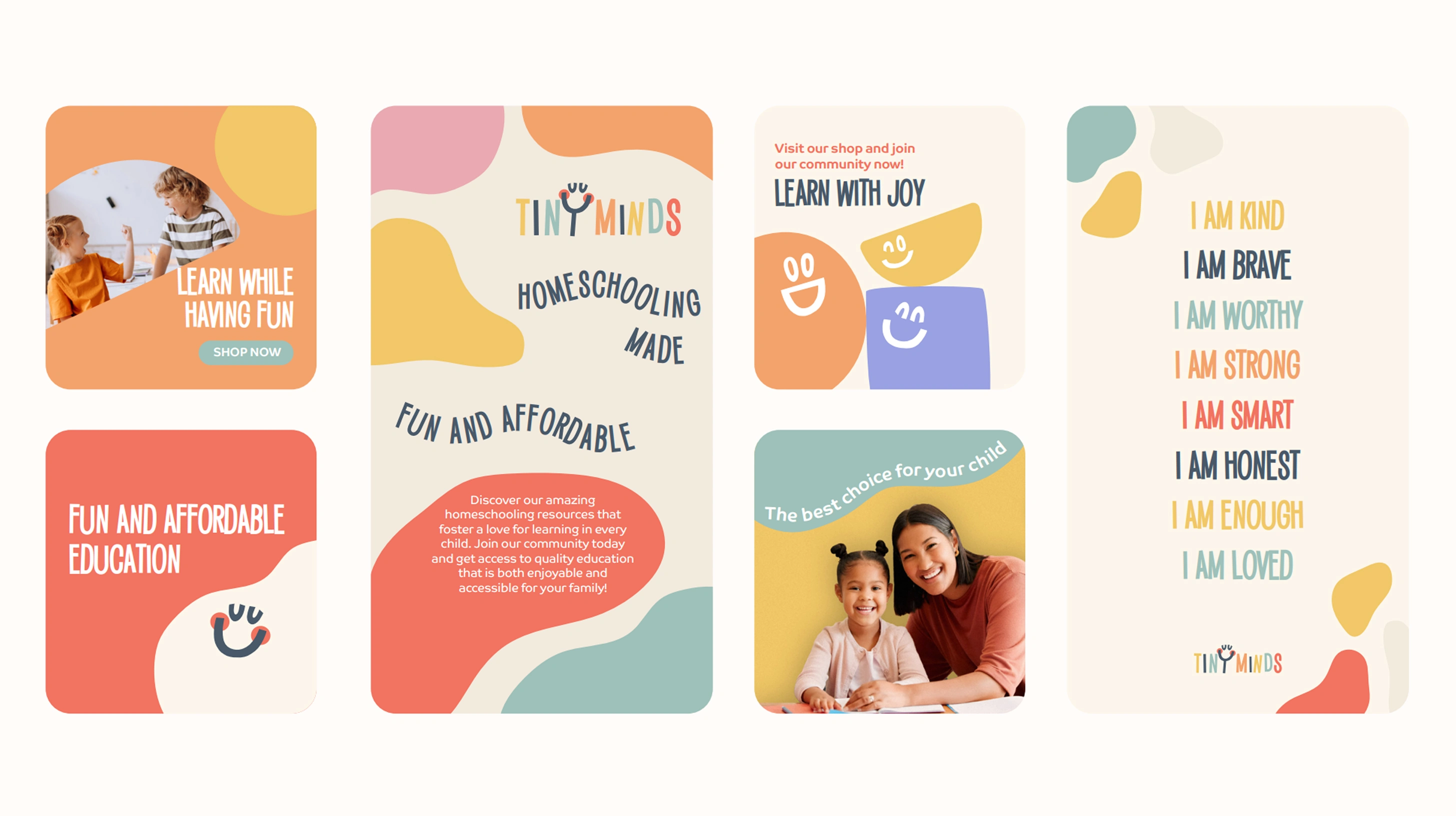
The boho-inspired art direction was a deliberate departure from the primary-color, clip-art aesthetic that dominates the category. Warmth and coziness over clinical brightness. The visual identity feels like a home, not a classroom.
Logo and Typography
The System
The identity system spans:
Logo: Bold, colorful custom type with the signature happy face in the "Y." The full color palette is embedded in the wordmark itself, making the logo a miniature expression of the brand's personality: diverse, creative, and unapologetically fun.
Primary color palette: A light background shade creates a clean, spacious canvas. Red serves as the main accent, complemented by yellow and neutral tones for backgrounds and text. The restraint here is intentional: it keeps the brand feeling organized and trustworthy while the secondary palette handles the energy.
Secondary color palette: The full rainbow plus neutral shades, used for illustrations, icons, and supporting graphics. It reflects the brand's core values of diversity and creativity, and gives the system flexibility across different subjects and age groups.
Typography: Two fonts working in tandem. Saker Sans is bold, extroverted, and fun, used for headings and titles. Co Text is a rounded sans-serif with soft edges and smooth shapes, used for body copy and captions. Together they strike the balance between playful and readable.
Art direction: Boho-inspired warmth and coziness that complements the color palette and graphic elements. The photography and illustration style creates a visual world that feels like home, not a sterile learning environment.
Color Palette and Elements
Art Direction and Photography
The Takeaway
Tiny Minds works because the identity doesn't separate "educational" from "enjoyable." The happy face in the logo, the boho art direction, the rainbow secondary palette, the rounded typography: every element reinforces the same message. Learning isn't medicine you have to sweeten. It's already sweet.
For parents scrolling through homeschooling options, that coherence matters. The brand feels like it was made by people who actually enjoy teaching kids, not by people who think education needs to be disguised as entertainment.
Like this project
Posted Jul 15, 2026
Brand identity for a homeschooling resource company. Logo, color system, typography, and art direction built around one idea: learning is inherently joyful.
Likes
0
Views
8
Timeline
Feb 1, 2024 - Ongoing