Luma — Branding for Adaptogen Wellness

Alessandro Alpago


The Setup
Luma is a company specializing in adaptogen blend products: matcha powder, mushroom coffee, maca, ashwagandha, and magnesium. The wellness supplement market is crowded with brands that either lean too clinical or too crunchy, leaving a gap for something that feels both intentional and inviting. Luma was built to fill that gap: purposeful blends that combine real nutritional benefits with something you actually want to drink.
The company is early-stage, which meant the brand needed to do heavy lifting from day one. No legacy equity to lean on, no established shelf presence. Every surface had to communicate the same thing: this is a brand that takes wellness seriously without taking itself too seriously.
Brand Identity Overview
Product Lineup
The Mark
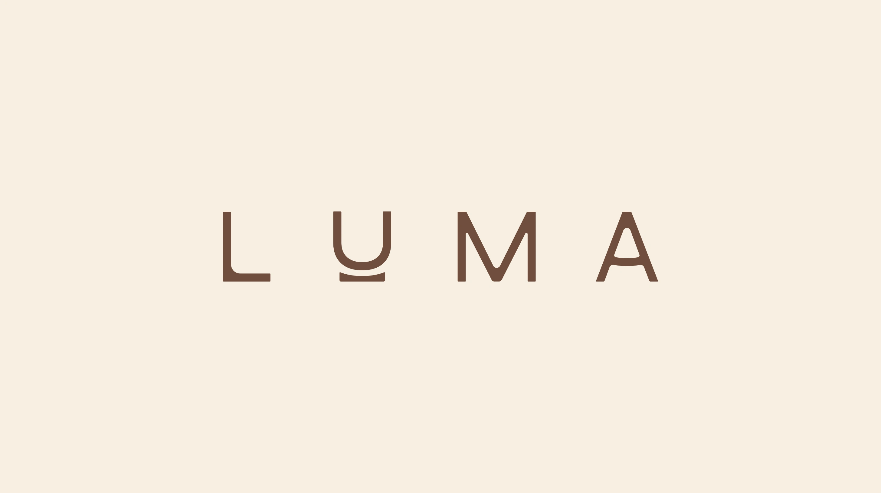
Luma's logo is built from geometric forms with thoughtfully curved vertices, a minimalist custom typeface that evokes serenity and wellness without defaulting to the soft, rounded letterforms the category overuses.
The distinctive shape supporting the "U" subtly references the base of a glass brimming with potential, a metaphor for the balance and stability Luma brings to your daily ritual. The letter's upward curve hints at the positive outlook you cultivate with Luma by your side. It's a small detail that carries the entire brand philosophy: grounded optimism.
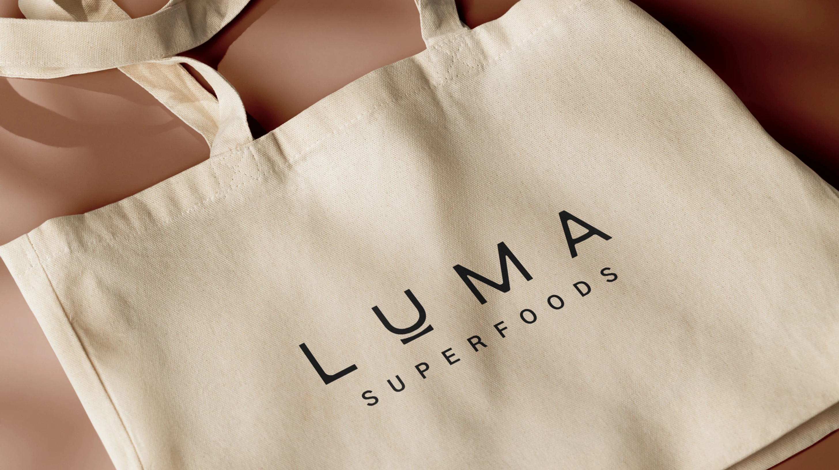
Logo Construction
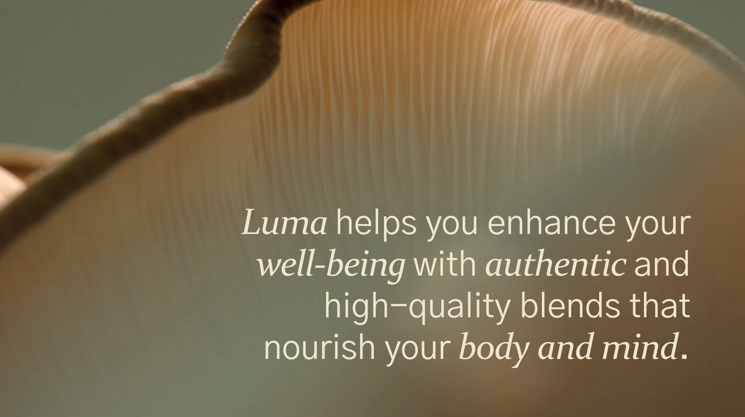
Logo Applications
The Palette
Luma's color palette is drawn directly from the natural ingredients inside the blends. Earthy greens, warm ochres, deep mushroom browns, and soft neutrals. Each shade maps back to a specific product in the range, creating an intuitive visual system where color tells you what you're reaching for before you read the label.
The palette conveys serenity and sustainability. It feels organic without feeling unrefined. The neutral foundation keeps the brand flexible across packaging, digital, and environmental applications, while the ingredient-driven accents give each product its own identity within the system.
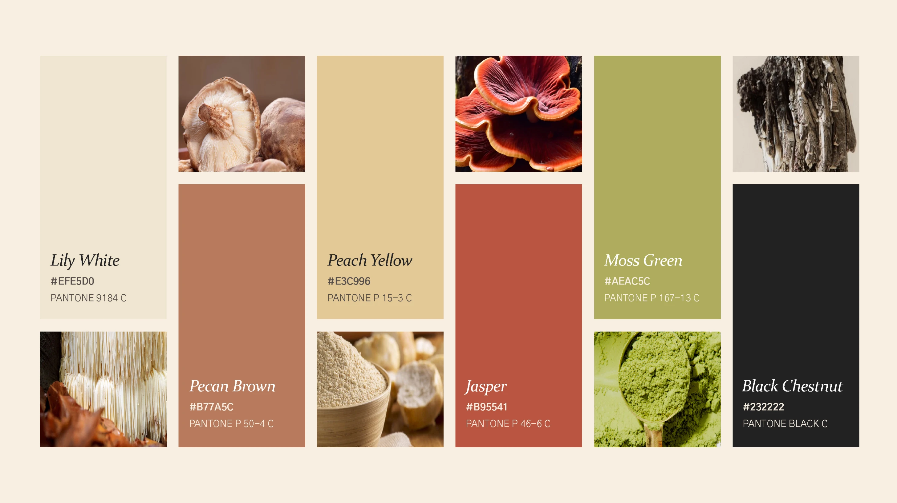
Color Palette System
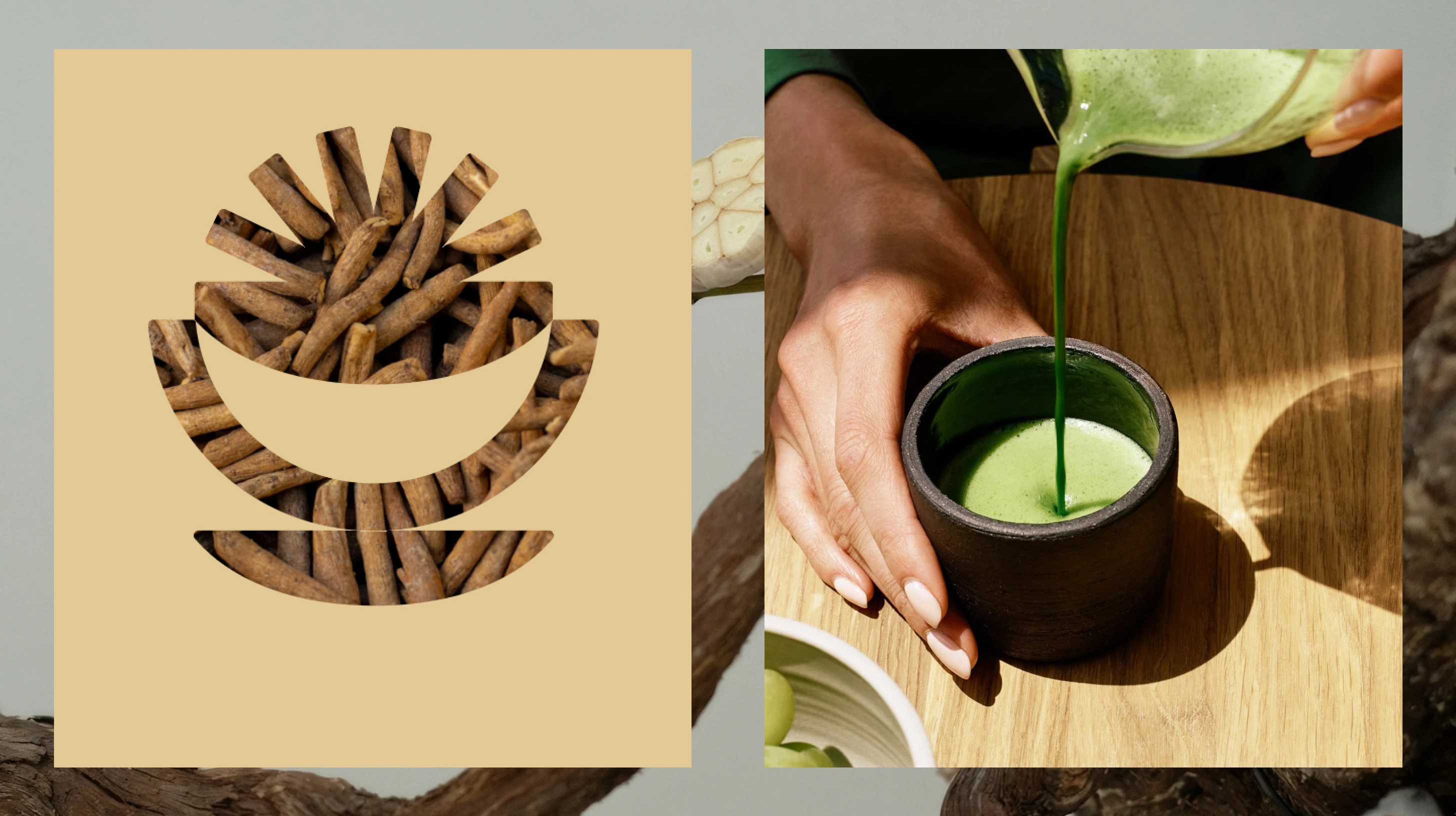
Packaging and Color Mapping
The Mood
The photography direction leans into simplicity and natural beauty. Soft lighting prevails throughout, casting gentle shadows that create a sense of tranquility rather than drama. Neutral tones dominate the compositions, reinforcing the minimalist aesthetic across every touchpoint.
Subjects are captured with precision, emphasizing details and textures: the grain of a powder, the surface of a ceramic cup, the way light catches an ingredient. The images set a mood of mindfulness. They don't shout wellness at you. They let you feel it.
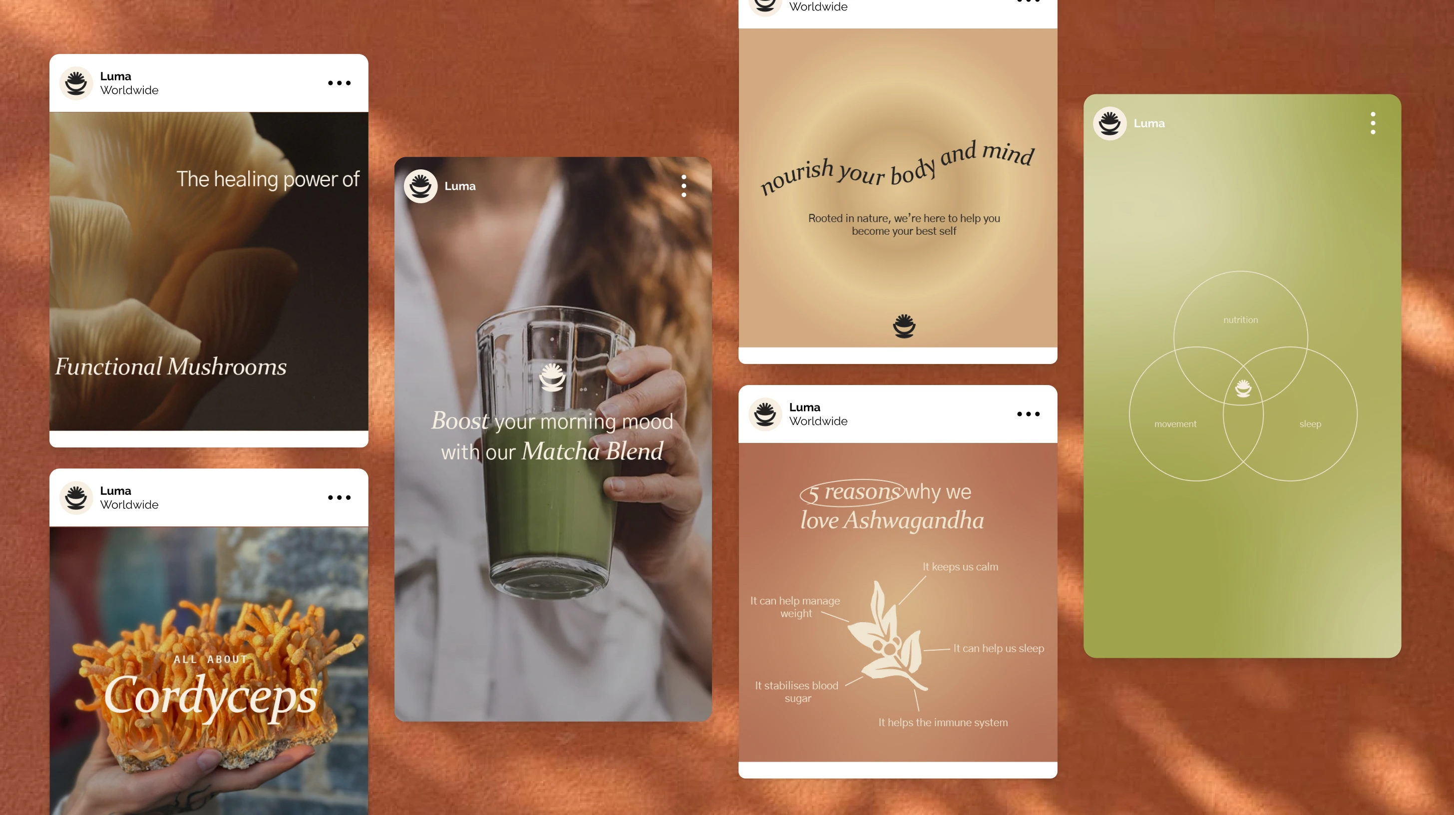
Photography Direction
The Takeaway
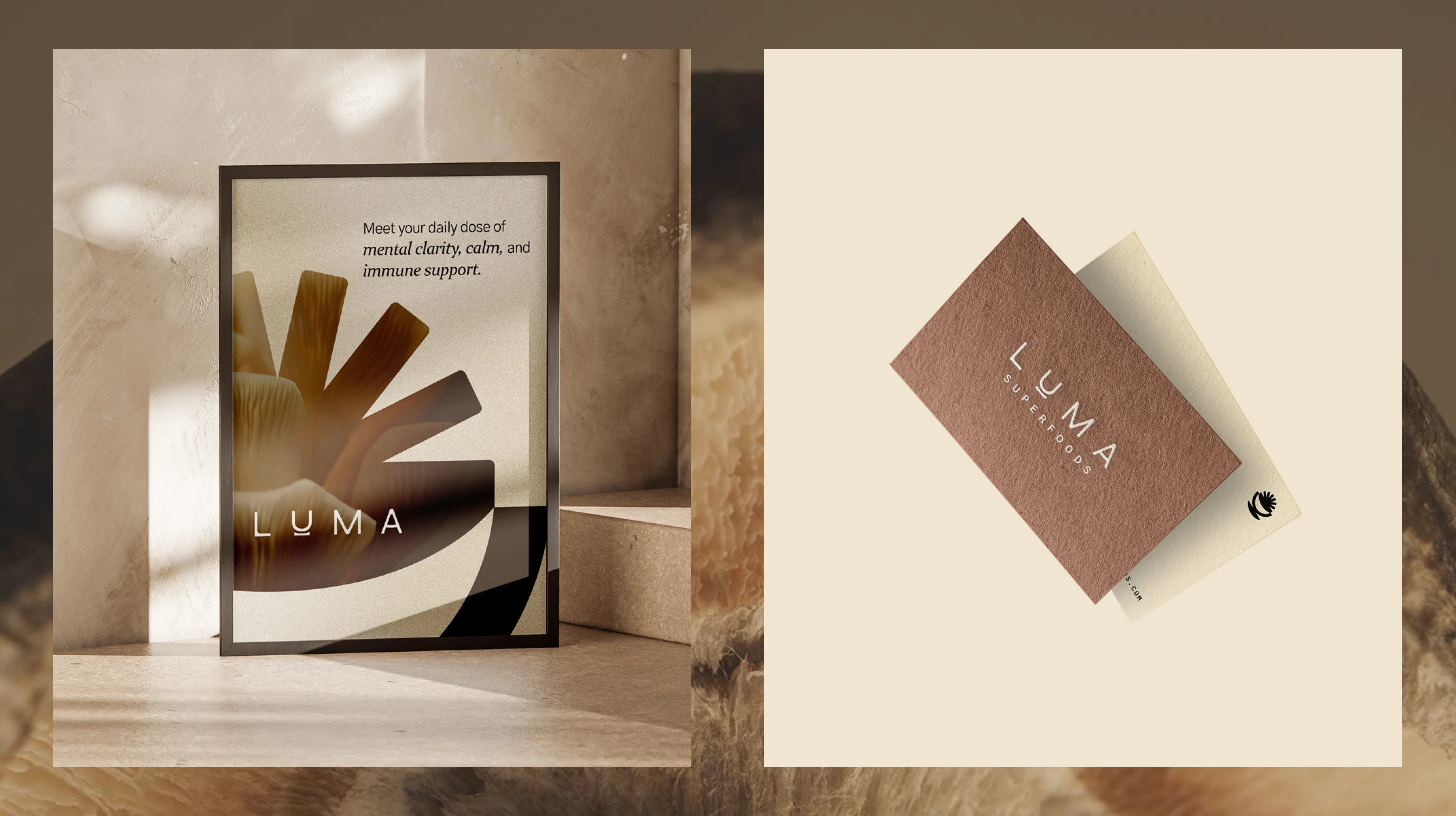
Luma's identity system works because every decision traces back to the same principle: let the ingredients lead. The logo references the ritual of drinking. The colors come from the blends themselves. The photography captures the textures and tones of real ingredients. Nothing is decorative for its own sake.
For an early-stage brand in a saturated market, that coherence is the competitive advantage. When every surface tells the same story, you don't need shelf space or ad spend to build recognition. The brand does the work.
Like this project
Posted Jul 15, 2026
Brand identity for an adaptogen wellness company specializing in purposeful blends. Logo, color system, photography direction, and packaging built.
Likes
0
Views
13
Timeline
Feb 1, 2024 - Ongoing