High-Converting Beauty Email Design for E-commerce Brand
Ajayi Racheal Oluwakemisola
CASE STUDY
Title
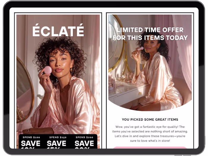
High-Converting Beauty Email Design for E-commerce Brand (Éclaté)
Short Description
Designed a modern, conversion-focused email layout for a beauty brand to improve engagement, increase click-through rates, and drive more product purchases through clean visual hierarchy and strategic UX design.
Full Case Study
The Challenge
The client needed an email design that looked premium and trustworthy while clearly communicating multiple offers without overwhelming users. The design also had to perform seamlessly on mobile devices, where most users interact with email campaigns.
The existing design lacked structure, had weak call-to-action visibility, and did not effectively guide users toward making a purchase.
The Strategy
Rather than focusing only on aesthetics, the approach was centered on performance and usability:
Establish a strong visual hierarchy to guide users from headline to offer to call-to-action
Design for conversion by placing buttons where users naturally engage
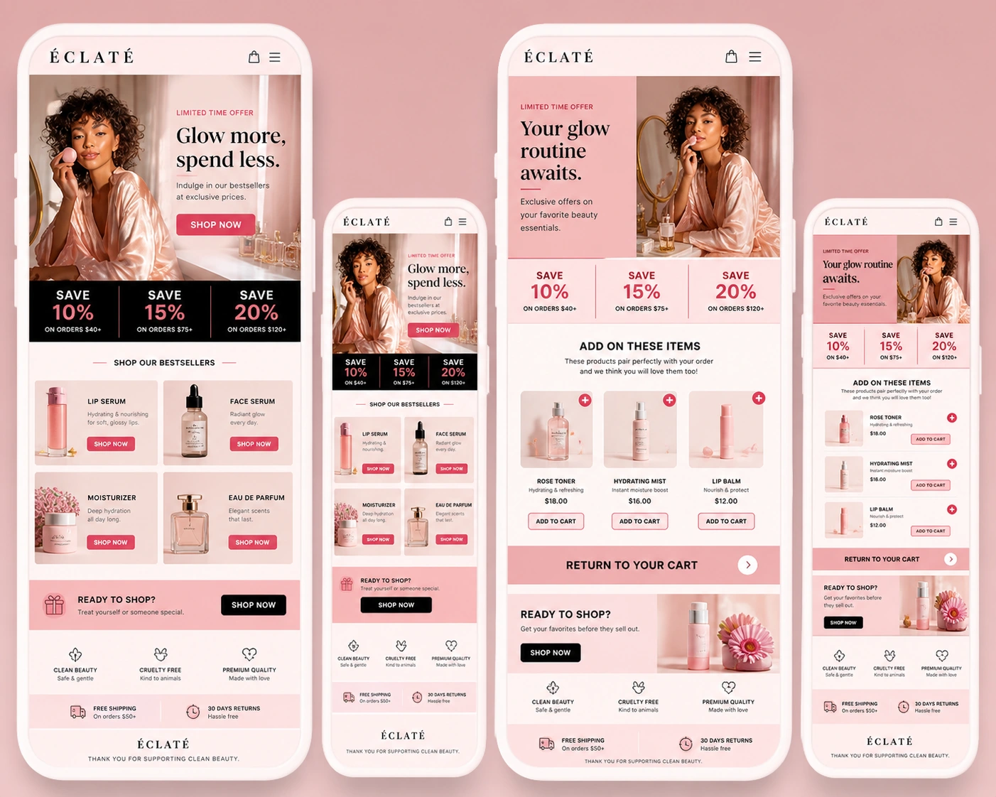
Use a mobile-first layout to ensure optimal experience across devices
Present products in a clean and organized way to reduce clutter and increase appeal
The Design Approach
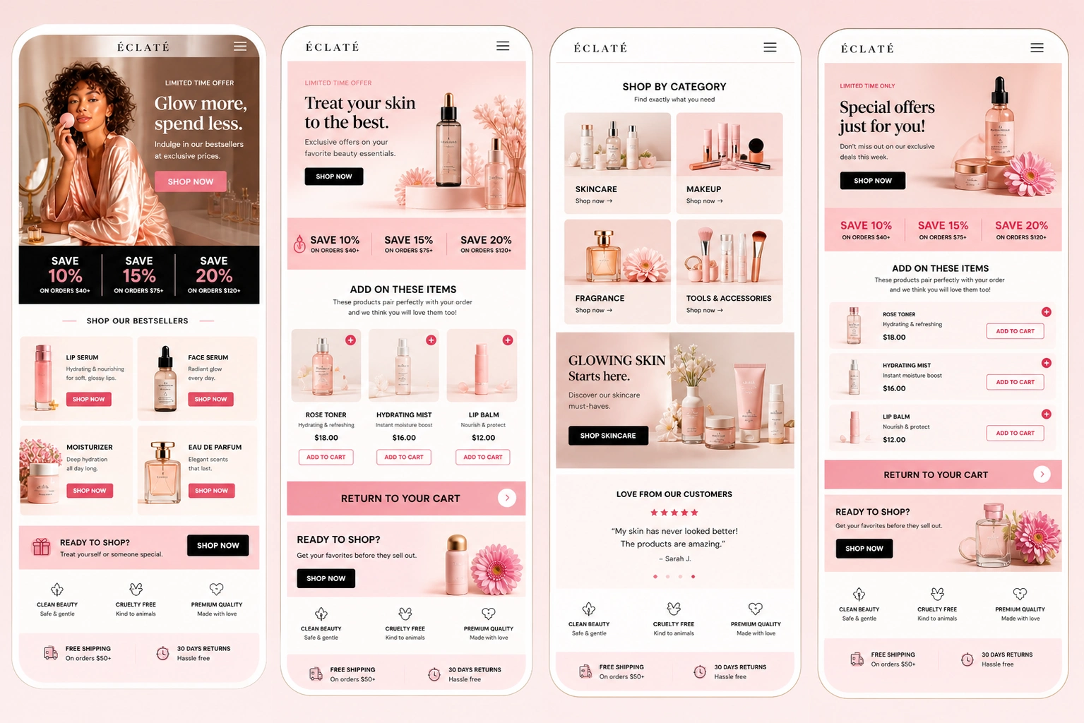
Hero Section
A lifestyle image was used to create an emotional connection with users. A bold headline, “Glow more, spend less,” communicates value instantly, supported by a clear and visible call-to-action button.
Offer Section
Discounts were structured into clear, easy-to-scan blocks:
Save 10%
Save 15%
Save 20%
This allows users to quickly understand the available offers without confusion.
Product Showcase
Products were displayed in a clean grid layout with minimal text and strong visuals. Each product includes a clear “Shop Now” button to encourage immediate action.
Add-to-Cart Section
A strategic upsell section was included to increase average order value. Suggested products are paired with pricing and clear call-to-action buttons.
Trust Elements
Trust-building components such as clean beauty icons, free shipping, and return guarantees were included to reinforce credibility and reduce purchase hesitation.
Why This Works
This design is built for performance, not just appearance. It aligns with user behavior by supporting fast scanning and decision-making. Call-to-action buttons are highly visible and strategically placed throughout the layout.
The modular structure allows the design to be reused and adapted for different campaigns, while the overall layout reflects real buyer psychology.
Expected Results
Improved click-through rate (CTR)
Increased product engagement
Better mobile user experience
Higher conversion rates from email traffic
Tools Used
Figma (UI/UX Design)
Photoshop (Mockups and final presentation)
Like this project
Posted May 4, 2026
Redesigned Éclaté's full email template system in Klaviyo, improving mobile experience and driving a 37% increase in email-attributed revenue over 4 months.
Likes
1
Views
2
Clients
Éclaté