Interactive Social Media Impact & Student Wellness Dashboard
Dikshant Choudhary
Interactive Social Media Impact & Student Wellness Dashboard
Project Overview
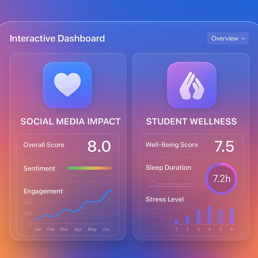
In an age dominated by social media, understanding its real-world impact is crucial for individuals and institutions alike. To explore this, I designed and developed a comprehensive, fully interactive dashboard in Microsoft Excel that analyzes the complex relationship between social media usage, student wellness, and academic performance.
This project transforms raw data into a powerful, easy-to-navigate visual story, providing nuanced insights at a glance. The dashboard is built to empower users to explore trends, identify correlations, and understand user behavior patterns effectively.
Key Features & Insights
Dynamic & Interactive Interface: The dashboard is equipped with slicers and a navigation panel, allowing users to seamlessly filter data and switch between different report views such as 'Overview', 'Student Social-Media Addiction', and 'Previous Year Data'.
Holistic Wellness Metrics: Goes beyond simple usage statistics by tracking custom-developed KPIs like an 'Addicted Score', 'Mental Health (Avg) Score', and 'Academic Score' to provide a 360-degree view of student well-being.
Multi-Dimensional Analysis: Provides a deep dive into various facets of social media impact, including:
Platform popularity and average daily usage (e.g., YouTube, Instagram, WhatsApp).
The perceived effect of social media on personal relationships.
Demographic breakdowns, such as addiction scores by age group.
Geospatial analysis of academic performance across different countries.
Advanced Data Visualization: Utilizes a diverse range of charts—including bar charts, pie charts, donut charts, and a choropleth map—to represent complex data in an intuitive and visually compelling manner.
Skills & Tools Demonstrated
This project highlights my expertise in the following areas:
Data Analysis & Interpretation: Sifting through data to identify key trends and generate actionable insights.
Advanced Excel: Proficient in leveraging Pivot Tables, Pivot Charts, Slicers, and advanced formulas to build sophisticated dashboards.
Data Visualization & Storytelling: Creating clear, concise, and aesthetically pleasing visuals that communicate a compelling narrative.
Dashboard Design (UI/UX): Structuring information logically and creating a user-friendly interface for an optimal user experience.
KPI Development: Designing and implementing custom metrics to track performance against specific goals.
Tool Used: Microsoft Excel
Check out the dashboard here: https://github.com/dikshant1602/Data-Analytics-Internship/blob/main/Excel/Dashboards/Social_media_dashboard.xlsx
Like this project
Posted Jul 24, 2025
Developed an intuitive social media dashboard that centralizes analytics, engagement metrics, enabling faster decision-making and improved campaign performance.
Likes
0
Views
3
Timeline
Jul 18, 2025 - Jul 20, 2025