📚 ReadIt App (UX/UI): Redesign Case Study
📝 Introduction:
ReadIt App is an innovative digital platform that will transport you to the realm of reading, accessible through digital media - anytime, anywhere around the globe. The core objective of ReadIt app is to encourage users to develop a reading habit.
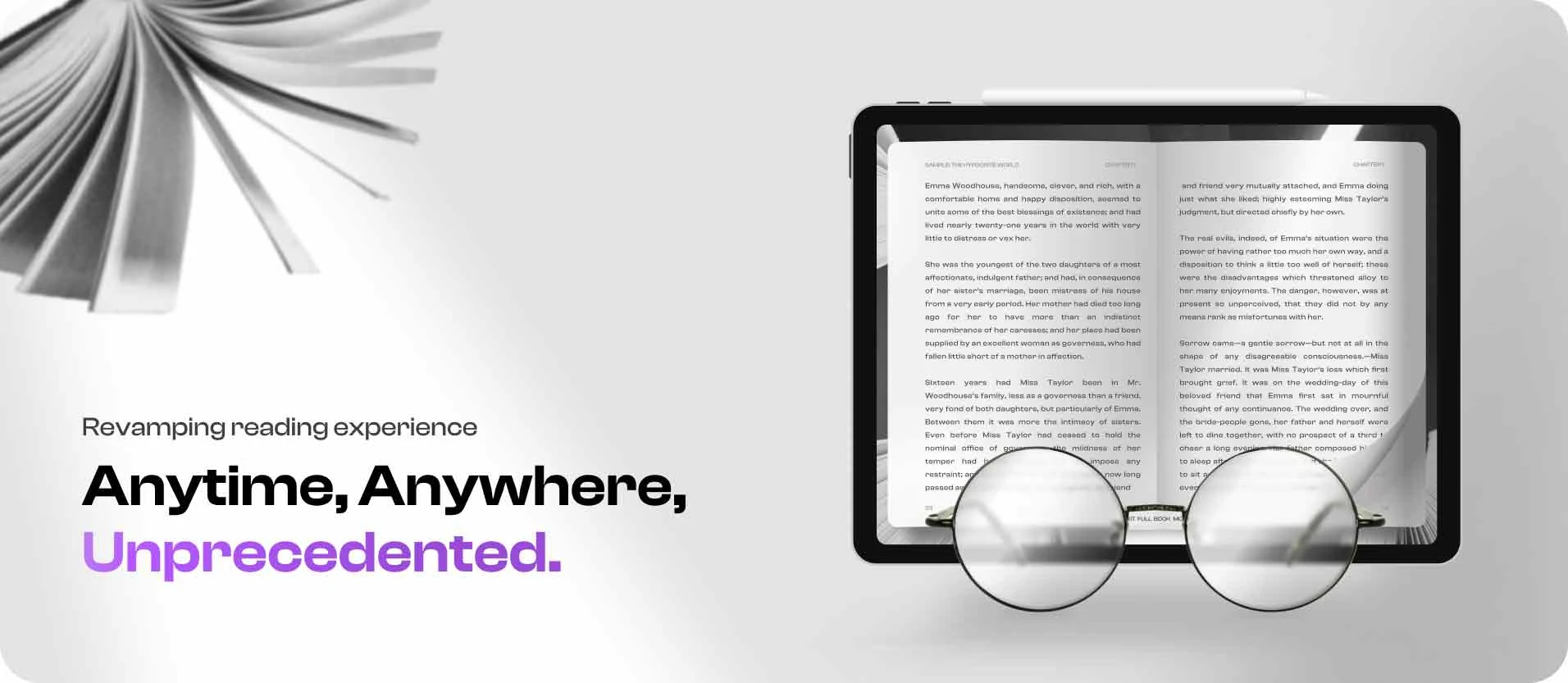
ReadIt: Digital app for immersive online book reading experience
📢 About Project:
Redesigning the app to cater the audience with immersive reading experience anytime and anywhere on the iPad or mobile app.
1: Project Specifications
Duration: March - June, 2023
Tools:
Figma
Miro
Adobe: Photoshop & After effects
2: My Role
User Experience (UX) Designer
Interaction (IxD) Designer
User Interface (UI) Designer
Visual Designer
3: Deliverables: (Web & Mobile)
User journeys & task flows
Site map
Low-fidelity wireframes
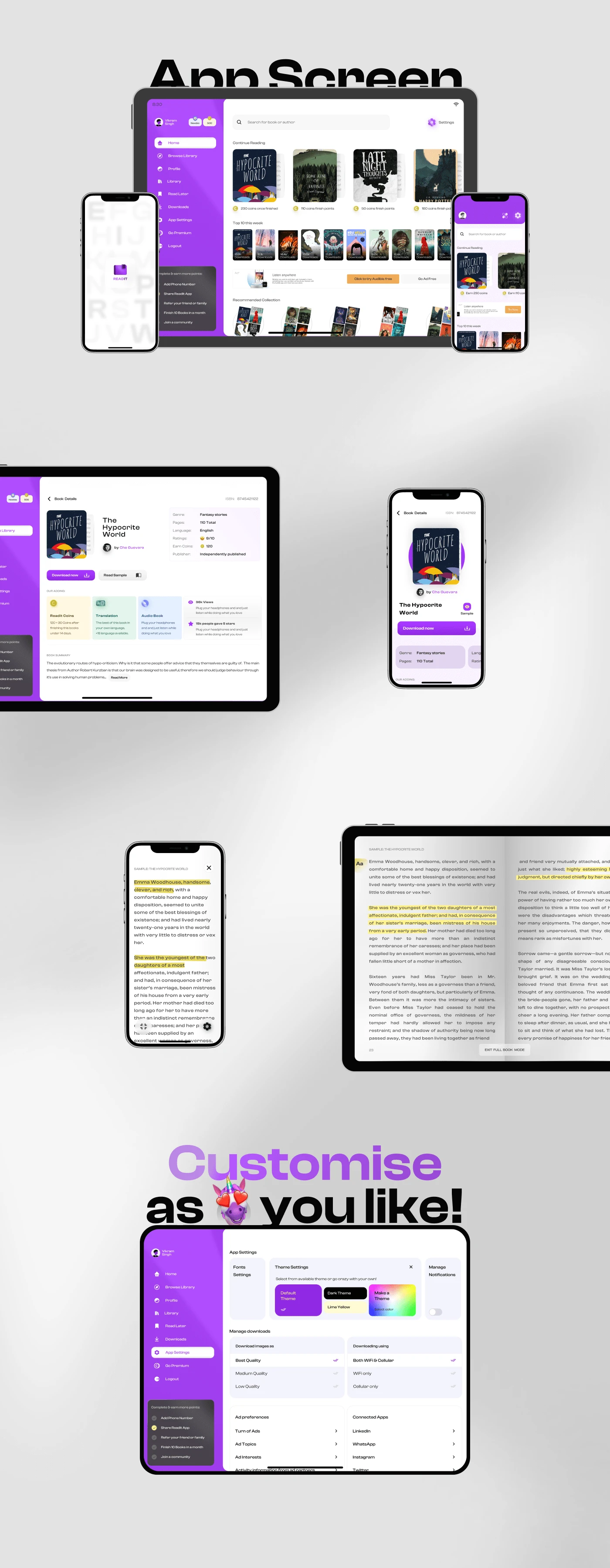
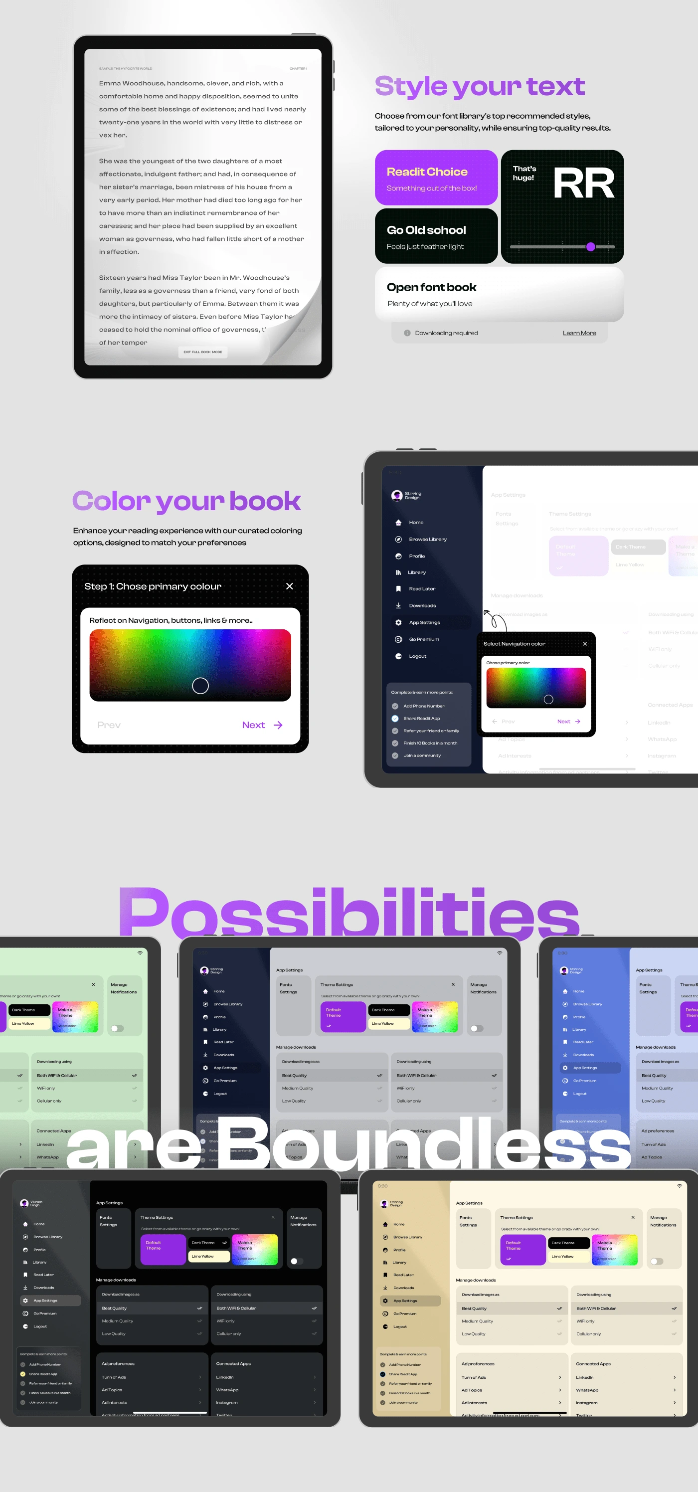
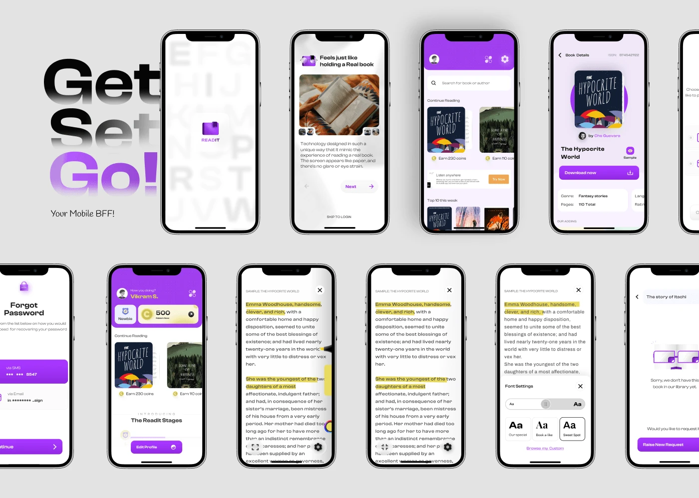
High-fidelity mockups and prototypes
Design system
😵 Problem statement:
Transform ReadIt app into a user-friendly, visually appealing, and engaging platform by revamping the overall experience and reimagining the app's aesthetics and highlighting the app features, functionality and benefits to the users
🎯 Project Goals:
The client had 4 parameters for enhancing the ReadIt App's overall UX and UI. These parameters included:

4 key parameter set by the Client to improve the ReadIt app design
👌 Engaging Interface: Visually appealing & user-friendly interface to captivate users and keep them engaged.
📊 Optimize for Conversions: Optimize the app for higher conversions, ensuring that users take desired actions and achieve their goals.
🚀Stand Out: The app should stand out from competitors by incorporating unique and innovative elements that set it apart.
🤩 Reward Full UI: a A comprehensive user interface that provides a rewarding and seamless experience, enhancing user satisfaction.
"With a clear understanding of the project's goals and the need for a redesign, it's time to dive into the specific details of what needs to be improved and how to address these issues. This will involve analyzing the current app, identifying areas for improvement, and developing a plan for implementing the necessary changes."
💣 Final Design glimpse:
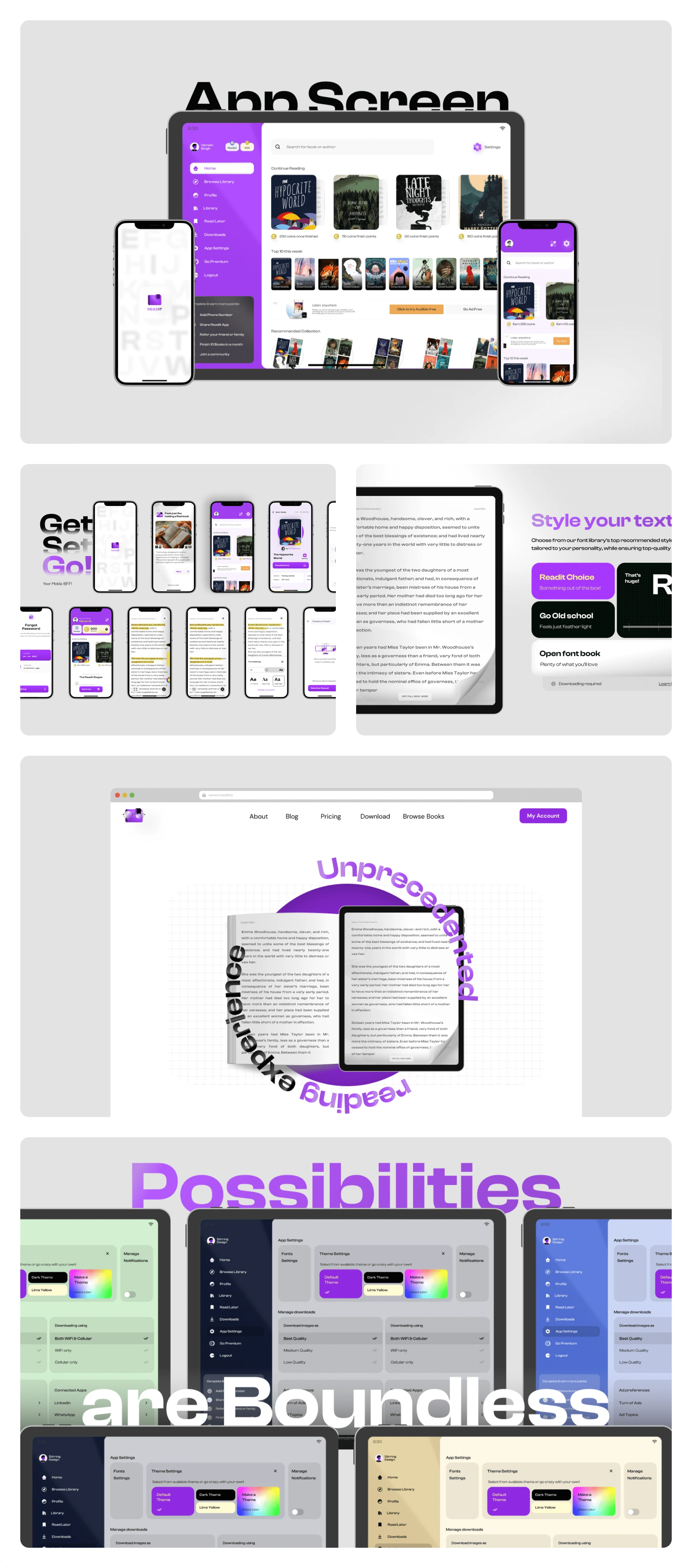
Some pictures from the ReadIt app revamped UI
✌ Design Process
1️⃣ Understanding the Product
I started by conducting a thorough analysis, including heuristic evaluations, UI design principles, and competitor analysis. This provided valuable insights for refining the current user experience and clubbing more info on what is lacking in the app currently.
Heuristics analysis:
To improve an app or website, it is important to identify its flaws and understand the reasons behind them. One method to achieve this is through heuristic evaluations. Heuristic principles serve as fundamental guidelines that aid in creating user-friendly and comprehensible digital products. By adhering to these principles, we can develop products that are effective and accessible to a wide range of users.
User Interface common principles:
A thorough examination of the design is conducted based on fundamental UI principles. This step is crucial because it helps designers identify weak points in the UI experience, pinpointing specific areas for adjustment. This approach enables designers to quickly identify and implement targeted solutions, speeding up the process of product improvement and ensuring a smooth user experience.
Competitor Analysis:
After gathering all unaddressed UX and UI concerns in the ReadIt app, I brainstormed a new version or fresh look for the app. To get inspiration, I researched similar apps and websites that did well. This included analyzing competitors and websites with outstanding designs.
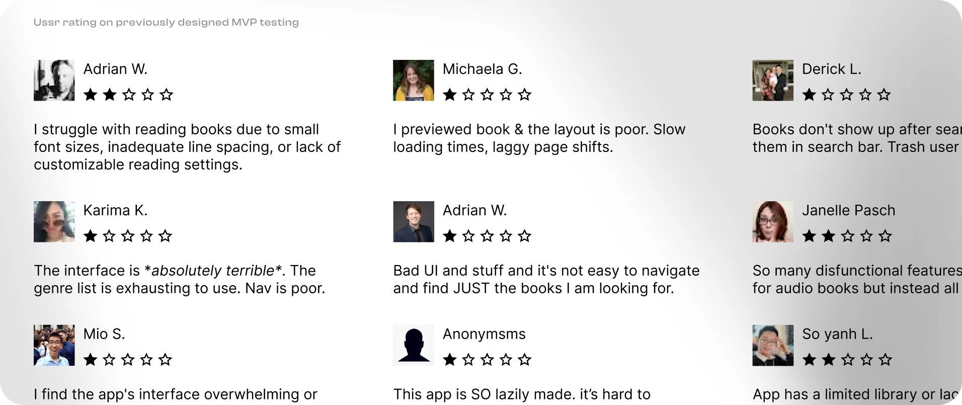
Collating Prior User Feedback from MVP Testing in the Redesigned UX Process for the ReadIt App
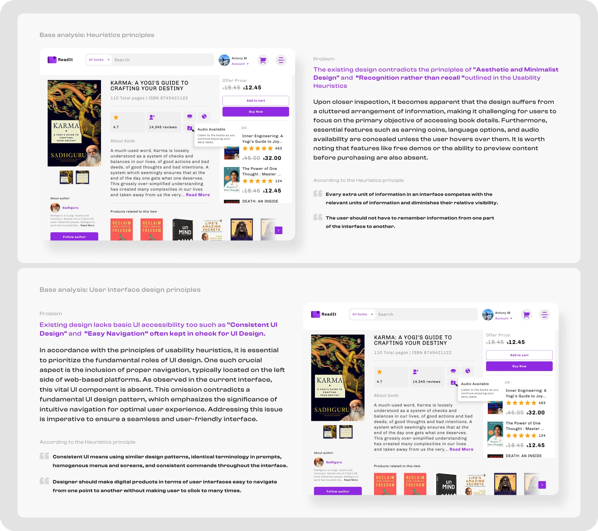
Pictures highlighting the App analysis undertaken during the new UX process for the ReadIt App
The client was pleased with the ideas and he also actively participated in the design process, making approval easy. We scheduled meetings to collaborate and finalize this stage, setting the stage for innovative ideas.
Outcome: After completing the initial stage of understanding the product, I identified several problems, such as poor layout, missing screens for scenarios like empty and error states, unaddressed user flows, overbooked UI, cluttered spacing, inconsistent typography and colors, lack of feedback for users, inconsistent and poor navigation flow, and more. I was now ready to move on to the next stage, which is brainstorming and ideation.
2️⃣ Brainstorming, Ideation and Wireframing
I started with brainstorming sessions to consolidate important points from the analysis phase. I studied and refined existing user flows and journeys, connecting missing pieces, removing unnecessary links, and establishing new ones while considering the suggested features and client preferences.
Once getting done with the flows, I quickly translated them into rough sketches.
After being satisfied with the sketches, I moved on to creating wireframes. This approach is more effective in conveying the design structure and information to clients.
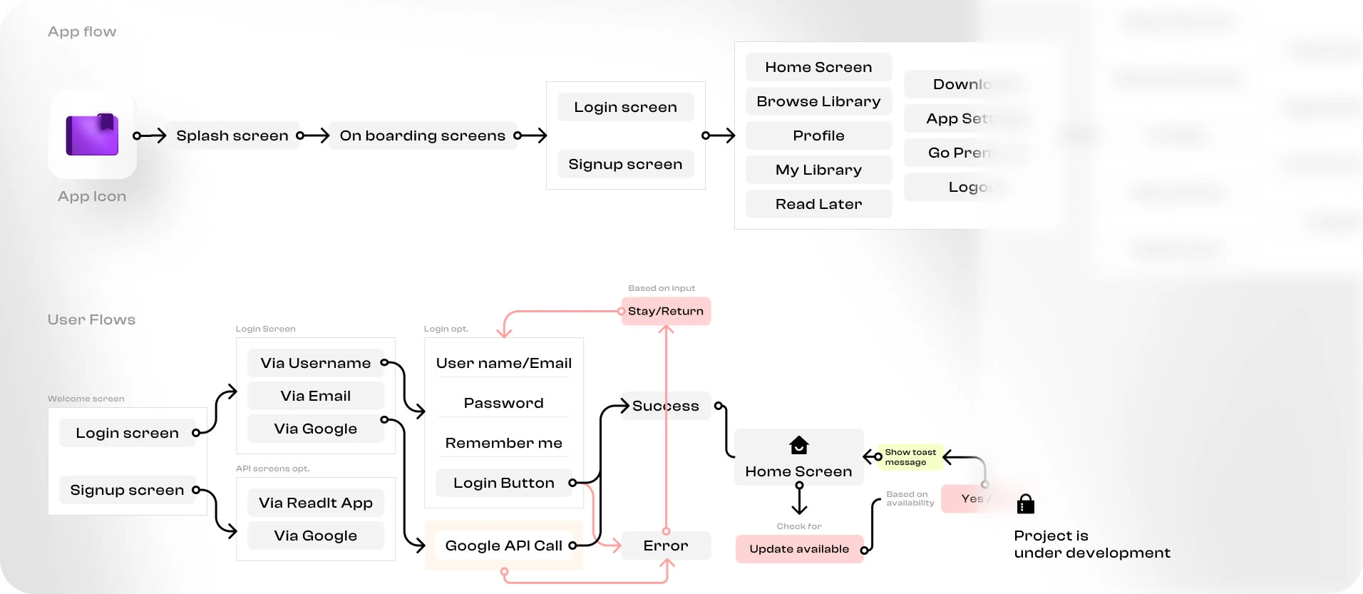
Image showcasing new User flow defined for the ReadIt App
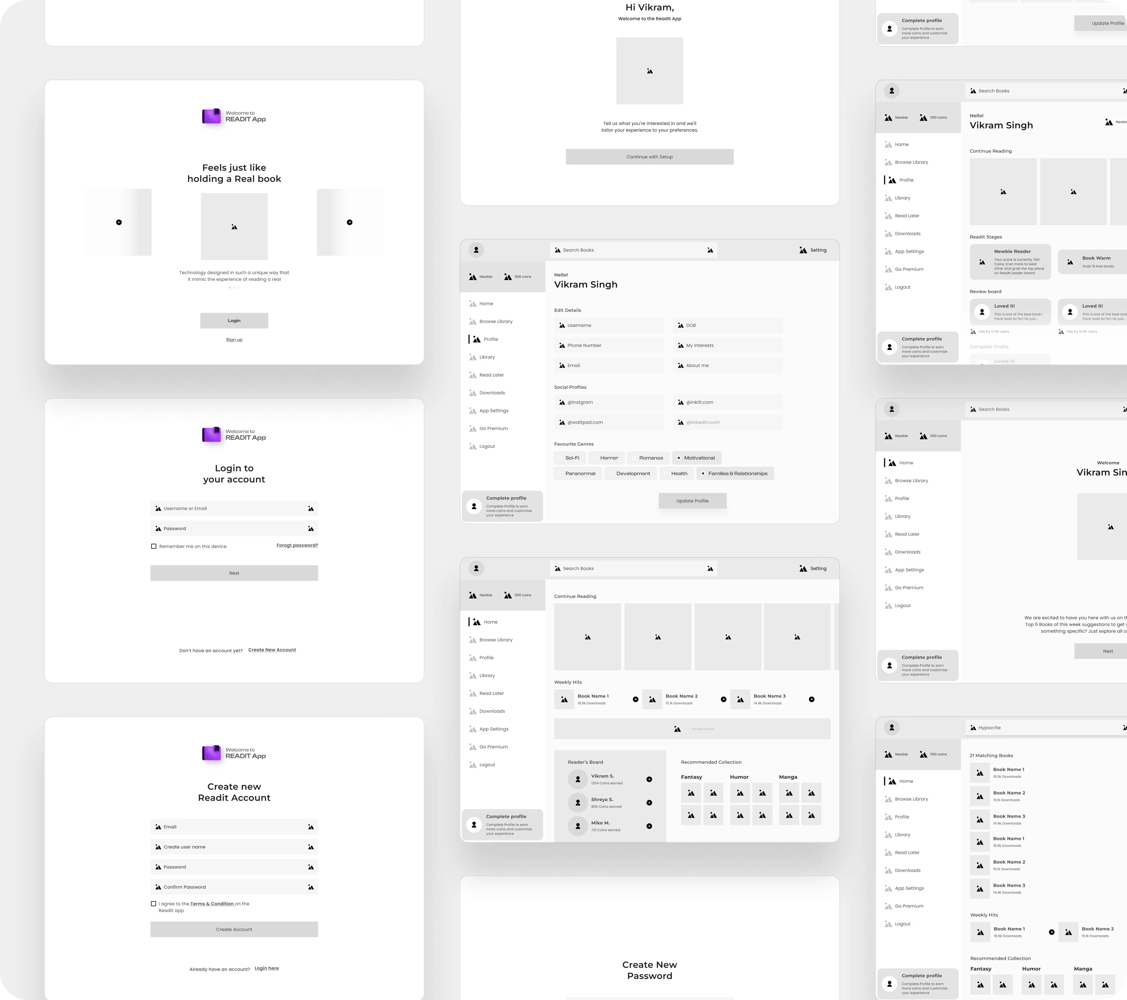
Image showcasing new Low-fed Wireframes designed for the ReadIt App
Feedback session
To share the design with my clients, I utilized Figma - a design tool that is specifically designed for creating digital design interfaces. I chose Figma over other alternatives, such as FigJam (a figma product), Miro board, Lucidspark, and Mural, due to its ease of use. Not only is it simple for me to operate, but it also takes my clients only a few minutes to learn how to use it. Additionally, collaborating on Figma is a seamless experience that ensures a smooth and efficient design process.
3️⃣ Detailed UI design (High Fidelity)
To ensure a comprehensive analysis of the UI design, I embarked on a creative exploration by developing two distinct design versions. The first version prioritized simplicity and minimalism, with a strong focus on delivering clean and intuitive user interactions. However, to truly push the boundaries of innovation, I felt compelled to explore a more visually captivating approach. As a result, I developed the second design version, which incorporated a bold and unique creative direction, integrating innovative user interface components and compelling visual elements.
In both versions, I designed the initial Login and Sign-up processes, along with three major internal screens: Homepage, Settings, and User Profile. I also created a High-end Prototype of it and shared it with client for review as well as to test with the same user (Guerrilla Research method) who already reviewed the existing ReadIt App.
😍 Final UI screens
4️⃣ Prototyping (High Fidelity)
Maximizing your product's potential requires more than just testing it after investing time and resources in its development. That's where prototypes come in, offering a valuable opportunity to try it out beforehand. However, a mere click-through prototype might not provide a holistic understanding of user reactions. Thus, I went the extra mile by designing prototypes that closely mirror the final developed app. Trust me, the results were truly invaluable. I can't share all the prototype links due to NDA as well as platform limitation, so sharing 2 GIF's for the same. Take a look at them yourself!
ReadIt app onboarding Interaction design
User onboarding designed for ReadIt app with gamification in mind
We'll this is it for the project. Hope you liked it. Let me know about it. If you have a projects let's connect and make it a success!

Like this project
Posted Nov 13, 2023
ReadIt App is an innovative digital platform that will transport you to the realm of reading, accessible through digital media - anytime, anywhere.

