Wysa - Mental Health Chat Redesign

Emmanuel Bliss


Wysa Hero
Project Overview
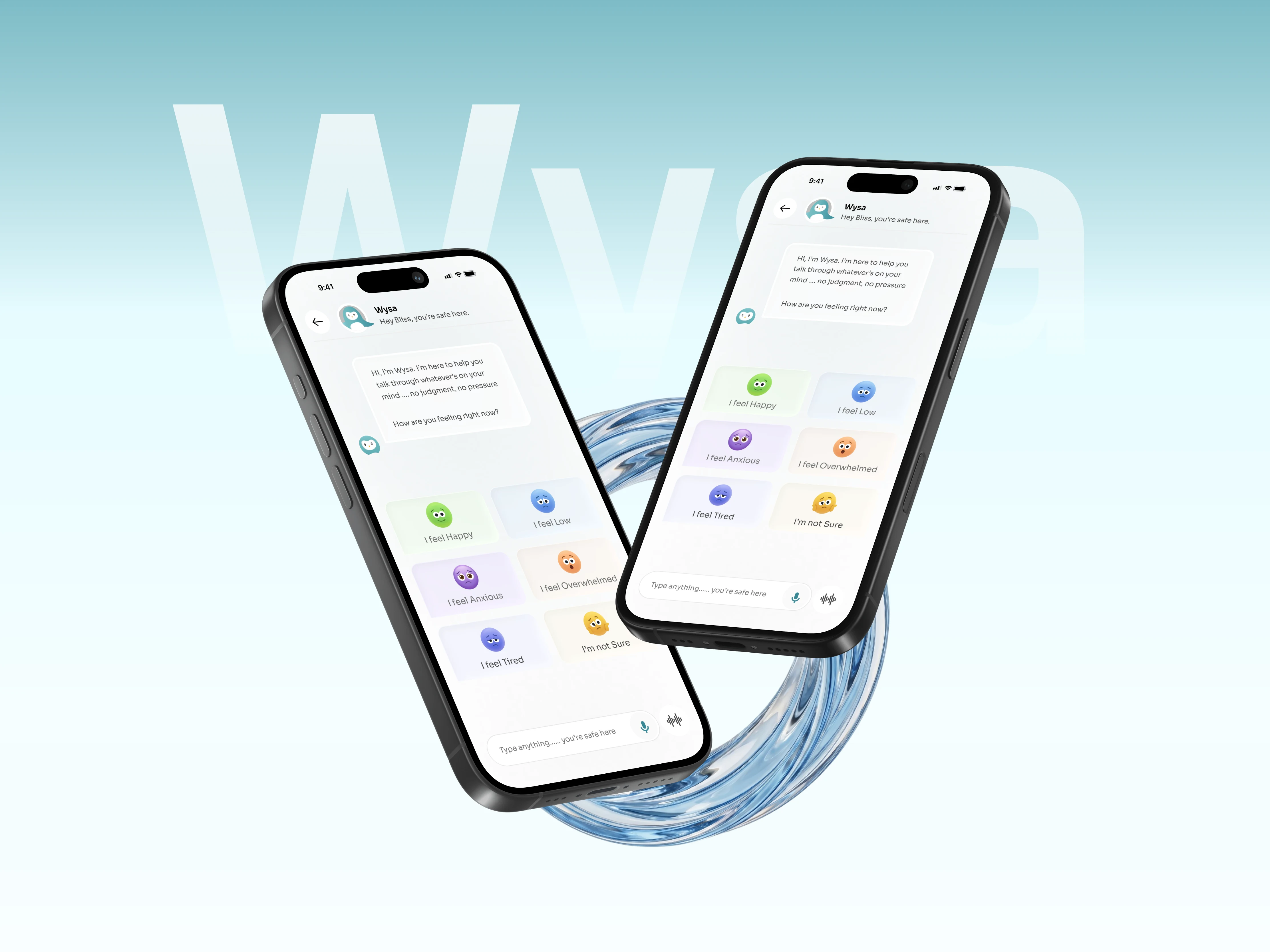
I redesigned the chat experience for Wysa, an AI-powered mental health app, as a self-initiated project exploring how small, intentional UX decisions can make emotionally sensitive conversations feel safer.
Wysa's core interaction happens in the chat. It's where users open up, seek guidance, and process difficult emotions. If that interface feels cluttered, confusing, or visually heavy, it works against the very thing it's trying to do.
I didn't redesign the entire product. I focused on the one screen that matters most: the conversation.
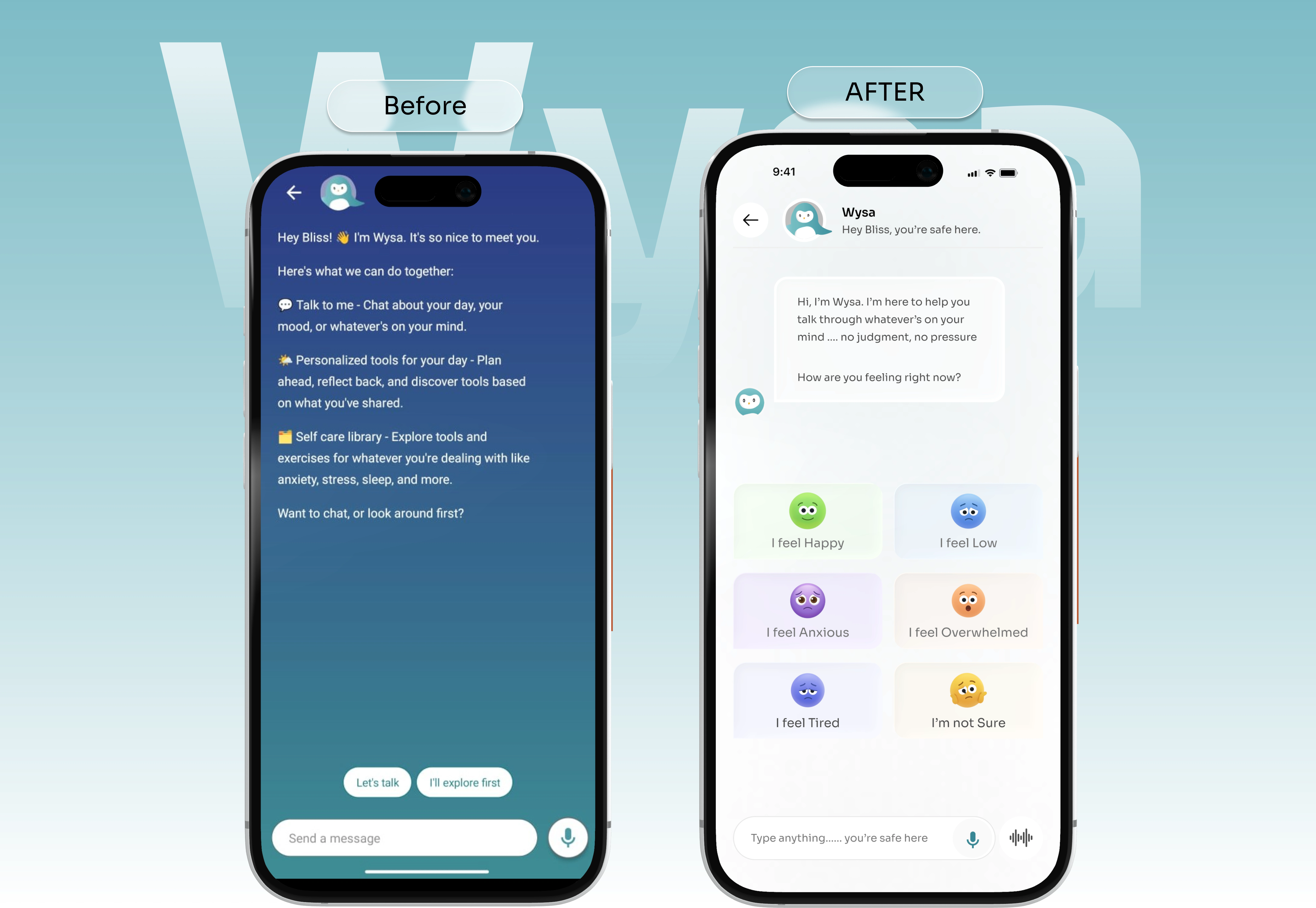
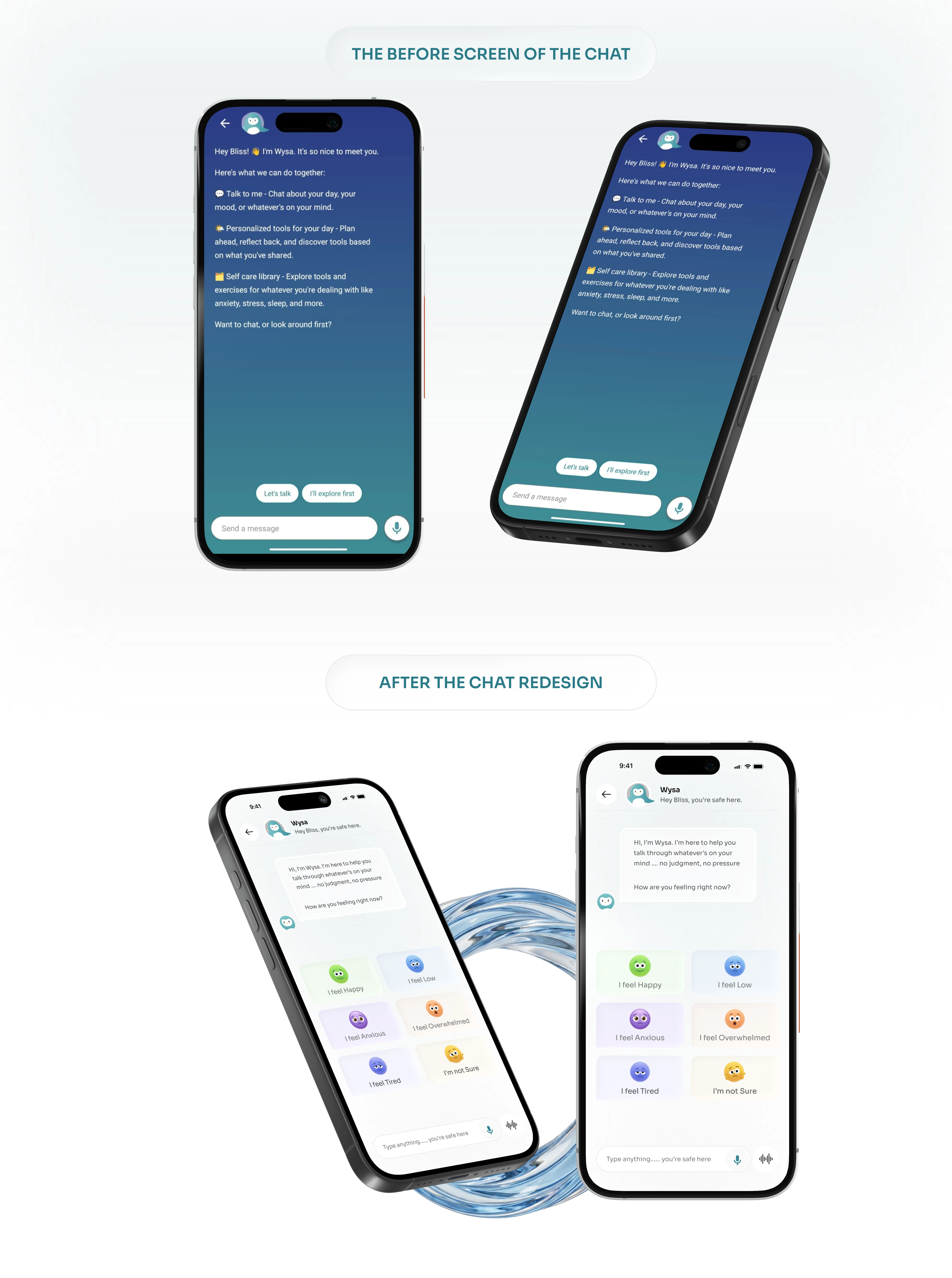
Current vs Redesign
The Problem
The existing chat interface had a few friction points that added up:
Weak message hierarchy made conversations harder to scan and follow
Visual clutter around the chat area competed with the actual content
Tight spacing created a sense of pressure in an experience that should feel open
Inconsistent rhythm in typography and layout broke the sense of calm
None of these are catastrophic on their own. But in a mental health product, small interface friction compounds. Users who are already overwhelmed don't need an interface adding to that feeling.
My Approach
I started by using the existing Wysa app and mapping out where the chat experience created unnecessary cognitive load.
The process:
Audited the current chat UI for readability, hierarchy, and emotional tone
Identified specific pain points in spacing, layout, and visual weight
Explored layout variations through iterative design in Figma
Refined into a high-fidelity redesign focused on clarity and emotional comfort
The goal wasn't to reinvent Wysa's design language. It was to take what already existed and strip away everything that got in the way of a calm, focused conversation.
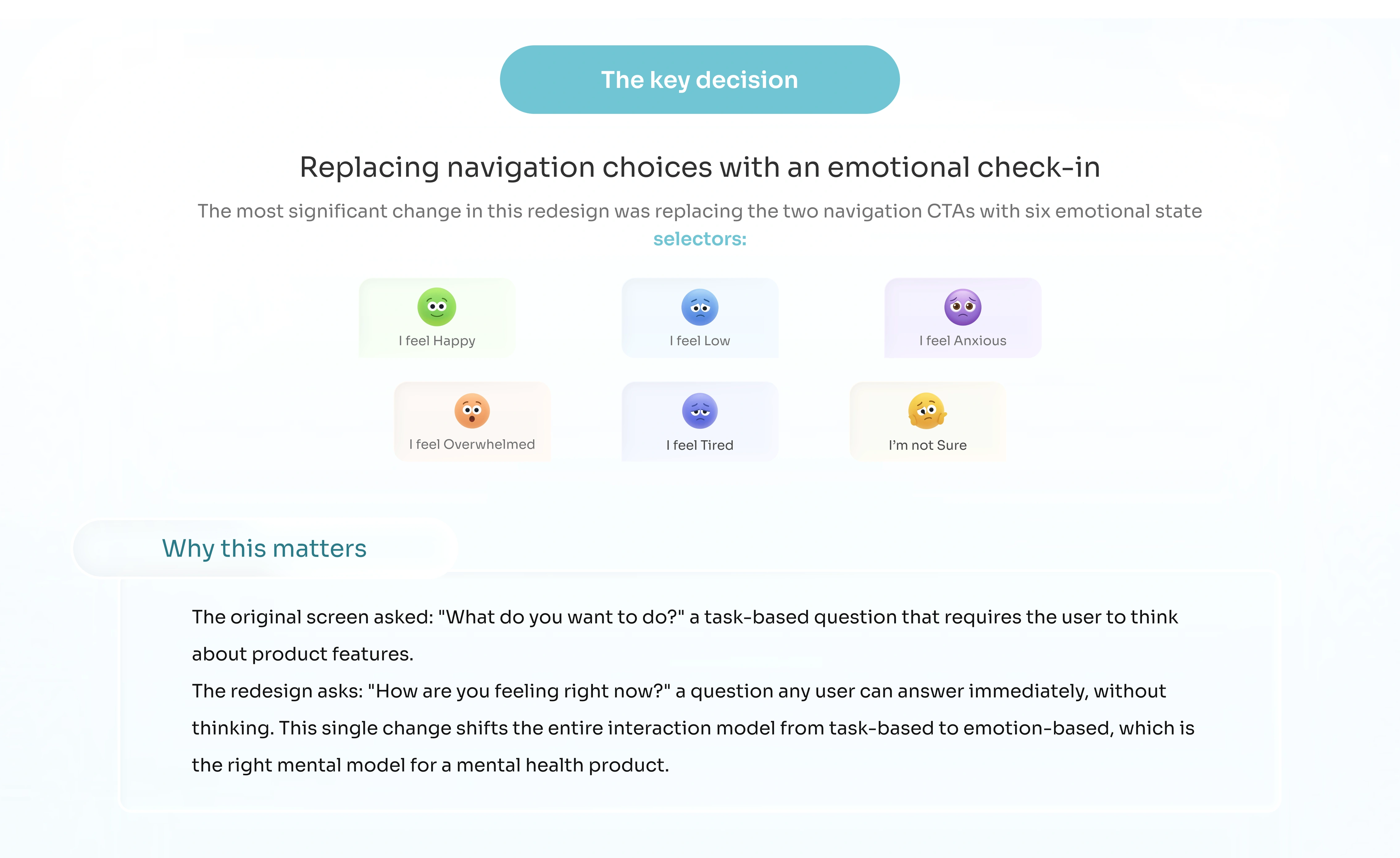
Exploration Visual
Design Decisions
Every decision was filtered through one question: does this make the conversation feel more supportive or less?
Clearer Message Hierarchy
Restructured how messages are visually weighted so users can scan conversations naturally. The bot's responses and the user's messages are now easier to distinguish at a glance.
Generous Whitespace
Opened up spacing between messages and around the chat area. Mental health conversations need room to breathe. The interface should feel spacious, not cramped.
Stripped-back Interface
Removed visual elements that weren't directly supporting the conversation. Fewer icons, fewer borders, fewer competing elements. The chat content leads, everything else recedes.
Consistent Visual Rhythm
Unified spacing, typography, and component sizing across the entire chat flow. Consistency creates predictability, and predictability creates comfort for users in vulnerable states.
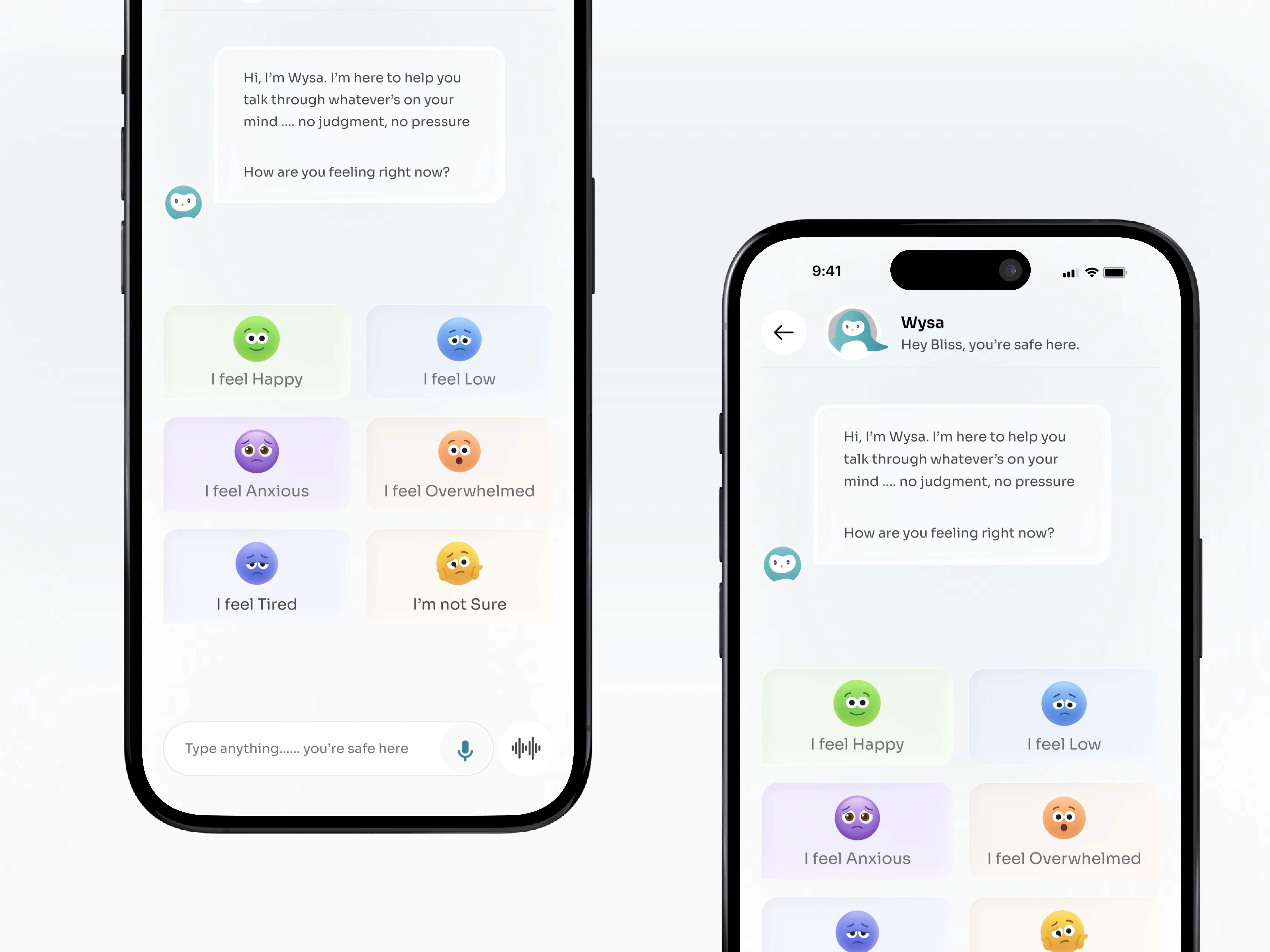
Mockup
Outcome
The redesign shows how targeted, intentional UX improvements can meaningfully change the feel of a conversational product without overhauling the entire system.
By simplifying the interface, improving readability, and giving the conversation more visual space, the chat feels more focused and more aligned with what Wysa is actually trying to do: help people navigate difficult moments without the interface getting in the way.
This project reinforced something I keep coming back to: in sensitive contexts, restraint is a design skill. What you remove matters as much as what you add.
Outcome
Like this project
Posted May 25, 2026
A redesign of Wysa's chat experience, reducing visual clutter and creating a calmer, more supportive conversation interface for emotionally vulnerable users.
Likes
1
Views
4