Clementine’s Kitchen - Homestyle Restaurant Website
Abe Treviño
Verified
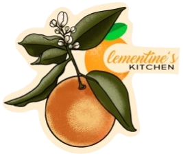
Clementine's Kitchen Logo
Clementine's Kitchen - Since 1946
The Clementine's Story
This project started with a simple question:
How do you capture the warmth of a homestyle kitchen inside a digital experience?
Working with Clementine’s Kitchen — a local gem in Laredo, Texas — became a journey in blending tradition and technology. 🍊💡
In October 2025 I sought out to conceptualize a modern restaurant experience for Clementine's Kitchen, a local hotspot for locals in Laredo, Texas, that aimed to elevate its existing guest experience, rewards system, and streamline their menu through a seamless blend of physical and digital interaction. The goal was to create an NFC-powered digital menu system that connects directly with the restaurant’s existing domain and aligns with the design, branding, and UX standards used in the project’s design brief.
Using a proprietary mix of tools — Cloudinary, Notion, and Framer’s CMS — I created interactive menu cards that turn browsing into a tactile experience. Each card tells a story: ingredients, intention, and tradition, all effortlessly accessible
All In all, a lightweight web experience that lives on the restaurant’s existing domain.
The solution features (but has not fully implemented) the NVIERNO Tactilinx Collection of NFC-enabled assets.
Low-Fidelity - Wireframe & Prototyping (Figma)

Preliminary Low-Fidelity wireframe
Home Page - Wireframe
High-Fidelity - Digital Ecosystem Creation (Framer)
1. Visual Identity & Brand Language
Warm Color Palette: Dominant oranges, yellows, and earthy tones reinforce homestyle comfort, warmth, and familiarity.
Cultural Elements: The hero section features a cozy Clementine-inspired wallpaper, using photography from inside the restaurant & using Affinity Designer to create illustrated artwork aligned with the restaurant’s personality and heritage.
Consistent Iconography: Use of small icons (fire emoji, cart icons, category labels) adds approachability while aiding scannability.
Rounded Card UI: Soft card components reinforce friendliness and accessibility, matching the brand’s “homestyle” aesthetic.
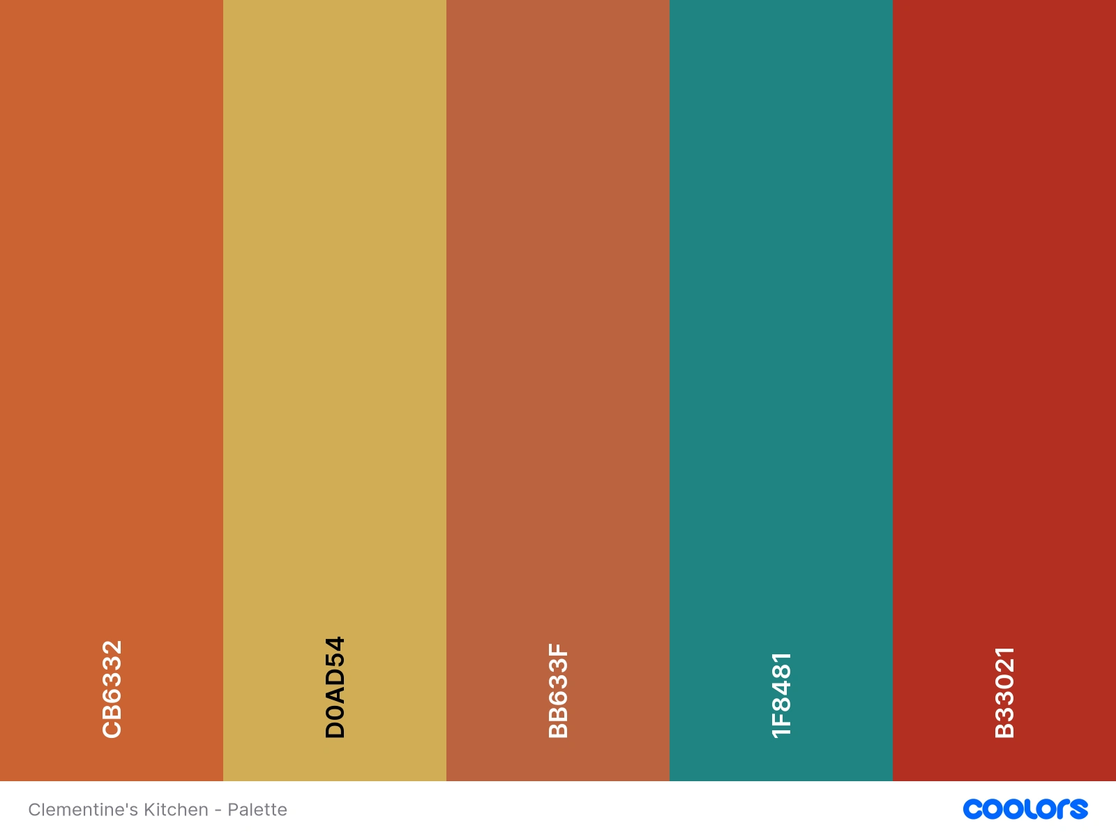
Preliminary Color Palette
2. Page Structure & Content Hierarchy
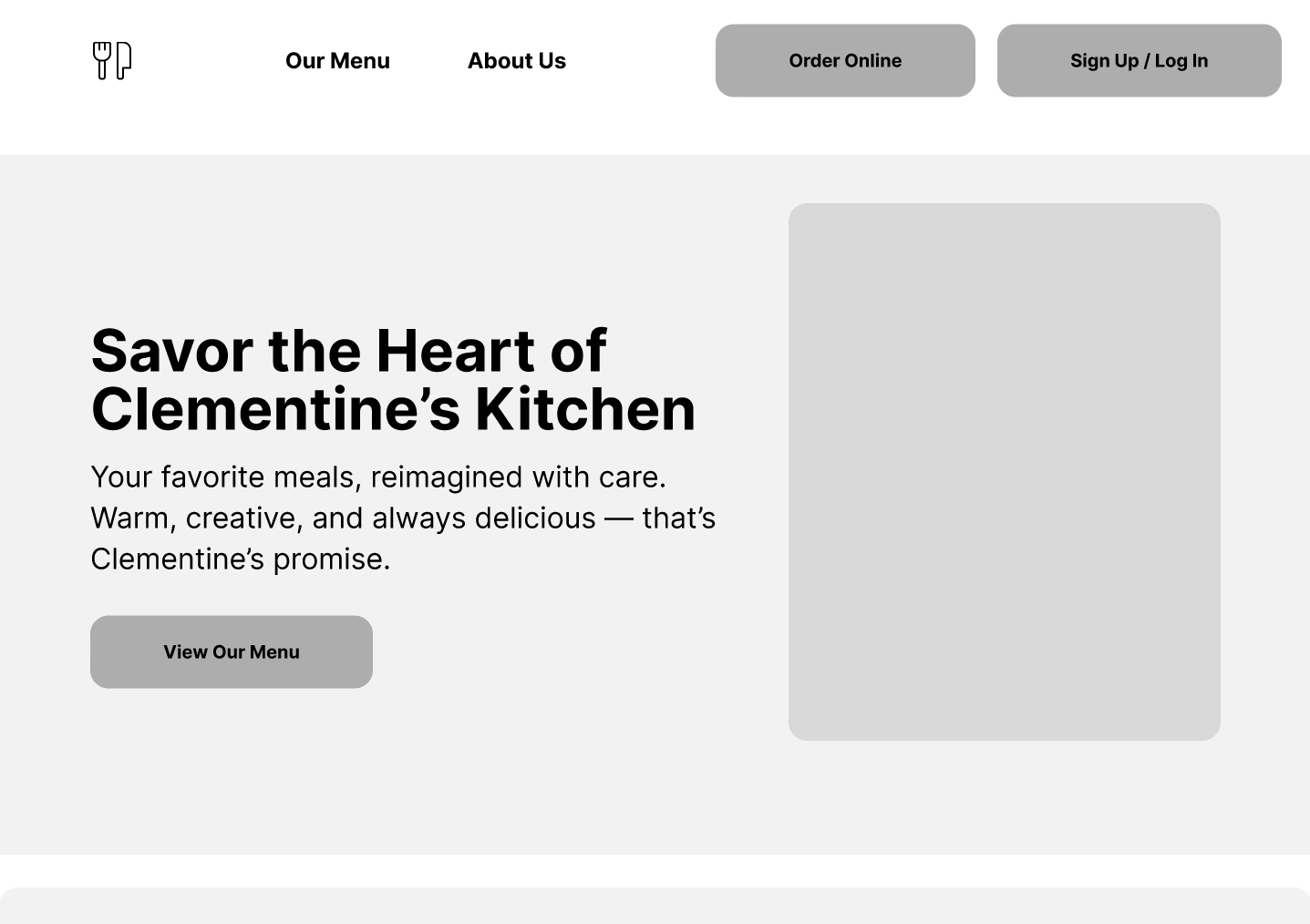
Hero Section
Strong headline immediately communicates the restaurant’s core value (“Homestyle Goodness”).
Short supporting copy clarifies location, cuisine, and ethos.
Primary CTA (“Order Online”) takes the user to client's preferred Ordering Portal (Doordash)
Hot Picks
Scrollable interactive slideshow allows customers to see local favorites
Customer-driven recommendations create social proof.
Two-item layout reduces cognitive load and focuses attention on customer favorites.
Clear pricing streamline ordering decisions.
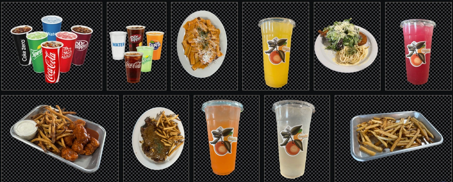
Background-less assets for use in the Menu Items (Hosted via Cloudinary)
Menu Card Design
Category tags (“Lunch Special,” “Sides,” “Entrée,” “Dessert”) visually organize a large menu.
Balanced card layout ensures each dish has space for image, description, ingredients/allergens, and price.
Consistent card structure improves readability and scanning behavior.

Using Framer's built-in CMS Function to sync with Notion, creating a database of menu items that can be updated instantly.

Framer CMS syncing with Notion
3. Interaction & UX Decisions
Persistent CTAs: “Order Online” and "See Full Menu" appear repeatedly to support task completion.
Ingredient & Allergen transparency: Each item includes detailed breakdowns without overwhelming the user—good trust-building.
Mobile-friendly card layouts: Cards stack cleanly, ensuring clarity on all screen sizes.
4. Photography & Visual Communication
Food photography: Real, unfiltered photos with no background emphasizes authenticity and modernity over high-gloss marketing images.
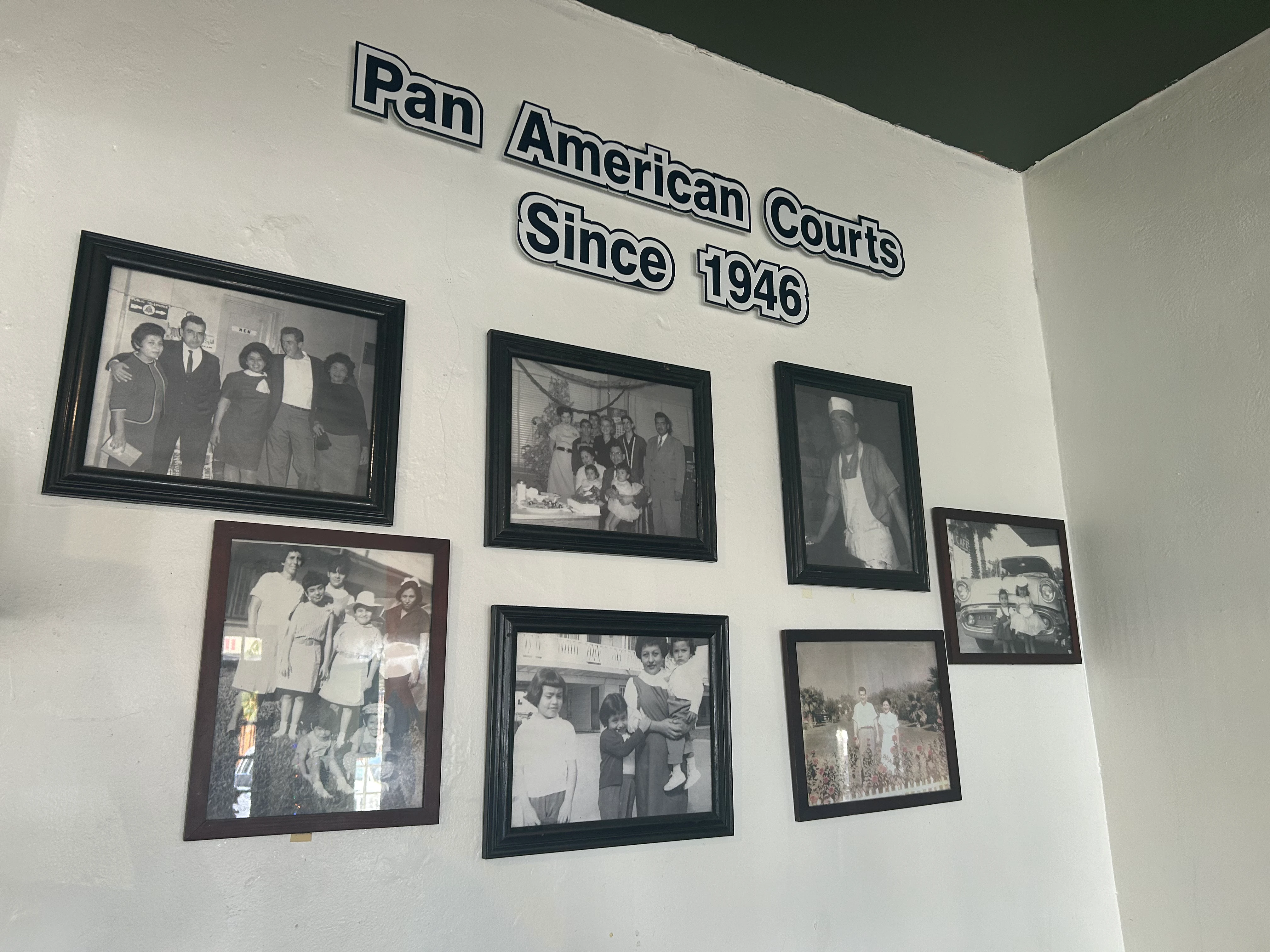
Behind-the-scenes photo section: Humanizes the brand by showing the kitchen environment and staff.
Historical images: Reinforce legacy (“Since 1946”), adding emotional and cultural resonance.
5. Narrative Construction
Storytelling block (“Since 1946”) provides heritage and credibility.
Community emphasis: Shows continuity between past and present, linking family legacy to modern digital ordering.
6. Location & Logistics
Interactive Map: Helps users quickly determine proximity and plan a visit.
Clear hours + address in footer: Follows best practices for restaurant UX.
7. Overall UX Strategy
Goals Addressed:
Quick ordering: Fast access to specials and high-demand items.
Menu discovery: Rich item descriptions reduce confusion and hesitation.
Brand trust: Historical narrative and real photography build authenticity.
Local identity: Colors, visuals, and tone reflect cultural roots and community connection.
Outcome:
A site that feels warm, approachable, and rooted in tradition while providing a modern digital ordering experience.
Strong visual hierarchy ensures users never feel lost.
Consistent card-based layout improves scanning, decision-making, and mobile usability.
Solution 2 - Rewards System Integration
Prior to NVIERNO's intervention, the business owner utilized business cards that doubled as 'Rewards' Cards. While a classic method to garner and retain new customers, they would often be misplaced/lost, leading to customer frustration.
This method of utilizing paper cards also created issues:
Costly and time-consuming reprinting cards in bulk.
Poor guest experience when physical cards were lost, leading to resetting of rewards progress with no way to track
No data feedback from guest interactions
No integration with the rest of their ecosystem (Clover POS)
Introducing: The ClemenCard Rewards System — Part of the NVIERNO Tactilinx Collection
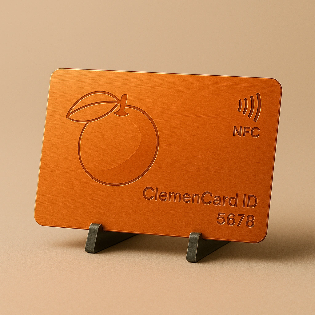
Concept Art for ClemenCard - A customers' Token to their Rewards System
The ClemenCard Rewards System is a premium, tech-enhanced loyalty card designed for modern restaurants using the NVIERNO Tactilinx Collection. Each ClemenCard contains an NFC/QR dual-code that instantly connects customers to their personalized rewards profile, enabling quick verification, seamless redemptions, and automated tracking.
Built for high-engagement hospitality environments, ClemenCards replaces Clementine's Kitchen's outdated punch cards with a reusable, secure, and trackable system that ensures every visit counts.
Staff can tap or scan the card to update redemptions, while customers enjoy exclusive offers, annual perks, and a polished branded experience that elevates the restaurant’s digital and physical ecosystem.
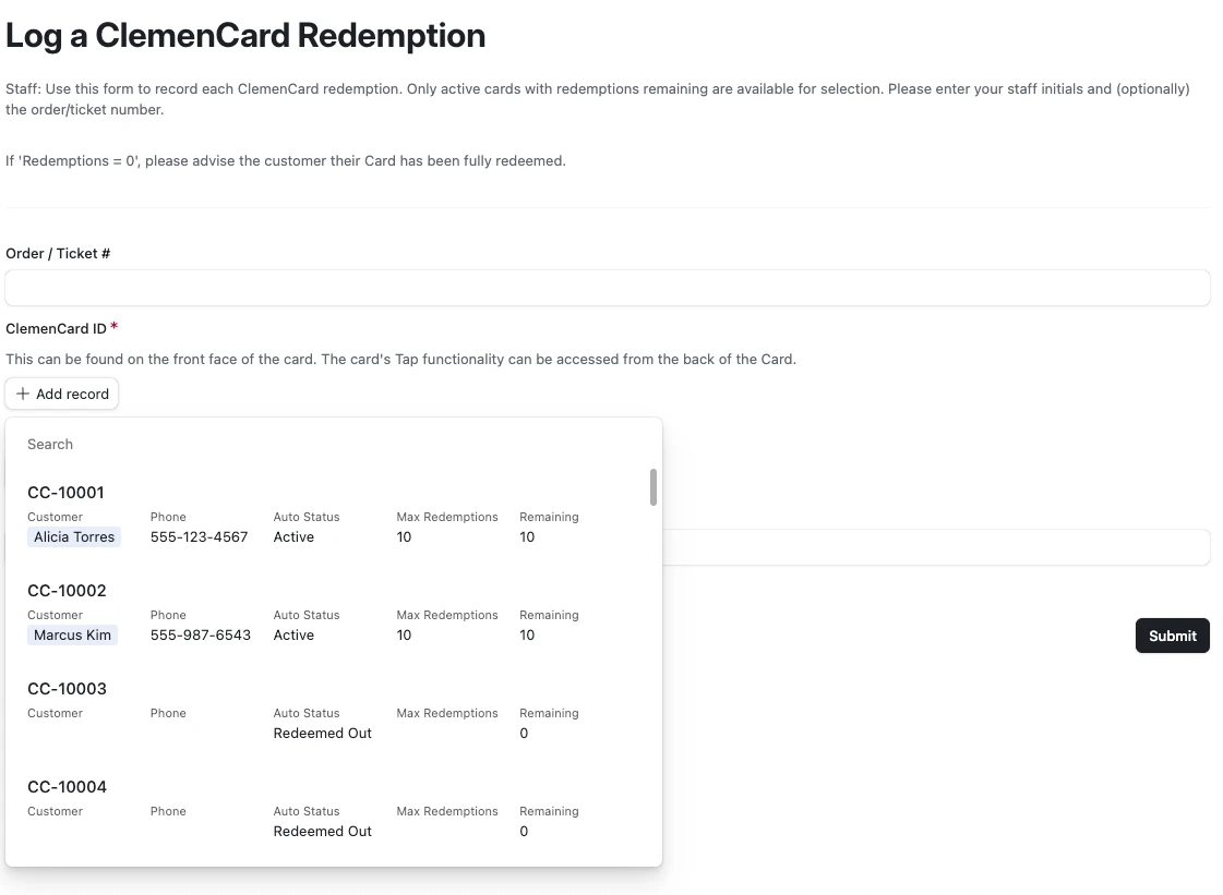
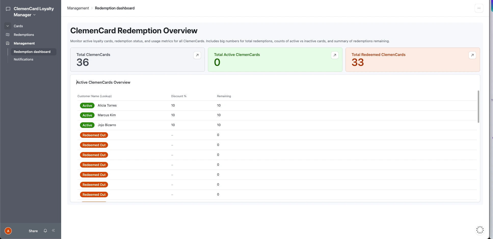
With the use of Airtable, NVIERNO created a dependable loyalty system that blends tactile design with smart technology. ClemenCards enable a smoother rewards workflow, reduce fraud or manual errors, and provide a long-term incentive program that feels modern, premium, and unforgettable.
Visit Clementines.kitchen today and see for yourself.
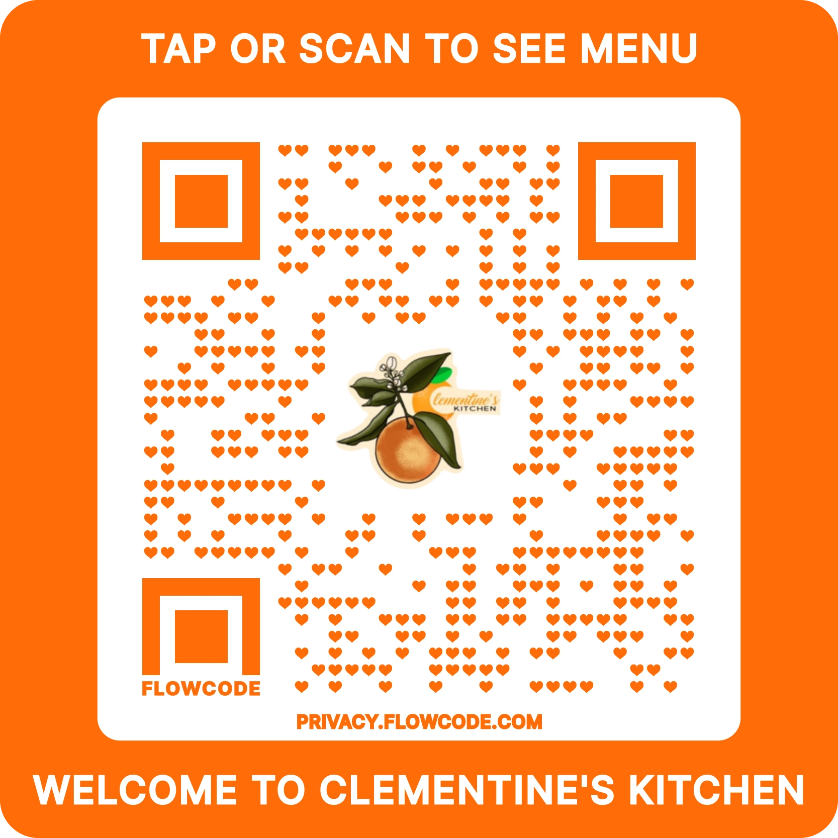
QR Sticker Design: Clementines.kitchen
The Clementine's StoryLow-Fidelity - Wireframe & Prototyping (Figma)High-Fidelity - Digital Ecosystem Creation (Framer)1. Visual Identity & Brand Language2. Page Structure & Content HierarchyHero SectionHot PicksMenu Card Design3. Interaction & UX Decisions4. Photography & Visual Communication5. Narrative Construction6. Location & Logistics7. Overall UX StrategyGoals Addressed:Outcome:Solution 2 - Rewards System IntegrationIntroducing: The ClemenCard Rewards System — Part of the NVIERNO Tactilinx Collection
Like this project
Posted Nov 19, 2025
Website for a vibrant casual dining restaurant serving up unique takes on comfort food, including tacos, seafood, burgers, and fried chicken.
Likes
0
Views
47
Timeline
Oct 6, 2025 - Oct 8, 2025
Clients
Clementine’s Kitchen