Wellhouse Website Re-design

Harry Graham


Overview
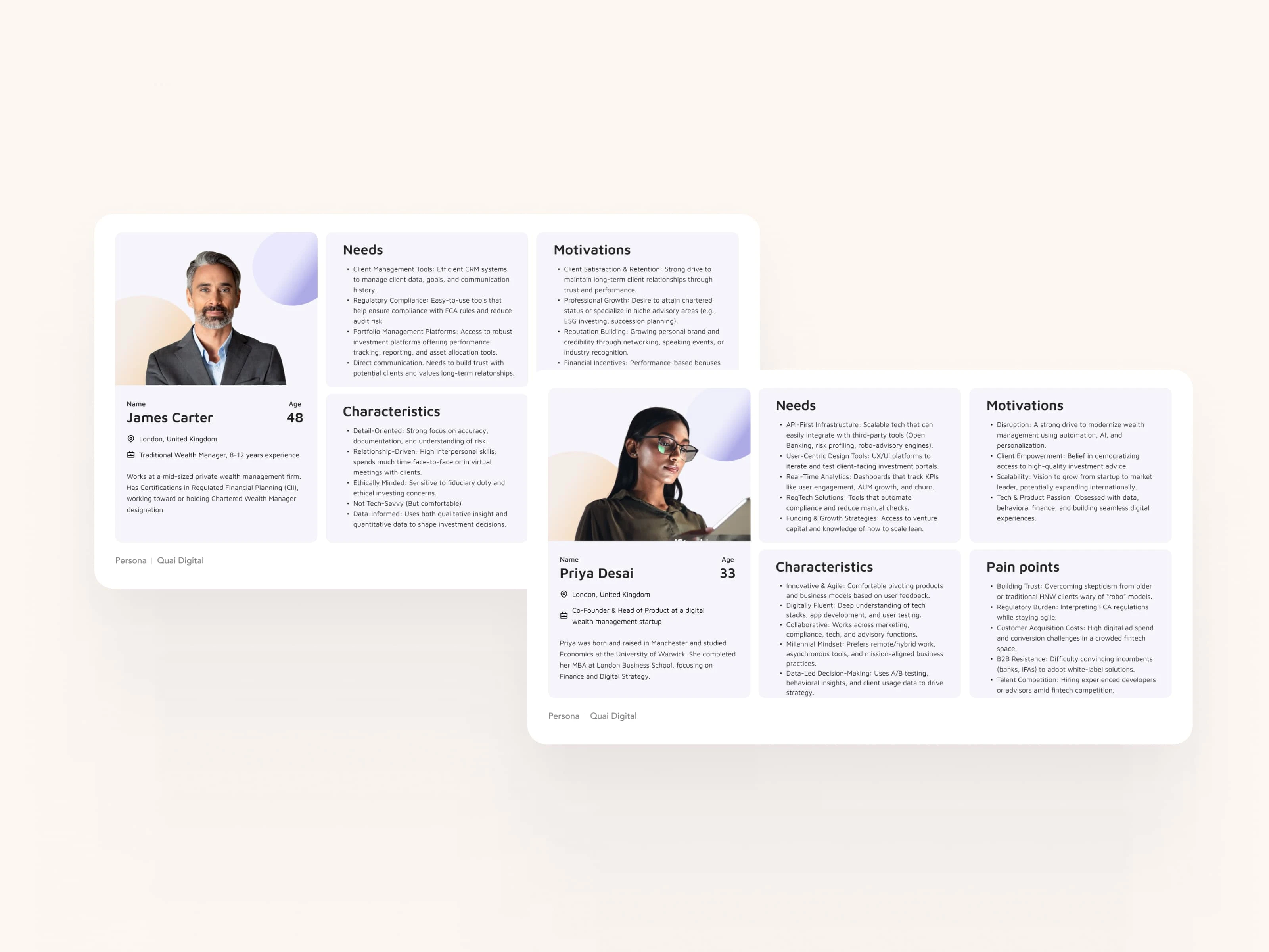
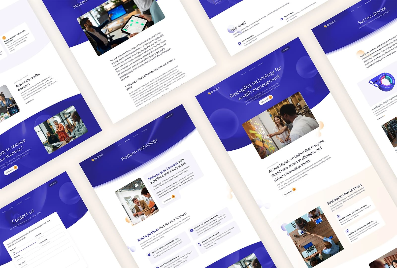
Quai digital is a white-label digital savings platform, specialising in investment products and financial administration services for the wealth management and fintech sectors. Working for Wellhouse, I was asked to re-design their website to help raise their profile and generate more leads.
Main Goals
01. Provide information
Highlight and detail the range of products and services offered by Quai Digital.
02. Demonstrate credentials
Showcase client testimonials, case studies, certifications, and industry awards to build credibility.
03. Generate inbound leads
Implement strategies and tools to convert website visitors into potential leads through contact forms, downloadable content, and calls-to-action.
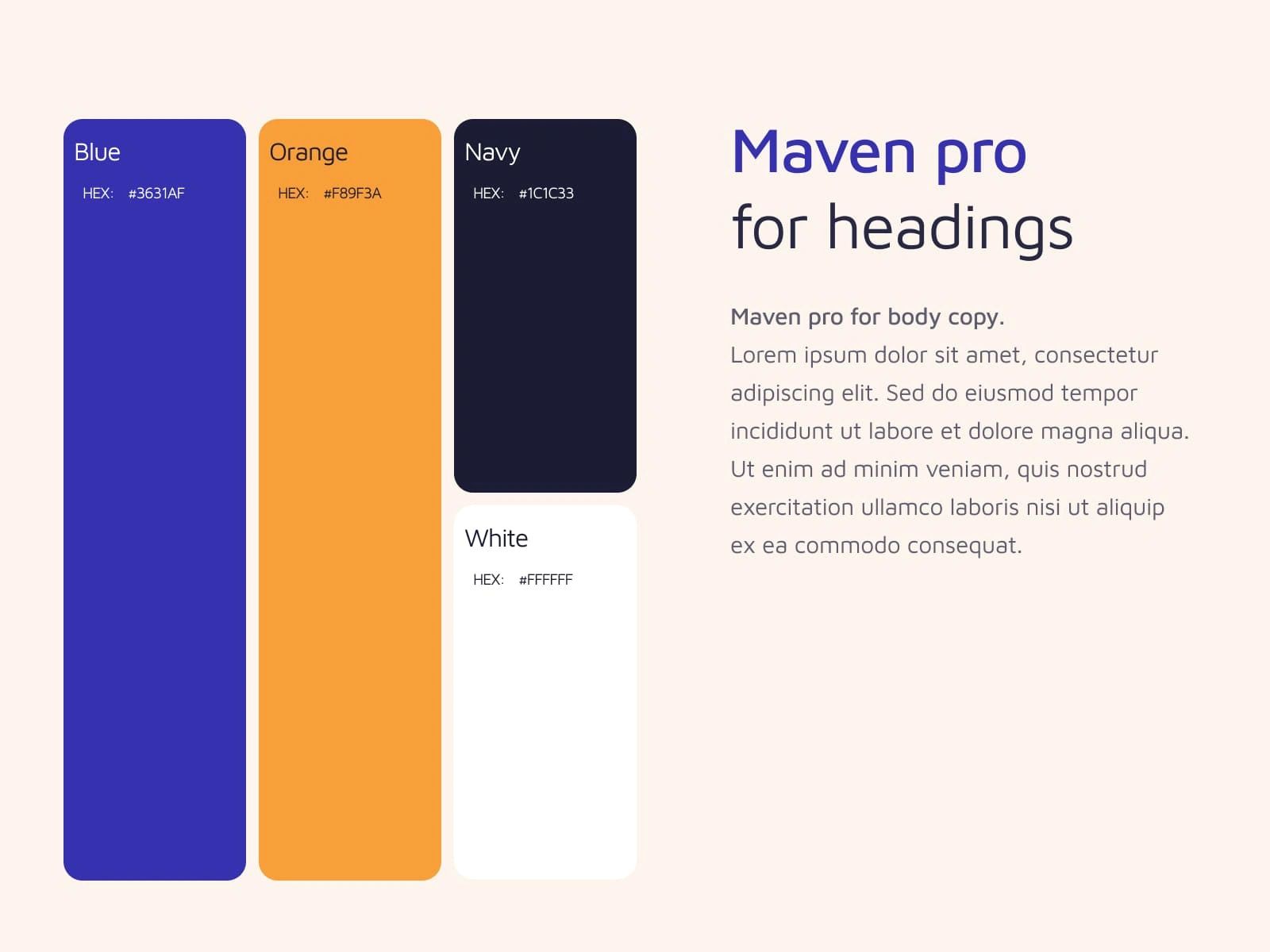
Visual Identity
This wasn’t a full rebrand, but I gave the brand’s main colours and fonts a refresh to make sure they were used consistently and in a way that was accessible and purposeful. The updated typography made the page hierarchy clearer and helped us highlight key messages for potential clients.
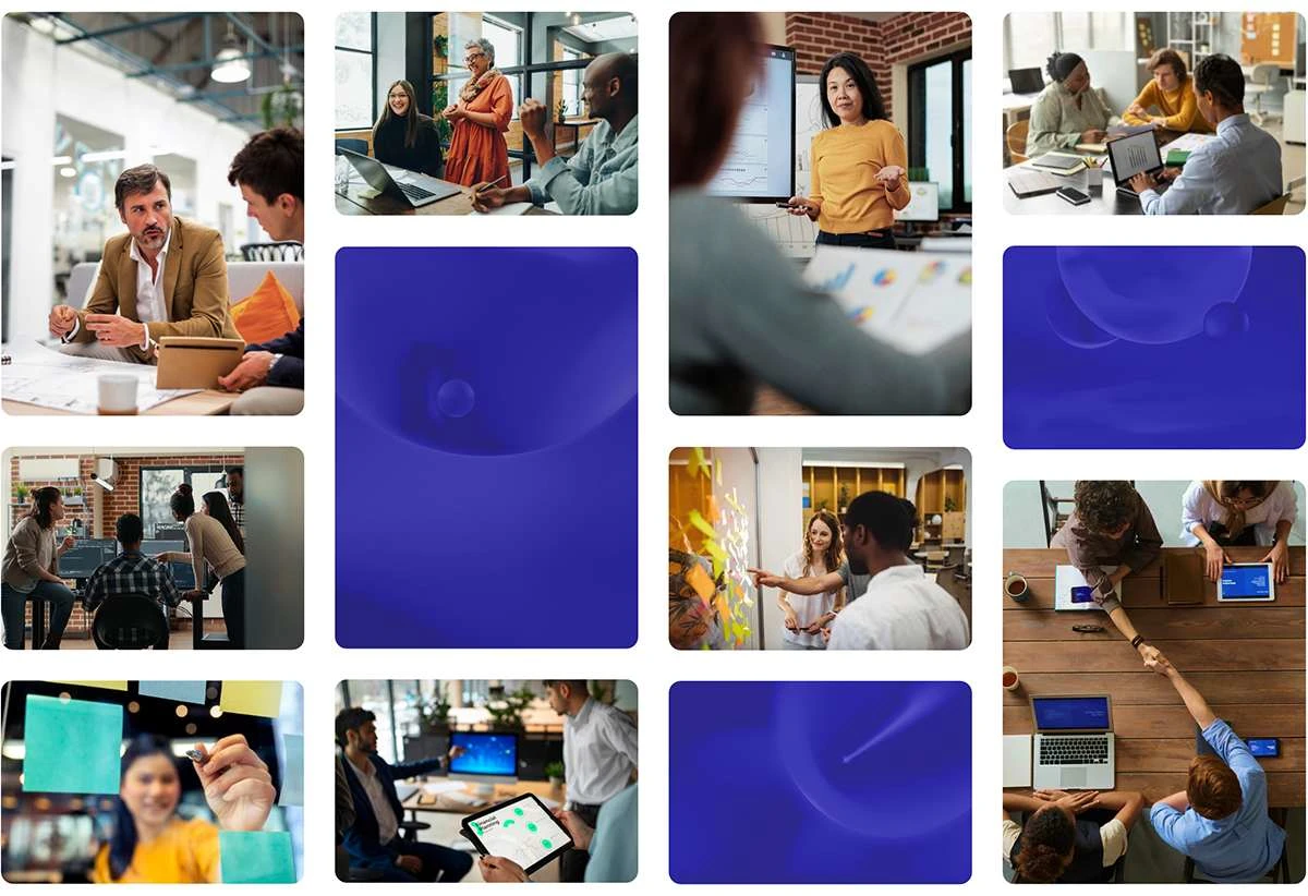
Imagery
To help set Quai apart from it's competitors, I defined a human-focused photographic style featuring positive, modern workplaces to convey their values of innovation, collaboration and client-centricity.
A clear structure that is easy to scan
For the key pages, the layout followed common patterns (such as F-patterns and zig-zag) that helped user's easily scan the page for an overview. By keeping the content minimal on these pages we could guide the user to key cta's and help generate new leads.
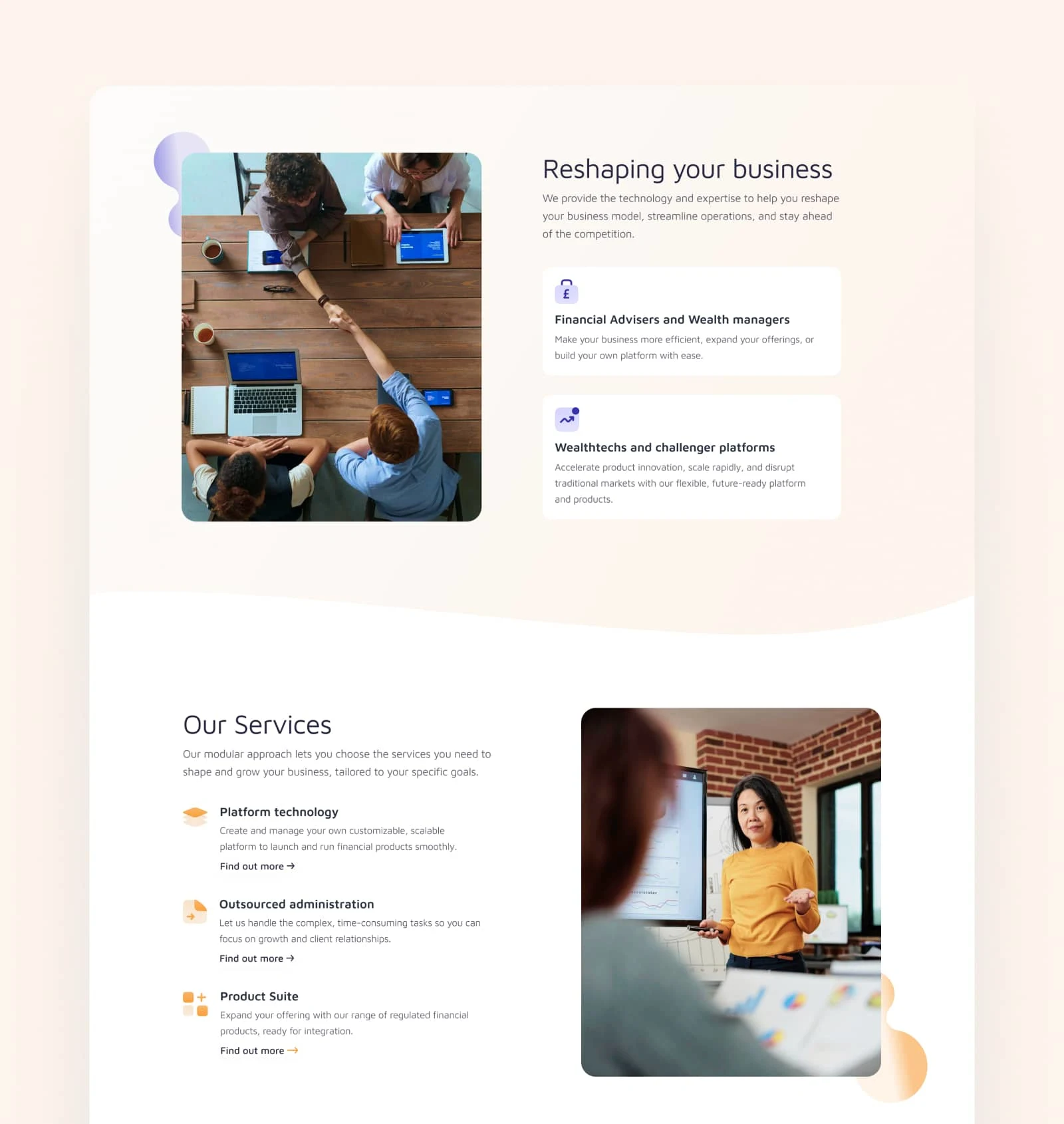
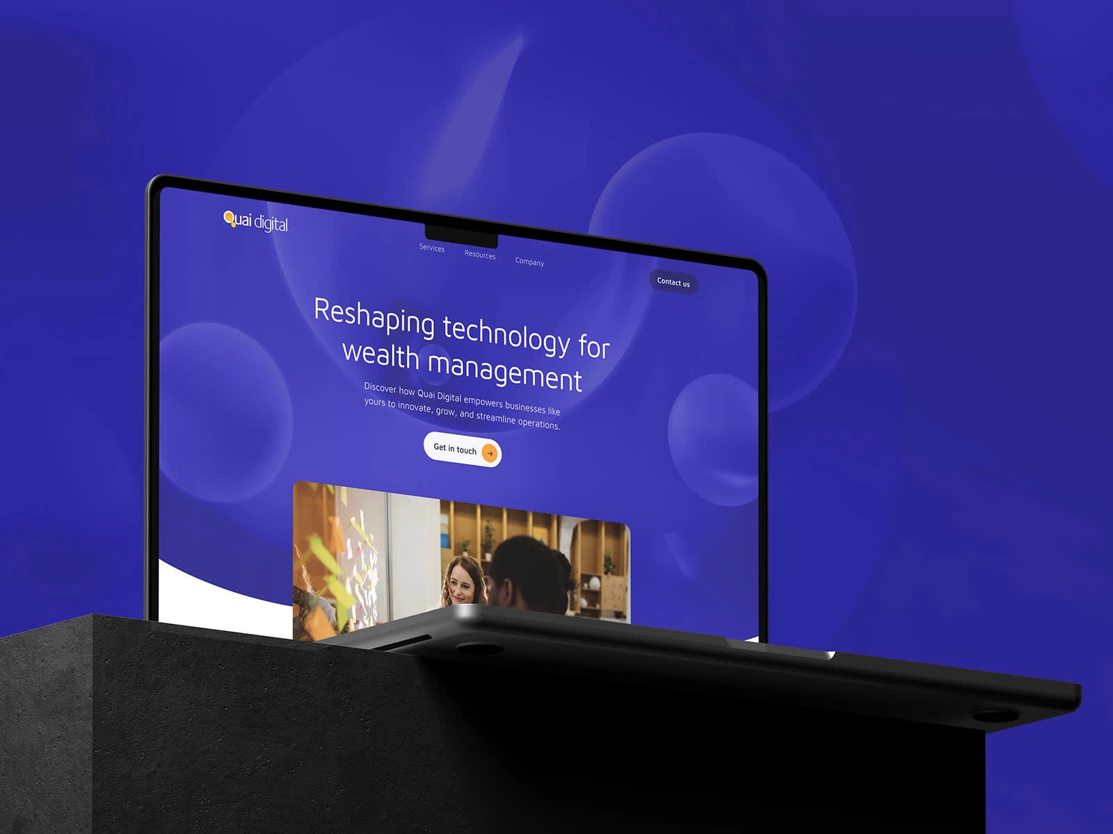
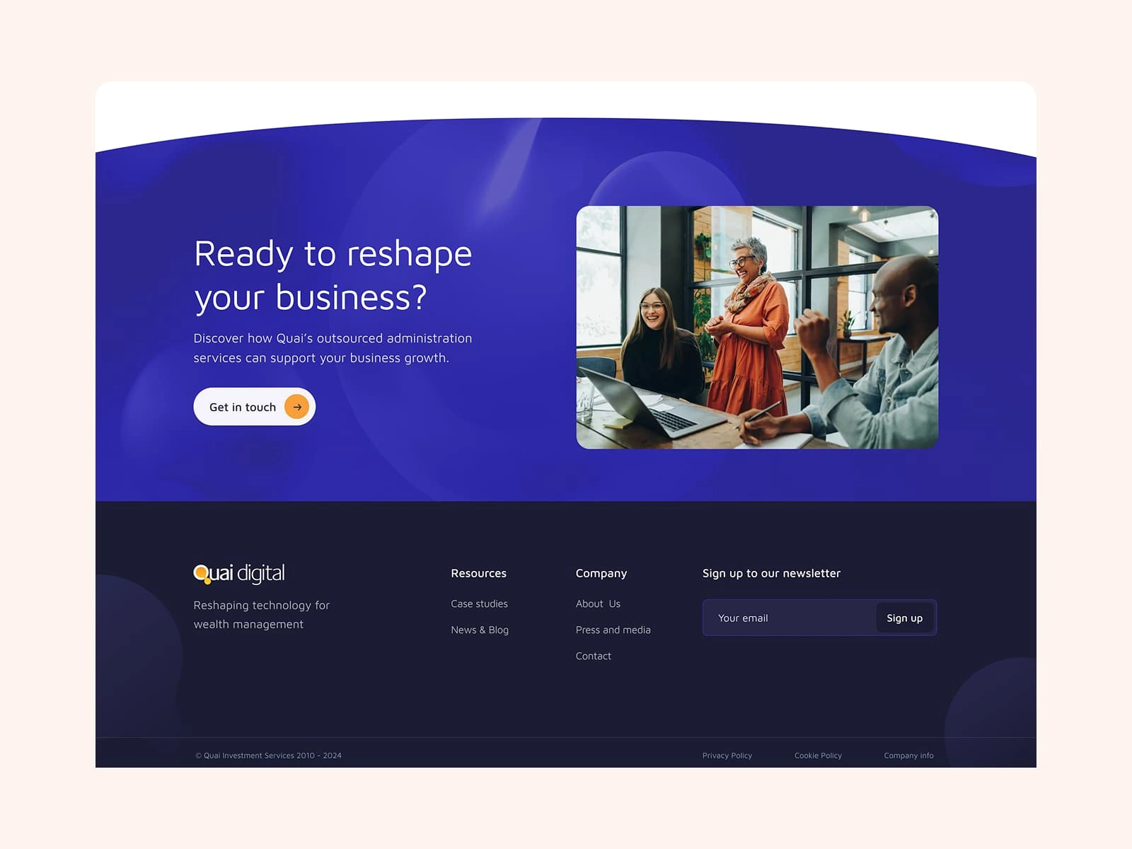
Showing innovation through fluidity
To help Quai connect with Wealth Management Challengers, the website’s visual design leaned into a theme of innovation. Drawing inspiration from the bubbles in their logo—often symbolic of ideas—I created a series of dynamic header images featuring fluid, shifting forms that suggest movement and adaptability. This concept carried through the site with flexible text modules, translucent dividers, soft rounded corners, and subtle motion, all working together to reinforce a sense of forward-thinking.
Bold, clear CTA's
Using the vibrant blue backgrounds only for headers and CTA sections ensured these stood out from the content. With concise, well-written copy and bold buttons, the new cta's were easier to digest and more inviting to click.
Reflections
Low-fi wireframes for the win!
Low fidelity wireframes helped us iterate quickly and refine the layouts and flow in order to meet a client deadline.
Keep breakpoints in mind
Building this website was a reminder to keep all breakpoints in min, not just mobile and desktop! Given that the page headers had some unusual shapes, planning for wider screens and tablets during design would've made development go smoother.
Thinking ahead
Whilst building the website in Wordpress, I was able to use tools to save common components and create standard templates, so that Quai can easily grow and create new pages in the future.
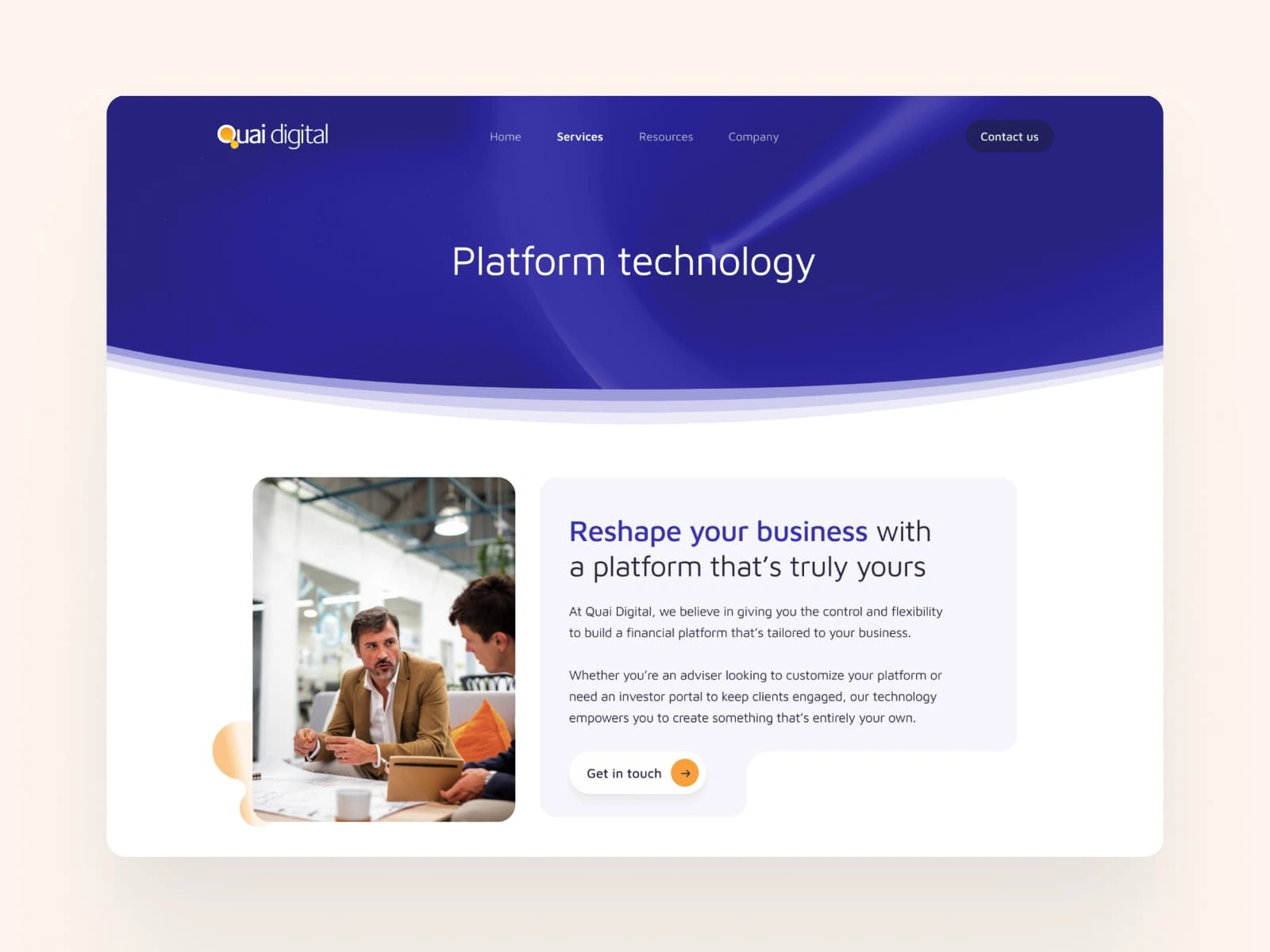
Secondary Page Header
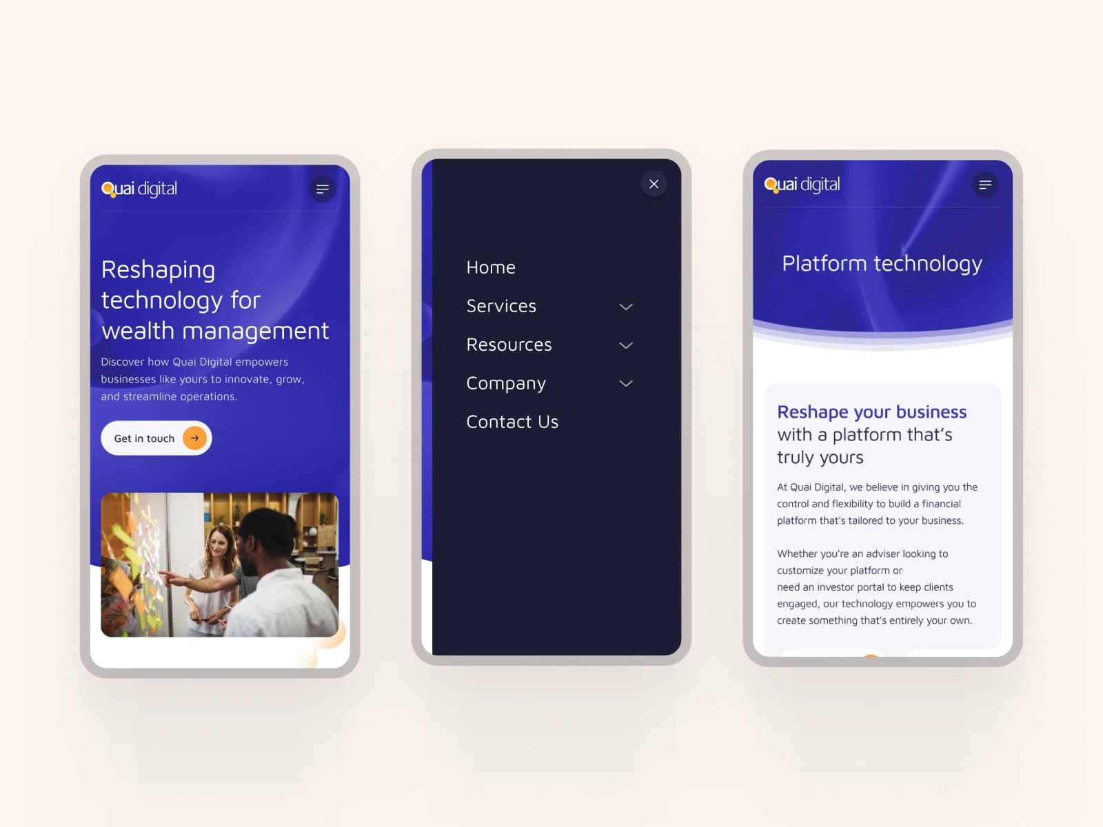
Mobile Designs
Desktop page designs
Like this project
Posted May 15, 2025
I re-designed Quai Digital's website to enhance their profile and generate more leads.
Likes
0
Views
7
Timeline
Jul 1, 2024 - Jul 31, 2025


Website Design and Visual Identity for Connect.ID
Website refresh and UX strategy for Renewable energy specialist
UX Redesign for PGIM Client Onboarding Portal