Website refresh and UX strategy for Renewable energy specialist
Harry Graham
Overview
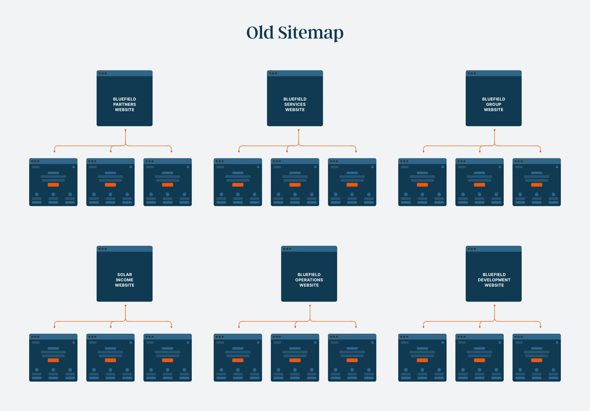
Working at White Marble, I was tasked with leading the design of a new website for a renewable energy specialist. The company had grown rapidly since their launch in 2009, and now had more than 5 separate business websites within the group. Our challenge was to unify and streamline a complex business model into one experience- which was easier for new customers to understand the business and easier for existing clients to navigate.
Discovery
After the initial client discovery meeting and research, we discovered the main painpoints for existing users and customers were:
Painpoints
New users searching for Bluefield were confused about which Bluefield website to go to
New users visiting one of the websites were unsure how to explore and navigate to other areas of the business. There is no clear place for them to get a clear overview of the business, causing them to leave the websites to go back to a search engine.
Some existing customers were unsure which of their business websites to go on to find the relative information. For example, some users looked on the team pages on several websites before finding the team member they needed.
To combat the confusion around the different sectors of the business, we proposed:
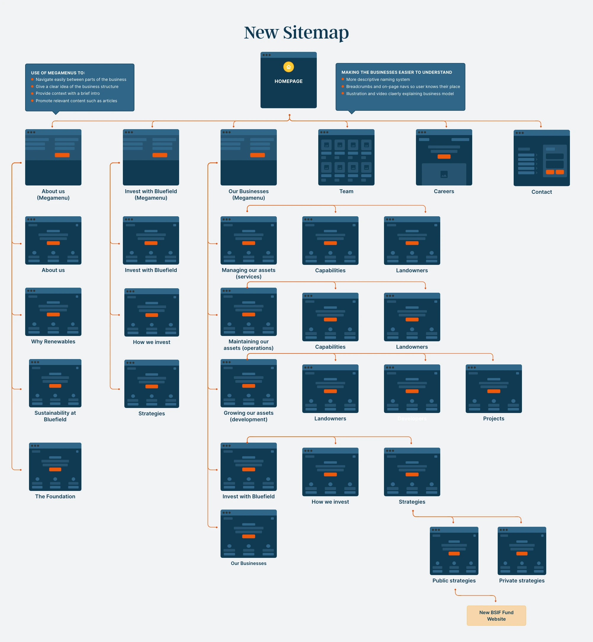
A new, more descriptive naming system
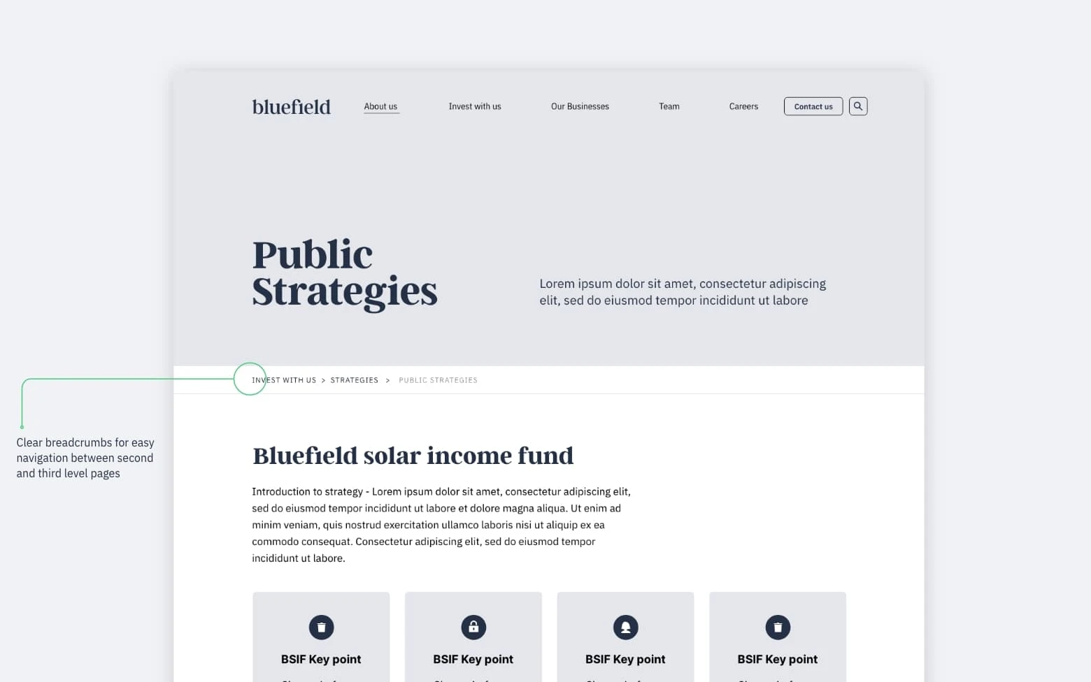
A single streamlined sitemap, which more accurately reflected the business structure and gave space to provide more context
Clearer and more consistent navigation with mega-menus that could display brief intros
Use of videos to explain the more complex areas of their business
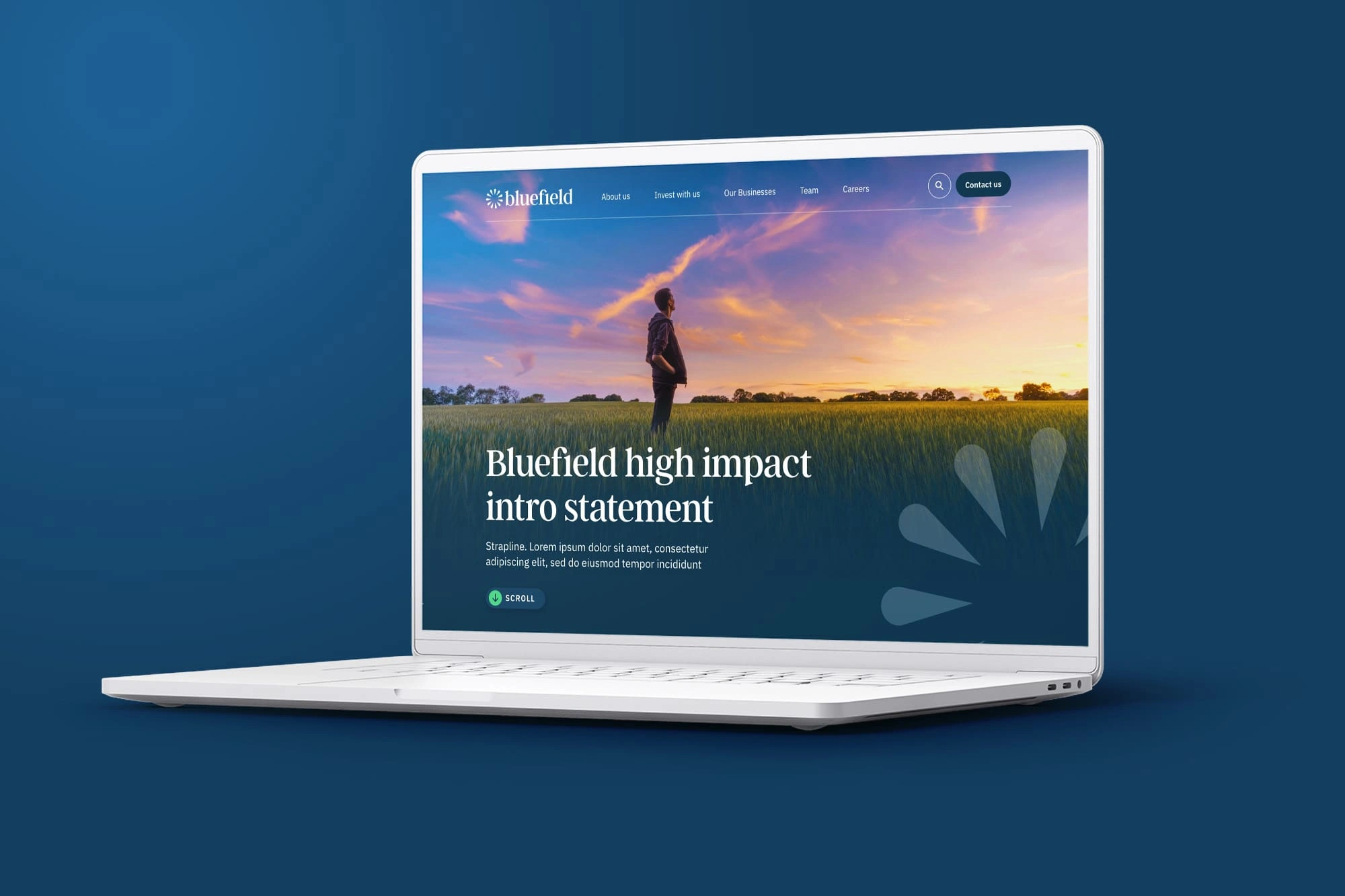
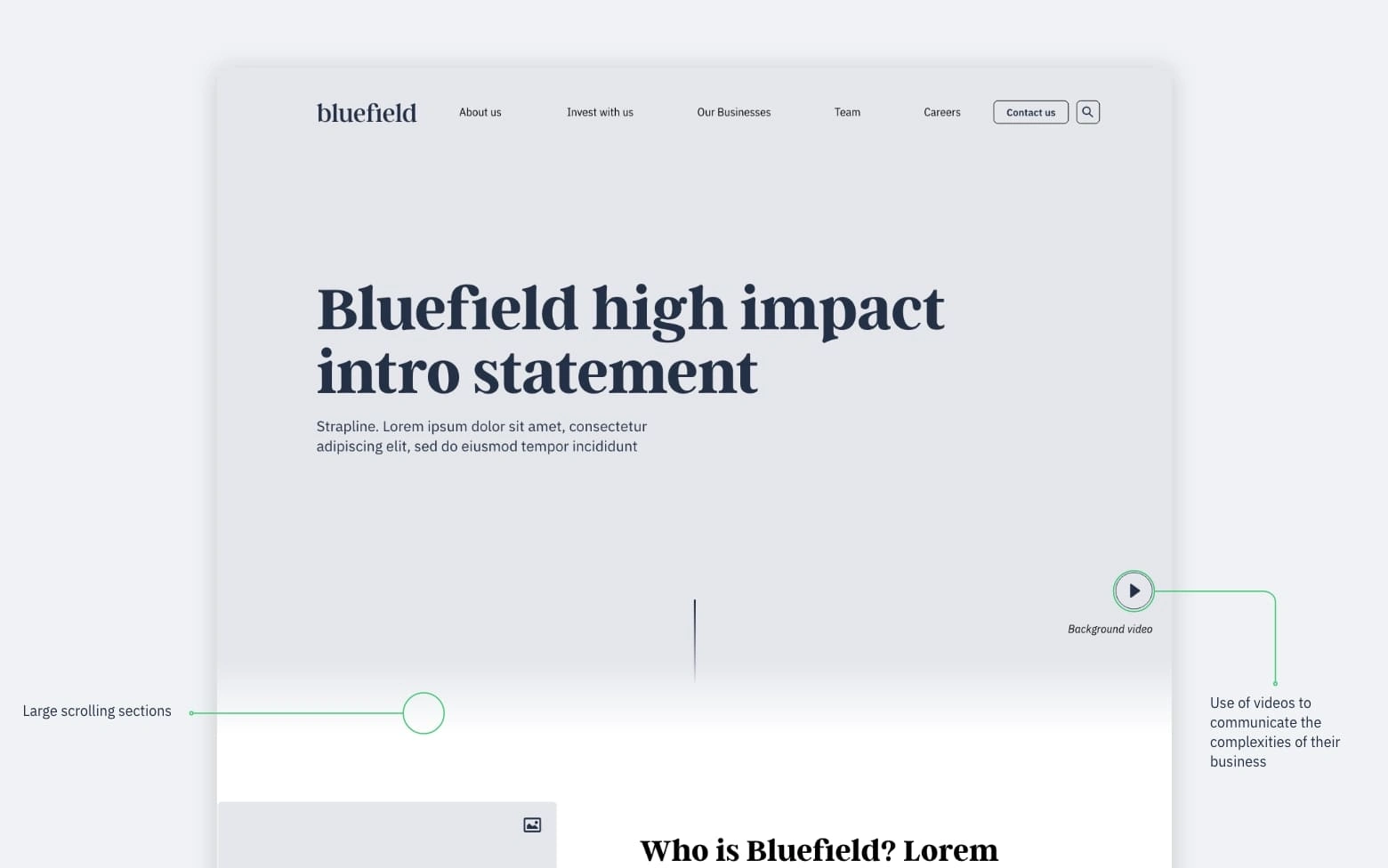
A bold homepage with large scrolling sections to visually introduce the business model and mission statement. We used progressive disclosure to slowly provide more detail without overwhelming the user.
Homepage wireframe
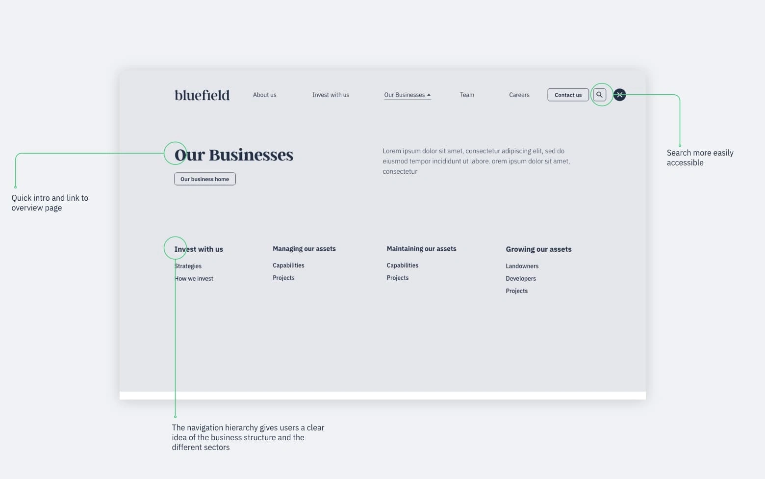
Navigation wireframe
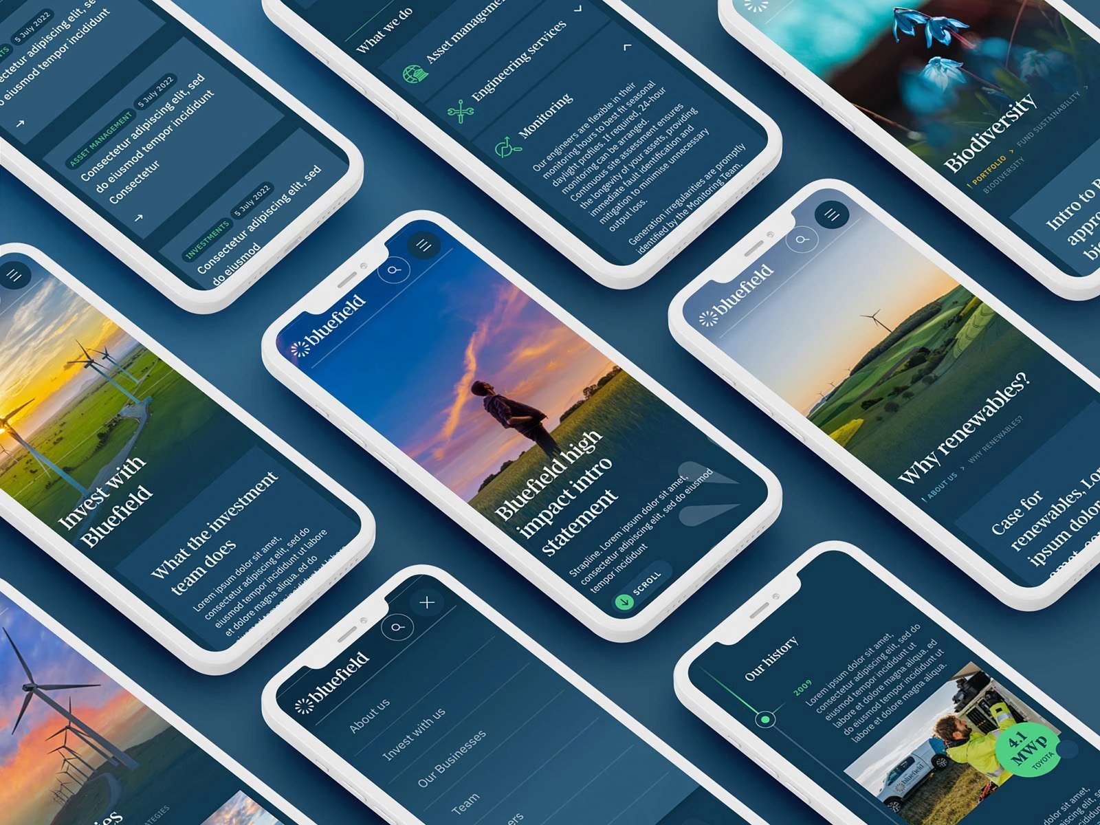
Refreshed Visual Design
Building on existing brand guidelines, we produced a website and design system that was bold, progressive and cohesive - ultimately giving more clarity to their customers. We re-enforced their overall theme of changing energy for the better by utilising long gradients and key images of sunrises/sunsets. By introducing some vivid, highlight colours and refining the typography we were able to make key messages more impactful. A fresh image library and a set of adaptable design modules were created to help Bluefield create future content that maintains creativity and consistency.
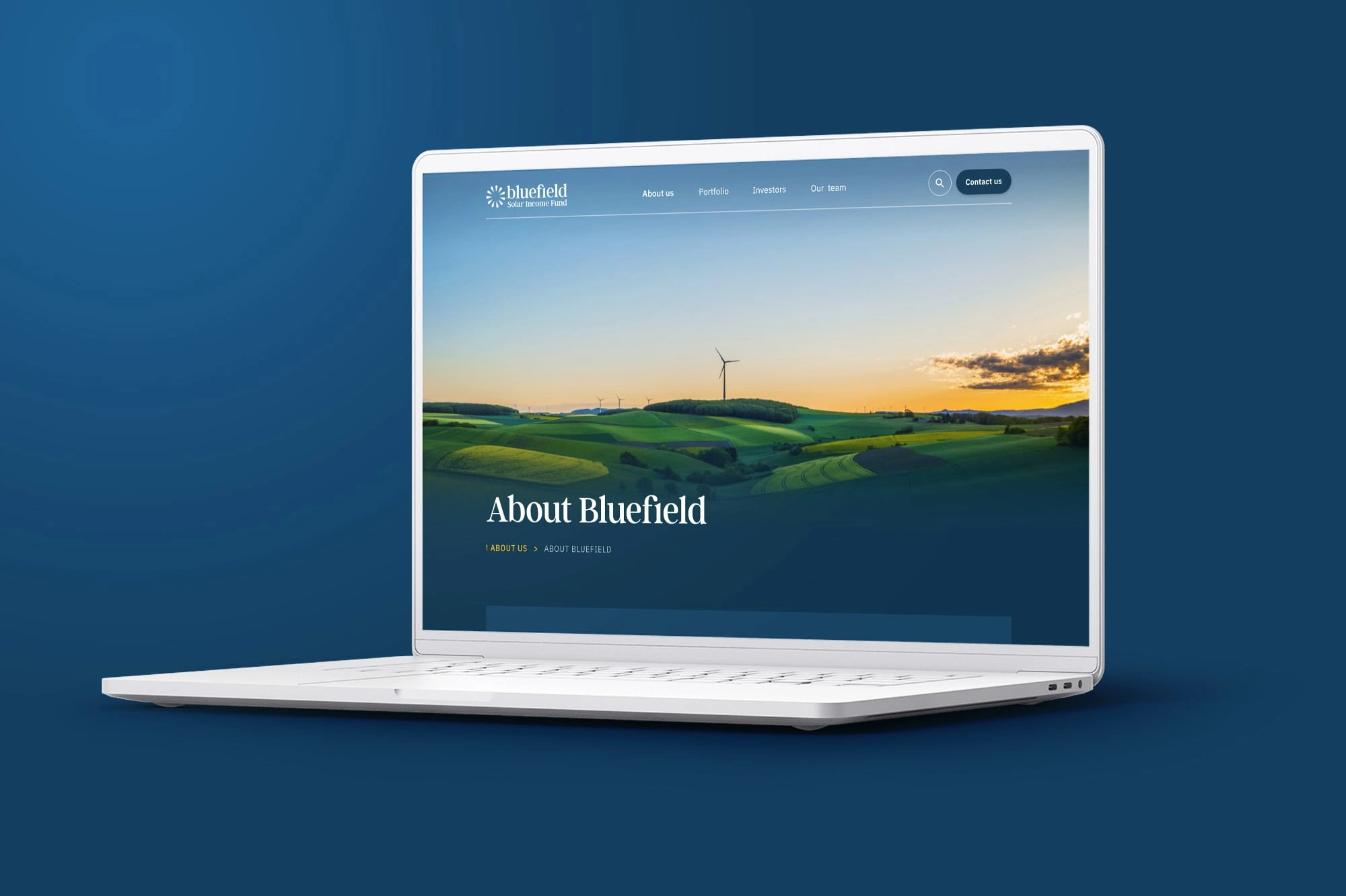
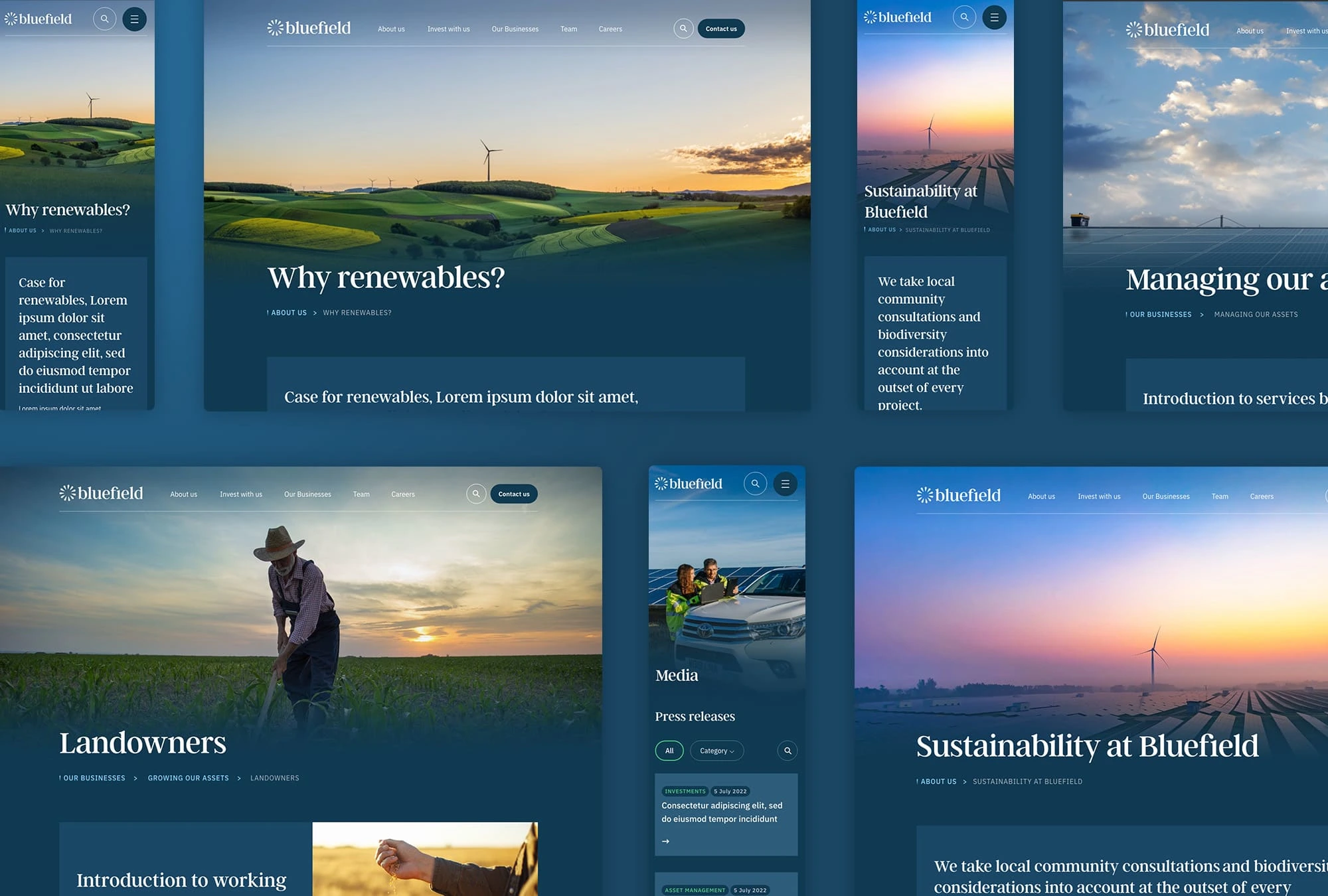
Heros & Imagery
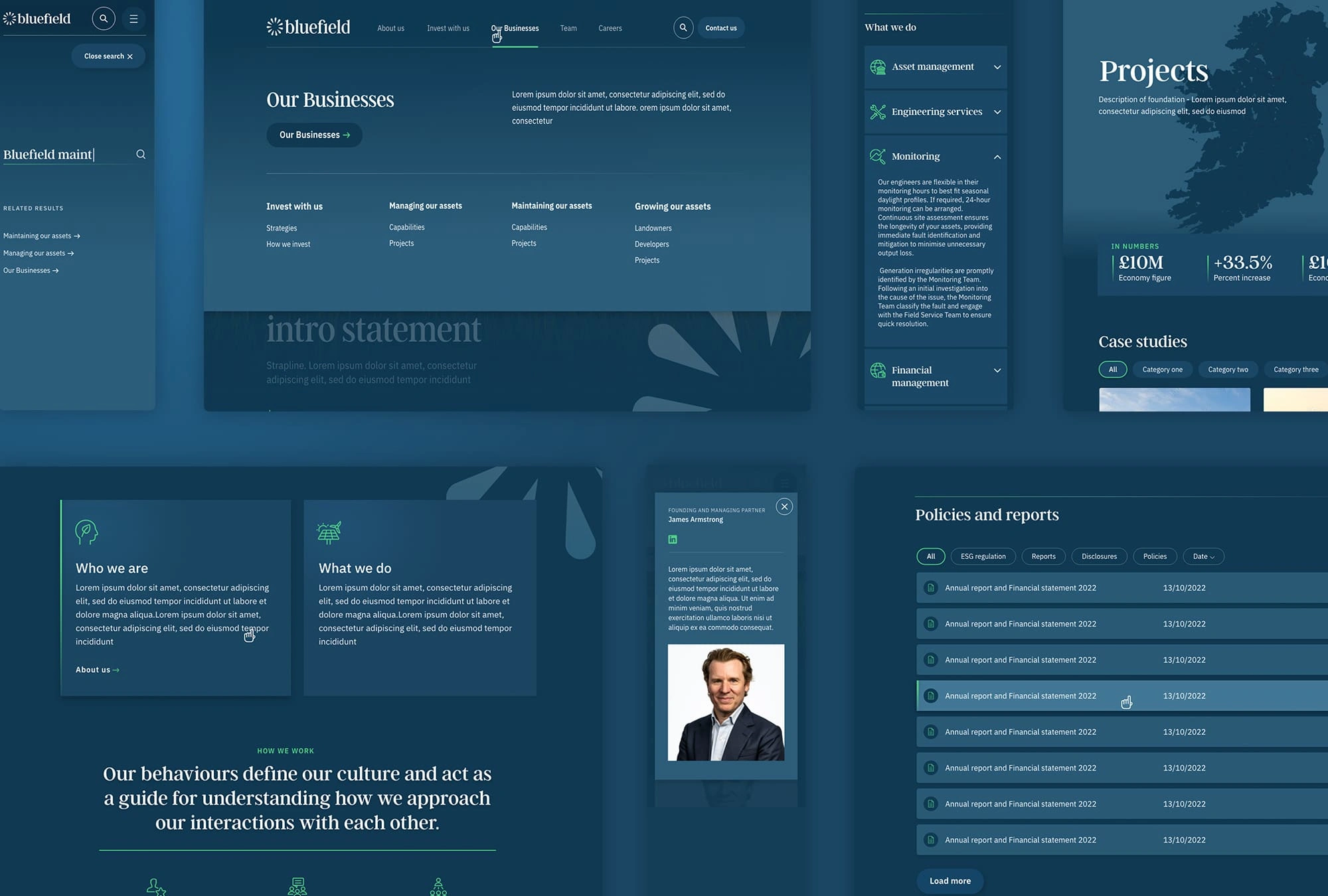
Navigation & common modules
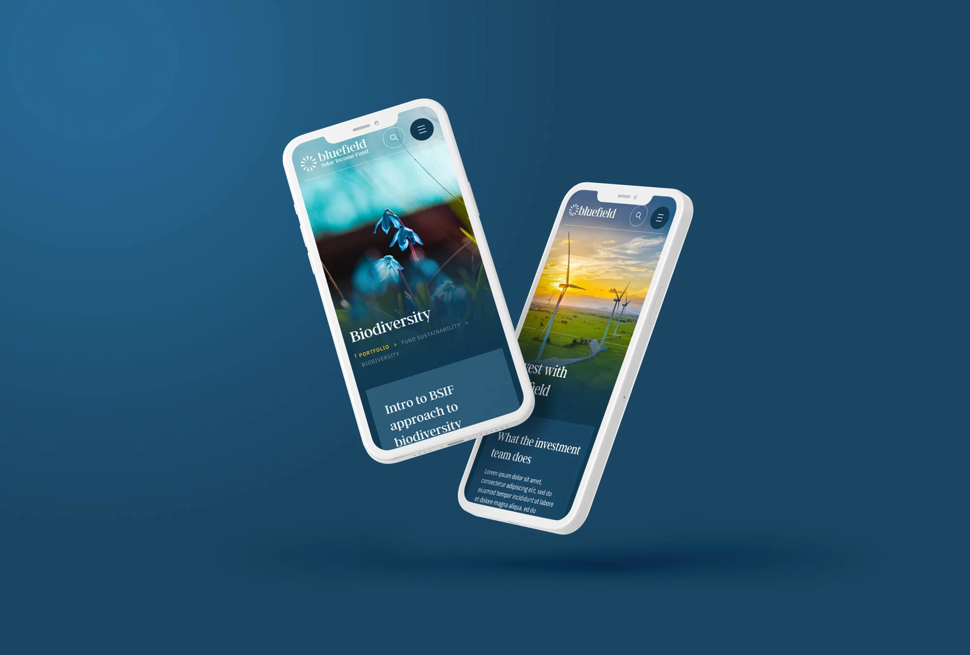
Mobile Designs
Like this project
Posted Apr 28, 2025
Working at White Marble, we delivered a website that was bold, progressive and cohesive - ultimately giving more clarity and engaging new customers.
Likes
0
Views
4
Timeline
Feb 28, 2023 - Apr 28, 2023