Quai Digital Website Redesign: Boosting Leads and Credibility
Harry Graham
The Challenge
Quai digital is a white-label digital savings platform and their website felt dated and overly corporate, struggling to reflect their growth and innovation in fintech. The goal was to reposition the brand with a confident, modern web experience that built trust while showcasing expertise.
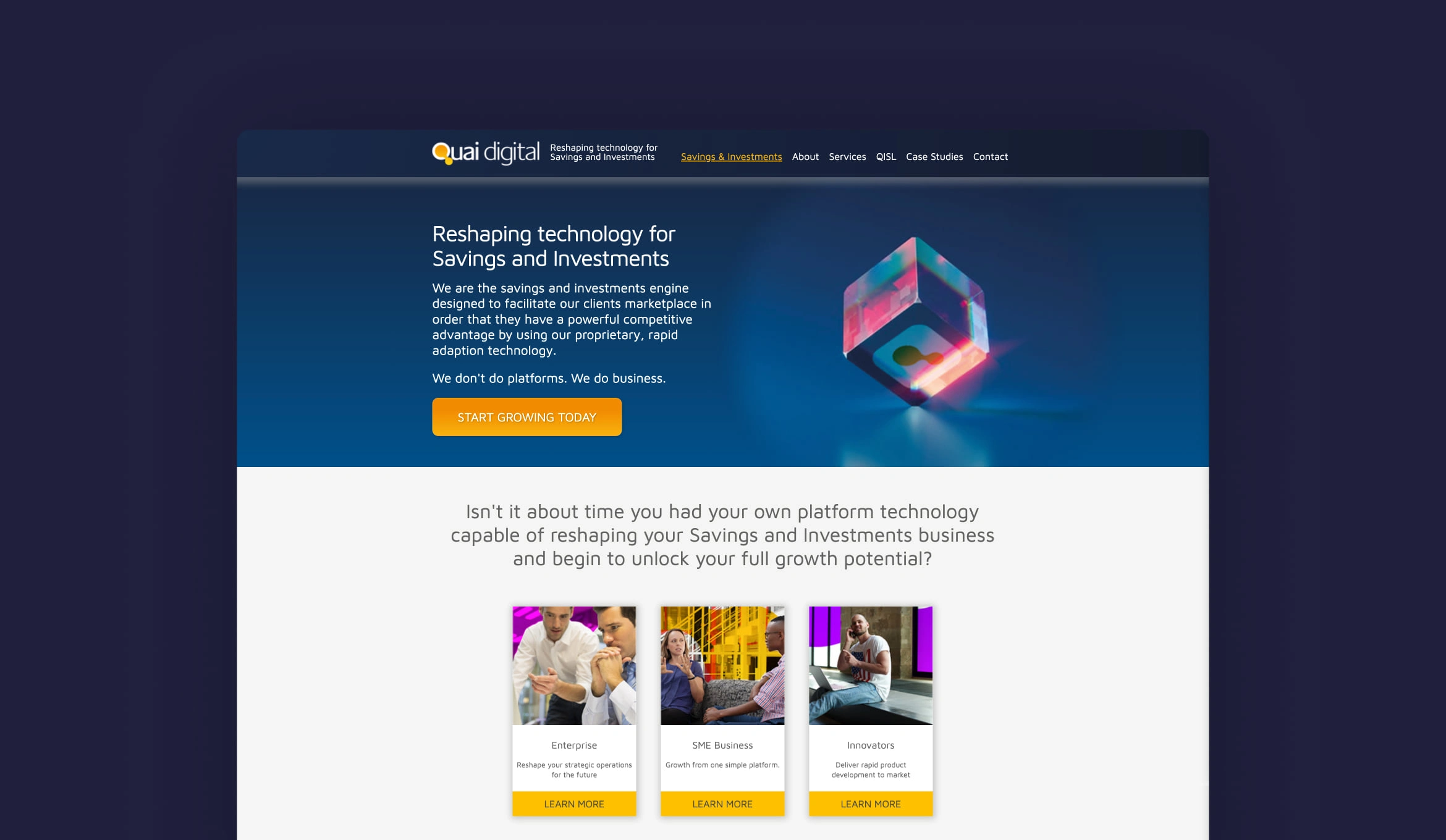
The previous website
Main Goals
01. Provide information
Highlight and detail the range of products and services offered by Quai Digital.
02. Demonstrate credentials
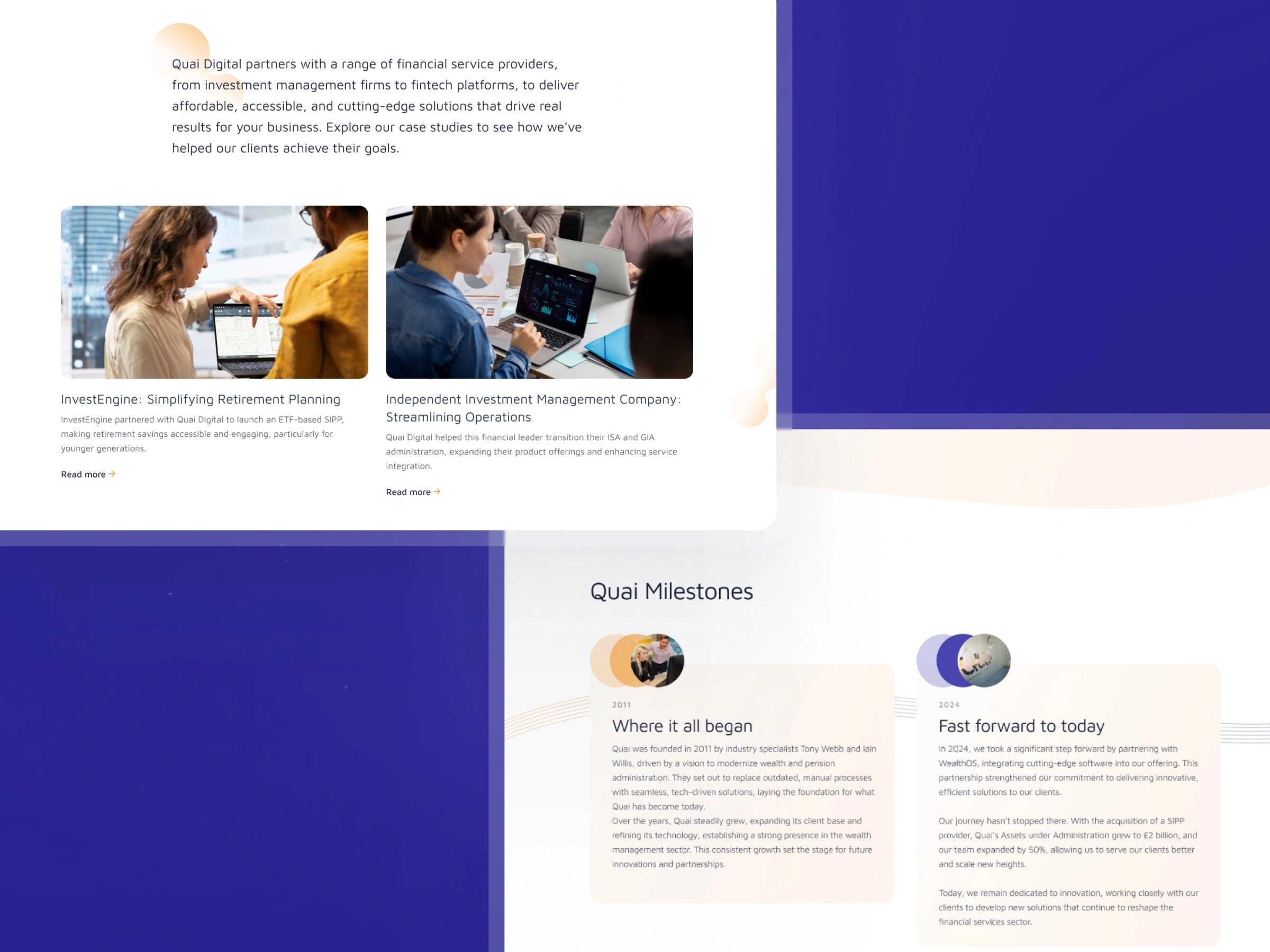
Showcase client testimonials, case studies, certifications, and industry awards to build credibility.
03. Generate inbound leads
Implement strategies and tools to convert website visitors into potential leads through contact forms, downloadable content, and calls-to-action.
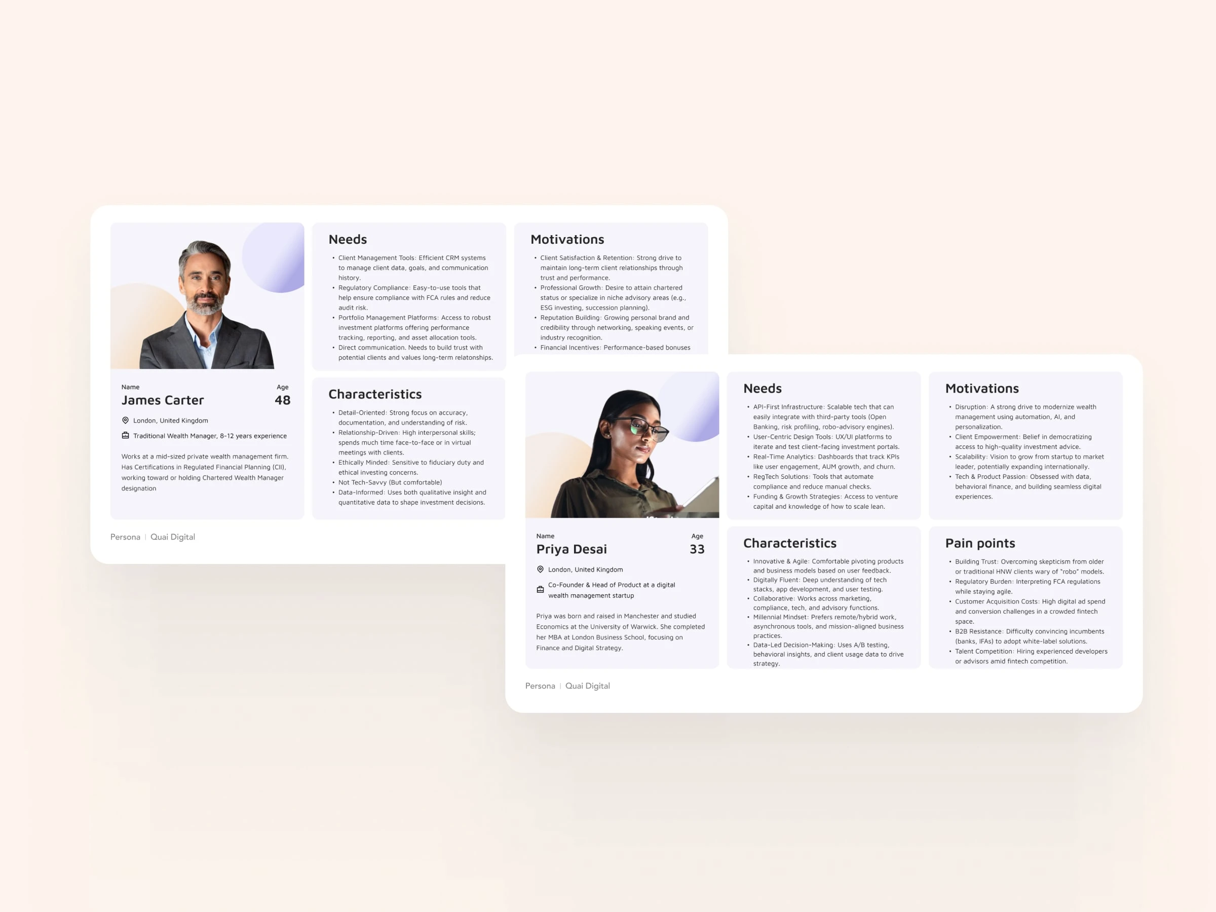
Research: Personas
Imagery
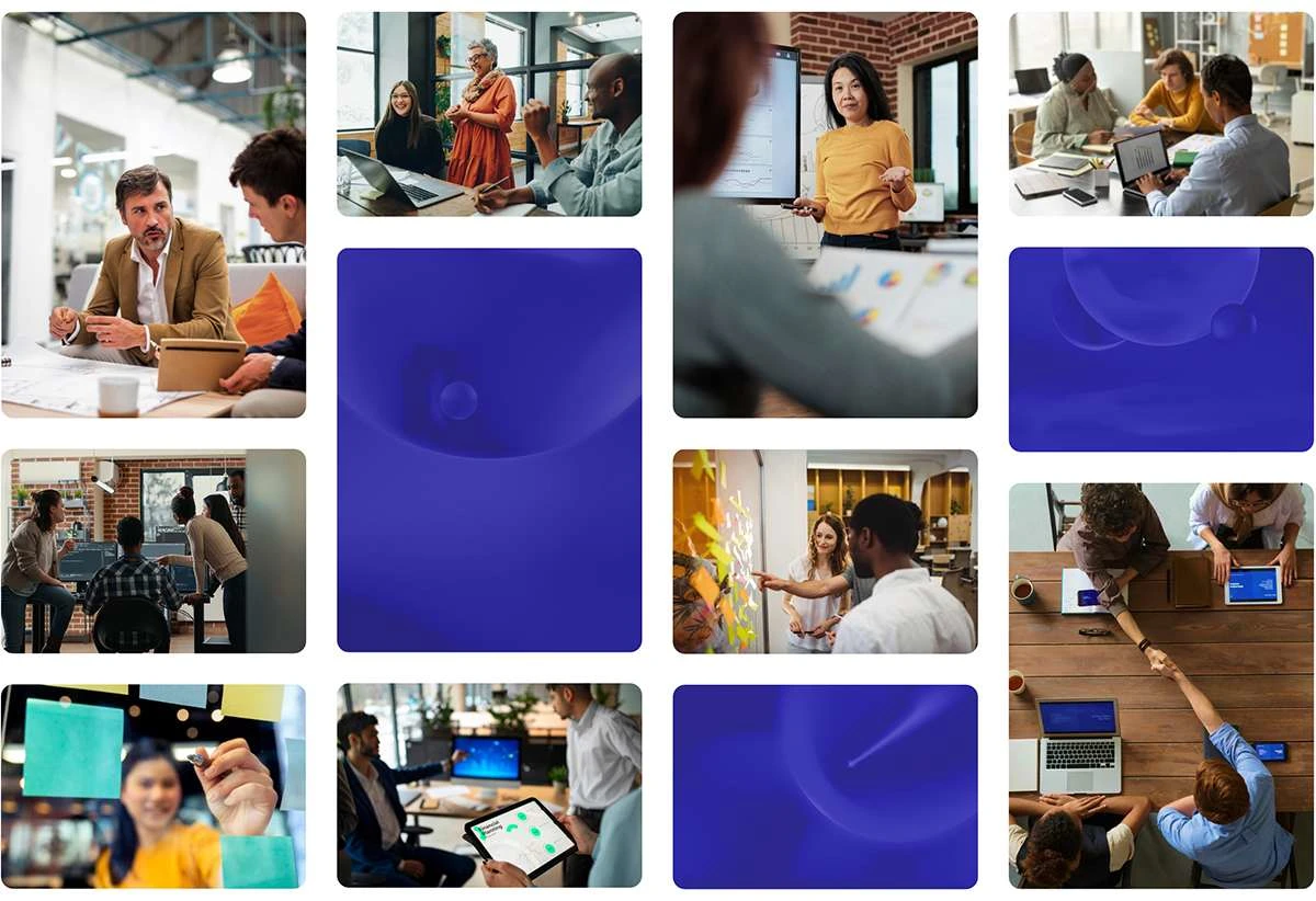
To help set Quai apart from it's competitors, I defined a human-focused photographic style featuring positive, modern workplaces to convey their values of innovation, collaboration and client-centricity.
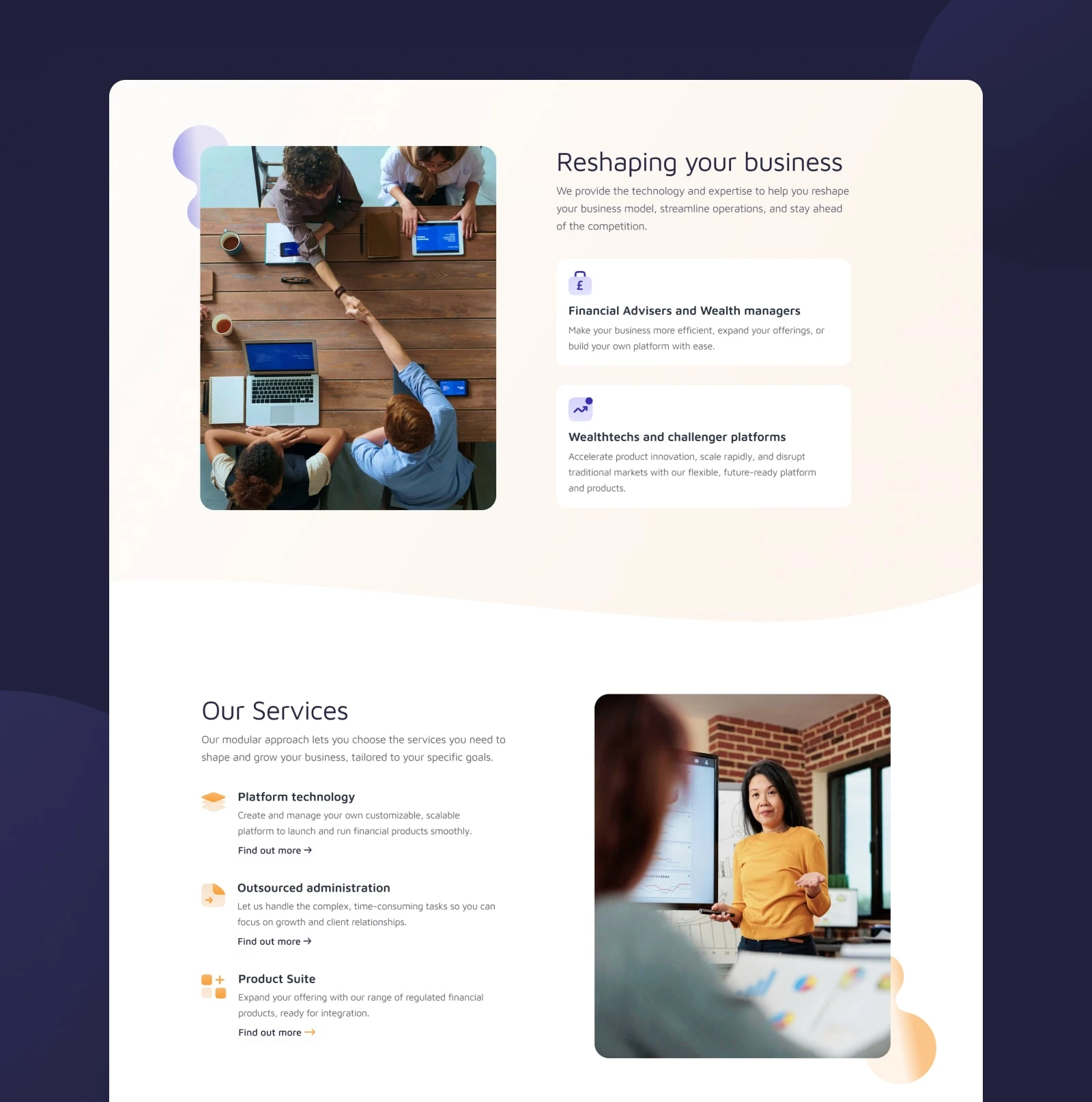
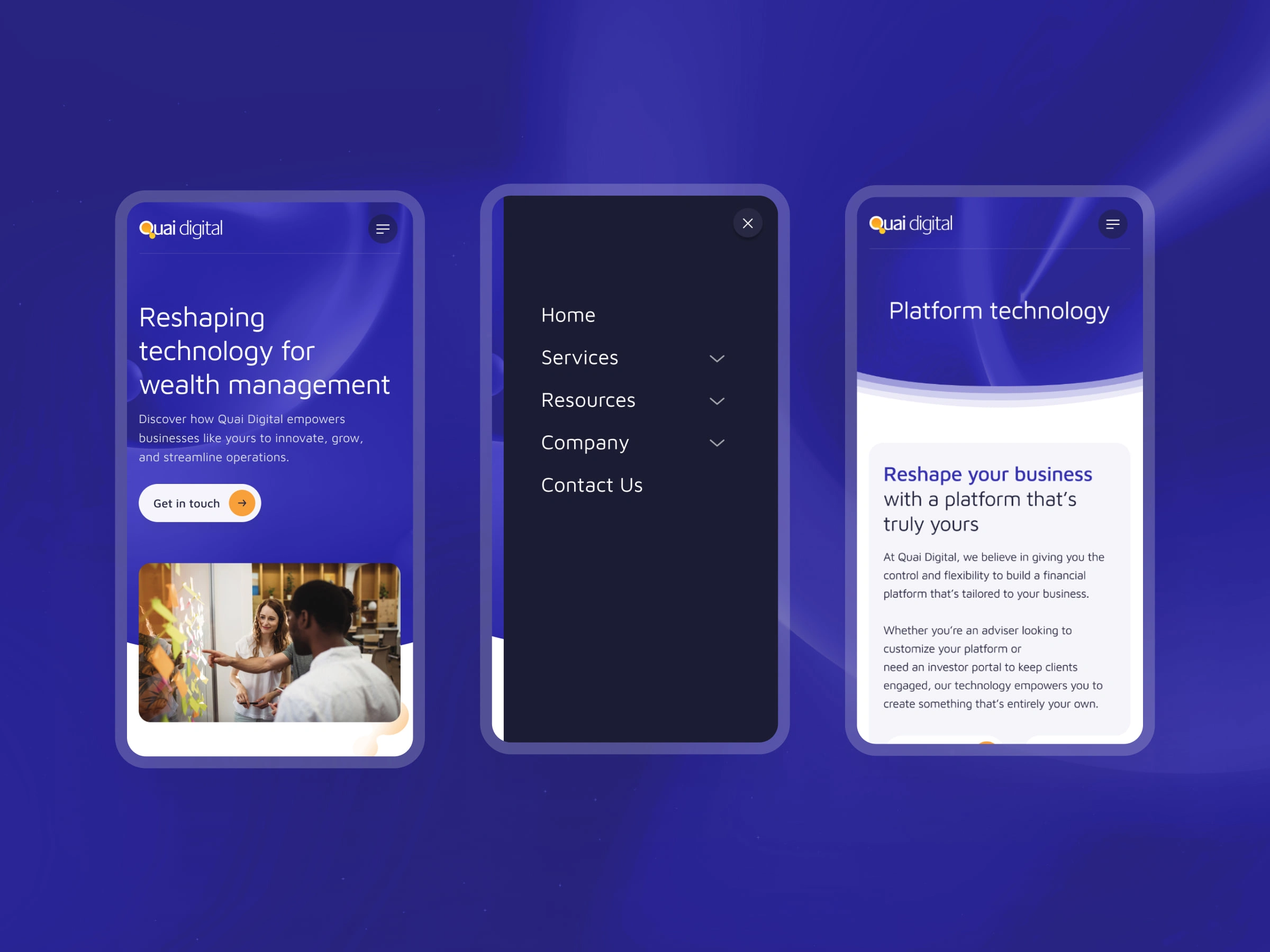
A clear structure that is easy to scan
For the key pages, the layout followed common patterns (such as F-patterns and zig-zag) that helped user's easily scan the page for an overview. By keeping the content minimal on these pages we could guide the user to key cta's and help generate new leads.
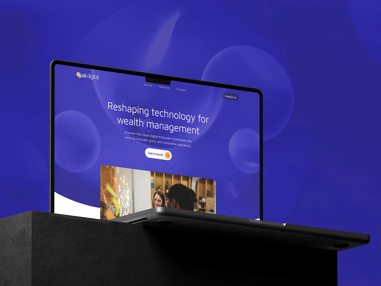
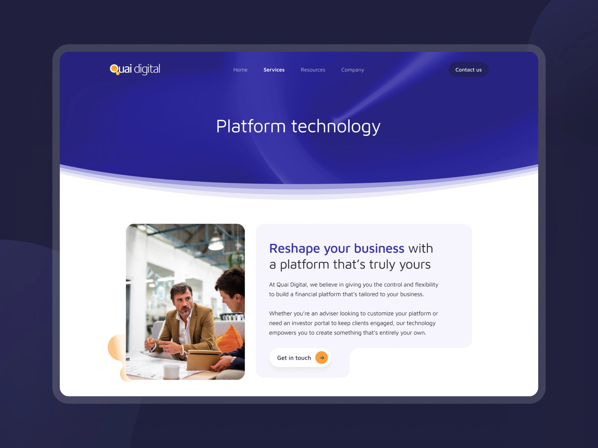
Showing innovation through fluidity
To help Quai connect with Wealth Management Challengers, the website’s visual design leaned into a theme of innovation. Drawing inspiration from the bubbles in their logo—often symbolic of ideas—I created a series of dynamic header images featuring fluid, shifting forms that suggest movement and adaptability. This concept carried through the site with flexible text modules, translucent dividers, soft rounded corners, and subtle motion, all working together to reinforce a sense of forward-thinking.
Impact
Delivered a refreshed, cohesive digital identity that strengthened market perception and improved user engagement.
The new site combined clarity, structure, and a sense of innovation — helping Quai stand out to wealth management challengers and convert more leads through a confident, human-first design system.
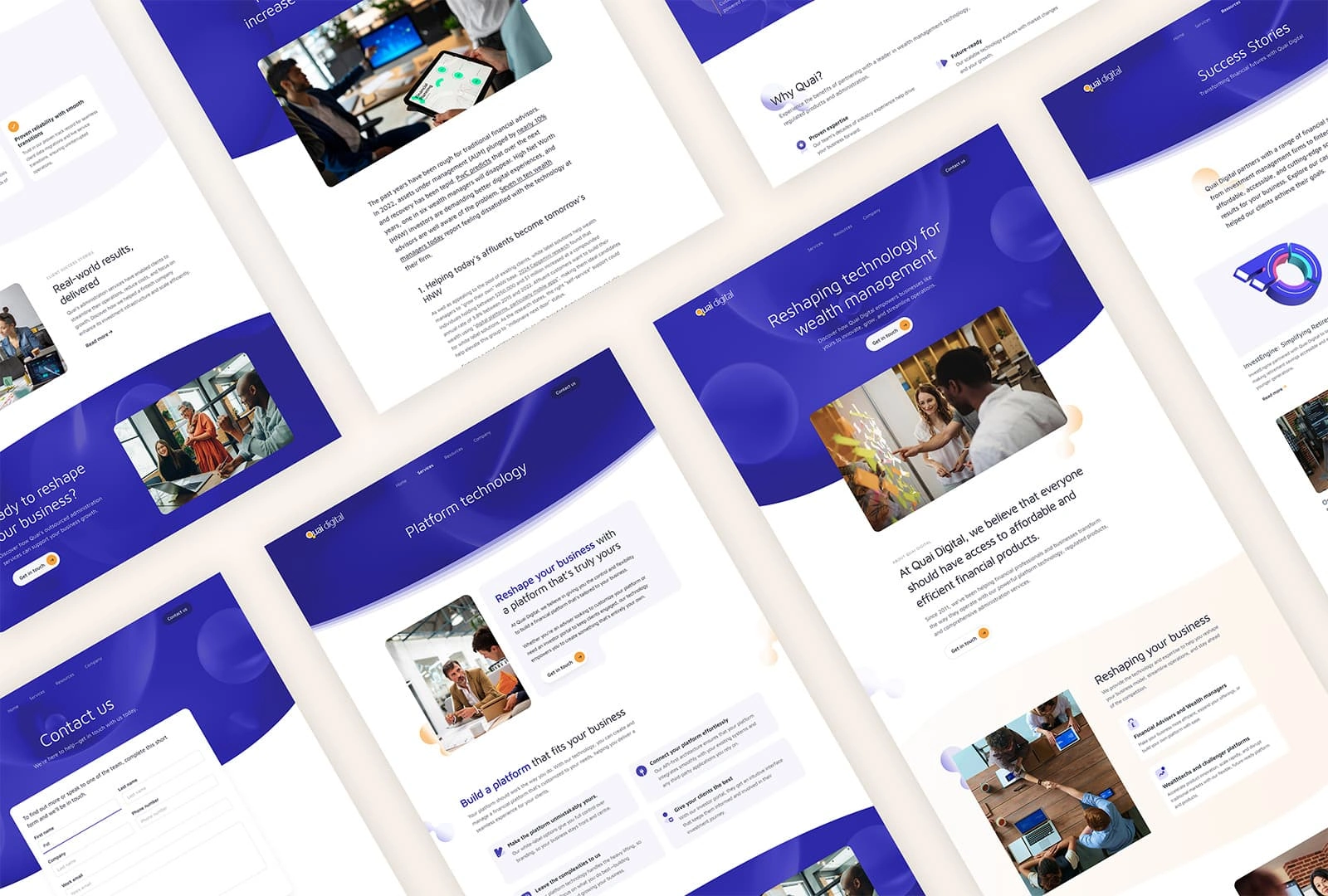
Desktop page designs
Like this project
Posted May 15, 2025
A redesign highlighting Quai’s focus on clients and innovation, helping them connect with new markets—with simple navigation and clear CTAs that boost leads.
Likes
0
Views
16
Timeline
Jul 1, 2024 - Jul 31, 2025