Streamlined Finance Dashboard for a Modern, Clearer UX
Harry Graham
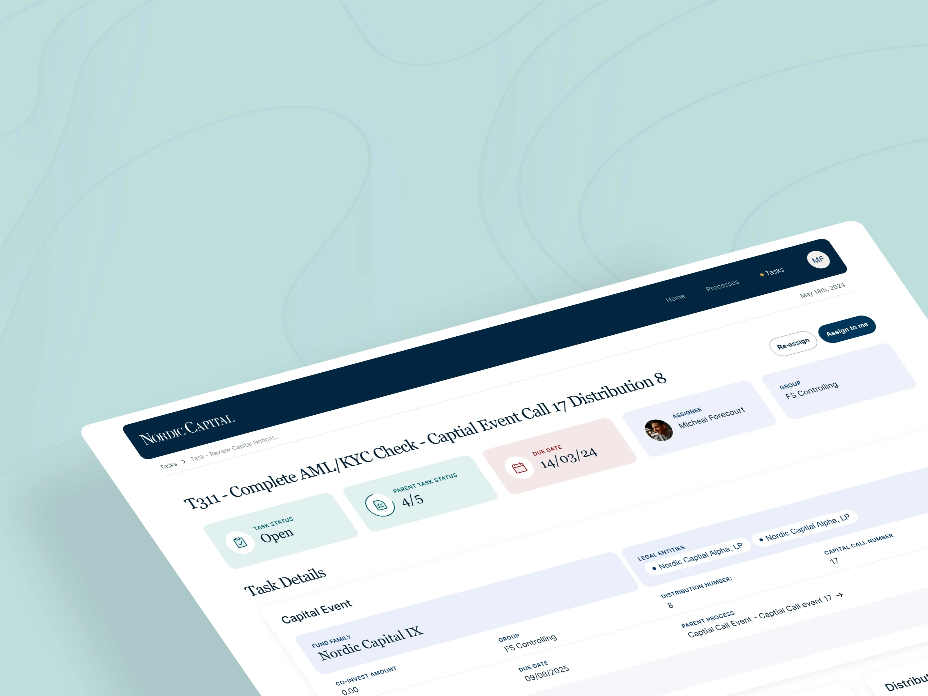
Dashboard Design for Nordic Capital
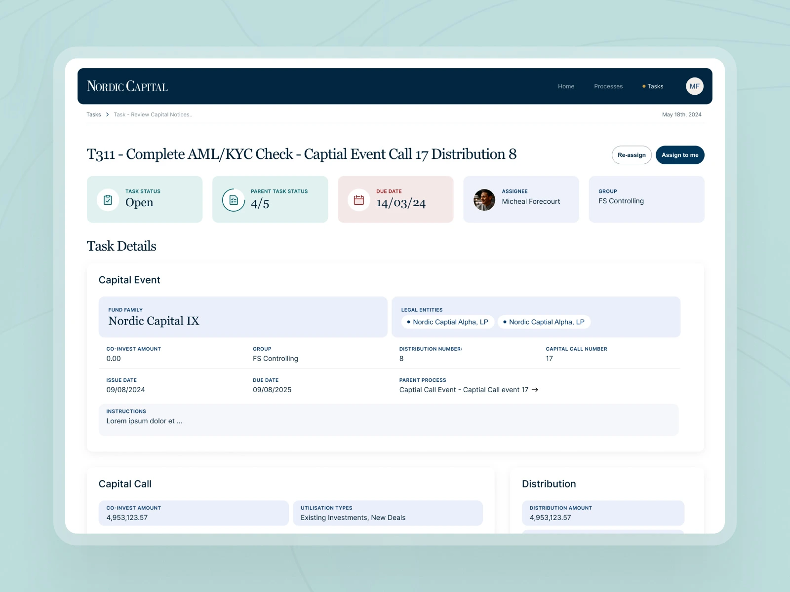
This short agency project focused on improving a data-heavy, visually overwhelming dashboard. To make the interface more intuitive and user-friendly, I restructured the information architecture and introduced clearer content groupings. Subtle colour tints and distinct typographic styles improved scanability while giving the brand a fresher, more modern look.
Like this project
Posted Aug 7, 2025
Redesigned a cluttered dashboard with clearer structure, improved hierarchy, and fresh visuals for a more intuitive, modern user experience.
Likes
0
Views
7
Timeline
Mar 3, 2025 - Mar 11, 2025