UX Redesign for PGIM Client Onboarding Portal
Harry Graham
Overview
PGIM recently built a portal to onboard its clients and complete important forms. After noticing a low completion rate, PGIM asked White Marble to perform a UX review and refine the interface.
Main Goals
01. Improve overall usability
Analyse current user pain points and perform review of the current user journeys to suggest possible improvements
02. Refine navigation
As the onboarding experience is complex and involves multiple steps, intuitive navigation and clear progess feedback is essential to ensure the user can complete their tasks.
03. Increase form completion rates
Employ best UI/UX practices to simplify the forms, reduce the overwhelm and help users feel in control.
Usability review of existing portal
Usability Review
To begin with, we performed a ux review and observed feedback from testing the client performed. Here's what we discovered:
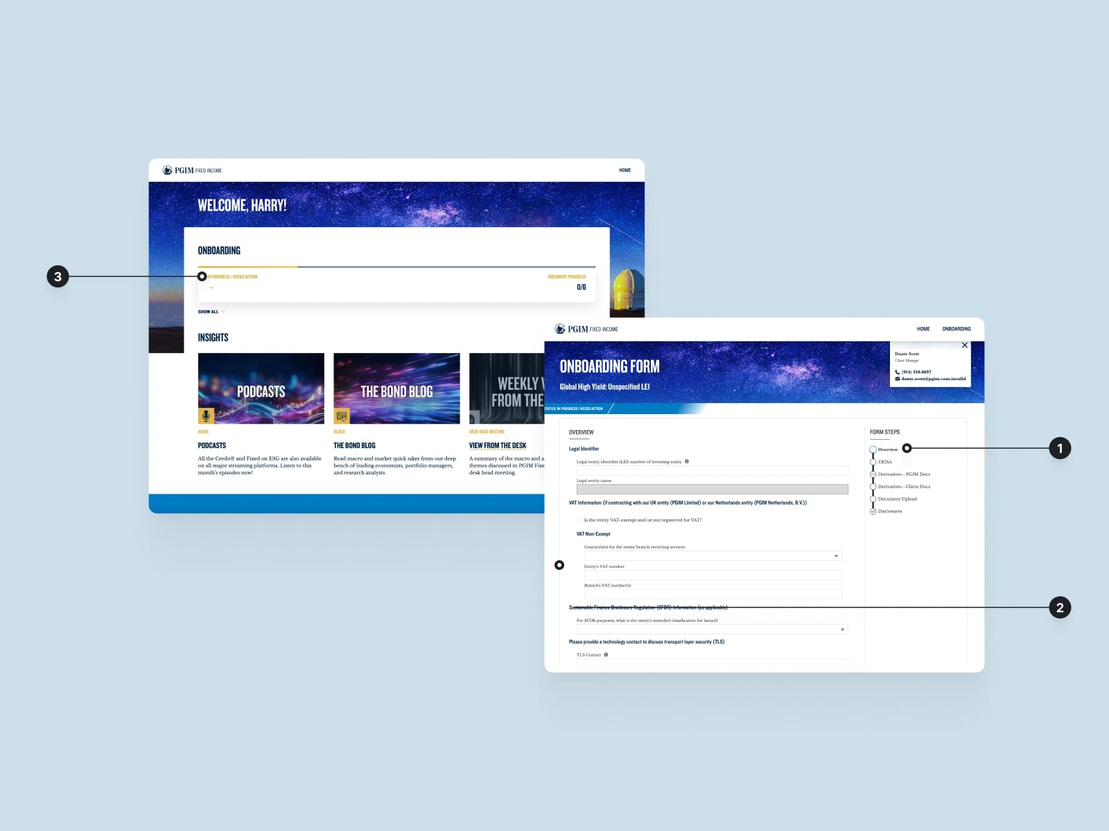
The user struggled to get a clear idea of their overall progress and the progress bar in the form journey was confusing. We also found that many users had long gaps between using the portal and would often struggle to remember where they were at.
The interface had a lack of hierarchy, consistency and spacing- making the pages harder to scan and increasing the cognitive load for users.
There's no helpful feedback and help- meaning when users get stuck, they get frustrated and drop out.
Some fonts and colours were inaccessible and not easily readable by a large group of users.
Forms were longs wall of fields which could be daunting and visually overwhelming for users.
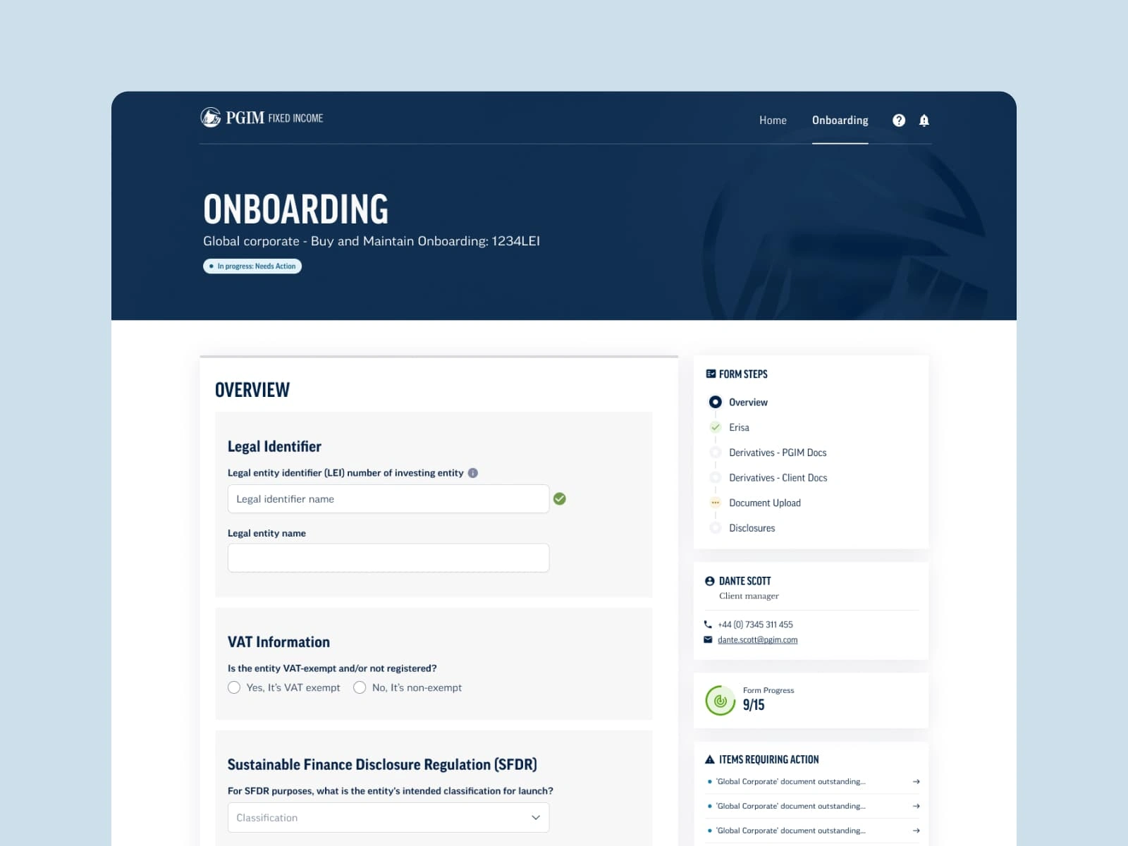
Simplified forms
To get started, I defined the visual style and UI elements- ensuring a design system that had clarity, flexibility and consistency with their brand guidelines. The majority of pain points came from the forms- so my focus was to simplify these forms to help make them more comprehendible and less daunting for the user. To do this, my design:
Visually grouped sections of the form- breaking it up can help reduce cognitive load and make the form appear more manageable
Improved the structure and use of space. Introducing a second column helped users find secondary information and help more quickly.
Added inline validation to fields and a help section so that users know what to do if they get stuck
Improved clarity of form steps with colour coding, to give a quicker idea of progress and task length
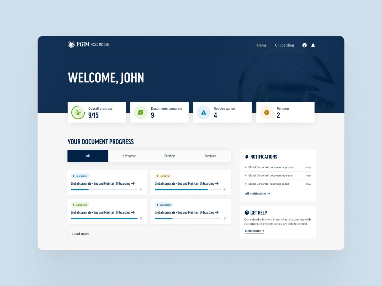
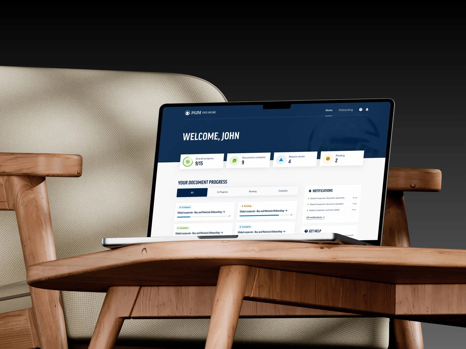
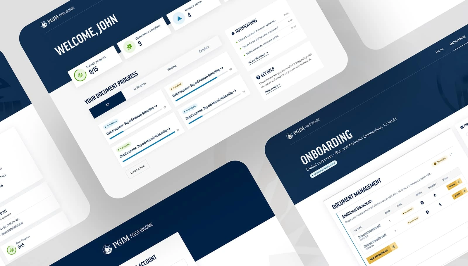
A clearer overview
To give the landing page a clearer overview and be more helpful, I suggested:
Adding some overview cards, to give a summary of progress. For the user’s that have not logged in a while, this can help give a quick visual summary and jog their memory.
Removing the photo and simplifying the header. This helps focus on the content, ensures accessibility and helps with readability of the titles
Adding tabs, to help when there might be lots of documents, so users can easily narrow down these results.
Making some small improvements to the progress cards, using colour coded status tags to easily differentiate and prioritise these tasks.
Bringing in a notifications box- so users can get a quick update and easily navigate to any important tasks.
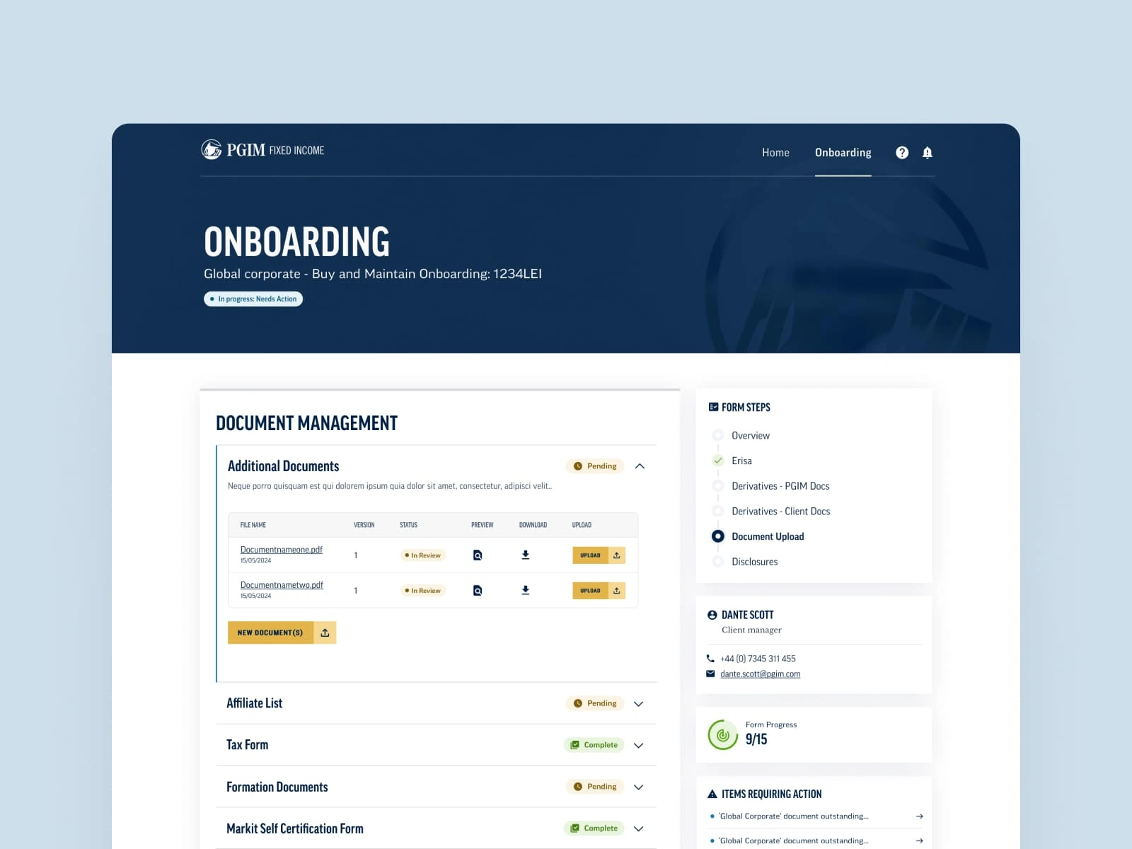
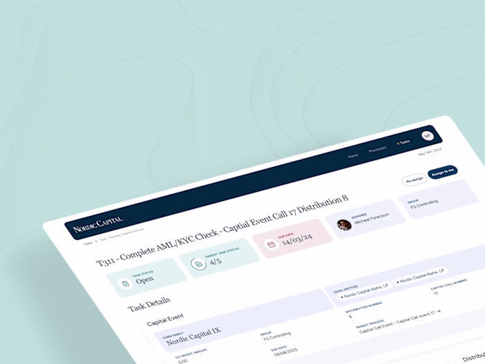
Document management
Previously, the document management page had several tales in a long list which was visually busy and difficult for users to find the document caregory. Our design made this process easier by:
Containing tables in easily scannable accordions to reduce the long list and help users quickly locate what they’re looking for. Users can drill down and see the details without getting overwhelmed.
I introduced more hierarchy into the Document tables by switching two primary cta's to icon buttons. This helped focus attention on the primary cta of 'upload'.
Helped improve readability by adding more whitespace to the tables, and these don’t get to cramped on smaller screens
To help users easily identify important documents, I added tags to easily see the status.
Impact
Happier clients
After the update, there were less contacts to support and customers gave a more positive reviews in the feedback form.
Higher completion rate
Although the client didn't share the exact data, the onboarding completion rate improved significantly and the time on the task was reduced.
An adaptive design system.
Spending the time to define a well thought out design system and using auto-layout for flexible components meant the client could save time and ensure consistency on future portals/dashboards.
Reflections & next steps
Take a step back and look at the bigger picture
There were complex areas of the onboarding where taking a step back and evaluating the user journey could've saved time later in the project. A big learning on this project was to trust my instincts, to question the project scope and clearly communicate the wider impacts of decisions.
Stakeholder empathy
Empathising and understanding the needs of stakeholders is powerful to help projects move forward positively.
Adding tooltips for help with context
Another feature that didn't make the final designs was tooltips for a smart tour of the product. These are a great way to show users key features in a contextual and engaging way.
Like this project
Posted May 15, 2025
Conducted UX review and refined PGIM's client onboarding portal to improve usability and completion rates.
Likes
0
Views
16