Health Product Store Mobile App Case Study

Abdul Qadeer


The Challenge
Health and wellness product apps face a unique design challenge: they need to feel trustworthy and scientific while also being warm and approachable. Most health product stores online look either too clinical (white backgrounds, tiny text, supplement-facts tables) or too gimmicky (neon colors, before-after photos, countdown timers). Neither builds the kind of trust that makes someone comfortable putting a new product into their body.
This project focused on designing a health product store app that balances credibility with approachability. The goal: make shopping for wellness products feel informed, safe, and enjoyable.
Design Approach
The design process started in Figma, where every screen was crafted to build product confidence through visual design and clear information architecture.
Key design decisions:
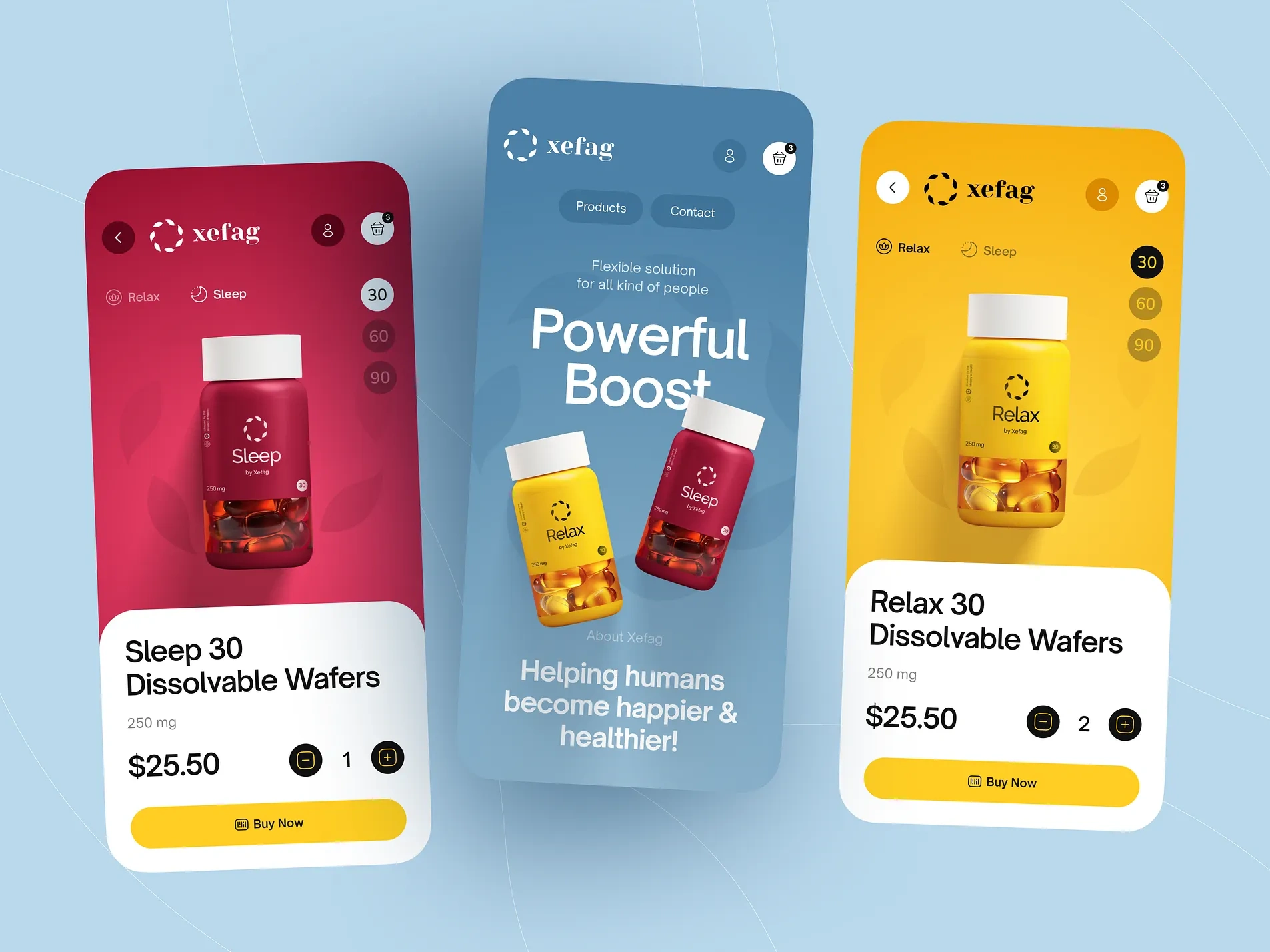
Product-specific color coding. Each product category gets its own color identity: calming blues for sleep products, energetic greens for vitality, warm purples for relaxation. The color system helps users navigate intuitively and creates strong visual associations between products and their benefits.
Benefit-first product presentation. Product cards lead with the primary benefit ("Better Sleep," "Daily Calm," "Natural Energy") rather than product names or SKU numbers. Users shop by outcome, not by ingredient list. The benefit is the headline; the product details follow.
Clear ingredient transparency. Each product page shows a complete ingredient list with plain-language explanations of what each ingredient does and why it's included. No proprietary blends, no hidden formulas. Transparency builds trust in a market plagued by skepticism.
Usage instructions with visual guides. Step-by-step usage instructions with illustrations showing how to take each product (dissolvable wafers, capsules, drops). Dosage, timing, and combination recommendations are clear and visual, not buried in fine print.
Customer reviews with health context. Reviews include the reviewer's health goal and how long they've used the product. "I've been using Sleep for 3 months and fall asleep 20 minutes faster" is more useful than "Great product, 5 stars."
Simple, confident CTAs. Large "Buy Now" buttons with clear pricing and subscription options. One-time purchase and subscribe-and-save are presented side by side with the savings clearly shown. No pressure tactics, just clear value.
Warm, premium visual design. Rounded corners, soft gradients, and generous product photography on colored backgrounds. The design feels premium and health-conscious simultaneously. Every screen communicates care and quality.
Shopping Flow
The health product purchase journey builds confidence:
Browse by health goal or product category
Learn about ingredients and benefits on detailed product pages
Read contextual reviews from similar health goals
Choose one-time or subscription purchase
Checkout with saved details and delivery preferences
Each step educates and reassures before asking for commitment.
The Result
A fully designed health product store app built in Figma, focused on making wellness product shopping feel trustworthy and informed. The design serves health and wellness brands, supplement companies, and DTC health startups looking for a mobile app that converts health-conscious shoppers through transparent product information, benefit-driven navigation, and a warm, premium visual experience.
Like this project
Posted Jul 14, 2026
UI/UX design of a health and wellness product store mobile app featuring colorful product screens, intuitive navigation, and conversion-focused shopping flows.