AI-Powered Website Design Full Case Study

Abdul Qadeer


The Challenge
AI companies have a communication problem. Their technology is complex, but their websites need to be simple. Most AI startup sites fall into one of two traps: either they're so technical that only engineers understand them, or they're so vague that nobody understands what the product actually does. The sweet spot, explaining powerful AI capabilities in clear, compelling terms, is surprisingly hard to hit.
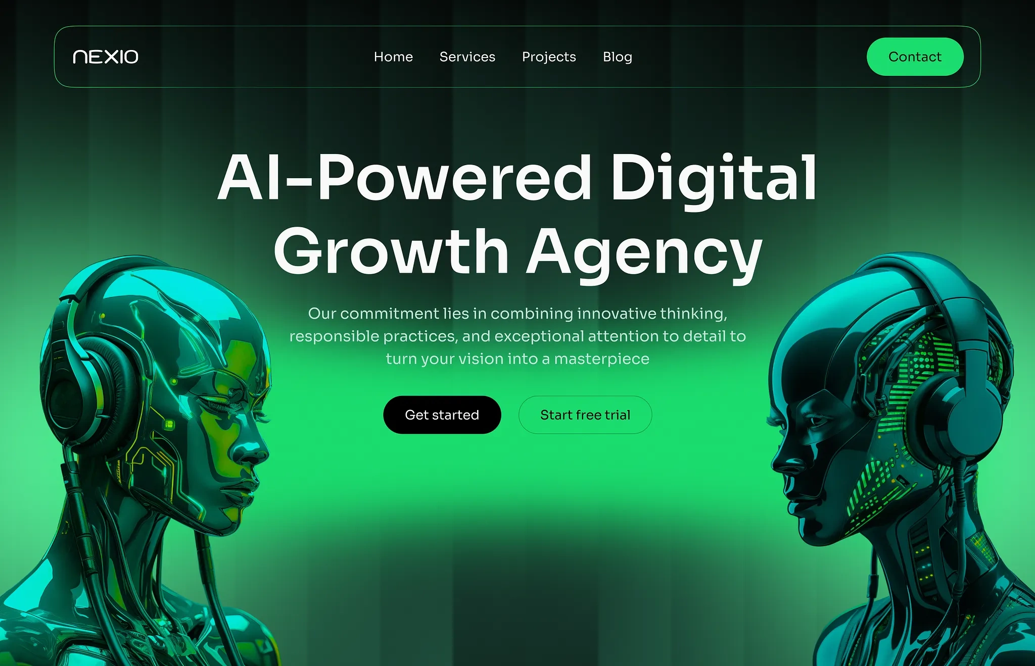
This project focused on designing an AI-powered SaaS website that makes complex technology feel accessible and exciting. The goal: visitors should understand what the product does, why it matters, and how to get started within 30 seconds of landing on the page.
Design Approach
The design process started in Figma, where every section was built to communicate capability without complexity.
Key design decisions:
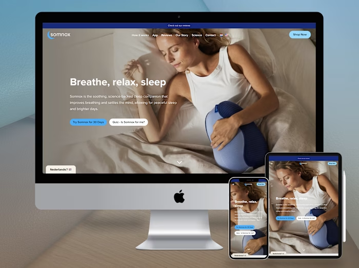
Hero section with instant clarity. A bold headline that states the product's core value proposition in one sentence. Supporting subtext explains the "how" in plain language. A prominent CTA button and a product screenshot or animation give visitors immediate context. No jargon, no buzzwords, no "leveraging synergies."
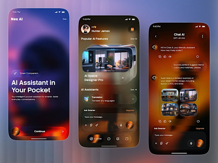
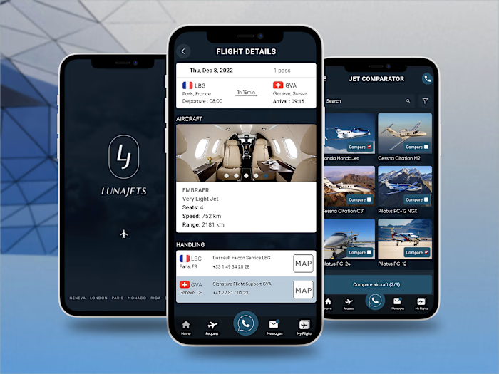
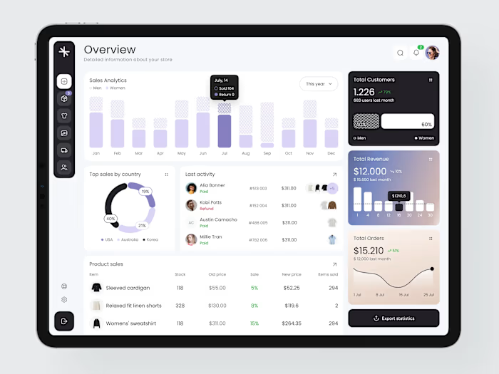
Feature showcase with visual demonstrations. Each feature gets its own section with a clear title, concise description, and visual demonstration (screenshot, animation, or diagram). Features are organized by user benefit, not technical architecture. Users see what the AI does for them, not how it works internally.
Social proof integration. Client logos, testimonials with real names and photos, and usage statistics are woven throughout the page. Trust signals appear at decision points, not just in a dedicated testimonials section. The proof is contextual and relevant.
Pricing with clear tiers. A straightforward pricing table with feature comparisons across tiers. No hidden fees, no "contact sales" for basic information. A free tier or trial option reduces commitment anxiety. The pricing section answers every question a prospect would have before clicking "Start."
Interactive product demos. Embedded interactive elements that let visitors experience the AI without signing up. A mini-demo or playground section shows the product in action. Seeing is believing, especially for AI products where the output quality matters.
Futuristic visual identity. Dark backgrounds with gradient accents, glowing UI elements, and subtle particle animations. The visual language communicates innovation and technical sophistication without feeling cold. The design says "cutting-edge" through aesthetics, not through claiming it in copy.
Performance-optimized layout. Clean code structure, optimized images, and lazy loading ensure the site loads fast despite rich visuals. A slow AI website undermines the "we're a technology company" message.
Page Architecture
The landing page follows a proven conversion structure:
Hero: What it is and why it matters (5 seconds)
Features: What it does and how it helps (30 seconds)
Social proof: Who uses it and what they say (15 seconds)
Demo: See it in action (60 seconds)
Pricing: How much and what's included (15 seconds)
CTA: Start now (5 seconds)
Total time to conversion decision: under 2 minutes.
The Result
A fully designed AI SaaS website built in Figma, focused on translating complex AI capabilities into clear, compelling web experiences. The design serves AI startups, SaaS companies, and technology platforms looking for a website that converts technical innovation into business growth through clear messaging, visual demonstrations, and conversion-optimized page architecture.
Like this project
Posted Jul 14, 2026
UI/UX design and development of a modern AI-powered SaaS website with futuristic visuals, clear product messaging, and conversion-optimized landing pages.
Likes
0
Views
14