Retail POS Analytics Dashboard Case Study

Abdul Qadeer


The Challenge
E-commerce owners and retail managers drown in data spread across multiple platforms. Sales numbers live in Shopify, inventory in a spreadsheet, customer analytics in Google Analytics, and financial reports in QuickBooks. Getting a clear picture of business performance means logging into four different tools and mentally stitching the data together. By the time the picture is clear, the moment to act has passed.
This project focused on designing a unified POS analytics dashboard that puts every critical business metric on one screen. The goal: give store owners and managers the clarity to make faster, better decisions without switching between tools.
Design Approach
The design process started in Figma, where every component was built to surface actionable insights, not just raw numbers.
Key design decisions:
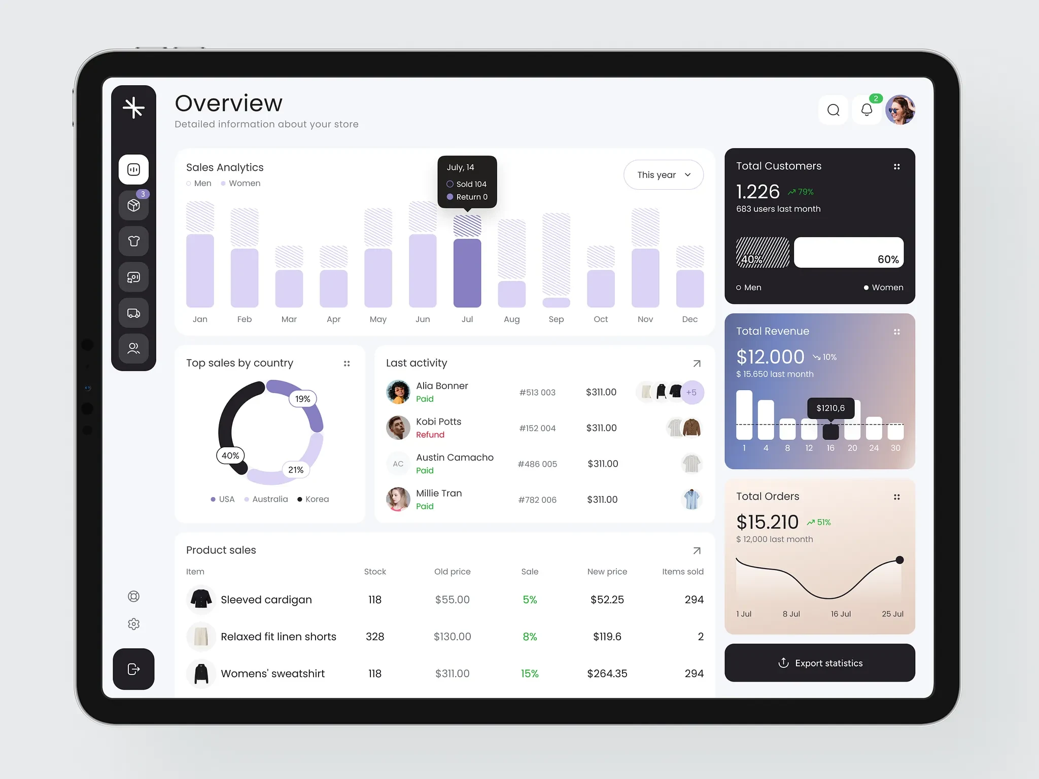
KPI cards at the top. Total revenue, total orders, customer count, and daily trends are visible immediately. Each card shows the current value with a comparison to the previous period (daily, weekly, monthly). Green or red indicators make performance direction obvious at a glance.
Monthly sales bar chart. A clear visualization of monthly sales broken down by category, gender demographics, and returns. Managers can spot seasonal patterns, identify top-performing segments, and track return rates without digging into spreadsheets.
Geographic sales overview. A country-by-country breakdown showing where revenue comes from. Useful for businesses with international customers to identify growth markets and allocate marketing spend.
Live transaction feed. A real-time list of recent transactions with mini product previews, customer names, amounts, and status. Managers see what's selling right now, not what sold last week.
Inventory management table. A summary view showing product names, stock levels, discount status, sold quantities, and revenue per item. Low-stock alerts and reorder suggestions are built into the table. No more surprise stockouts.
Sidebar navigation. Clean, icon-based sidebar with sections for Dashboard, Orders, Products, Customers, Analytics, and Settings. The sidebar collapses on smaller screens to maximize data display area.
Dark theme with data-friendly colors. A dark background reduces eye strain during long monitoring sessions and makes charts, graphs, and status indicators pop visually. Color coding is consistent: green for positive, red for negative, blue for neutral data points.
Dashboard Architecture
The dashboard is organized in a visual hierarchy:
Top row: High-level KPIs for instant health check
Middle section: Charts and visualizations for trend analysis
Bottom section: Detailed tables for operational decisions
Each section serves a different decision-making speed: glance, analyze, and act.
The Result
A fully designed retail POS analytics dashboard built in Figma, focused on consolidating fragmented e-commerce data into one actionable interface. The design serves e-commerce platforms, retail SaaS companies, and POS providers looking for a web dashboard that helps store owners monitor performance, manage inventory, and make data-driven decisions from a single screen.
Like this project
Posted Jul 14, 2026
UI/UX design of a retail POS analytics dashboard for e-commerce owners to monitor sales, inventory, customer data, and revenue trends in a single unified interface.
Likes
0
Views
26