E-Commerce Marketplace Mobile App Case Study

Abdul Qadeer


The Challenge
Most e-commerce apps feel like shrunken websites. They cram desktop layouts into mobile screens, bury products behind endless menus, and make checkout feel like filling out a tax form. The result: high bounce rates, abandoned carts, and frustrated shoppers who go back to browsing on their laptop.
This project focused on designing a mobile-first e-commerce marketplace that treats the phone as the primary shopping device, not an afterthought. Every interaction was designed for thumbs, not cursors.
Design Approach
The design process started in Figma, where every screen was optimized for mobile shopping behavior: quick browsing, impulse discovery, and frictionless checkout.
Key design decisions:
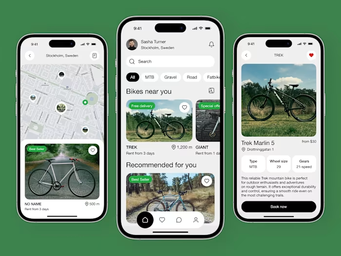
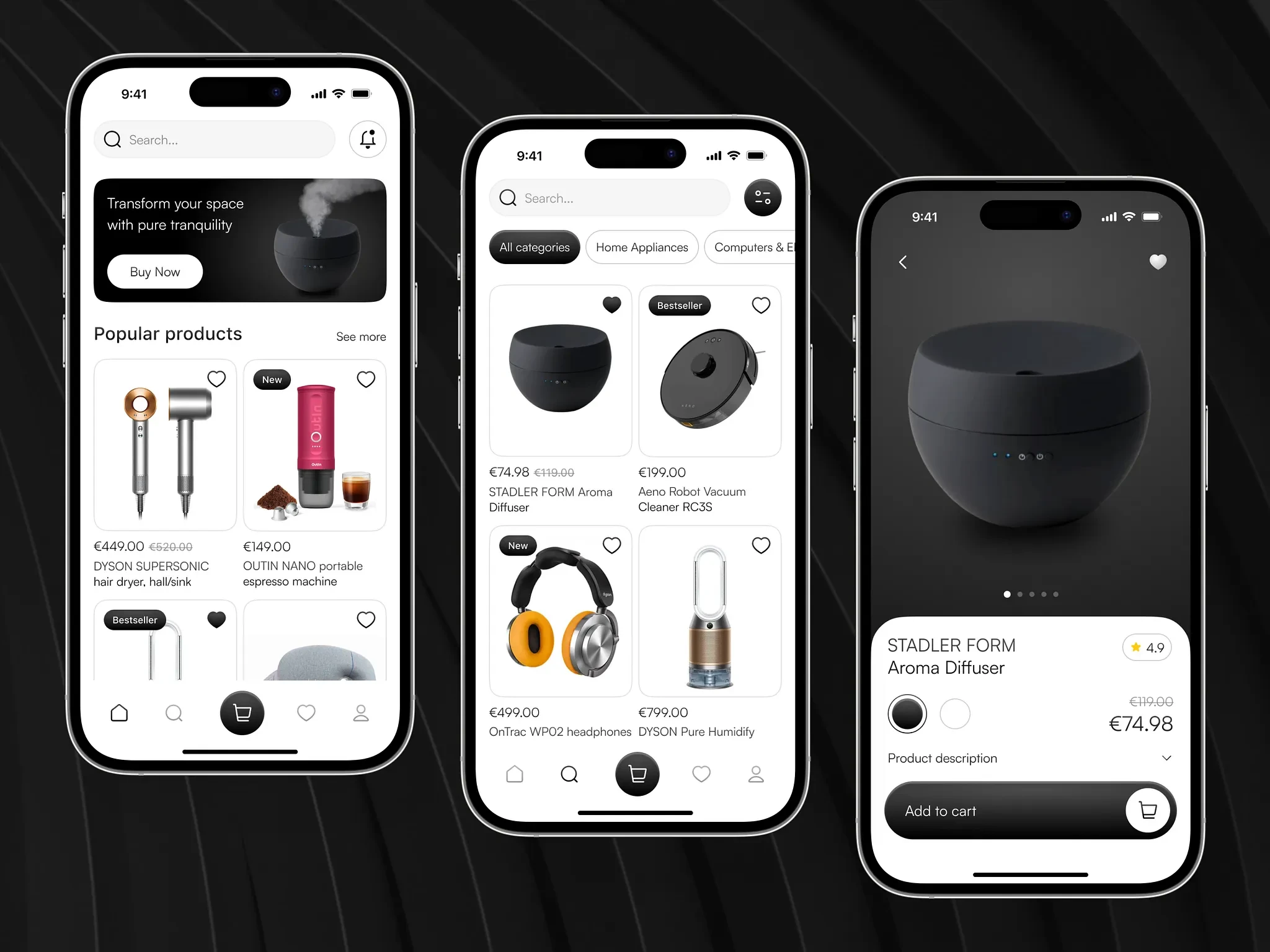
Visual-first home screen. A hero banner showcases featured promotions, followed by curated product collections and trending items. Users see products immediately, not categories or text-heavy navigation. The home screen is a storefront window, not a directory.
Smart product discovery. Category browsing, search with auto-suggestions, and personalized recommendations based on browsing history. Filter and sort options are accessible but don't dominate the screen. Users find products through multiple paths depending on their intent.
Rich product pages. Large product images with swipe galleries, clear pricing, size/color selectors, customer reviews with photos, and related product suggestions. Every product page answers the three questions shoppers ask: "What does it look like?", "How much?", and "Is it good?"
One-tap add to cart. Products can be added to cart without leaving the browsing flow. A persistent cart badge shows item count. The cart slides up as an overlay for quick review without losing browsing context.
Streamlined checkout. Saved addresses, saved payment methods, and order summary on a single screen. Guest checkout for new users with minimal required fields. The goal: purchase completion in under 30 seconds for returning customers.
Order tracking. Real-time order status with delivery timeline, carrier tracking integration, and push notifications for status changes. Users always know where their order is.
Clean, modern visual language. White backgrounds with product photography as the visual hero. Minimal UI chrome so products take center stage. Consistent card layouts create a scannable, magazine-like browsing experience.
Shopping Flow
The purchase journey is designed for speed:
Discover through home feed, search, or categories
Evaluate on rich product pages with reviews and images
Add to cart without leaving the browse flow
Checkout with saved details in under 30 seconds
Track delivery in real-time
Each step minimizes taps and maximizes product visibility.
The Result
A fully designed e-commerce marketplace app built in Figma, focused on mobile-first shopping that prioritizes product discovery and fast checkout. The design serves e-commerce startups, retail brands, and marketplace platforms looking for a mobile app that converts browsers into buyers through visual product presentation, intuitive navigation, and a frictionless purchase flow.
Like this project
Posted Jul 14, 2026
UI/UX design of a modern e-commerce marketplace mobile app with product discovery, detailed product pages, and a conversion-optimized shopping experience.
Likes
0
Views
20