Solace — Mental Wellness App Design

Hibye Studio


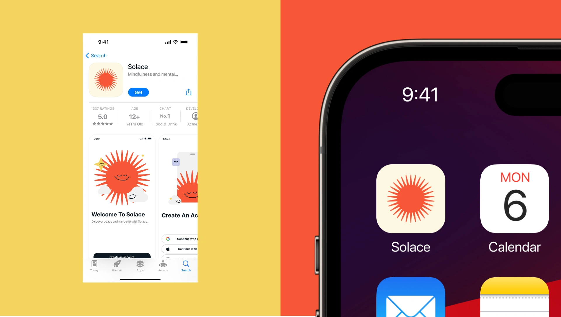
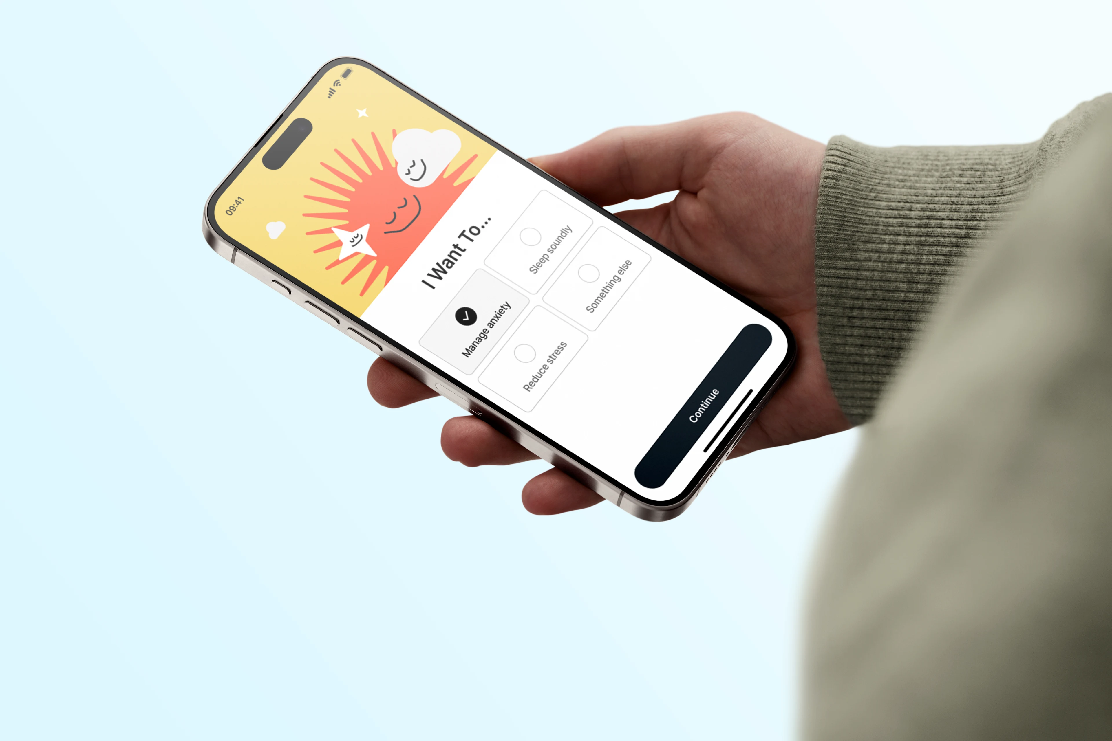
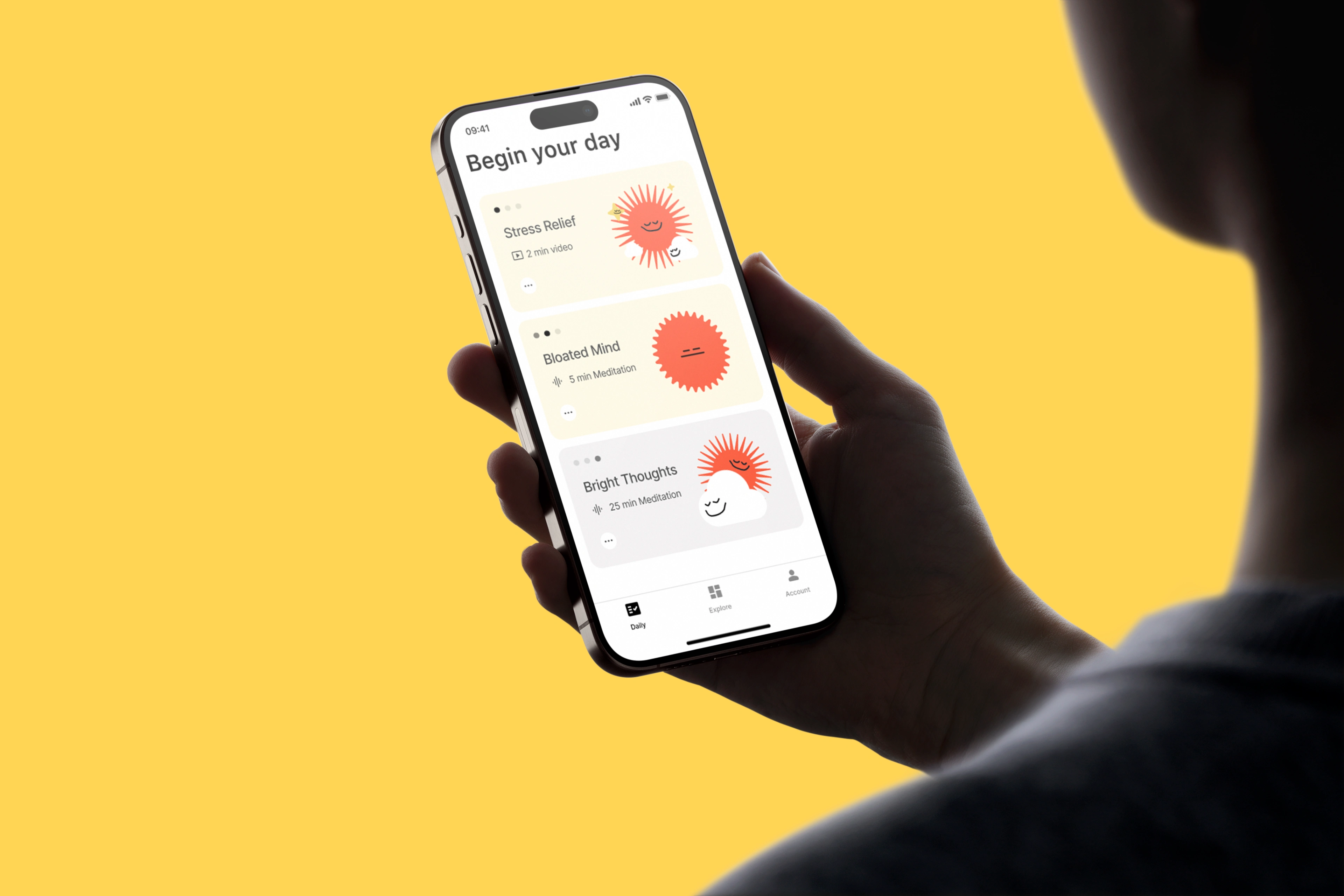
A mental wellness app concept designed around calm. Every screen, every interaction, every color choice was made to lower the user's stress level, not add to it.
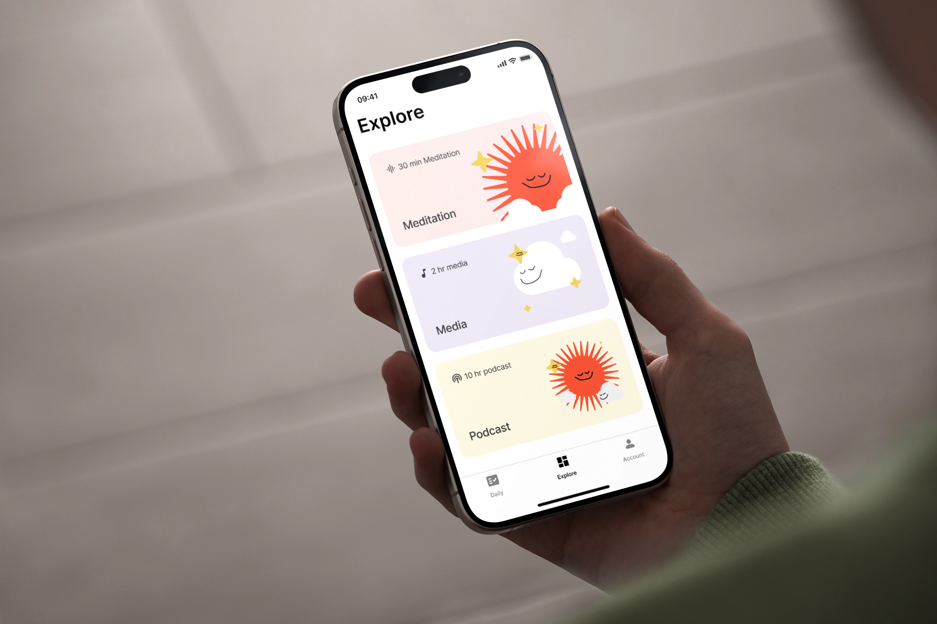
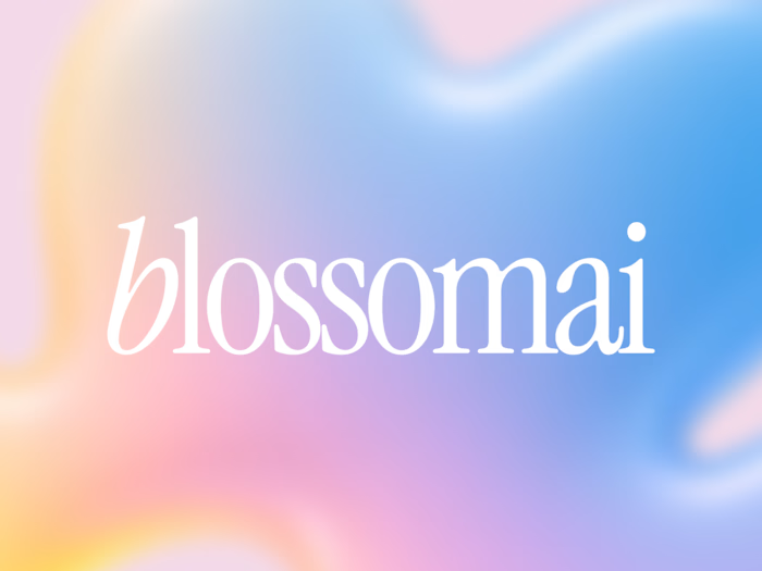
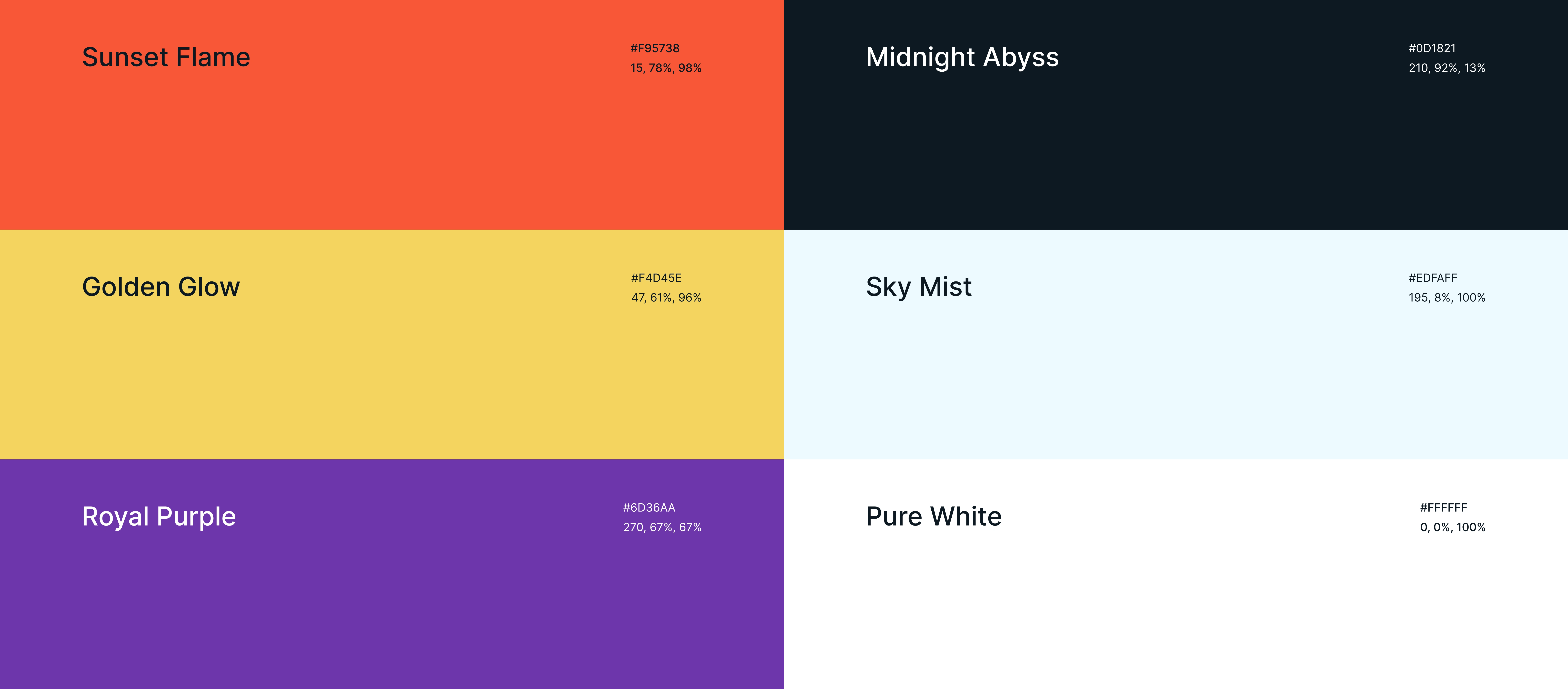
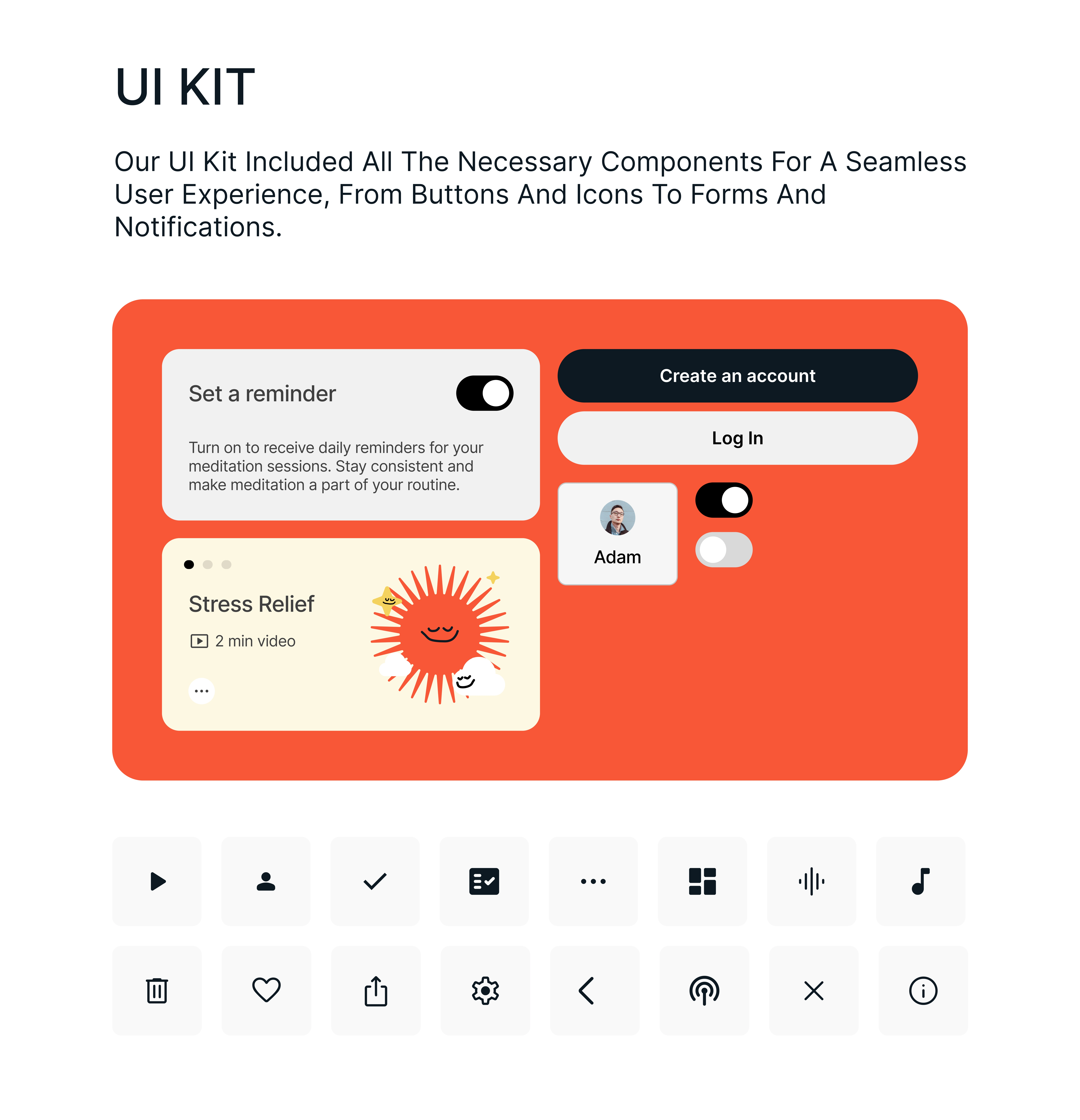
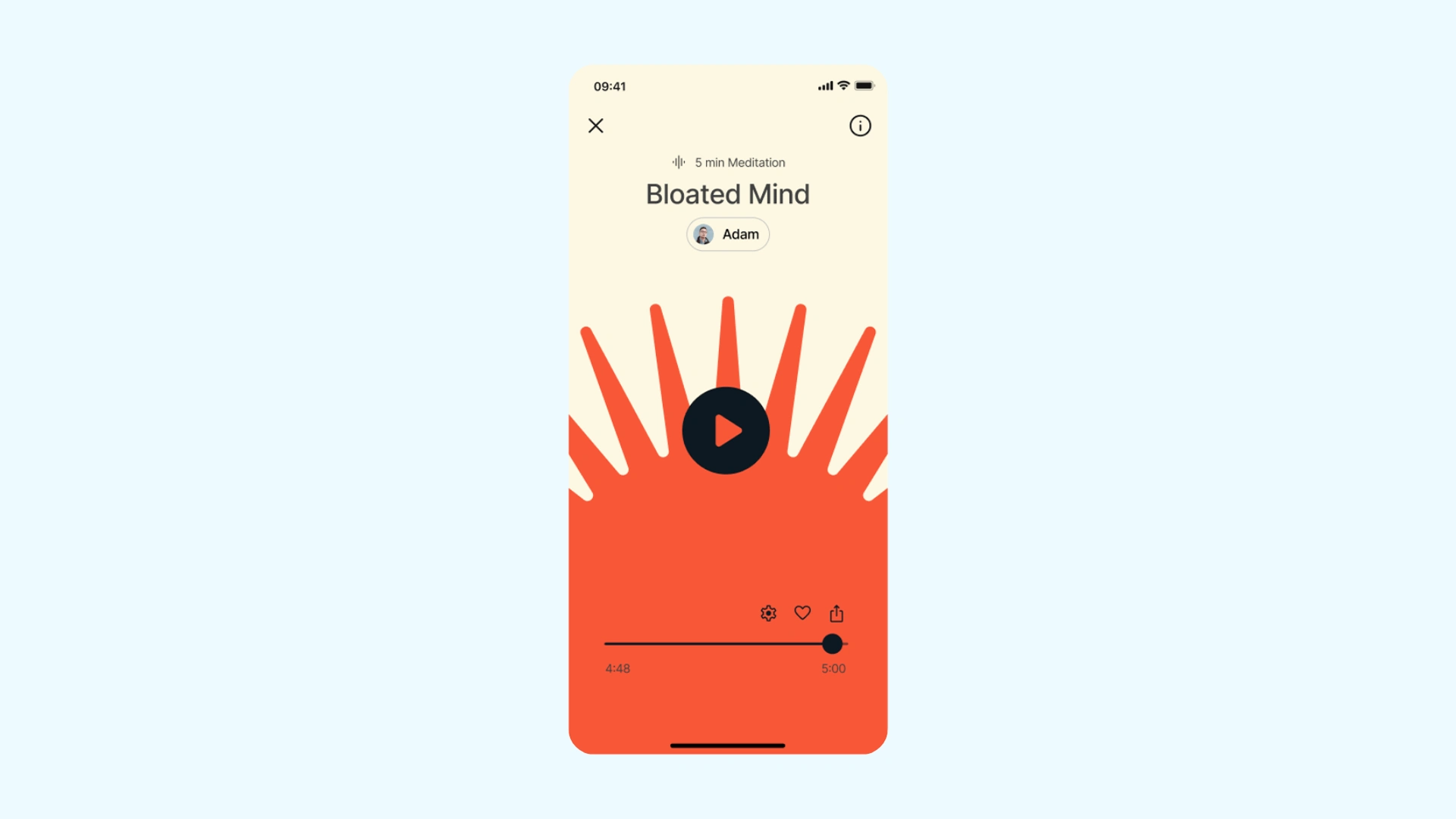
The visual direction uses soft gradients, generous spacing, and a muted palette that feels like a deep breath. The UI avoids sharp edges and high-contrast elements that create visual tension.
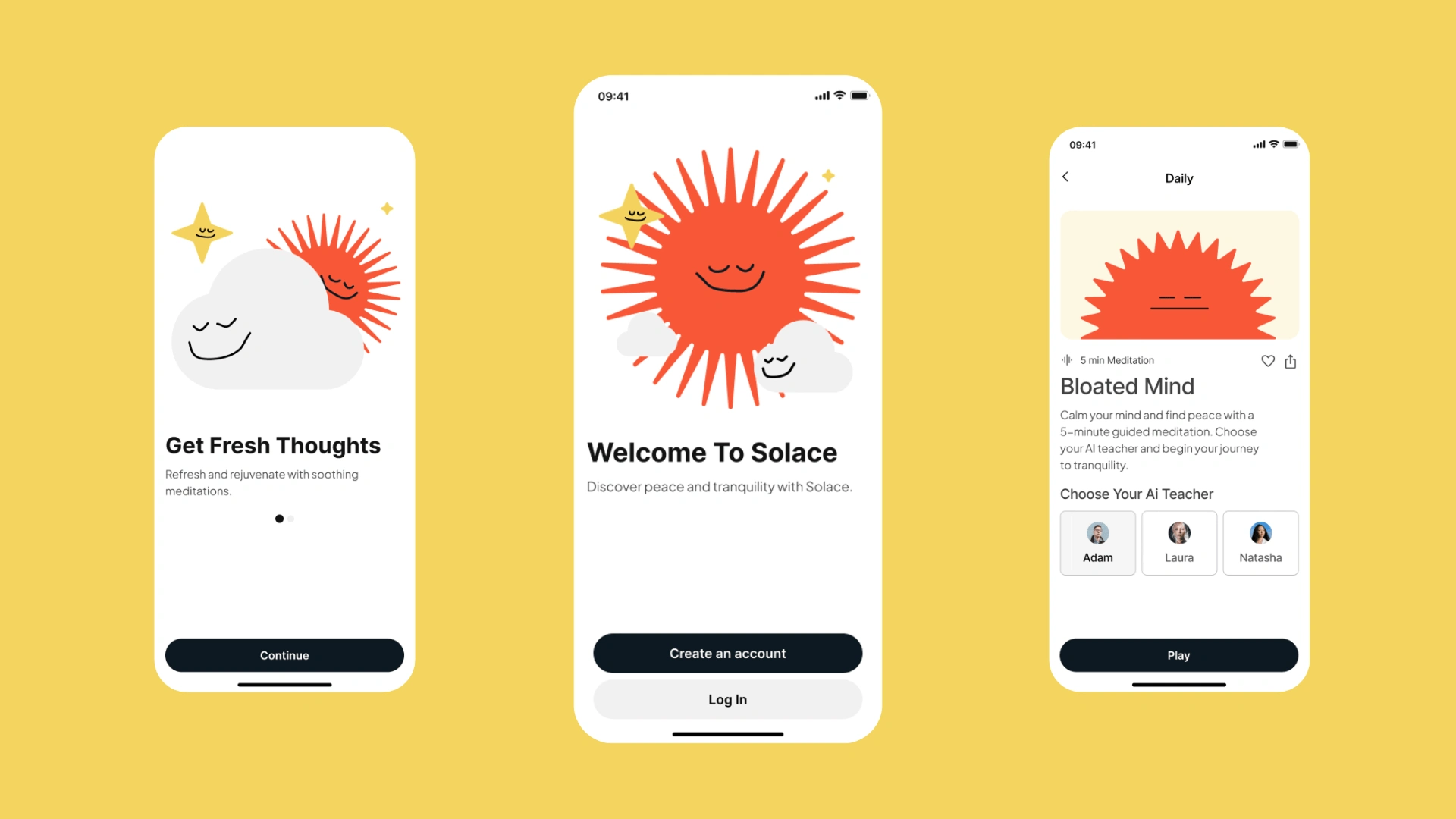
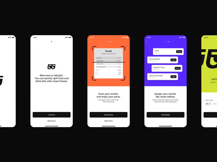
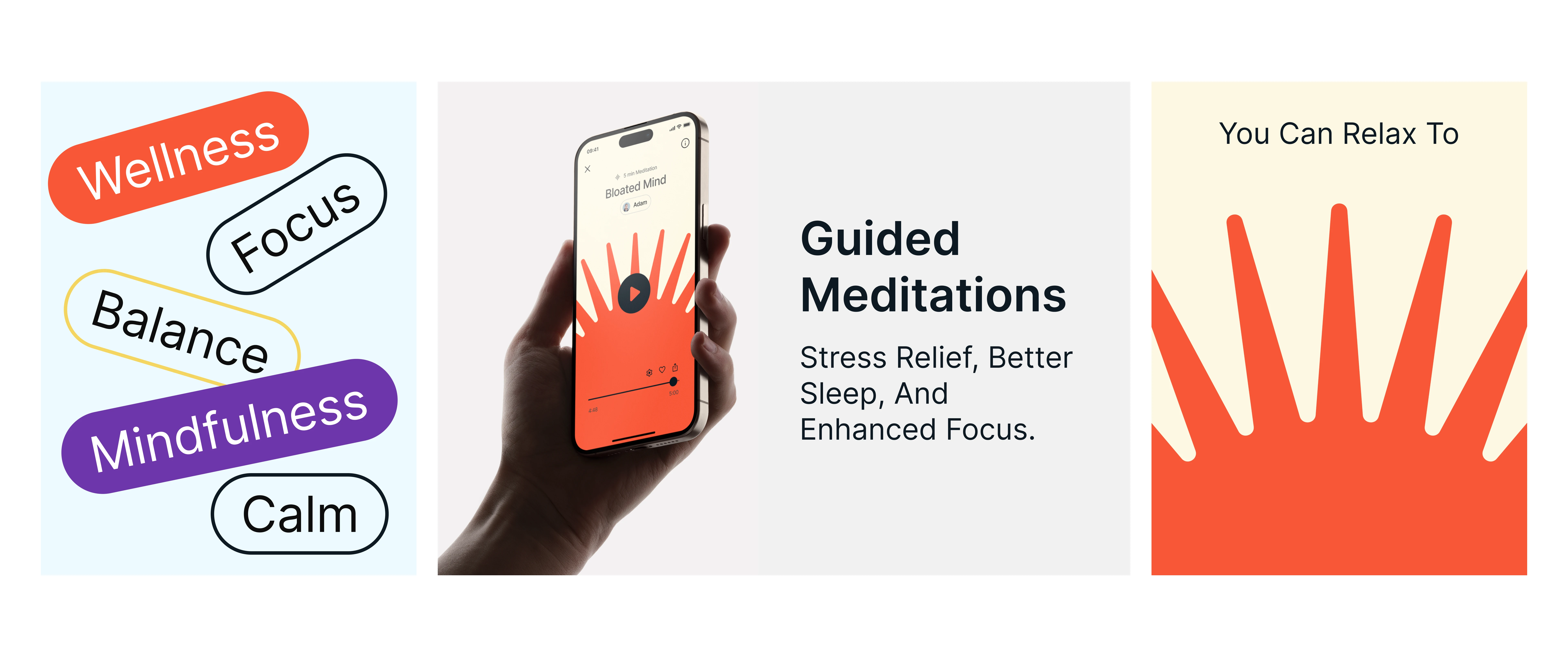
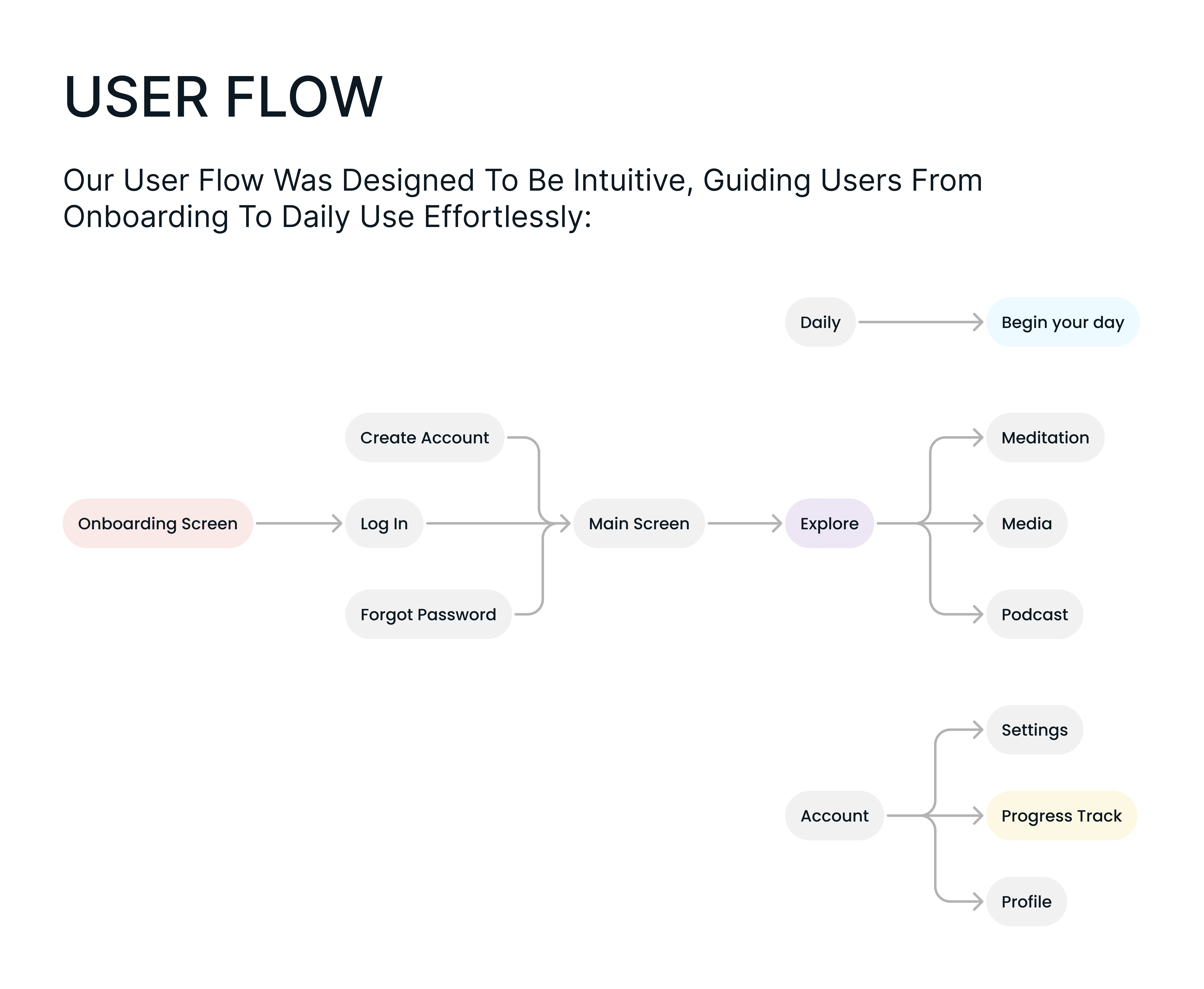
Core features include guided meditation, mood tracking, and breathing exercises. Each flow was designed to feel intuitive enough that users can engage even when they are not in the best headspace.
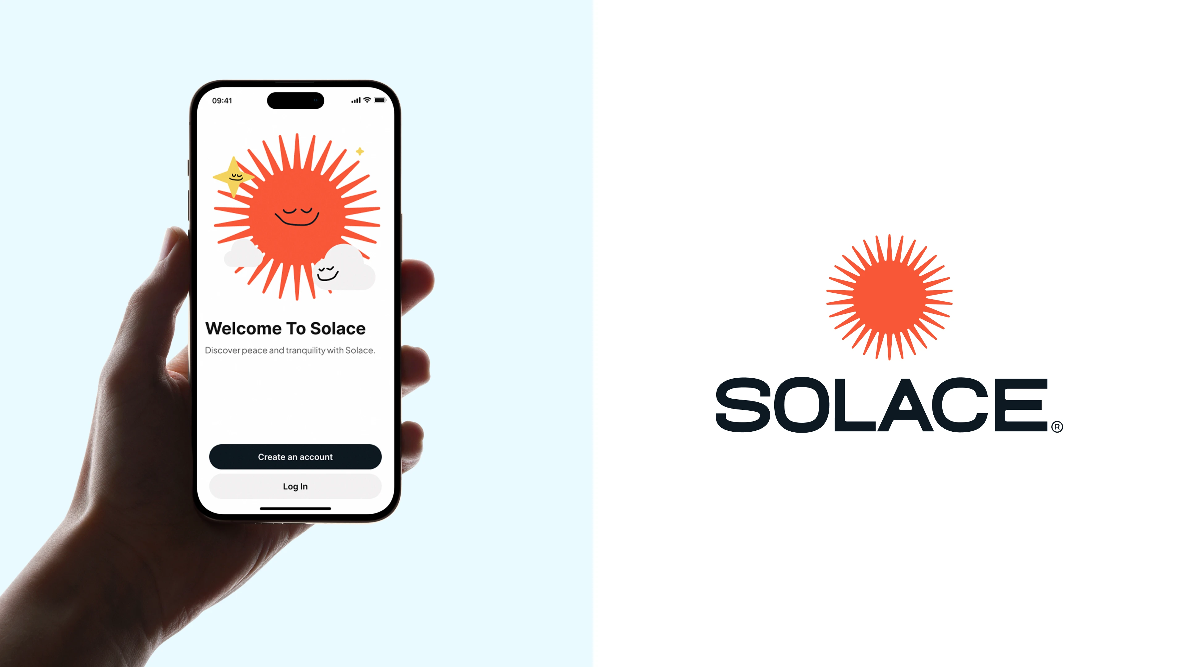
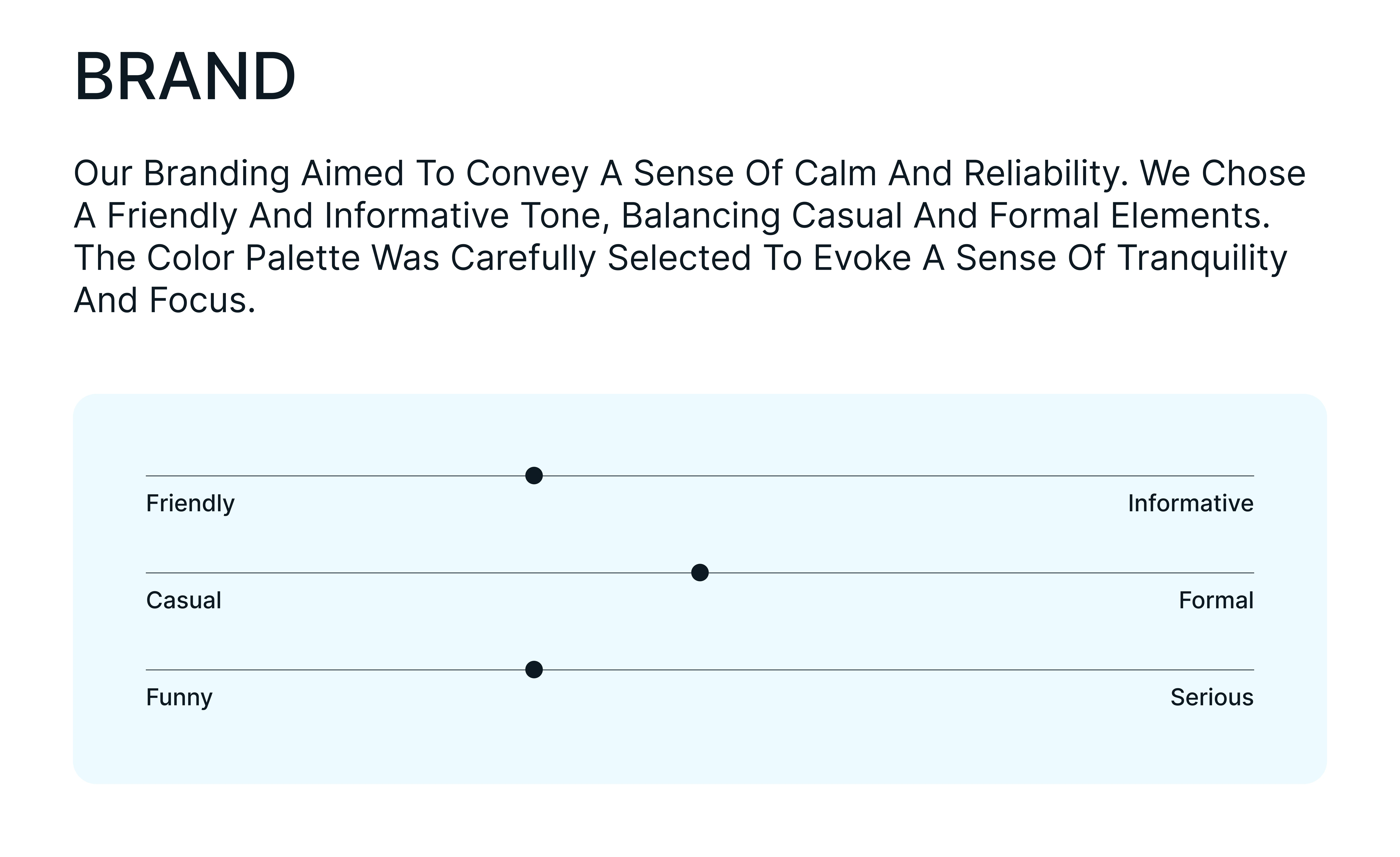
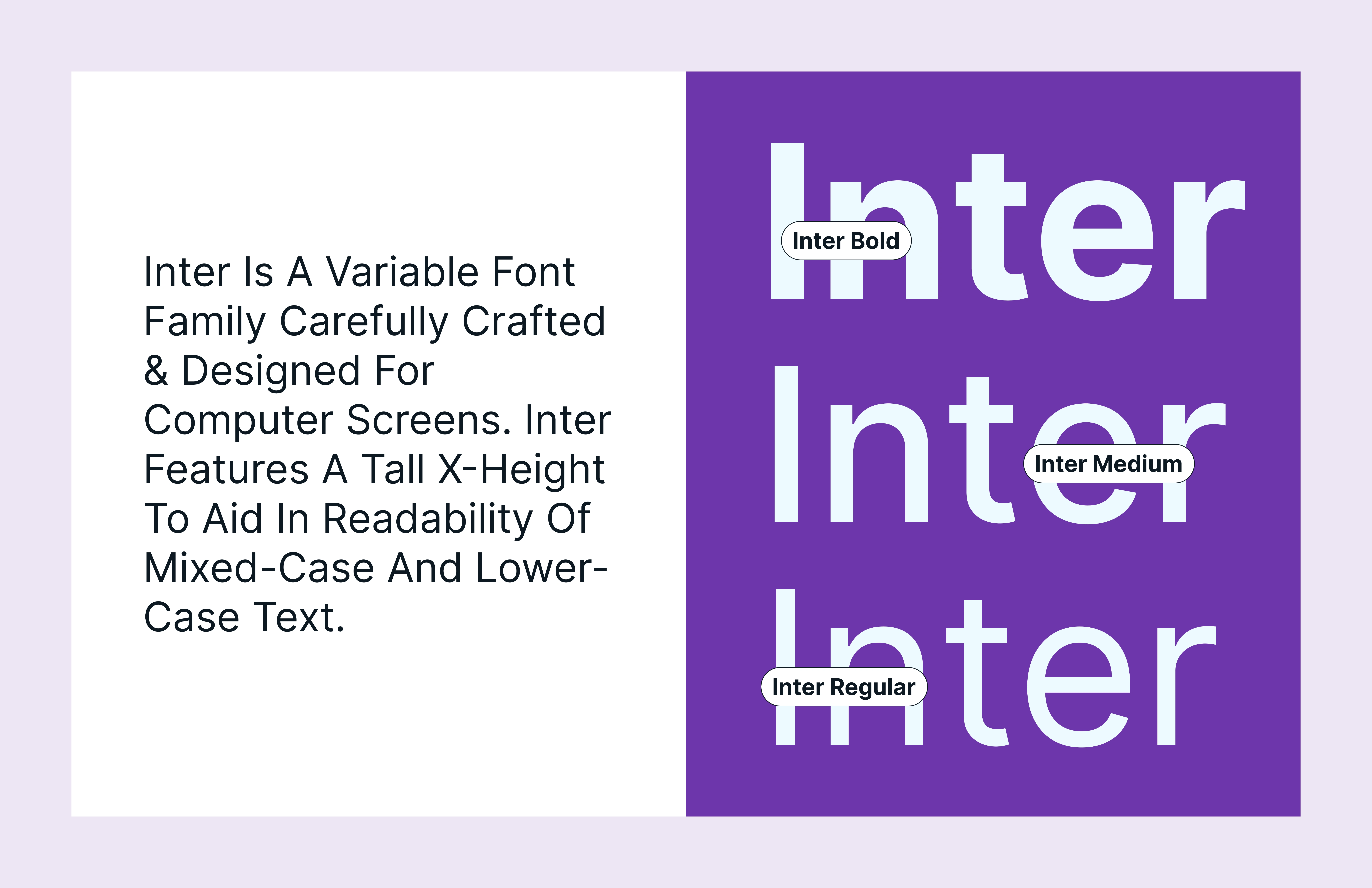
The brand identity extends beyond the app into marketing, social content, and onboarding. The same sense of calm carries through every touchpoint.

Like this project
Posted Jun 19, 2026
Built a clean mental wellness app design with guided meditation, mood tracking, and soft branding focused on calm and balance.