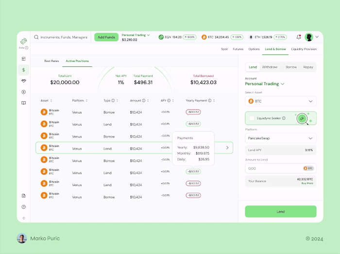
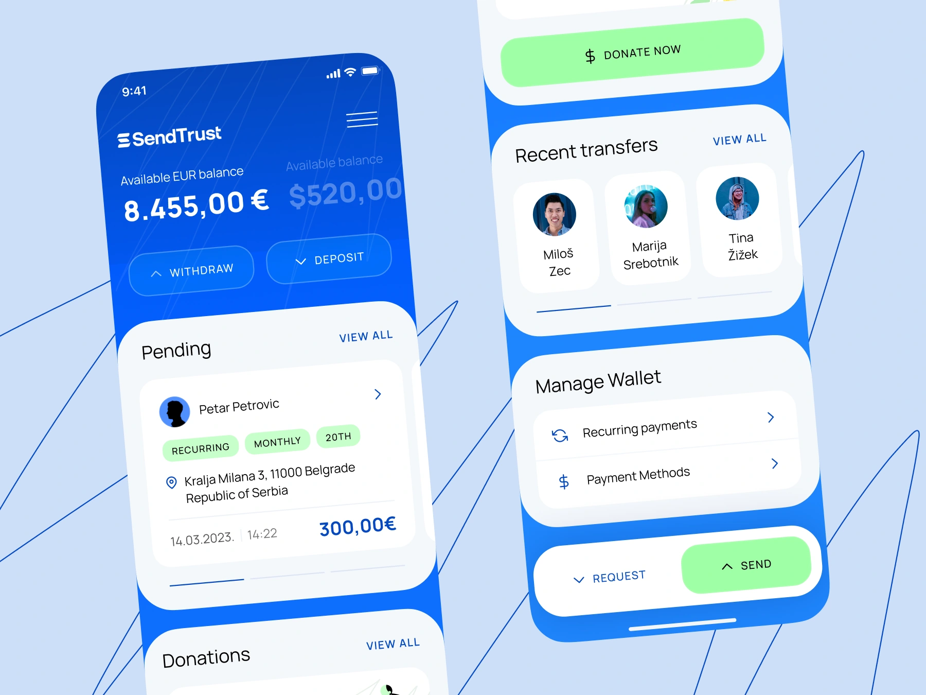
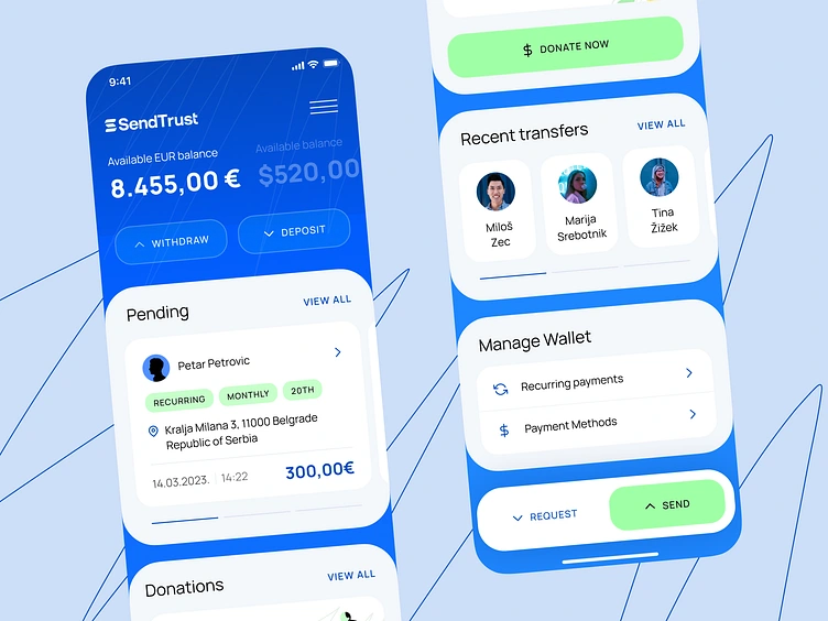
Money Transfer App
Marko Puric
Experimenting with colors and layout is a simple way to make an app more interesting.
This is the design for a money transfer app.
The client wanted something visually engaging.
He wanted his app to be authentic, not just another app in the fintech world.
To avoid that, I researched the most popular fintech apps.
They all looked very similar:
- Lots of white space
- Neutral colors
- Minimalist
- Serious
While these designs are functional and convey trust, they often lack personality.
I took a bit different approach:
- Vibrant yet professional colors
- Subtle micro-interactions
- Unconventional layout
The result is the app with a lot of character, which stands out among other apps in the field.
Design isn’t always about following the rules, something you need to experiment and exit the comfort zone.
Dm me “Killer app UI” if you want your app to feel truly authentic.
Like this project
Posted Jul 11, 2025
Fintech apps all look alike—minimalist and serious. I went bolder: vibrant colors, unique layout, real character. DM “Killer app UI” to stand out.
Likes
0
Views
7