Live Chat Support App (Case Study)
Marko Puric
A client reached out:
“Marko, our users have a hard time using messaging”
Me:
“Hold my oat milk latte”
I analyzed what users said.
I analyzed the old UI in detail.
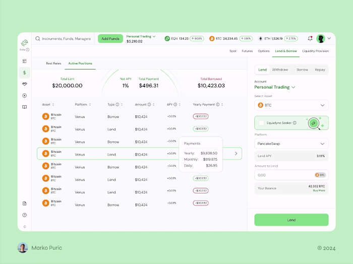
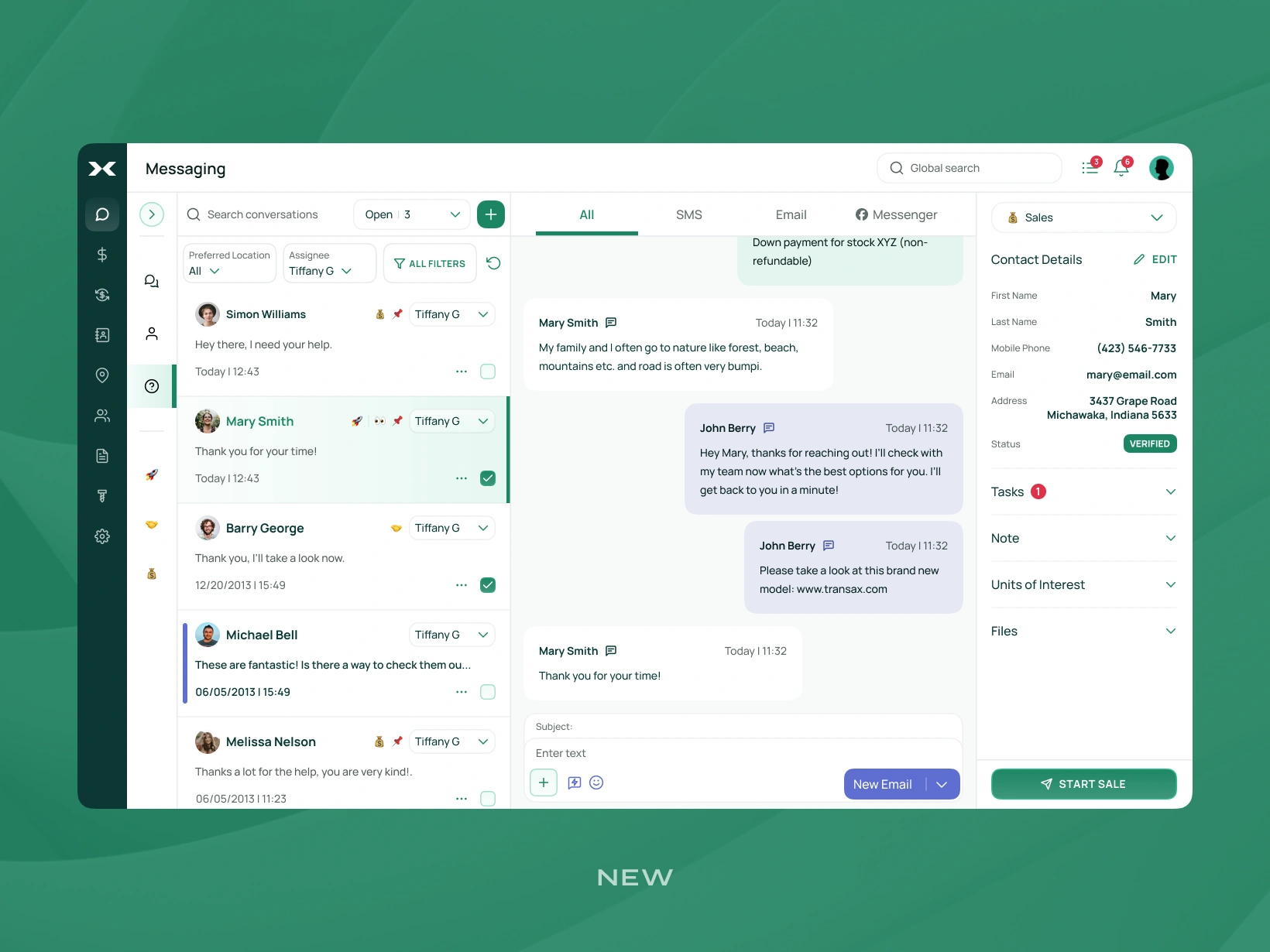
Problems with the old design:
• UI feels cluttered
• Chat area is too small
• Too many strong colors
• Overall bad use of space
• Certain elements are too big
• Filter bar takes up too much space
• 3 levels of top navigation are overwhelming
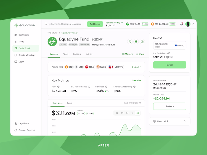
How the new UI solved these problems:
→ Top navigations are reduced to 2 levels
More vertical space, for users with smaller laptops
→ Minimal and light colors
For a lightweight experience
→ Just 2 filters are visible
Making the UI less overwhelming
→ Other filters placed in the ‘All filters’ button
To keep advanced features
→ Reduced panels and bars sizes
Making UI breathable
→ Collapsable side navigation bar on the left
Leaving more space for chats
Working with advanced UIs with a lot of features is challenging.
You should reduce UI complexity, while not compromizing on functionalities.
Here's the gist of what I did to ensure a better UX:
→ Reduced the complexity
→ Made the UI more lightweight
→ Left more real estate on the screen
Now let’s see what users think.
Send me ‘UX design’ in DM if your app has a poor user experience.
Like this project
Posted Jul 11, 2025
Users struggled with messaging. I redesigned the UI - less clutter, more space, simpler filters, without losing features. DM “UX design” to fix yours.
Likes
0
Views
16