Recibook brand identity and website redesign
Zlatko Najdenovski
Récibook – Designing a brand where written stories are turned into audio experiences
Overview
Recibook transforms written stories into immersive audio experiences for young audiences. Working from the island of Mauritius, their team of artistic directors, sound engineers, writers, and actors bring brand narratives to life through original audio productions.
But while the company radiated creativity, curiosity, and playfulness, their brand identity and website didn’t. The digital presence felt disconnected from who they truly were — joyful, youthful, imaginative. I was invited to realign the brand with its spirit.
The challenge
Create a brand identity and website that expresses Recibook’s child-like wonder without compromising clarity, accessibility, or usability.
Key objectives
Develop a playful, memorable logo that clearly communicates “audio storytelling.”
Design an illustration language that feels hand-drawn, warm, and expressive.
Build a website that’s both wildly creative and fully accessible.
Ensure the final system is easy to implement and scale.
My approach
Finding the logomark hiding in plain sight
The early explorations pushed into whimsical metaphors — from doorways into magical worlds to treehouses and humanoids beaming waves of colour.
But the winning idea was the simplest one: a microphone emitting audio wavelengths. Clear, meaningful, instantly recognisable — and perfect for motion in future brand assets. It captured both the craft (audio) and the audience (young, curious, imaginative).
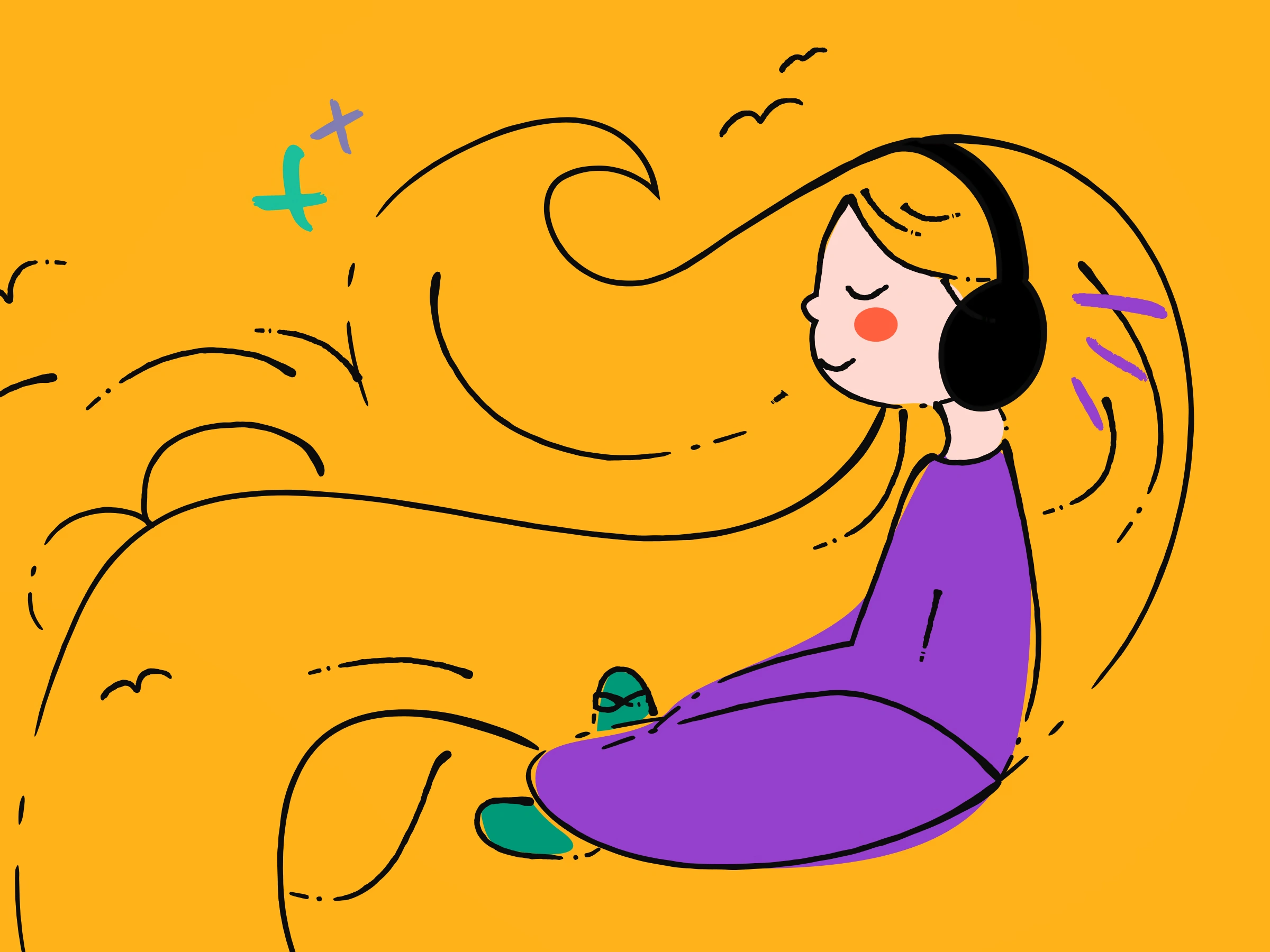
Freeform, child-like illustration language
To bring Recibook’s youthful energy to life, I collaborated with Macedonian illustrator Bojana Jovanova, whose hand-drawn style was the perfect match.
We used doodles, textures, uneven lines, and playful character shapes to create a visual world that feels alive — energetic, warm, human. This language became a key asset across the site and social media materials.
A website that is playful and accessible
Recibook’s website needed to feel like a storybook—colourful, expressive, and full of character—yet it also had to stand firmly on the foundations of good usability. The challenge was in blending two seemingly opposite worlds: Bojana’s free-form illustrations and my structured, grid-based approach to layout.
By weaving these together, the site became a place where imagination and logic coexist beautifully. The illustrations bring warmth and personality, overflowing with the same energy the Recibook team pours into their audio stories. Meanwhile, the underlying design system ensures that everything remains readable, intuitive, and accessible.
Through careful use of hierarchy, contrast, typography, and spacing, the website preserves the joy of a children’s book while offering the clarity of a well-designed product. The result is a world that feels playful without ever sacrificing usability—a digital experience that’s as delightful as it is dependable.
Recibook now has a brand that feels true to its mission — joyful, story-driven, and deeply human. The logo is easily animatable, the illustrations form a distinctive visual universe, and the website supports both creativity and clarity.
Testimonial
This collaboration went perfectly. Zlatko is both a strong proposer and a good listener. His professionalism is constant throughout the design process, from the format of the deliverables to his responsiveness and availability. Rarely can one find such a designer.— Maxime Demoor, CEO・Stratalis.net
Post-launch success
+27% rise in inquiries from children-focused brands
The playful identity immediately resonated with organisations seeking audio experiences for children.
Bounce rate reduction in first 30 days
The refreshed storytelling and visuals encouraged deeper website browsing.
SEO visibility score doubled
Using clear structure, alt descriptions on images, and semantic markup boosted organic discoverability.
Like this project
Posted Nov 17, 2025
Recibook turns stories into immersive audio for kids, but its digital identity lacked that magic. I rebuilt the brand and site to capture its playful spirit.