Designing Tribevibe: A social app for offline connections
Zlatko Najdenovski
Tribevibe – Designing a mindful social startup that helps people meet offline
Idea
The pandemic began. The world froze. Businesses pivoted from offline to online, digital to more digital. And there I was, doing the most counterintuitive thing imaginable: I started building a community-driven social app for offline experiences.
Yes—an app to help people meet in the real world, during a global lockdown. But the logic made sense in my head: While everyone else was adapting to the pandemic, I was preparing for its aftermath. If competitors zig, you zag, right?
In theory, it was brilliant, but in practice.? Well, as the saying goes: “In theory, there is no difference between theory and practice. In practice, there is.” Tribevibe became a startup journey that looked smooth on paper but was full of beautiful chaos, invaluable lessons, and creative breakthroughs.
This is the case study of that journey.
Overview
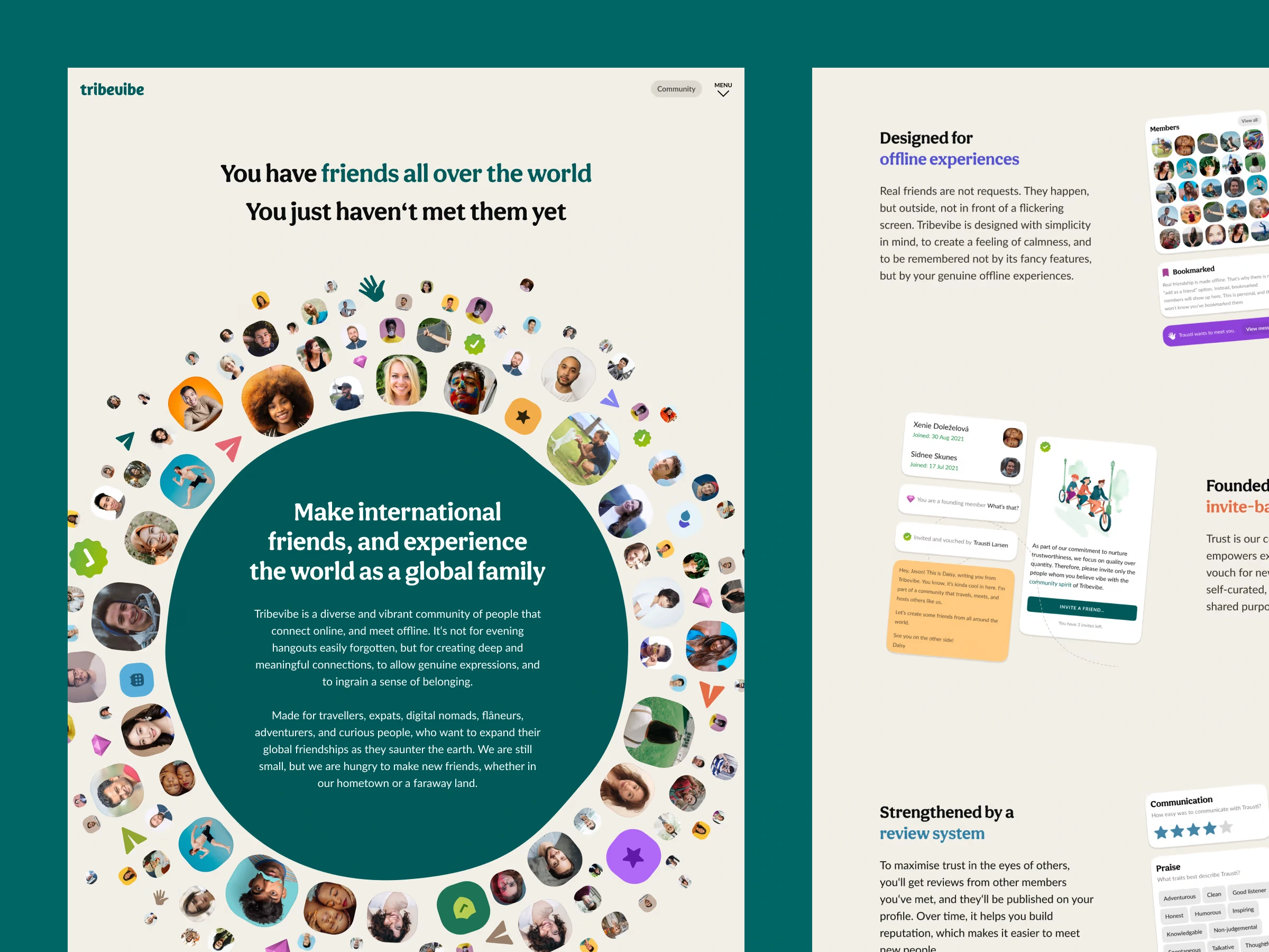
Tribevibe is a community built for people who connect online but meet offline. Not for quick hangouts, nor for dopamine-driven feed scrolling, but for genuine, meaningful friendships—the kind you remember years later.
It’s built for travellers, expats, digital nomads, flâneurs, adventurers, global roamers, and curiosity-driven humans who want a social fabric that extends far beyond their hometowns.
The idea was simple but powerful: Reconnect people with the physical world. Not through loud notifications or addictive design patterns, but through gentle social discovery, shared vibes, and real-life encounters.
At first, I thought Tribevibe’s main competitor would be Couchsurfing. By May 2020, Couchsurfing was struggling for survival, and I saw a perfect opportunity, and I clicked: “When Couchsurfing declines, the community will drift to Tribevibe.”
But reality had a different lesson waiting: I wasn’t competing with Couchsurfing. I was competing with social media itself—the machine that consumes attention, time, and intention.
To grow, Tribevibe needed more than clever features. It needed a philosophical stance, a reason for people to put their phones down and meet someone in person. It needed to balance growth with ethics, discovery with consent, curiosity with comfort. That meant rethinking product strategy from the ground up.
Objectives
Find the leanest possible way to design a mobile app that enables people to meet while they travel.
Create features that organically and sustainably expand the Tribevibe community.
Self-fund the entire startup without draining my life savings.
Talking about hidden system complexities
Designing an app for meeting people sounds simple—until you start building it.
Tribevibe required enough infrastructure to make a developer cry into their coffee: user authentication, chat functionality, review and trust system, geo-spatial location, invite system, verification flows, safety mechanisms, preference matching, notifications and timing logic and then sore more.
Every tiny interaction becomes a branching tree of potential user paths. And every path needs clarity, safety, and intentional design.
The onboarding
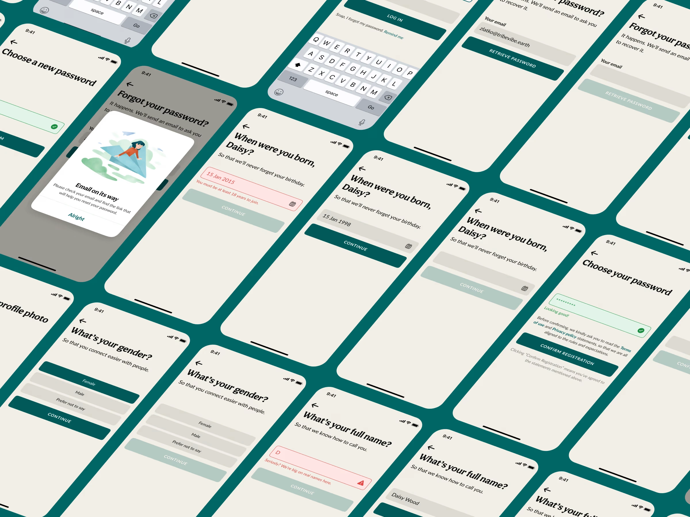
Onboarding is where people decide whether to trust your app—or abandon it.
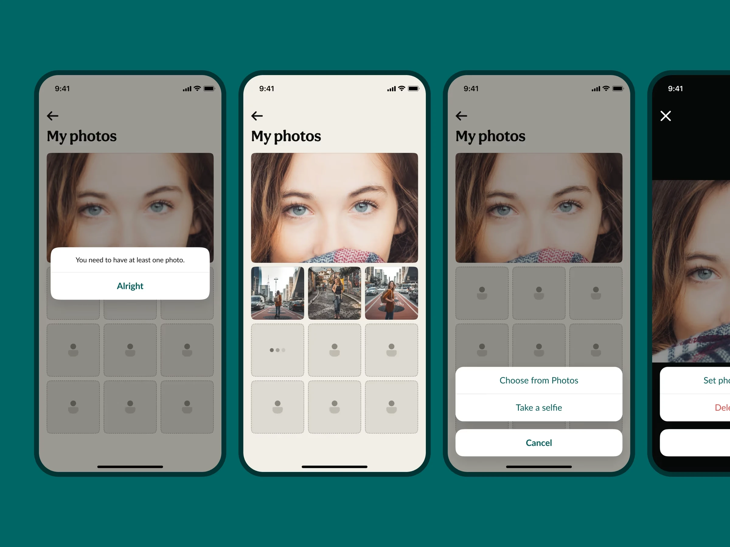
For Tribevibe, I kept onboarding focused, warm, and human. The goal was to gather just enough information to create a real profile without overwhelming new members. Guidance mattered. Guardrails mattered even more.
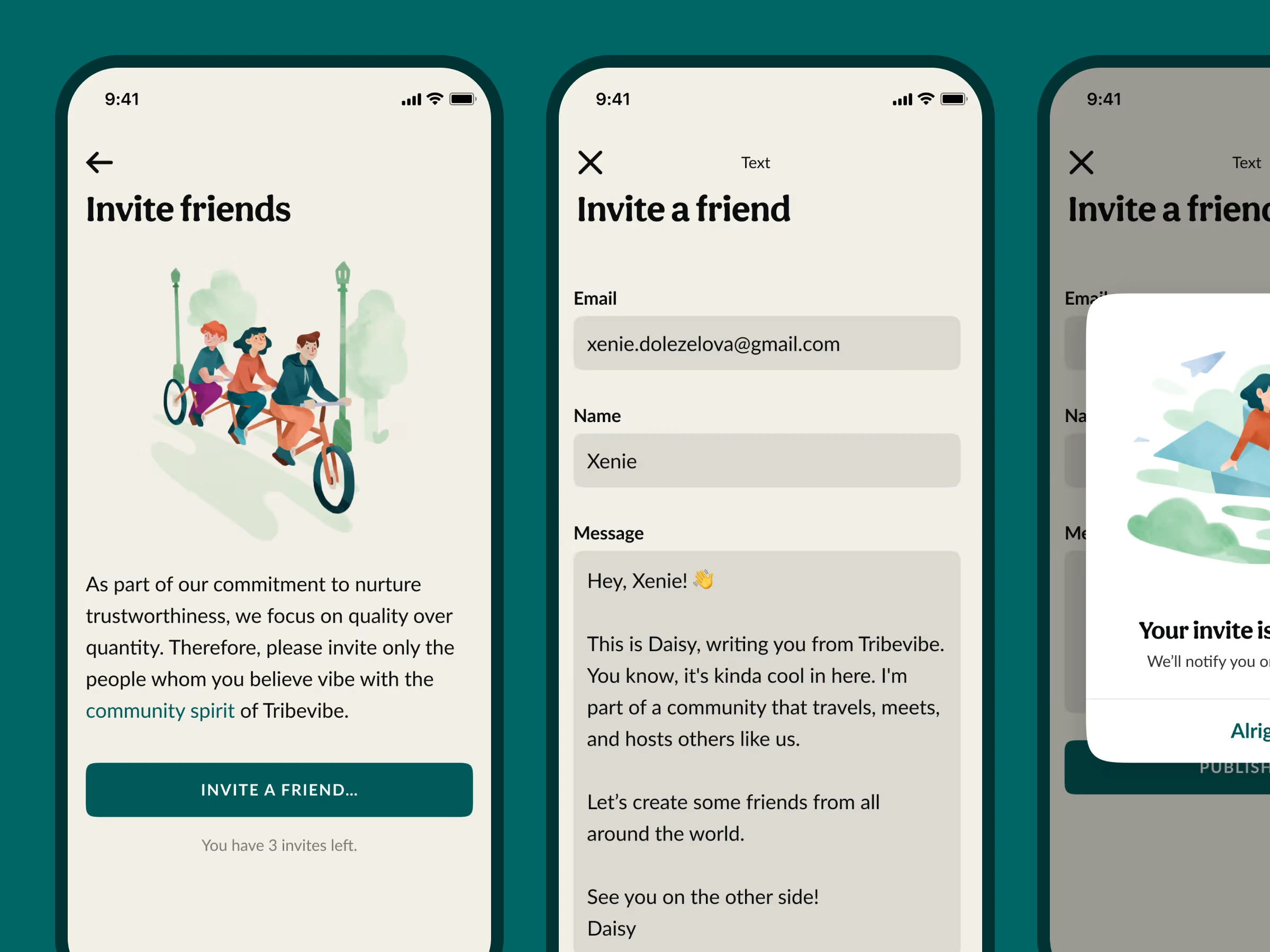
The invite system
Tribevibe was never meant to be “open to everyone.” To register, you needed a personal invite from an existing member. This created a sense of belonging, trustworthiness among strangers, and organic, community-driven growth.
Instead of viral mechanics, Tribevibe was supposed to grow like old-school communities: person to person, circle to circle, city to city.
Designing the general look and feel
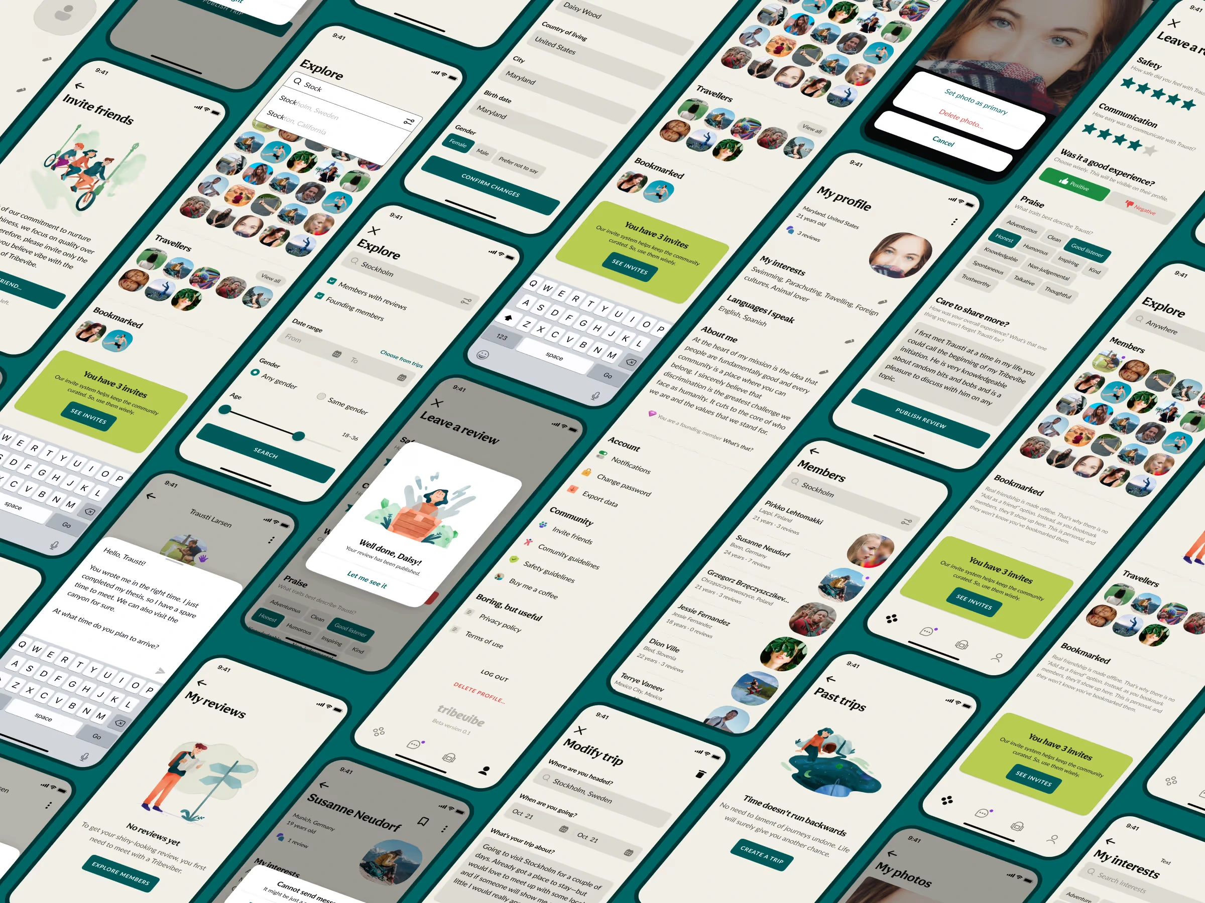
The app was intentionally minimalistic. No feeds, no endless scroll, no notifications screaming for attention. Just a simple discovery flow, profiles built around presence, place, and interests, a vibe-based matching mechanic, a messaging system, safety and trust layers, invite and referral logic, a location-aware exploration map
The UI encouraged intentionality. The UX reduced friction while avoiding the addictive design patterns common in the industry.
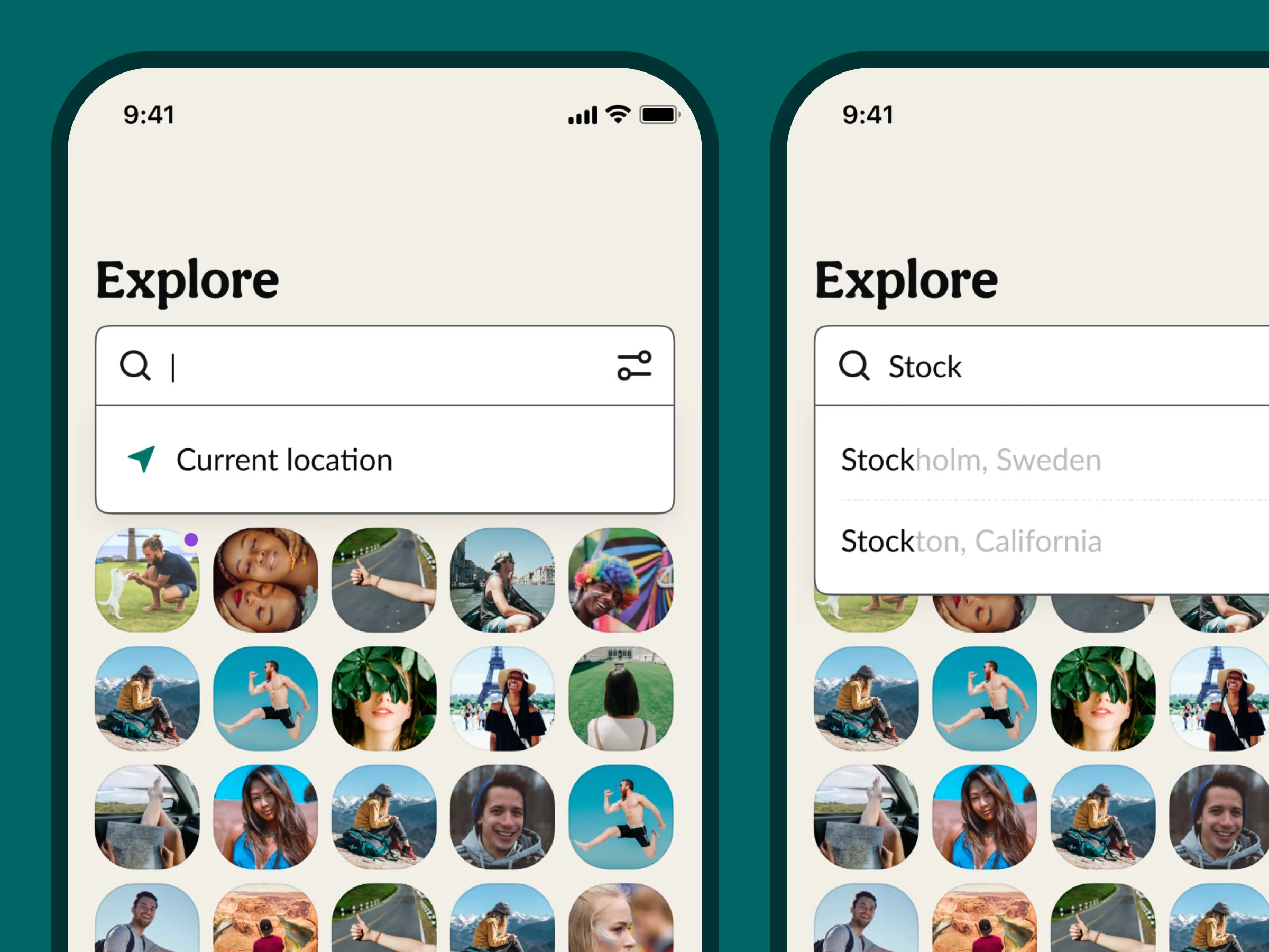
Geo-based discovery of people
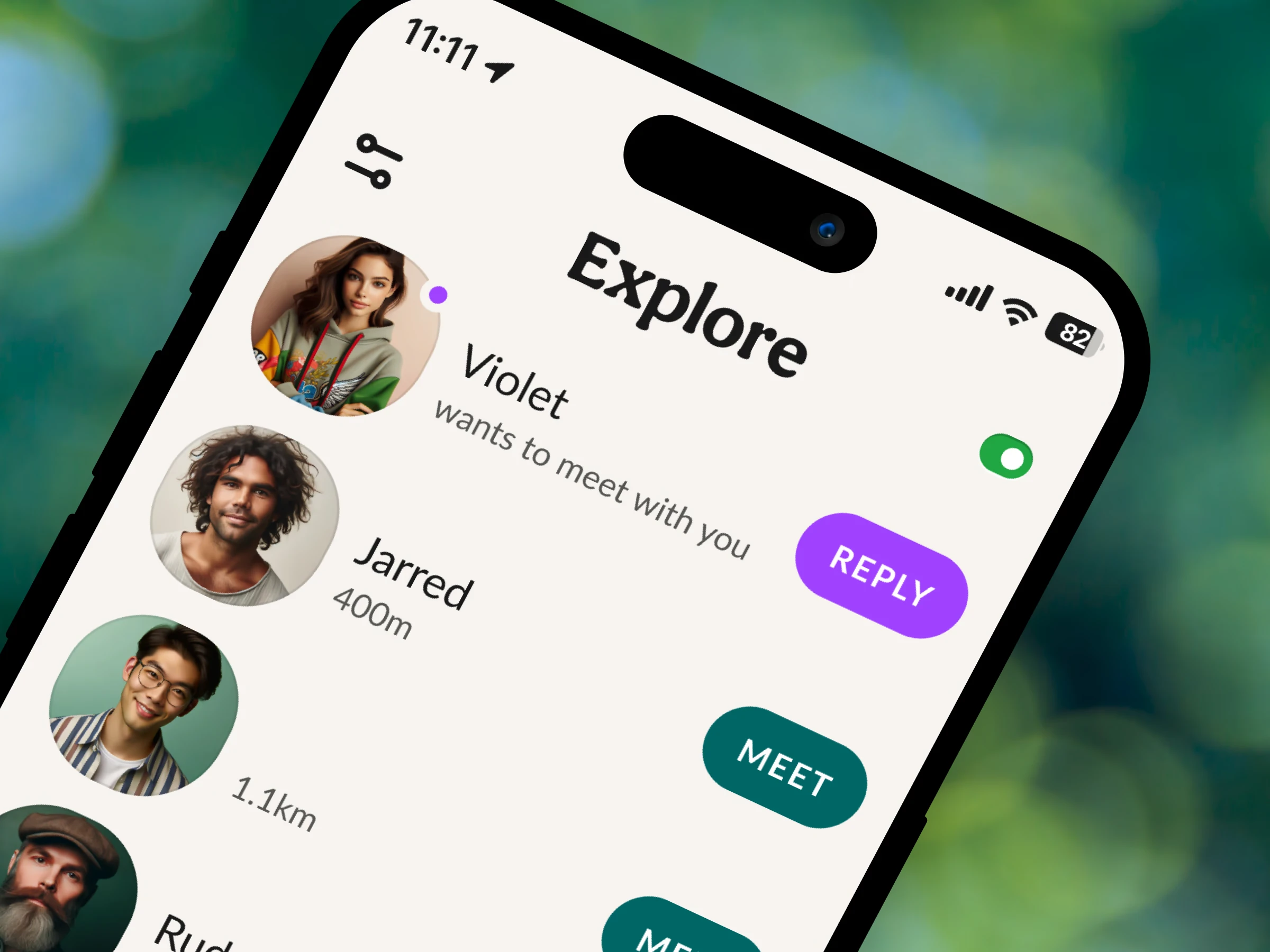
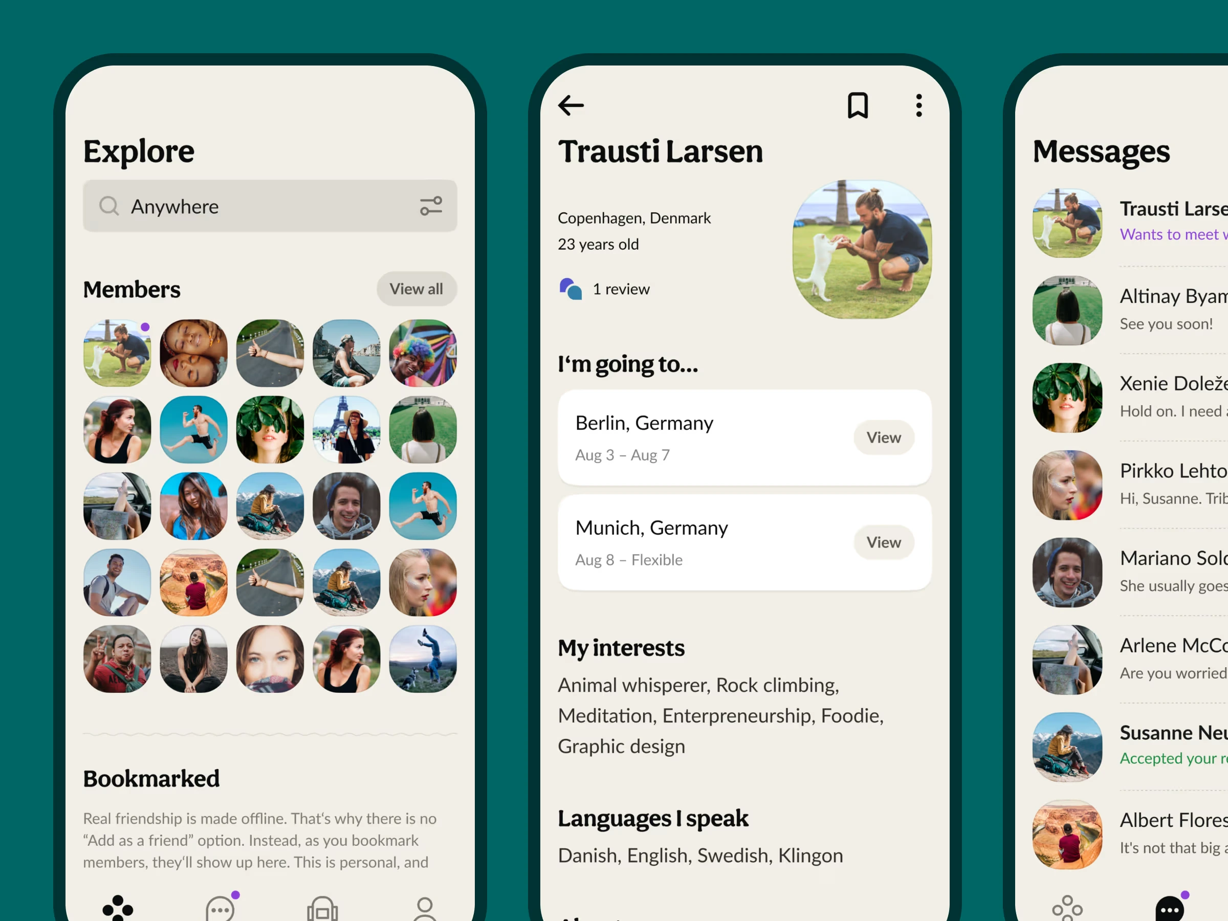
The Explore section became the heart of the experience—a way for members to discover each other based on real-world proximity. A map-driven browsing experience, online/offline status indicators, profiles anchored in place, not in arbitrary algorithms.
It encouraged natural, local discovery. Not swiping, nor browsing endlessly. Just people near you, living their lives, open to meet offline.
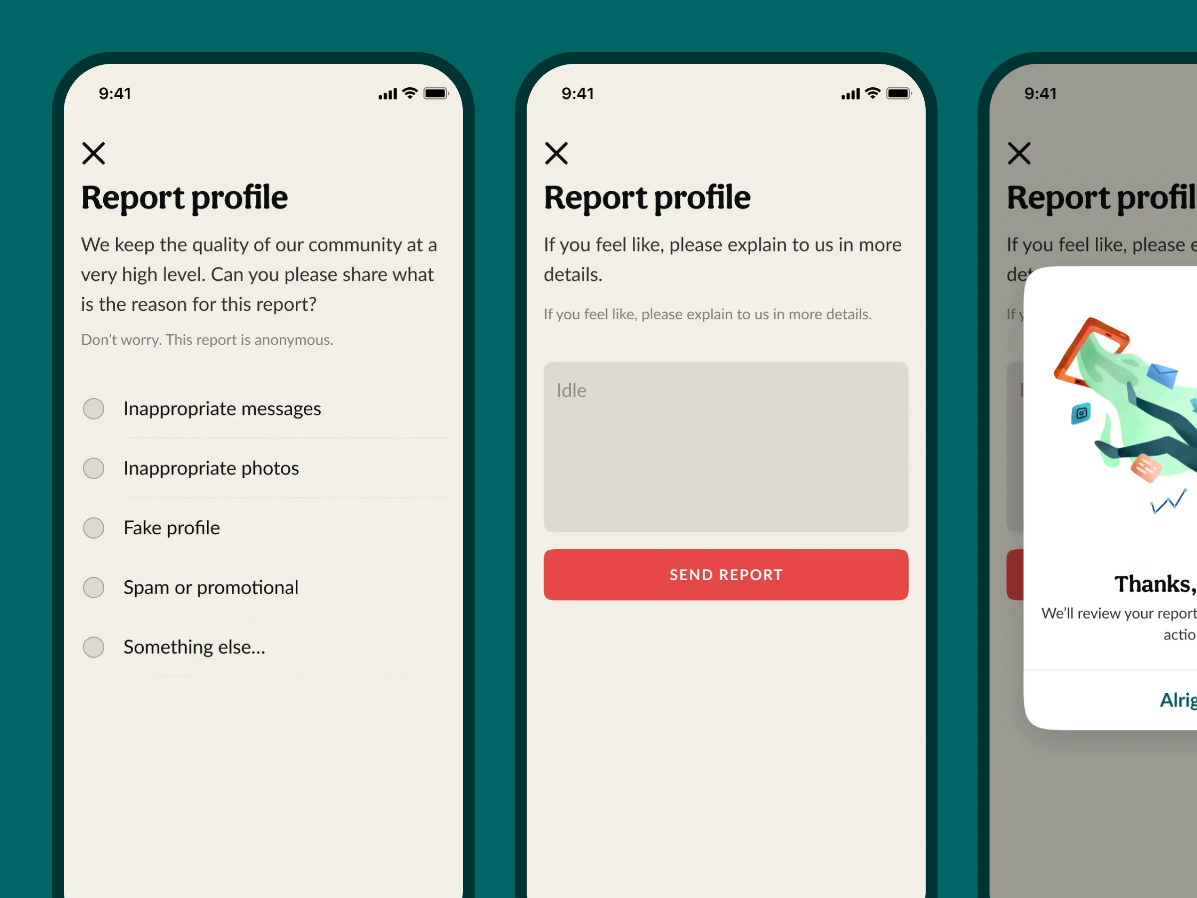
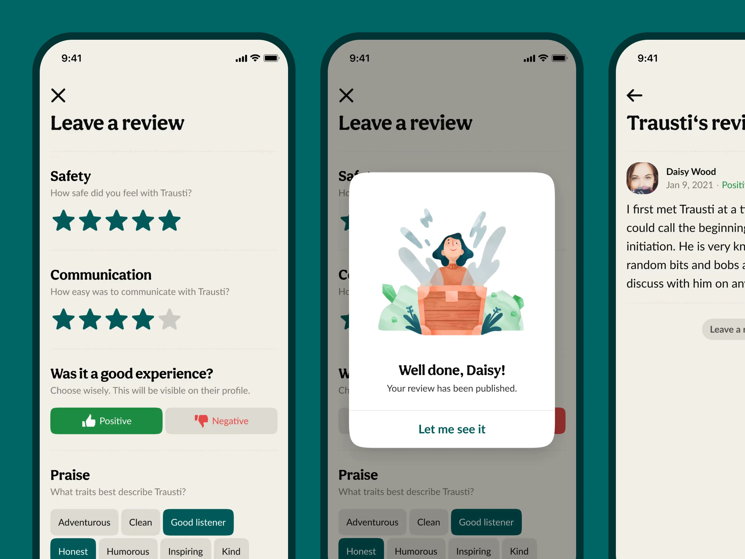
Reporting and safety controls
Real-life meetups require robust safety layers. I designed an integrated reporting system so members could quietly flag a profile for inappropriate behaviour or suspicious activity. This wasn’t an afterthought—it was foundational. Great communities need great guardrails.
Bookmarking a friend (not “adding” one)
“Add as a friend” felt too social-media-ish, too digital, too superficial, and too performative.
So I introduced Bookmarks instead—a soft connection gesture and a reminder: “I’d like to reconnect with this person someday.” It worked just like you are bookmarking a website.
You are never sending a ping to the website, and in the same manner, a ping is never sent to the bookmarked person. It avoids the social-media psychology of collecting friends and encourages the offline psychology of staying in touch.
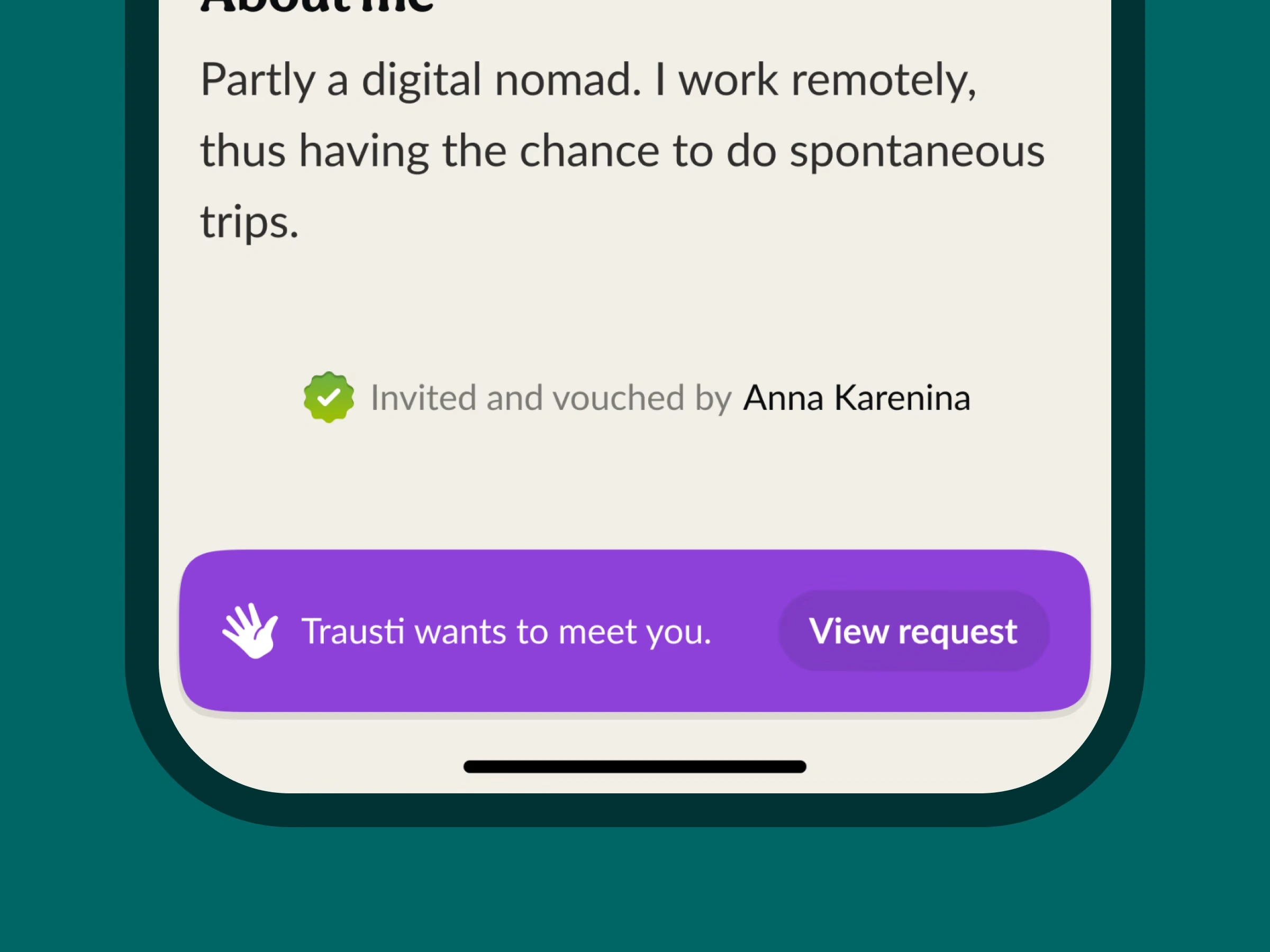
Chat functionality
Chat is one of the hardest things to design and build. So I kept it intentionally lean and respectful. A chat could only begin once both sides mutually approved they wanted to meet. No unsolicited messages. No digital noise. No chasing. This turned the chat into a pre-meeting space, not a new digital hangout.
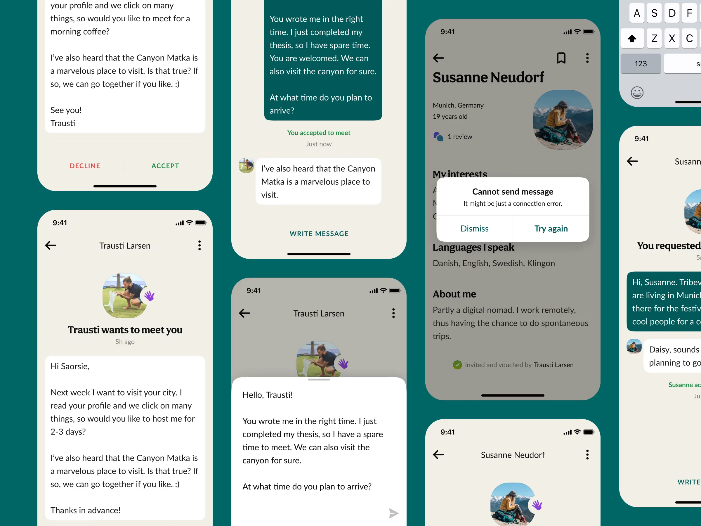
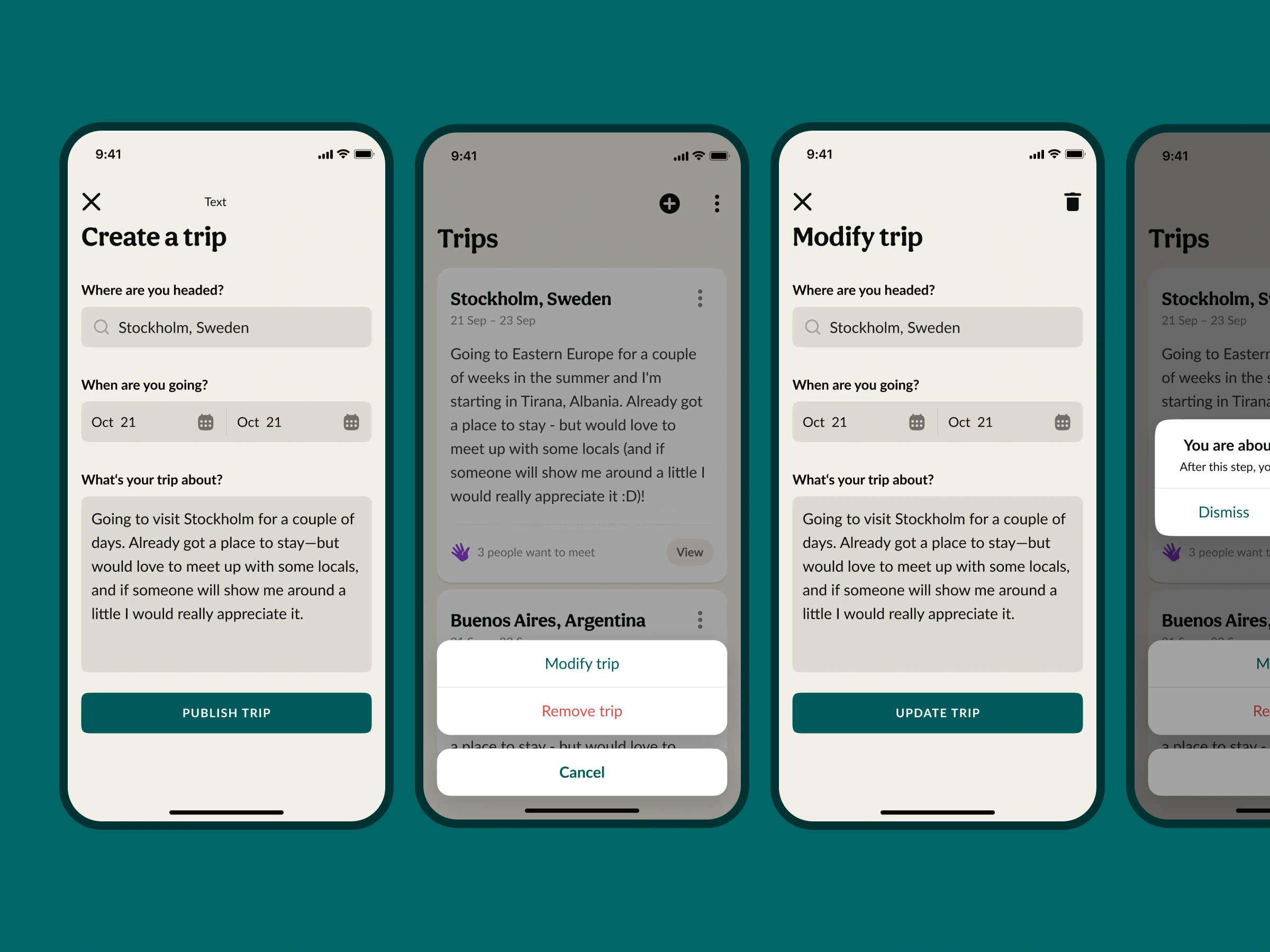
Public trips
To make discovery more dynamic, I added Public Trips—a way for members to share where they’re going next. This feature allowed others to see who might be visiting their city, meet travellers with shared interests, and host newcomers in their hometown. It helped Tribevibe grow organically through movement itself—friendships formed on trains, beaches, co-working spots, and airports.
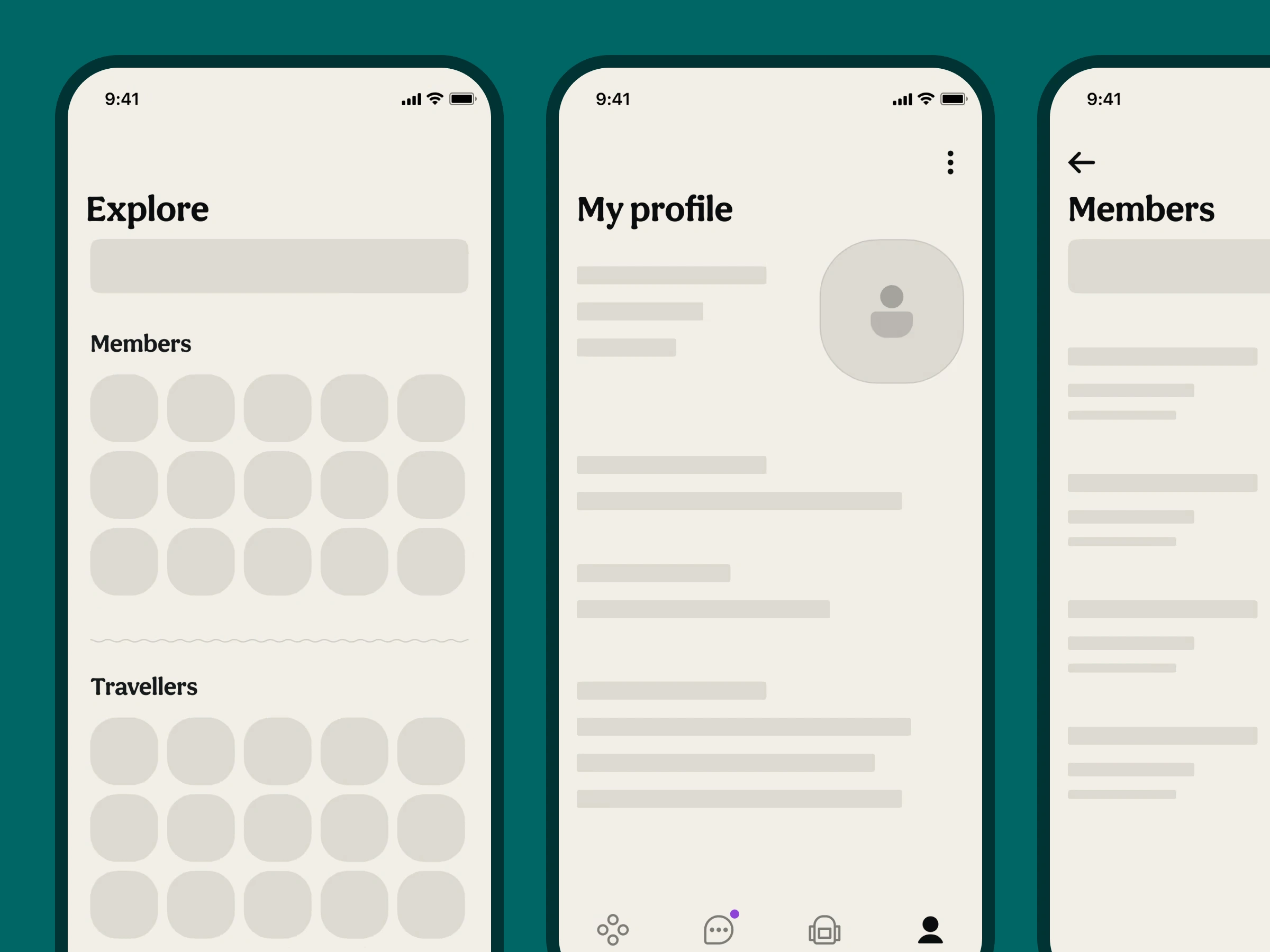
Empty states and skeletons
Empty states are where first impressions happen. For a brand-new user, almost every screen is an empty state. I spent time designing thoughtful messaging, visuals, and guidance so the app felt welcoming even when nothing was populated yet. Instead of “nothing here,” empty states expressed possibility and warmth.
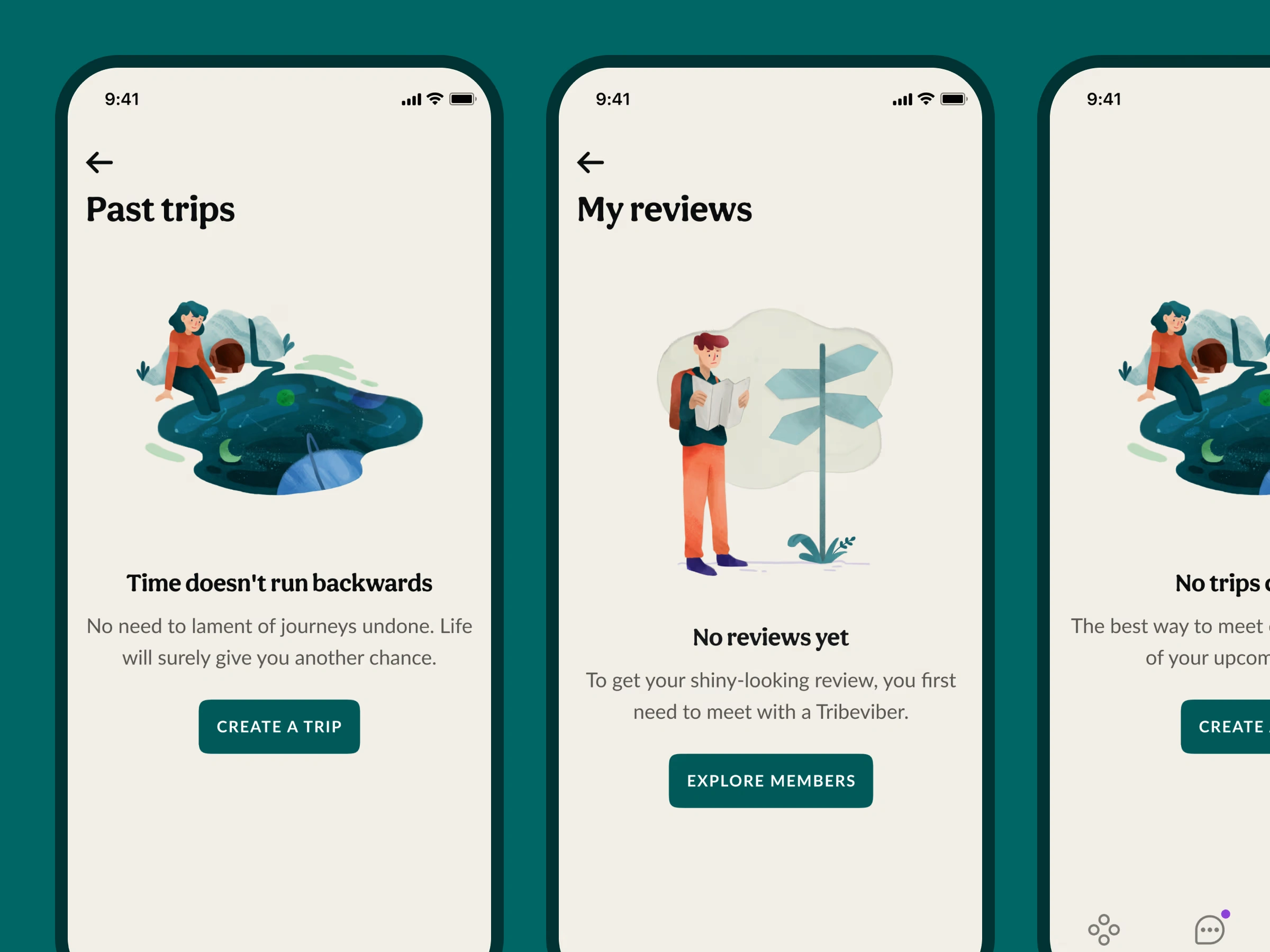
Also, before any content loads, people still form opinions. A blank screen feels broken. A loading spinner feels boring. So, I designed skeleton screens that gave structure and anticipation—small touches that transformed waiting time into a smooth, reassuring experience.
Designing the website
The website became the storytelling layer of Tribevibe—why it exists, what it stands for, and why offline connection still matters. The brand voice leaned into poetic, human language instead of marketing jargon. Tribevibe wasn’t selling features. It was offering a philosophy of connection.
Like this project
Posted Nov 18, 2025
Tribevibe connects curious global humans through social discovery and real-life meetups—helping online connections become meaningful and lasting friendships.
Likes
1
Views
20
Timeline
May 1, 2020 - Jul 20, 2020
Clients
Tribevibe