Iconduck web platform redesign and design system
Iconduck – Redesigning the largest open-source platform for vector icons
Overview
Iconduck is the brainchild of Oliver Nassar, and in just three years it grew from a scrappy side project into a massive open-source platform with over 300,000 vectors. As the product matured, it needed a full redesign—brand, website, web app, and design system.
Oliver brought me in to lead that transformation. This creative journey would become one of the biggest and most comprehensive product redesigns I’ve ever led.
Challenge
Iconduck had reach, content, and community, but the product experience was struggling under its own weight. The brand felt dated, the logo didn’t reflect its personality, the navigation felt constrained, and the site structure couldn’t support the growing number of vectors and features.
I needed to rethink everything: the brand identity the search and filtering experience, the layout system for displaying huge volumes of assets, the creator visibility, the subscription flow, and the underlying design system that would scale as the platform expanded.
The complexity of Iconduck was closer to a full web application than a simple website. Every decision had to account for system states, edge cases, and a wide variety of user behaviors.
Objectives
Craft a distinct, memorable brand identity anchored in Iconduck’s playful personality.
Redesign the entire website and web app to support browsing, filtering, and downloading 300k+ vectors.
Elevate vector creators with dedicated profile pages and better discoverability.
Improve the subscription flow and highlight the benefits of premium access.
Build a robust and scalable design system to support the platform’s long-term growth.
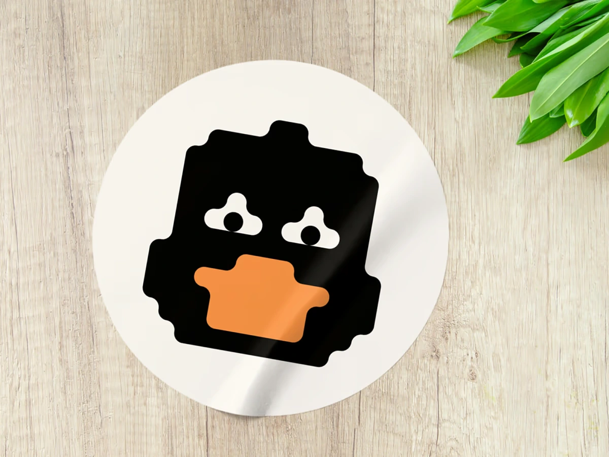
From the beginning, Oliver and I knew the logo had to be a duck—but not just any duck. It needed to quack with personality. We explored dozens of shapes and silhouettes trying to strike the perfect balance between simplicity and charm.
The pixelated duck
After rounds of refinement, the chosen symbol emerged: the pixelated duck. A playful, iconic nod to the tiny squares—pixels—that form the foundation of all creative work. To complement it, I designed a custom pixel-style typeface, drawn literally pixel by pixel, to echo the same quirky spirit.
An online home for 300,000+ vectors
Designing the new interface meant building a layout system that could adapt to a wide range of vector styles, licenses, and formats. The challenge was finding a structure that felt playful, yet consistent enough to prevent visual chaos.
I redesigned the filtering, browsing, and download flows so users could quickly find exactly what they needed across hundreds of thousands of assets.
More than just a website
Iconduck isn’t a regular website; it’s a fully fledged web application with user accounts, saved collections, a download manager, payment subscriptions, vector color customization, third-party integrations and what not.
Each feature introduced countless component states and edge cases. I mapped and redesigned them all—from notifications and loaders to error states and success feedback—to make the experience predictable and delightful.
Putting creators at the forefront
The old site didn’t showcase the talented designers behind the vectors.
So I created dedicated creator profile pages where users can discover, browse, and appreciate the work of individual artists—turning Iconduck into a platform that celebrates community, not just assets.
A seamless checkout experience
Iconduck’s revenue relies on a paid subscription that unlocks unlimited downloads, premium resolutions, and advanced integrations. To support this, I designed a clean and frictionless checkout flow that clearly communicates the value behind upgrading.
Designing cohesive marketing materials
To keep the identity unified, I extended the new branding into all marketing assets—from plugin visuals to banners to social media posts. Everything needed to feel unmistakably “Iconduck.”
Design system to the rescue
With a product of this size and complexity, a design system was essential. I built a comprehensive component library that defined typography, color styles, tokens, cards, search blocks, vector previews, page layouts, and every interactive state. This system became the blueprint for every page and feature, enabling the product to evolve with consistency and speed.
Zlatko is an incredibly talented product designer and thinker. He’s someone you can collaborate with deeply, and trust that you will leave the experience with a better product and business than before.— Oliver Nassar, Founder - Iconduck.com
Post-launch success
4× increase in icon downloads
Following the redesign, people downloaded significantly more assets per session thanks to clearer navigation and more intuitive filtering tools.
Faster search-to-download flow
The new search architecture and streamlined interface reduced friction, helping users find and save the right vectors in nearly half the time.
Business acquired
Just a few month after the redesign. Iconduck was acquired, marking a strategic exit and validating the redesign’s role in scaling the platform toward this milestone.
Like this project
Posted Nov 17, 2025
Iconduck grew into a huge open-source icon platform, but its product lagged behind. I led a full rebrand, redesign, and design system to help it scale.
