Pond Foundation Brand Identity and Website Redesign
Zlatko Najdenovski
1 collaborator
Pond Foundation – Strategising a childhood memory into a purpose-driven brand
Overview
Pond Foundation helps organisations step out of noise and into clarity, guiding them toward strong climate action rooted in responsibility and care. Their name carries a beautiful childhood memory. The “pond” as a sacred place of calm, reflection, and wise decision-making. To align their message with their mission, they needed a new visual identity and a complete website redesign.
With the early success of Scott‘s A Different Way project, I was recommended to his colleague Sam, who chose to work with me not just for my design approach, but because we shared a deeper intention: a belief in service, impact, and meaningful work done with heart.
The challenge
Transform a poetic, emotional metaphor—the pond—into a brand identity that feels purposeful, credible, and scalable across a global mission-driven organisation.
Key objectives
Create a new logo grounded in the symbolism of calm, reflection, and positive ripple effects.
Redesign the website to express the brand’s purpose with clarity and minimalism.
Establish a visual system that is natural, tactile, and distinct from typical climate-action brands.
Elevate their initiative offerings with recognisable, themed iconography.
My approach
Let the ripples begin
A pond creates ripples, just as meaningful ideas create impact. My early sketches explored this metaphor through concentric forms and subtle organic geometry. I also considered symbols like a lotus blooming at the centre, representing purity of intention.
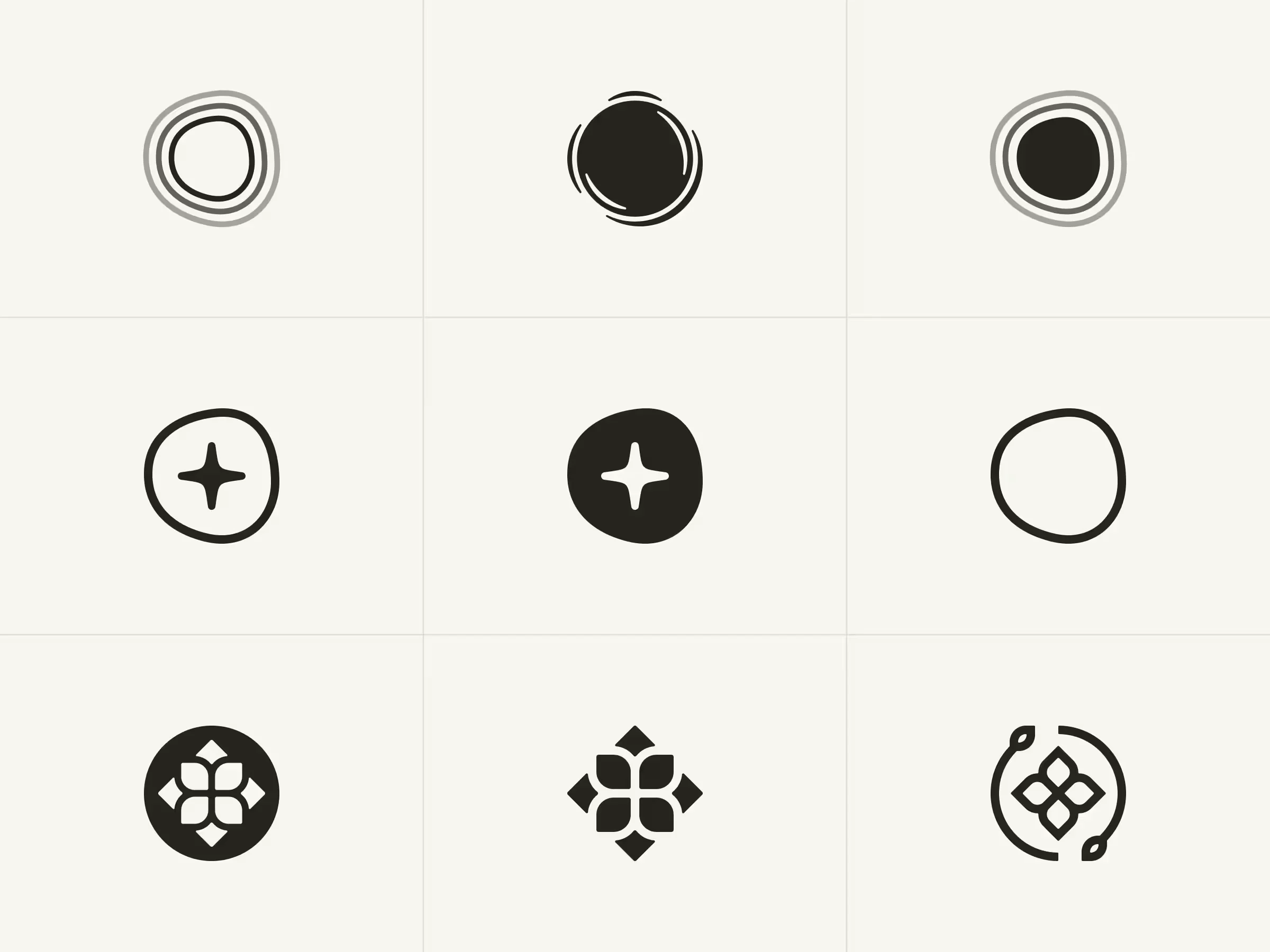
But how about a responsive logo?
One exploration was a responsive mark that adjusted across breakpoints—a modern idea, but ultimately too risky. A brand built on emotional resonance needs recognisability, not novelty for novelty’s sake. I kept the conceptual freedom but grounded it in simplicity.
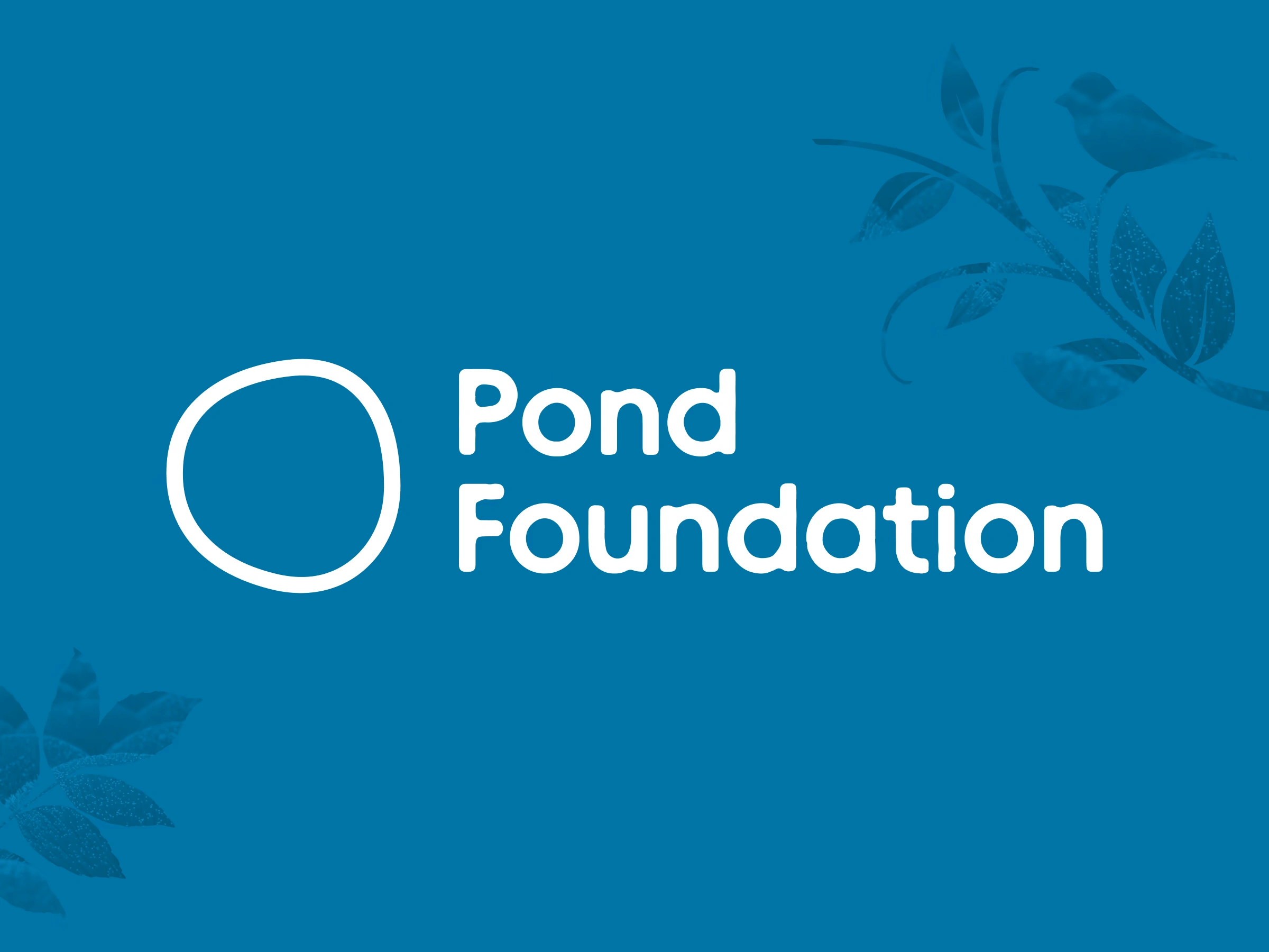
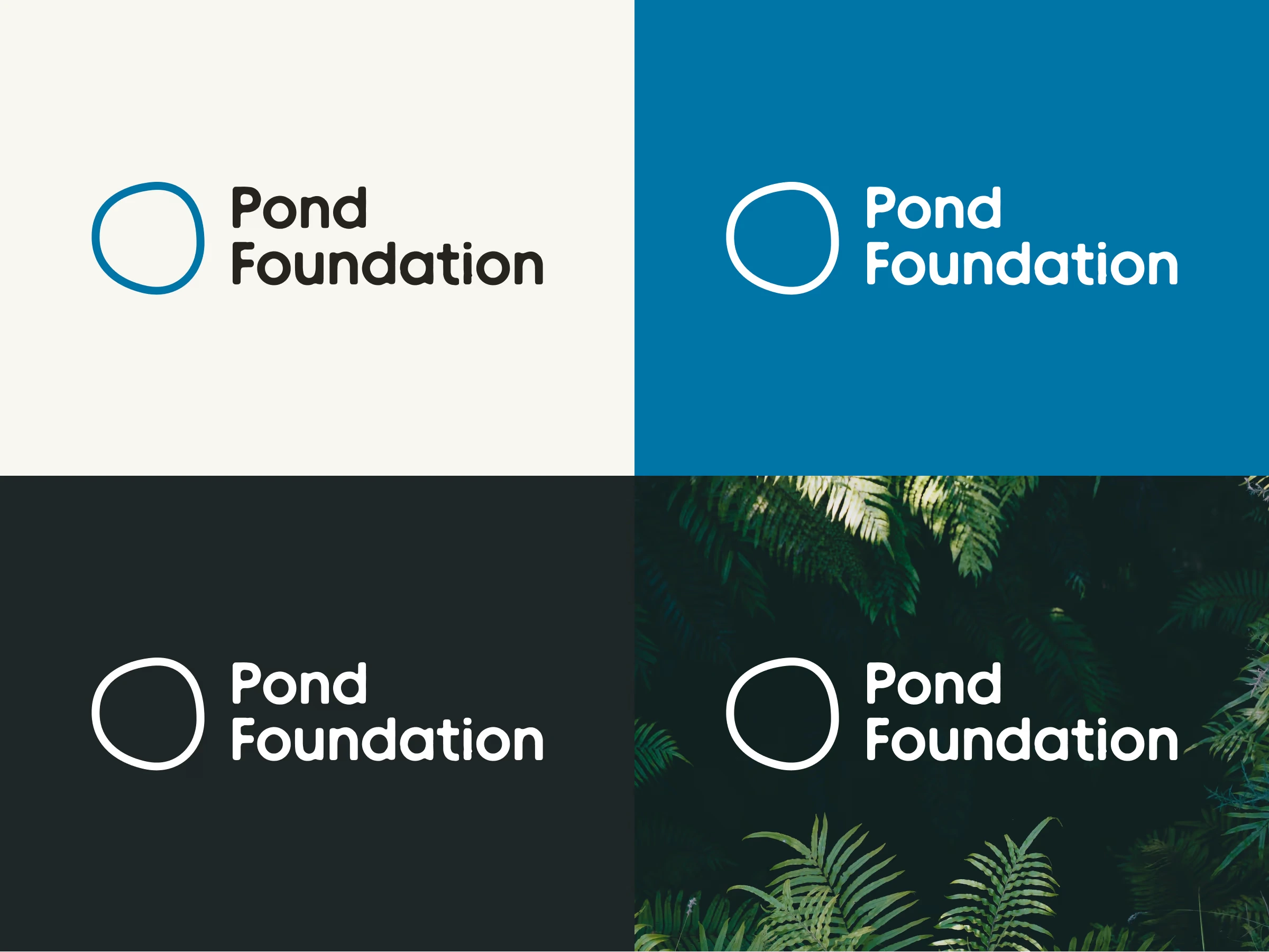
The imperfect-perfect circle
In the end, the question came to the following: What is a pond at its visual essence? Perhaps just a still, quiet, and reflective circle.
A circle might seem too basic, until you pair it with the right typeface and context. Once set properly in space, the mark starts to whisper its essence. The slight irregularity gives it humanity, grounding it in the natural world rather than corporate polish.
Minimal, organic, with a dash of grunge
Building from the logo, the website embraces a visual language that is minimal yet tactile: soft tones, gentle contrast, and edges that feel subtly imperfect.
Nothing is pitch black, nor pure white. The palette revolves around a pale, almost paper-like beige paired with a deep, calming blue. They were all intentional choices to evoke nature without imitating it literally.
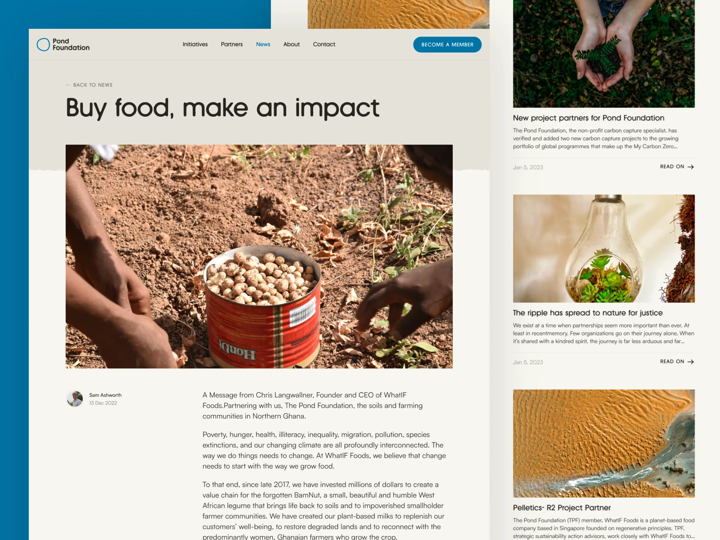
A website is nothing without the little visuals
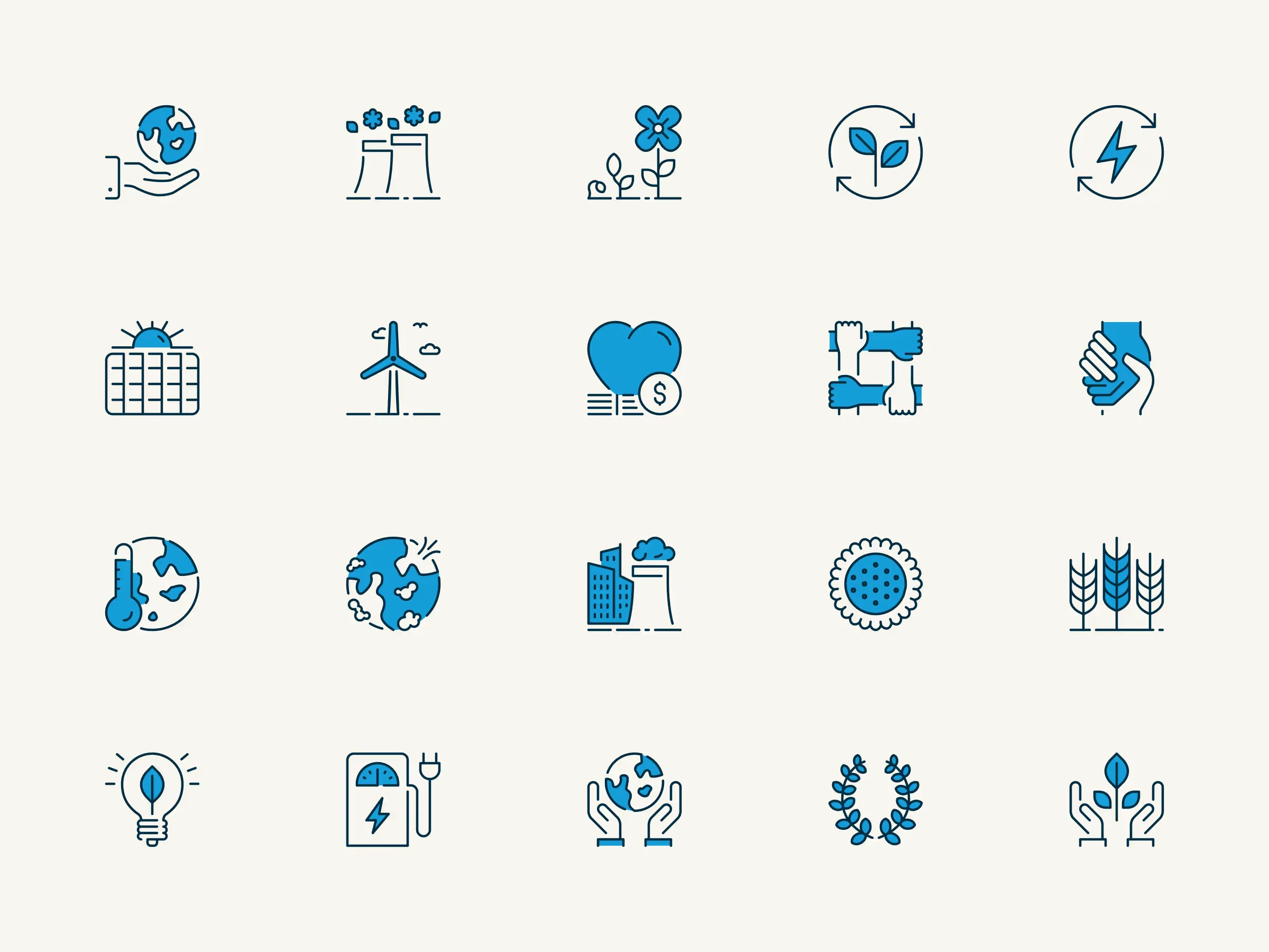
Iconography plays a major role in the site’s rhythm and expressiveness.
To maintain coherence, I designed a few line-based icons sprinkled with the brand‘s accent colour. Their light, organic quality fits perfectly into the aesthetic direction.
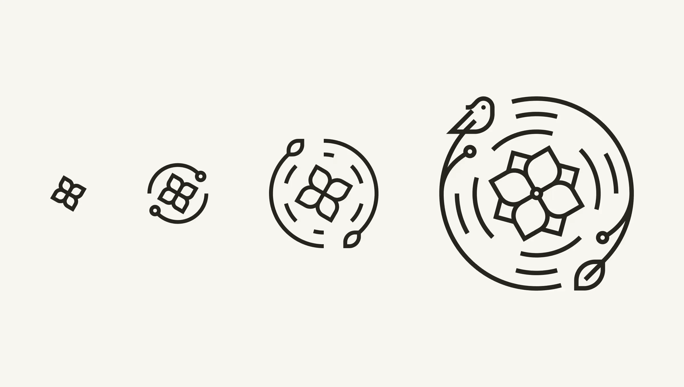
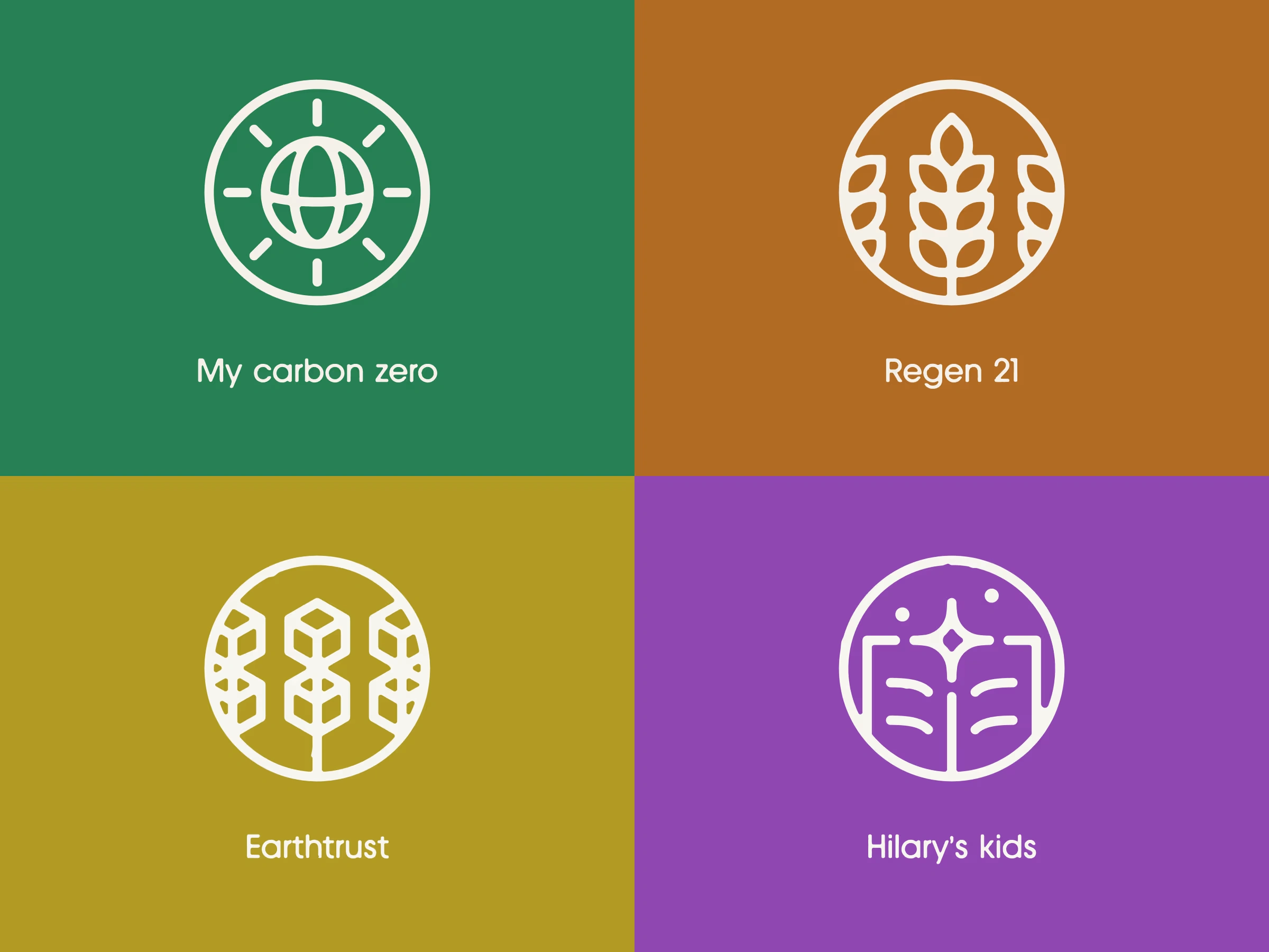
Themed icons for the Initiatives
Each Pond Foundation Initiative needed a visual distinction. I designed a symbolic “micro-logo” for each initiative and assigned a unique colour to it, creating clarity for organisations navigating their options. Now, the only challenge left is making sure I never run out of colours as new initiatives appear.
A website is never done
A good website requires more than visuals. Following my full checklist, I optimised the experience at every layer—accessibility (alternative text, contrast, font sizes), SEO structure, metadata, and content clarity.
When it came time to launch, I proposed dropping the old, long domain
thepondfoundation.org and moving to the more succinct, memorable pond.foundation. Sam agreed, and it instantly strengthened the brand’s presence.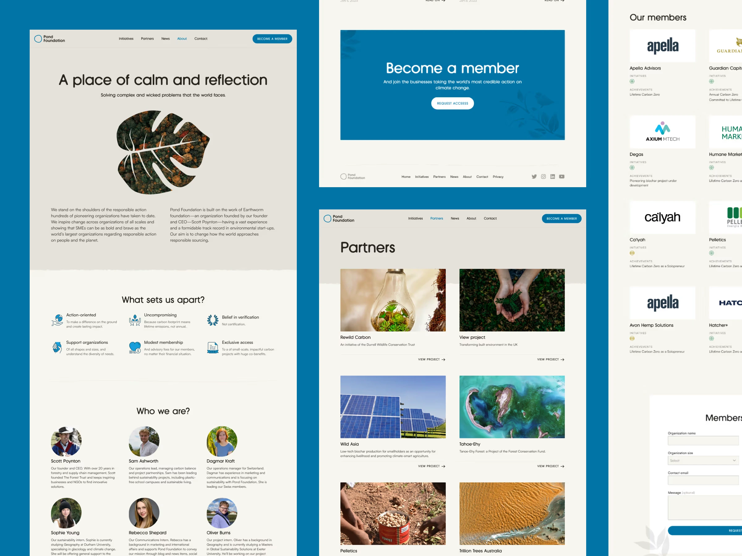

Outcomes
The new brand identity and website gave Pond Foundation a clearer, calmer, more grounded digital presence aligned with their mission. Their storytelling became more cohesive, and their Initiatives gained recognisability through themed visuals.
Testimonial
It was a rewarding experience to work with Zlatko. His “ensage,” approach jumped out at me when I saw it. His commitment to deeply human values made him stand out and I'm thrilled with the final result. Now... to our next project together!— Scott Poynton, Founder・A Different Way
Post-launch success
70% increase in website retention rate
The new visual clarity and straightforward navigation encouraged repeat exploration across various website sections.
18% reduction of bounce rate
The calm, minimal layout helped users stay longer and understand the mission better.
Improved accessibility compliance
Better contrast, cleaner typography, and consistently applied alt text boosted accessibility scores.
Like this project
Posted Nov 17, 2025
Developed a new brand identity and website for Pond Foundation, enhancing digital presence and mission alignment.
Likes
1
Views
13
Timeline
Jan 5, 2023 - Feb 2, 2023
Collaborators