Built with Framer
Vault® — Building a modern financial brand from the ground up

Max Iriani


Live site: https://vaultfinance.com
VAULT® — Building a clearer financial experience for independent professionals
A complete fintech brand and digital experience designed to help independent professionals manage their money with greater clarity, confidence, and control.
Role: Brand Strategist, Brand Designer, Product Designer & Web Developer
Services
Brand Strategy
Visual Identity (+ Social Media)
Product Design
Web Design & Development
01 — The Challenge
Making financial management feel simpler for a new generation of professionals.
Independent professionals have more ways to earn and manage money than ever before.
Freelancers, founders, consultants, and creators often move money between banks, payment platforms, savings accounts, business expenses, and multiple cards.
The problem isn't a lack of financial tools.
It's fragmentation.
Traditional financial platforms often make managing money feel complicated, while newer fintech products tend to focus on individual features rather than the bigger financial picture.
VAULT needed to communicate a different idea:
Your money shouldn't feel scattered.
The goal was to build a fintech brand that could make financial management feel clear, intelligent, and confident — while positioning VAULT as more than another banking product.
02 — Brand Strategy
Positioning VAULT as a financial operating system, not just a fintech.
Before designing the identity, I defined what VAULT should represent and who it should be built for.
The audience
VAULT is designed primarily for independent professionals:
→ Freelancers
→ Founders
→ Consultants
→ Creators
→ Agency owners
→ Digital professionals
These users often have more financial complexity than a traditional banking experience is designed to handle.
The strategic opportunity
Instead of competing directly with traditional banks, VAULT was positioned as a financial operating system — bringing earning, spending, saving, and financial planning into one connected experience.
The brand needed to feel:
Clear: Making financial information easier to understand.
Confident: Giving users a stronger sense of control over their money.
Intelligent: Using technology to make better financial decisions possible.
Premium: Creating a level of trust and quality expected from a modern financial platform.
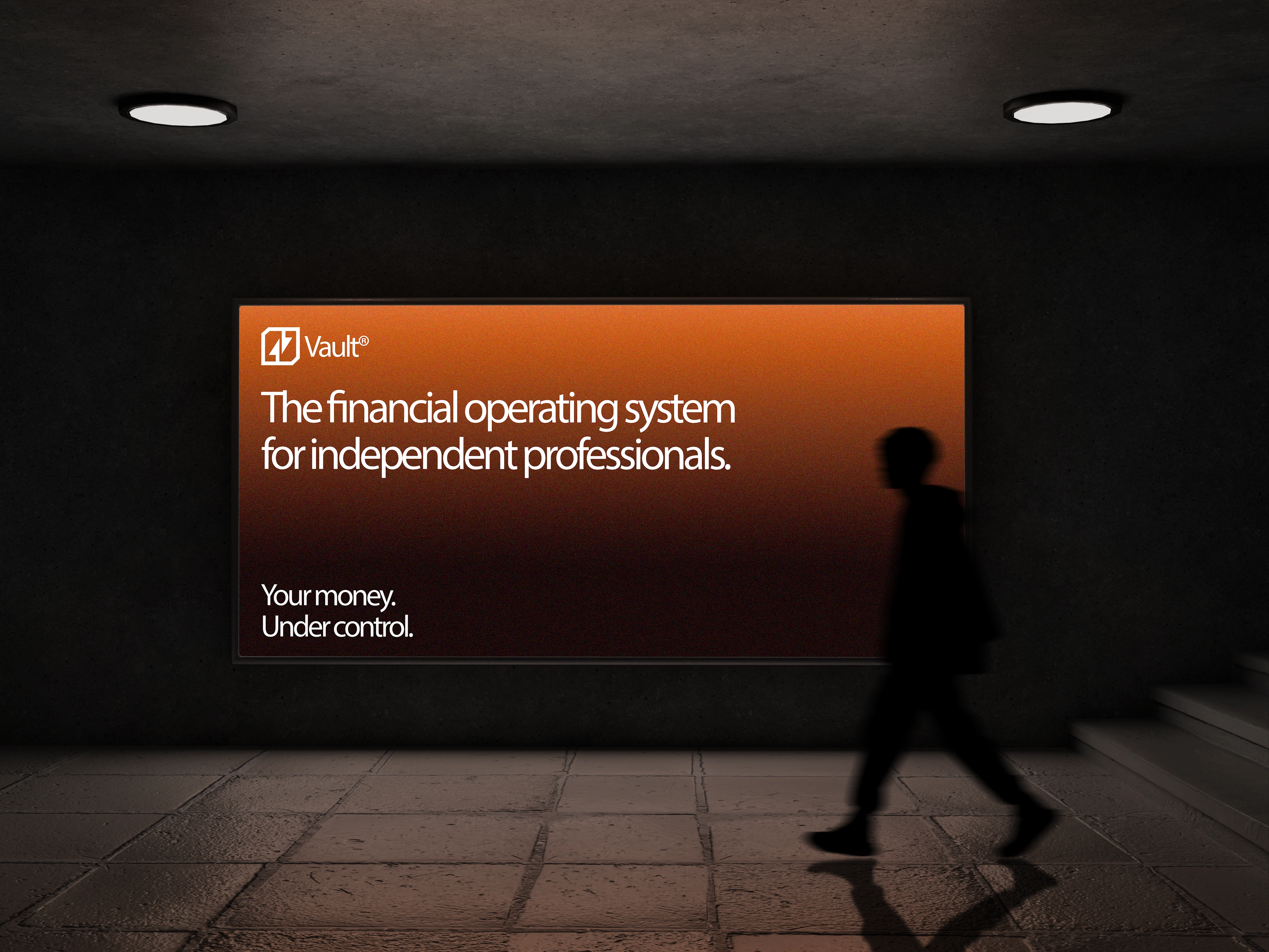
The central brand idea became: Your money. Under control.
03 — Visual Identity
Building a visual system around structure, control, and clarity.
The VAULT identity was designed around the idea of financial structure.
Rather than relying on predictable fintech visual language, the system uses geometry, negative space, typography, and restrained color to create a more distinctive and premium presence.
The logo
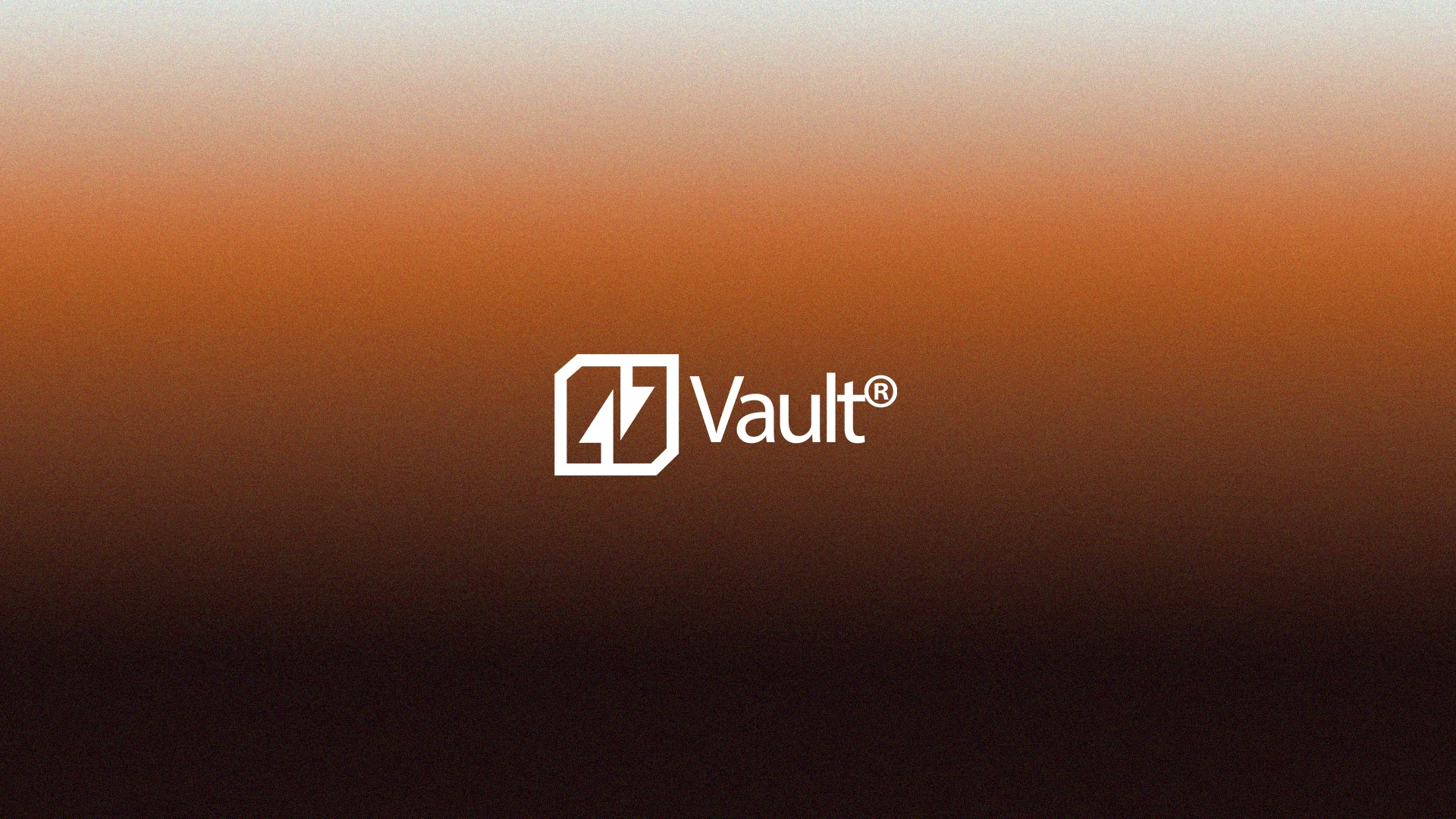
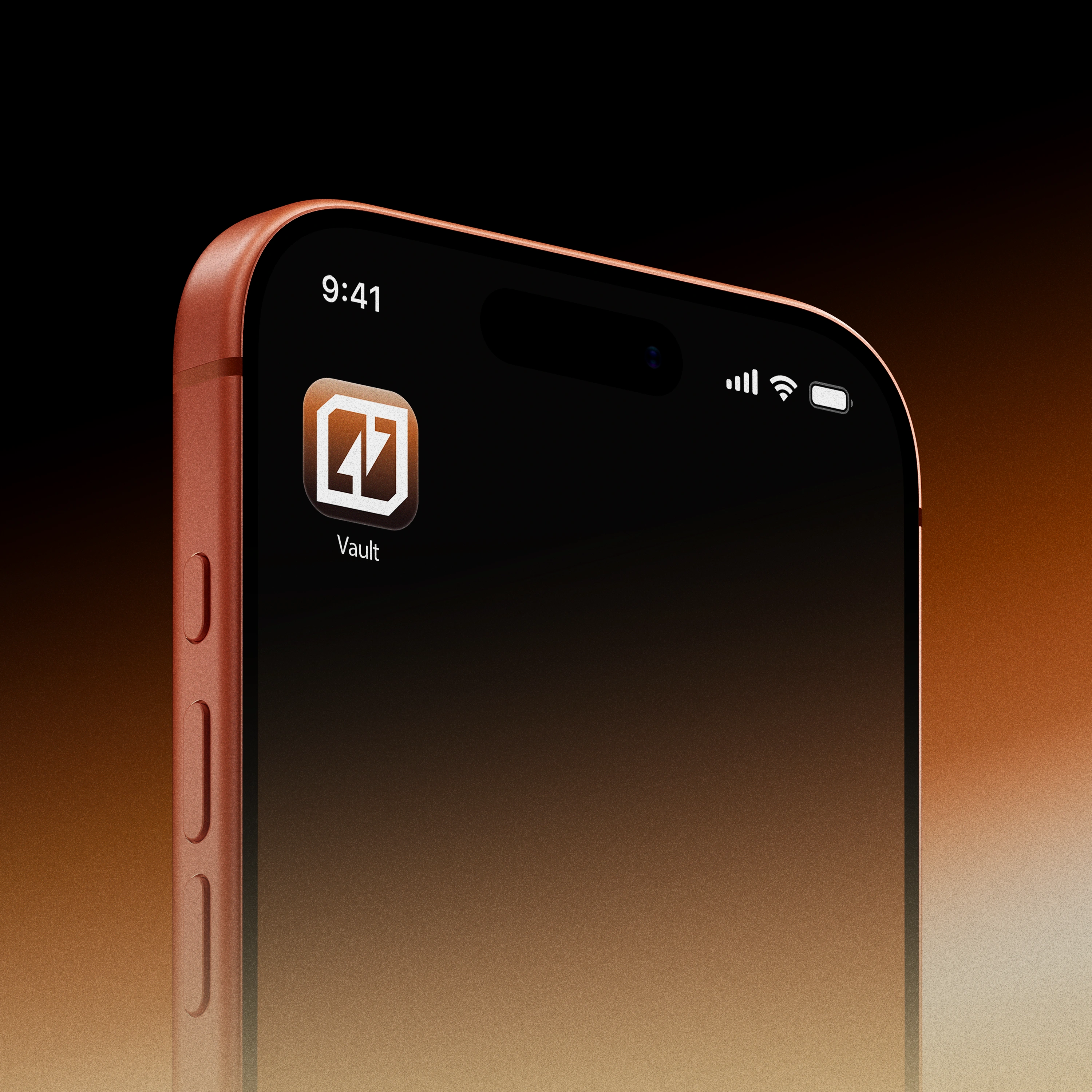
The VAULT symbol is built around two opposing arrows contained within a simple geometric square.
Each arrow is split in half and points in an opposite direction — one emerging from the bottom and the other extending downward from the top. Together, they create a sense of movement, balance, and controlled flow.
The surrounding square references a vault or secure chamber, translating the meaning of the brand name into a simple visual form without relying on an obvious lock or security symbol.
The result is a minimal, modern mark that combines:
→ Movement — the flow of money
→ Balance — financial control
→ Containment — the idea of a vault
→ Precision — a structured financial system
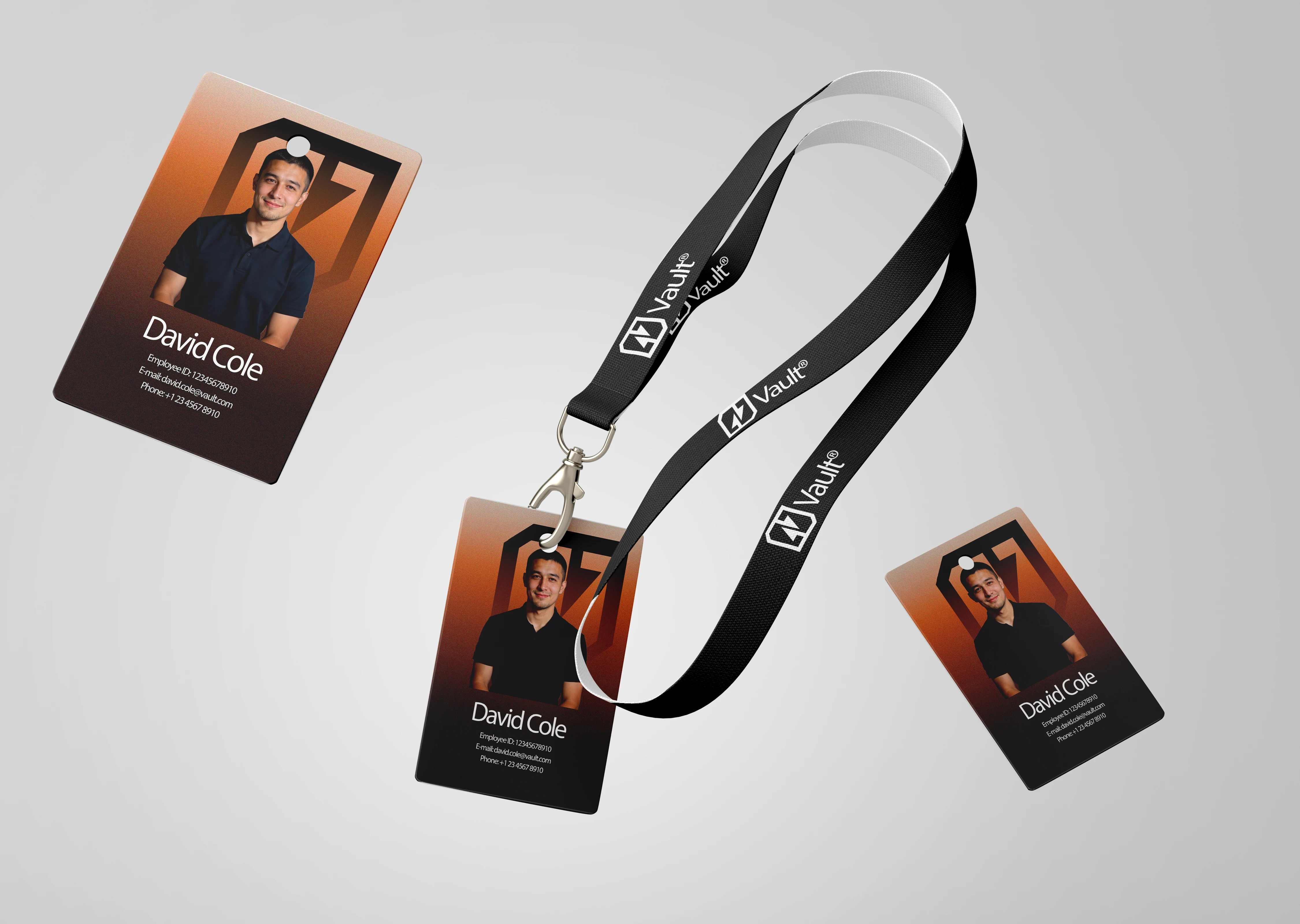
The simplicity of the symbol allows it to work consistently across the entire identity, from the website and social media to the physical VAULT card.
Typography
Typography became one of the main tools for establishing VAULT's personality.
The system combines a contemporary sans-serif typeface with strong typographic hierarchy to create a balance between:
Precision. Clarity. Confidence. Modernity
Large, direct headlines create a strong presence, while smaller typography handles financial information with precision.
Color
The VAULT color system is built around a warm, distinctive orange — #BA642F — combined with deep blacks and soft off-whites.
Rather than using flat color, the primary visual treatment is a three-stage gradient with subtle noise, creating depth and a tactile, almost atmospheric quality.
The gradient transitions from:
Deep black at the bottom → VAULT Orange (#BA642F) through the center → Soft white at the top.
The noise layer adds subtle texture to the gradient, preventing it from feeling overly digital or polished and giving the visual system a more tangible, premium character.
This gradient becomes one of the most recognizable elements of the identity, appearing across key brand moments, digital compositions, and product visuals.
The color system creates a balance between:
→ Black — depth, sophistication, and control
→ Orange — energy, confidence, and distinction
→ White — clarity, openness, and simplicity
→ Noise — texture and visual depth
Rather than functioning as a decorative effect, the gradient acts as a core visual asset, giving VAULT a recognizable visual signature across every touchpoint.

04 — Social Media
Extending the brand beyond the product.
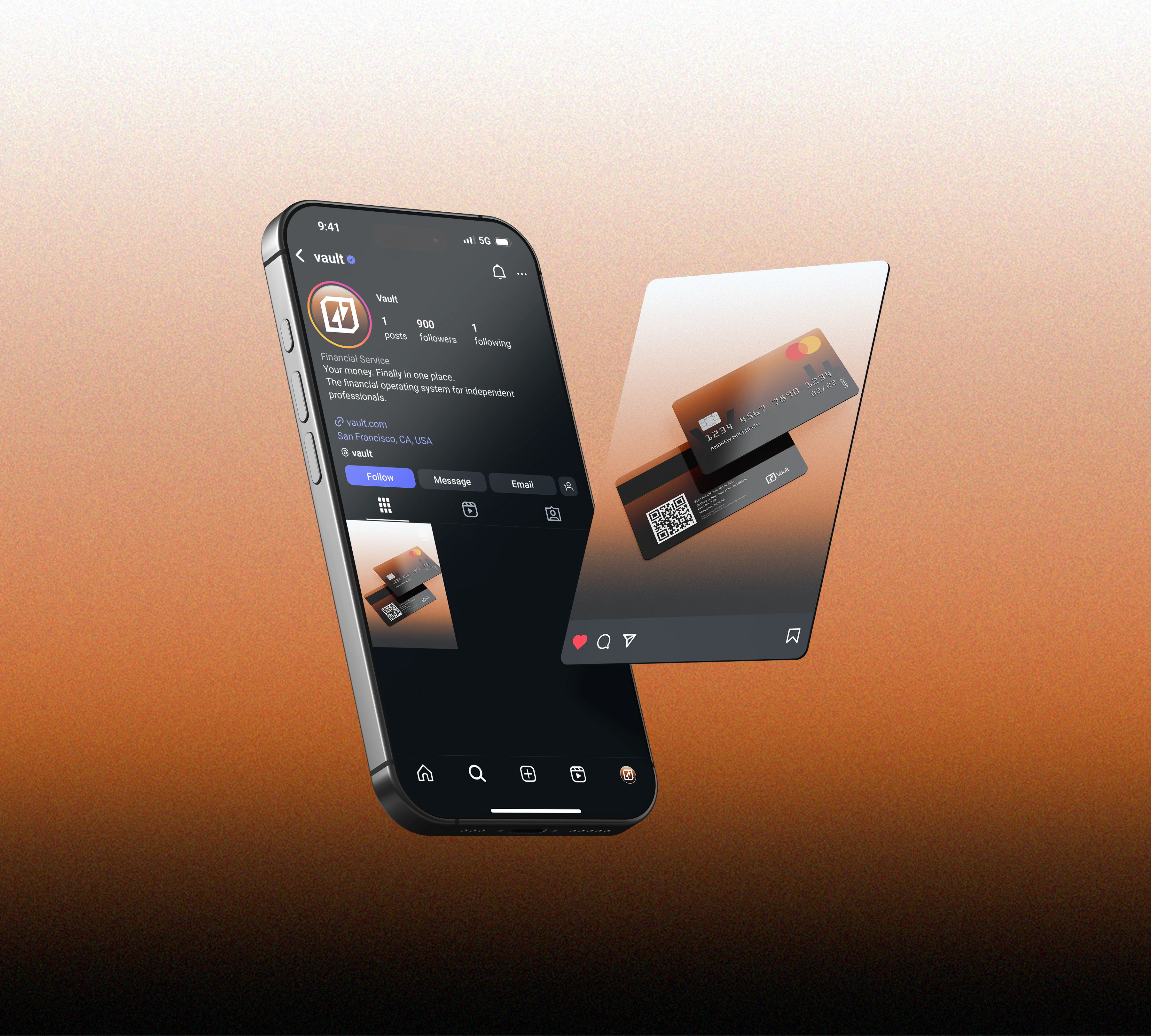
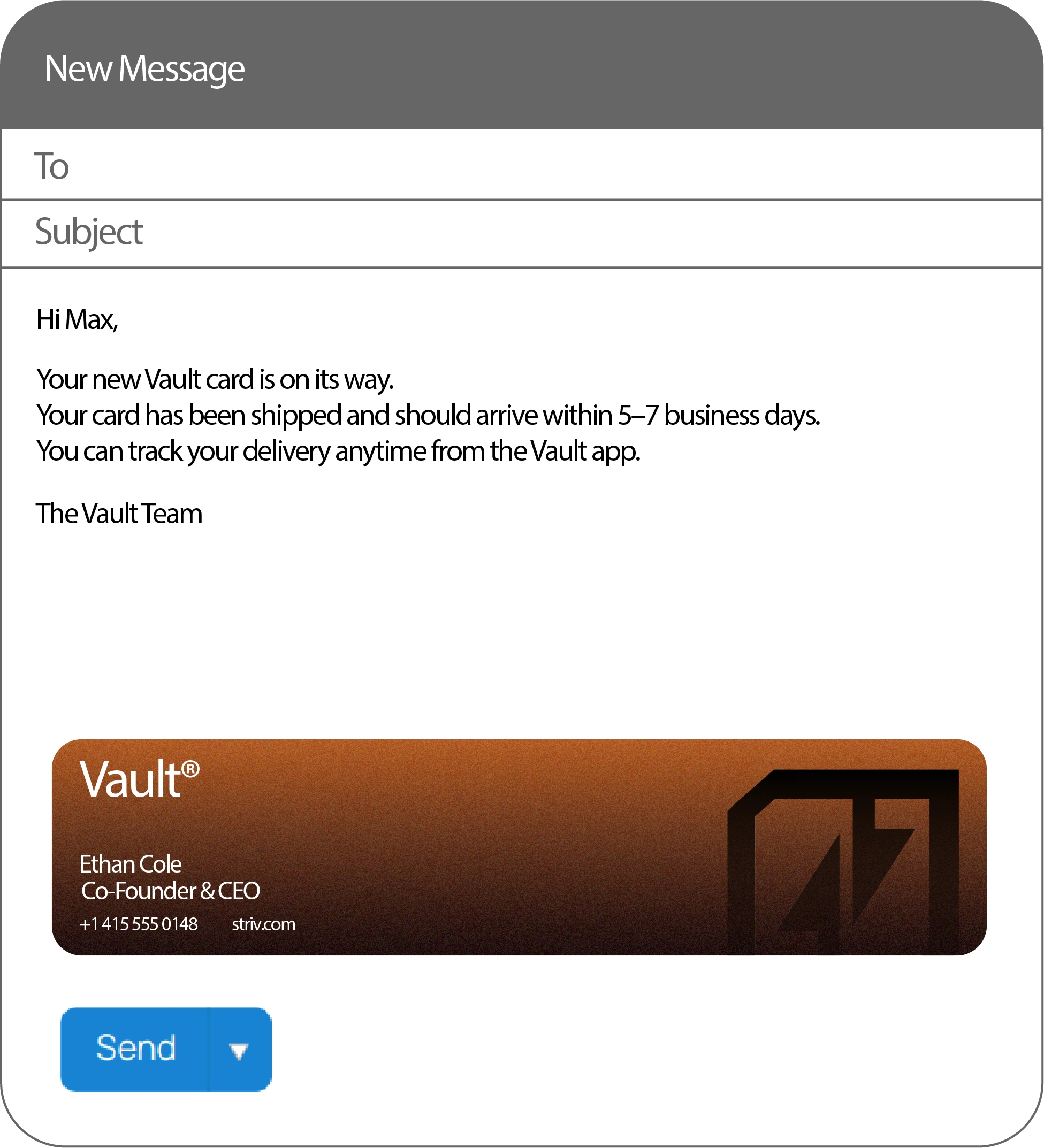
The social presence was designed as an extension of the VAULT identity rather than as a separate marketing layer.
The objective was to establish a recognizable visual language that could communicate the brand consistently across different types of content.
The system was built around:
Product-focused compositions
Showcasing the VAULT card and digital experience.
Educational content
Making financial concepts easier to understand.
Brand-led messaging
Building recognition around VAULT's philosophy and positioning.
Editorial layouts
Giving the brand a more sophisticated and distinctive presence in the fintech space.
Every post follows the same visual principles established by the core identity.
05 — The VAULT Card
Turning the brand into a physical experience.
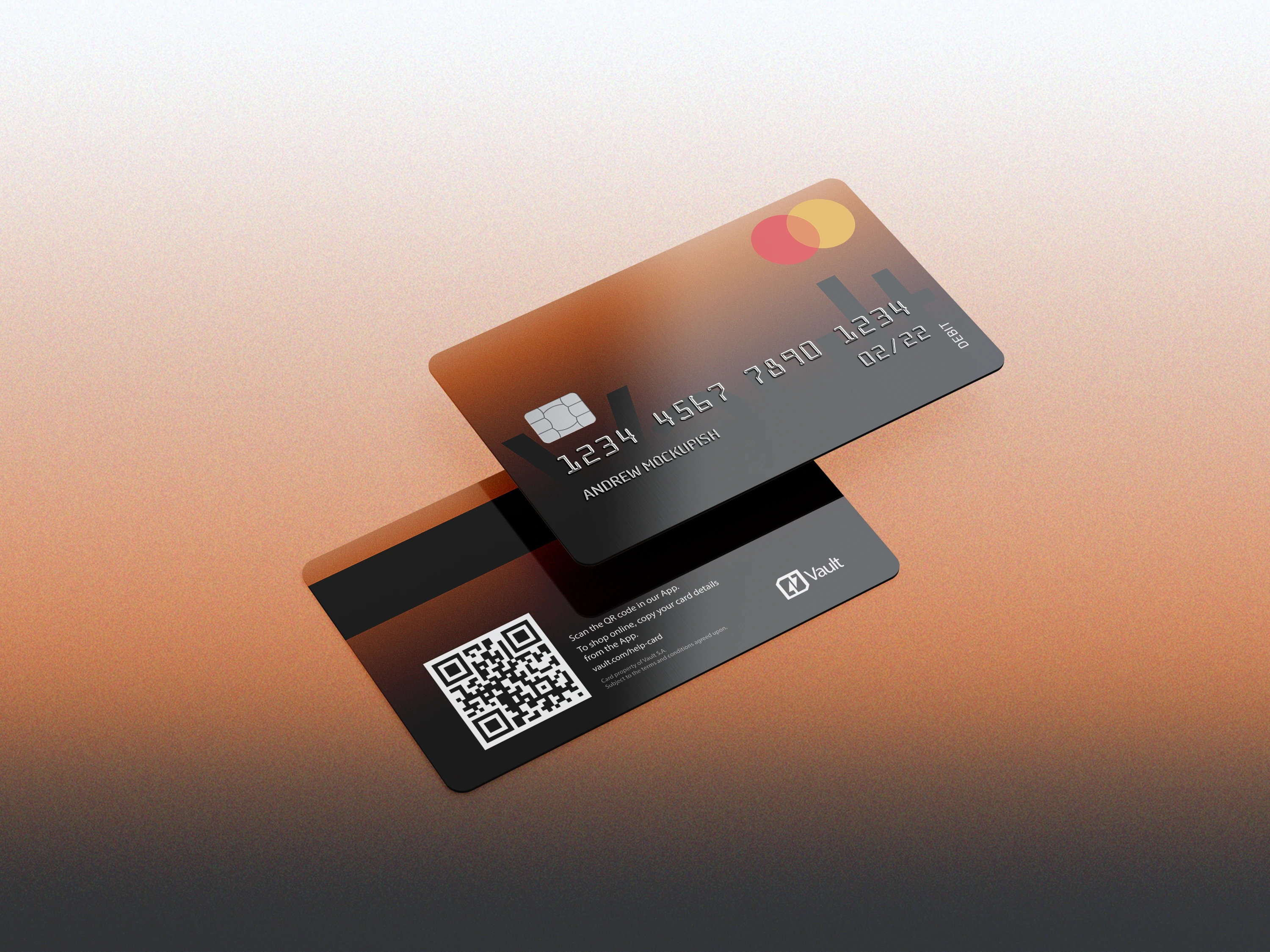
The VAULT card is one of the most important physical expressions of the brand, translating the visual identity into a tangible product.
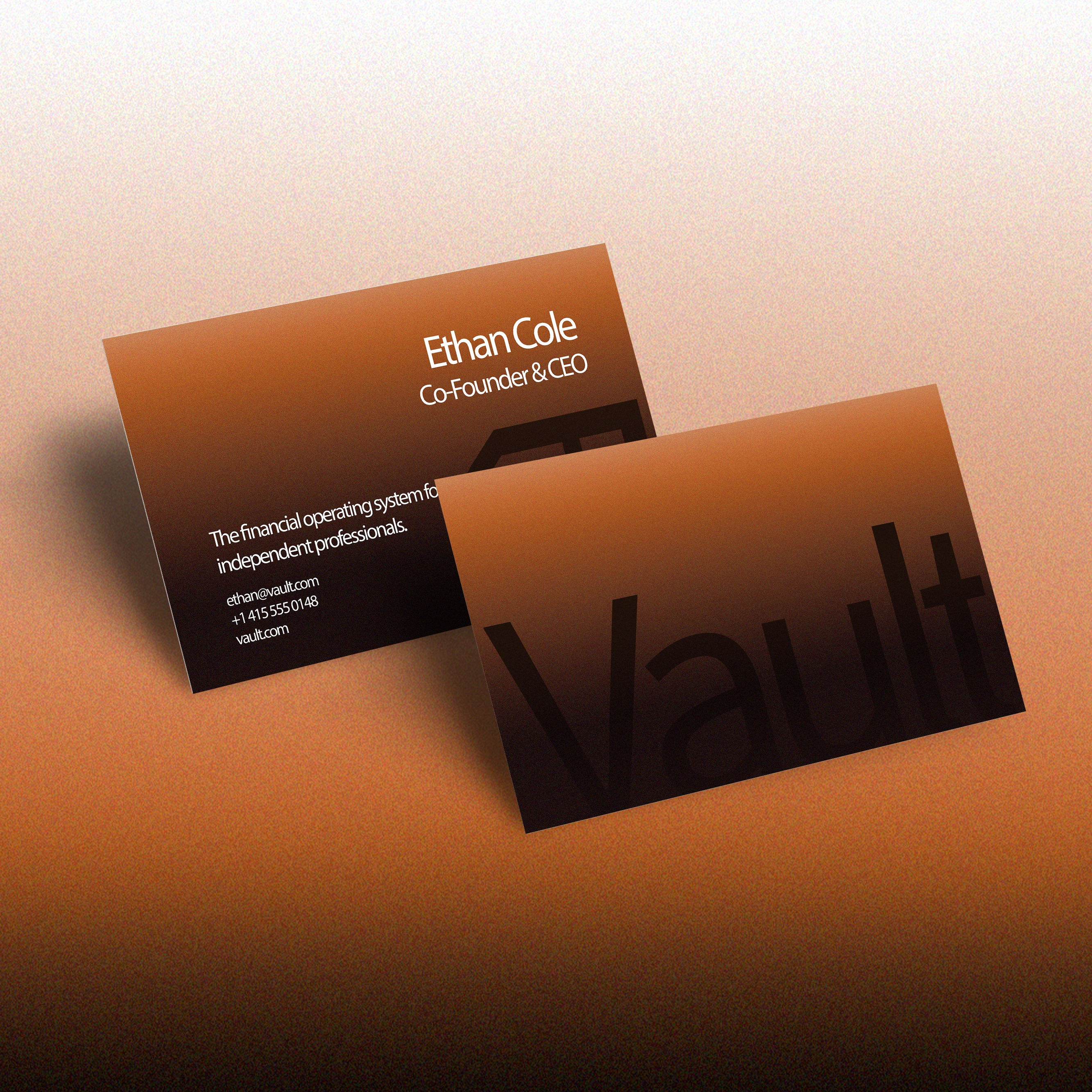
The card features the brand’s signature gradient, enhanced with a subtle noise texture that gives the surface more depth and a tactile, premium feel.
The front keeps the composition intentionally minimal. A large, low-opacity "VAULT" sits across one side of the card, creating a subtle graphic layer without overwhelming the design. The remaining information is kept minimal, allowing the gradient and logo to remain the primary visual elements.
The back of the card takes a more functional approach, featuring a QR code connected to the VAULT app, alongside relevant app and support information. This creates a direct connection between the physical card and the digital product.
06 — Web Development
Bringing the experience to life in Framer.
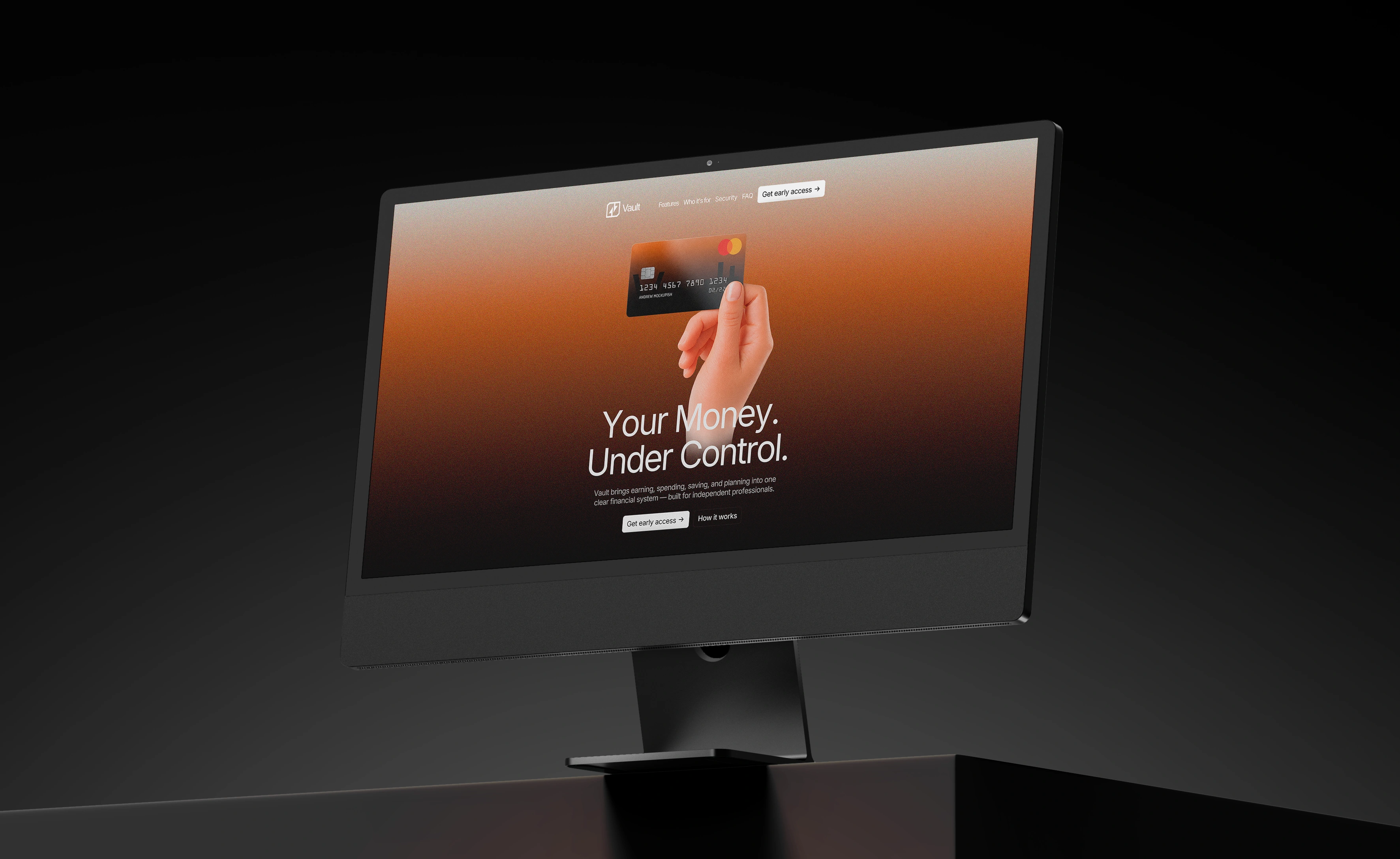
The final website was designed and developed in Framer, translating the visual system into a responsive and interactive digital experience.
The development focused on maintaining the precision of the design across:
→ Desktop
→ Tablet
→ Mobile
Interactions and animations were kept purposeful, supporting the premium feel of the brand without overwhelming the experience.
The result is a flexible digital system that can evolve alongside the VAULT product.
07 — Final Outcome
A complete fintech brand built around financial clarity.
VAULT started with a simple question:
What if managing your money felt less complicated?
The answer became a complete brand system spanning strategy, identity, social media, physical product, and digital experience.
From the logo and visual language to the VAULT card and website, every touchpoint was designed around the same central idea:
Your money. Under control.
The result is a fintech concept designed to feel clear, confident, and premium — built for a generation of independent professionals managing money on their own terms.
Foundation Studio™ | byfoundation.studio
Like this project
Posted Aug 12, 2026
Strategy, identity, card design, social media, and a digital experience for a fintech built for independent professionals.
Likes
3
Views
47
Timeline
Jul 29, 2026 - Aug 12, 2026