Built with Framer
Tercia Pay — Framer Design & Development

Max Iriani


See it live here: https://www.terciapay.com/
Tercia Pay — Transforming fintech complexity into a clear digital experience
A strategic website experience designed to simplify financial operations, communicate value, and build trust for a modern fintech platform.
Role: Web Designer & Framer Developer
Services
UX Strategy
Web Design
Interaction Design
Framer Development
01 — The Challenge
Translating a complex fintech ecosystem into a simple digital experience.
Tercia Pay is an electronic wallet platform designed for businesses and public organizations, combining payment distribution, expense management, and fiscal compliance into a single ecosystem.
While the platform provides a wide range of capabilities — from automated CFDI generation and expense control to integrations and real-time reporting — communicating this complexity clearly was the main challenge.
The website needed to:
Explain the platform's value without overwhelming visitors
Build trust from the first interaction
Communicate efficiency, security, and innovation
Guide users through a clear path toward conversion
The goal was not only to create a visually polished website, but to transform a complex financial solution into an experience that feels intuitive and reliable.
02 — Digital Strategy
Turning complexity into clarity
When users evaluate financial technology solutions, they are not only looking for features. They need to understand:
→ What problem does this solve?
→ How does it improve my operations?
→ Why should I trust this platform?
The website strategy was built around answering these questions through a structured user journey:
Understand
Introduce Tercia Pay's purpose and value proposition clearly.
Explore
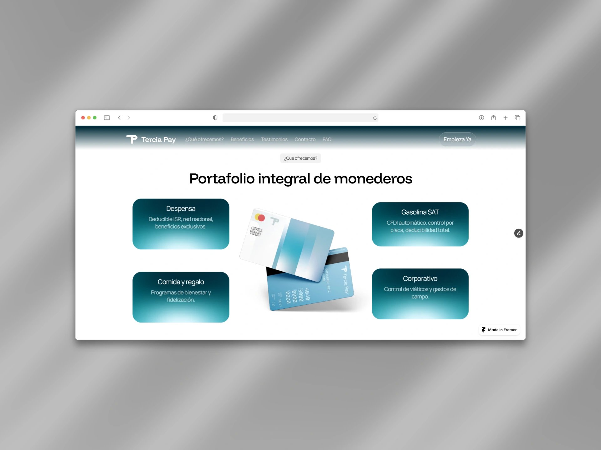
Present the different solutions and capabilities within the ecosystem.
Evaluate
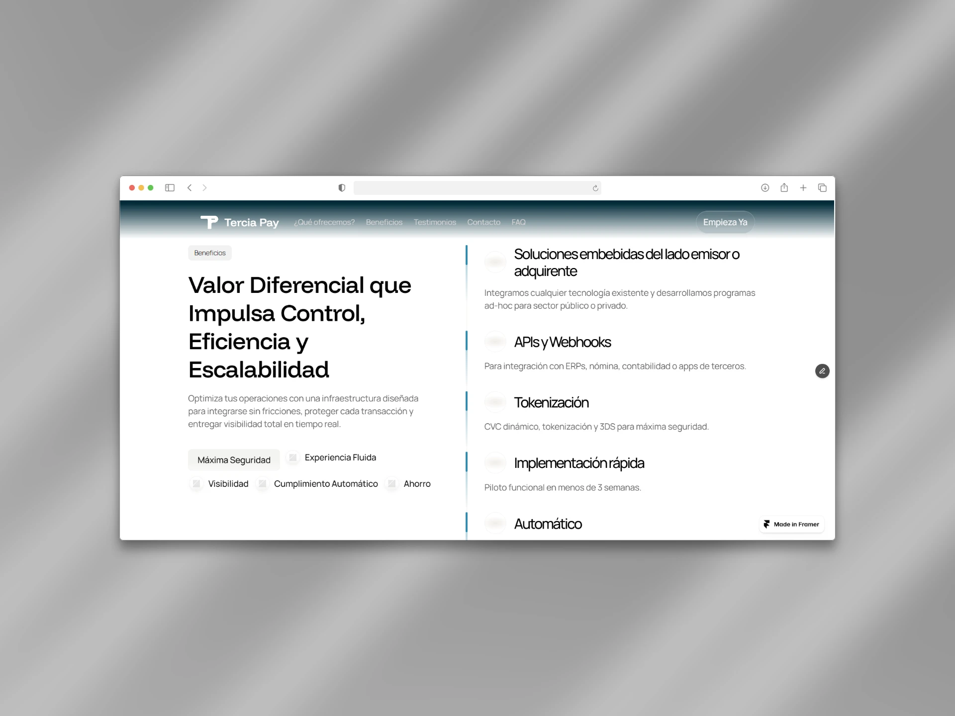
Highlight benefits, trust signals, and reasons to choose the platform.
Act
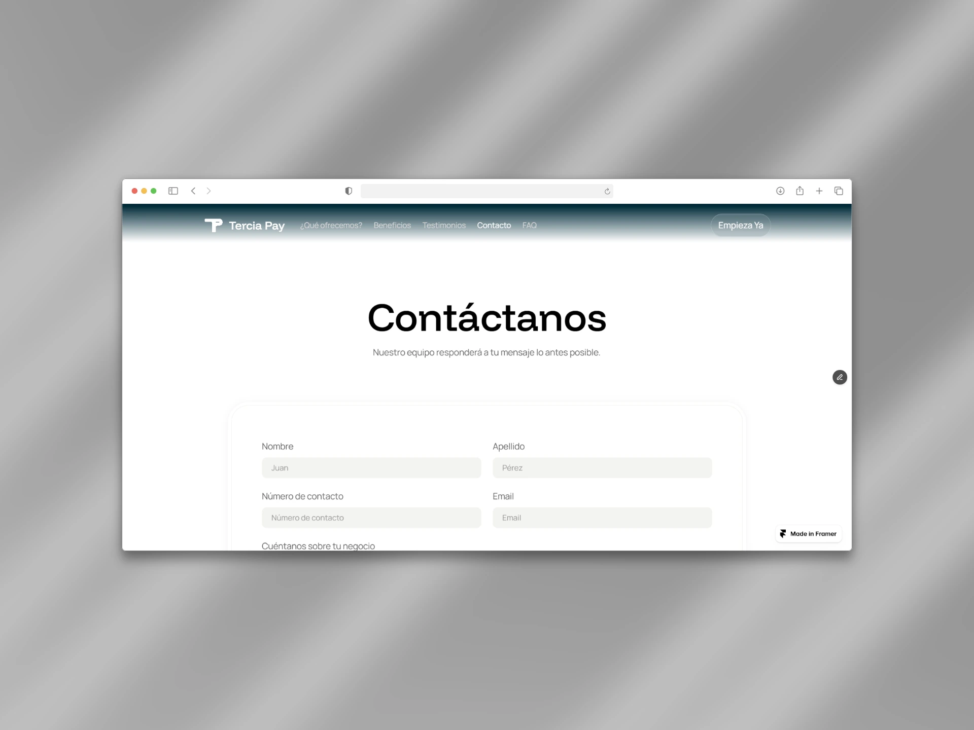
Create a simple path for potential customers to start a conversation.
Each section was designed with a specific role in moving users from awareness to confidence.
03 — Translating Brand Identity Into Digital Experience
Designing trust within the fintech space.
The existing Tercia Pay identity established a visual language based on light tones, blue colors, and a sense of technological reliability.
The website translated these principles into a clean and modern digital environment focused on clarity and confidence.
The visual direction was built around:
White backgrounds for openness and accessibility
Blue tones to reinforce trust, security, and innovation
Generous spacing to improve readability
Minimal layouts to keep focus on the message
For a fintech product, simplicity is not only an aesthetic choice — it is a way of reducing uncertainty and creating confidence.
04 — Hero Experience
Creating immediate understanding and confidence.
The hero section was designed around one key objective:
→ Help visitors understand what Tercia Pay does within the first interaction.
The challenge was communicating a broad ecosystem of solutions without making the experience feel complicated.
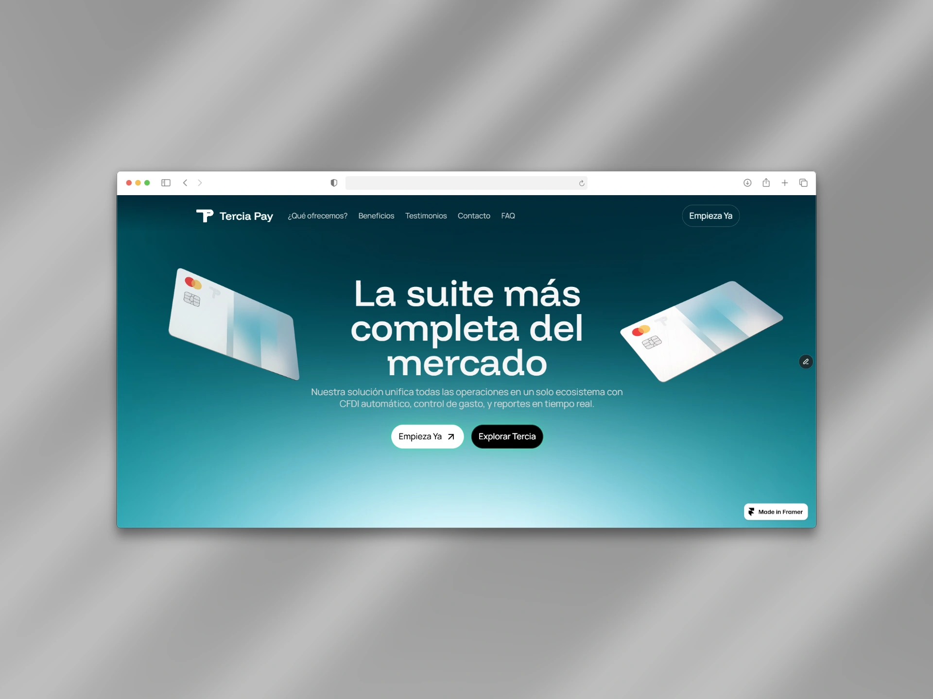
To achieve this, the hero combines:
A clear value proposition
Brand-aligned blue gradients
Dynamic floating cards
Subtle motion
The animated cards introduce the different capabilities of the platform, visually representing Tercia Pay as a complete ecosystem rather than a single isolated product.
The interaction creates engagement while reinforcing the core message:
→ Multiple financial solutions, unified in one platform.
05 — Communicating Value Beyond Features
Transforming technology into business benefits.
One of the main design challenges was avoiding a communication style centered only around technical terminology.
Features such as:
APIs and webhooks
Tokenization
CFDI automation
Real-time reporting
are important, but users need to understand the business impact behind them.
The website was designed to translate technical capabilities into clear benefits:
From:
"API integrations and tokenization"
To:
"A secure and flexible infrastructure that integrates seamlessly with existing business systems."
→ This approach makes the product easier to understand for decision-makers who may not have a technical background.
06 — Design System & Framer Development
Building a scalable digital foundation.
The website was designed and developed entirely in Framer, focusing on creating a flexible and maintainable experience.
Key considerations included:
Reusable components
Consistent visual patterns
Responsive behavior across devices
Smooth and purposeful interactions
Performance optimization
The goal was to create a digital foundation capable of evolving alongside Tercia Pay as the platform continues to grow.
07 — Final Outcome
A clearer digital presence for a modern fintech platform.
The final website positions Tercia Pay as a reliable and innovative solution for businesses looking to improve payment management, operational control, and fiscal compliance.
By combining strategic structure, intentional design, and a scalable development system, the experience transforms a complex fintech ecosystem into a clear and trustworthy digital journey.
The result is a website built not only to explain what Tercia Pay offers, but to help potential customers understand its value and take the next step with confidence.
Like this project
Posted Jan 2, 2026
Designed and developed a clear, trust-driven Framer website for Tercia Pay, simplifying a complex fintech product into a modern digital experience.
Likes
3
Views
39
Timeline
Nov 2, 2025 - Dec 3, 2025