Oona - Visual Identity & Packaging Design

Rebecca Arnaud


Introduction
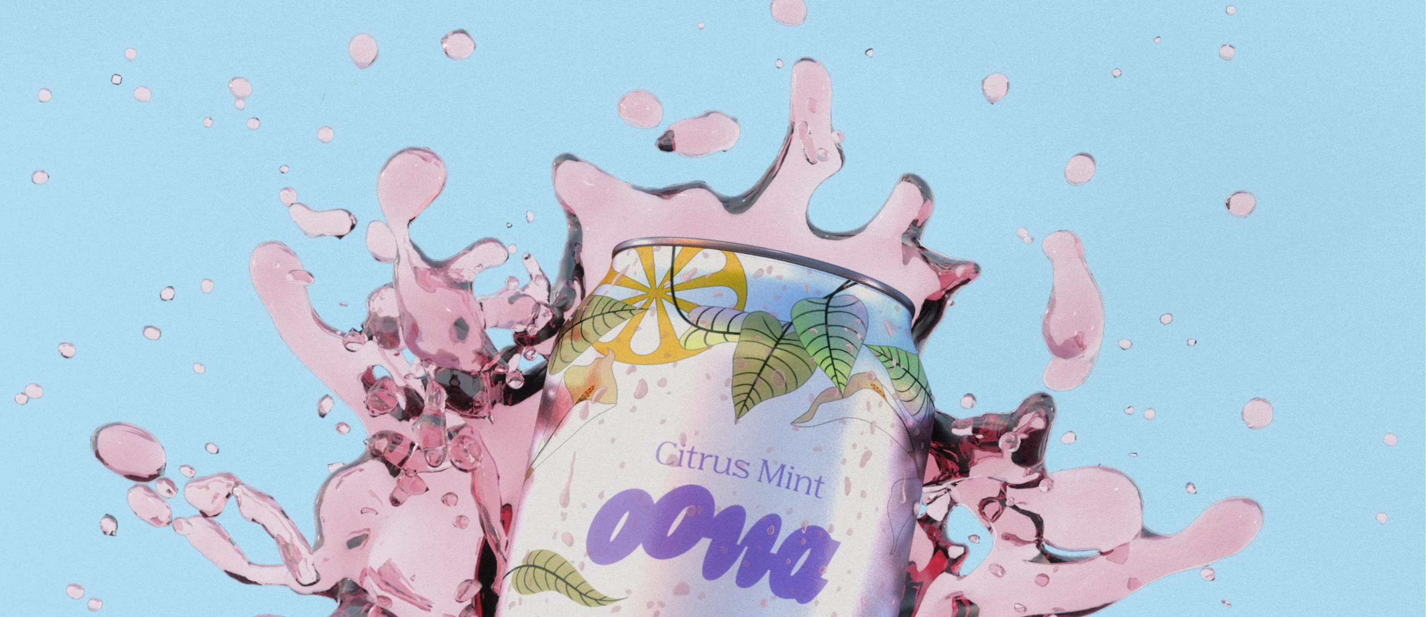
Oona came to us with a clear goal: build a brand that feels like a breath of fresh air in the wellness space. They weren’t just selling a supplement—they were launching a lifestyle of calm, clarity, and playful nostalgia. Our mission was to create a visual identity that embodied this soothing-yet-fun balance and positioned Oona as a standout among hydration and wellness competitors.



Process
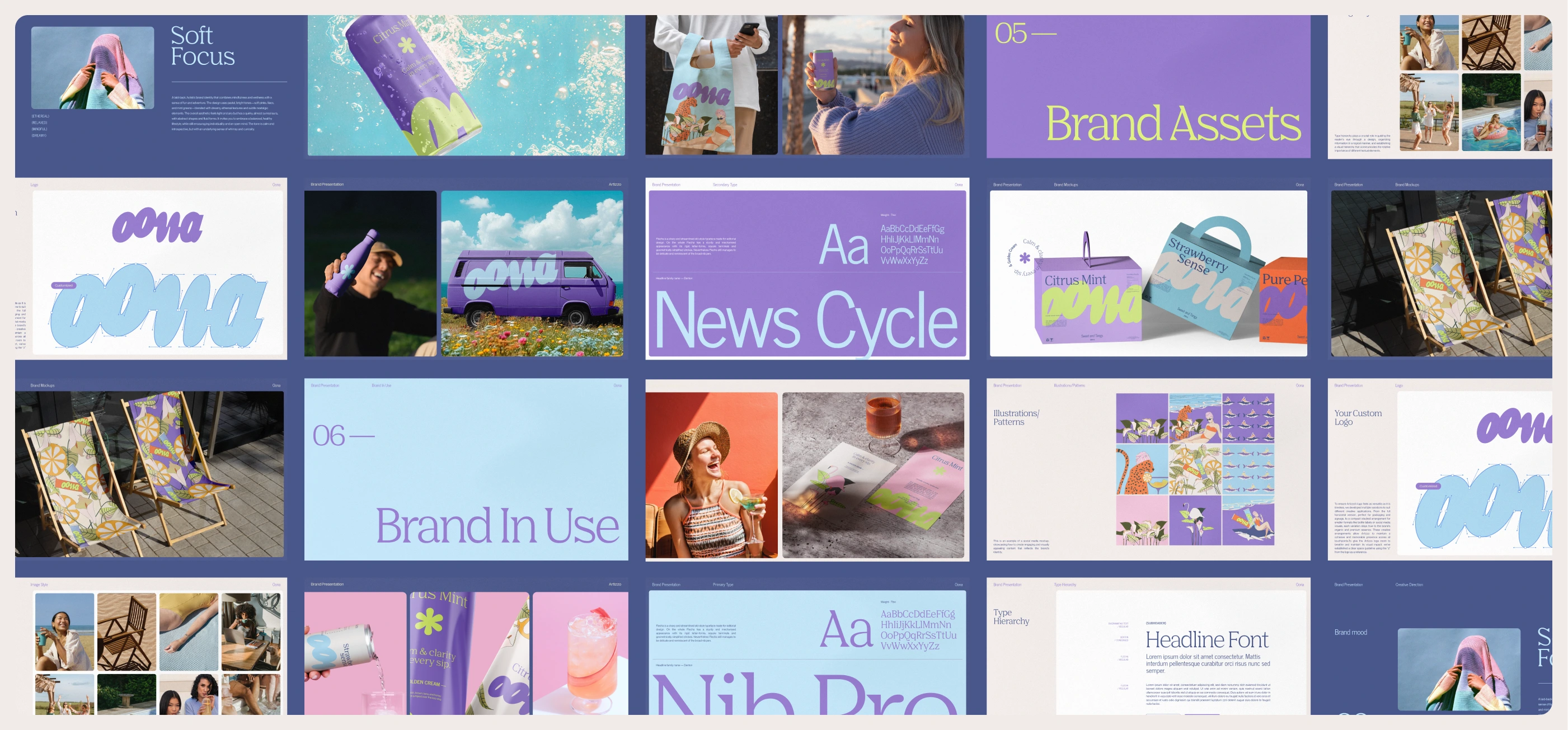
We started by immersing ourselves in Oona’s world, its mission to help people stress less and live more, its youthful energy, and its honest, feel-good approach. Drawing inspiration from brands like Vacation Inc. and Waterboy, we explored design directions that could blend retro charm with a clean, modern edge. It was crucial to avoid visual cues that leaned too “clinical” or “electrolyte-based,” and instead build a brand that felt instantly familiar and intentionally calming.


Solution
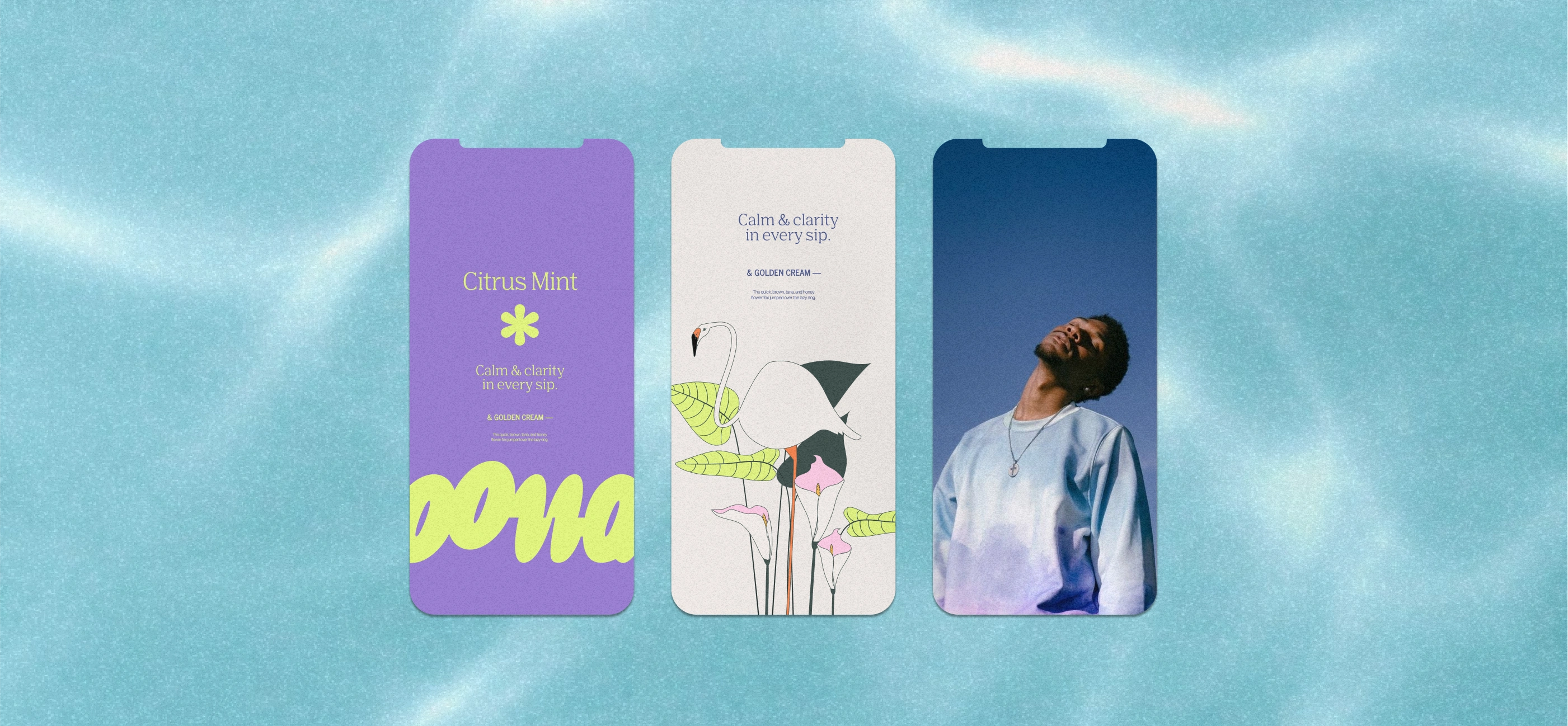
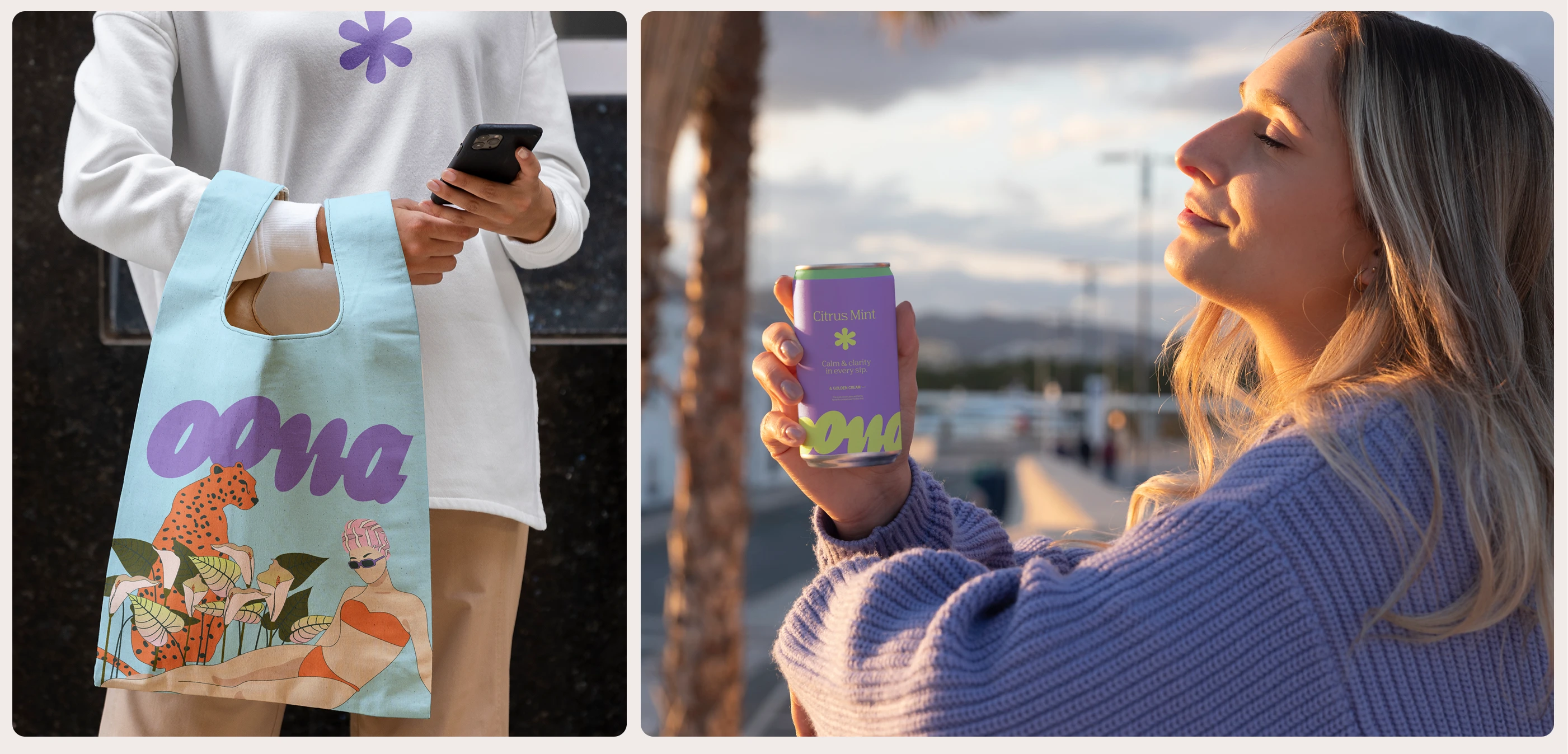
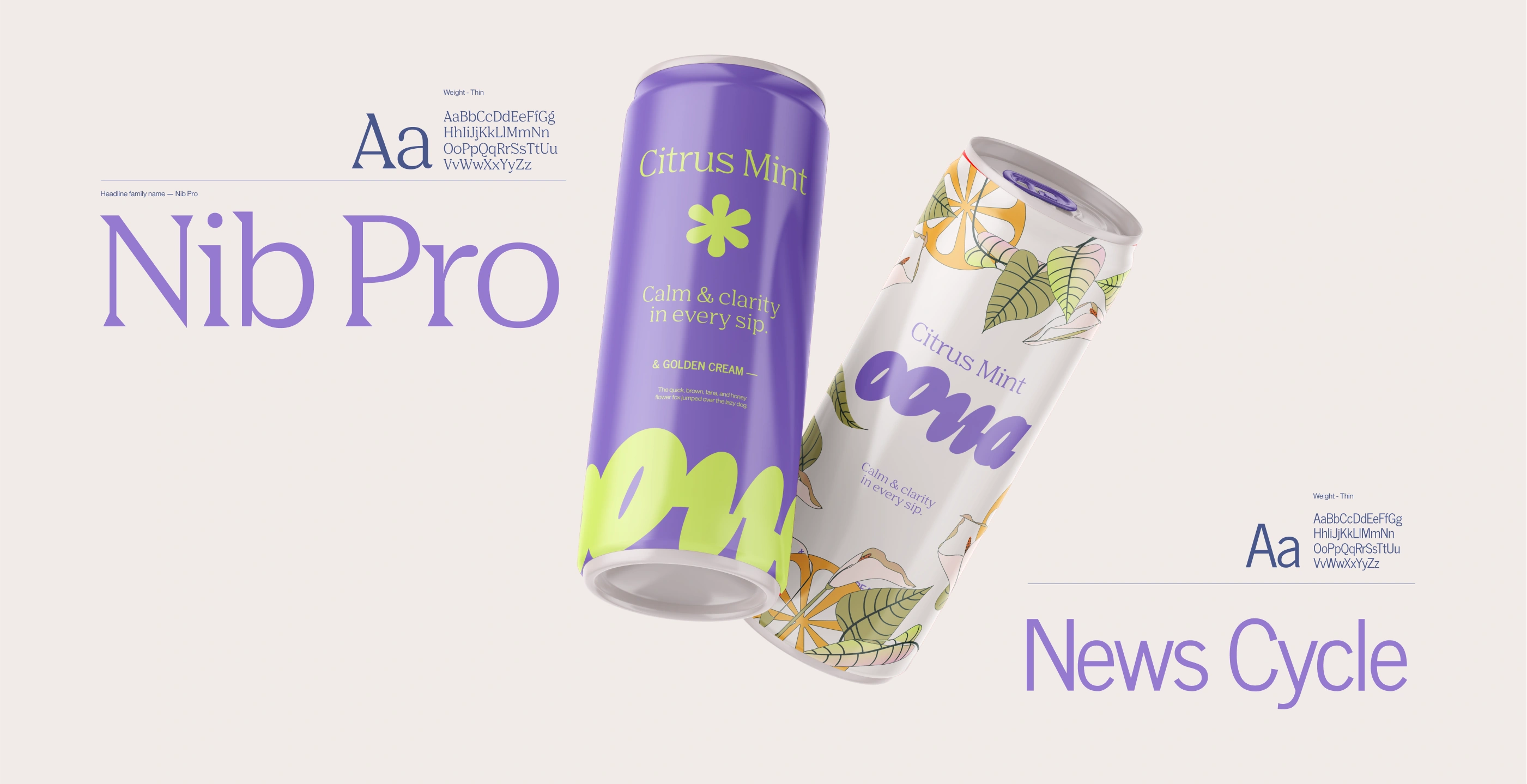
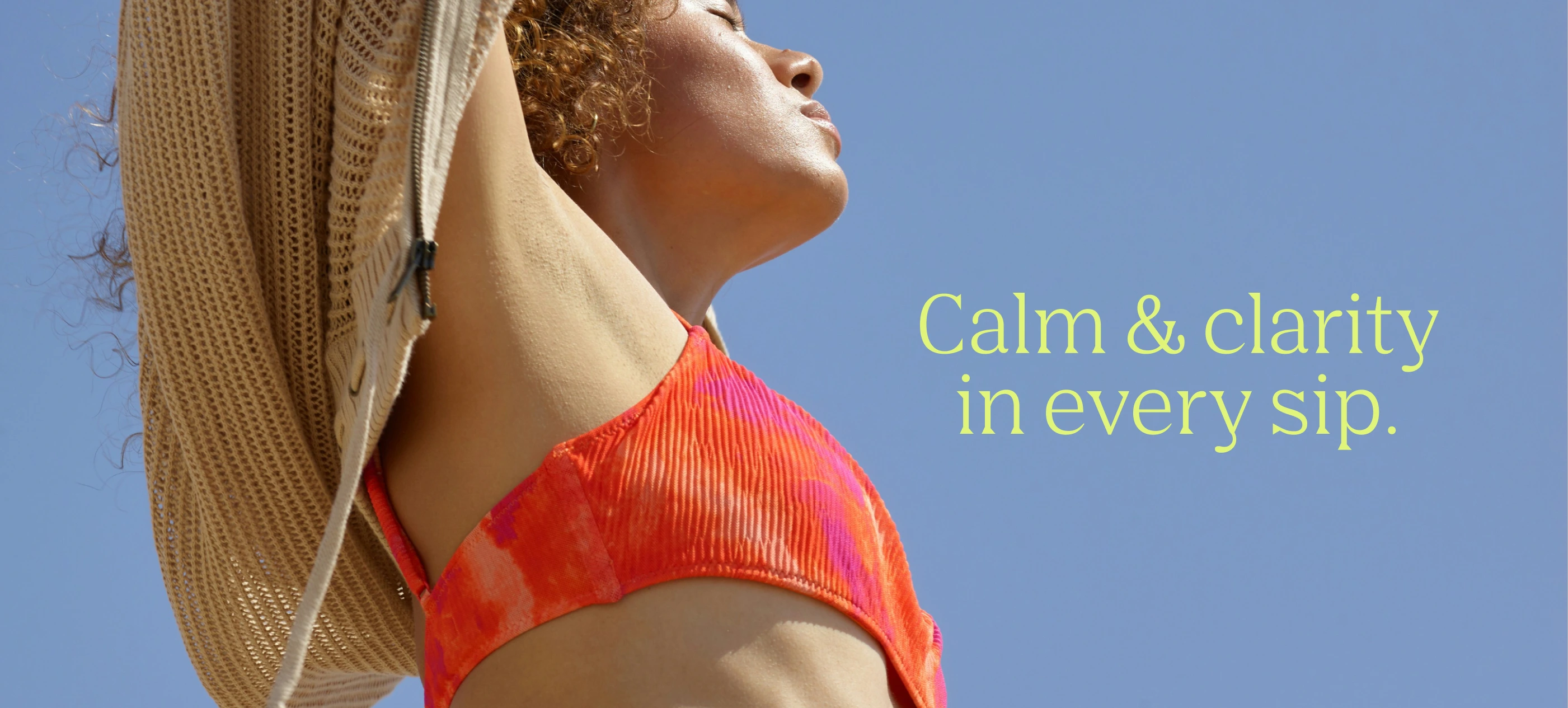
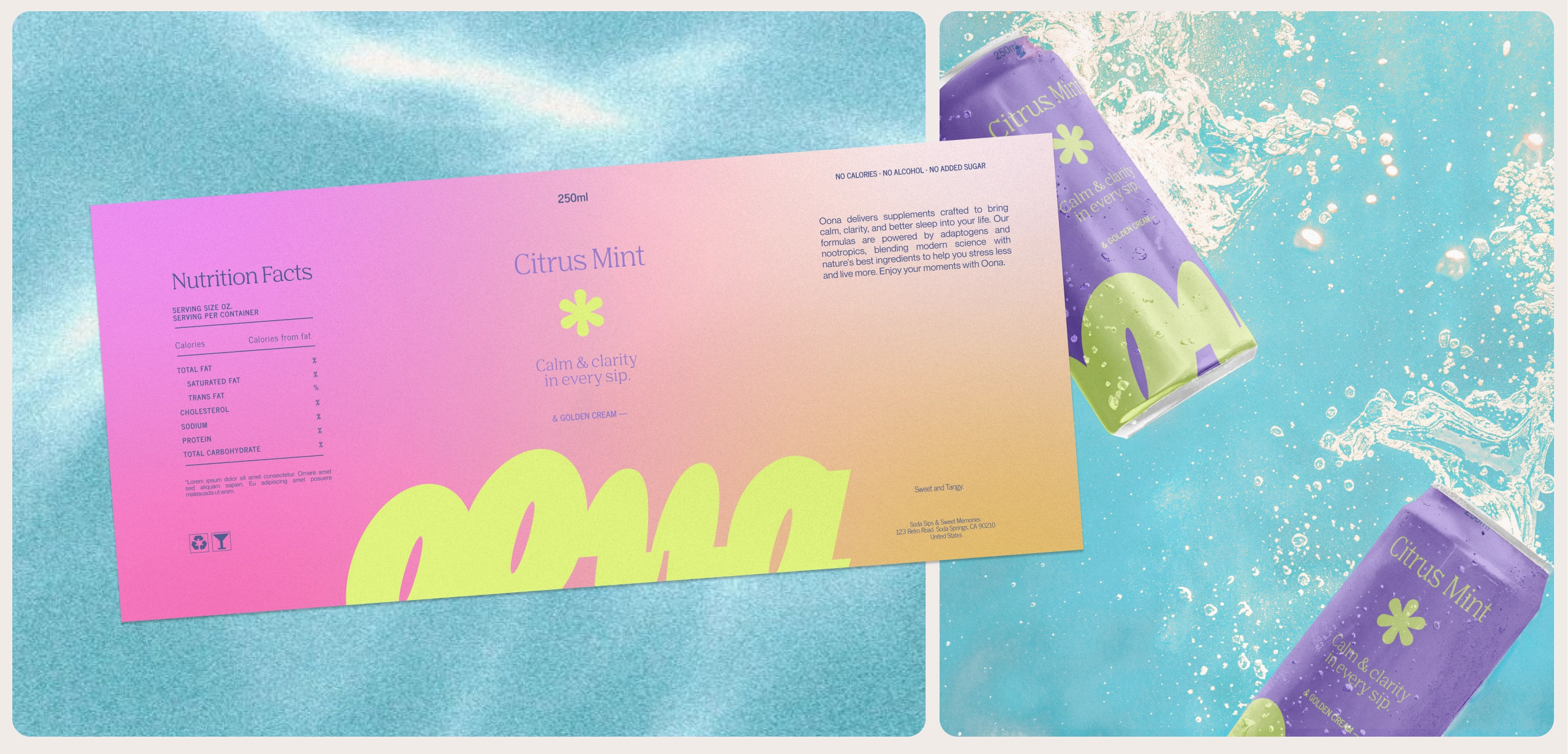
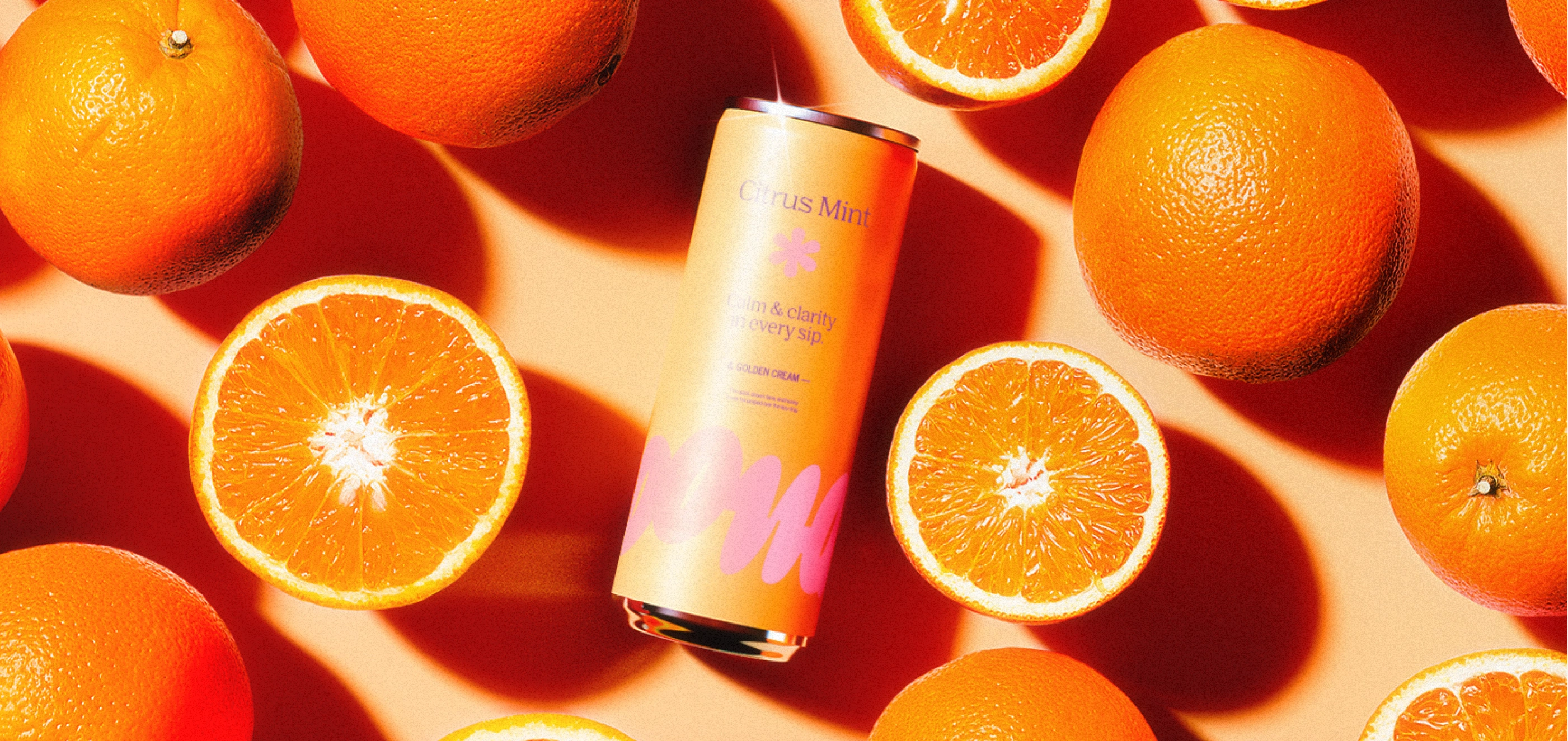
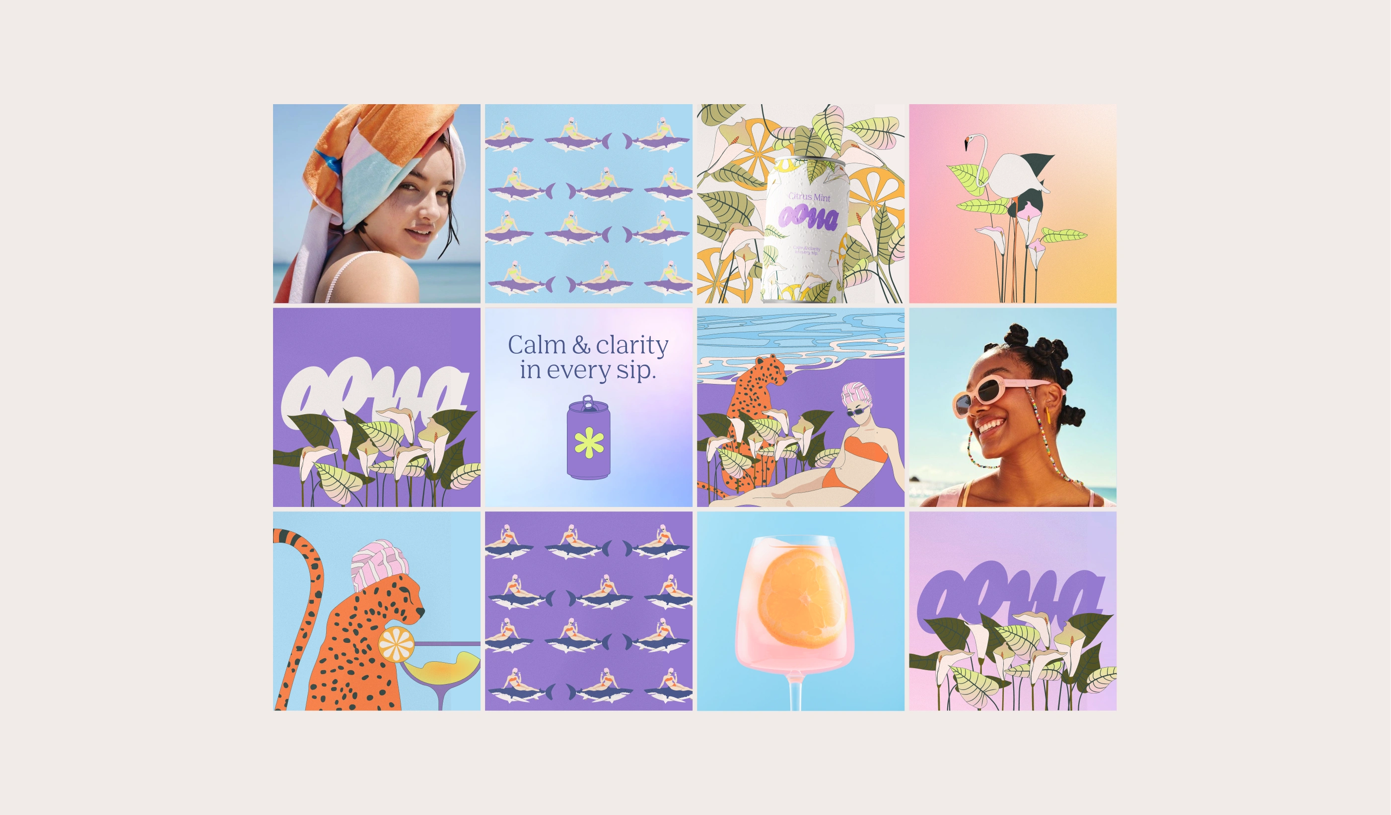
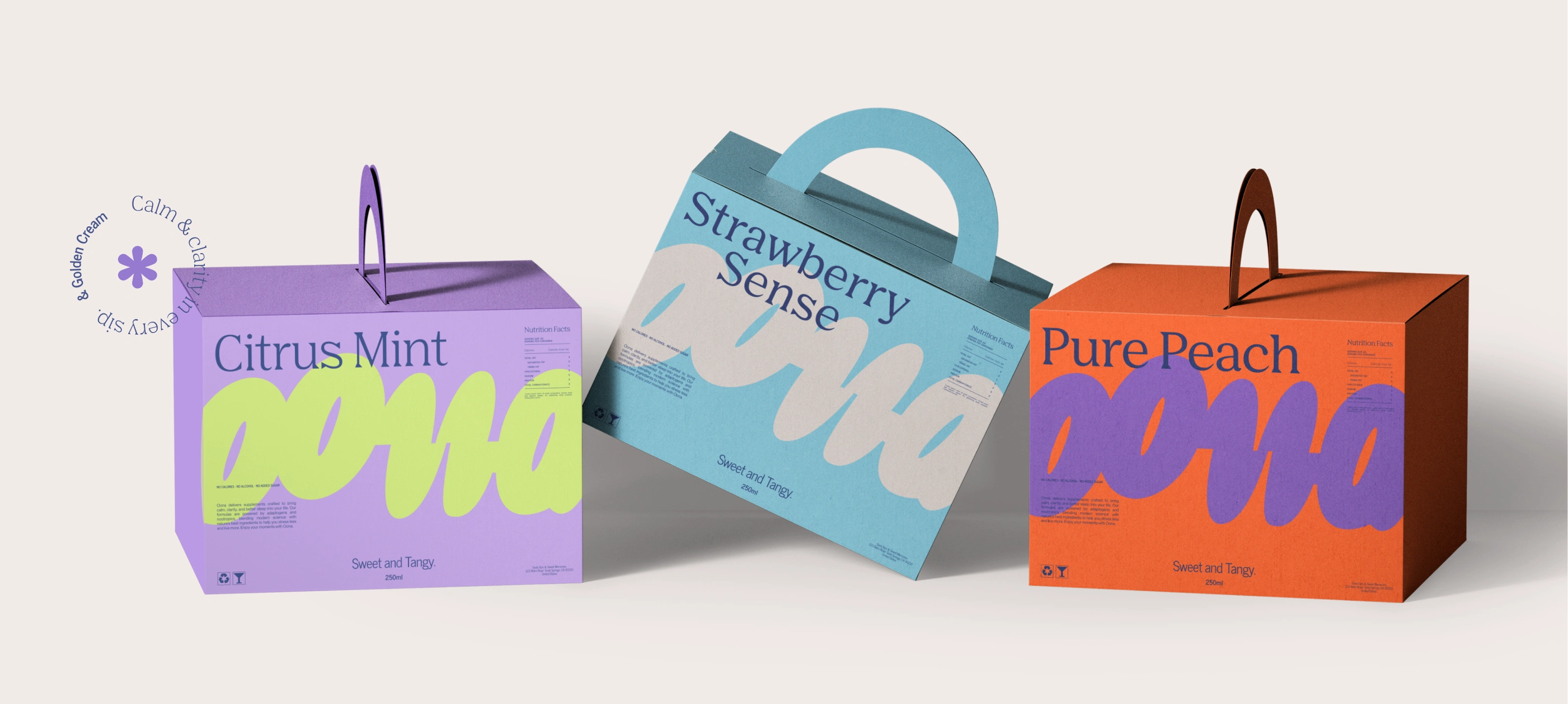
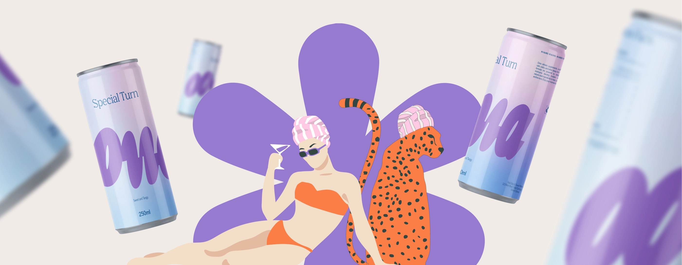
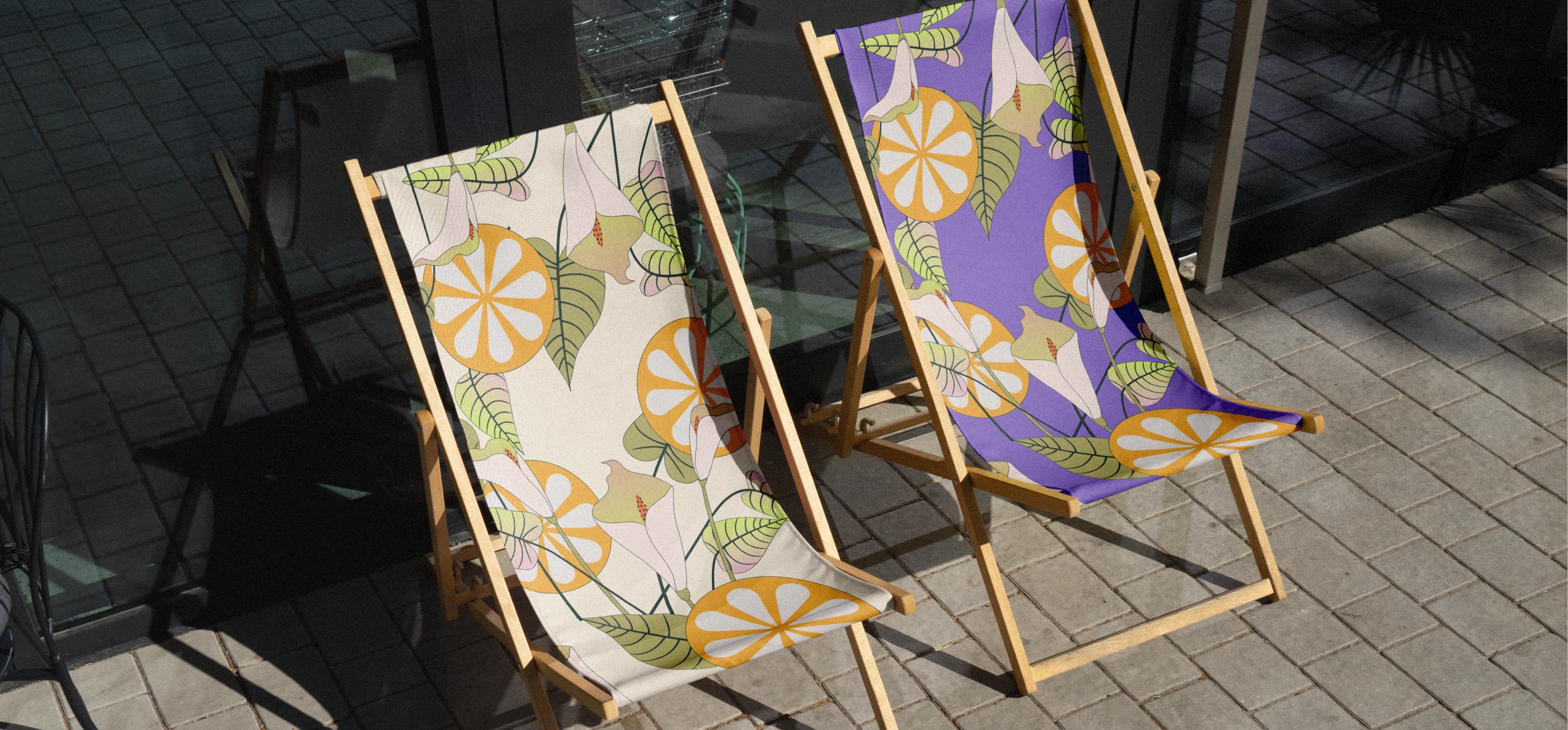
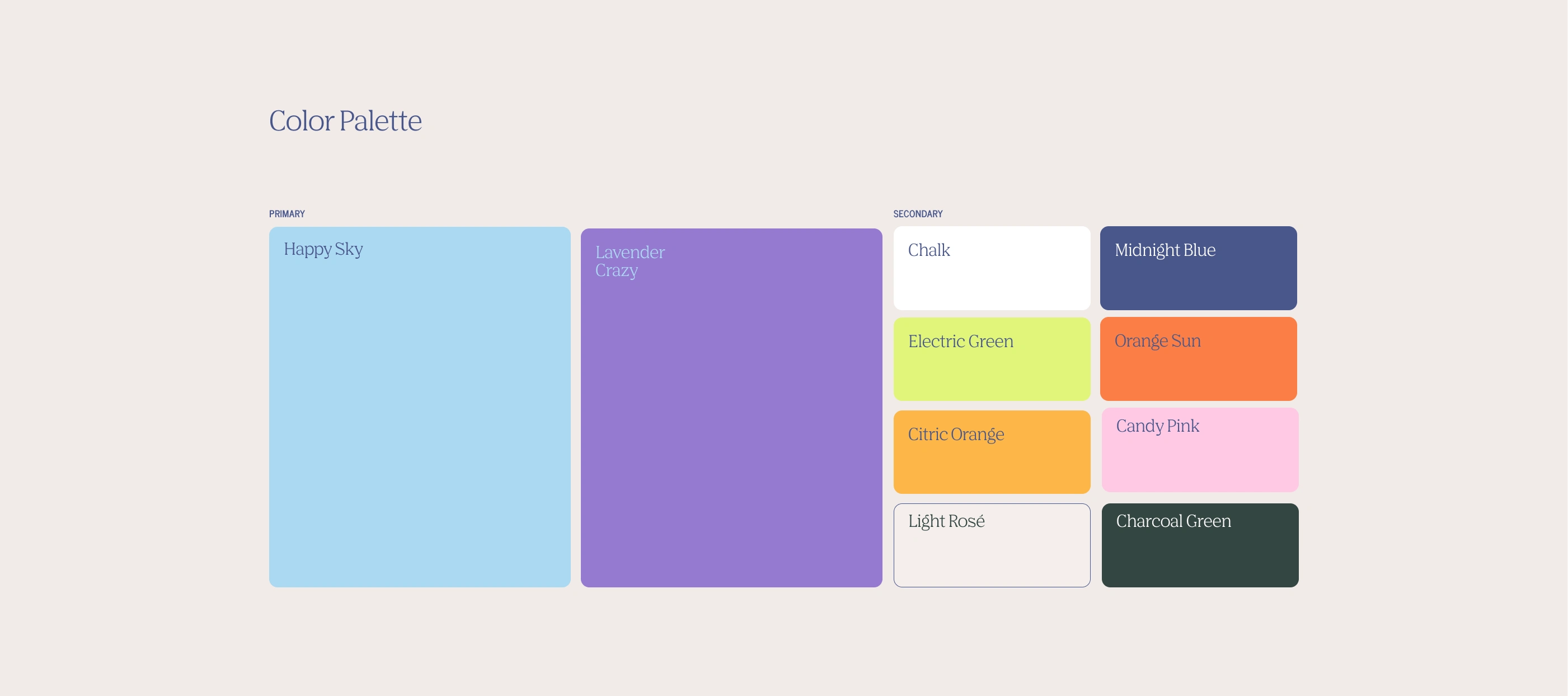
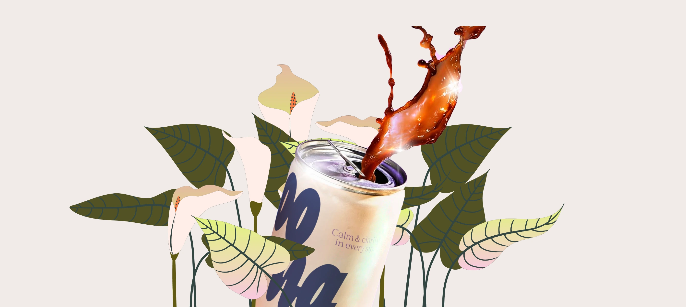
The final identity came to life through a soft, welcoming color palette, bold yet nostalgic typography, and playful illustrations that echo the relaxed mood of a perfect summer afternoon. We designed packaging that stands out on shelves and in digital ads—starting with Oona’s flagship product: a calming drink mix in single-serve stick packs. From logo to layout, every detail was crafted to express ease, joy, and quiet confidence, giving Oona a brand that’s as refreshing as the product itself.

Like this project
Posted Jun 18, 2026