Keeper Coffee - Brand Strategy, Identity & Website by Rebecca ArnaudKeeper Coffee - Brand Strategy, Identity & Website by Rebecca Arnaud

Keeper Coffee - Brand Strategy, Identity & Website

Rebecca Arnaud

Rebecca Arnaud

The Client 
Some brands already feel like stories waiting to be told, Keeper Coffee was one of them. Its founder, Brittany, comes from a family who built their lives inside New York delicatessens and Italian kitchens, and that heritage shaped the way she built Keeper. It’s a neighborhood café in Portland that feels like a pause in the middle of a busy day: familiar, cozy, thoughtfully designed, and full of quiet personality.
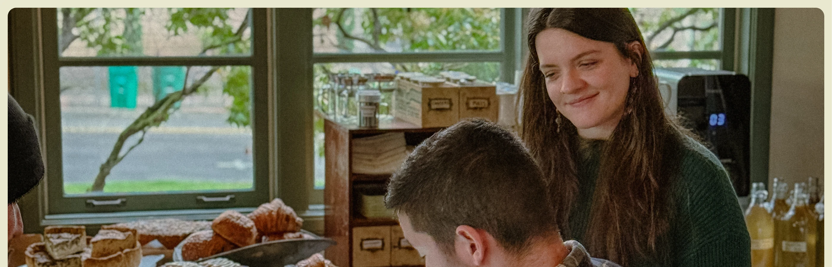
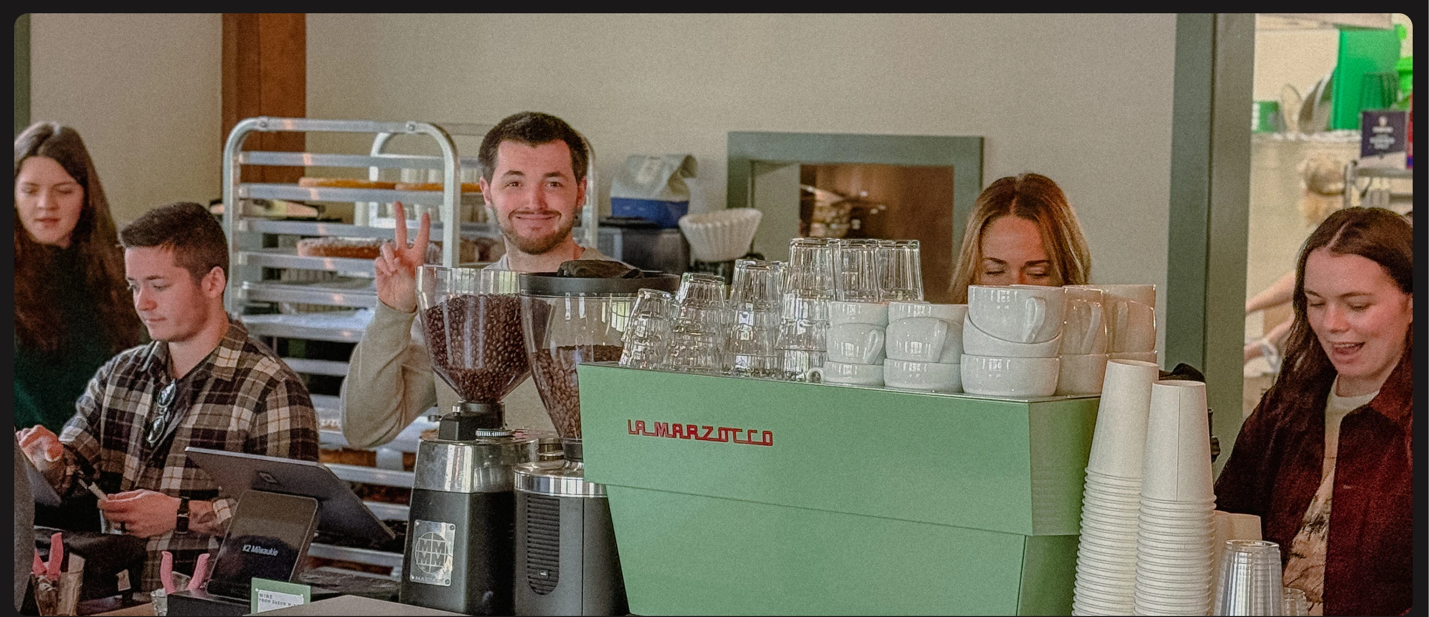
Keeper quickly became a place where people felt seen, from the dream-girl creative grabbing a latte on her way to work, to the neighborhood seniors who visit every morning for routine and connection. Keeper is a community anchor with a soul of its own. When the project arrived in my studio, it was already loved; it simply needed to be reflected with the same clarity, elegance, and intention that people felt inside its doors
Role: Visual Identity / Merch Design / Website Design / Brand Strategy / Collaterals
Done by my studio
The Challenge
Keeper was entering a new phase: opening a second location, expanding its menu into wine, brunch, and a small garden kiosk called The Keepette. Growth was happening fast, but the brand identity hadn’t been built to scale. It had a strong essence, but lacked cohesion. Visual elements were created over time, not strategically. The brand felt warm and intentional in person, but inconsistent online. And as Keeper evolved into a broader hospitality experience, the identity needed to honor its origin while maturing into something timeless, cozy, community-driven, and ready for expansion.
This is the moment many rising brands face, when heart and growth intersect, demanding clarity, structure, and an identity capable of holding everything they’re becoming and turning that impact into new possibilities
We approached Keeper with a full brand ecosystem grounded in strategy. Through focused strategy workshops, we defined the emotional core of the brand and aligned the team on a vision that could support expansion without losing its soul.
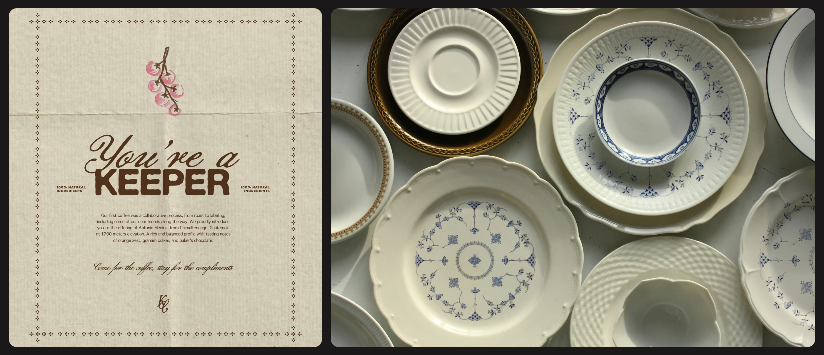
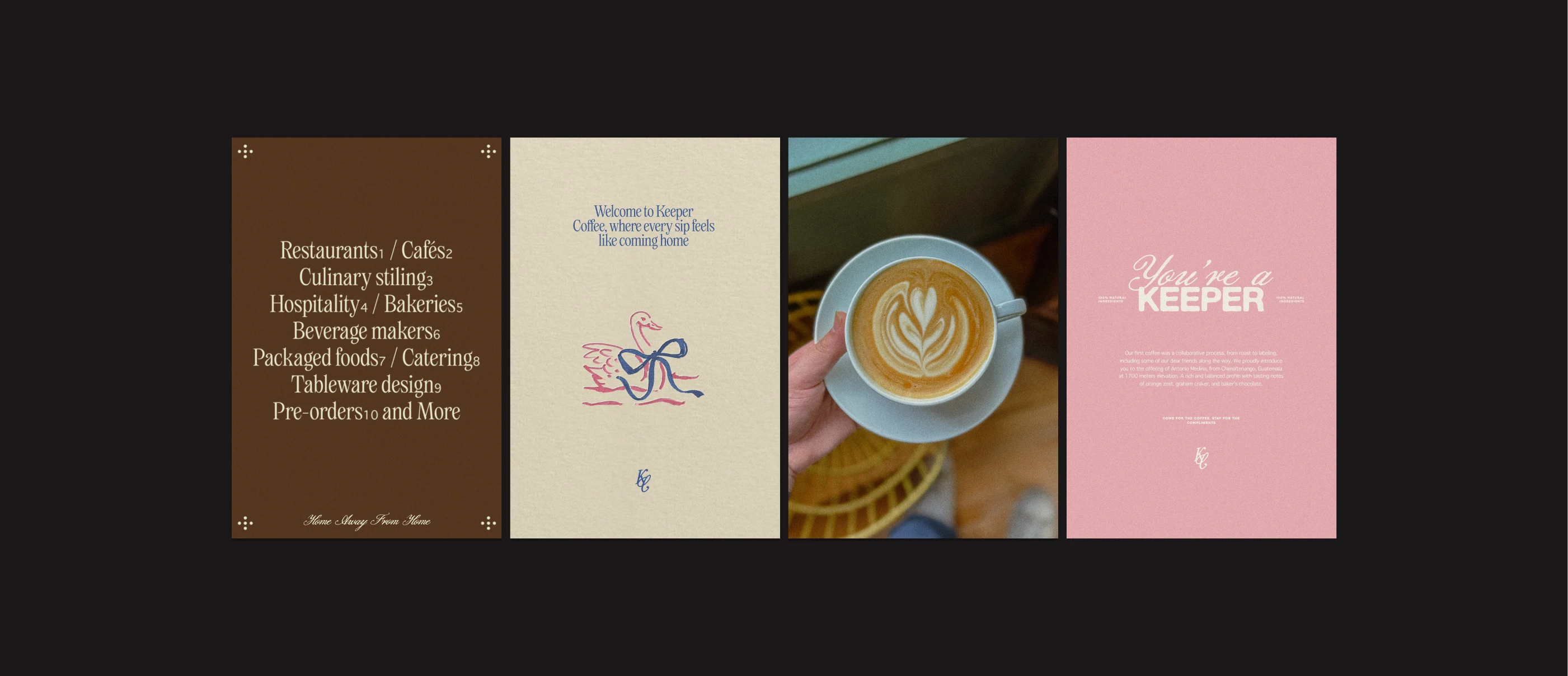
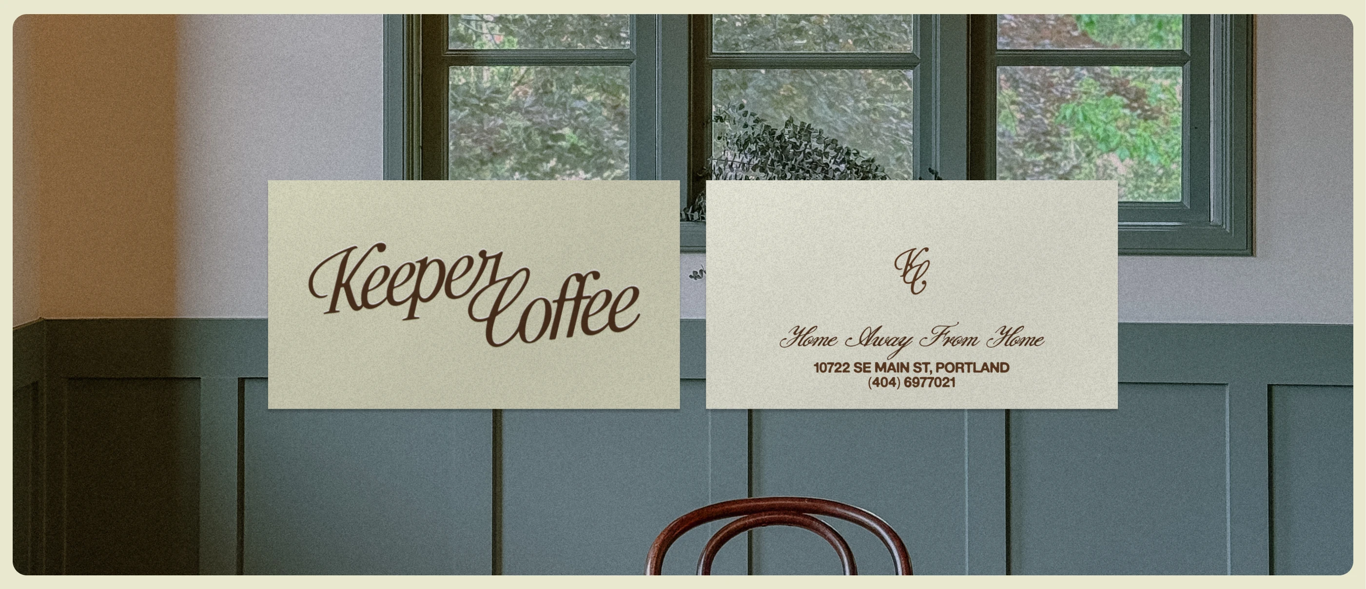
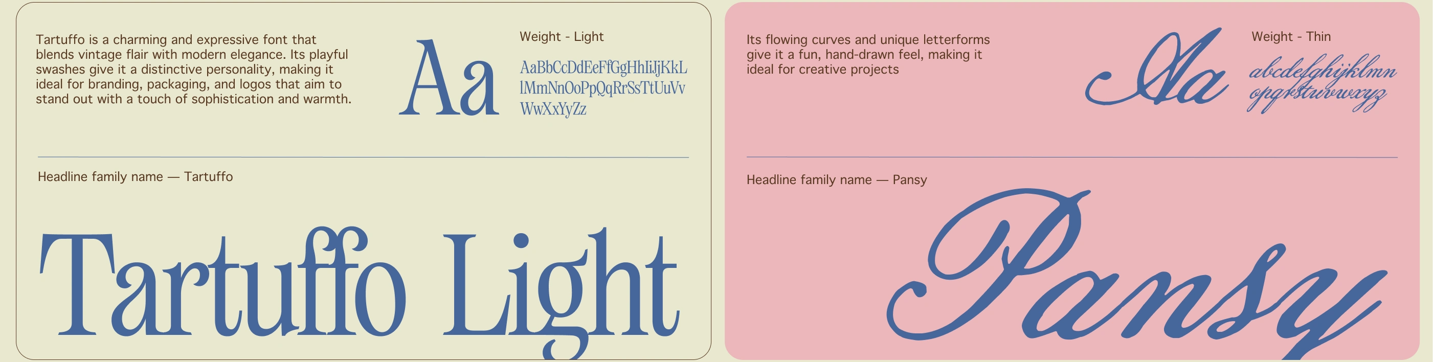
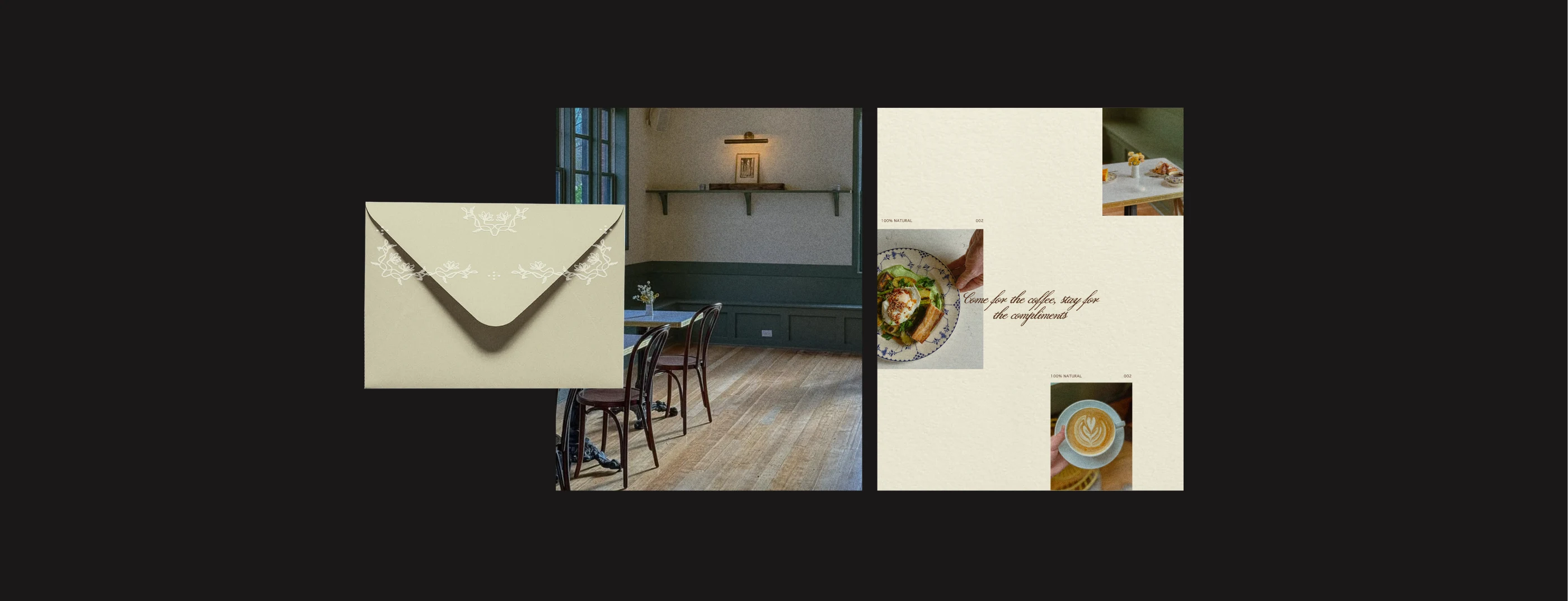
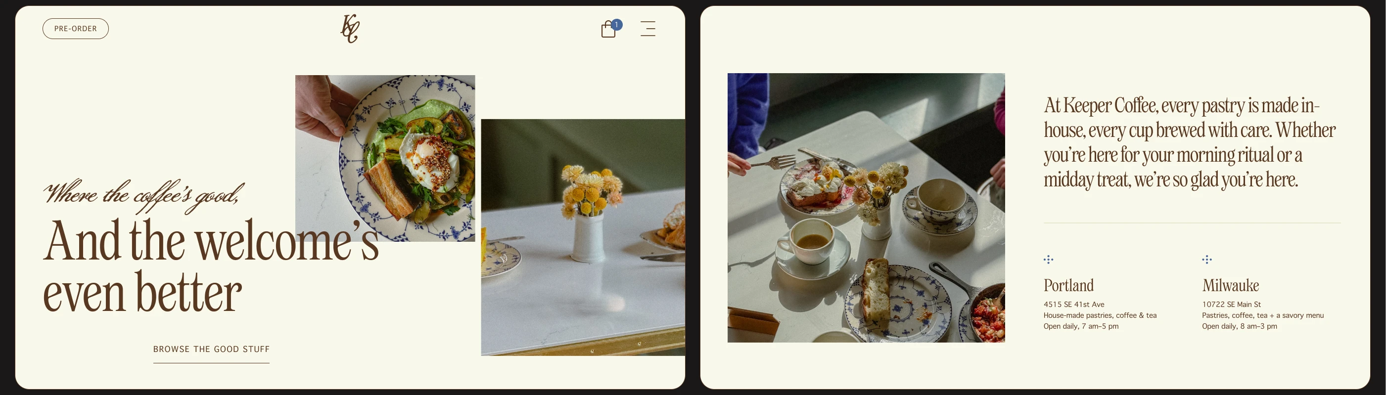
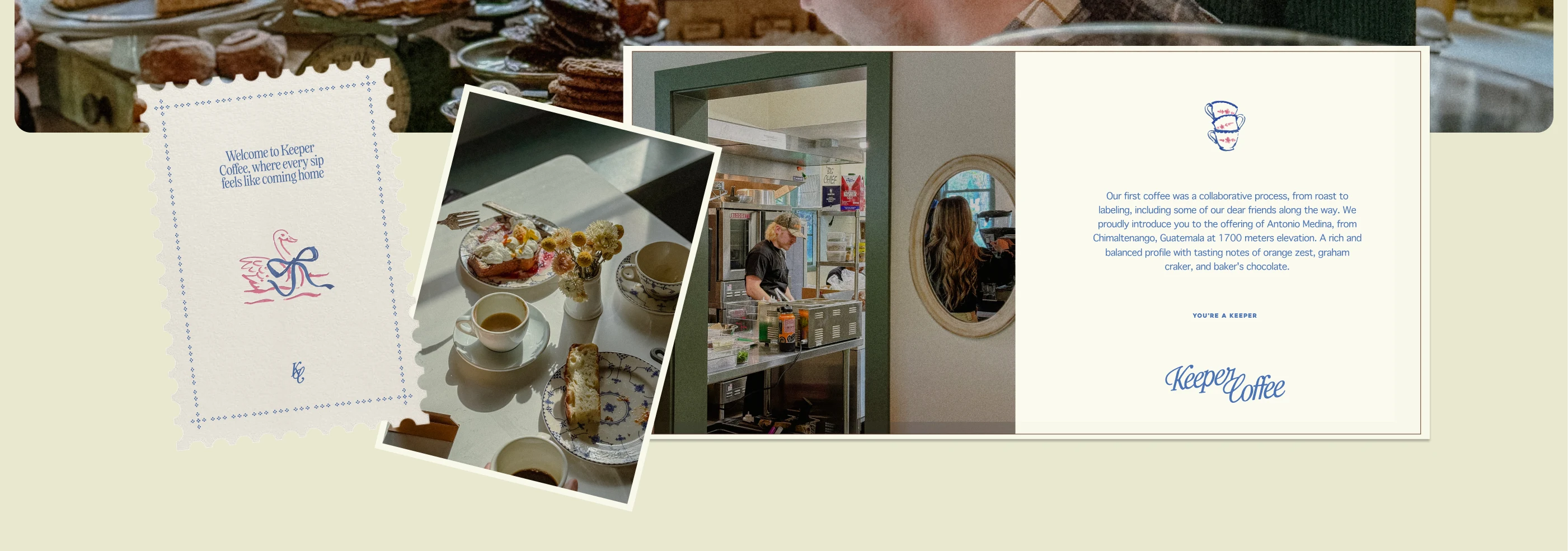
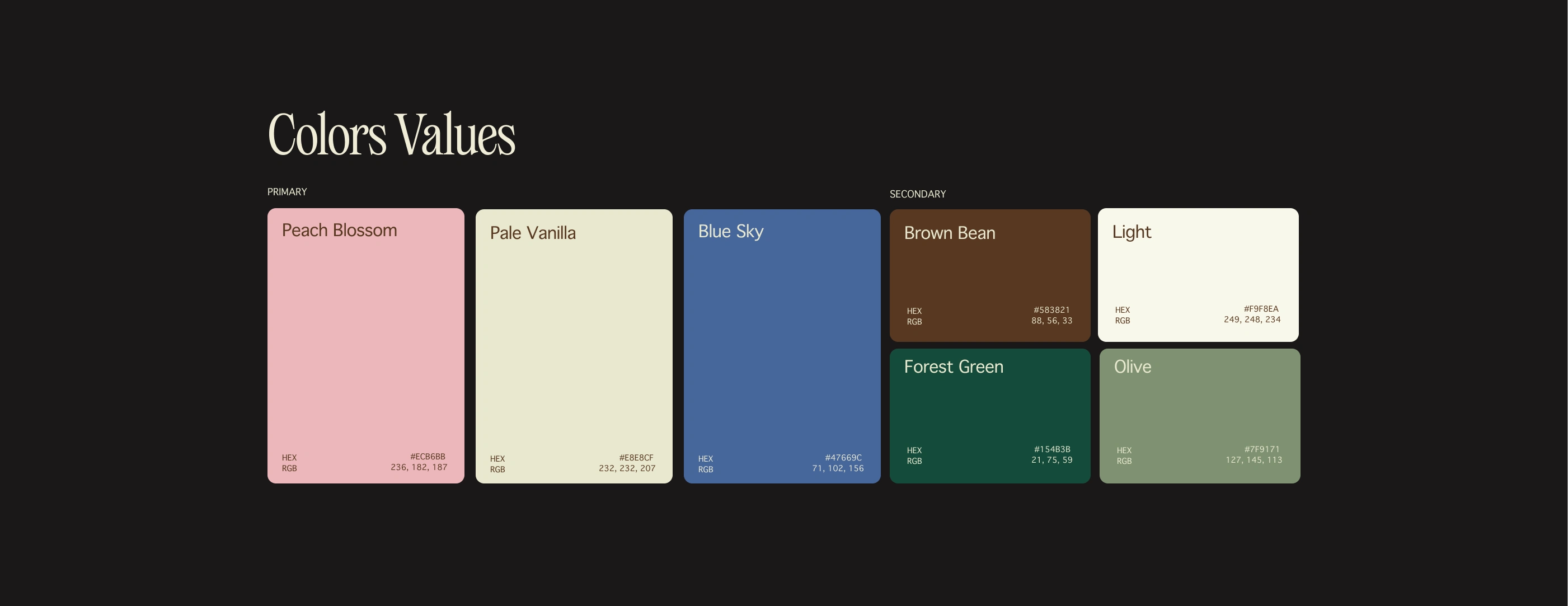
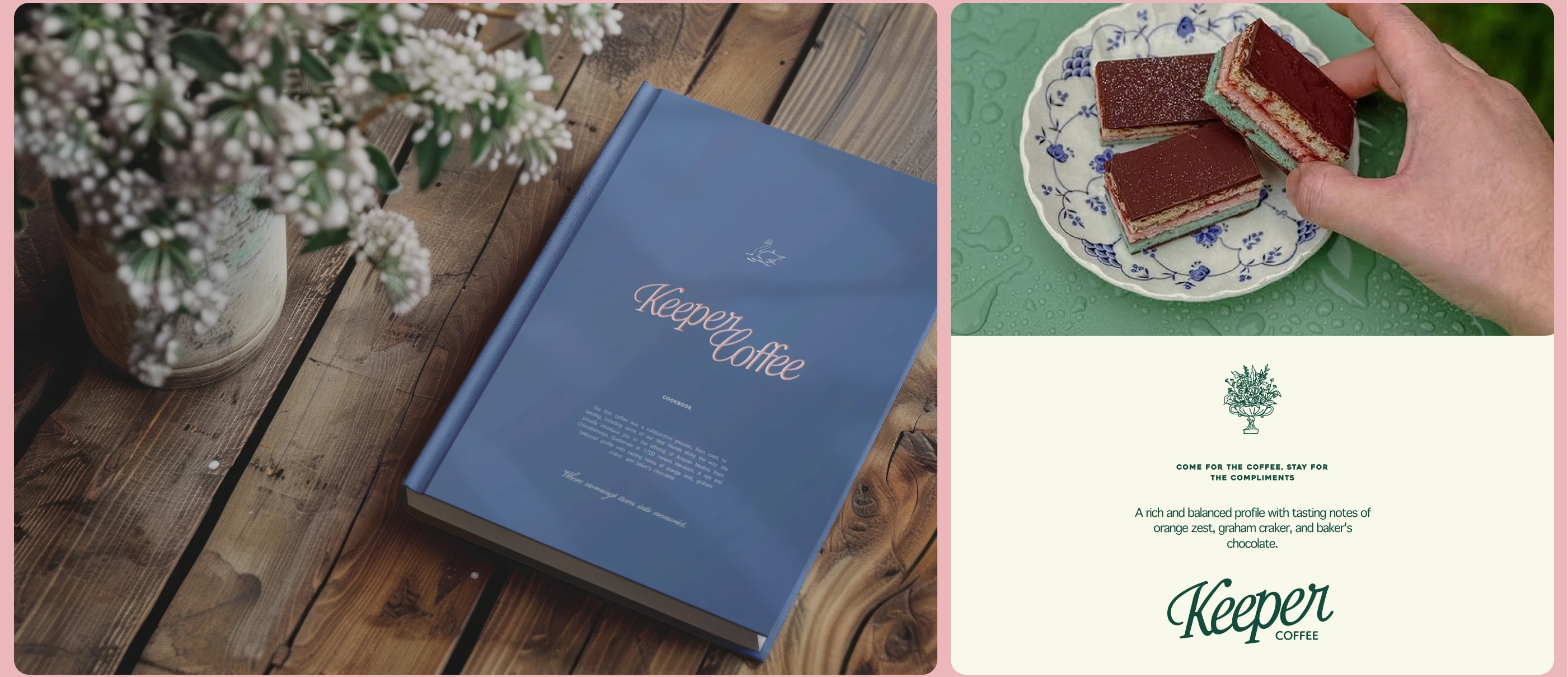
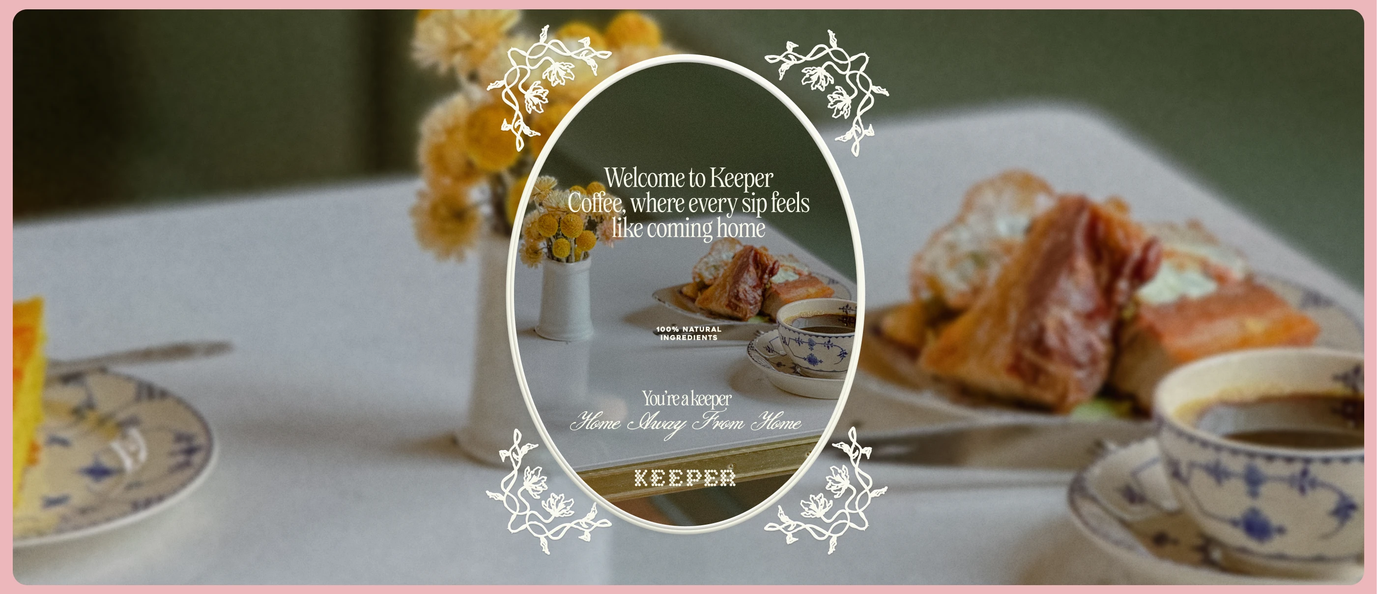
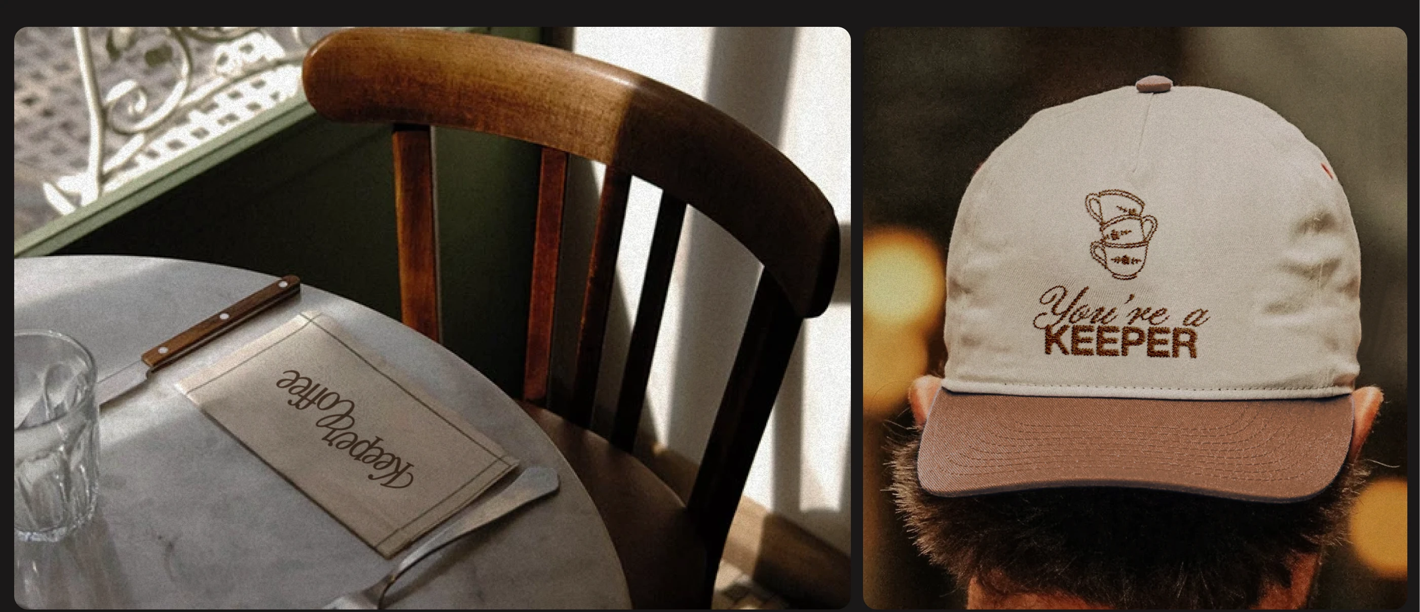
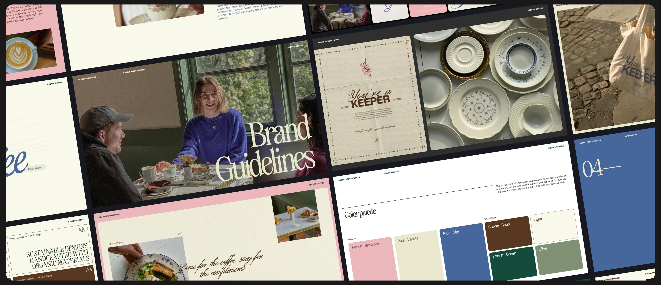
From there, we developed a cozy, human, elegant calligraphy, warm textures, botanical cues, and a palette rooted in Keeper’s familiar atmosphere. Alongside the identity system, we created motion design assets to bring the brand’s charm and fluidity into its digital presence.
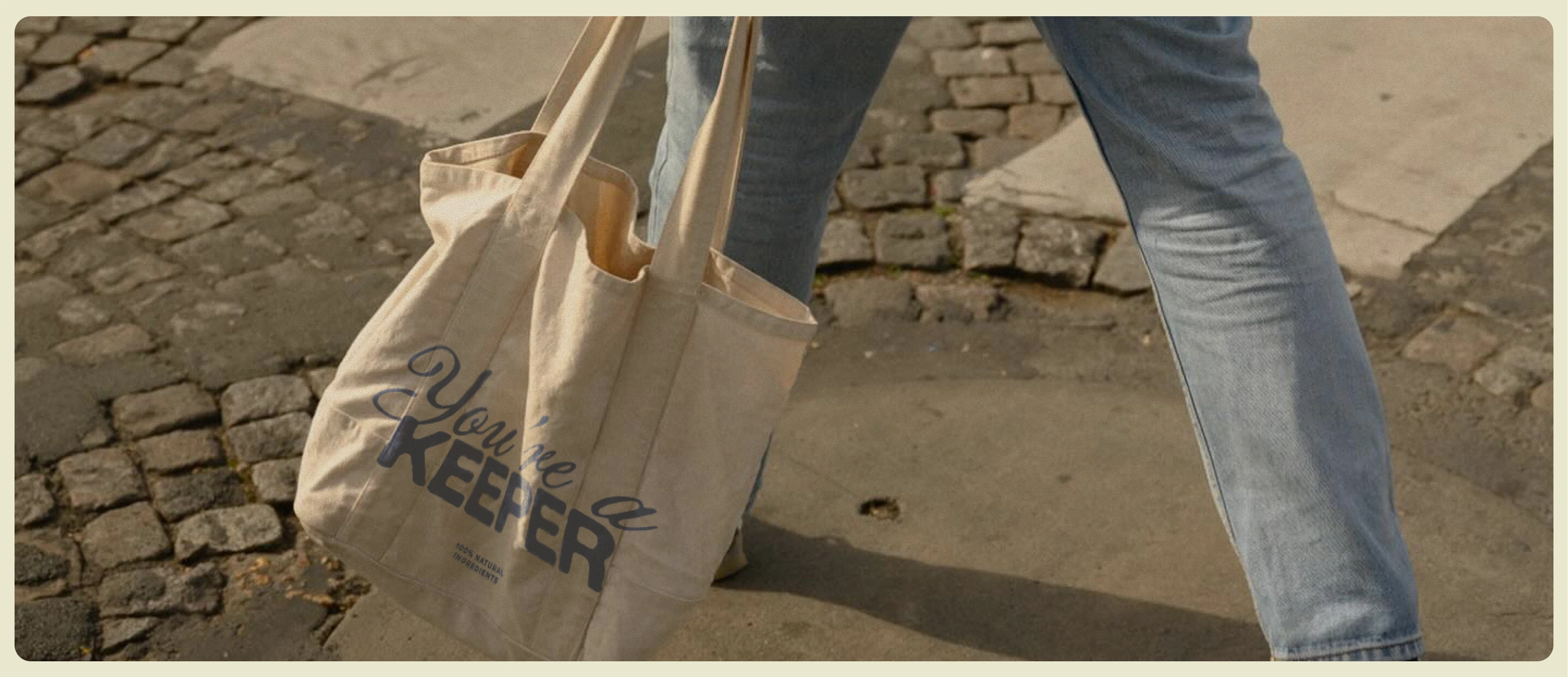
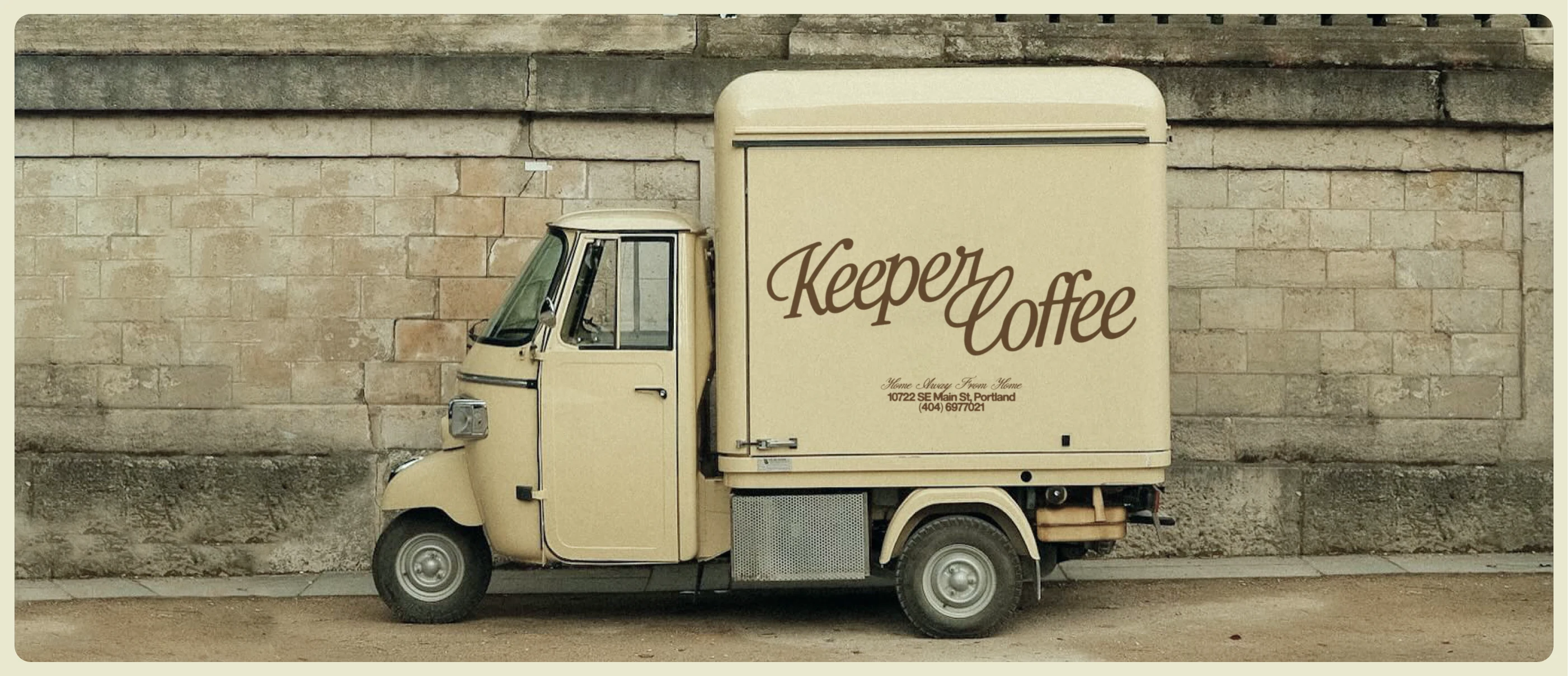
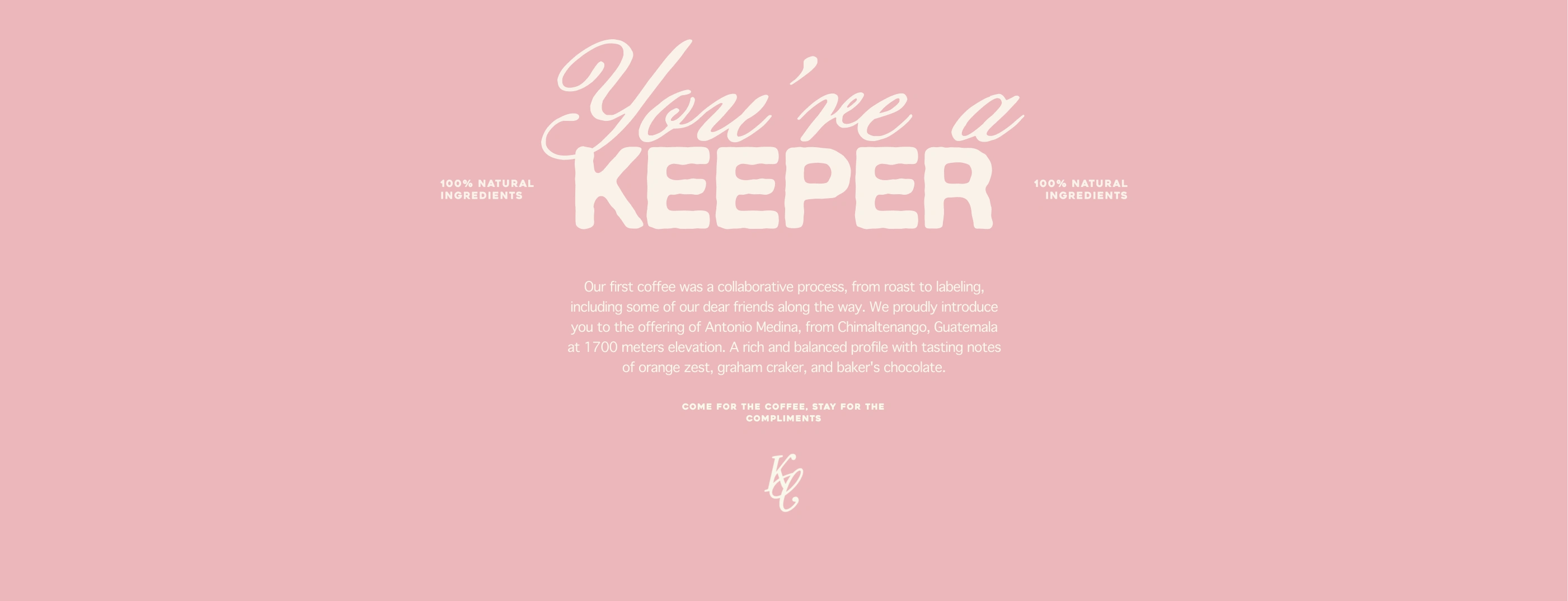
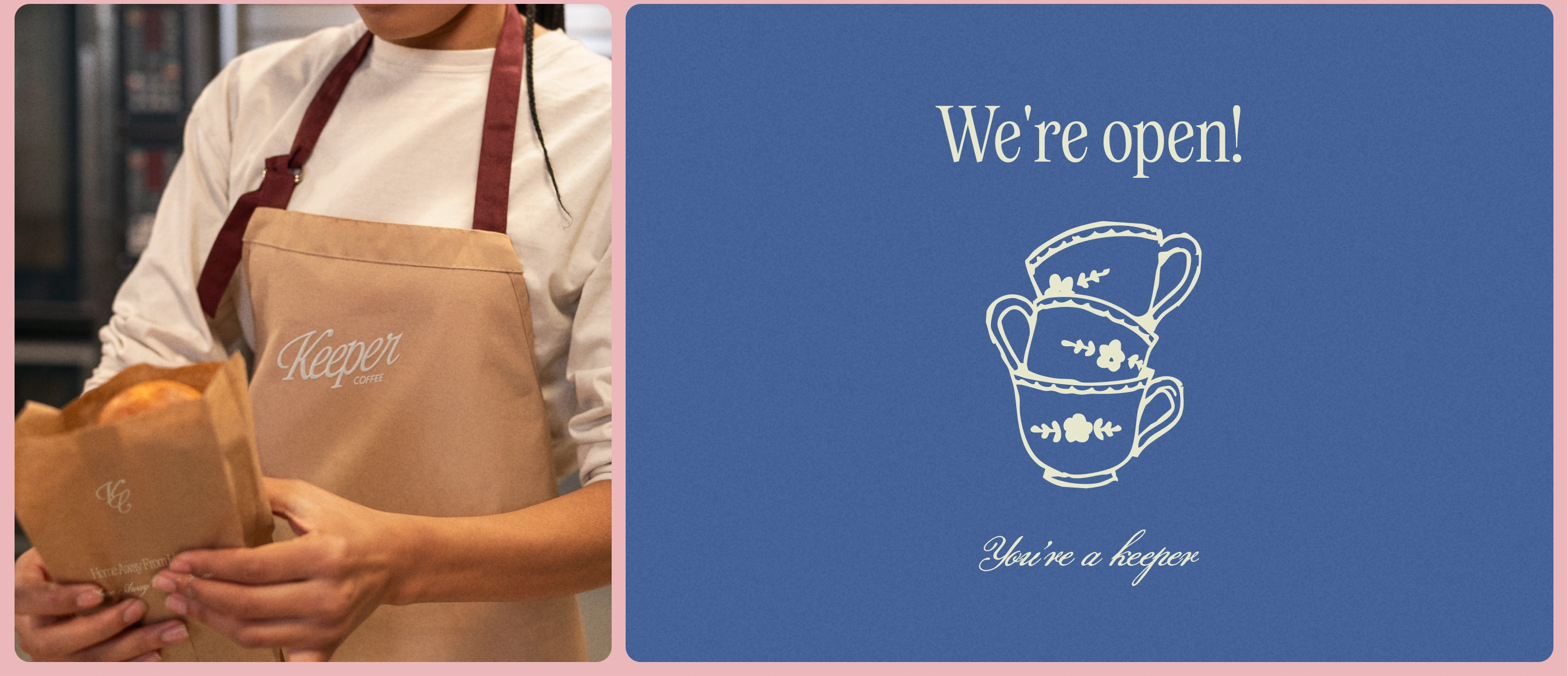
Everything was built to form a solid, scalable foundation: menus, packaging, signage, social templates, and digital elements working as one cohesive ecosystem. The result is a brand ready to grow with confidence, consistency, and ease
The Final Brand Experience The new Keeper identity feels like a natural evolution of the brand, the kind of design that doesn’t overwrite the existing story, but reveals the depth that was always there. It captures the café’s warmth and neighborhood charm while elevating it with sensibility and cozyness, creating an experience that feels both everyday-comfortable and quietly sophisticated.
This identity now functions as a living system: clear, cohesive, and designed to support the pace of a growing hospitality brand. It strengthens operations, enhances the guest experience, and gives Keeper the visual confidence to expand into new locations, menus, and offerings without ever losing its soul. Keeper feels like home, only now, it carries the elegance and maturity of a brand built for the long run
Find me on Instagram // Website // Pinterest
Like this project

Posted Jun 18, 2026

Keeper was entering a new phase: opening a second location, expanding its menu into wine, brunch, and a small garden kiosk called The Keepette. Growth was happening fast, but the brand identity hadn’t been built to scale. It had a strong essence, but lacked cohesion. Visual elements were created over time, not strategically. The brand felt warm and intentional in person, but inconsistent online. And as Keeper evolved into a broader hospitality experience, the identity needed to honor its origin while maturing into something timeless, cozy, community-driven, and ready for expansion.