B2B Presentation Data Dashboard Optimization

Anaol Megersa


B2B Presentation Data Dashboard Optimization Case Study
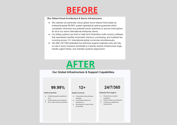
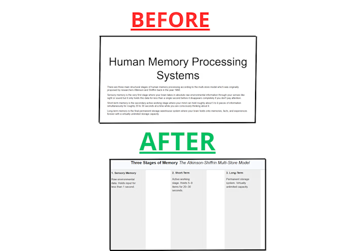
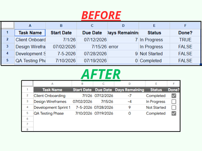
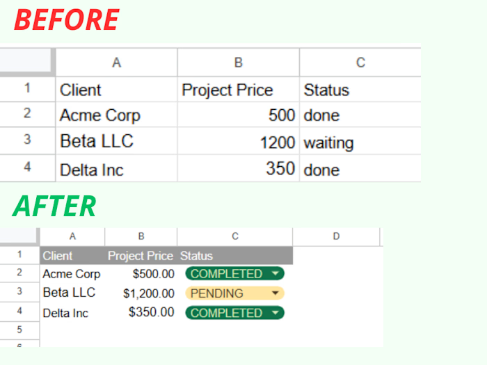
The Challenge: The client's original Q3 performance slide relied on dense, text-heavy paragraphs that buried the key financial achievements.
The Solution: I restructured the layout into a clean, executive 3-column metric grid.
The Impact: Amplified core sales and revenue metrics ($145.2K Revenue, 1.8% Churn, $42 CAC) using a bold corporate blue color accent. Stripped away conversational filler text to deliver an instantly scannable, pitch-ready dashboard.
Like this project
Posted Aug 9, 2026
B2B Presentation Data Dashboard Optimization Case Study The Challenge: The client's original Q3 performance slide relied on dense, text-heavy paragraphs that...