Workflow diagrams rendered from data, not screenshots

Jessy Mariau

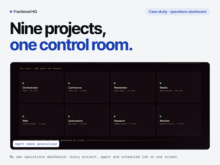
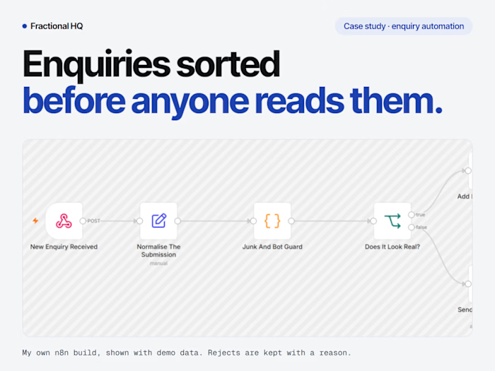
Automation work has a presentation problem. The artifact is a canvas inside a tool like n8n or Make, and a screenshot of that canvas is the worst possible way to show it. The labels turn to mush at thumbnail size, the layout is whatever the tool decided, and the image only means anything to someone who already uses that tool.
So I stopped screenshotting and made the diagram a rendering target instead.
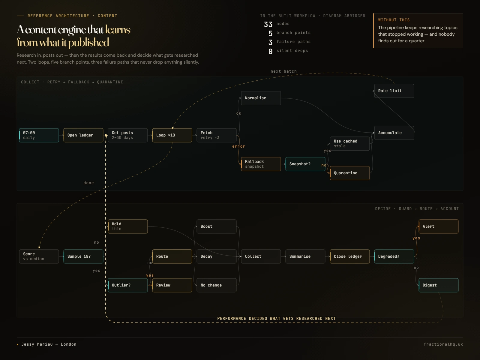
A content engine workflow rendered from data: two loops, five branch points and three failure paths, drawn as a single graph
The system
Every diagram is declared as data: nodes, edges, background bands, and the loop-back arcs that close the cycle. A renderer turns that declaration into SVG inside an HTML page, and headless Chrome exports a PNG at whatever size the destination needs. Adding a new diagram is a data edit, not a design job.
Nodes carry a column index rather than a pixel position, so x = 8 + c * 148 against a 132px box. Overlap became impossible by construction, which mattered because the first version was hand-positioned and shipped with two boxes sitting on top of each other.
Node classes are semantic rather than decorative: trigger, step, guard, gate, failure, loop, output. Colour follows meaning, so a reader can see where a workflow is allowed to fail before reading a single label.
What was harder than it looked
The loop-back arcs. A single cubic bezier cannot cross a band of nodes. Whatever the control points, the pull toward the endpoint drags the curve back through a row of boxes. Four attempts confirmed it before I accepted the geometry was against me. The fix was to stop treating them as curves at all and route them as rectilinear paths through deliberately empty lanes, dropping below the band and rising up a column gutter.
Edge labels sit on the line they describe. So they carry a background-coloured stroke painted underneath the fill. Without it the dashes run straight through the word and the label reads as struck through.
Headless Chrome bakes RGB subpixel fringing into the PNG unless LCD text is explicitly disabled. It looks fine on screen and shows up as coloured haloes the moment the image is scaled or placed on a non-LCD surface.
The destination sets the constraints
The first set rendered at 16:9 and was quietly destroyed on upload. The target gallery locks its cropper to 4:3, so a quarter of the width was cut away, taking the outer columns of the graph with it. No amount of dragging the crop frame recovers that, because at 4:3 the frame is narrower than the image at every position. The renderer now defaults to 4:3 and the extra height went into the graph rather than into letterboxing.
Honesty rules built into the system
Each diagram carries a small stat block, and those numbers are public claims. The rule is that every figure is resolved from the live system in the same turn it is written, never estimated or remembered. One draft claimed a reference count roughly three times the real number and was caught before publication.
Claims also have to be checkable from the image itself. An early version said "5 phases" and it was replaced with "5 branch points", because a viewer can count branch points in the drawing and cannot count phases. The caption reads "diagram abridged" so the gap between the real node count and the drawn one is disclosed rather than glossed over.
The diagram below describes a fictional hotel group. It is labelled as demonstration data in the headline and again in the stat block. A showcase should prove the machine without exposing anybody's business.
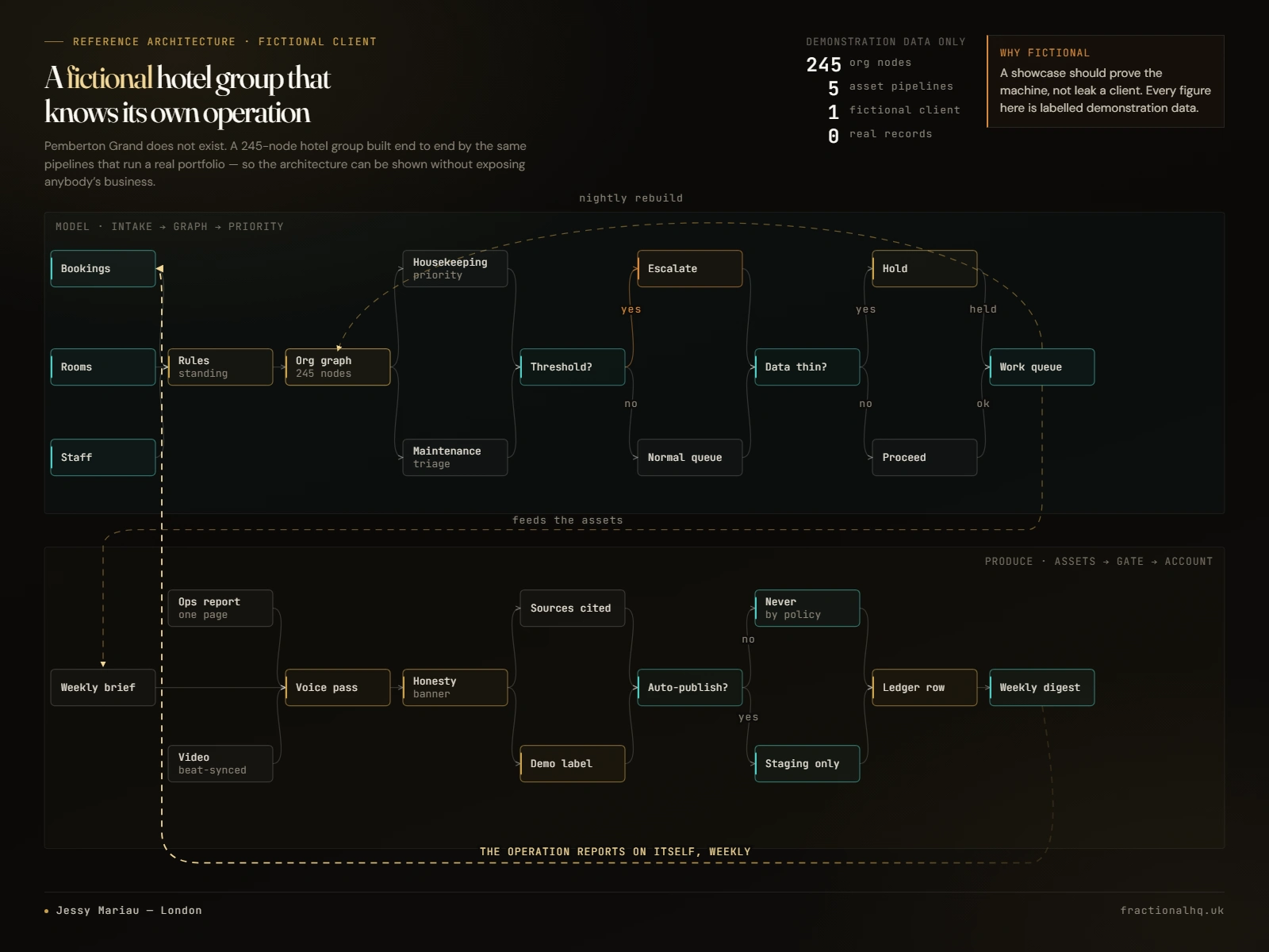
Reference architecture diagram for a fictional hotel group, labelled as demonstration data
Why it was worth building
The diagrams are now platform-agnostic and reusable. The same file feeds a marketplace gallery, a social carousel, a deck or a site section, and none of it is tied to the tool the automation happens to run in. A new diagram costs a data edit and one command.
Like this project
Posted Jul 27, 2026
Automation diagrams as code: nodes, edges and failure paths declared as data, rendered to brand-consistent PNGs at any size in seconds.