Disinfo Radar - Visual Brand Identity
Oana Maries

Brand Concept Behind the Visual Identity, project overview and mission
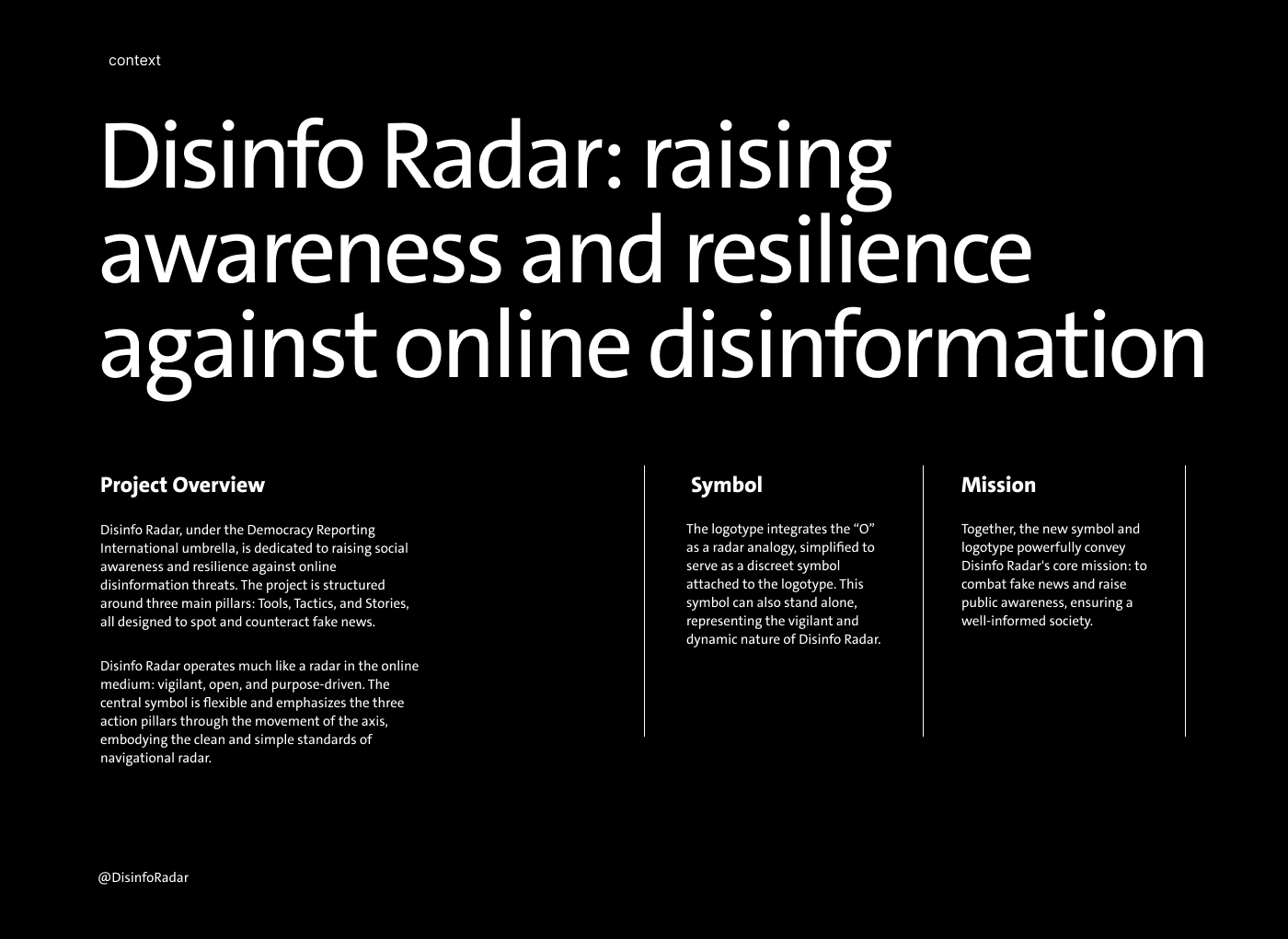
Disinfo Radar: raising awareness and resilience against online disinformation
Project Overview
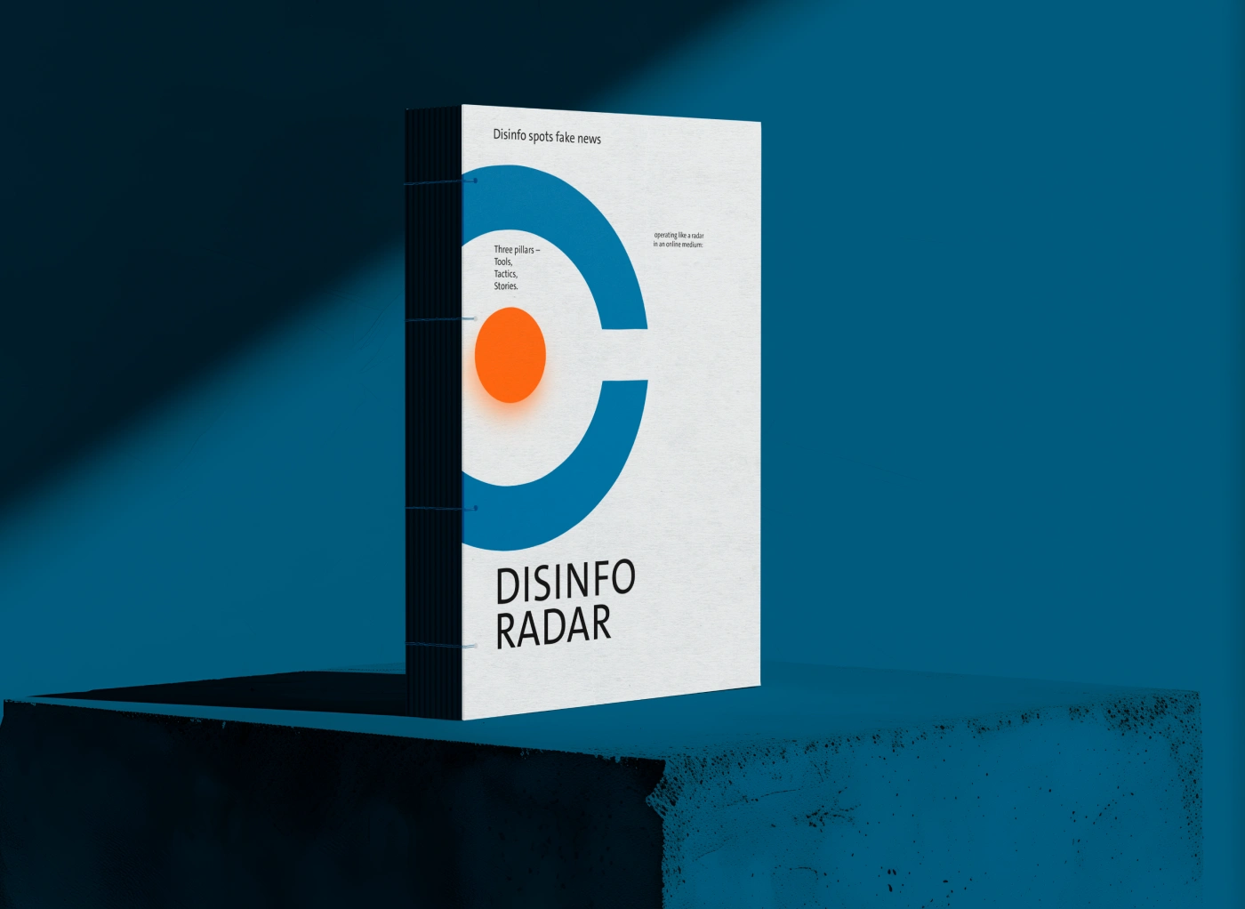
Disinfo Radar, under the Democracy Reporting International umbrella, is dedicated to raising social awareness and resilience against online disinformation threats. The project is structured around three main pillars: Tools, Tactics, and Stories, all designed to spot and counteract fake news.
Disinfo Radar operates much like a radar in the online medium: vigilant, open, and purpose-driven. The central symbol is flexible and emphasizes the three action pillars through the movement of the axis, embodying the clean and simple standards of navigational radar.
@DisinfoRadar
Symbol
The logotype integrates the “O” as a radar analogy, simplified to serve as a discreet symbol attached to the logotype. This symbol can also stand alone, representing the vigilant and dynamic nature of Disinfo Radar.
Mission
Together, the new symbol and logotype powerfully convey Disinfo Radar’s core mission: to combat fake news and raise public awareness, ensuring a well-informed society.
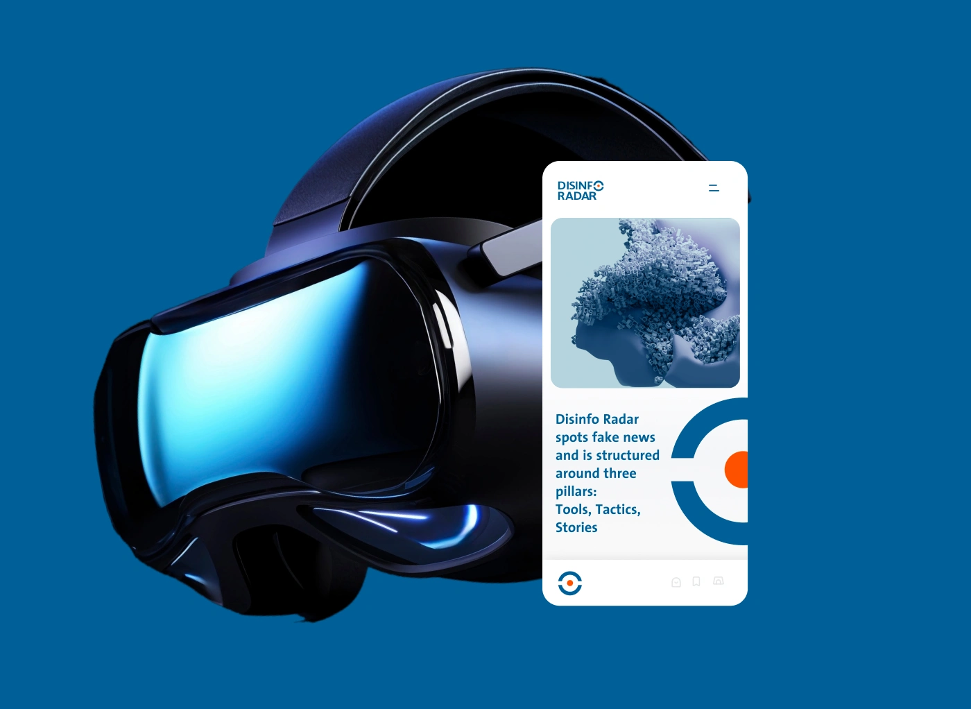
Disinfo Radar Visual Identity on Mobile Screen
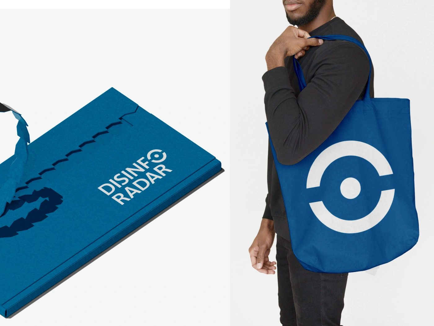
Collateral Brand Book for Disinfo Radar
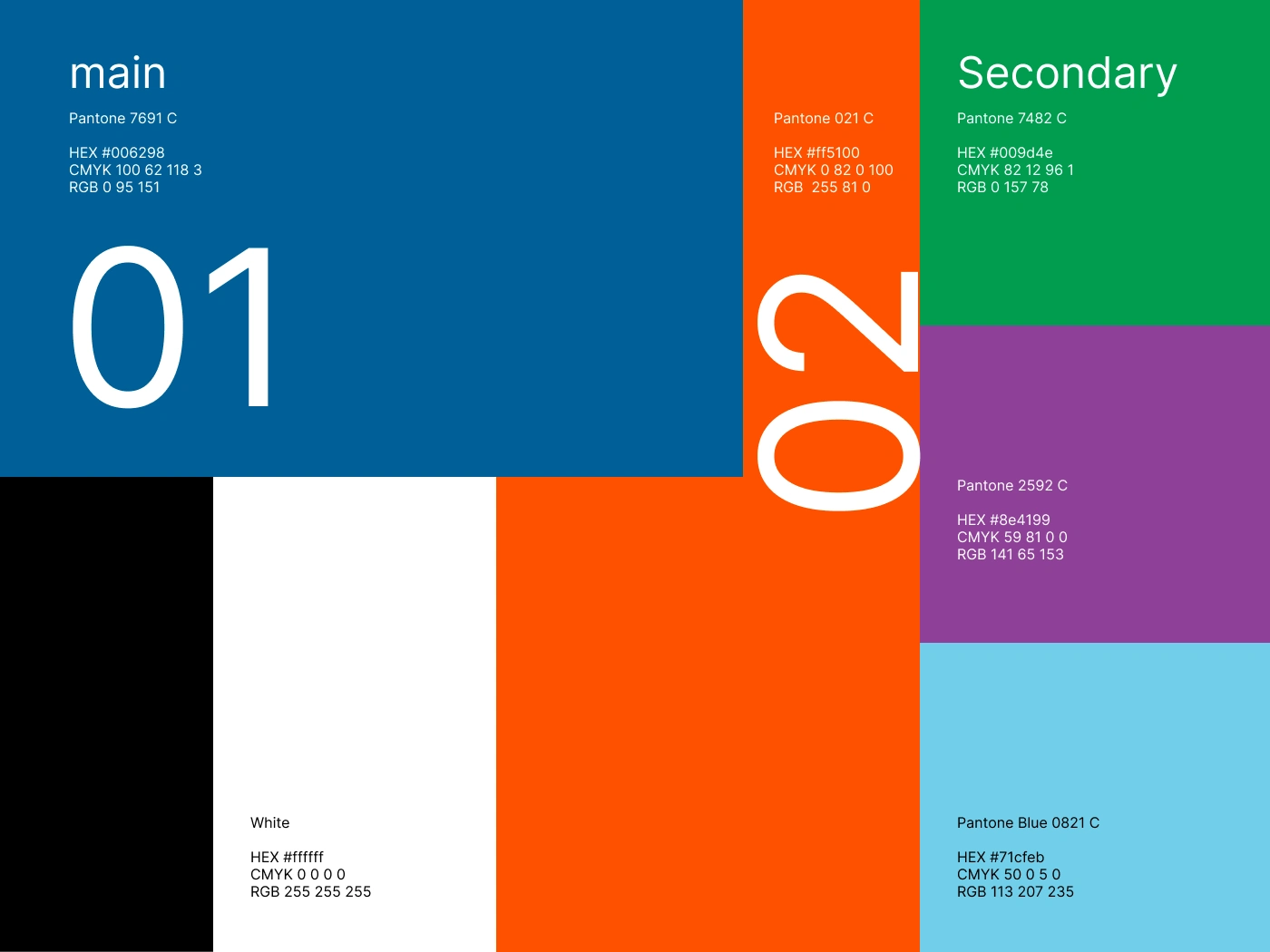
Color Pallete, primary and seconday colors for Disinfo Radar
The Symbol is very versatile and function great as a image container or stamp, on different type of media
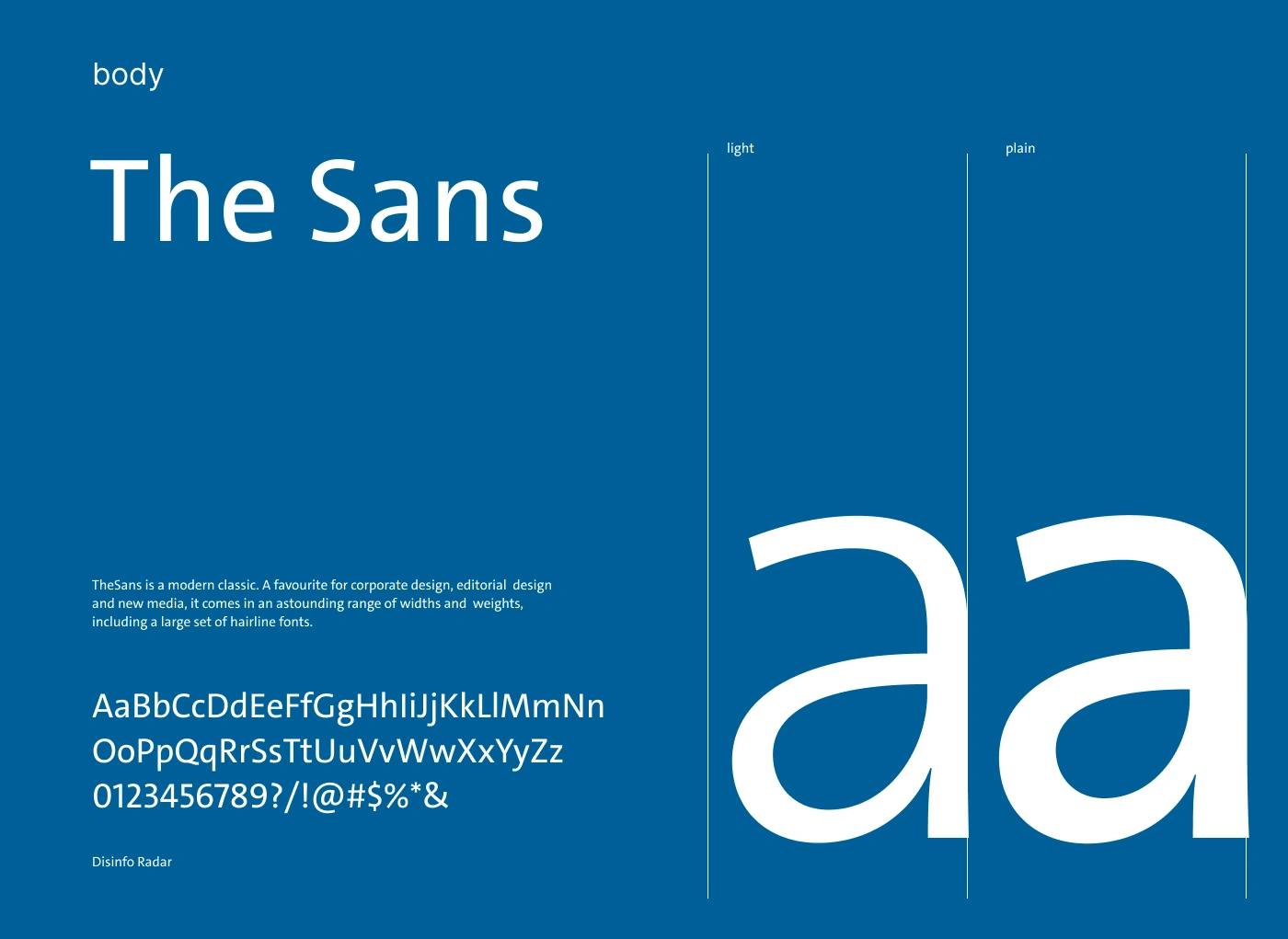
The Sans is the main typography that complement the brand identity, is a combination of modern clasic.

Business card Design for Disinfo Radar
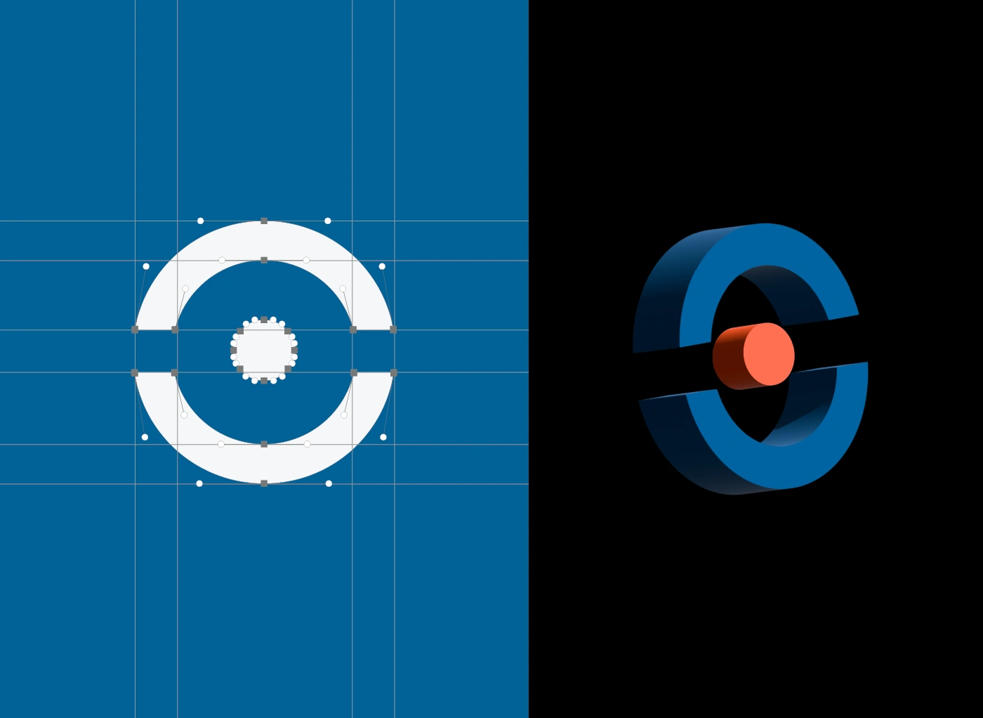
Disinfo Radar symbol outline grid process and 3D.
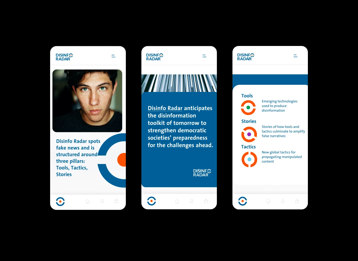
The Strategy including Tools. Stories, Tactics can be very engaging on mobile as well.
The Disinfo Radar symbol is strong and minimal, functioning very well on diverse types of materials, in different contexts

Logo symbol as collateral
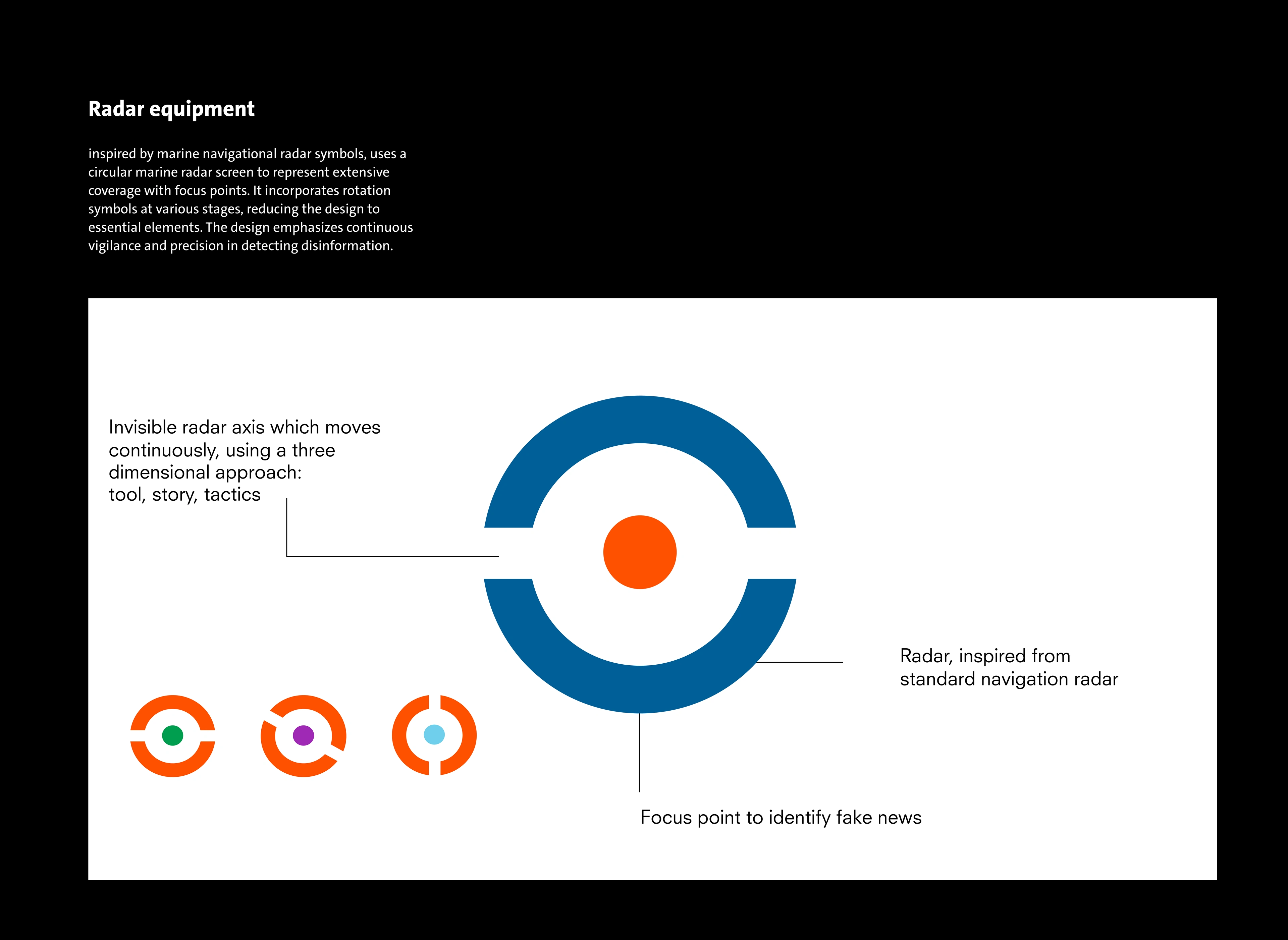
The main concept behind the Disinfo Radar brand focuses on deconstructing fake news. It is inspired by the form of standard radar navigation and features continuous dynamic movement using a three-dimensional approach: tools, story, and tactics. These three pillars function as sub-symbols of the brand and predominantly use orange as the color symbolizing the focus point—the center of the symbol. A dynamic version of this symbol can be viewed on their website, www.disinforadar.com
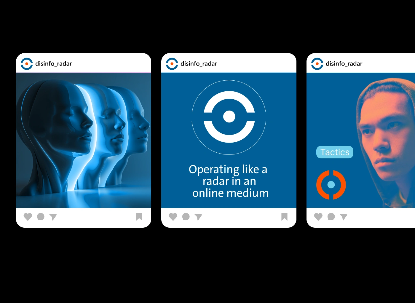
Disinfo Radar's visual identity displays consistency on social media
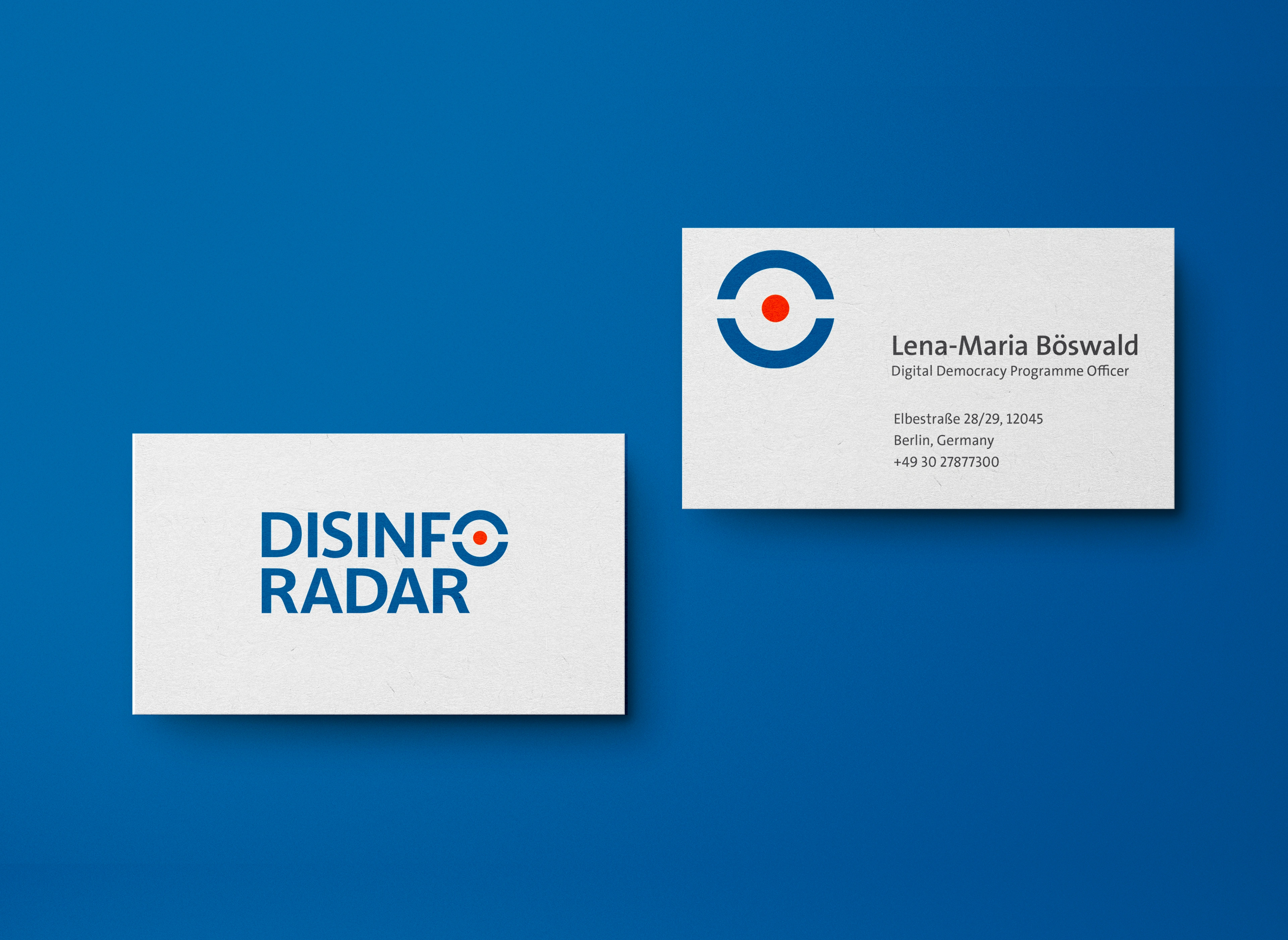
Business card using the symbol in full colors.
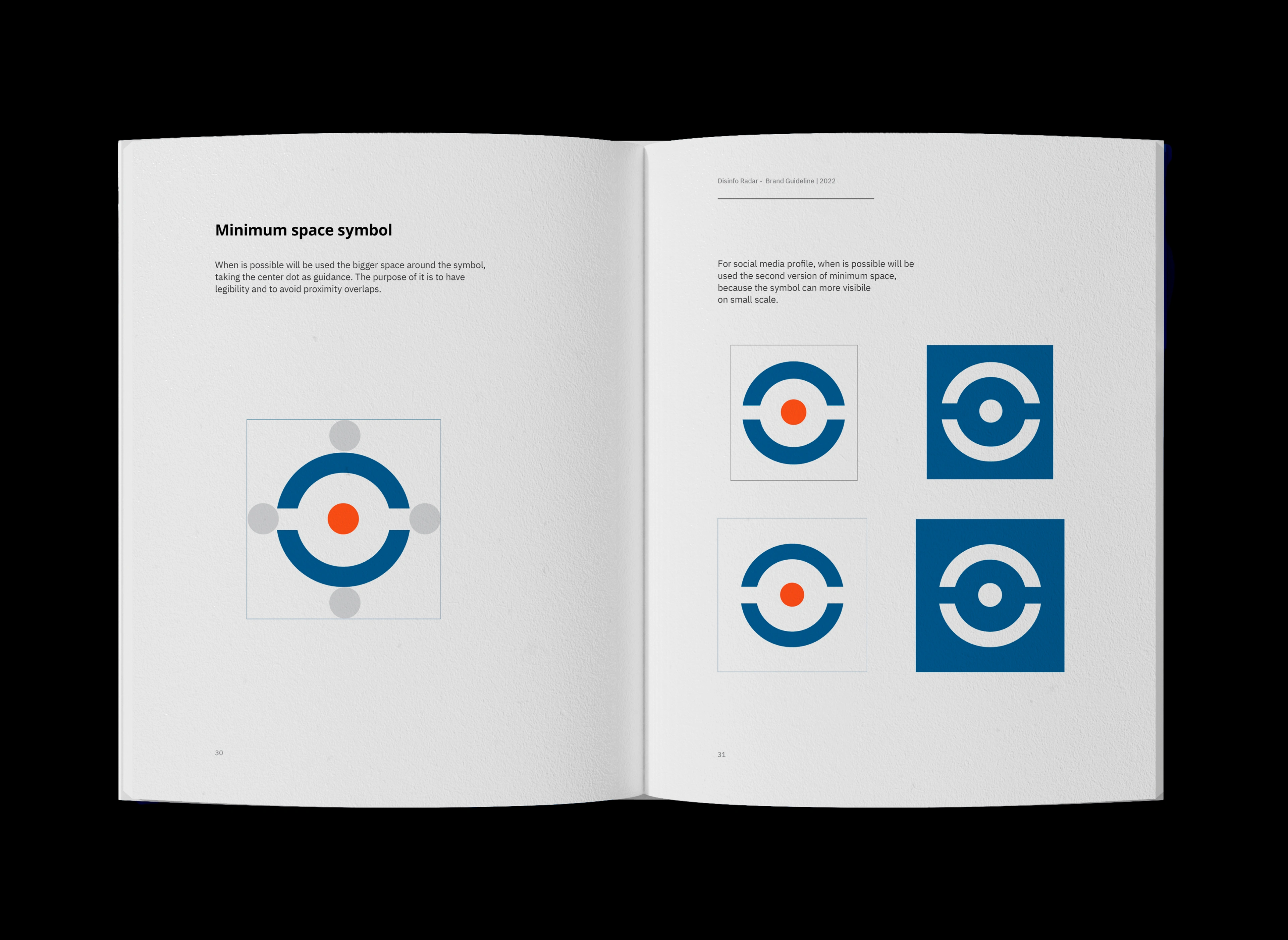
Spread from the Brand Guideline with direction for the use of space in the symbol.
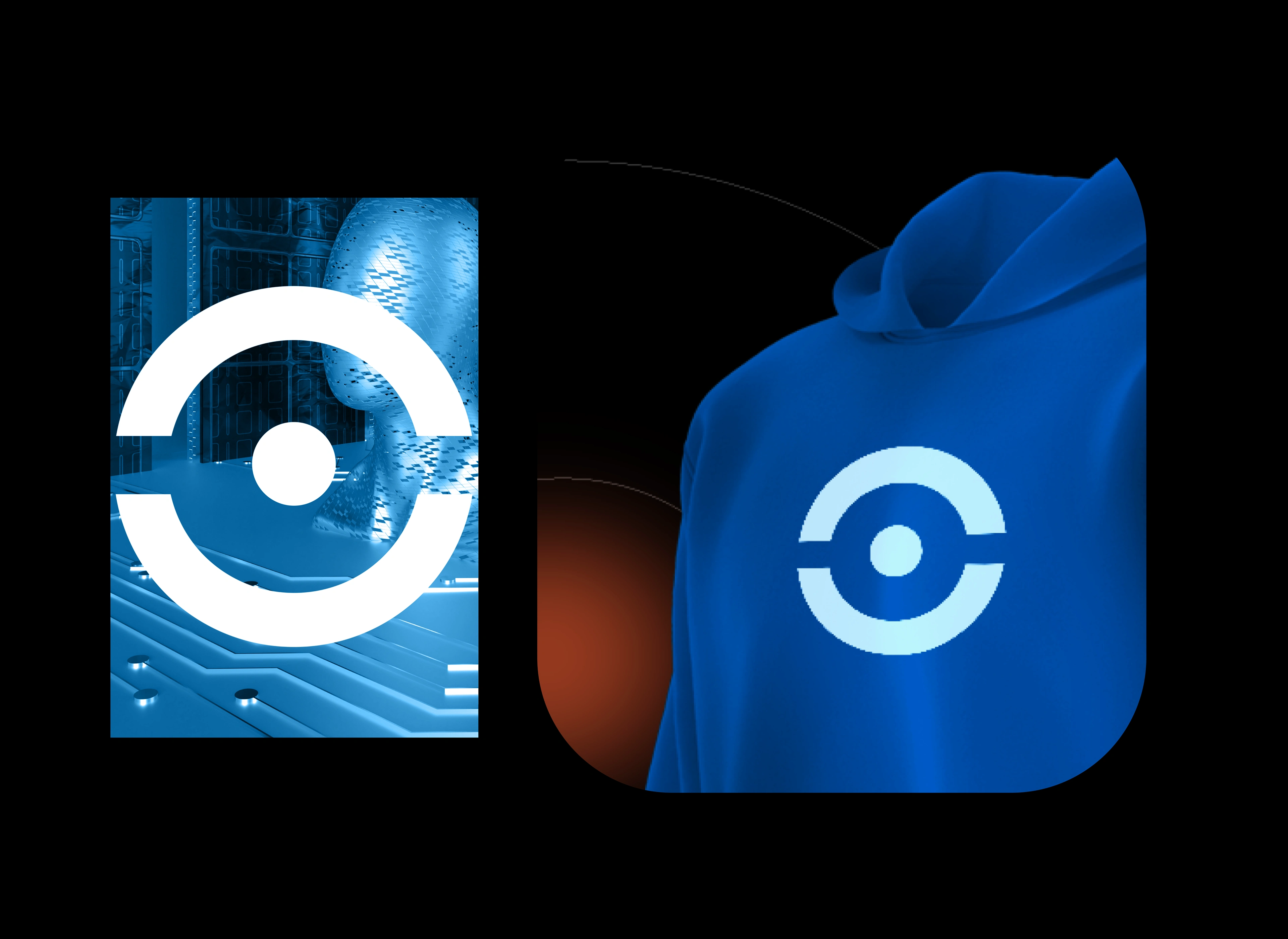
Here you can see the symbol on collateral items like hoodies or print materials. It is very bold and powerful.
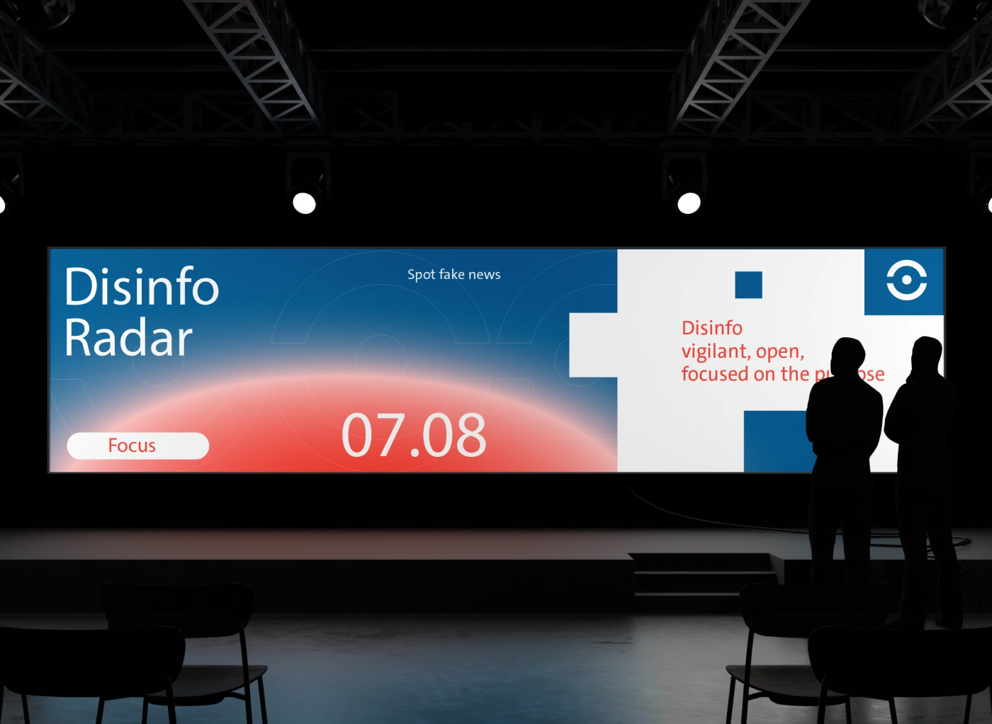
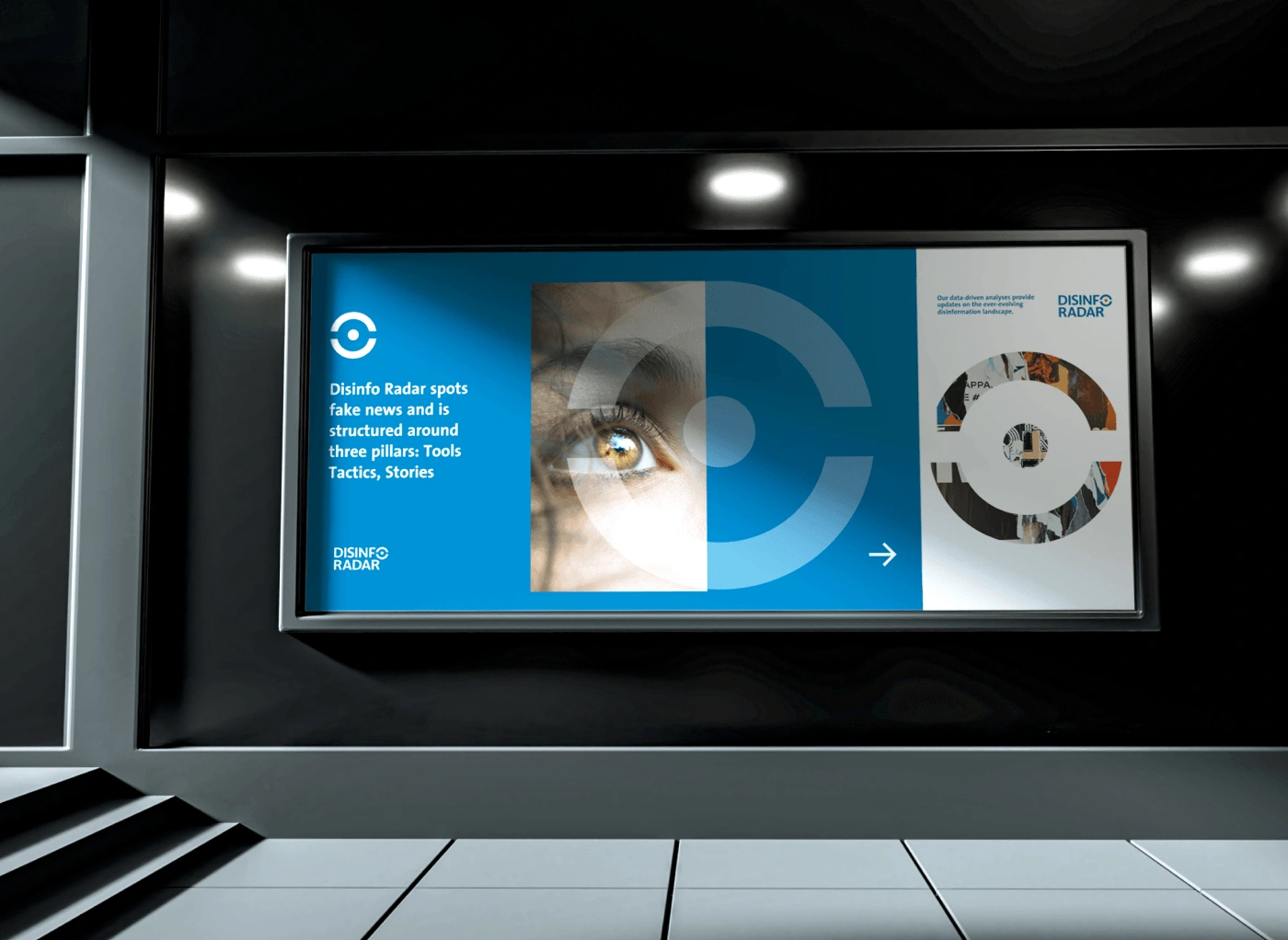
Billboard design using the visual identity coherence for Disinfo Radar.
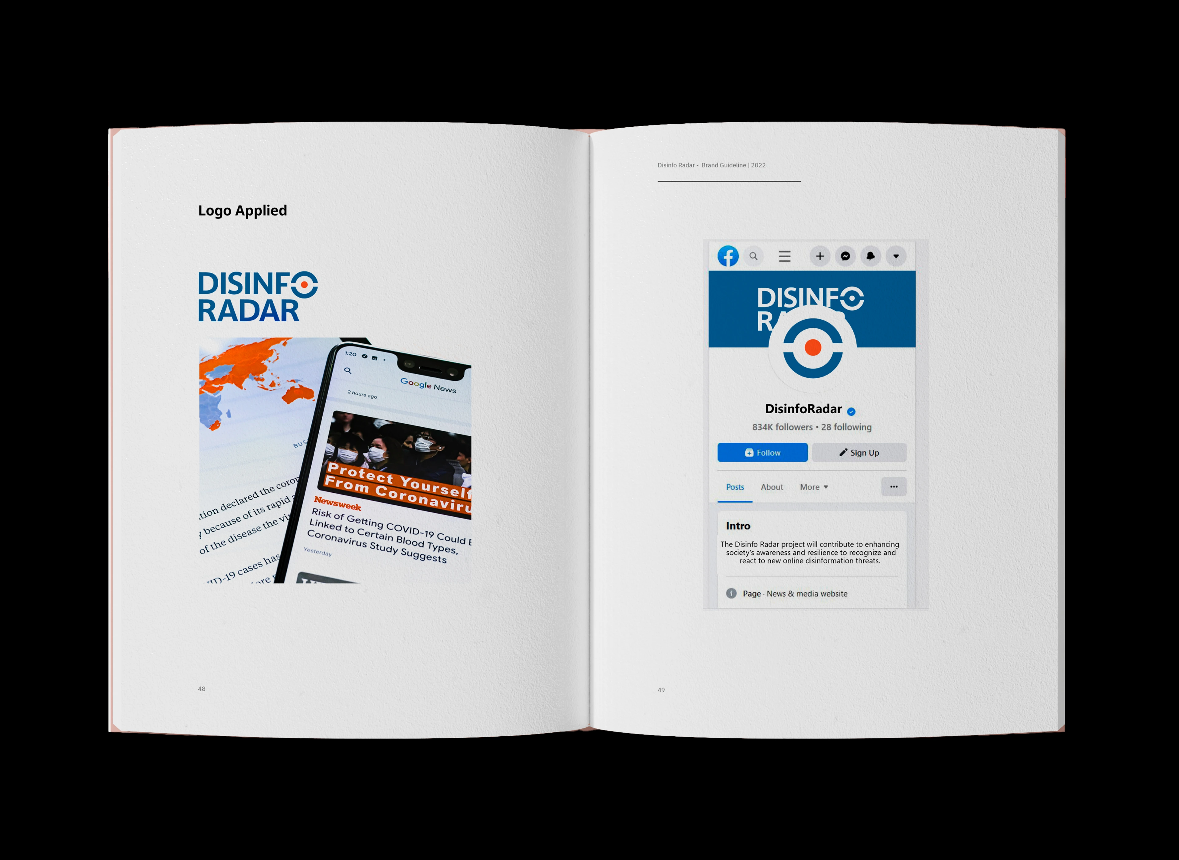
Spread from the Brand Guideline using the coherence of identity in social media, media pages.
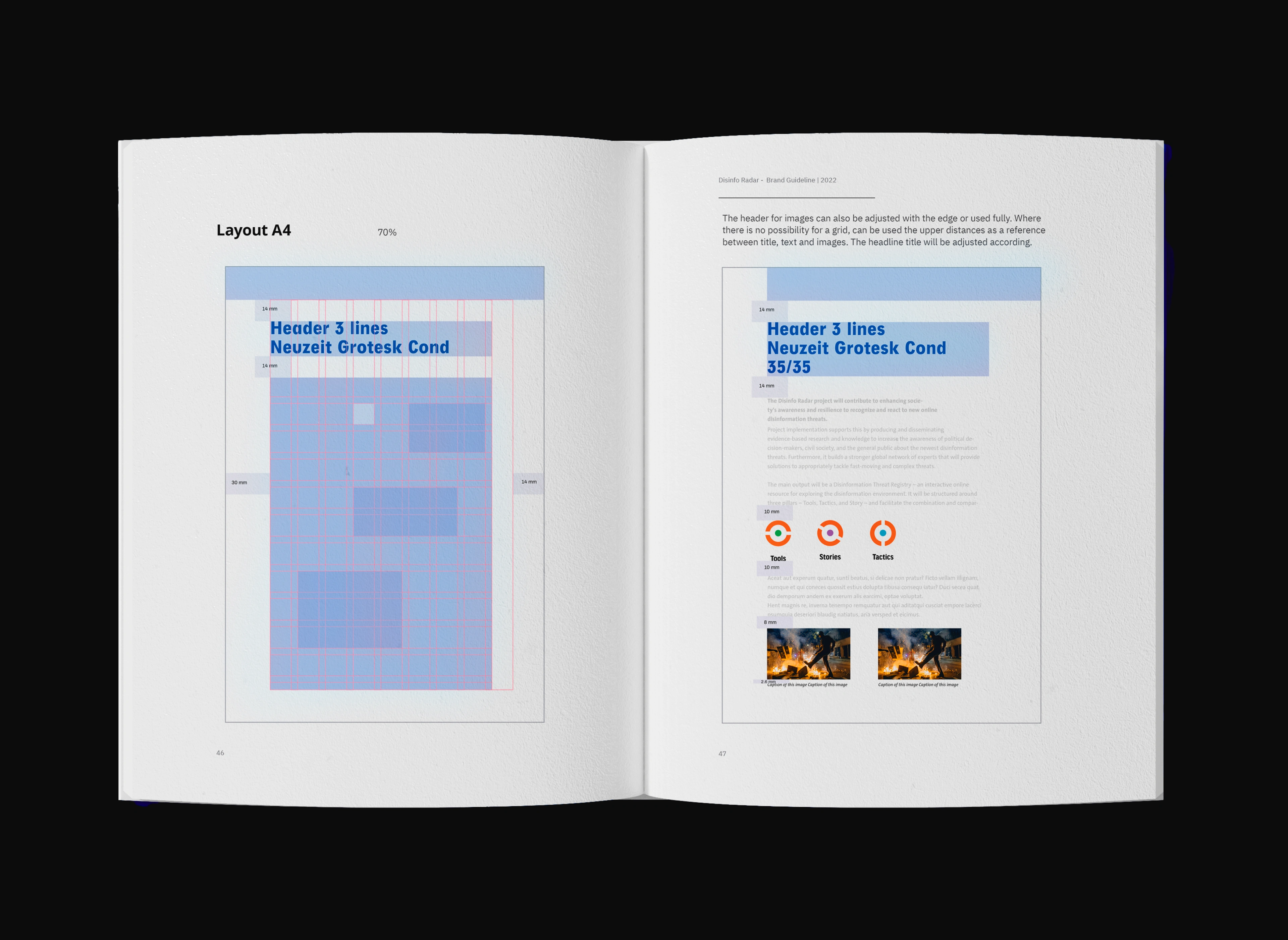
Layout design, grid, and structure I've prepared for Disinfo Radar using the well-established visual identity.
You can see this project also on Behance https://www.behance.net/portfolio/editor?project_id=202859361
Like this project
Posted Mar 15, 2025
Disinfo Radar fights fake news with Tools, Tactics & Stories, raising awareness and resilience to ensure a well-informed, truth-driven society.