Rebranding DRI Berlin
Democracy Reporting International (DRI) is an independent, impartial, non-profit organization registered in Berlin, dedicated to promoting democracy worldwide. The organization currently operates in 36 countries.
The main objective was to create a symbol that preserves DRI’s core values while also enhancing visibility in a consistent and professional way.
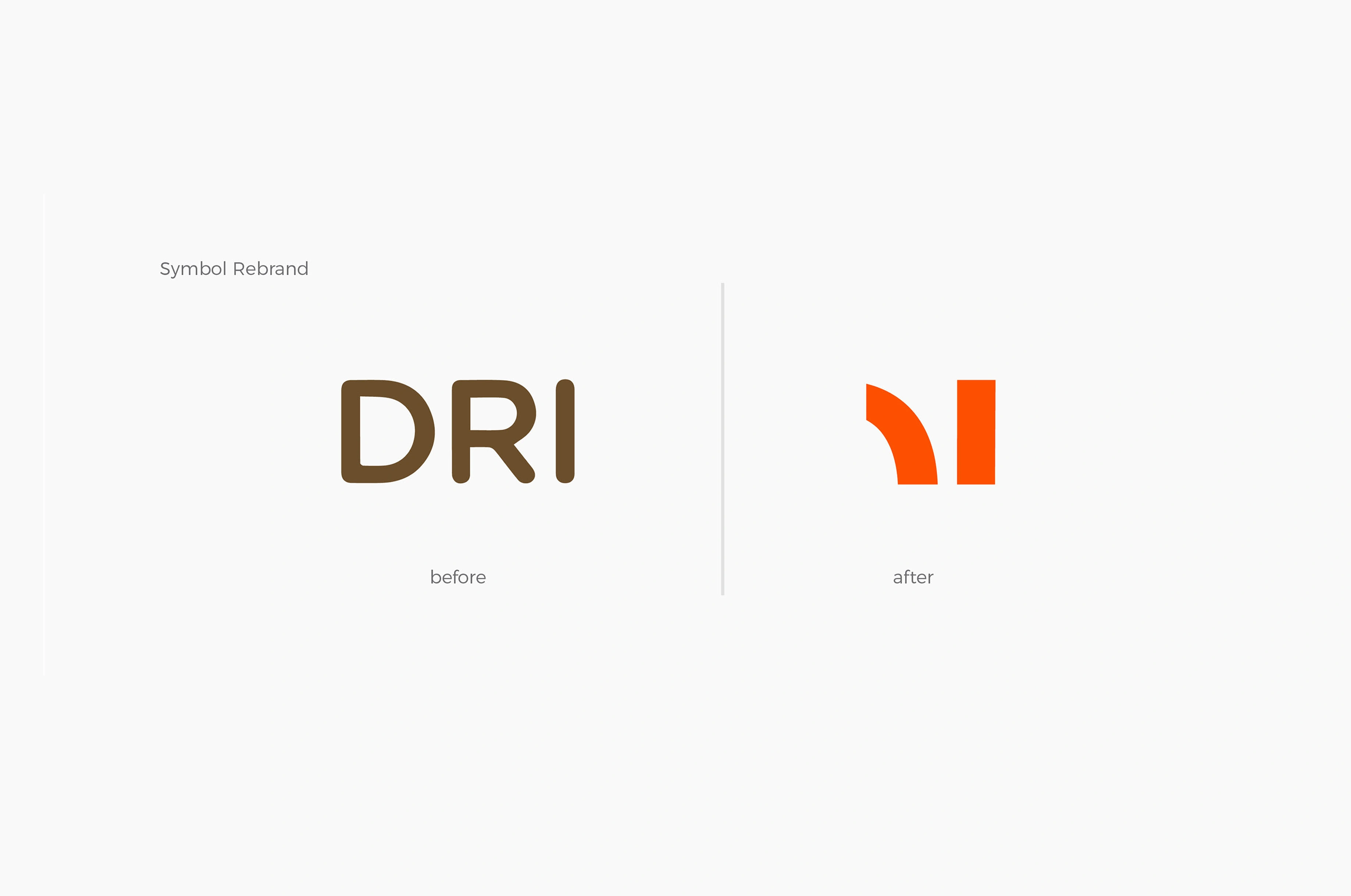
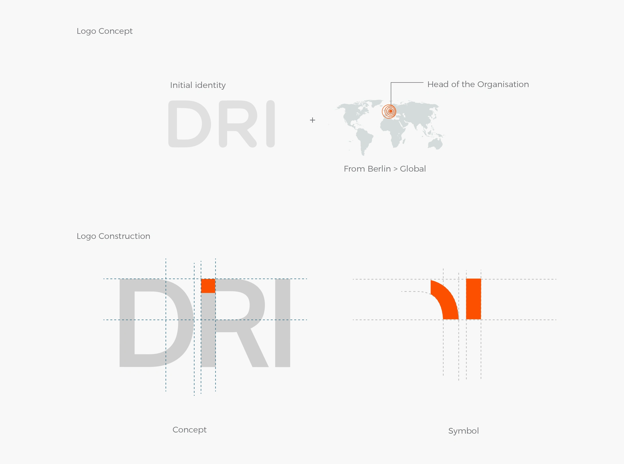
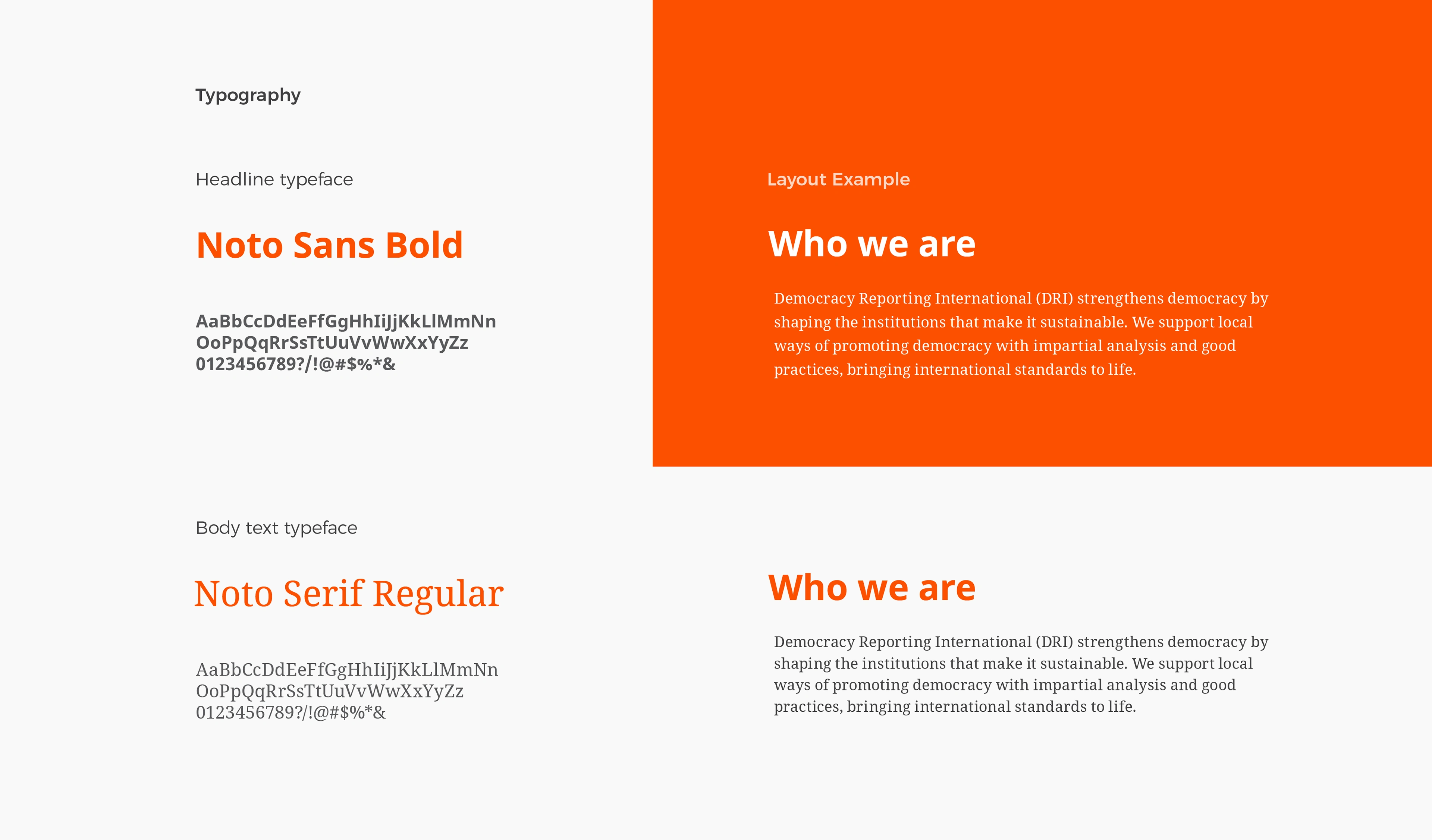
The new DRI visual identity originates from the organization’s name abbreviation and reflects its global reach—headquartered in Berlin—while extracting the essence that balances its current objectives with its past mission. The colour transition from brown to orange symbolizes optimism and determination. The need for rebranding arose from the organization’s expansion and its pursuit of focus, universality, and coherence in terms of visual identity.
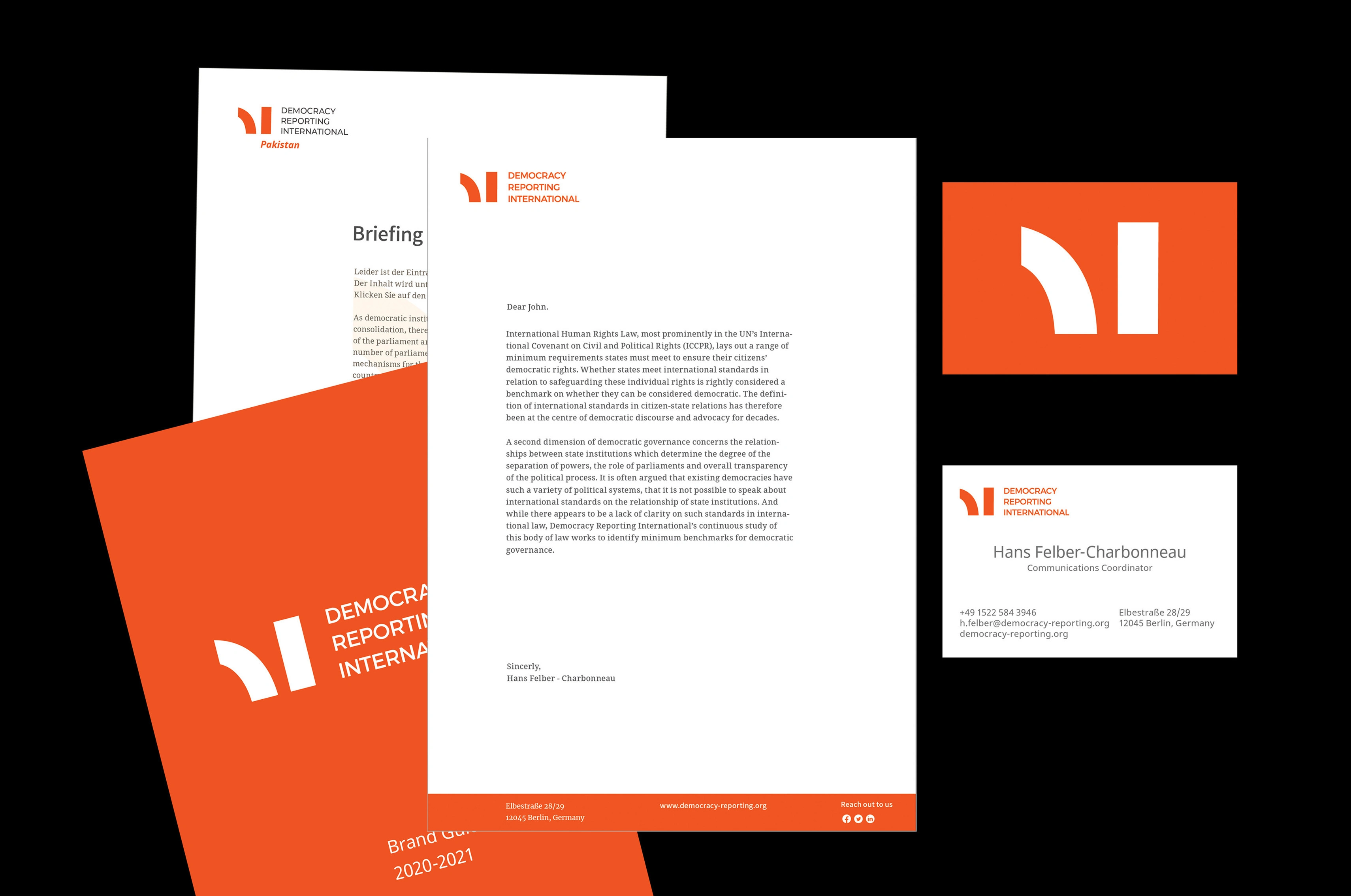
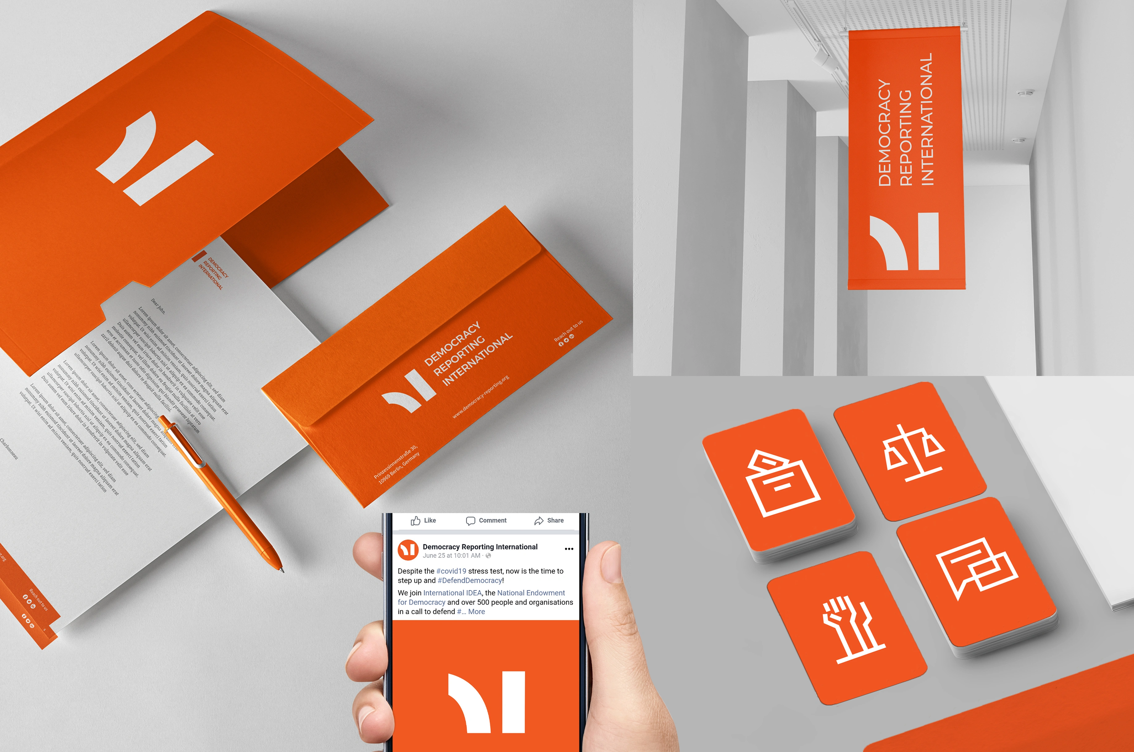
As a result, the new identity is solid,and well-defined, and provides a fresh perspective on communication across various environments and platforms. It is captivating and trustworthy, offering the possibility of a dynamic identity that uses the symbol as a flexible space. The contrast between the symbol and the logotype generates interest, emphasizing the organization’s new approach.
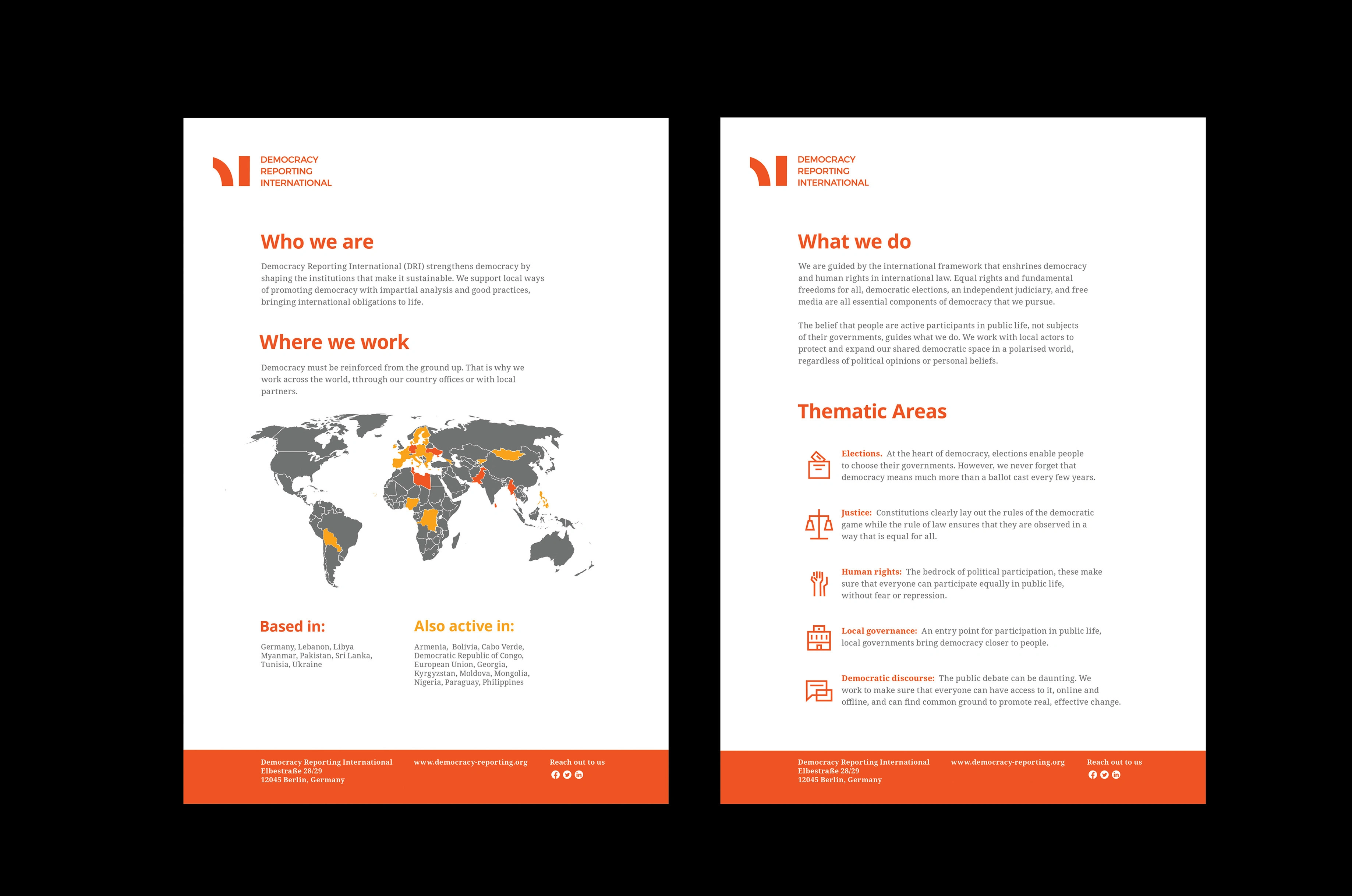
The concept updates the previous symbol while visually encompassing the global map to highlight DRI’s worldwide work. From this intersection, the essence emerges—starting centrally from the headquarters in Berlin and expanding globally.
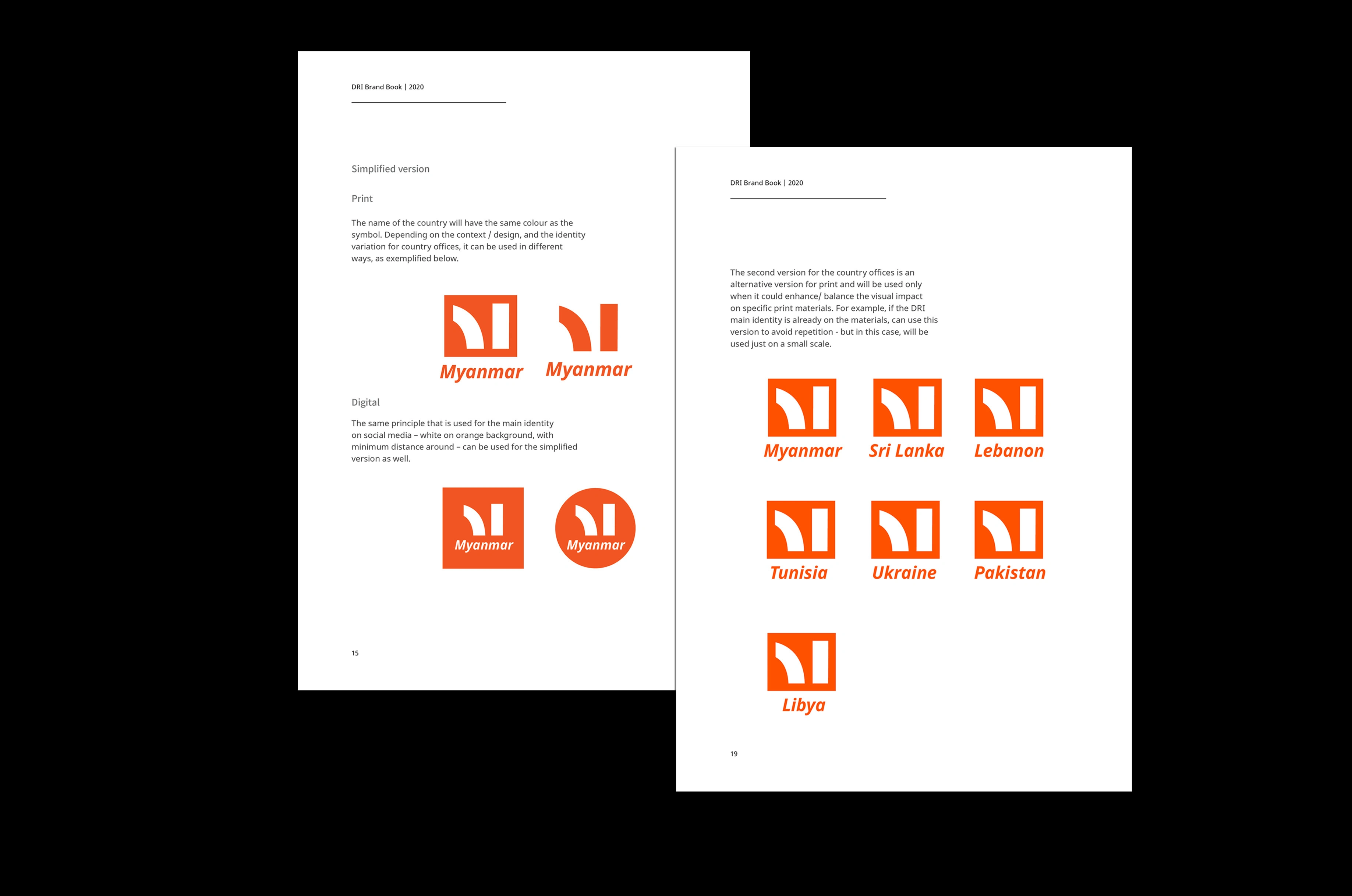
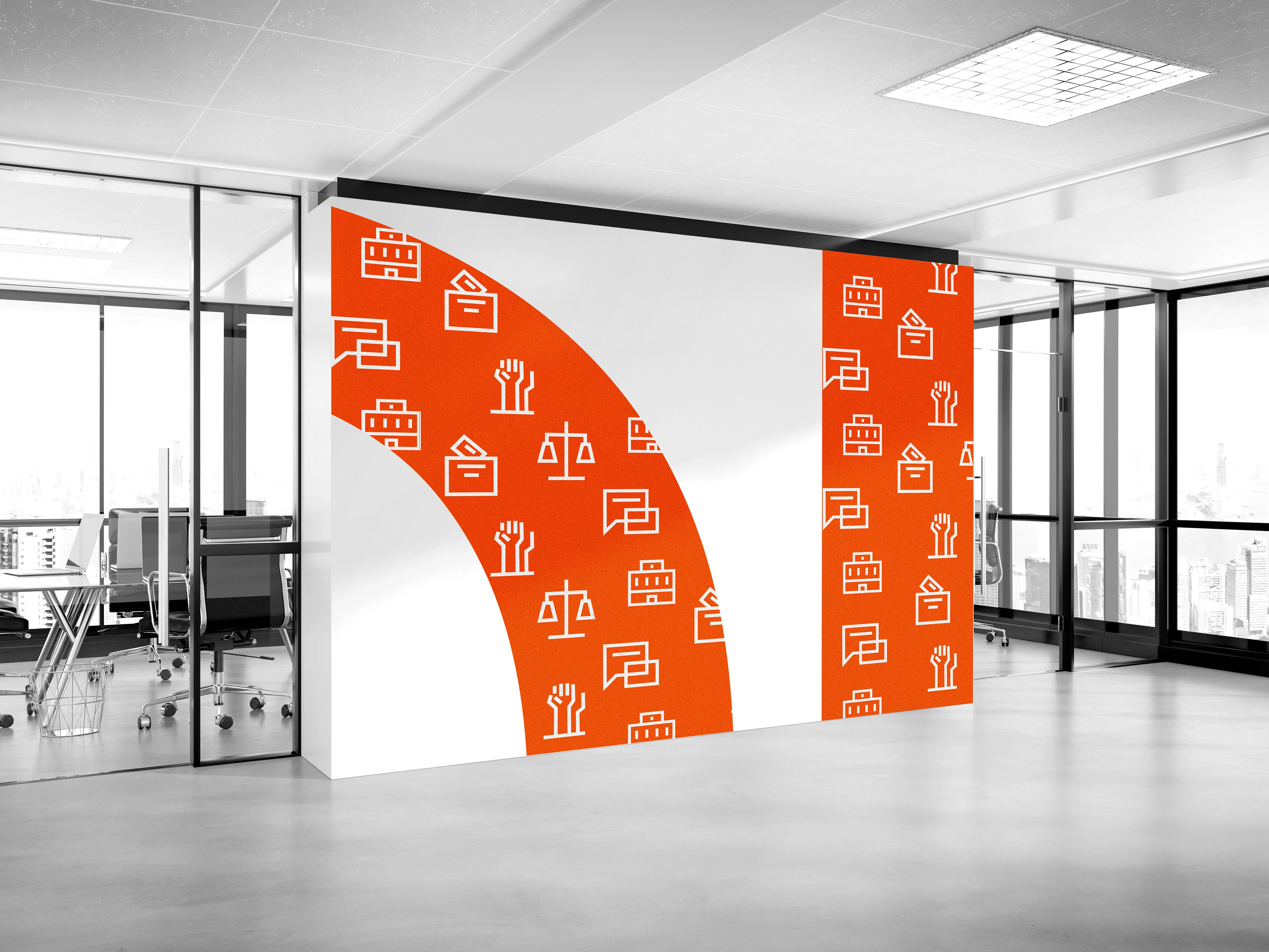
In addition to the visual identity, secondary logos were developed for the countries in which the organization operates, along with a set of main icons representing key themes and secondary icons for specific areas of intervention.
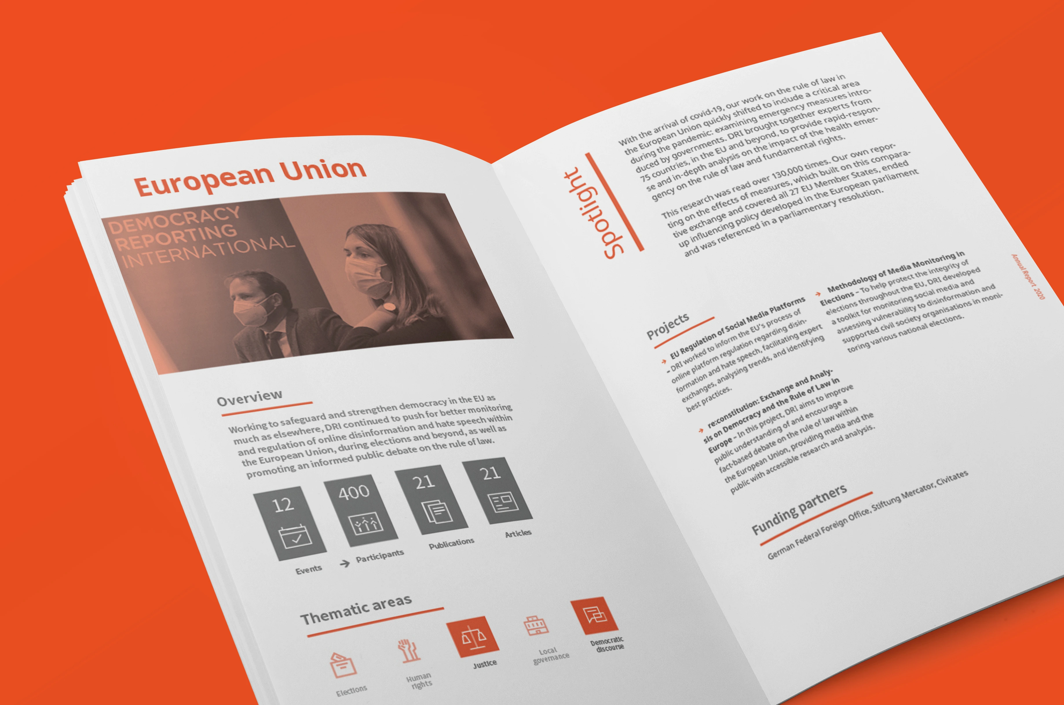
This excerpt is taken from the DRI Annual Report, based on the new identity.

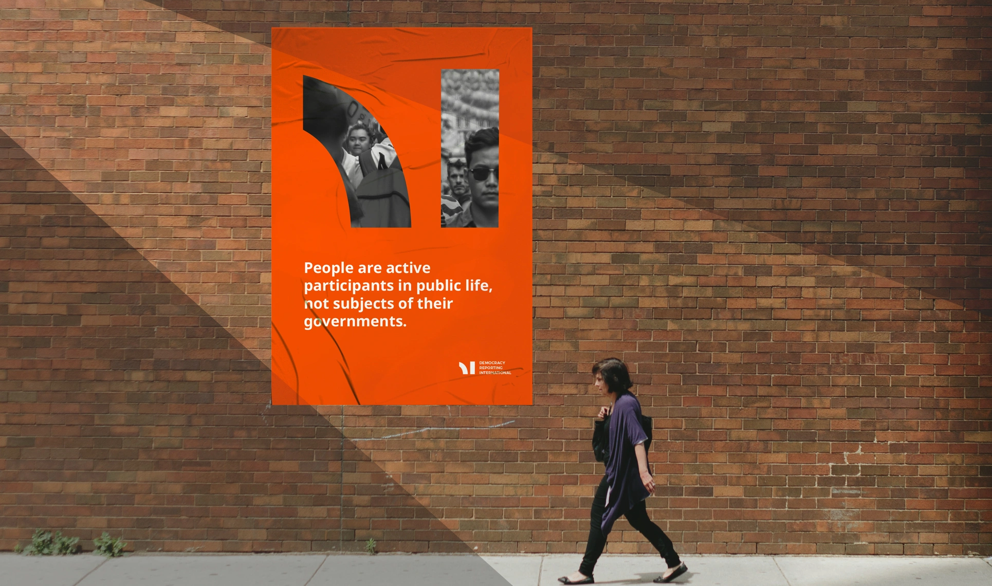
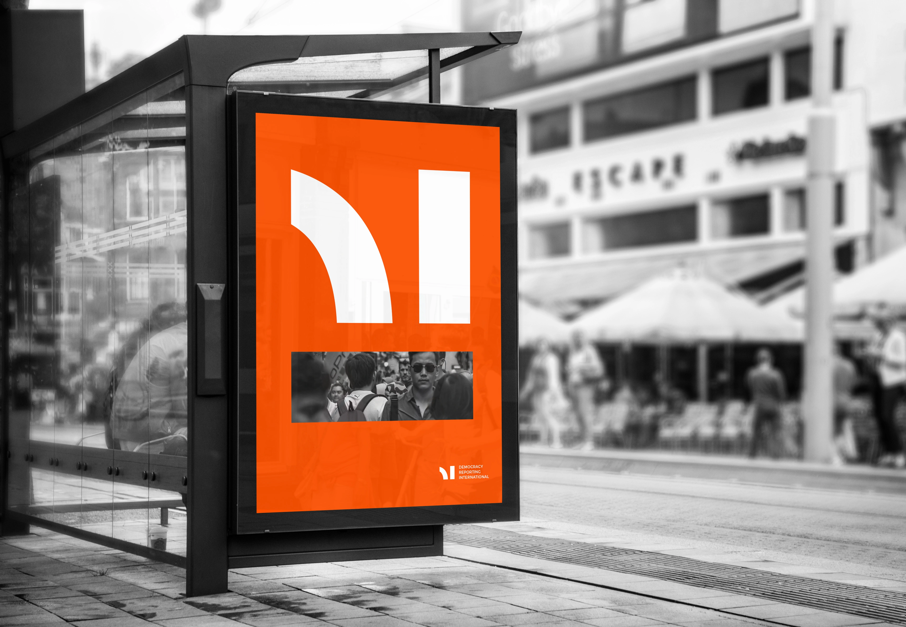
Dri Outdoor Billboard
Like this project
Posted Mar 14, 2025
DRI rebranded to enhance visibility, reflecting its global reach from Berlin. The new identity is solid, dynamic, and symbolizes optimism and determination.
Likes
1
Views
7
Clients
Democracy Reporting International


