ZenHome — Smart Home App

Ivan Razin


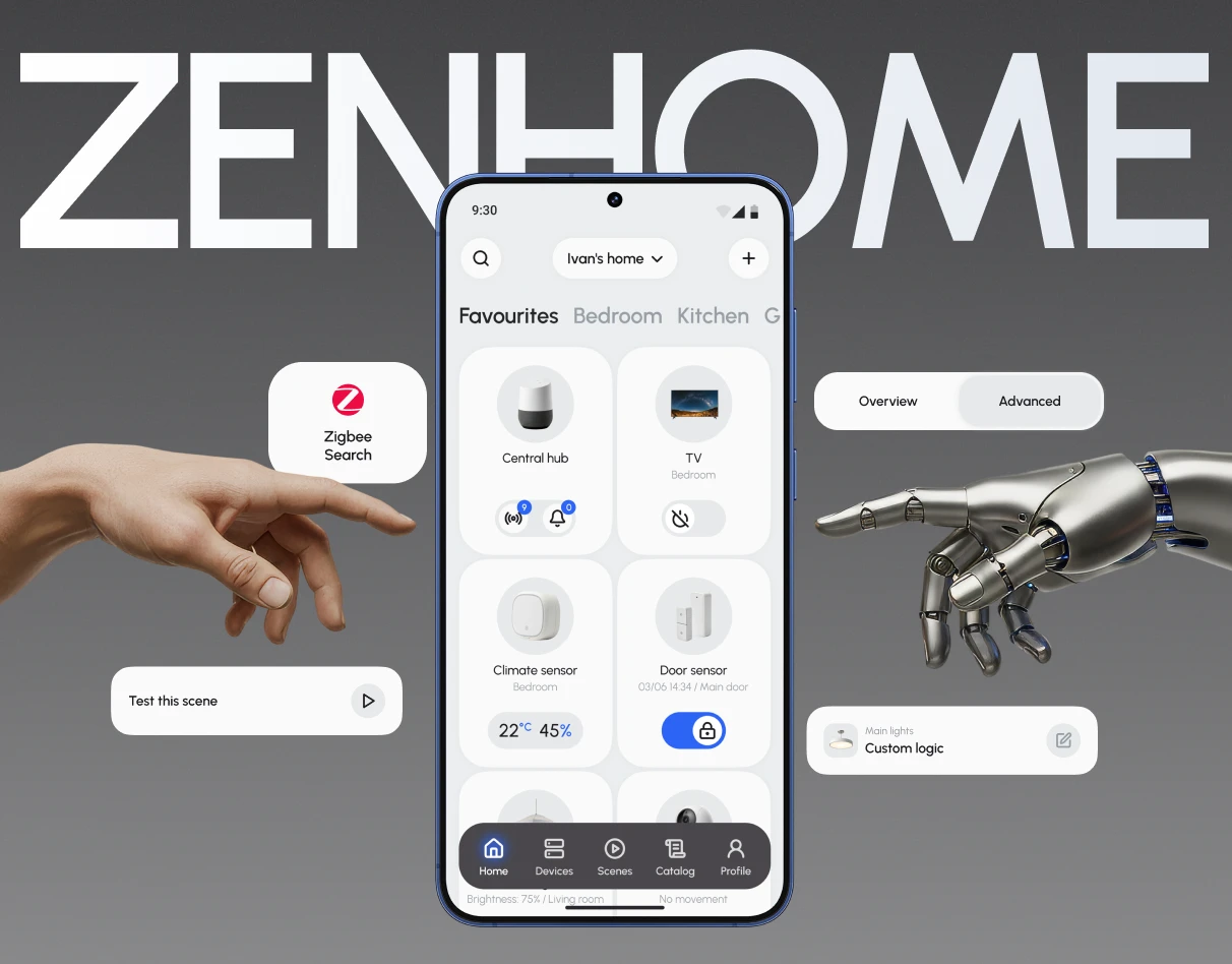
ZenHome — Smart Home Mobile App
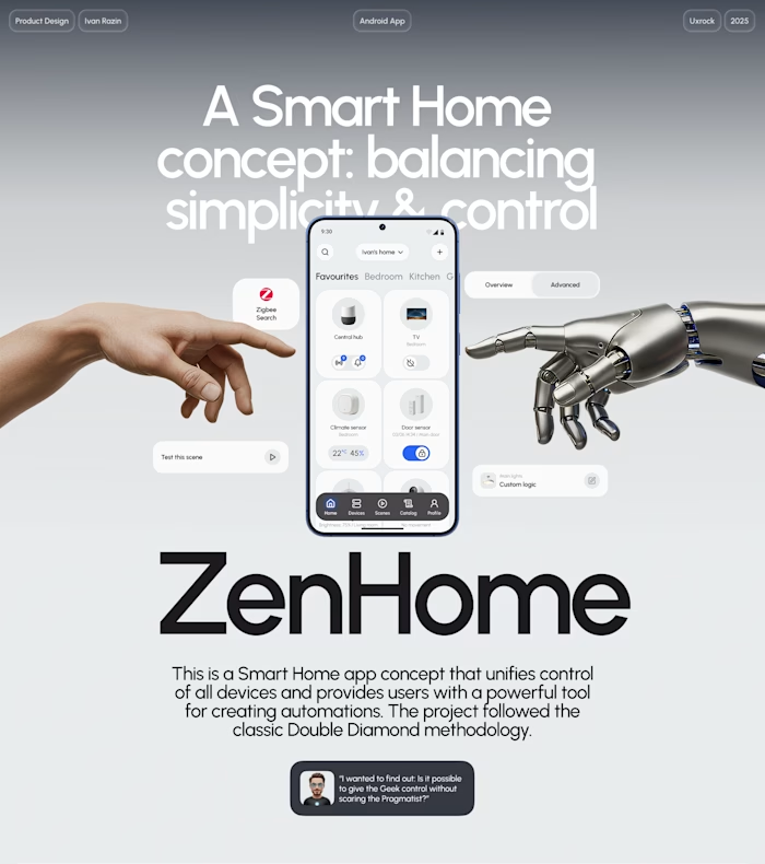
ZenHome is a smart home app that brings all devices into one ecosystem and gives users a powerful tool to build automations.
The challenge
Smart home apps tend to fall into two extremes: too simple for advanced users or too complex for everyone else. As a result, users end up switching between multiple apps to manage a single home.
I designed ZenHome around progressive disclosure — keeping everyday controls simple while giving advanced users access to deeper automation logic.
Key outcomes
75% of participants ignored the global “+” action and looked for automation creation from a device card.
2 user modes
Basic Mode for everyday tasks + Custom Logic for advanced automation.
Research → Testing → Iteration
4 user interviews + moderated usability testing + first-click testing informed the product direction and subsequent design iterations.
Problem research
Key problems
For Pragmatics: technical barrier & fragmentation
I analyzed the market leaders (Yandex Alice, Aqara Home, VK Marusya) and conducted in-depth interviews. The research revealed two core problems that became the foundation of my work:
Complex device setup. Adding and configuring new devices is often confusing and takes more time than it should.
Multiple apps instead of one. To control devices from different brands, users have to juggle several apps — which creates friction and a fragmented experience.
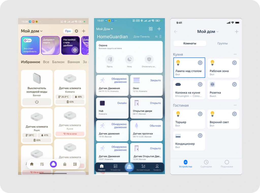
Home screens of key competitors
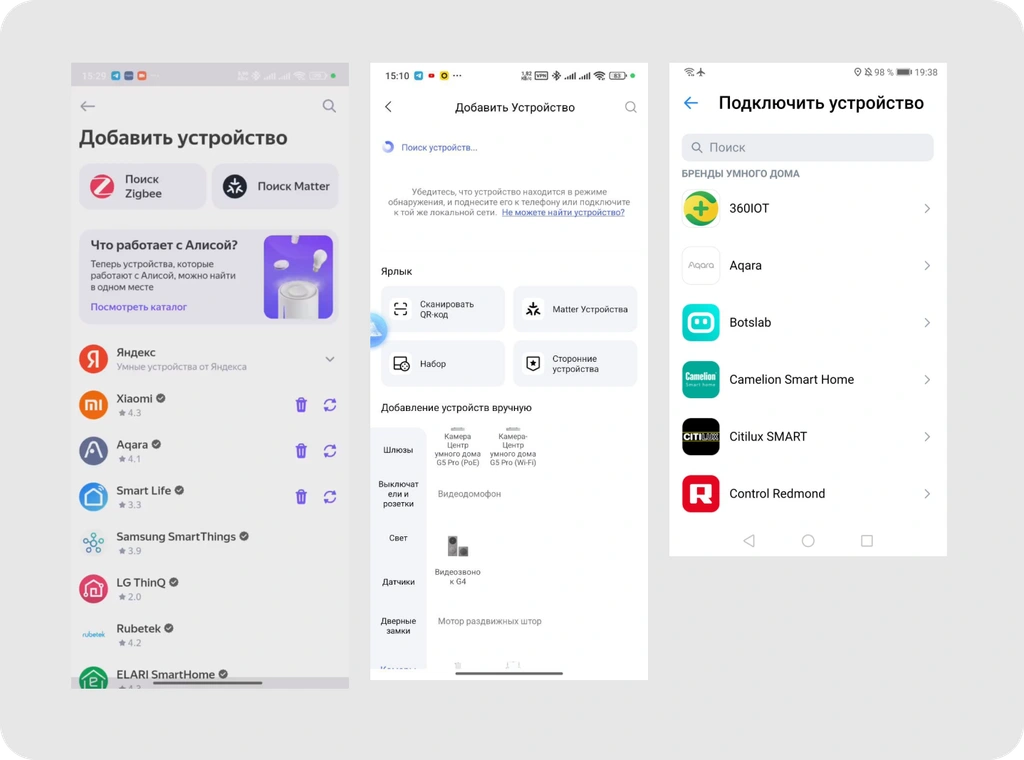
Device setup flows
For Tech Geeks: “Functionality ceiling”
Mainstream smart home apps often prioritize simplicity over flexibility, which makes them limiting for advanced users.
Limited toolkit. Power users quickly hit the limits of basic “If / Then” automations. They need variables, advanced conditions, and scripting capabilities.
Uncomfortable alternatives. To get full control, they often switch to complex platforms like Home Assistant — powerful, but not designed for a smooth mobile experience.
Current solutions
For Tech Geeks, the main “go-to solution” is Home Assistant — an open-source platform that can connect devices from different brands and support almost any automation scenario.
However, it comes with a steep learning curve: it requires strong technical skills, working with configuration code (YAML), and time to set up and maintain a self-hosted system.
Home Assistant dashboard
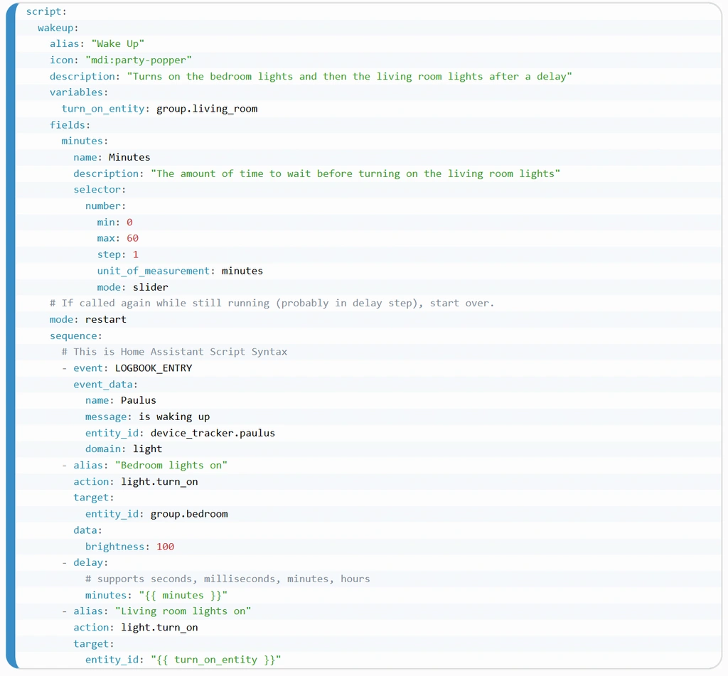
Automation code editor in Home Assistant
What’s the value?
Solving these problems is an opportunity to fill a gap in the market and build a product for a mainstream audience.
For users: Turn smart home management from a complex engineering hobby into a simple everyday tool. Technology becomes accessible and “invisible” — set it up once and forget it.
For business: Capture two key market segments at the same time:
Attract Pragmatics through a low entry barrier and ease of use.
Retain Tech Geeks by offering powerful customization options.
Outcome: MAU growth and higher sales of ecosystem devices through cross-selling.
Goals
💡Business goals
Increase LTV: Extend user lifetime value by enabling deeper, more meaningful automation scenarios.
Grow cross-sales: Drive additional device purchases through in-app recommendations.
💡Product goals
I defined key success metrics for the main user scenarios to measure design effectiveness:
Device onboarding:
Success rate: % of devices connected successfully on the first attempt
Time on task: Time to complete the onboarding flow
Connection failure rate: % of failed connection attempts (technical issues + user errors).
Automation creation
Task completion rate: % of automations created successfully
Time to create: Average time to set up one automation
Error rate: Frequency of mistakes while configuring logic.
Personas
During research, I identified two key user segments with very different needs and behaviors:
Situational Pragmatist:
A user who values speed and simplicity and doesn’t want to dive into complex settings. For them, smart home tech is a tool that should “just work” out of the box.
🟢 Motivation: convenience, simplicity, saving time on routine tasks.
🔴 Barrier: fear of breaking something; not wanting to “become an engineer”. Complex setup flows and overloaded interfaces create frustration.
Needs:
Save time on routine tasks, improve home comfort and safety.
Have one control center for all devices and a simple onboarding flow.
Tech Geek
An enthusiast for whom smart home is a hobby. They enjoy deep customization, automation, and experimenting with devices.
🟢Motivation: full control, flexibility, customization. Barrier: closed ecosystems and lack of tools for truly advanced automations.
🔴Barrier: closed ecosystems and lack of tools for truly advanced automations.
Needs:
Build a fully automated smart home system with custom, complex scenarios.
Use a flexible automation tool with advanced conditions and cross-brand device integration.
🗣️ User Stories
Based on research and persona analysis, I defined key user stories for two core scenarios:
Device onboarding and scenario setup
As a Situational Pragmatist, I want to add a device quickly and easily, so I can start using it right away.
As a Tech Geek, I want to add a device without technical issues and configure it in detail, so I can unlock its full potential and build advanced automations.
⭐ Solution Exploration
Hypotheses
Based on desk research and competitor analysis, I defined a set of initial hypotheses. I needed to understand whether users actually need advanced settings — or if they’re primarily looking for simplicity. To validate these assumptions and hear real stories, I conducted 4 interviews with participants matching our personas. This helped me better understand their context and refine the product direction.
Hypotheses for Situational Pragmatists
Hypothesis 1: A clear and effortless device onboarding flow will help users start using the smart home right away — without stress.
Hypothesis 2: A minimalist interface focused on core actions will help users complete everyday tasks quickly, without having to learn the system.
Hypotheses for Tech Geeks
Hypothesis 1: Advanced users will choose our product if it supports flexible automation building and cross-brand device integration.
Hypothesis 2: If the app includes a built-in and easy-to-use compatible device recommendation system, tech geeks will expand their ecosystem more often through new purchases.
Key Insights:
For Pragmatists: the “quick start” hypothesis was confirmed. They critically need a step-by-step device onboarding flow that guides them clearly and doesn’t require technical knowledge.
For Tech Geeks: strong functionality alone doesn’t justify a “clunky” UI. They want an interface that feels aesthetic and intuitive, while still giving full access to advanced automation setup and complex logic.
Solution: To avoid overwhelming beginners while still supporting power users, I applied progressive disclosure.
Instead of building separate app versions, I separated control levels within a single screen using a segmented control:
Basic Mode: enabled by default. A clean interface with essential controls (sliders, colors) that feels familiar to anyone.
Custom Logic: moved into a dedicated tab. Advanced features and code stay out of the way, but remain accessible to Tech Geeks in one click.
📐 Information Architecture
I restructured the navigation to reduce complexity and keep key actions within 2 taps (add a device, run a scene, control lights).
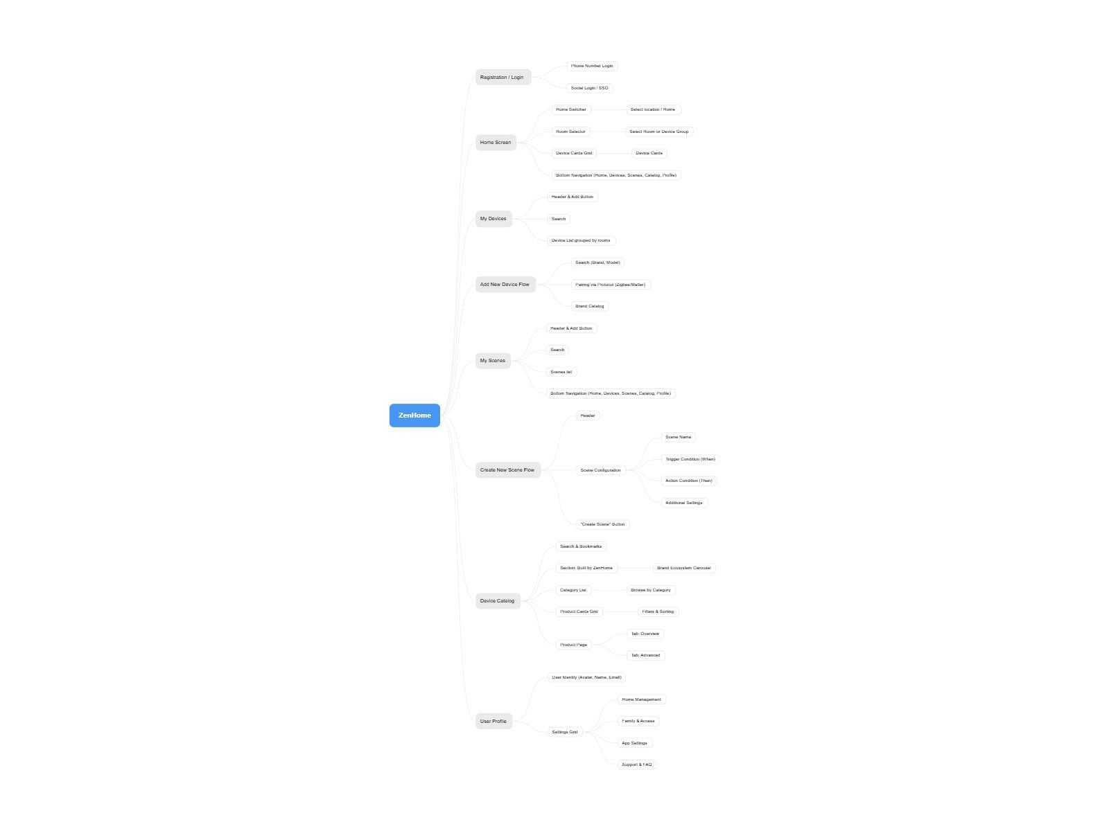
User Flow: From Adding a Device to Building an Automation
Before designing the UI, I needed to define the product’s structure and logic — the foundation that would help resolve this conflict.
I focused on the Happy Path across three key scenarios: onboarding, adding a new device, and most importantly — creating an automation.
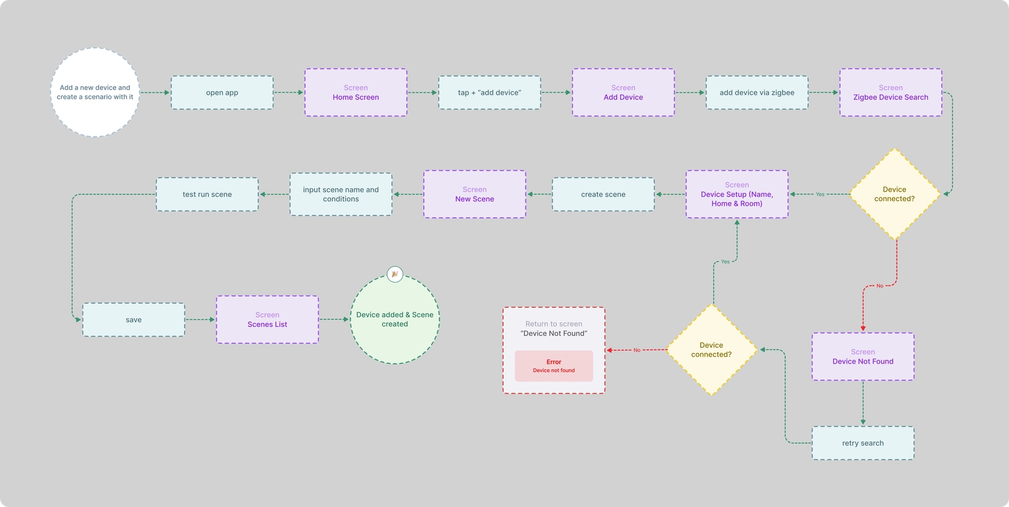
Solutions
👉 Situational Pragmatist: Device Setup Friction
Key solution: I designed a minimal Home screen and a step-by-step guided device setup flow with clear tips and prompts.
Minimal UI: The main device control screen removes unnecessary visual noise. Only core actions are shown so users can start using their smart home right away.
Linear setup flow: The process is split into simple screens where each step requires just one clear action. The system guides the user with helpful explanations to reduce anxiety and uncertainty.
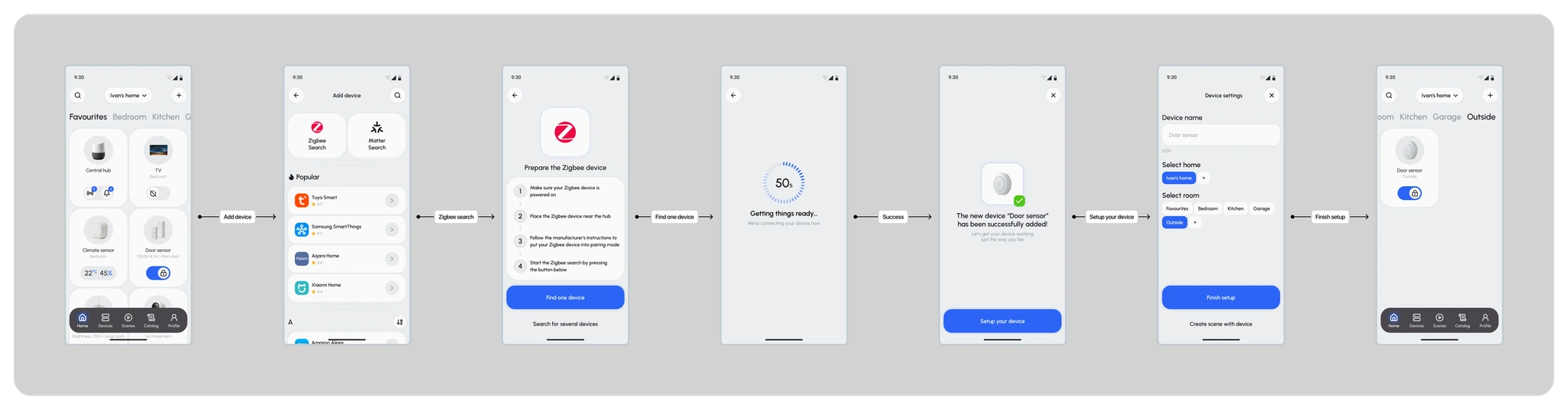
Zigbee device onboarding flow
Why it works
Lower cognitive load: The interface takes complexity away from the user — no need to understand technical settings.
A positive first experience: Successfully connecting a device on the first try builds trust and confidence, encouraging users to explore the app further.
Potential risks
Hardware dependency: Even a well-designed UX fails if the device connects slowly or inconsistently on a technical level. This flow strongly depends on reliable hardware performance.
Adaptive Help When Setup Fails
Instead of showing a generic error message, the system changes its approach. If the first attempt fails, the next try provides more detailed guidance. This way, the app “recognizes” the user’s effort and actively helps them recover — reducing frustration and keeping the experience supportive.
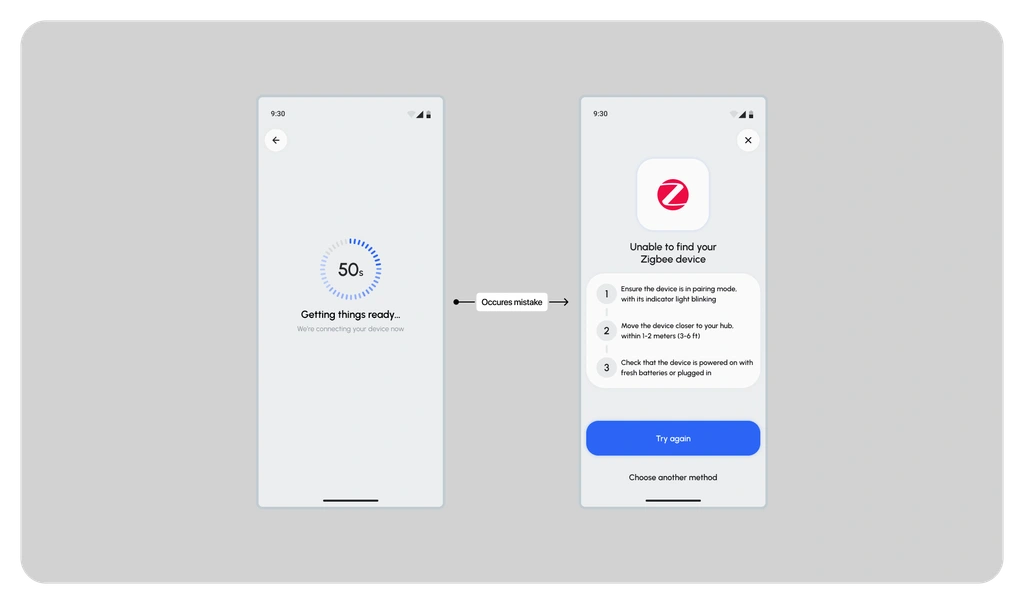
Basic guidance after the first failure
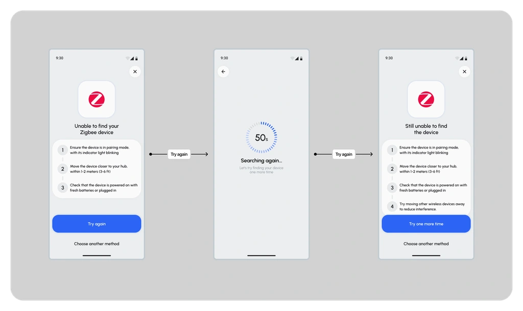
More detailed instructions and additional steps on repeated failure
👉 Solution for Tech Geeks: Advanced Automation
The solution was built around a multi-level approach to automation. The core tool is a flexible visual builder (When/Then), which allows users to combine multiple conditions and actions in a clear block-based interface.
For advanced users who want maximum control, I introduced an optional Custom Logic mode — letting them adjust device parameters through code.
🖍️ Creating and Naming Automation
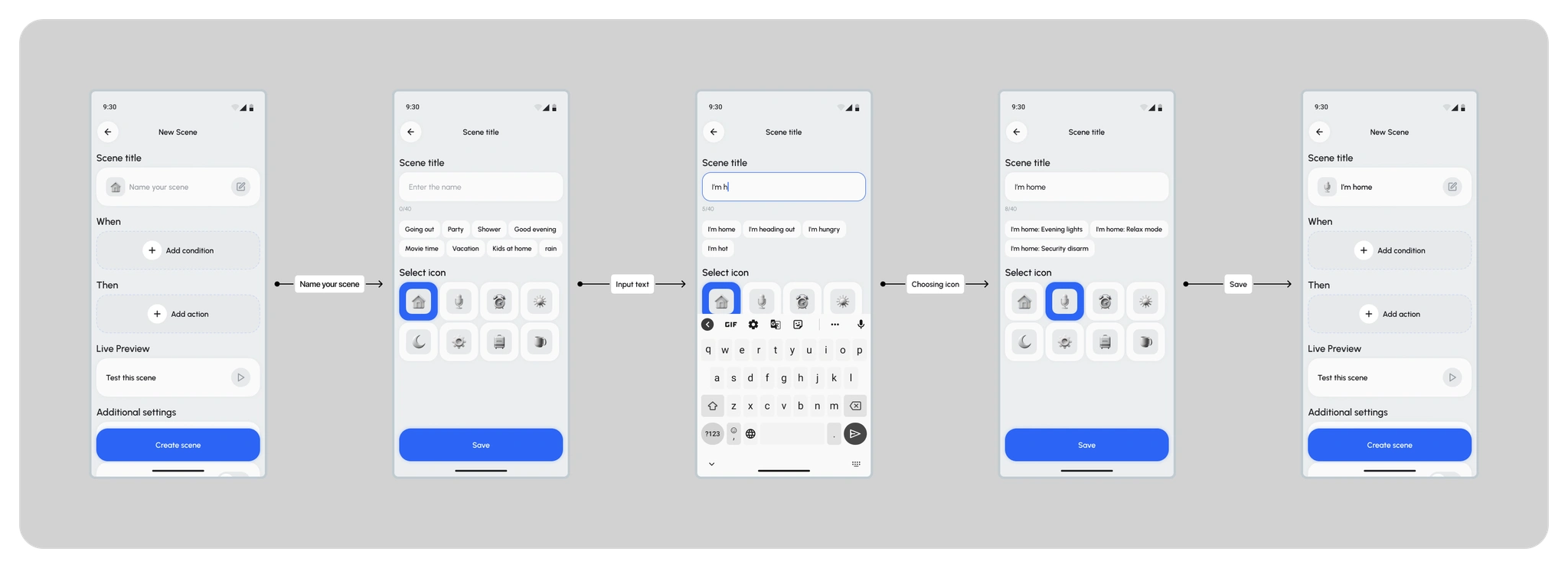
Creating and Naming Automation
To eliminate the blank canvas effect and speed up input, I enhanced the standard text field with smart chips. They provide contextual name suggestions, adapting to what the user types.
➕ Adding a Trigger — When — Add Condition
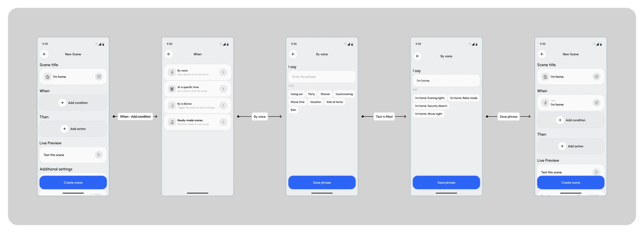
At this stage, the Trigger is defined—the launch condition. I started with the simplest path (By voice) to keep the experience intuitive and human.
➕Adding an Action — Then — Add Action
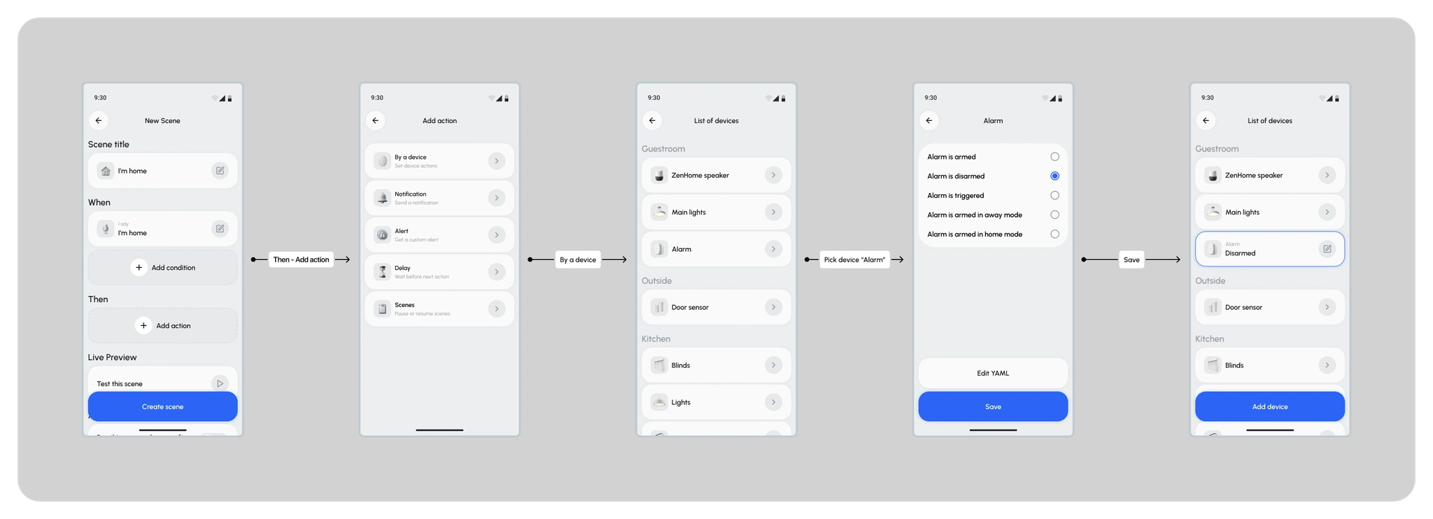
Adding an Action — Then — Add Action
Setting the Action (Then). The user chooses how the device responds. I used ready-made state presets (e.g., Disarmed) to reduce complex configuration to a single intuitive tap.
➕Finalizing the Automation
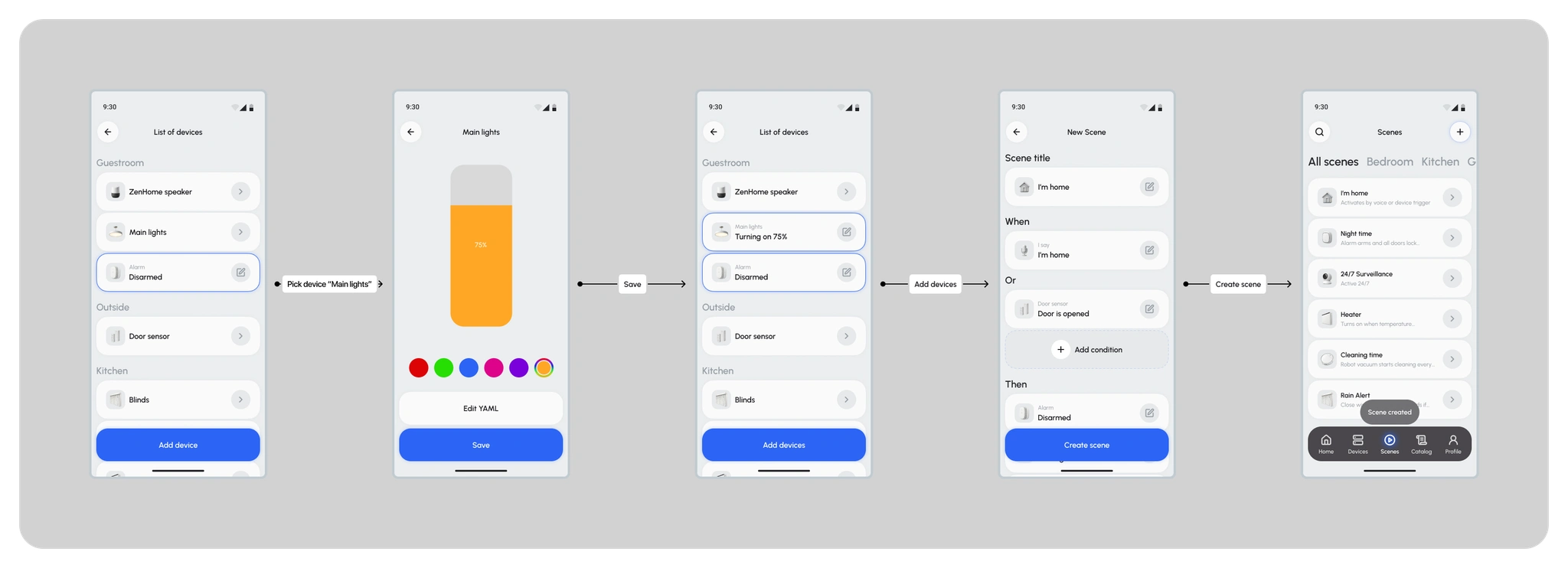
At this stage, the user sees the full picture: the trigger conditions (When / Or) and the resulting actions (Then). This provides a sense of control and helps validate the entire chain before saving.
👨💻 Solution for Tech Geeks: Custom Logic
The default functionality isn’t enough for advanced users. To keep this audience engaged and solve their lack of flexibility, I designed Custom Logic — an advanced mode that removes the limitations of pre-built controls and gives users full access to the device logic.
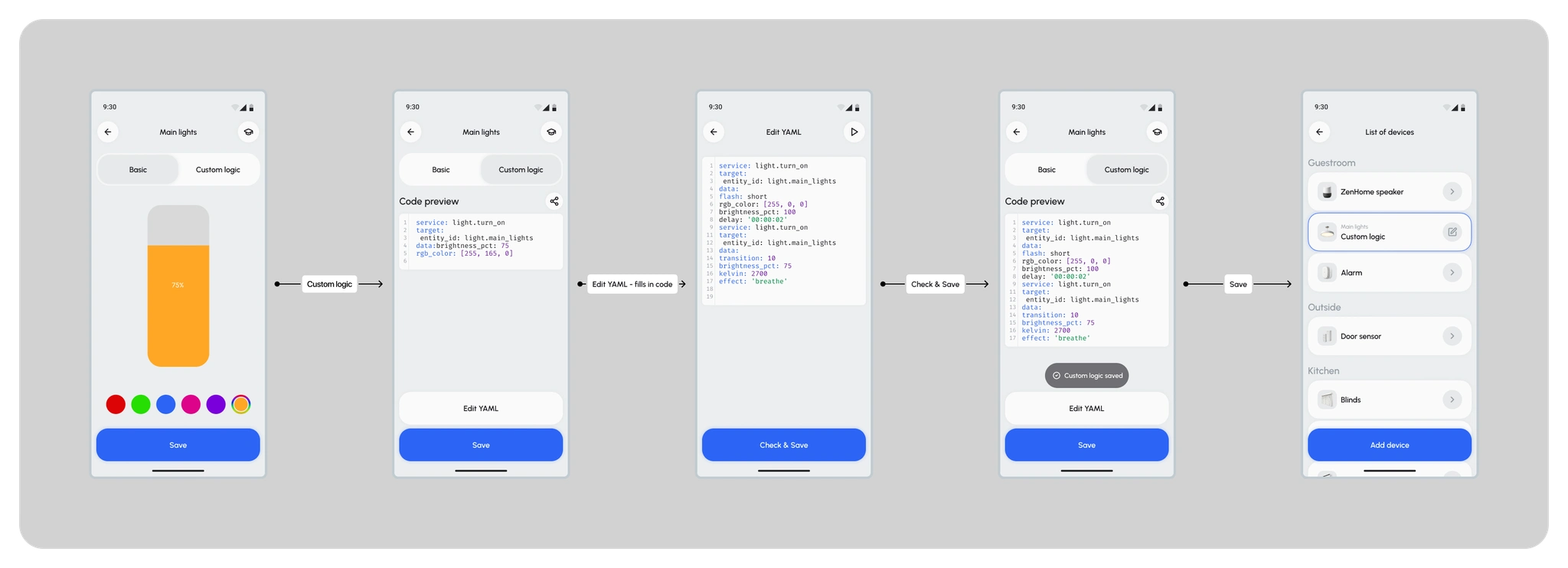
The Basic / Custom Logic segmented control separates automation complexity. Advanced functionality stays hidden for beginners, but remains available to power users in one tap — without cluttering the core interface.
A full YAML editor allows users to bypass default presets and access device parameters directly for maximum fine-tuning.
This solves the key pain point for Tech Geeks: custom scripts are saved and work as a native feature, giving users the flexibility and control that closed ecosystems usually lack.
💡Prototype & Testing Scenario
To validate my hypotheses, I built an interactive high-fidelity prototype. This version was used for moderated qualitative usability testing.
Task for participants: “Imagine you want to create a new automation. You need to set it up so that when you come back home (triggered by a door sensor or voice command), the security system disarms automatically, the blinds open, and the lights turn on.”
💡 Solution Testing
To validate the proposed solutions, I ran two rounds of testing: moderated qualitative interviews and quantitative testing.
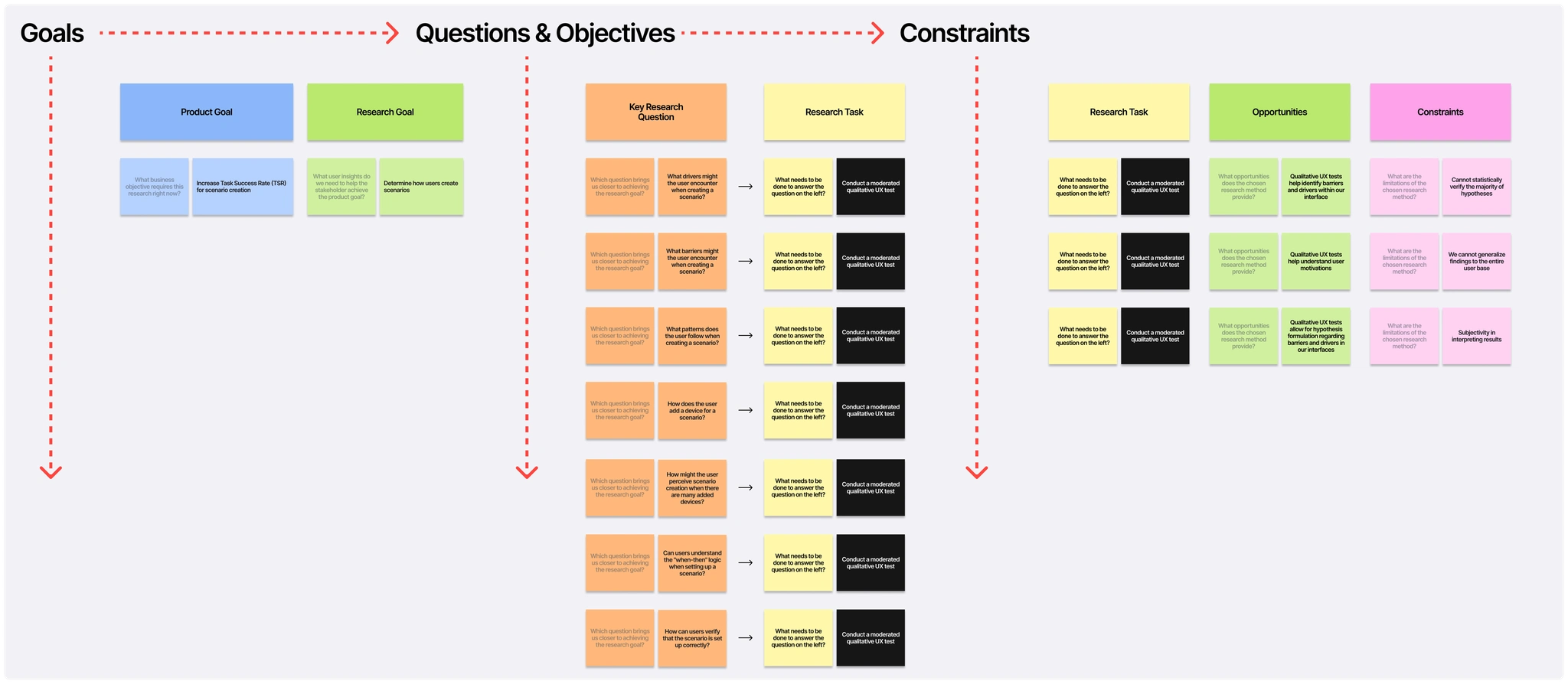
Qualitative testing
I tested the design with 3 participants (1 Tech Geek, 2 Pragmatics) using a clickable high-fidelity prototype. Format: remote moderated interview.
Key research questions
What drivers motivate users to create automations?
What barriers do users face when building an automation?
What patterns does the user follow when creating an automation?
💡Results
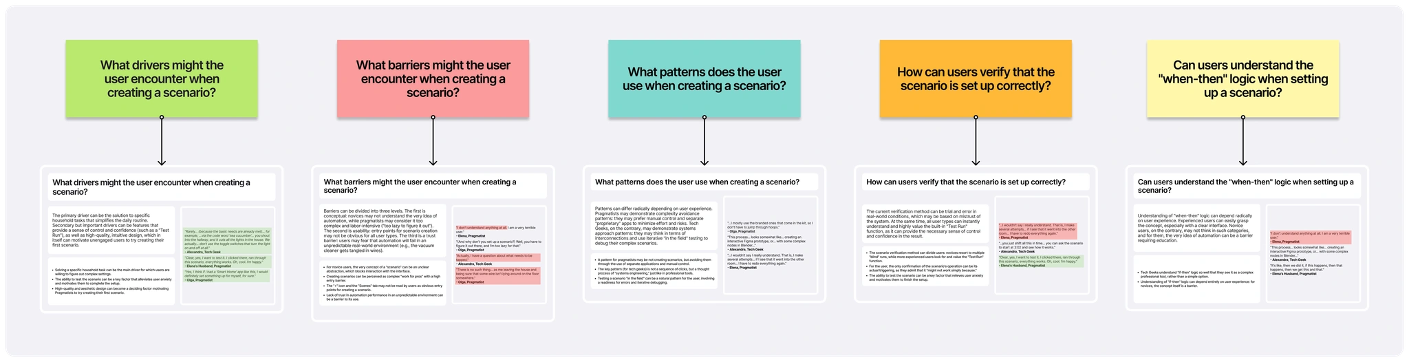
Based on the interviews, I identified 5 key insights about user barriers and motivation drivers:
Entry barrier: the “+” icon and the “Scenes” tab were not perceived as clear entry points. Users expected a more explicit call to action.
Mental model: automations were perceived as a “tool for professionals” (similar associations with Blender / node-based logic). For beginners, the concept of a “Scene” felt abstract and intimidating.
Visual design as a driver: a clean and polished UI became a key adoption factor for Pragmatics. Familiar patterns (close to Apple-like simplicity) lowered the “effort barrier” and increased motivation to try.
Control reduces anxiety: the ability to test an automation inside the builder (Live Preview) became a strong motivation driver. It turns an abstract setup into a predictable outcome and helps users confidently finish the flow.
💡Quantitative testing
In the interviews, I noticed that users often ignored the global “Create scene” button (“+”). To check whether this was a consistent issue, I ran a first-click test.
Task: Imagine you often forget to turn off the lights when leaving home. Create an automation so the lights turn off automatically every time you leave.
Result: 75% of participants ignored the “+” button and clicked on a device card instead.
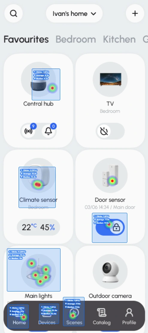
Click map
Data-driven iterations
Supporting the user’s natural behavior
Testing showed that users intuitively looked for the scene creation entry point inside a device card. Instead of forcing a new interaction pattern, I adapted the interface to match their expectations and existing behavior.
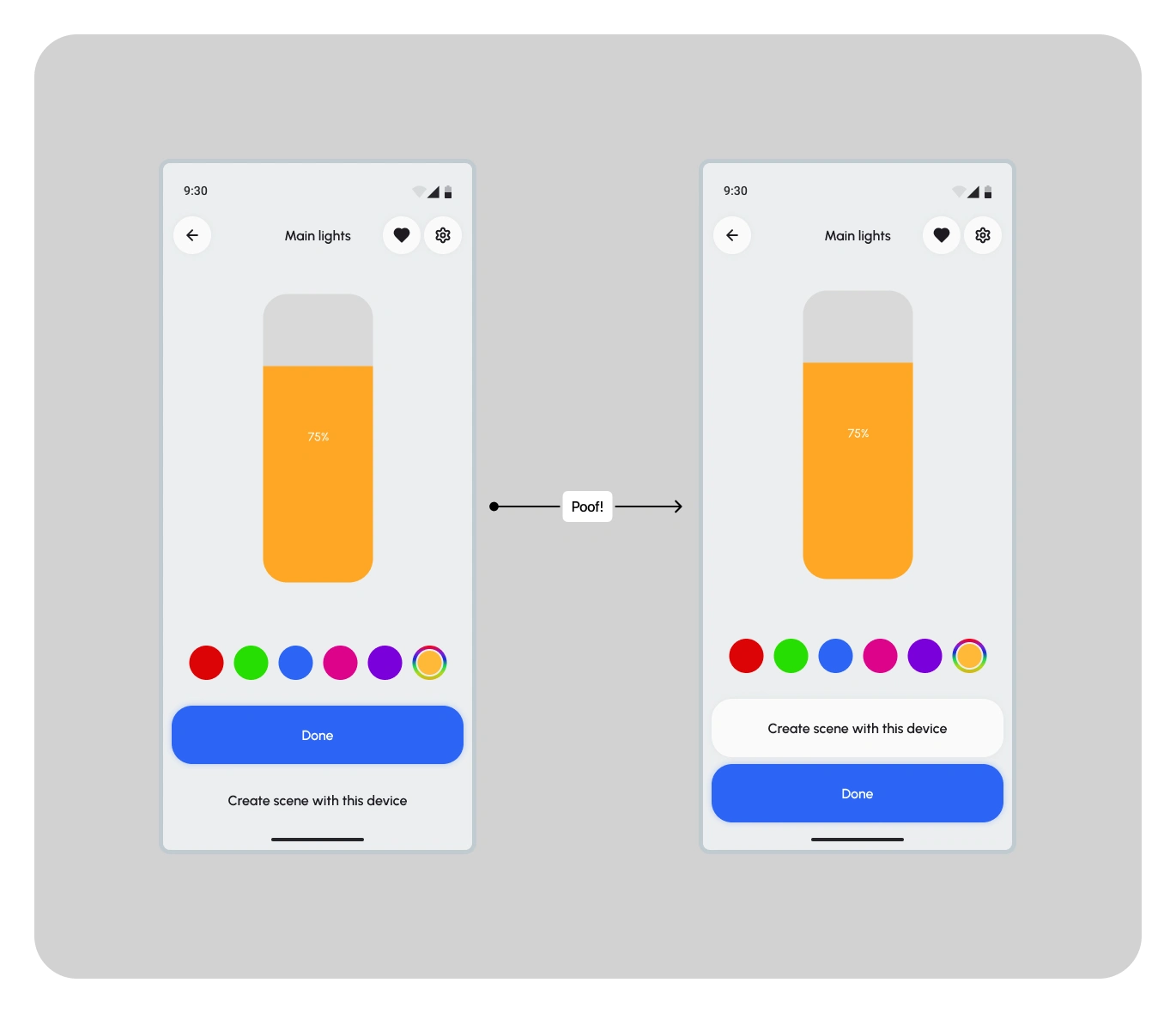
Luckily, the device card already had a built-in fallback option — “Create scene with this device”. I turned it into a full-size button to officially support this user flow.
Improving discoverability
During moderated interviews, users struggled with one key issue: they couldn’t find a clear entry point to create automations.
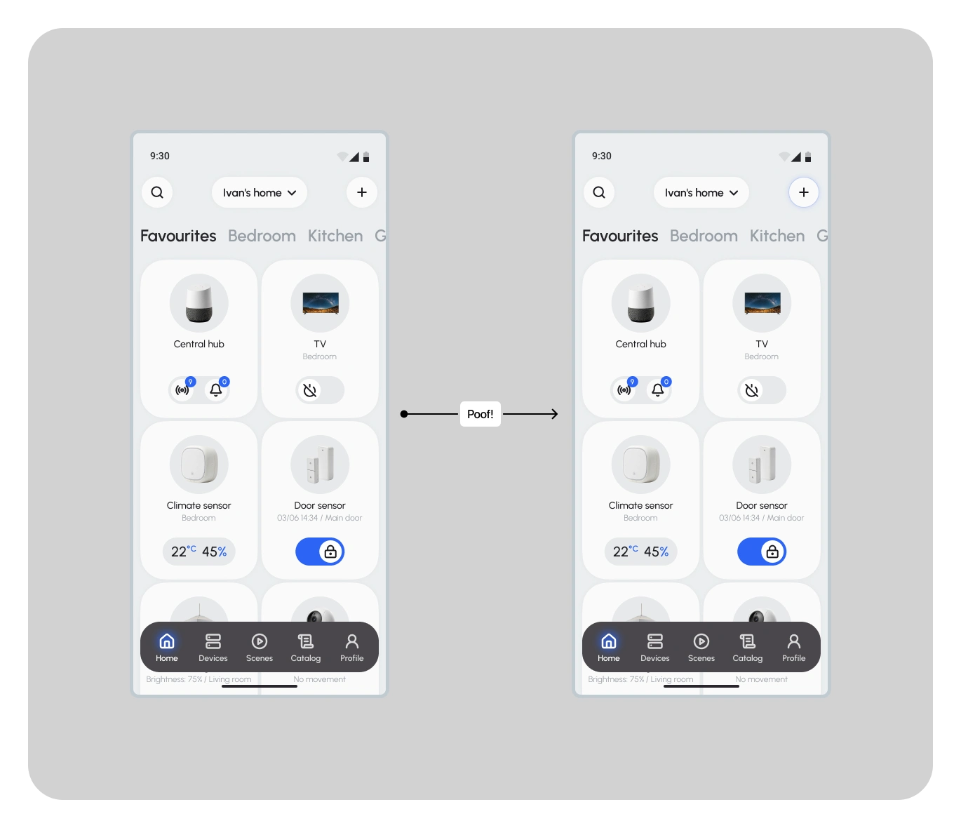
For the main entry point, I made the “+” icon on the Home screen more prominent to gradually teach users this flow.
Measuring Success
Project outcome
The solution was successful because it struck the right balance: lowering the entry barrier for beginners while still providing depth for advanced users.
For Pragmatics: The mindset shifted from “I don’t want to deal with this — it’s for my husband” to “This feels like an iPhone — give me 3 minutes and I’ll set it up myself.” A clean, polished UI and intuitive logic removed the “complexity barrier”.
For Tech Geeks: To meet the need for deeper control, I introduced two power features:
Live Preview: a built-in test run that gave users a sense of safety and confidence. I turned automation setup into a predictable and controllable setup flow.
Custom Logic: advanced in-app scripting inside the When / Then structure. It allows users to bypass built-in presets and create truly custom automations (e.g., complex lighting patterns with precise timing), bringing the product closer to professional-grade tools.
Hypothetical Metrics
Since I didn’t have access to real product analytics, I defined a set of metrics I would track after launch to validate my design decisions:
Adoption Rate (Entry points): Comparison of the % of users who start creating automations from a device card vs the global “+” button.
Goal: Validate the hypothesis that contextual entry (from a device) is the primary pattern for most users.
Task Success Rate: % of users who successfully complete automation creation without dropping off.
Goal: Check whether the flow is no longer perceived as “complex” or “for professionals only”.
Preview-to-Save Conversion Rate: % users who used Live Preview and then successfully saved the automation.
Goal: Validate that Live Preview reduces uncertainty and increases confidence to complete the flow.
User Feedback
The strongest proof of success was users’ emotional reaction during testing. The interface managed to engage even participants who were skeptical at first.
Pragmatic user: “This app is amazing — I’d totally install something like this on my iPhone. If I had it, I’m sure I’d set everything up myself. Look — it’s been three minutes, and I already know how it works.”
Tech Geek: “The testing feature is really impressive. It gives you confidence that the automation will actually run. Everything feels well designed — and it’s intuitive.”
Key Takeaways
This project became my professional transition from web design to more structured product thinking in mobile UX.
I discovered my core strength: my work is built on the balance between logic (systems thinking) and aesthetics (visual clarity). One doesn’t work without the other.
The project was delivered under strict constraints: an unfamiliar market and no access to real devices. I proved that a research-driven process can still lead to strong product decisions even in high uncertainty.
Project assets
Thank you for your time!
This project was a big challenge for me, and I’m happy I was able to take it from an initial idea to a validated solution.
If you’d like to explore the components, design system, or all 100+ iteration screens in detail — feel free to check the source file:
Like this project
Posted Oct 5, 2026
Smart home hub app concept to unify device control and let users build both simple and advanced automations.
Likes
1
Views
0
Timeline
Mar 17, 2025 - Dec 1, 2025