ZIL — Digital Museum Service

Ivan Razin


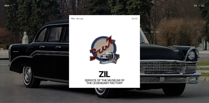
ZIL — Digital Museum Service
A digital ecosystem designed to turn a traditional museum visit into a more accessible, engaging and predictable experience.
My role: Product Designer
Platform: Web Service
Industry: Digital Museum
The challenge
Museum visits can feel confusing and exhausting: visitors struggle with navigation, don’t know what to see first, and often lack enough information to confidently plan their visit.
As part of the product team, I owned the core visitor journey around themed routes and guided tours, shaping the experience from information architecture and user flows to the final UI. My scope covered interactive maps, route planning, guide profiles, online ticketing and the booking journey — turning a potentially overwhelming museum visit into a clear, structured experience.
Key outcomes
54 interviews
with museum visitors and staff helped identify the main barriers and behavioral patterns.
190+ survey responses
helped validate hypotheses and prioritize the MVP.
51.3%
of respondents wanted to see real-time museum occupancy — leading to a live visitor counter in the service.
My ownership
focused on the core Route and Guide Profile journeys, from information architecture and user flows to high-fidelity UI.
Digital transformation of a legacy brand: ZIL Museum
We designed a digital ecosystem for the ZIL Museum — a full-scale service that redefines how people engage with a legendary brand. The product was built for a broad audience: from tourists and families with kids to engineering enthusiasts interested in Soviet industrial history.
The key business goal was to remove barriers to visiting the museum: simplify ticket purchases, eliminate queues, and make the factory’s unique heritage accessible online for users worldwide. With this project, we also helped attract a younger audience — turning the museum from an “archive” into a modern cultural experience.
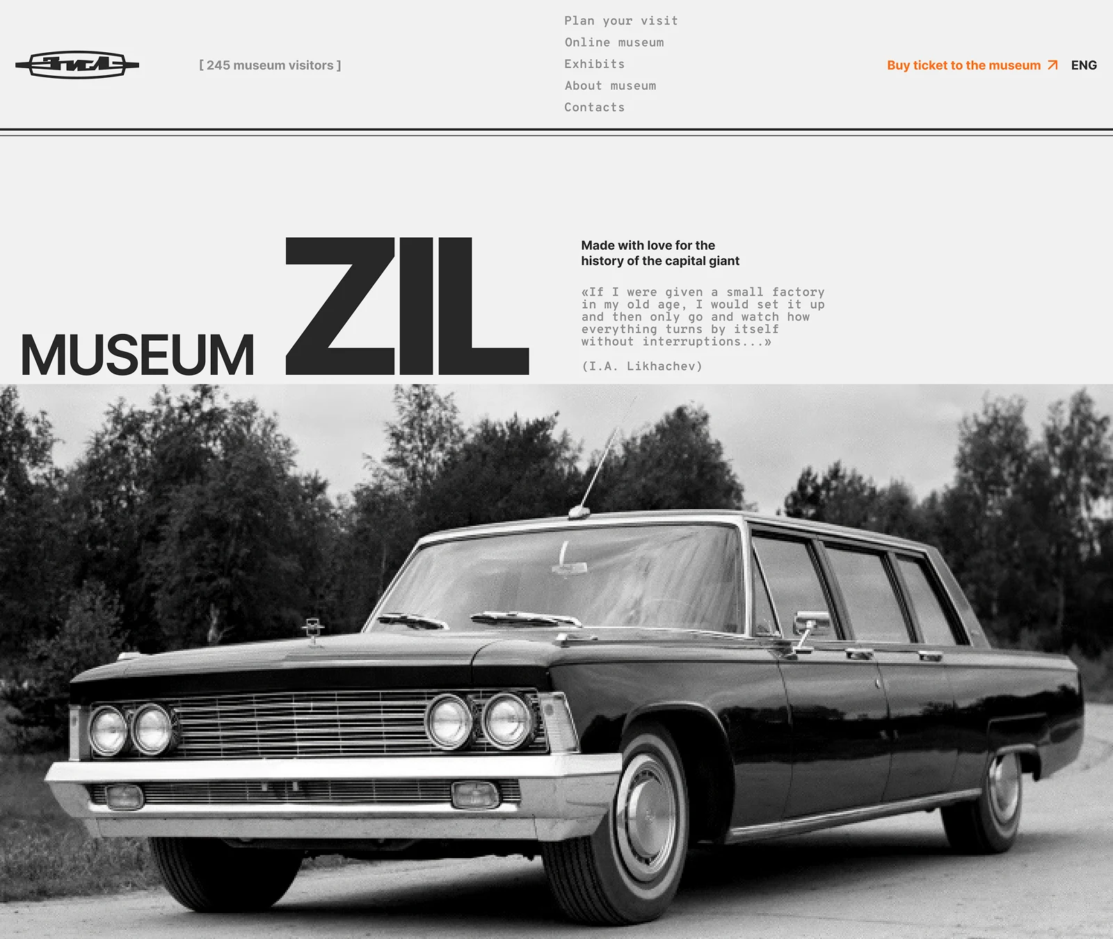
About the project: Inspiring future engineers
We designed the service around the idea of a teenager who dreams about cars. The key goal was to create a product that doesn’t just inform, but inspires visitors — potentially encouraging them to pursue engineering as a career.
This was a team project — in this case study, I focus on my area of ownership and the key design decisions I worked on.
I contributed across the full product cycle: from user research and problem definition to interface design and solution validation.
My main scope of responsibility was the key journey pages: “Route page” and “Guide Profile.”
To get there, we completed a full product cycle and delivered an MVP concept in 4 months. Our decisions were data-driven: we conducted 50+ interviews, formulated hypotheses, and prioritized them using ICE Scoring to stay focused on what mattered most.
🤔 Problem research
To identify the real barriers, we conducted 54 in-depth interviews with museum visitors and staff. We used the “5 Whys” method to get to the root cause. Here are the key problems we discovered:
Key insights grouped by: motivations, barriers, and other behavioral patterns.
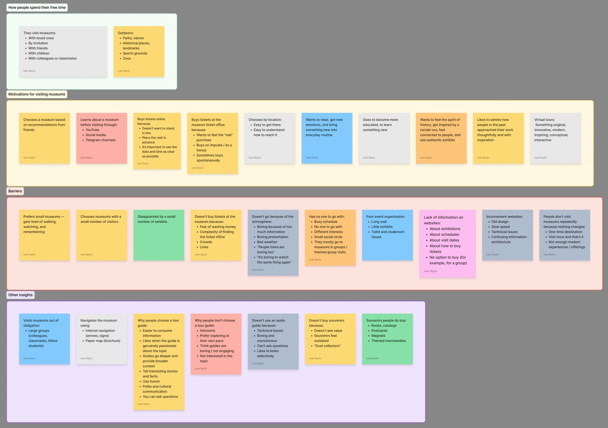
Key insights grouped by: motivations, barriers, and other behavioral patterns.
Key problems
👉 Problem: Disorientation
Visitors often feel lost in large museum spaces. Paper maps are inconvenient, and the lack of clear navigation causes stress and fatigue.
Participant insight: "It’s impossible to figure out where to go… The Tretyakov Gallery is a brutal labyrinth you can’t escape. Even if they gave you a map at the entrance like in the Hermitage… a paper map still isn’t as convenient as a digital one.”
👉Problem: Boredom and “Museum Fatigue”
Many people perceive museums as “boring and exhausting.” Audio guides feel monotonous and technically inconvenient, while live guides aren’t always available — and may not suit introverts.
Participant insight: "I don’t like audio guides — they’re impossible to listen to… Boring and monotonous. I’ll take a personal guide if the option exists, but I wouldn’t actively look for one."
How it worked before
Before digitalization, the visitor experience relied on outdated patterns that reduced overall satisfaction:
Navigation: paper maps that are awkward to use — or no wayfinding at all (“maze effect”).
Content: monotonous audio guides (“robotic voice”) or dry text on display labels.
Ticketing: waiting in a physical line was the only way to enter the museum, which discouraged younger visitors and busy people.
💎 What’s the value?
We designed an ecosystem that solves these problems on two levels:
For users:
Curated experience: instead of wandering randomly, users get themed routes with a clear navigation structure (like a “GPS for history”).
Global access: a full-featured Online Museum (3D tour) allows users to explore exhibition halls and view exhibits from anywhere in the world.
Seamless visit: buying a ticket online in 2 minutes removes the stress of waiting in lines and guarantees entry.
Emotional connection: the ability to choose a guide based on personality type and interests (through profiles and reviews).
For the business:
Higher conversion: a simplified ticket purchase funnel (directly from the homepage or through a selected route).
Higher average order value: cross-selling tours and guide services through personalized cards.
Younger audience: a modern digital service attracts people who are used to the convenience level of Uber or Yandex.Afisha.
🗣️ Personas
Active visitor
Who they are: enjoys history, engineering, and cultural activities. Visits museums often and looks for new knowledge.
Pains: gets frustrated by poor navigation, boring audio guides, and crowds. They care about content quality and deeper immersion.
Goal: get exclusive information and spend time comfortably.
Passive visitor
Who they are: rarely goes to museums and finds them boring. Usually comes along with friends or for hype / photos for social media.
Pains: afraid of wasting time and doesn’t know where to start the visit.
Goal: quickly find “the most interesting” parts, take photos, and not get tired.
⭐ Solution Exploration
💡 Hypotheses & data validation
Based on competitor analysis and interviews, we formulated a set of hypotheses for both user types. To avoid spending budget on unnecessary features, we launched a quantitative survey (190+ respondents).
Here are the key insights that shaped the MVP scope:
Hypothesis 1: Socializing
Assumption: We believed that solo visitors would want to find company for a museum visit through the app (matching by interests).
Result: ❌ Not confirmed. 86% of respondents said they visit museums only with family or friends and are not looking for new connections in this context.
Solution: We decided not to build a complex social feature.
Hypothesis 2: Crowd control
Assumption: Visitors want to know how crowded the museum is in order to avoid large groups. ✅ Result: Confirmed.
51.3% of users said it’s important to see the number of people in real time.
Solution: We implemented a live visitor counter in the website header. Users can instantly check the current occupancy on any page and decide whether it’s a good time to visit.
Hypothesis 3: Visit predictability
Assumption: The main barrier before visiting is lack of information. People are afraid of wasting time. Result: Confirmed.
The survey revealed strict content expectations:
85% want opening hours and ticket prices immediately.
64% choose tours based only on ratings and reviews.
Solution: We redesigned the structure so that routes, reviews, and exhibits are available before purchasing a ticket — reducing the “buying blind” anxiety.
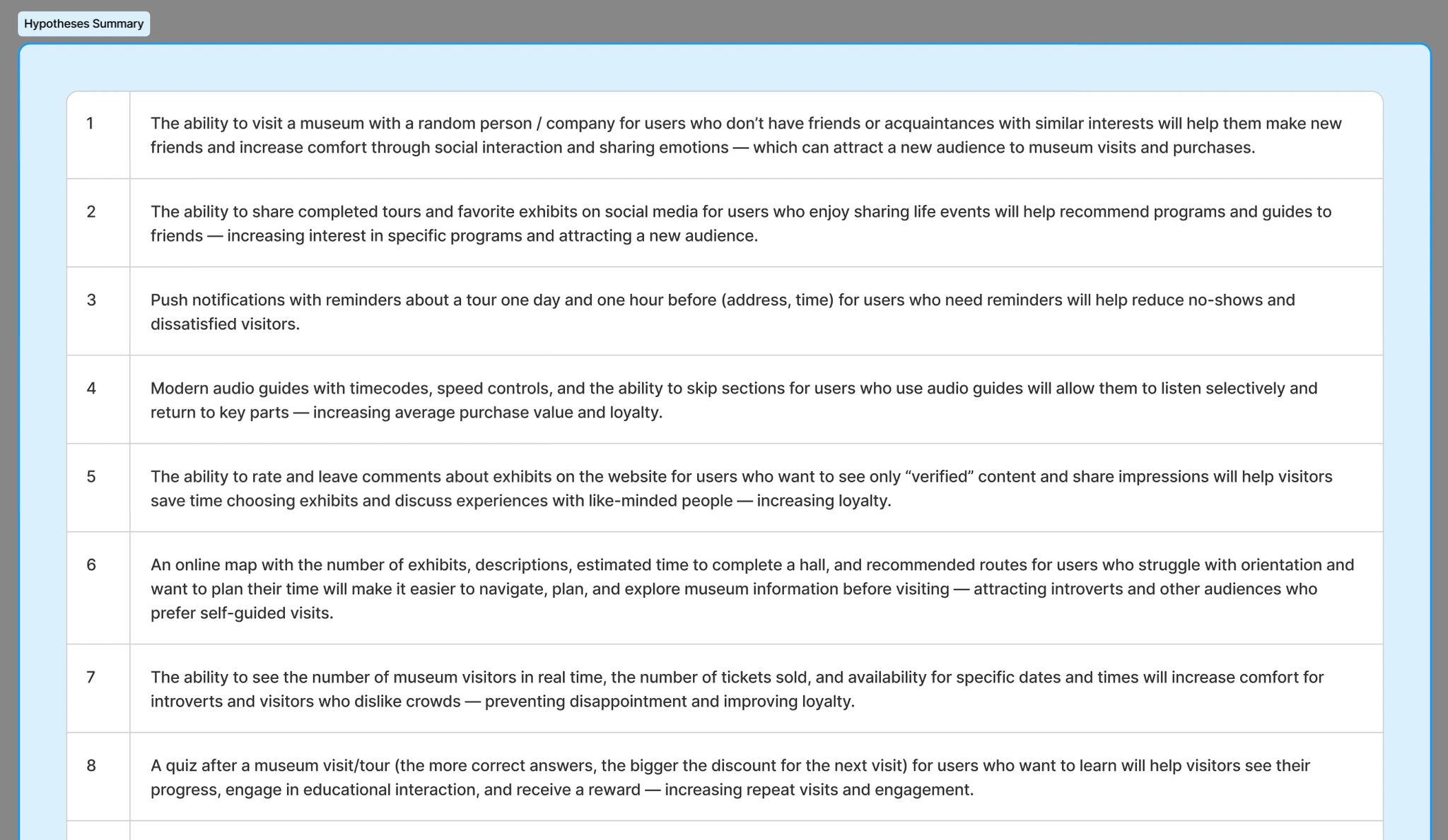
Initial hypothesis backlog (post-interviews)
User Scenarios (Job Stories)
After conducting qualitative and quantitative research, we analyzed user behavior, motivations, needs, pain points, and concerns. Based on these findings, we defined the core functionality of the service through job stories and features. We generated many feature ideas and selected the most in-demand and development-friendly ones for implementation.
We defined dozens of scenarios — here are the key ones that shaped my design decisions:
Context: Routes and Timing
“When I visit a museum for the first time, I want to understand in what order I should explore the exhibits and how much time it will take, so the whole story forms clearly in my head and I can stay on schedule.”
Context: Choosing a Guide
“When I go to a museum, I want to be sure the guide is competent and engaging, so the tour feels meaningful instead of turning into a boring lecture.”
Context: Planning a Visit
“When I’m planning a visit with my child, I want to know in advance how crowded the exhibition halls will be, so my child can see everything without being pushed around and won’t get upset.”
Prioritization (ICE Scoring)
There were too many job stories for the first version of the product — it was impossible to implement everything at once. To focus only on what would bring the most value for both the business and users, we evaluated all ideas using the ICE framework (Impact, Confidence, Ease).
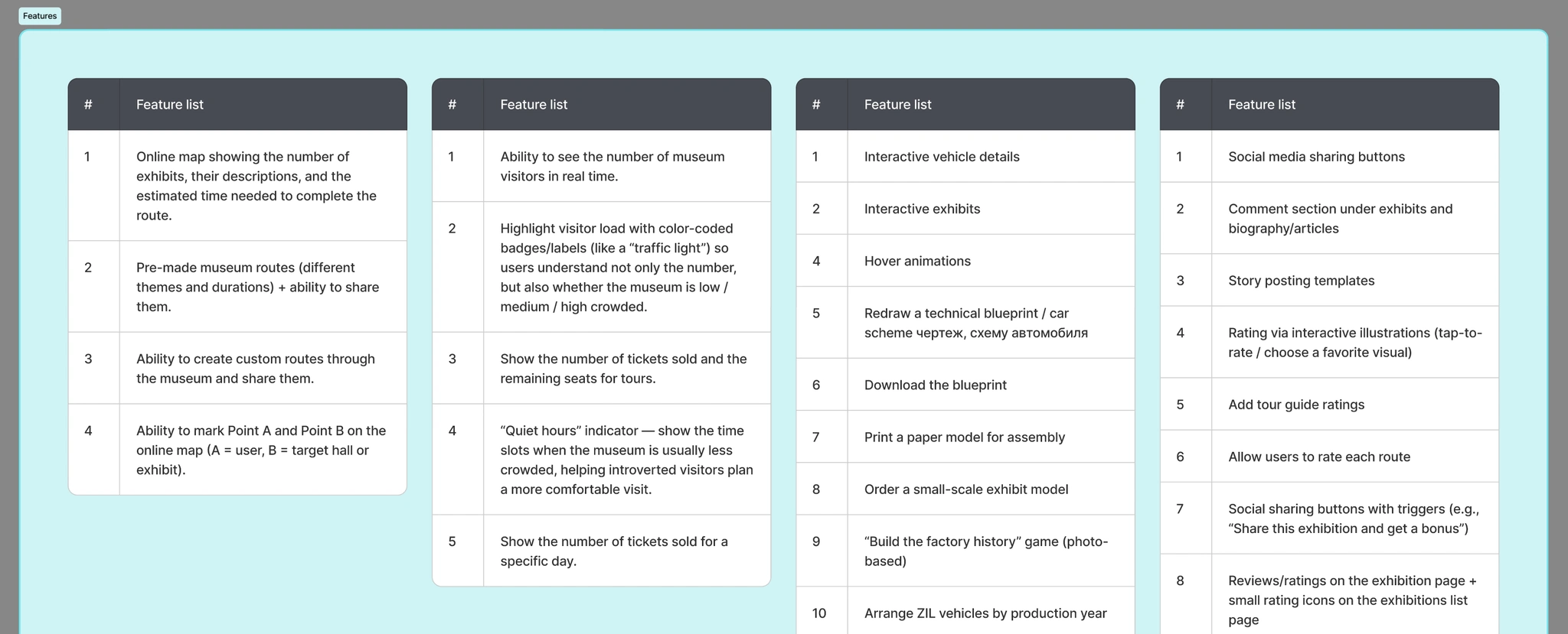
Feature pool grouped into themes before ICE scoring
As part of this prioritization, I took ownership of designing the core user journey:
Routes: Selecting a pre-made route with timing.
Guide Profile: A side page with ratings and key information.
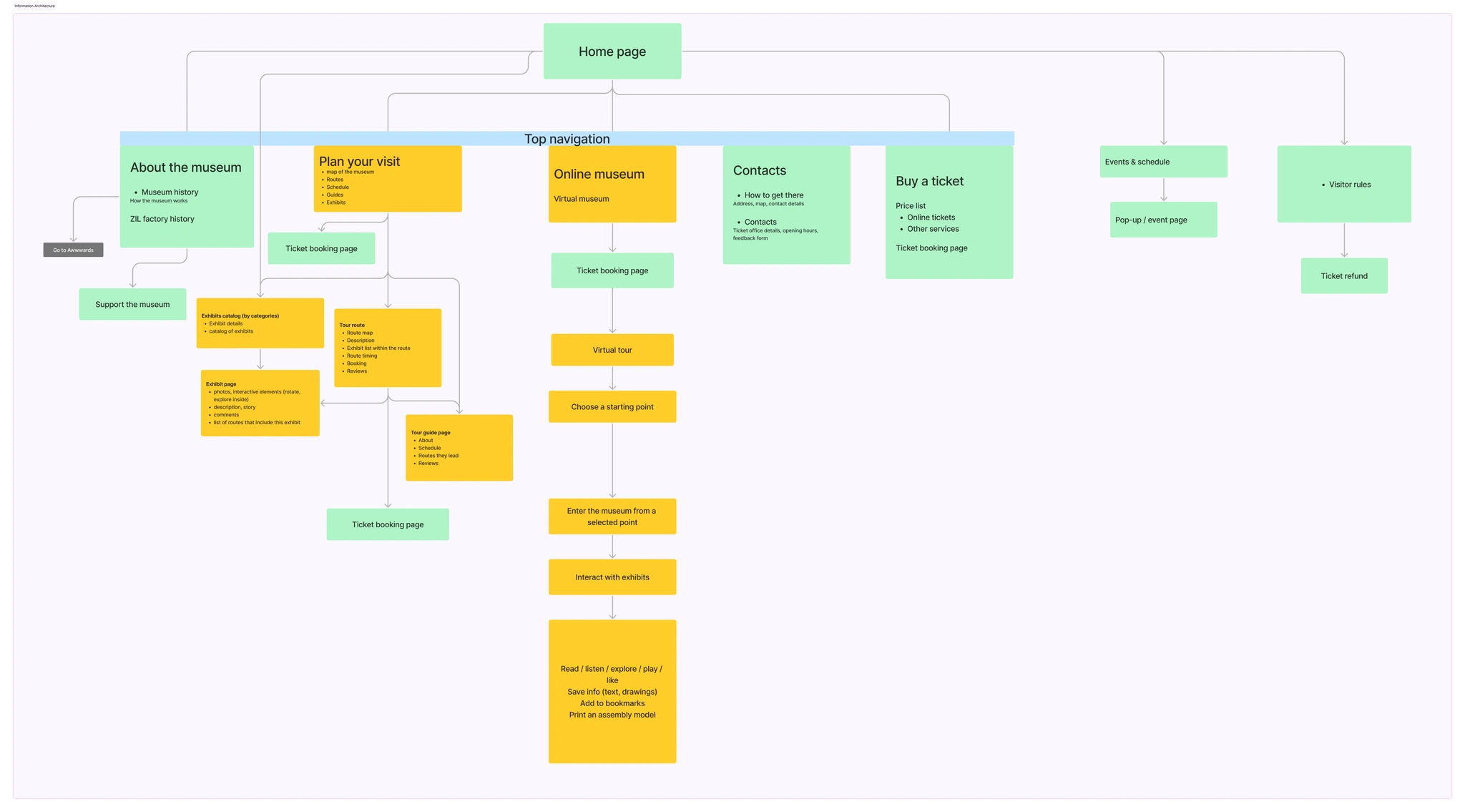
Information architecture
Solutions
👉 Solving the disorientation problem
Problem: Visitors feel lost in large spaces. Paper maps are inconvenient, and the lack of clear navigation causes stress and fatigue.
Key solutions:
Thematic routes: Instead of a chaotic list of halls, we offered pre-built visit scenarios.
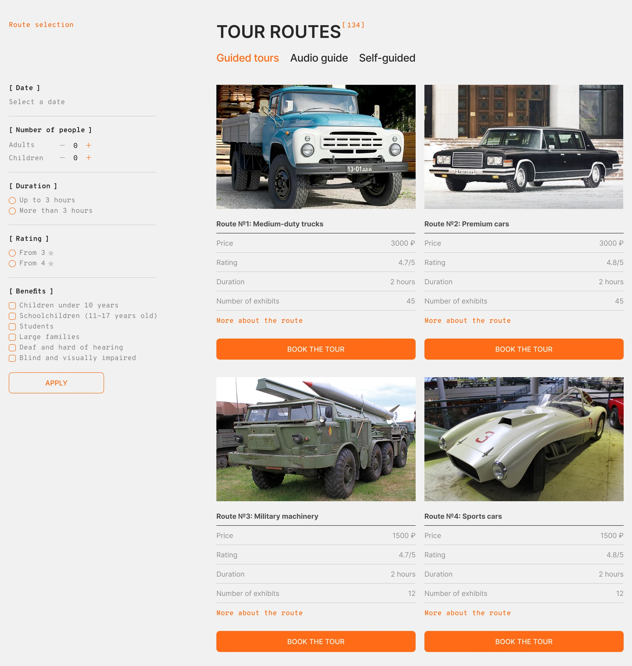
Route cards with clear titles and photos help users instantly understand the theme
Time estimation: The route card immediately shows the duration, price, and number of exhibits, so users can easily plan their visit and manage their energy.
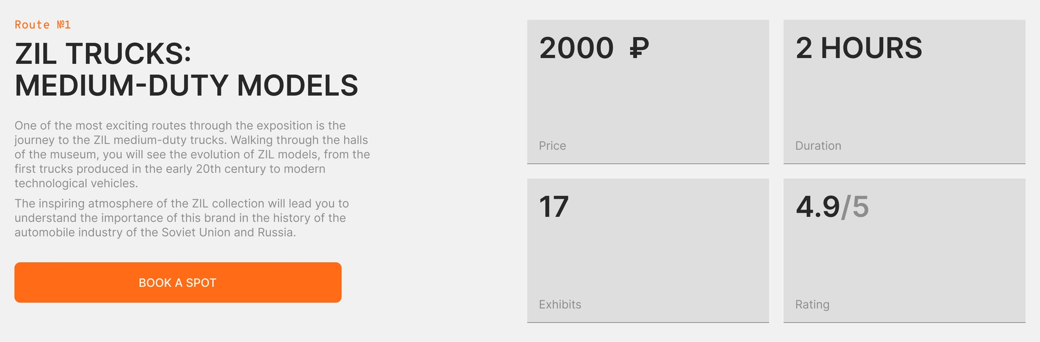
Route card layout with key visit details (time, price, exhibits, rating)
Preview mode: The ability to explore the route and view the full list of exhibits before starting the tour or making a purchase.
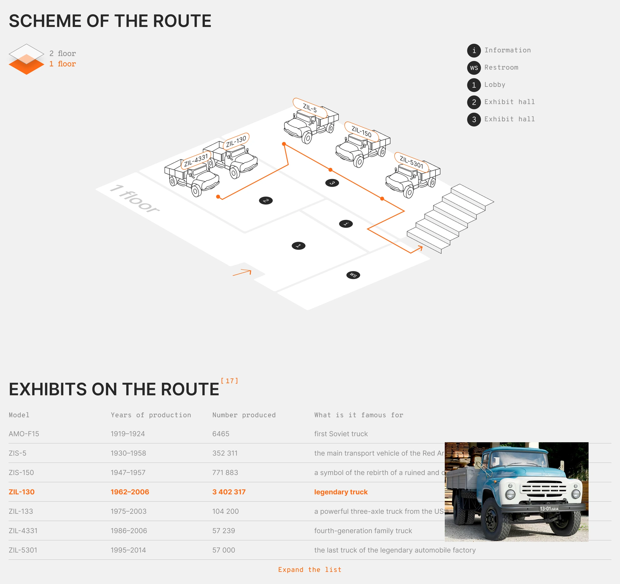
Interactive route map and exhibit list within the route page
👉 Problem: Boredom and “Museum Fatigue”
Visitors complain that audio guides sound monotonous, and tours often turn into boring lectures. It’s hard to find a guide who feels “on the same wavelength” as you.
Key solutions:
Personality-based guide selection: We shifted the focus from dry facts to human connection. Route cards immediately show guide photos, so users can choose someone who feels more relatable and visually appealing — creating a sense of trust and sympathy from the start.
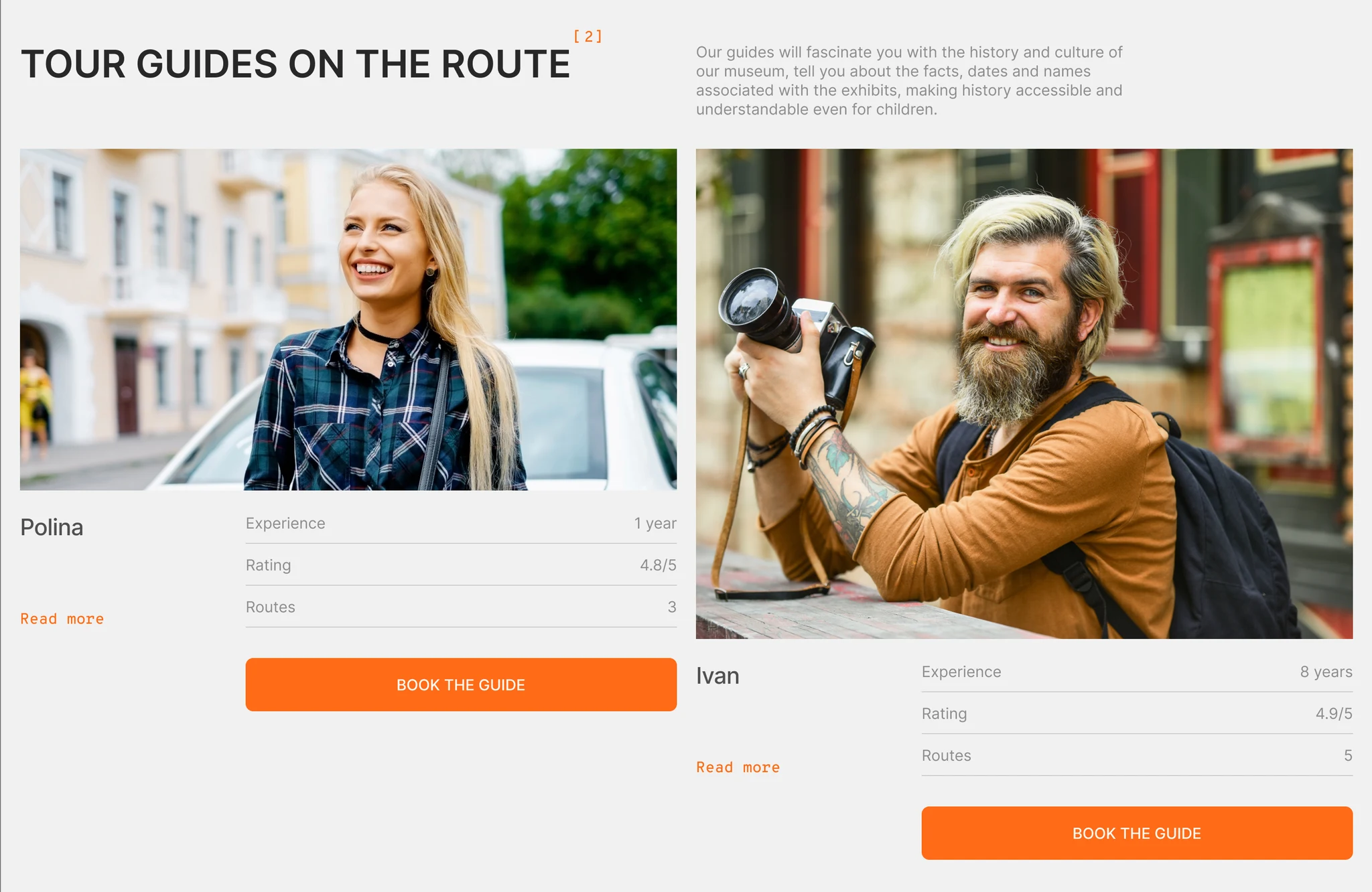
Guide marketplace with profiles, filters, and quick booking
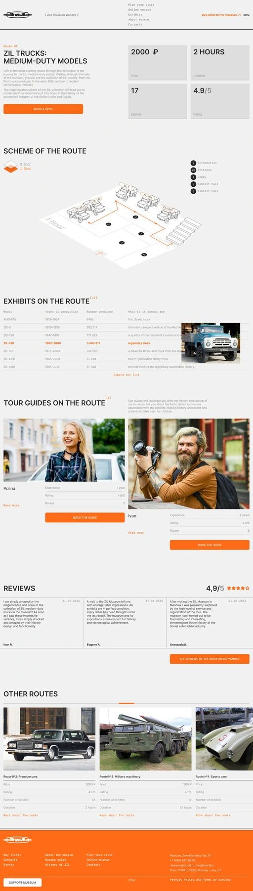
Route page
Profile & social proof: By clicking “Learn more”, users open a detailed guide profile in a side panel (side page). Here, we highlight the guide’s personality through their interests and communication style, while also validating their expertise with real ratings and reviews. All key information is available instantly, without extra navigation or dropping out of the booking funnel.
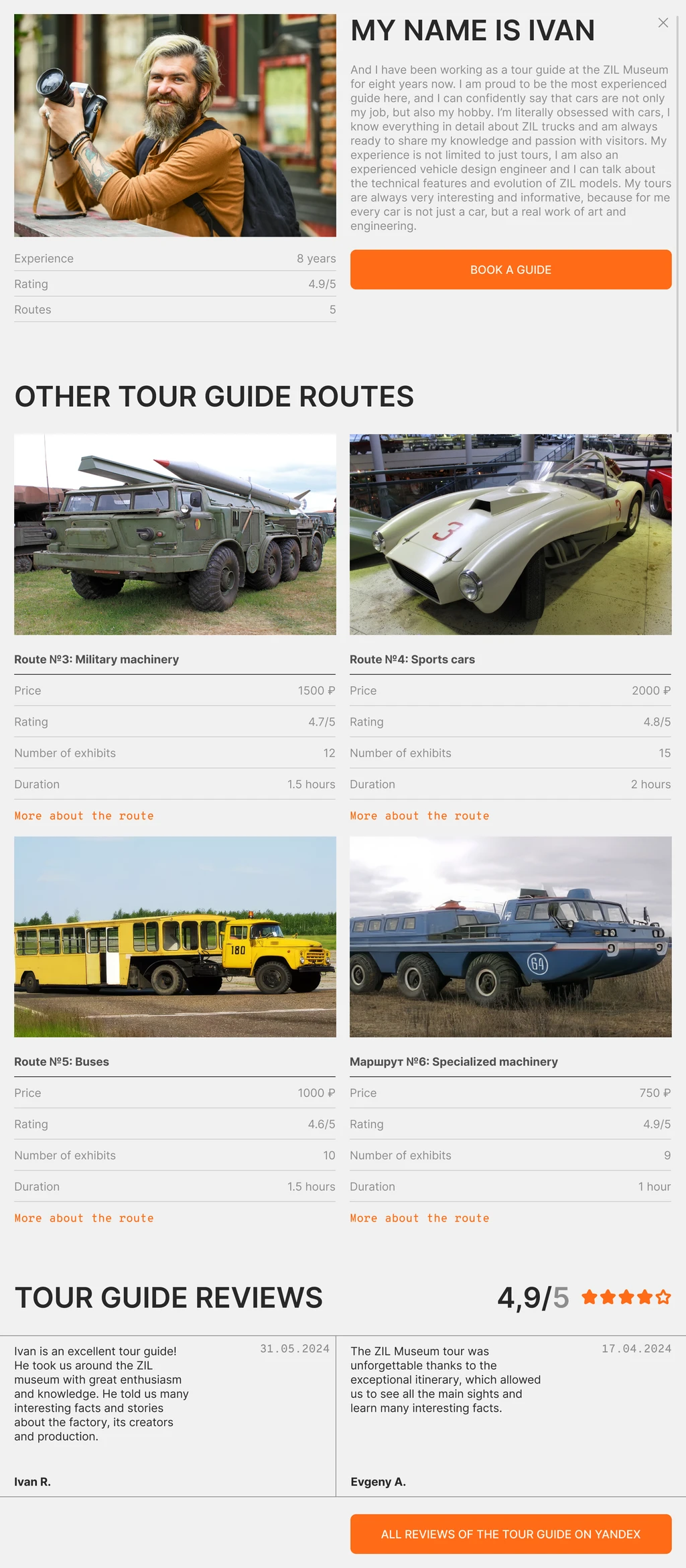
Guide side page
Logical flow completion
After choosing a route and a guide, the user proceeds to a standard checkout. Thanks to the well-designed planning stage (route selection + trust in the guide), the user reaches the cart already motivated, which reduces the drop-off rate.
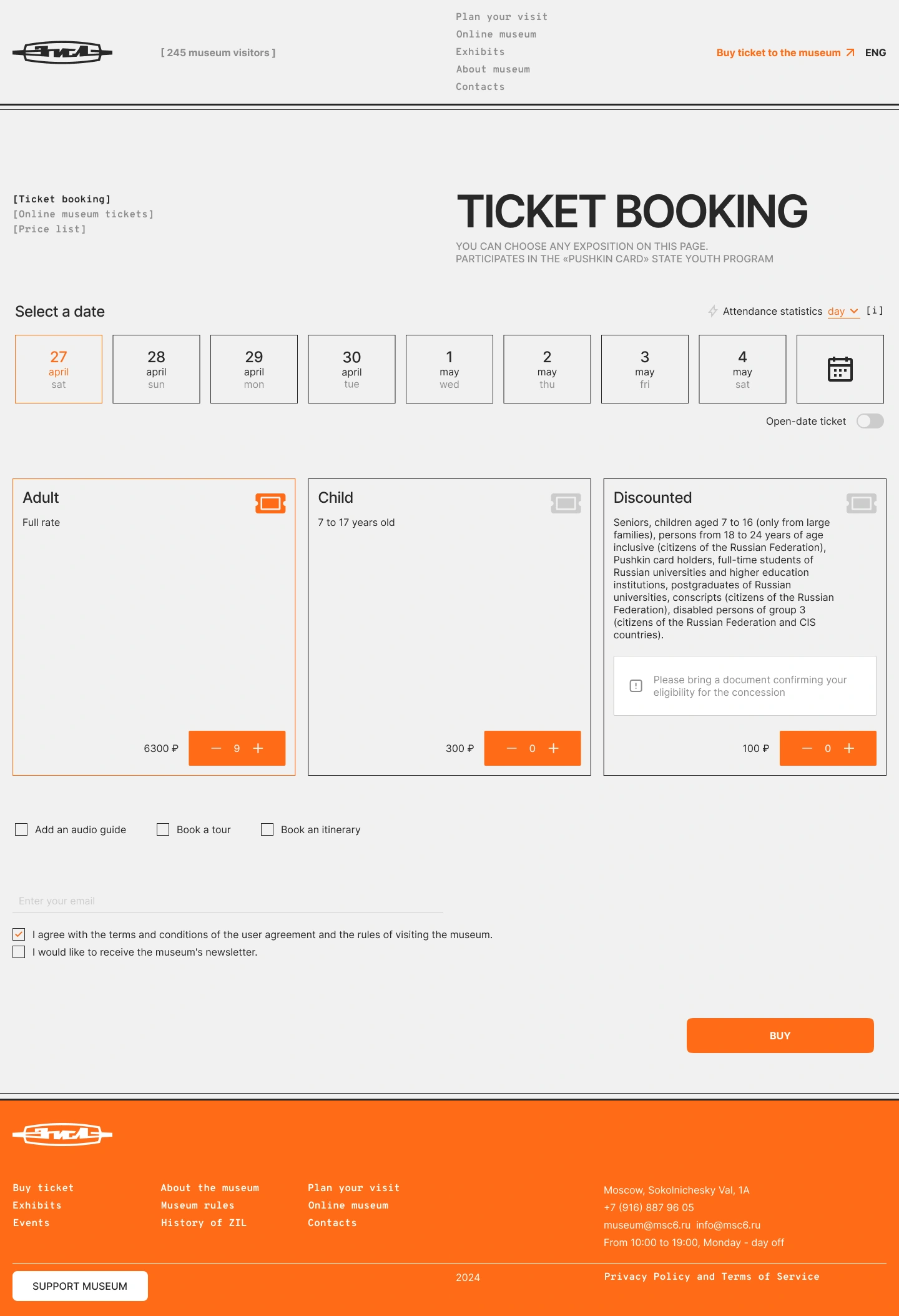
Ticket booking page (date & ticket selection)
Solution Testing
Since this was a large team project, some working materials and testing results were not preserved. In this case study, I highlight my area of responsibility and the key solutions I worked on.
Measuring Success
Since this was an educational project and I don’t have access to real product analytics, I designed a metric system that I would track after launch to validate the effectiveness of the solutions on the Route and Guide Profile pages.
Route page
CTR “Book a spot” - The share of users who clicked the booking button from the route page.
CTR “Book a tour guide” - The share of users who moved from the route page to guide booking.
Guide profile
CTR “Book a tour guide” - The share of users who clicked booking after viewing the guide profile.
CTR “All tour guide reviews on Yandex” - The share of users who opened reviews (as a trust and interest signal before making a decision).
Key Takeaways & What I Learned
This project became my first full-scale experience working on a product within a large team.
During this project, I:
learned how to collaborate effectively and align decisions across team members
understood how to turn research into clear problems, hypotheses, and scenarios
improved my ideation and decision-making process (brainstorming → filtering → prioritization)
learned to make decisions not based on “taste,” but on logic and data
gained confidence in designing complex user journeys.
Project Materials
Thank you for your attention!
If you’d like to explore the project in more detail, the link below includes the full Figma file with all pages and materials.
View Project in Figma
Featured article (RU): Full case story on VC.ru
Like this project
Posted Oct 5, 2026
A digital ecosystem for the ZIL Museum. A large-scale team project.