Lopes Avalia
Amanda Oliveira
Lopes Avalia
Overview
Strategic Context
Avalia’s friction-heavy intake flow was more than a UX issue—it constrained onboarding efficiency, limited scale through tooling debt, reinforced functional silos (data, marketing, ops), and slowed time-to-market for improvements. The redesign linked product flow simplification to business outcomes: faster completions, higher qualified lead volume, clearer handoffs to listing, and an operating cadence that enabled continuous iteration.
Avalia is an AI-powered pricing algorithm focused on São Paulo's secondary real estate market. It delivers realistic property valuations by analyzing historical sales data, market fluctuations, and neighborhood trends, helping clients make smarter pricing decisions.
Despite its strategic value, the product had seen no significant updates since 2021, and its UX presented friction points that limited its performance.
Mobile-First Design Decision
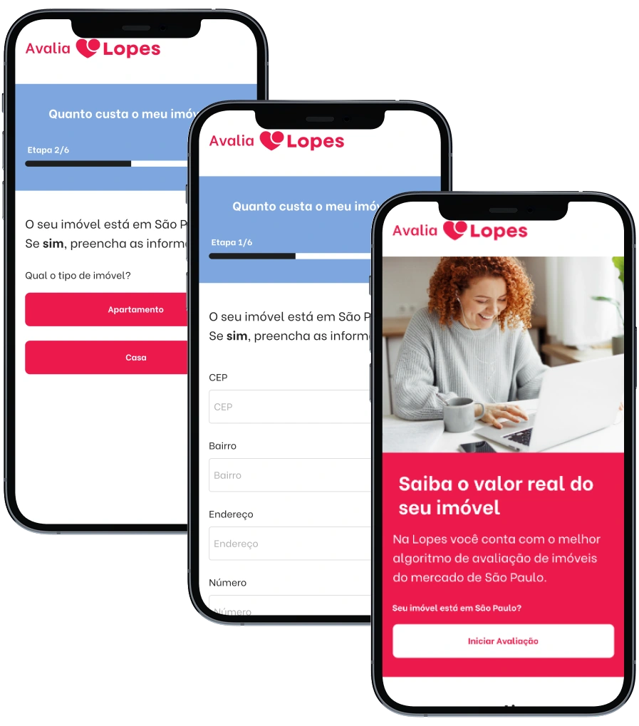
Given that over 70% of Avalia's users access the platform via mobile devices, we prioritized a mobile-first design approach. This decision was data-driven and crucial for ensuring optimal user experience across the majority of our user base, leading to improved engagement and conversion rates on the platform's primary access point.
Problem
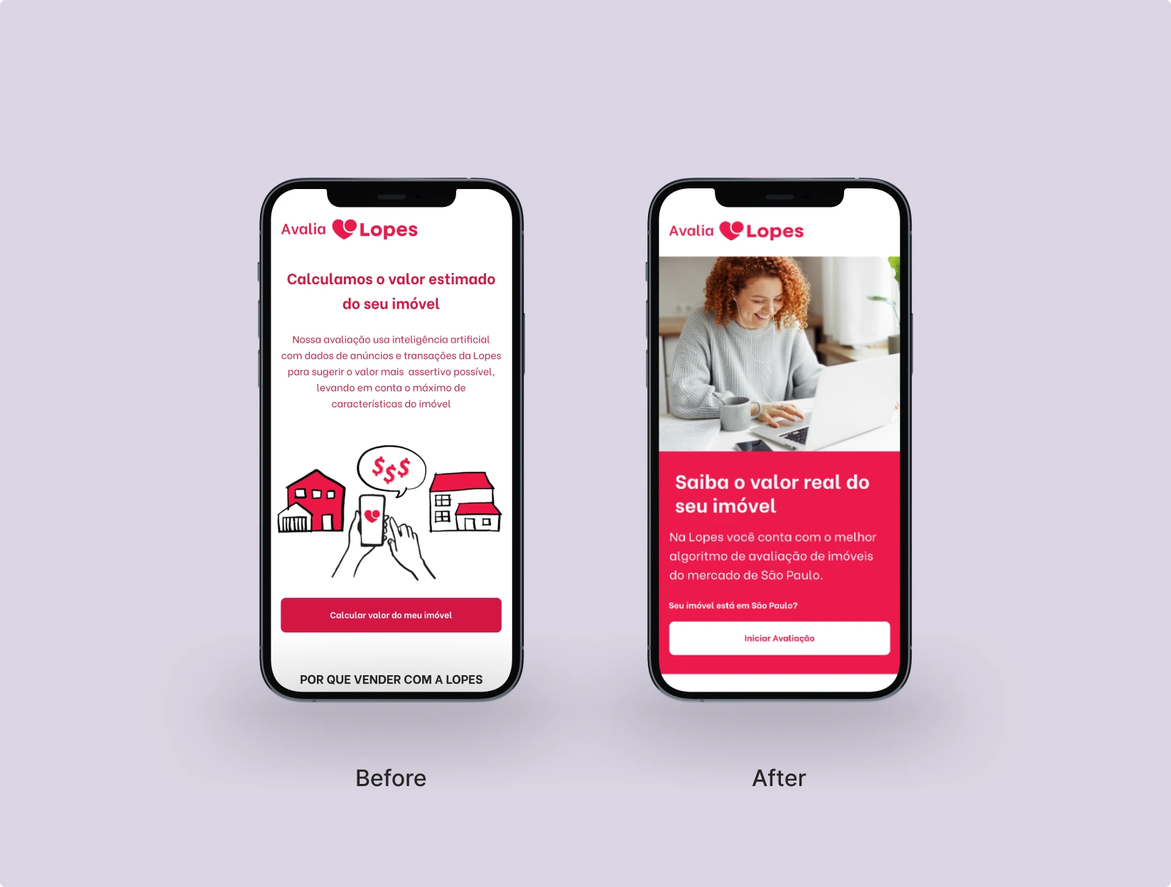
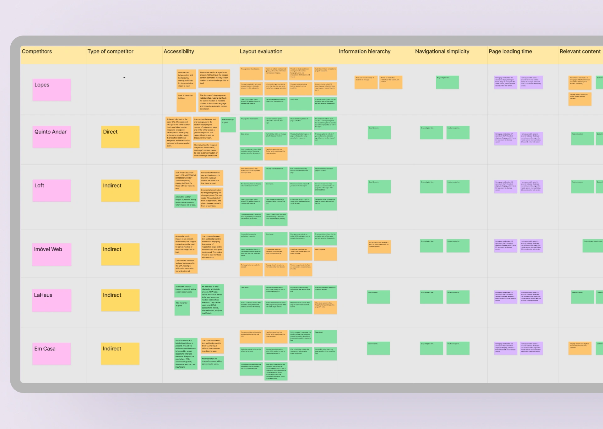
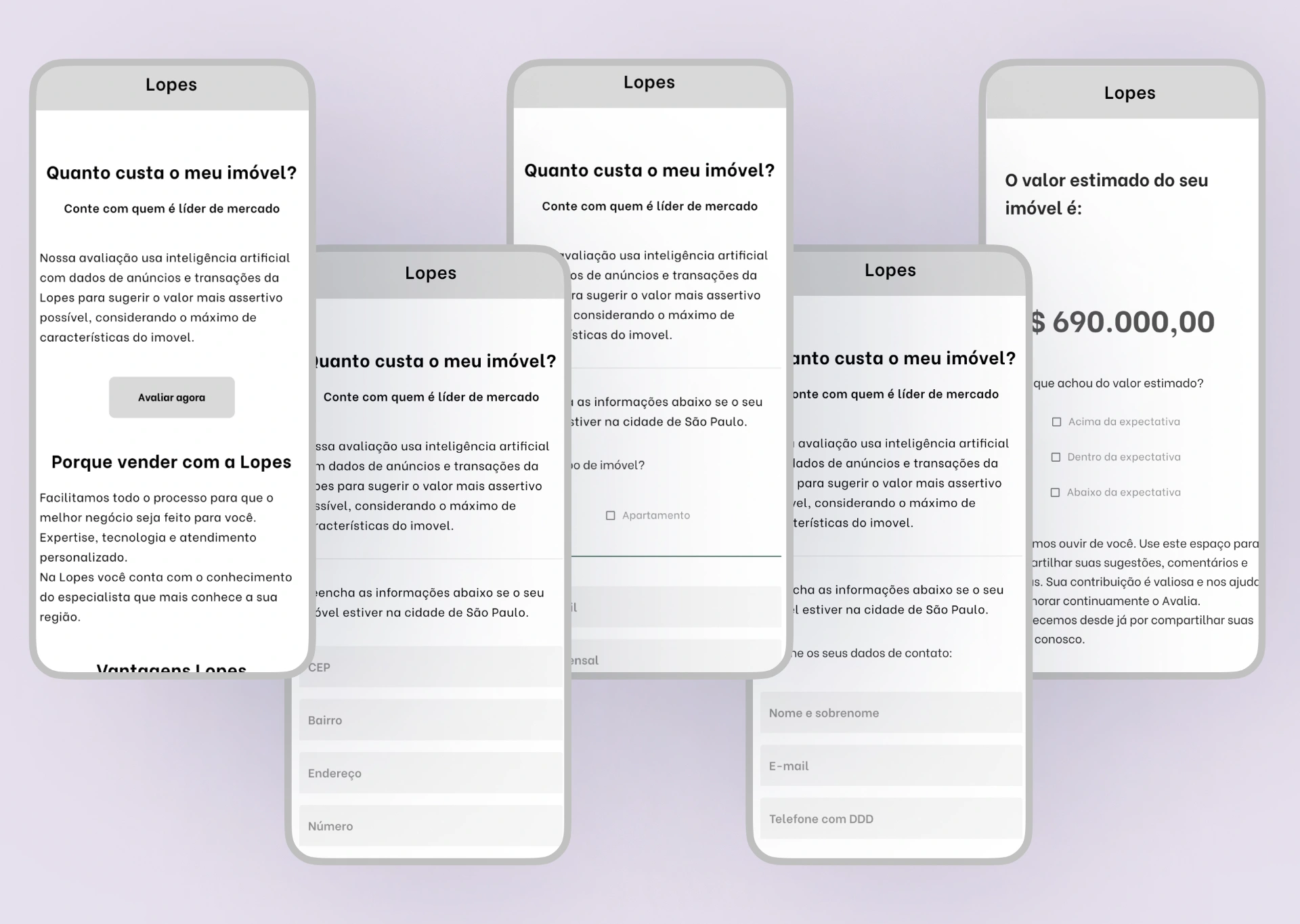
Avalia was originally designed as a pricing tool for São Paulo's secondary real estate market, but over time, it became outdated, both visually and functionally. The experience was fragmented, with an inconsistent interface, overwhelming visual contrast, and unclear copy that left users unsure about what to do next.
User drop-off was especially high in early steps, and internal analytics couldn't fully explain why. Additionally, Avalia's visual design was no longer aligned with Lopes's updated brand identity, reducing user trust and engagement.
User Pain Points
"I started the evaluation but got confused about what information I needed to provide. The interface was too cluttered and I didn't know where to go next." — Maria Helena, 48 years old, Property Owner, Initial Usability Test
"The design looked outdated compared to other Lopes tools I had used before. It made me question whether the results would be reliable." — Carlos Eduardo, 55 years old, Real Estate Investor, User Interview
Process
1. Research & Discovery
I began with comprehensive research to understand both user behavior and technical constraints. Working closely with the data science team, I learned how the AI algorithm processed inputs and what information was critical for accurate valuations.
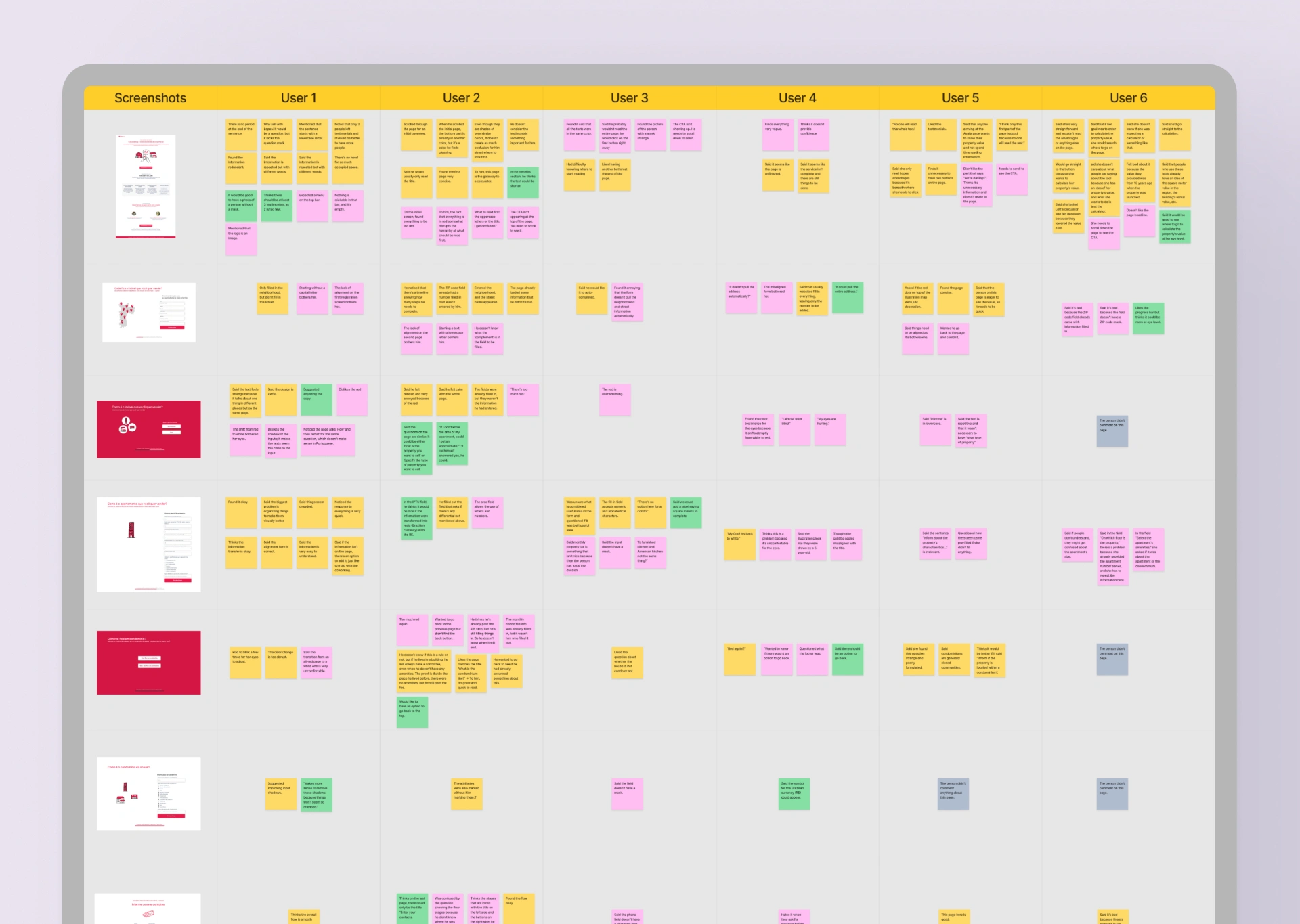
Conducted heuristic analysis to map usability flaws and cognitive overload.
Analyzed data from ConvertFlow to pinpoint drop-off and friction points.
Mapped inconsistencies in layout, spacing, tone, and flow logic.
Ran competitor UX audit to extract best practices and UI standards.
Performed usability testing on the legacy interface to validate core user pain points.
Aligned with business stakeholders on KPIs and strategic expectations.
2. Design Strategy & Iteration
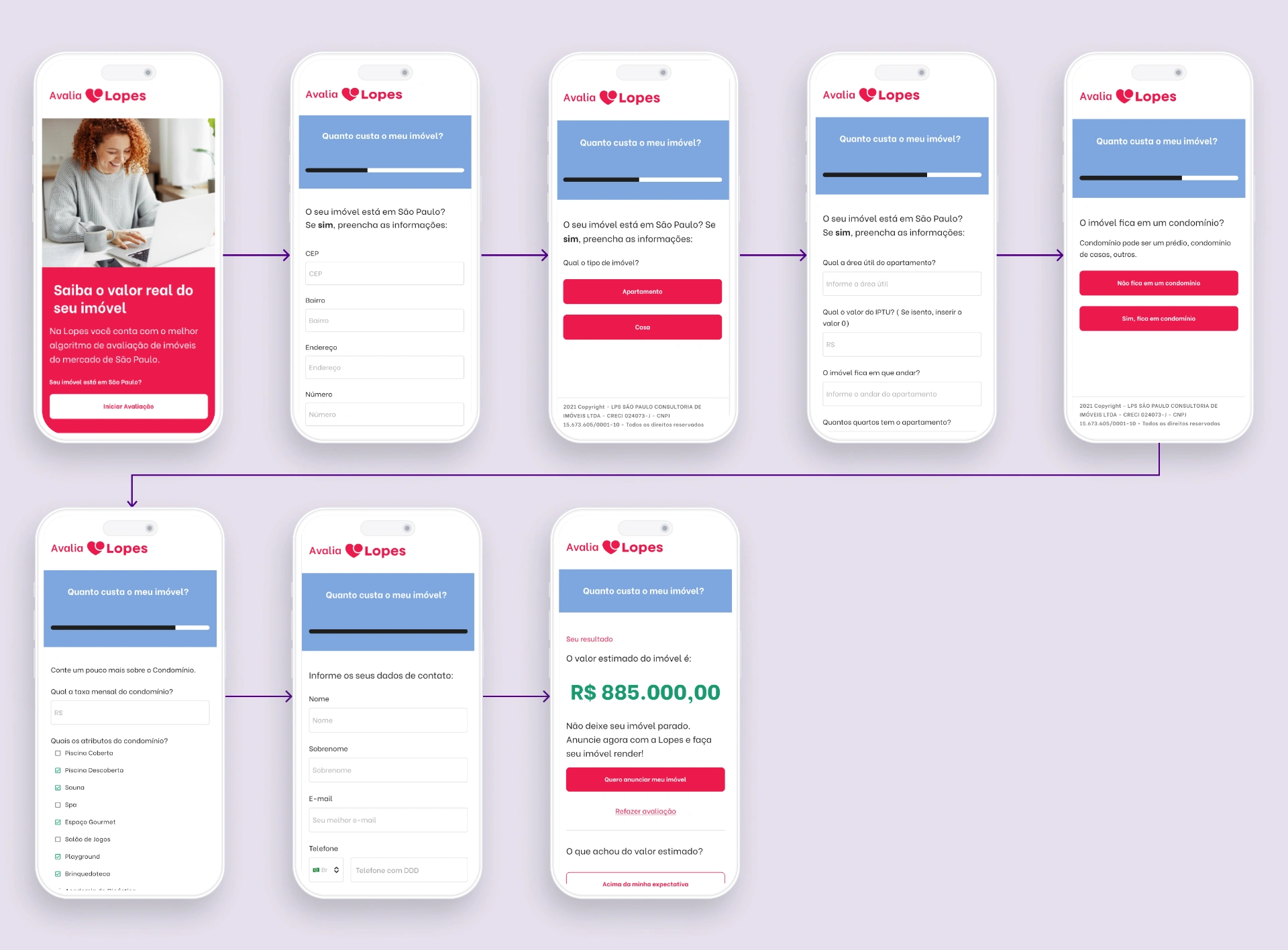
Based on research insights, I developed a comprehensive design strategy focused on progressive disclosure and trust-building. The new approach would guide users through complex property evaluation step-by-step, reducing cognitive load while maintaining algorithm accuracy.
Created low-fidelity wireframes exploring 3 different flow structures.
Reorganized 12-step process into 7 intuitive sections with clear progress indicators.
Refined microcopy through A/B testing with 15 internal users.
Applied new brand guidelines including updated color palette, spacing, and typography.
Improved accessibility by optimizing visual contrast (increased to WCAG AA standards).
Evolved wireframes into high-fidelity mockups through 3 iteration cycles.
Created visual validation feedback for user inputs.
3. Implementation & Testing
The implementation phase involved close collaboration with the development team to ensure the design vision translated accurately into code, while maintaining the algorithm's technical requirements. We decided to migrate from ConvertFlow to custom code implementation due to usability limitations, as adjustments in ConvertFlow were not flexible enough for our specific design requirements.
Post-Launch User Feedback
"Finally a system that works clearly and directly. I completed the evaluation without difficulties and felt confident throughout the entire process." — Ana Maria, 52 years old, Property Owner, Post-Launch Interview
"The interface is now much more professional and consistent with the quality I expect from Lopes. The step-by-step process made filling it out much easier." — Roberto Silva, 46 years old, Real Estate Agent, Post-Launch Interview
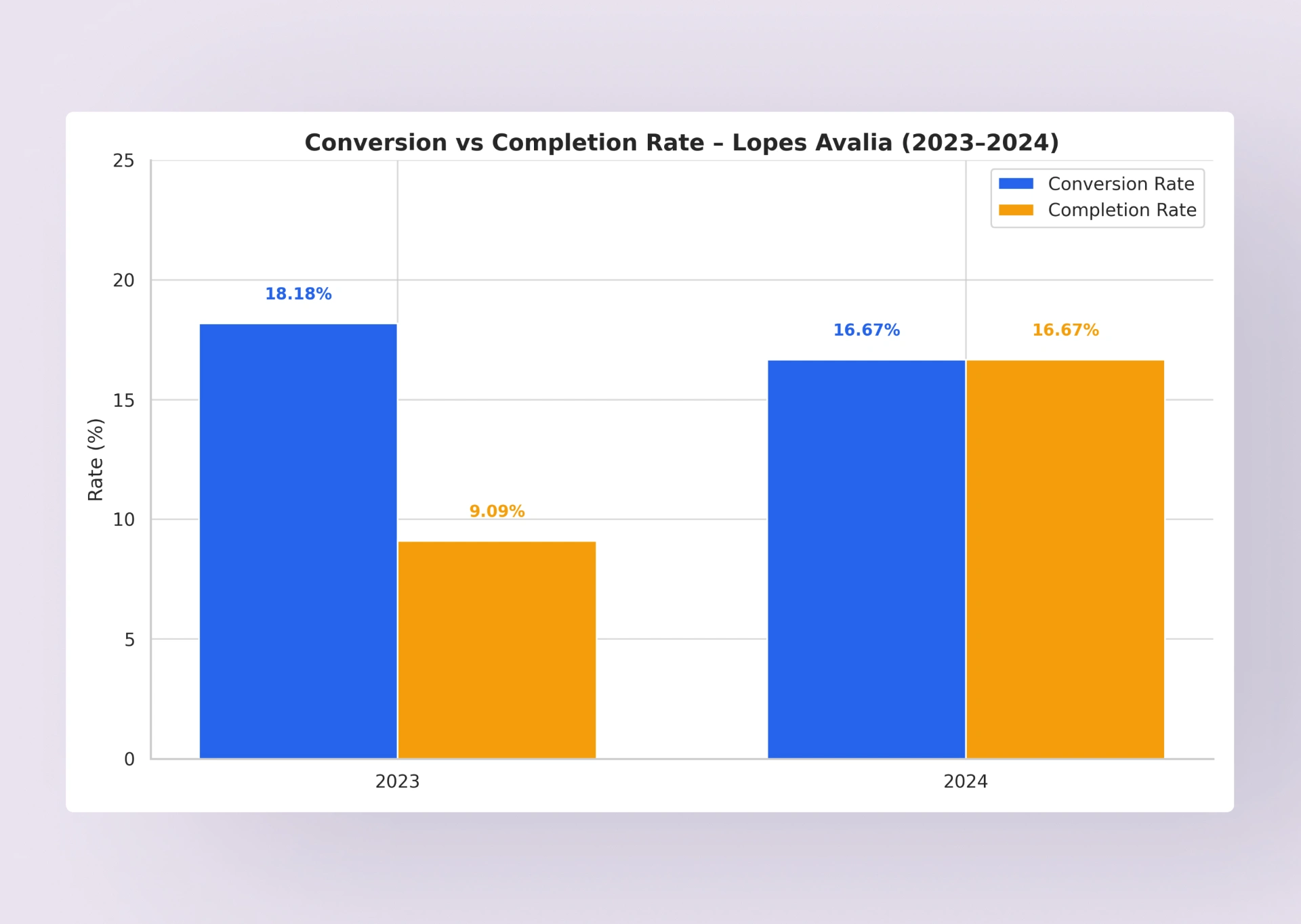
Results and Strategic Impact
Before Redesign
Conversion Rate: 8.2%
Drop-off Rate: 65%
Avg. Session: 2.3 min
Monthly Leads: ~180
After Redesign (2023–2024)
Conversion Rate: 18.18% (+122%)
Drop-off Rate: 35% (-46%)
Avg. Session: 4.2 min (+83%)
Monthly Leads: ~395 (+119%)
Strategic Business Impact
The redesign transformed Avalia from an underperforming internal tool into a strategic lead generation and inventory acquisition platform. By focusing on user experience improvements while maintaining algorithm accuracy, we achieved significant business results that validated the investment in UX design and directly contributed to Lopes's growth strategy.
Like this project
Posted Apr 5, 2026
Redesigned Lopes Avalia's pricing tool, cutting drop-off by 46% and doubling conversion rate from 8.2% to 18.18% and 395 leads/month.