ONRANGE Brand Identity Development

Fábio Cambrea


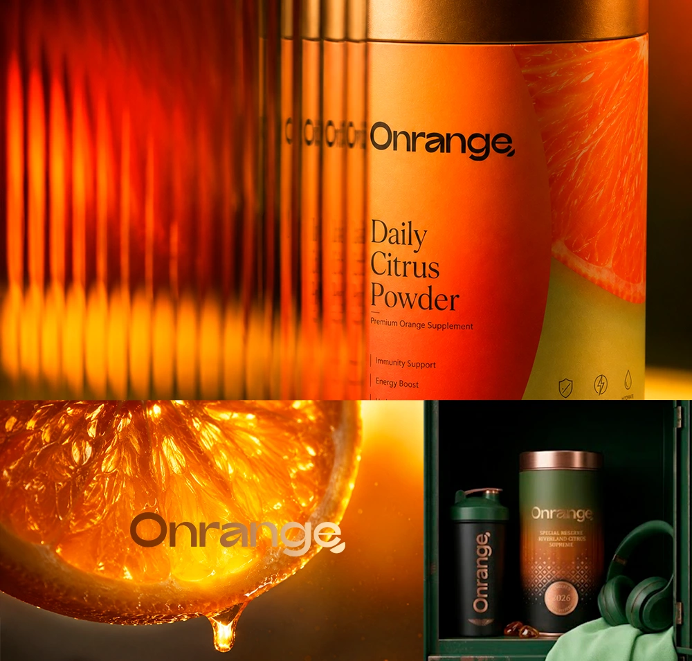
ONRANGE doesn’t sell vitamins. It captures the sun of the Riverland and gives it back to you, one morning at a time.
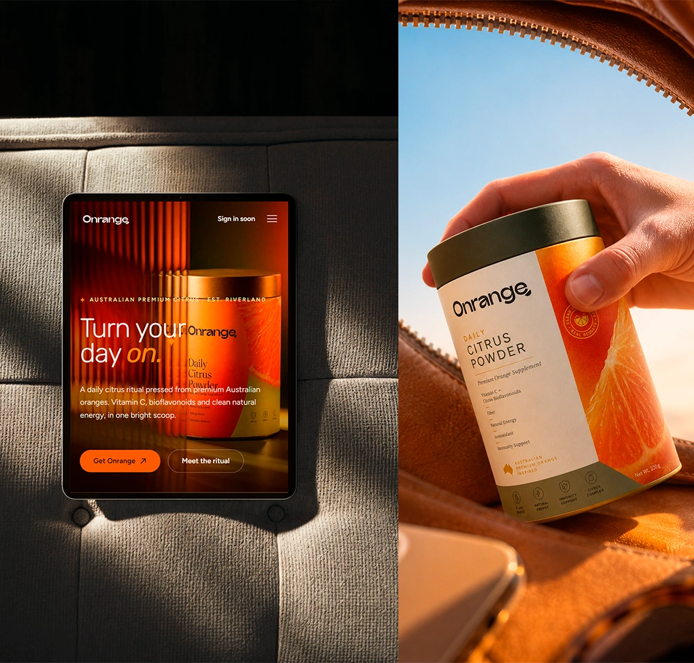
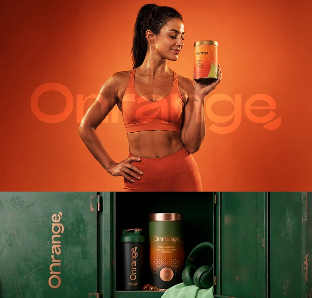
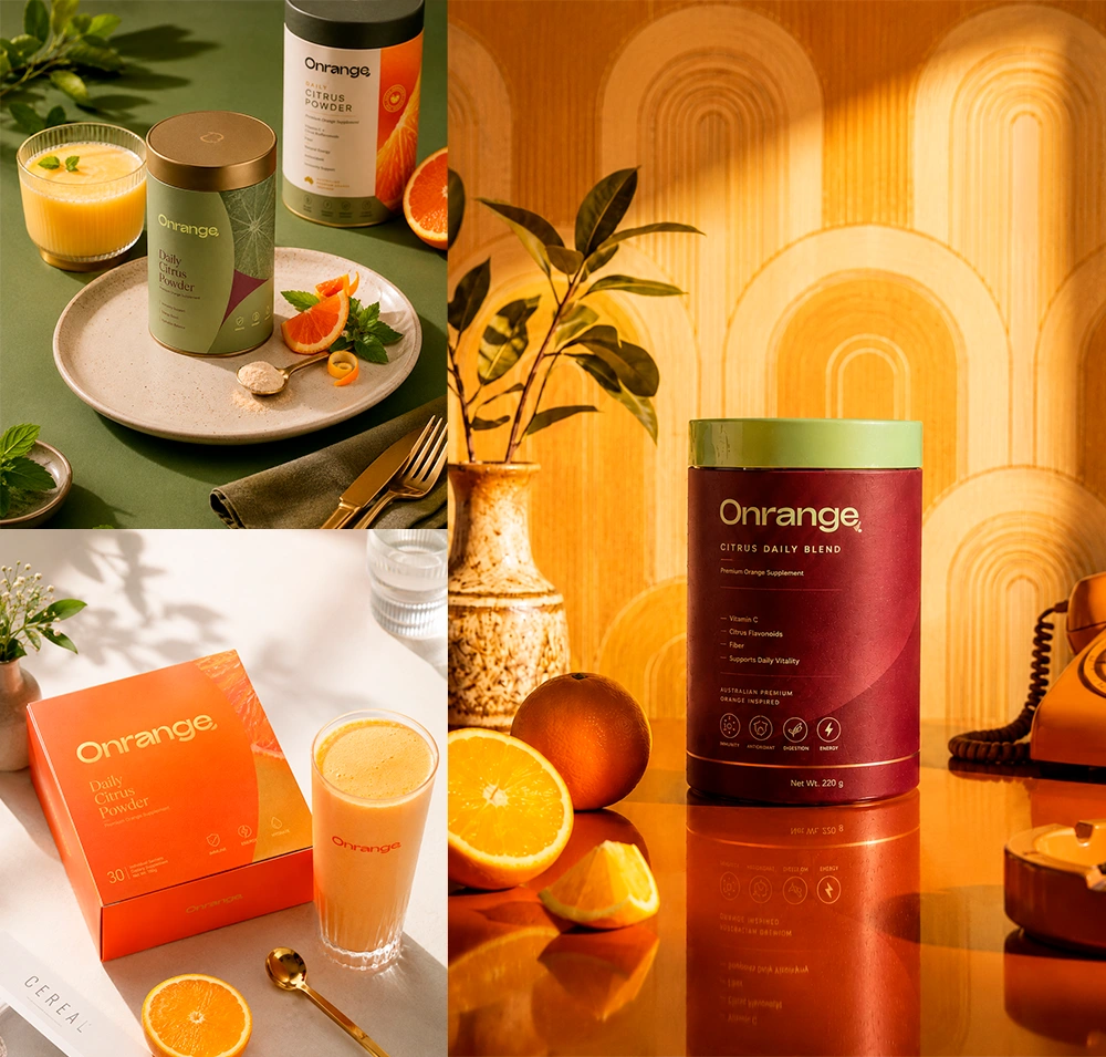
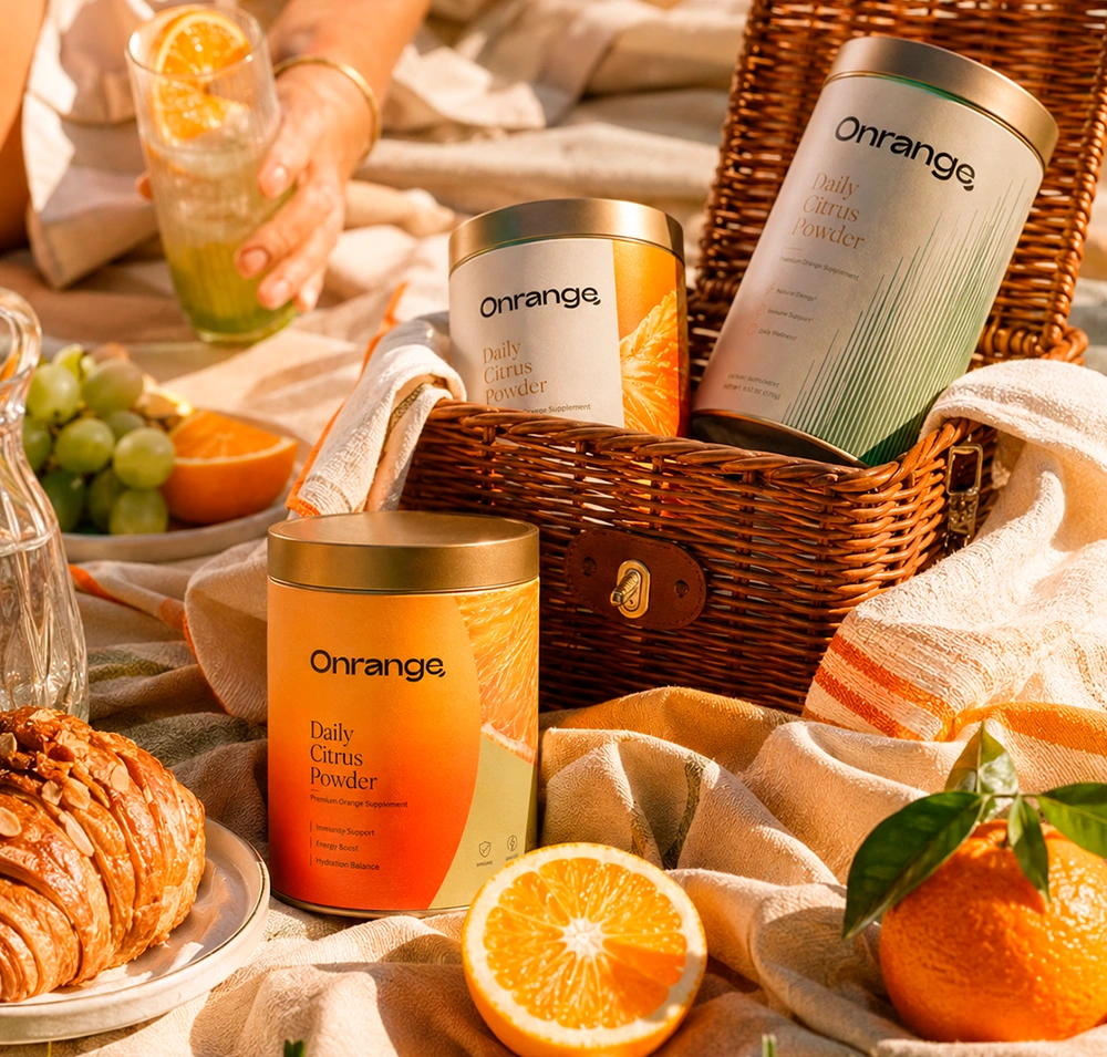
The name comes from ON + ORANGE, built around one persistent idea: turning one of the most ordinary moments in your routine, your daily dose of vitamin C, into a ritual you actually look forward to repeating. This is not a gym supplement. It is premium functional nutrition in a category of its own, created for people who care about their health without compromising on flavor, aesthetics or meaning.
Behind the brand is Rowan, who grew up among the orange groves of the Riverland in South Australia. Alongside his business partner Eamon and his wife Lúcia, who was born in Brazil, he is involved in every detail. The brand became a way of honoring the fruit that has been part of his family’s story for generations. More than a business, it is personal.
Within the brand’s custom typography, the most distinctive feature lies in the letter “a”. Its internal cutout subtly evokes an orange segment, a leaf, a drop, fruit pulp and citrus movement. It creates a precise connection between the name and the concept while remaining minimal. This detail matters because it avoids the visual clichés commonly found in the category and turns the name itself into a recognizable symbol.
The opening “O” also carries strong symbolic meaning. It can be read as the sun, an orange, a cycle, a point of origin and the repetition of a daily ritual. Its large, circular form gives the wordmark a memorable visual entry point.
The final “e”, with its extended lower stroke, adds another layer of personality. Its shape can suggest a comma, a curl of orange peel or a fresh piece of fruit in motion. It gives the identity a subtle signature. The word does not simply stop. It finishes with movement, almost as if leaving a citrus trail behind.
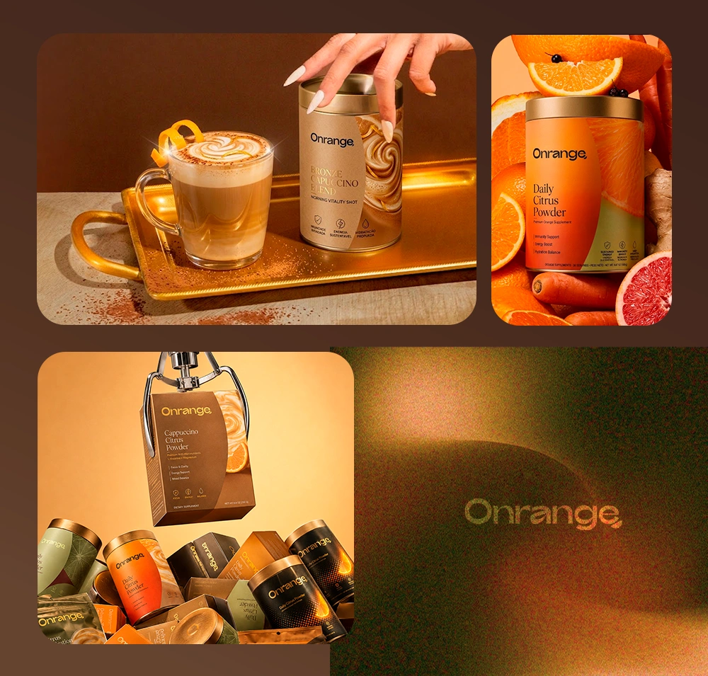
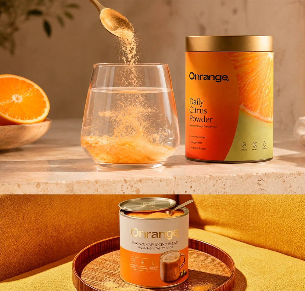
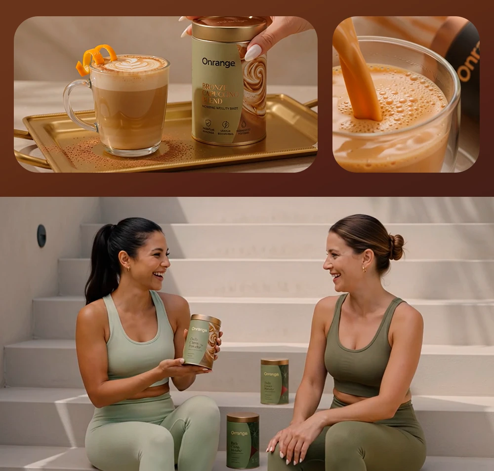
There are many flavors, from Daily to Glow, from Sport to orange cappuccino. Yet at the heart of every one of them is the same essential ingredient: the local orange. It is where everything begins, and it never disappears from the story.
The project is still taking shape, building partnerships with local growers and suppliers along the way. Slowly, carefully, orange by orange.
From Adelaide to the world.
Like this project
Posted Sep 21, 2026
Brand strategy and custom visual identity for ONRANGE, turning Australian Riverland citrus into a distinctive premium daily ritual.