Brand Identity Development for VIDE

Fábio Cambrea


VIDE · Integrated Medical Intelligence
The medical intelligence trusted by the most demanding companies.
Not every brand project begins with a name. This one began with a discovery: hidden within the founder’s surname, Viana Delgado, was the Latin word vide, an imperative meaning to observe, consult the source, and look more closely. From an emotional coincidence, we uncovered an entire territory of meaning.
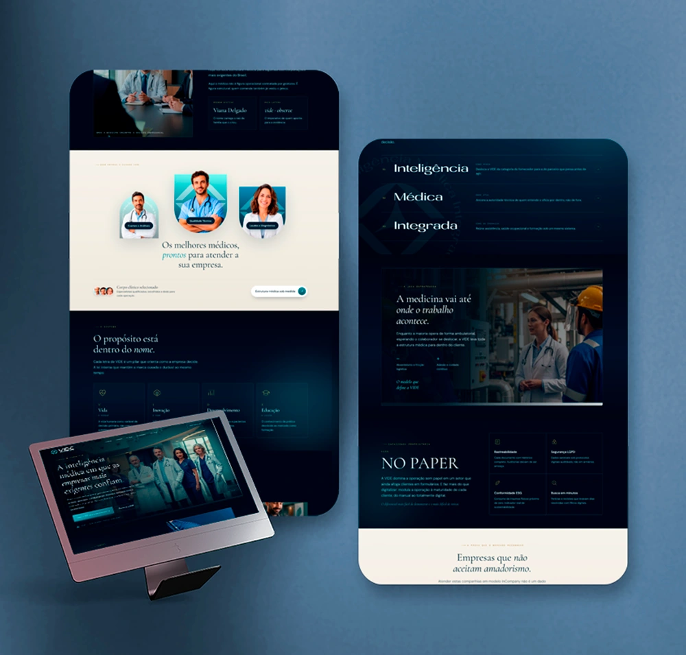
VIDE does not simply provide medical services. It guides medical decision-making. It is a physician-led structure that manages other physicians, bringing complete clinical operations into some of the country’s largest companies.
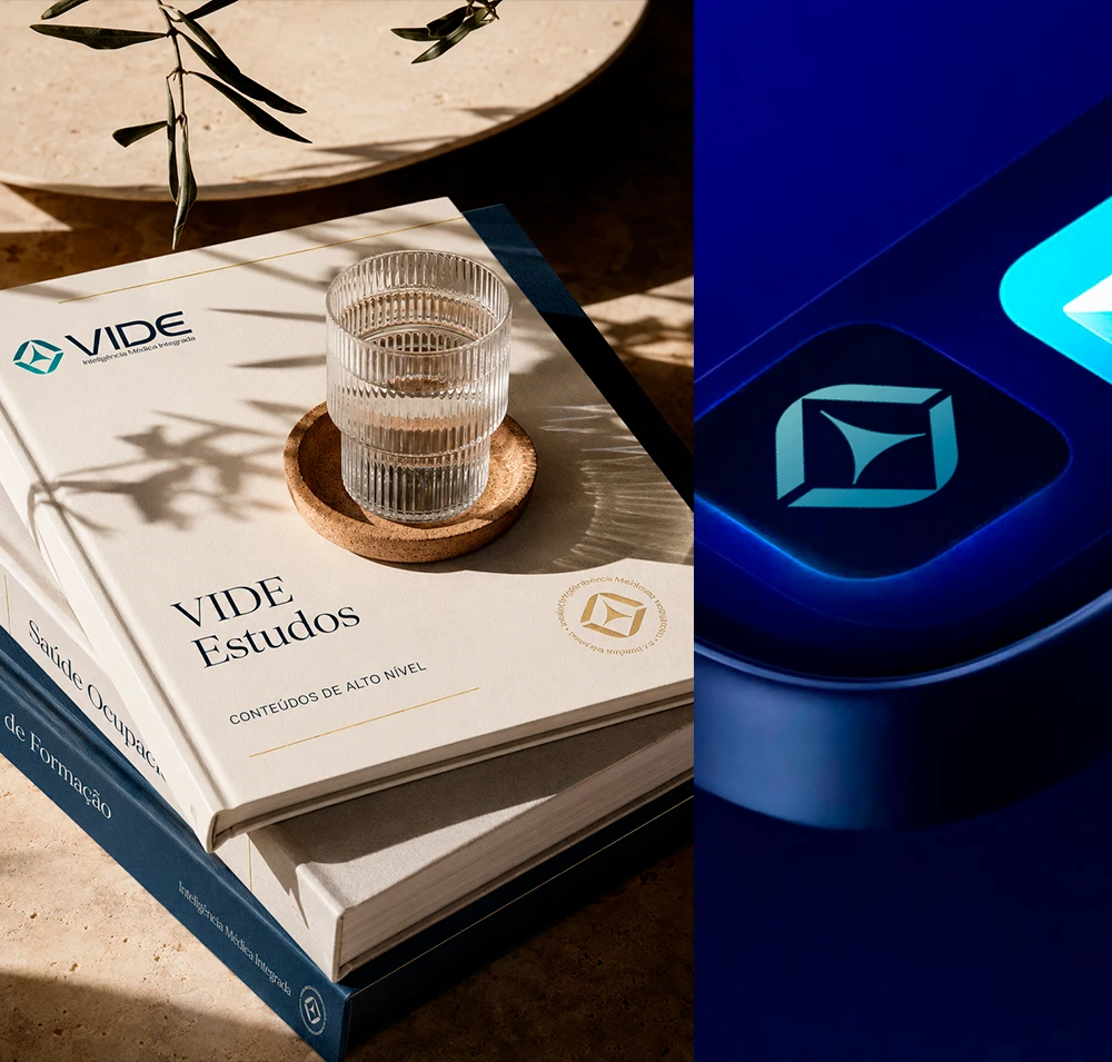
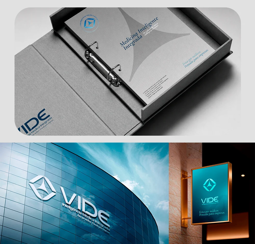
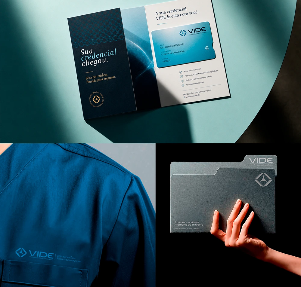
The logo deliberately avoids every familiar medical cliché. There is no cross, no heartbeat line, no stethoscope. Instead, the symbol is built around three simultaneous readings: the brand’s initial, an eye in observation that connects directly to the Latin origin of the name, and a three-point core representing the company’s three business areas operating under one unified intelligence: Medical Assistance, On-site Occupational Health, and Medical Education.
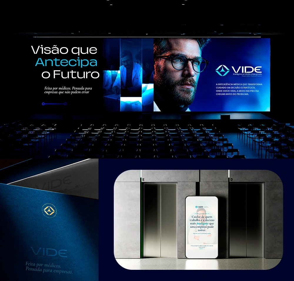
The typography was designed from scratch, with a custom “V” that expands as it rises, translating growth into form. Combined with a palette of deep blue, petrol green, and gold accents, the identity delivers exactly what the client wanted but had not yet achieved: the presence and authority of a major company.
This branding project did not simply decorate a business. It gave it a thesis, a voice, and a distinct place in the minds of decision-makers.
It transformed a service provider into a reference, an obligation into something desirable, and a family name into a lasting brand asset.

Like this project
Posted Sep 22, 2026
Strategic branding for a physician-led healthcare company, transforming a family name into a distinctive, authoritative identity built for growth.