Brand Identity Design for Human Movement Specialist

Fábio Cambrea


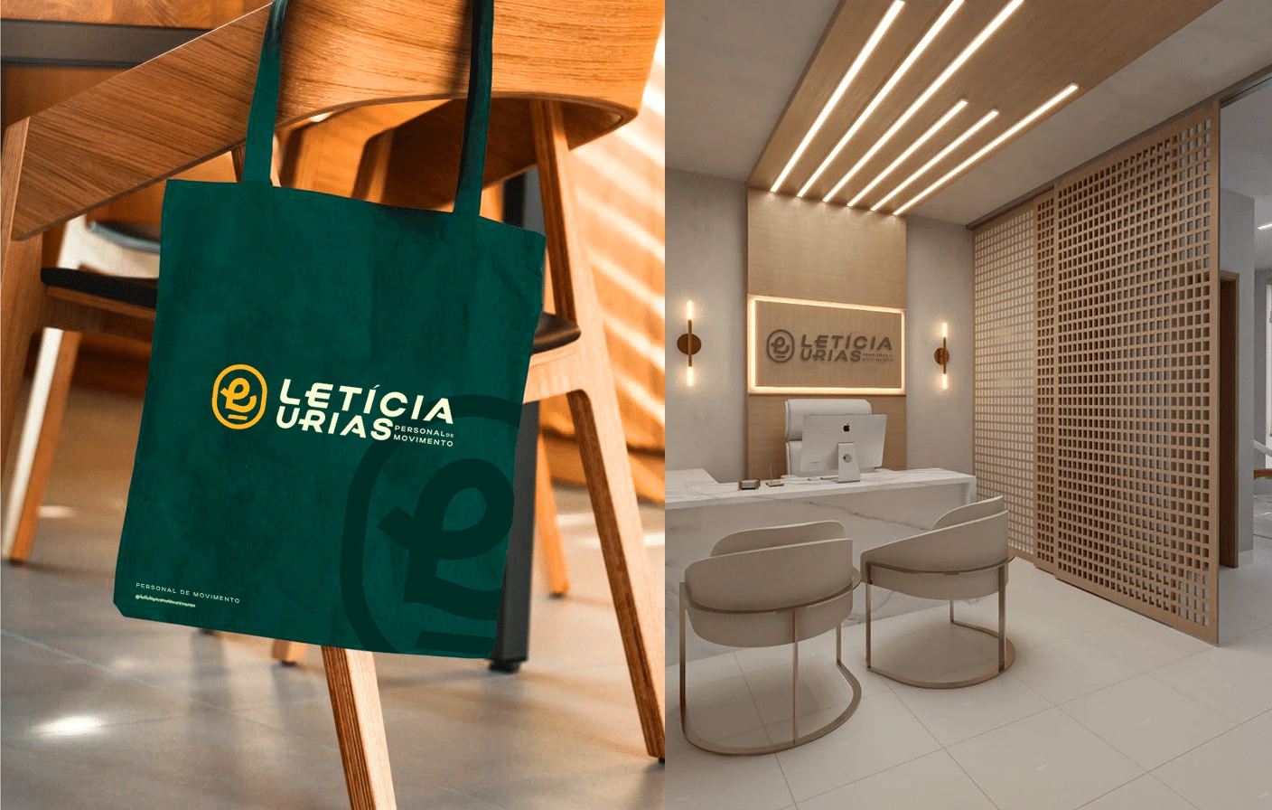
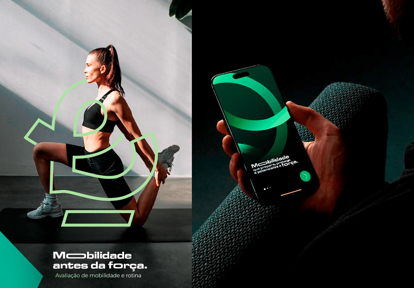
The main objective was to reposition Letícia not simply as a personal trainer, but as a specialist in human movement, someone who understands, supports, and guides the body with awareness and purpose. More than creating a visually appealing identity, the project was designed to build a human, expressive, and memorable brand that clearly communicates what makes her approach different in the market.
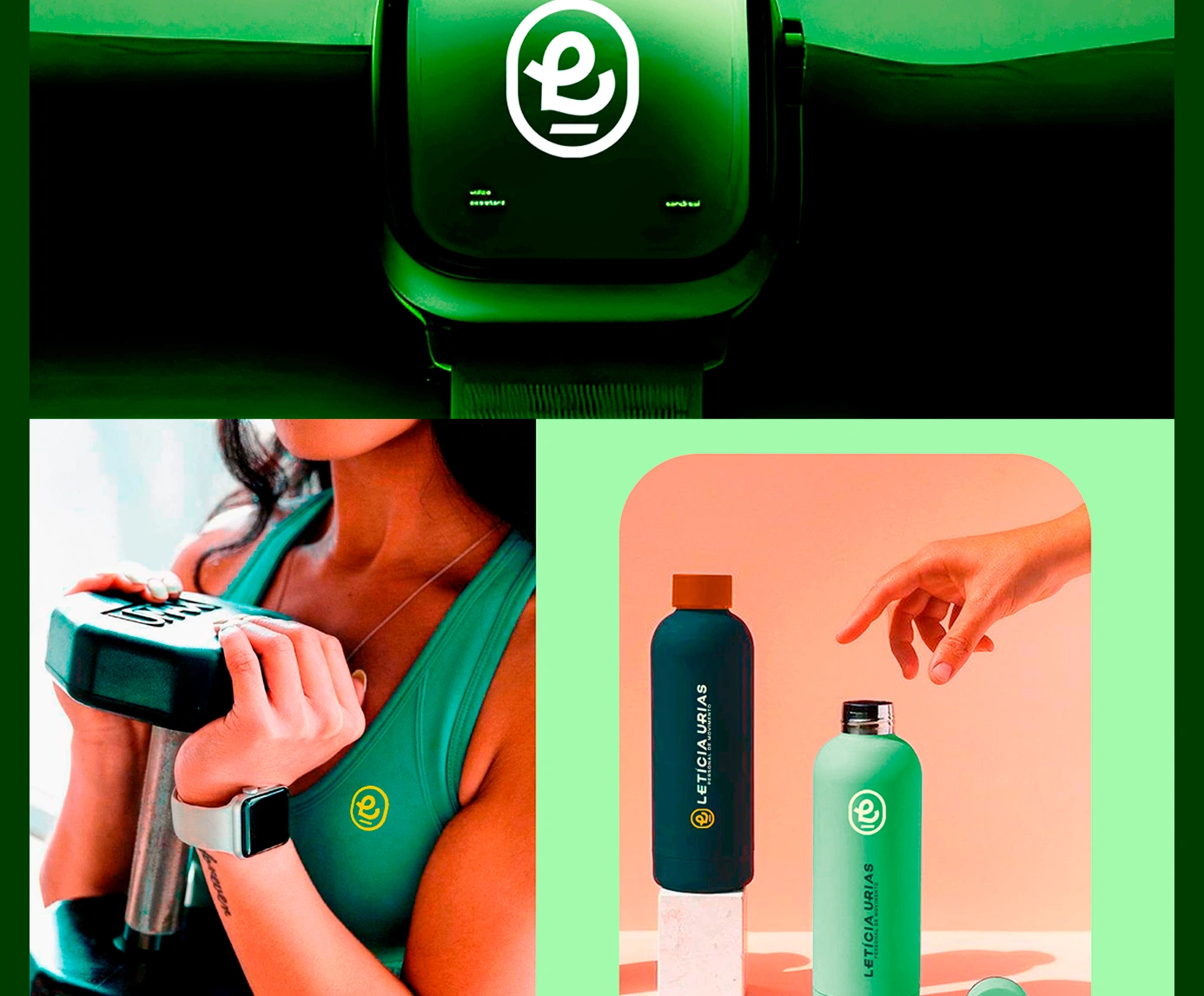
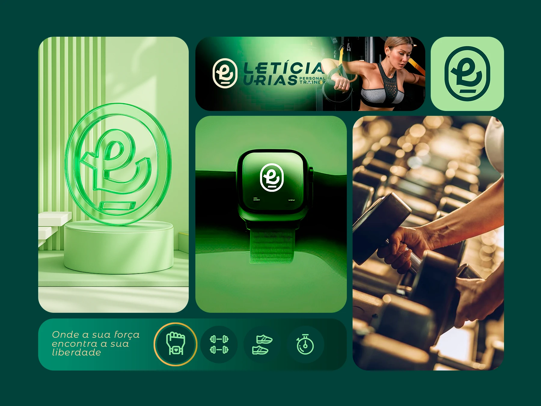
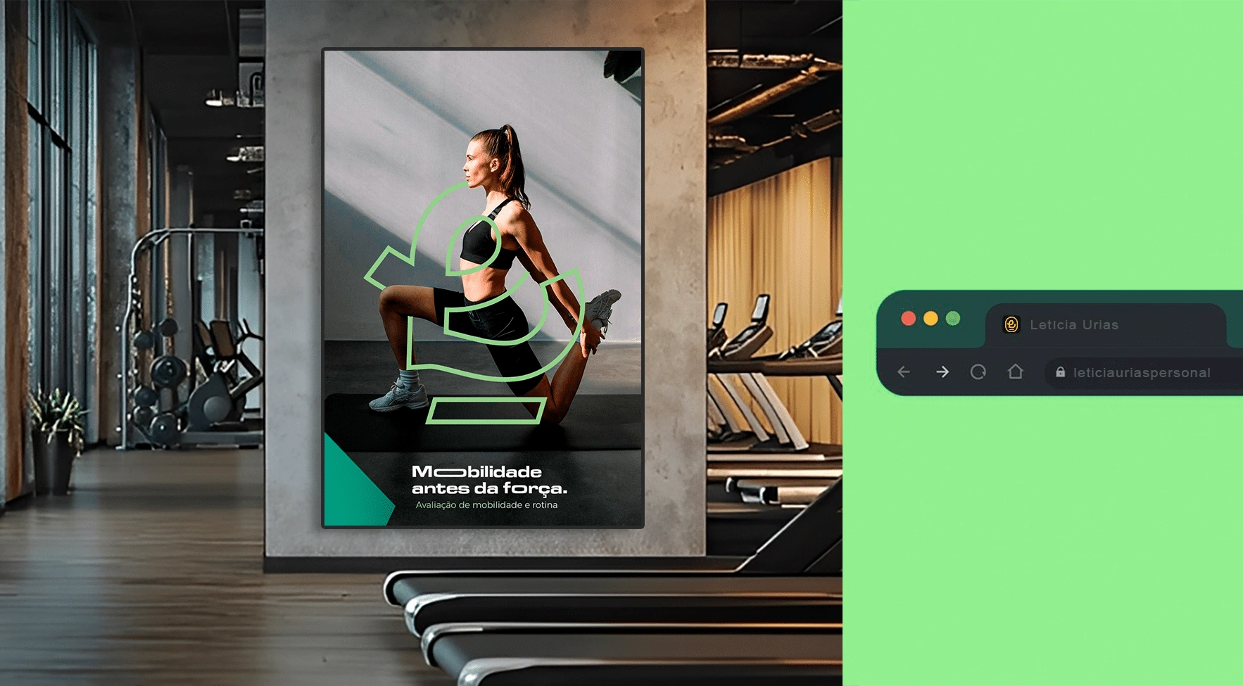
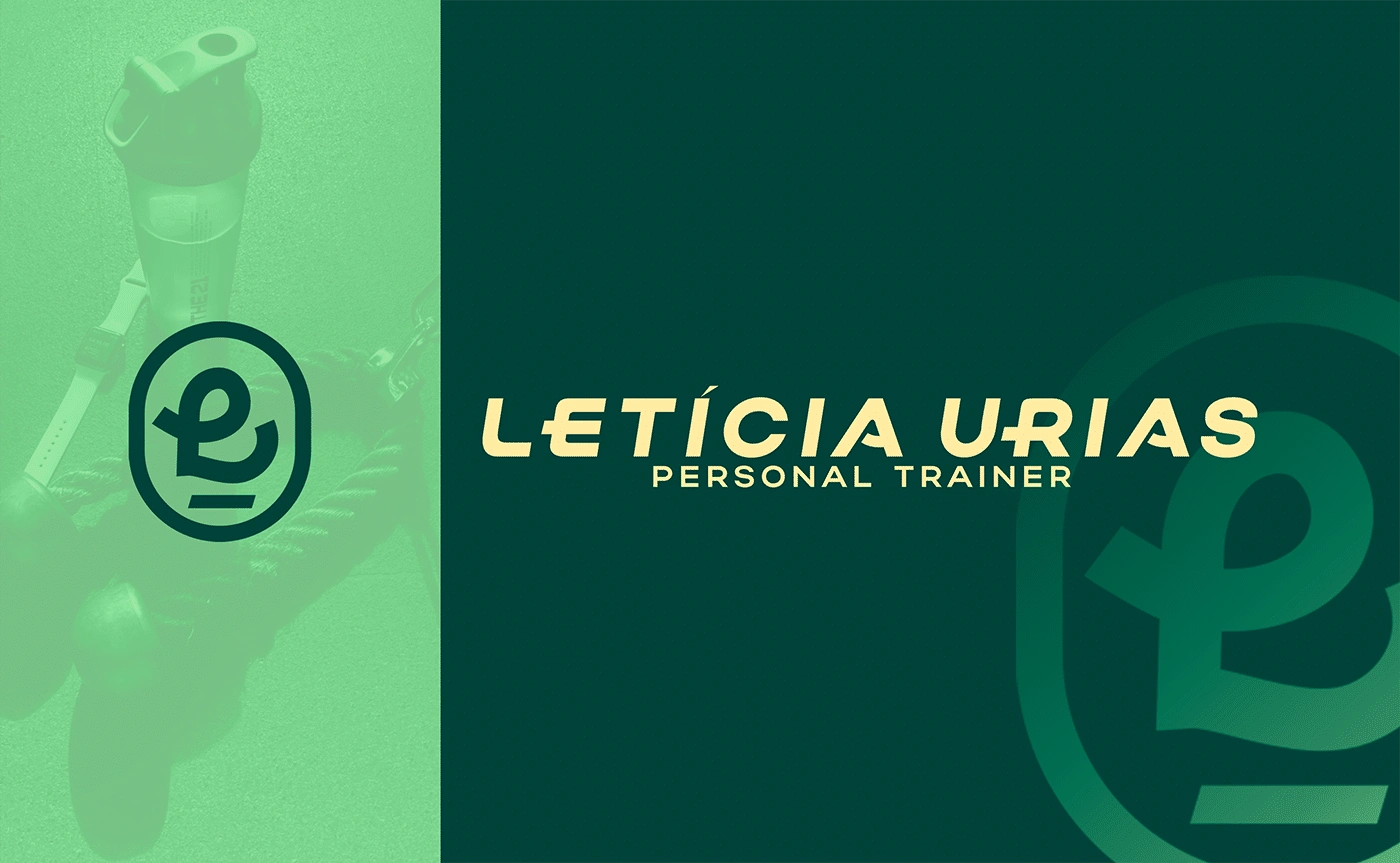
The foundation of the symbol is Letícia’s initial, creating a direct and personal connection to the professional behind the brand. But it does not function merely as a letter. It comes to life through a continuous, fluid curve that evokes the movement of the human body.
The form also subtly resembles a heart, expressing care, empathy, warmth, and well-being with restraint and elegance. These qualities are central to a brand rooted in the Caregiver archetype and closely connected to the needs of its audience.
The rectangular line at the base of the symbol reinforces stability, balance, and tangible physical progress. It also represents the foundation Letícia provides through both technical expertise and emotional support, helping her clients move with greater confidence, freedom, and quality of life.
The chosen typography is strong, contemporary, and free from unnecessary elements. It communicates professionalism and credibility, while its subtle cuts, angles, and inclinations reinforce the idea of movement and create a visual system that feels dynamic, purposeful, and distinctly her own.



Like this project
Posted Sep 22, 2026
Repositioned Letícia from personal trainer to specialist in human movement with a unique brand identity.