Wanderly: AI-Powered Travel Planning App Design
Jesutofunmi Oluwalade
🌍 Wanderly — Smart Travel Planning App
Designing a Personalized, AI-Powered Trip Planner for the Modern Traveler
When I started designing Wanderly, I wasn’t thinking about airplanes or destinations.
I was thinking about mental clutter.
Because travel planning today is stressful. You’re switching between apps, comparing prices, trying to make sense of dates, and juggling excitement with overwhelm.
I wanted to build an app that makes travel feel like a breath of fresh air — organized, smart, and emotionally grounding.
💭 The Moment That Sparked It
It started with a question I asked myself:
“Why does trip planning something meant to bring joy — often feel like work?”
That was my challenge.
Could I design an app that feels like a companion? One that understands the user, helps them plan calmly, and still keeps things visually delightful?
That question became Wanderly.
🎯 My Design Intent
This project was about designing emotionally intelligent simplicity.
Every element — from the greeting “Good Morning Jesutofunmi” to the floating gradient blues — was meant to reduce friction and add calm.
I set three goals for myself:
Make the journey personal.
The app should feel like it knows who you are and how you travel.
Make planning effortless.
From budget to itinerary, every interaction should feel smooth and predictable.
Make visuals emotionally resonant.
The design should make people smile before they even book their trip.

🧭 How I Designed It
1. Starting With Feelings, Not Features
Before jumping into wireframes, I listed feelings I wanted users to experience: calm, trust, excitement, clarity.
These words guided every decision — from color palette to motion transitions.
2. Building the Flow
The experience had to mirror the natural rhythm of how people dream and plan:
Dream → 2. Personalize → 3. Plan → 4. Confirm
Each stage introduces just the right amount of interaction.
No clutter, no pressure.
3. Visual System
The interface was designed around a soft gradient ecosystem — fluid blues inspired by early-morning skies.
The icons? Rounded, glowing, and full of life.
The typography? Modern and humble.
The tone? Conversational, never corporate.
🖼️ The Experience (Screen by Screen)
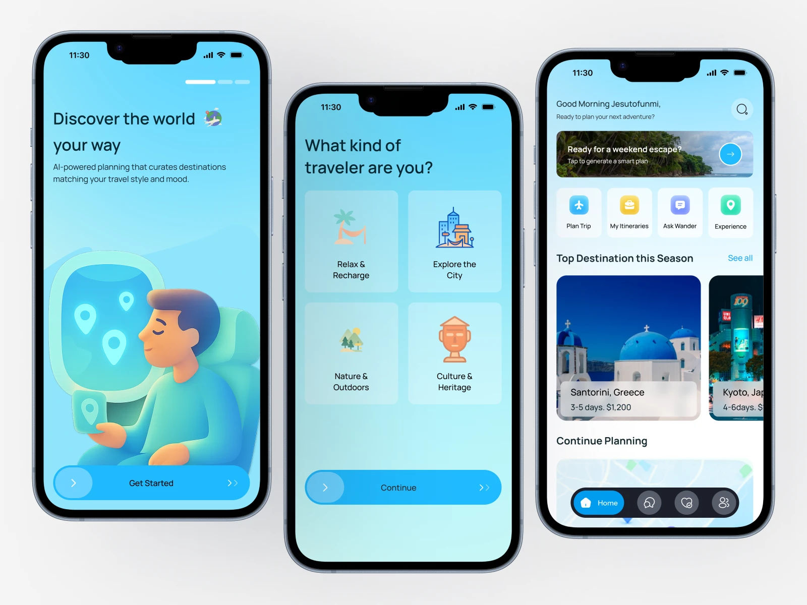
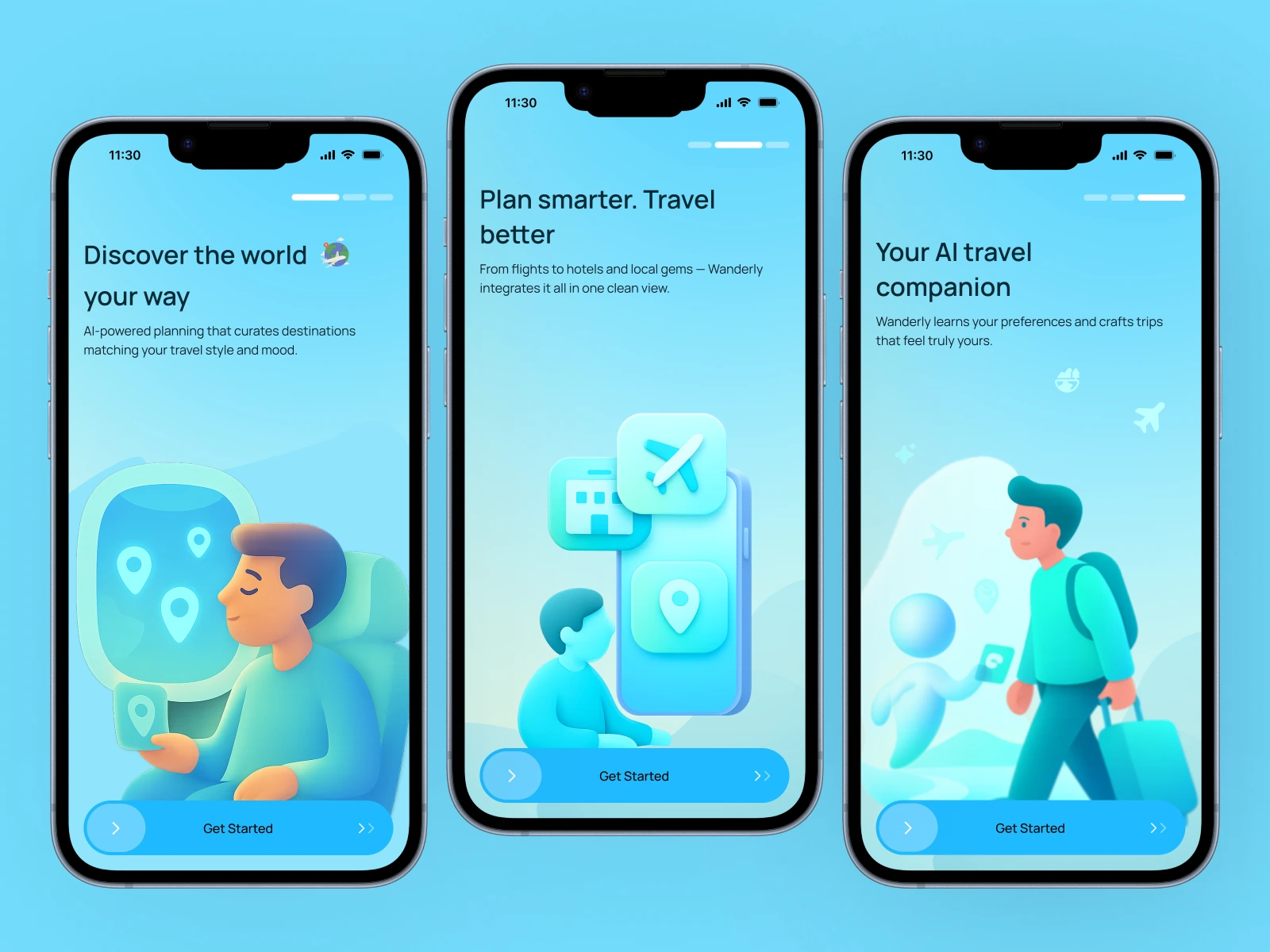
🌍 1. Onboarding — “Discover the world your way.”
I didn’t want to overload users with features.
Instead, I focused on trust and curiosity. Each screen is a friendly invitation — a warm visual handshake from the product.
💡 2. Personalization — Because no two travelers are alike.
Users select travel types (Relax, Adventure, Culture).
The UI uses expressive icons and a familiar “card tap” gesture, making it feel playful and personal.
A budget slider reinforces control — it’s still your trip, just made smarter.
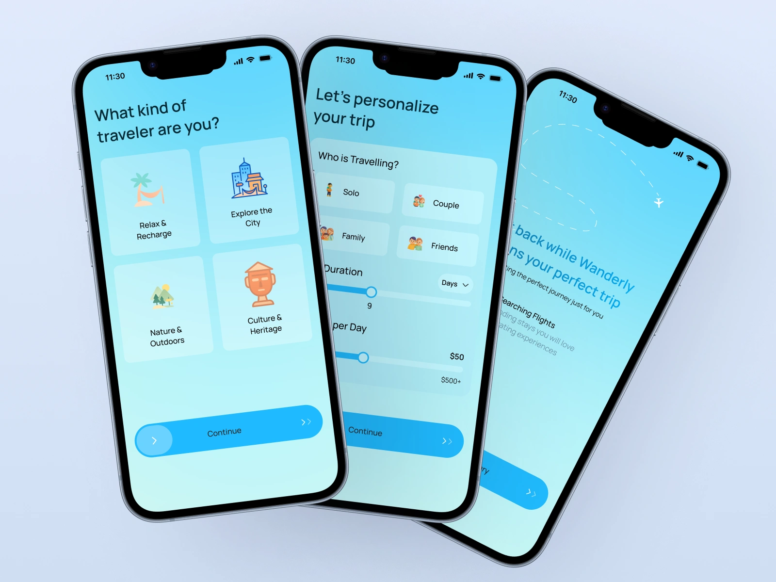
🤖 3. AI Trip Planning — The calm behind the magic.
Here, users sit back while Wanderly generates their plan.
The animation is slow, almost meditative.
The copy reads:
“Sit back while Wanderly plans your perfect trip.”
Because trust is built in those small emotional details.
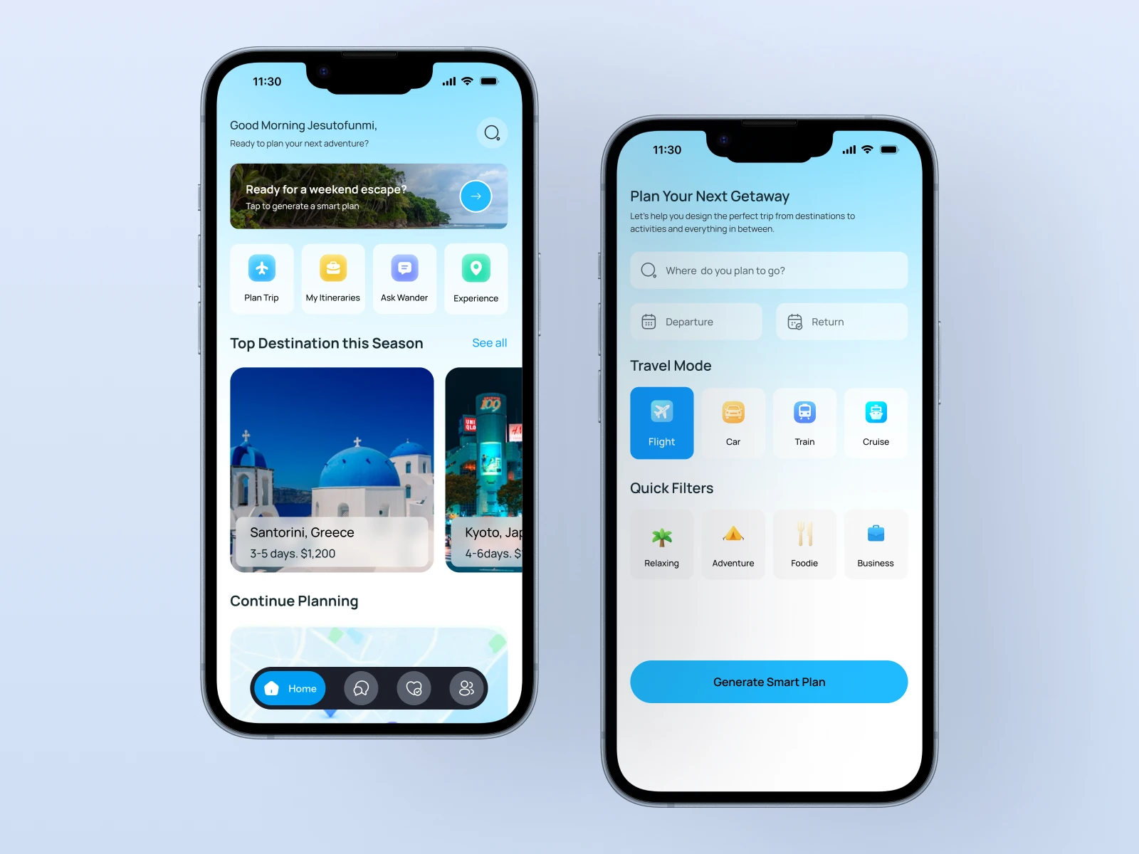
🏠 4. Home — The travel hub that feels like home.
This screen is about warmth and intention.
The personalized greeting (“Good Morning, Jesutofunmi”) was my favorite design touch — it humanizes the digital.
The layout balances predictability (standard grid for quick actions) with delight (hero card for “Ready for a weekend escape?”).
🧳 5. Smart Plan Overview — Information without overwhelm.
I designed this section like a conversation, not a spreadsheet.
Each trip card gives you a story: destination, duration, budget, and photo that sells the vibe, not just the price.
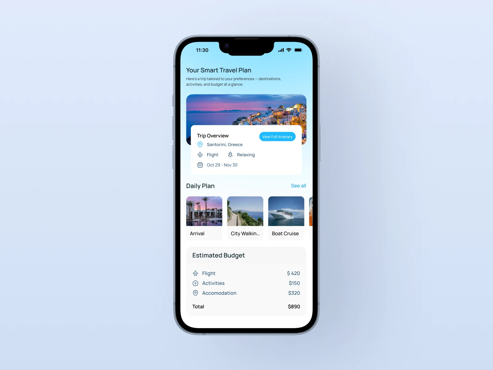
💰 6. Budget Breakdown — Clarity you can feel.
This was where function met visual rhythm.
A minimalist pie-card layout explains where your money goes — without anxiety.
Numbers are clear, but the colors make it feel light.
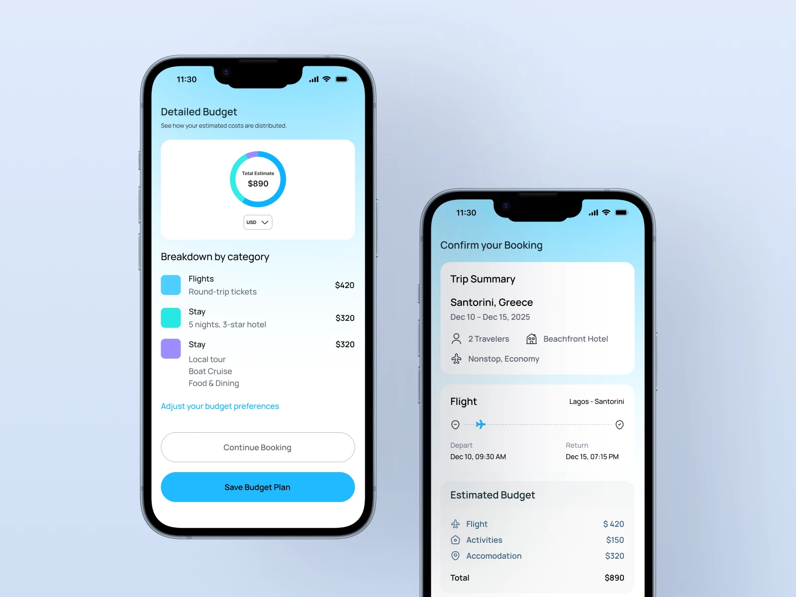
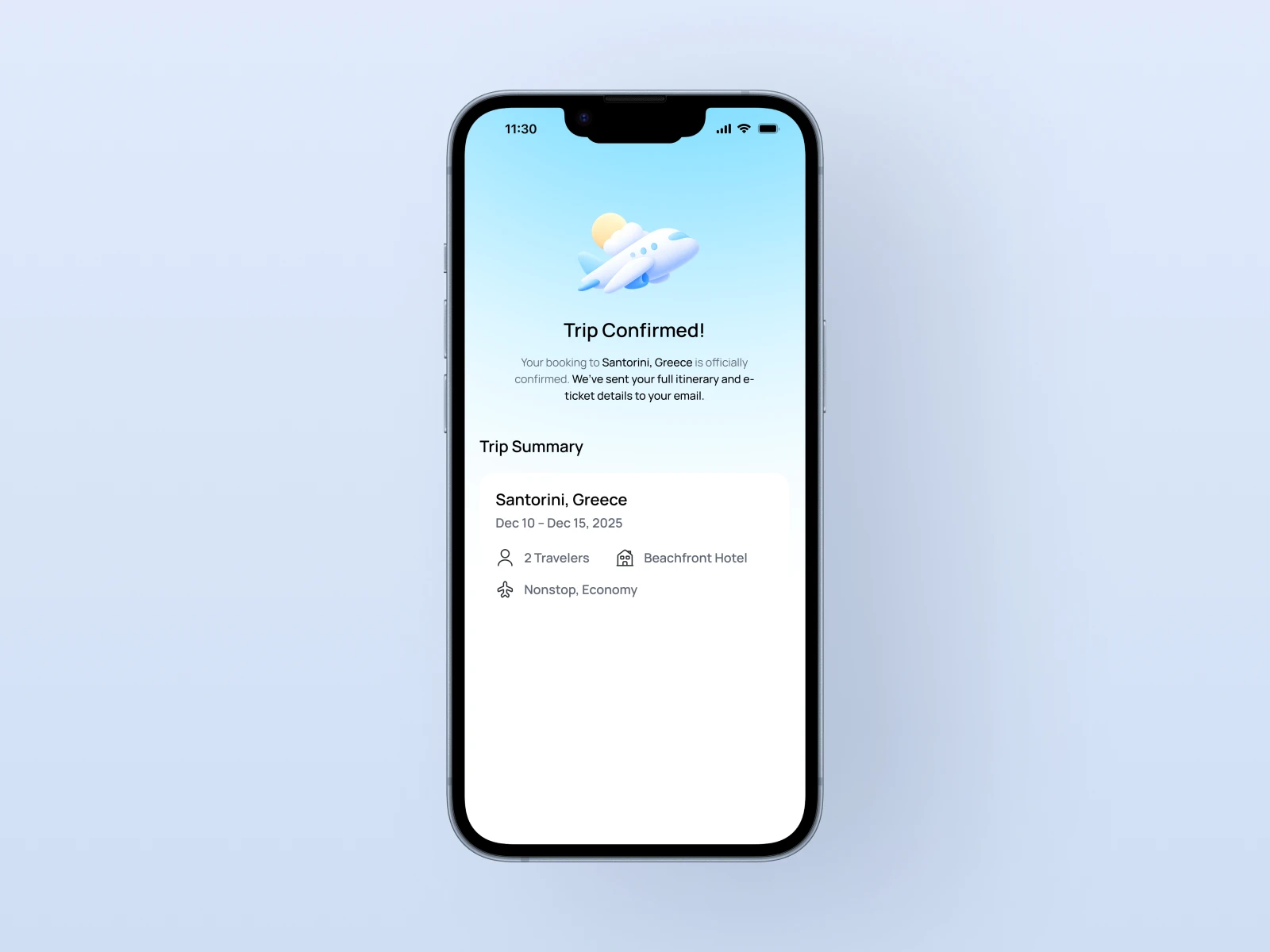
🎉 7. Confirmation — The emotional full stop.
I added a subtle airplane illustration taking off.
It’s not just design — it’s the emotional closure the user deserves.
📈 What I Learned
Calm interfaces convert.
The smoother the experience, the higher the user’s trust.
Microcopy matters.
“Make we start” or “Ready for a weekend escape?” — these words create tone and connection.
Designing emotion is a skill.
UI isn’t only about layout; it’s about designing how a moment feels.
⚙️ Tools Used
Figma – for design system and prototypes
Illustrator – for 3D icons and vector refinement
Notion – to track flows, states, and copy tone
🌅 Reflection
This project reminded me why I love design.
It’s not about pixels or perfection — it’s about clarity, rhythm, and human moments.
I wanted Wanderly to feel like a friend you plan a trip with. And in that process, it helped me rediscover something important:
Design is at its best when it feels invisible — when it quietly gets out of the way and lets joy happen.
Like this project
Posted Oct 22, 2025
An intuitive travel companion designed to help users plan, personalize, and confirm trips effortlessly — with a focus on ease, trust, and beauty in every detail