“Visual Heartbeat of True Love”
Alok Yadav
Crafting a Visual Heartbeat for "Not Everyone is Meant for True Love"
Every book cover project presents a unique challenge: to distill the emotional complexity, narrative arc, and thematic depth of a manuscript into a single, compelling image. The cover serves as the visual overture, the first point of contact between an author's world and a potential reader's heart. For Aditi Sahu’s poignant novel, Not Everyone is Meant for True Love, this challenge was particularly profound. The project required more than an aesthetically pleasing design; it demanded a visual thesis that could honor a story of immense vulnerability and resilience.
The Author's Vision and the Designer's Mandate
The collaboration with author Aditi Sahu began with a deep immersion into the world of her protagonist, Aanya. The manuscript details a journey that is both deeply personal and universally resonant, tracing an emotional arc through four distinct phases: The Dream of Love, The Breaking Point, The Realization, and The Acceptance. Aanya’s story begins with the intoxicating illusion of a first love she believes is her "forever," progresses through the devastating silence of heartbreak, and culminates in a quiet but powerful journey of self-discovery and acceptance.
The primary design mandate was therefore to create a cover that could encapsulate this entire transformation. A purely romantic or joyful image would betray the raw pain of loss that is central to Aanya's growth. Conversely, a design steeped only in melancholy would misrepresent the novel's ultimate, uplifting message: that endings are not failures, but doorways to new beginnings, and that the greatest love story is often the one we learn to write within ourselves. The central design question became one of emotional equilibrium: How can a static image hold both the sorrow of a past love and the emergent hope of a future self in a delicate, resonant tension? The cover needed to visually argue that the provocative thesis of the title leads not to despair, but to a different, more profound form of fulfillment.
The Final Cover: A Deep Dive into Design and Symbolism
The final cover for Not Everyone is Meant for True Love is the result of a strategic process aimed at achieving this narrative balance. Every element—from the color palette to the typographic treatment—was deliberately chosen to function as a symbolic counterpart to Aanya’s journey, creating a visual narrative that unfolds for the viewer.
The Power of the Palette: A Narrative in Gradient
Color is a primary vehicle for emotion in design, and the cover’s palette was engineered to be a journey in itself. Rather than relying on a single hue, the design employs a seamless gradient that mirrors Aanya’s emotional evolution from the beginning of the story to its conclusion.
The gradient begins at the horizon with a warm, fiery red-orange. This specific blend of colors is psychologically associated with passion, energy, confidence, and warmth. It perfectly symbolizes the initial, intoxicating phase of Aanya’s love for Aarav, a period described in the manuscript as "The Sweet Beginning," filled with late-night talks and promises of "forever". This vibrant warmth is concentrated at the story's emotional core—the point of human interaction—representing the vitality and all-consuming nature of first love.
As the eye moves upward, the palette transitions into the deep, contemplative tones of violet and dark blue. These cooler colors are psychologically linked to introspection, melancholy, and even sadness ("feeling blue"). This segment of the gradient visually represents the emotional landscape of the novel's second act, "The Breaking Point," particularly the "Nights of Silence" and profound loneliness Aanya experiences after her heartbreak. While dark blue can also convey stability and trust, in this context, it evokes the somber quietude of a heart in mourning. This visual "cooling" is a direct metaphor for the fading of passion and the onset of a period of difficult but necessary self-reflection.
The Duality of Light: The Symbolism of the Sun
The most powerful symbolic element of the cover is the central luminous orb, whose meaning is deliberately and strategically ambiguous. It is designed to be interpreted as both a sunset and a sunrise, fusing the novel's core thematic tension into a single visual metaphor.
Viewed as a sunset, the orb represents endings, the completion of a cycle, and a time for reflection on what has passed. This interpretation aligns perfectly with Chapter 4, "When Forever Ends," and the painful but quiet conclusion of Aanya’s relationship with Aarav. The warm, fading light speaks to the beauty of the love that was, even as it disappears over the horizon.
Simultaneously, the image can be read as a sunrise, a powerful and universal symbol of new beginnings, hope, rebirth, and enlightenment. This reading corresponds directly to the latter half of Aanya’s journey, particularly the sections on "Moving Forward" and rediscovering life beyond romantic love. The dawning light suggests that even after the darkest night of heartbreak, a new day—and a new self—is emerging.
This intentional ambiguity is the cover's conceptual anchor. The novel's central message is that "endings are not failures, but doorways to new beginnings". By creating an image that is simultaneously a sunset and a sunrise, the design visually embodies this philosophy. It tells the reader that the very moment of ending contains the seed of a new beginning. The loss is not separate from the growth; it is the catalyst for it.
A Story in Silhouette: Iconography and Composition
The figurative elements on the cover are rendered in silhouette to maintain a sense of universality, allowing readers to project their own experiences onto the scene. Their specific gestures and composition, however, are deeply tied to the narrative.
The primary female figure, representing Aanya, is not depicted in a state of active pursuit or desperate reaching. Her posture is one of quiet contemplation and receptivity. She holds a space, her hands cupped to receive something of great value. This posture reflects her evolution in the latter half of the book, where her journey becomes internal, focused on acceptance and self-love rather than on reclaiming a lost relationship.
Reaching toward her is a larger, disembodied hand, symbolizing the memory of her past love, Aarav. Crucially, the hand is not grasping or taking; its gesture is one of releasing or gently offering. This mirrors the quiet, undramatic nature of the breakup described in the manuscript, which ends not with a fight but with the resigned statement, "I just… don’t feel it anymore". The gesture is one of letting go.
The exchange between them is the key to the cover's story. The hand releases what appear to be teardrops or petals of light, which fall into Aanya's hands, held over the sun. This interaction is a visual metaphor for the "Lessons from Pain". It symbolizes that the relationship, though it ended, has bequeathed something essential to her: experience, wisdom, and the catalyst for profound personal growth. She is, in effect, gathering the remnants of that past love and transforming them into her own light—the dawn of self-acceptance.
The Voice of the Text: Typography as Tone
The typographic choices were made to establish the book's literary tone and emotional intimacy, creating a hierarchy that guides the reader's perception.
The main title, Not Everyone is Meant for True Love, is set in a classic, elegant serif typeface. This choice lends the book a sense of gravitas and literary quality. It positions the provocative title not as a cynical declaration, but as the premise for a thoughtful, serious exploration of love and life. A classic serif font suggests a timeless story, elevating the narrative beyond a simple contemporary romance.
In contrast, the subtitle, A Story of Love, Loss, and Self-Discovery, is rendered in a delicate, handwritten script. This adds a crucial layer of intimacy and personal vulnerability. It feels like an entry from a diary, promising the reader an authentic, heartfelt, and deeply human story. The interplay between the formal serif of the title and the personal script of the subtitle perfectly captures the book's essence: a universal, literary theme told through a singular, deeply personal lens.
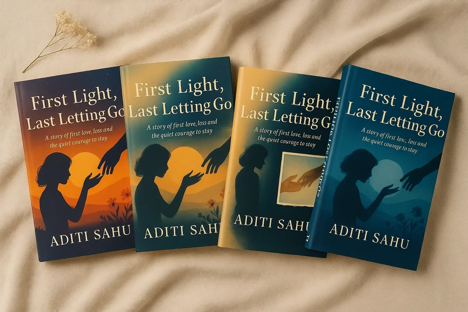
The Design Journey: Exploring the Path to the Perfect Cover
The final cover was not a singular stroke of inspiration but the culmination of a rigorous exploratory process. To ensure the chosen direction was the most effective and truthful representation of the author's work, several alternative concepts were developed and evaluated. These alternatives, visible in the mockup image under the working title First Light, Last Letting Go, each successfully visualized a specific facet of Aanya's journey but ultimately proved insufficient to capture the narrative in its entirety.
Deconstruction of the Alternatives: Focusing on a Single Narrative Beat
Each rejected cover can be understood as a strong execution for a different, more narrowly focused version of the story. Analyzing their limitations reveals why the final design was the superior strategic choice.
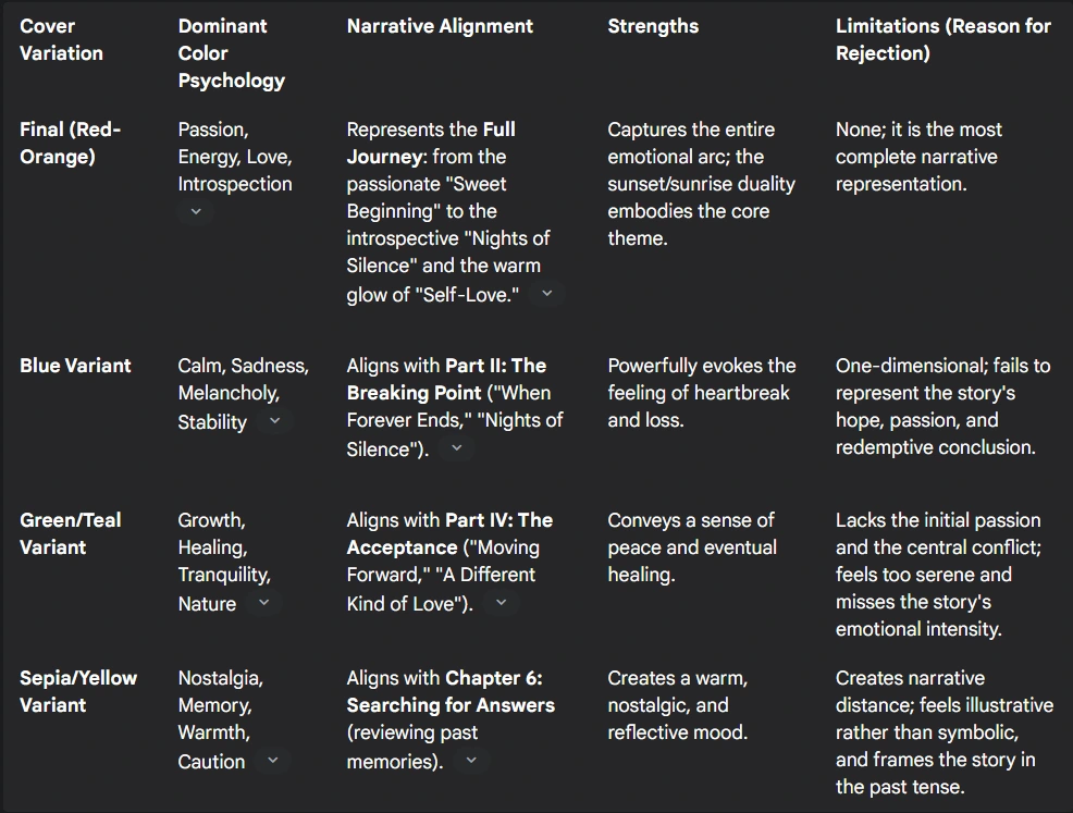
The Blue Variant: A Study in Melancholy and Loss
This concept utilizes a cool, dark blue palette. Psychologically, blue is a complex color; while it can evoke calm and stability, it is also strongly associated with sadness, melancholy, and emotional coldness. This cover powerfully captures the emotional atmosphere of Part II: The Breaking Point. It is the visual equivalent of the "Nights of Silence," embodying the profound grief and loneliness that follow Aanya's heartbreak. The strength of this design is its unflinching depiction of loss. However, its limitation is that it traps the story in this single, painful moment. It fails to convey the warmth of the initial romance or the eventual hope and empowerment that define the story's conclusion, thus misrepresenting the narrative's full, redemptive arc.
The Green & Teal Variant: The Quietude of Healing
This variation employs a palette of green and teal. Green is overwhelmingly associated with growth, nature, tranquility, and healing. This design effectively visualizes the themes of the novel's final acts, Part III and IV: The Realization and The Acceptance. It speaks to the "Lessons from Pain" and Aanya's discovery of "A Different Kind of Love" within herself, her friendships, and her passions. The cover conveys a powerful sense of peace and resolution. Its weakness, however, lies in what it omits. It lacks the fiery intensity of the initial love affair and the visceral, transformative pain of the breakup. The central conflict of the story is absent. By presenting only the tranquil conclusion, the cover suggests a story of gentle healing rather than a journey of resilience forged in the crucible of heartbreak.
The Sepia/Yellow Variant: A Fading Memory
This version uses a warm, monochromatic, sepia-toned palette. This color scheme immediately evokes nostalgia, memory, and the passage of time. The inset, box-like image of the hands creates a more literal, illustrative feel, as if one is looking at an old photograph. This approach aligns well with Chapter 6, "Searching for Answers," in which Aanya pores over old messages and memories, trying to make sense of the past. The design successfully frames the story as a reflection. However, this is also its primary limitation. By framing the narrative so explicitly as a memory, it creates an emotional distance for the reader. It suggests the story is already over, rather than inviting the reader to experience Aanya's journey in the present tense. The more symbolic and immersive approach of the final cover proves more powerful and universal.
Comparative Narrative Analysis of Cover Concepts
To provide a clear, strategic summary of this evaluation process, the following table contrasts the narrative alignment of each design concept. This methodical comparison demonstrates that the final selection was based not on subjective preference but on a rigorous analysis of which cover most completely served the author's story.
The Strategic Choice: A Synthesis of Story and Image
The selection of the final cover for Not Everyone is Meant for True Love was a decision rooted in a narrative-first design philosophy. The process moved beyond simple aesthetics to ask a more fundamental question: which design is the most truthful and complete servant to the author's story?
Beyond Aesthetics: A Narrative-First Approach
The analysis of the alternative concepts makes it clear that while each had its merits, they were ultimately telling only a single chapter of a much larger story. The blue cover told the story of loss. The green cover told the story of healing. The sepia cover told the story of memory. The red-orange cover was the only one that succeeded in telling the entire story, holding the narrative's inherent contradictions in a beautiful and poignant balance: the pain of loss with the beauty of growth, the end of a relationship with the beginning of self. It is a design that does not shy away from the darkness of heartbreak but insists on framing it with the warm, emergent light of self-acceptance.
The Cover as a Promise
Ultimately, a book cover is a promise to the reader. The final design for Aditi Sahu's novel makes a series of profound promises. It promises a story of intense passion and deep, vibrant emotion, communicated through the fiery red-orange at its heart. It promises an honest journey through introspection, sorrow, and the quiet solitude of a healing heart, reflected in the deep violets of the upper sky. Most importantly, through the powerful, ambiguous symbol of a sun that is both setting and rising, it promises that within the story of a painful ending, the reader will find a powerful and illuminating new beginning.
This project exemplifies a design process where deep empathy for the narrative, combined with strategic visual communication, leads to a solution that is not only beautiful but also profoundly meaningful. The final cover forges an immediate, resonant connection between the author's words and the reader's heart, inviting them into a story that acknowledges pain while ultimately celebrating the enduring power of the human spirit to heal, to grow, and to find love in its many, often unexpected, forms.
Want to Collaborate?
If you’re an author or publisher seeking a book cover that deeply resonates with your story, or a complete visual identity that makes your work stand out, I’d love to collaborate.
📬 DM me here on Contra or email: alokyadav5275757@gmail.com
I’ll be happy to share the full case study for this project, additional design concepts, and the animated book reveal clips.
Available for:
Book Cover Design
Author Branding
Freelance Projects
Concept-to-Launch Collaborations
Like this project
Posted Sep 15, 2025
Designed a book cover for Aditi Sahu's novel, capturing its emotional depth and narrative arc.
Likes
2
Views
13
Timeline
Aug 29, 2025 - Sep 10, 2025