Web3 Gaming BI Dashboard

Diana O


Web3 Gaming Business Intelligence Dashboard
Technologies: Svelte, D3.js
Features:
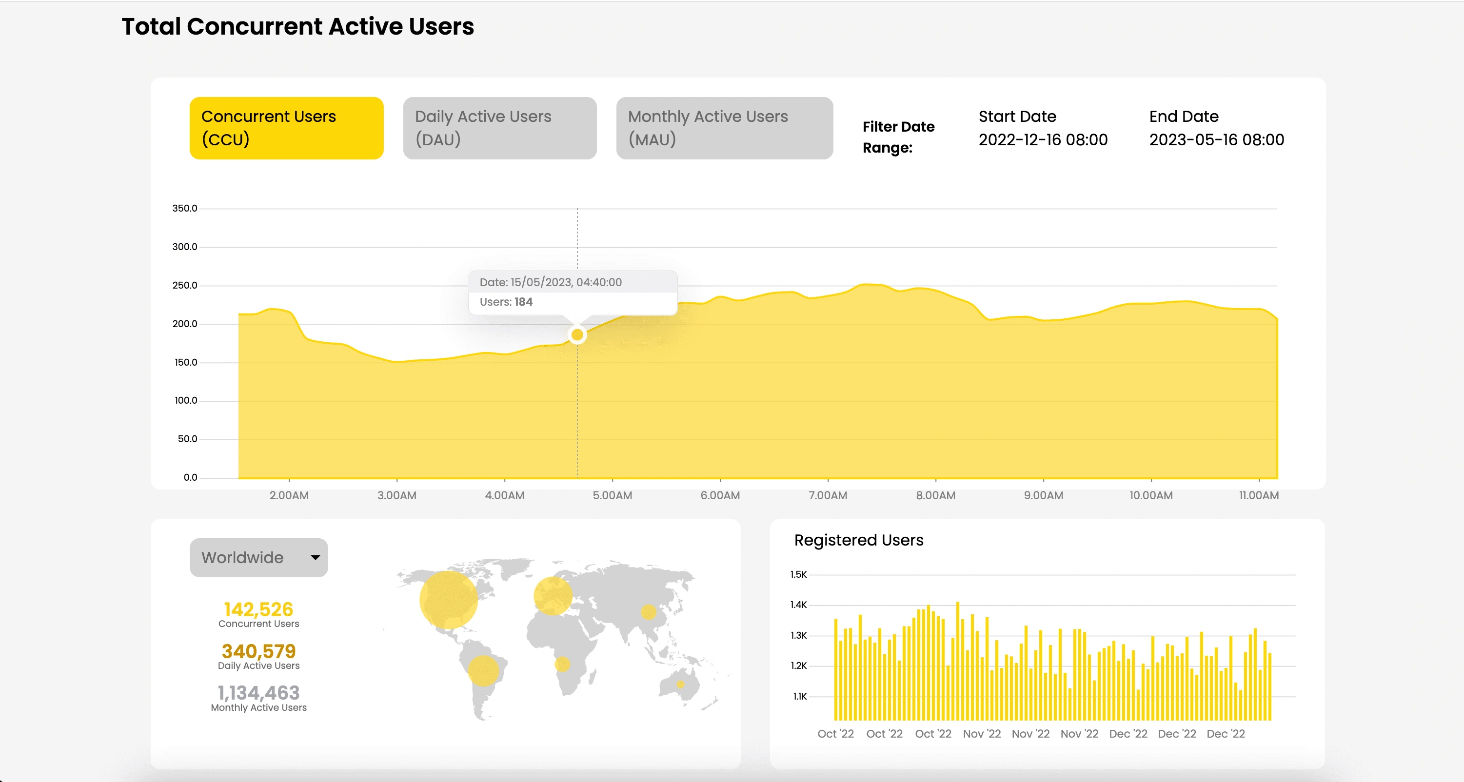
- As the line chart is zoomed out, the x-axis domain becomes less granular, transitioning from 10-minute intervals to 1-week intervals, while asynchronously extracting new data from an API.
- The tooltip appears at the nearest point upon hovering.
Like this project
Posted Aug 9, 2023
Built a business intelligence dashboard with Svelte and D3.js to visualize user data, enabling client to monitor key metrics over time periods.


Constructing a Knowledge Graph from unstructured data with LLMs
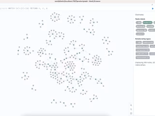
Implementing Retrieval-Augmented Generation with Knowledge Graph
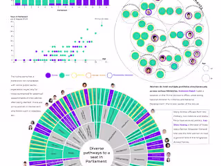
Women in Singapore's 14th Parliament
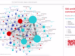
Tech in Asia Article Network: Exploring Authors & Topics