Flutter UX/UI Design for a Payment App – Mobile App
Valentina Guerrero

The Challenge
Design a mobile payment app for iOS and Android that lets users send money, pay bills, and manage their balance securely. The app needed to feel as fast and trustworthy as established players (Venmo, Mercado Pago) while serving a Latin American market where many users are making their first digital payment.
Research & Discovery
Analyzed 6 payment apps (Mercado Pago, Nequi, Daviplata, Venmo, Cash App, and Revolut) to understand trust patterns and transaction flows. Key findings:
First-time users in LATAM often abandon onboarding when asked for too much personal data upfront
Transaction confirmation screens are where most anxiety happens: users need absolute clarity on amount, recipient, and fees before tapping "send"
Balance visibility is the #1 reason users open payment apps daily, yet many bury it below promotions
Defined two personas: a young professional sending money to friends regularly, and an older user paying utility bills for the first time digitally.
The Hard Problem: Security Perception vs. Speed
Payment apps face a fundamental tension: users want transactions to feel instant, but they also want to feel protected. Too many confirmation steps and the app feels slow. Too few and users feel exposed.
What made it difficult:
The app handles real money, so every screen carries emotional weight. A misplaced decimal or wrong contact could mean a lost payment.
Biometric authentication adds security but interrupts flow if triggered too often
Error states in financial apps can cause panic if not communicated carefully
Users from different age groups have wildly different comfort levels with digital payments
How I solved it:
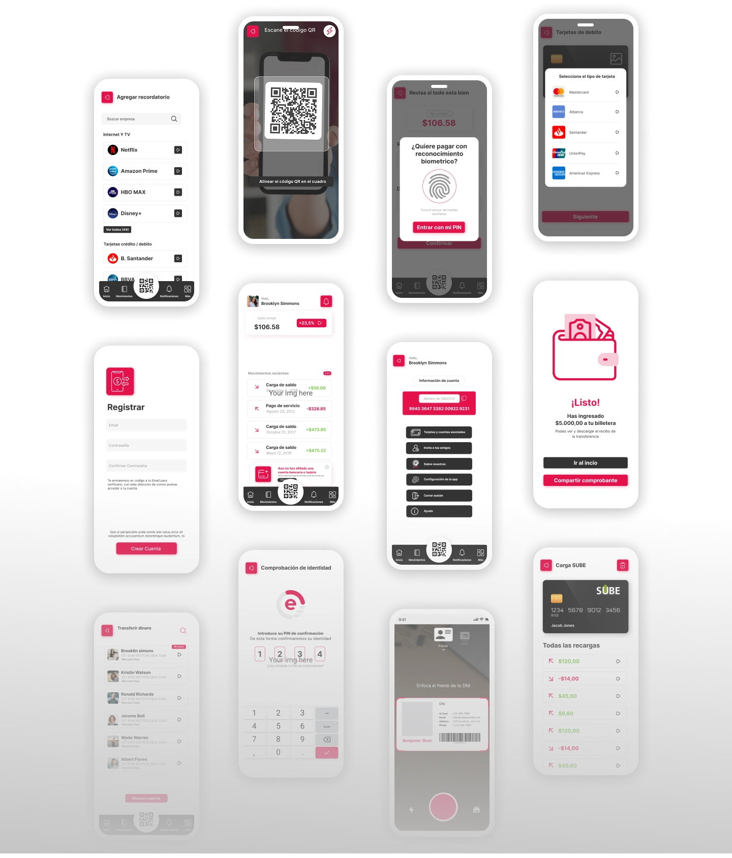
Confidence-building confirmation flow: Before any transaction executes, a full-screen summary shows recipient (with photo if available), exact amount in large type, fee breakdown, and estimated arrival time. The "Confirm" button requires a deliberate swipe (not just a tap) to prevent accidental sends.
Adaptive authentication: Biometrics trigger only for transactions above a user-set threshold or when sending to a new contact. Small, frequent transfers to saved contacts skip the extra step.
Calm error handling: Instead of red alerts and exclamation marks, errors use neutral language and always include a next step. "This transfer couldn't be completed. Your balance hasn't changed. Try again or contact support." No panic-inducing language.
Progressive onboarding: Users can explore the app and receive money with minimal setup. Full verification (ID, selfie) is only required when they want to send above a certain limit. This gets users in the door before asking for commitment.
Visual Design
Clean, minimal palette with green as the primary action color (associated with money and success)
Large, bold typography for amounts to eliminate misreading
Generous whitespace around transaction details to reduce cognitive load
Subtle motion design on successful transactions (a gentle checkmark animation) to provide emotional closure
Consistent component system designed for Flutter implementation constraints
Outcome
Delivered 35+ screens covering onboarding, home dashboard, send/receive flows, bill payment, transaction history, and settings. Interactive prototype for usability testing with both personas. Figma file structured with auto-layout and Flutter-friendly spacing tokens for seamless developer handoff.

Like this project
Posted Aug 16, 2024
Mobile UI design for a secure and intuitive payment app. Flutter-ready UX/UI focused on clarity, speed, and trust across iOS and Android devices.
Likes
2
Views
60