Tozan creative and strategic direction
Zlatko Najdenovski
1 collaborator
Tozan – Aligning an AI-led startup to a brand that speaks to non-tech customers
Overview
Tozan is an AI-driven optimization platform that helps organizations continuously test, learn, and adapt. It‘s the missing ingredient in the A/B testing world. Instead of running static experiments that stop at data collection, Tozan’s intelligence reallocates traffic in real time, guiding teams toward better performance with every new visitor. It’s experimentation that never sleeps.
My collaboration started with what seemed like a simple ask—a single landing page. But as with many projects that begin small, it quickly revealed a much deeper design challenge. Drew—Tozan’s founder—needed more than a new logo and a website; he needed clarity in how well the new brand and website communicates to the ideal customer. The product was powerful, but the story wasn’t yet aligned with the market.
The challenge
AI-driven experimentation is already a noisy field. Every startup claims intelligence, but few could explain it clearly or credibly. Tozan’s technology was solid, but its differentiation lived in the subtleties: continuous optimization, adaptive intelligence, human-informed learning.
The real challenge wasn’t visual at all, but conceptual. How do you express something technically complex in a way that feels human, trustworthy, and approachable?
That challenge shaped everything that followed—from the tone of the brand to the geometry of the logo, from the hierarchy of the website to the metaphors in its illustrative diagrams.
Key objectives
Define a visual and verbal identity rooted in simplicity and intelligence.
Create a web experience that translates complex ideas into visual empathy.
Build a foundation for scalability, so that new content, features, and use cases could be integrated without diluting the brand.
My approach
From the beginning, I treated Tozan not as a one-off project but as a continuous iterative process. Just like its AI core, the brand had to learn and evolve continuously.
My first task was brand positioning—asking fundamental questions about the audience, their motivations, and the problem Tozan solved differently. This positioning exercise gave me a strategic compass that guided every aesthetic and linguistic decision later on.
Once I had that clarity, the design work became a matter of translation—turning strategy into structure, insight into interface. That approach shaped every design choice—from color contrast and typography rhythm to how headlines, buttons, and illustrations interacted as part of a consistent, living language.
The process
Building the identity
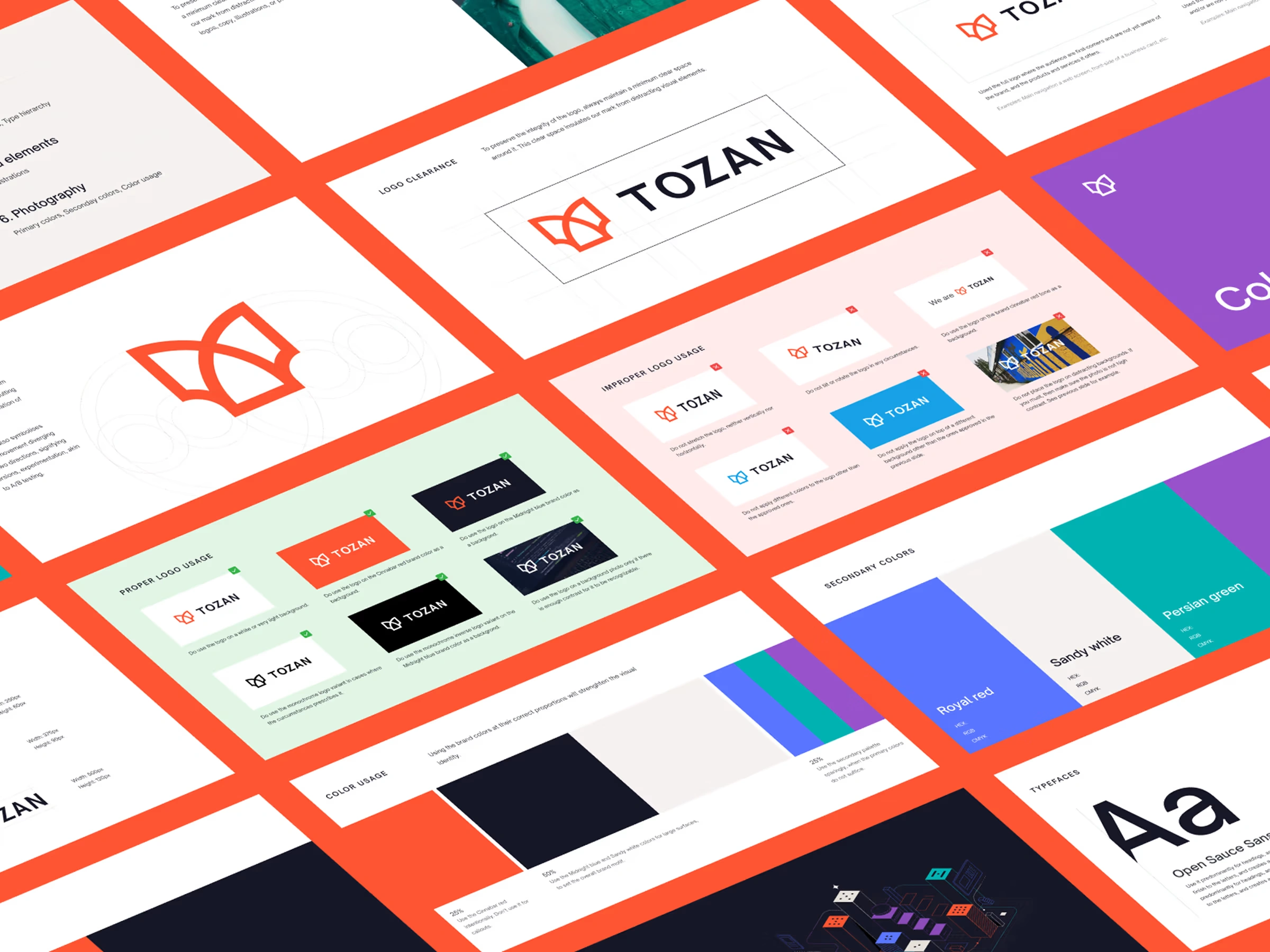
With the strategic core defined, I moved into the more tangible part of the project. The logo became an anchor point—a minimal mark that embodied Tozan’s essence: precision, adaptability, and flow.
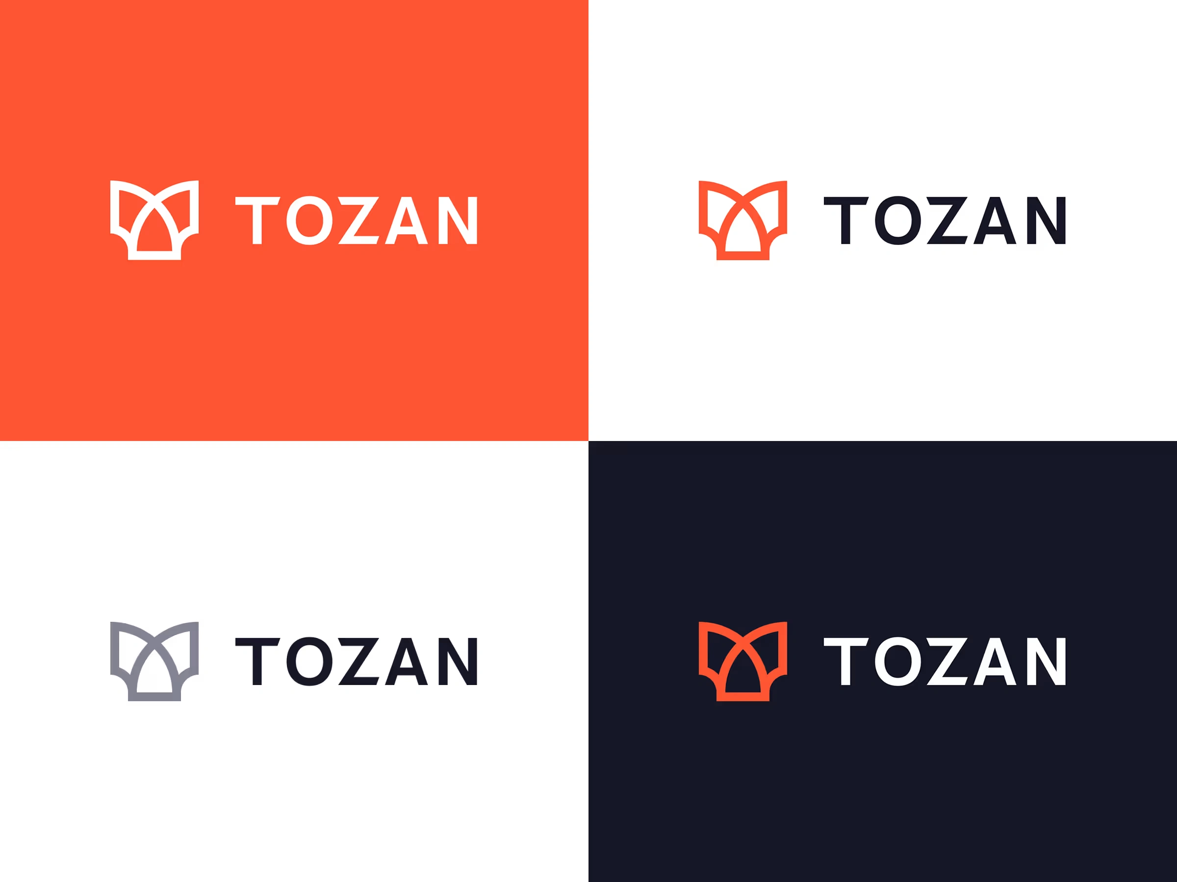
But instead of treating it as an isolated symbol, I designed it as part of a system—one capable of expressing itself coherently across digital surfaces, investor decks, documentation, and marketing assets.
The identity guidelines I built for Tozan went beyond “logo usage.” They became a brand manual for thinking—outlining tone, personality, and audience dynamics. The goal was not just to protect the logo but to protect the integrity of the brand’s story.
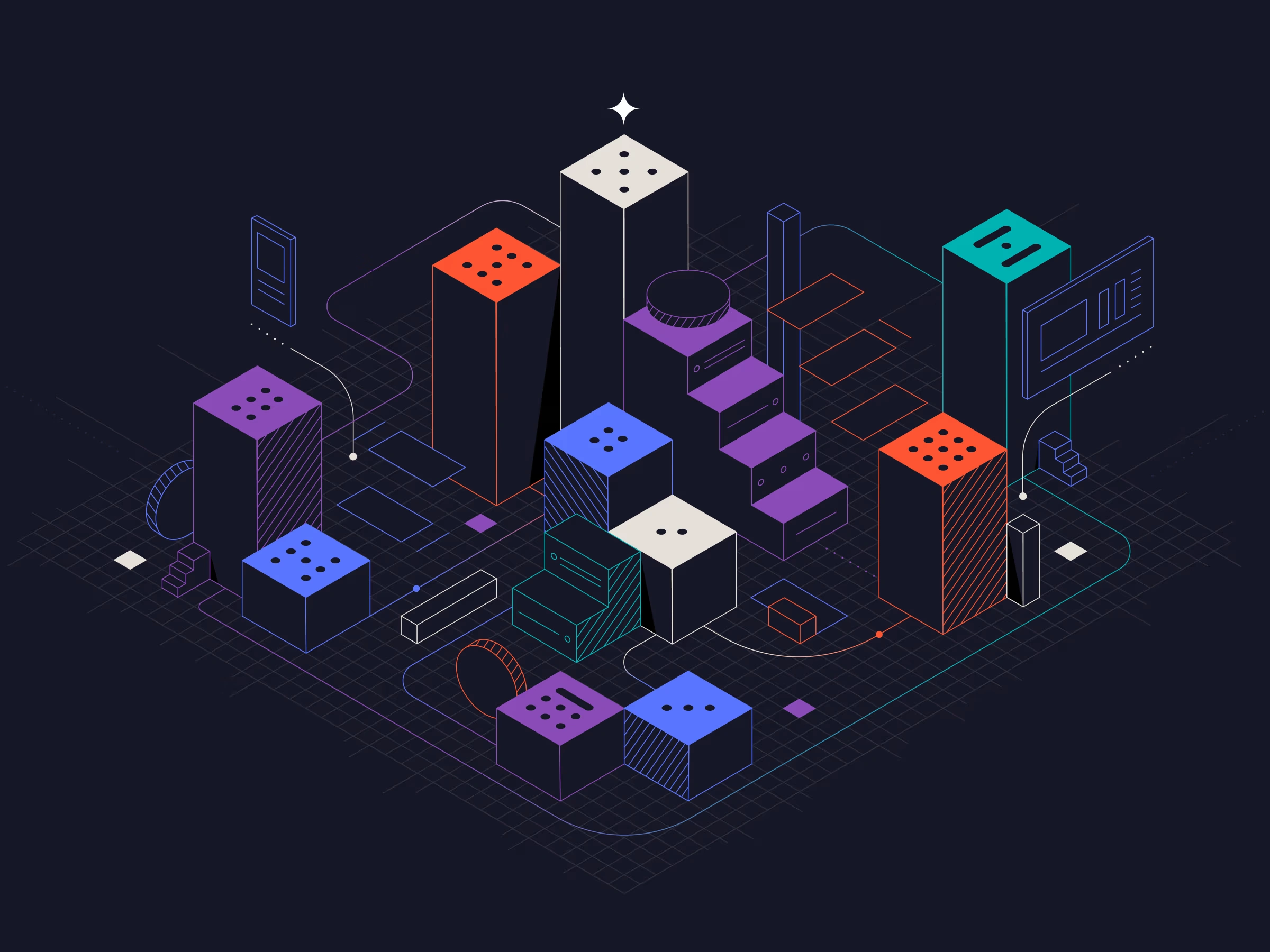
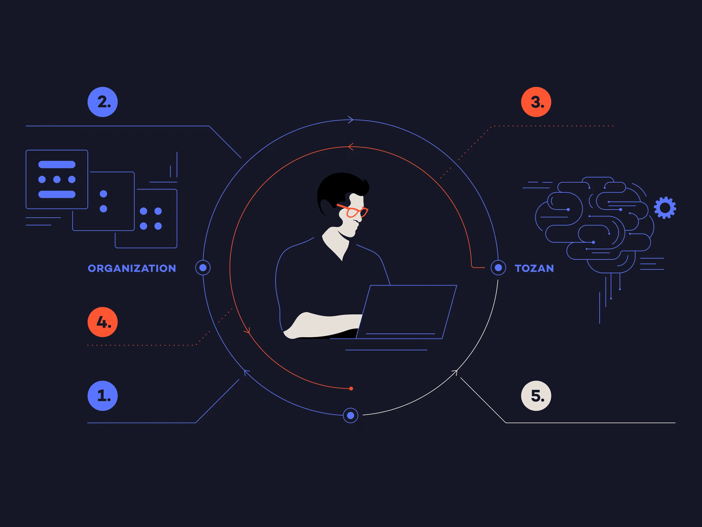
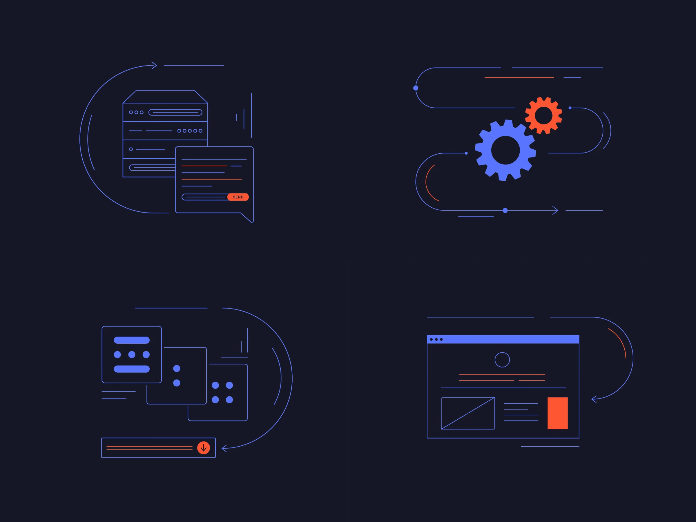
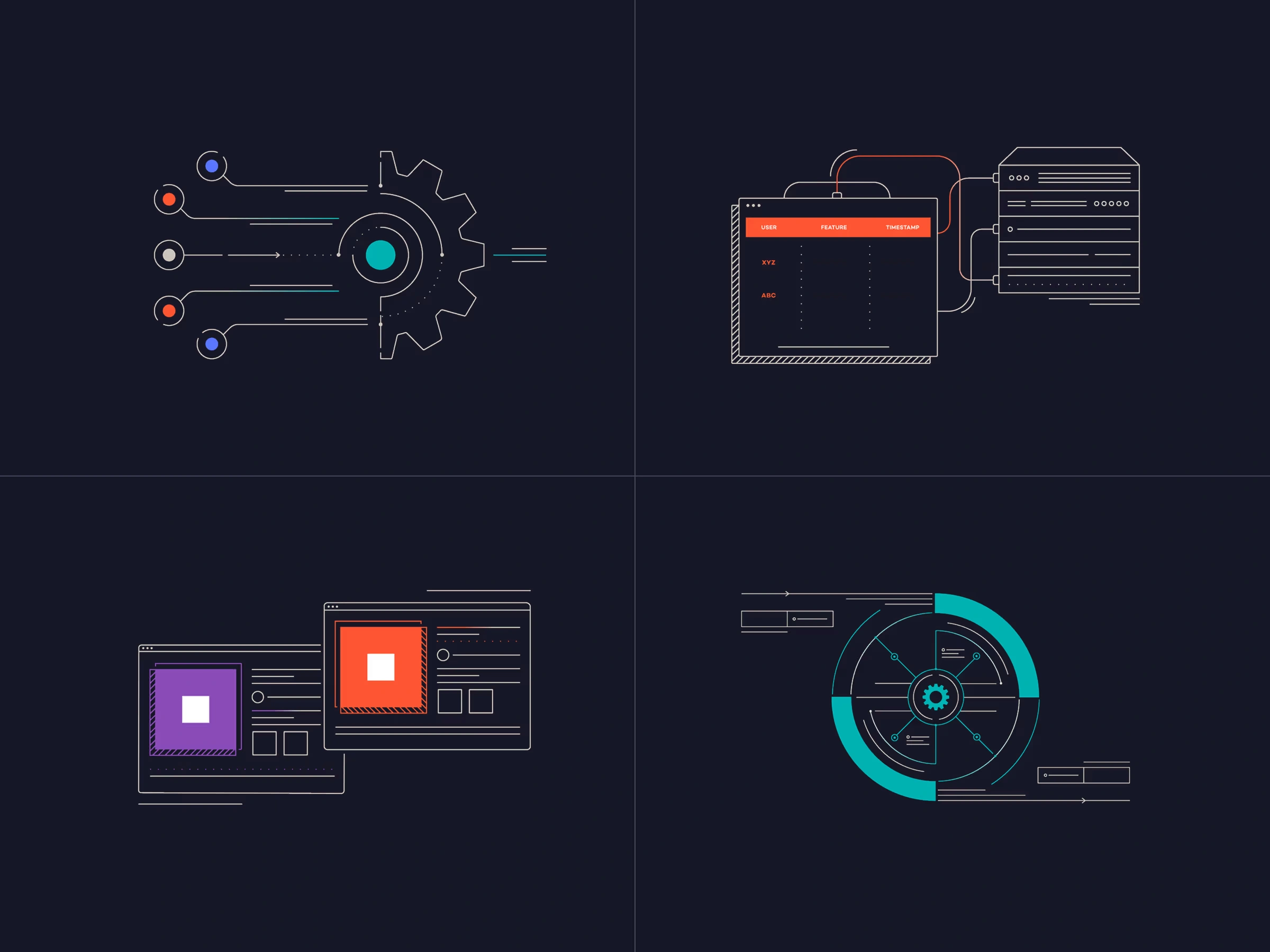
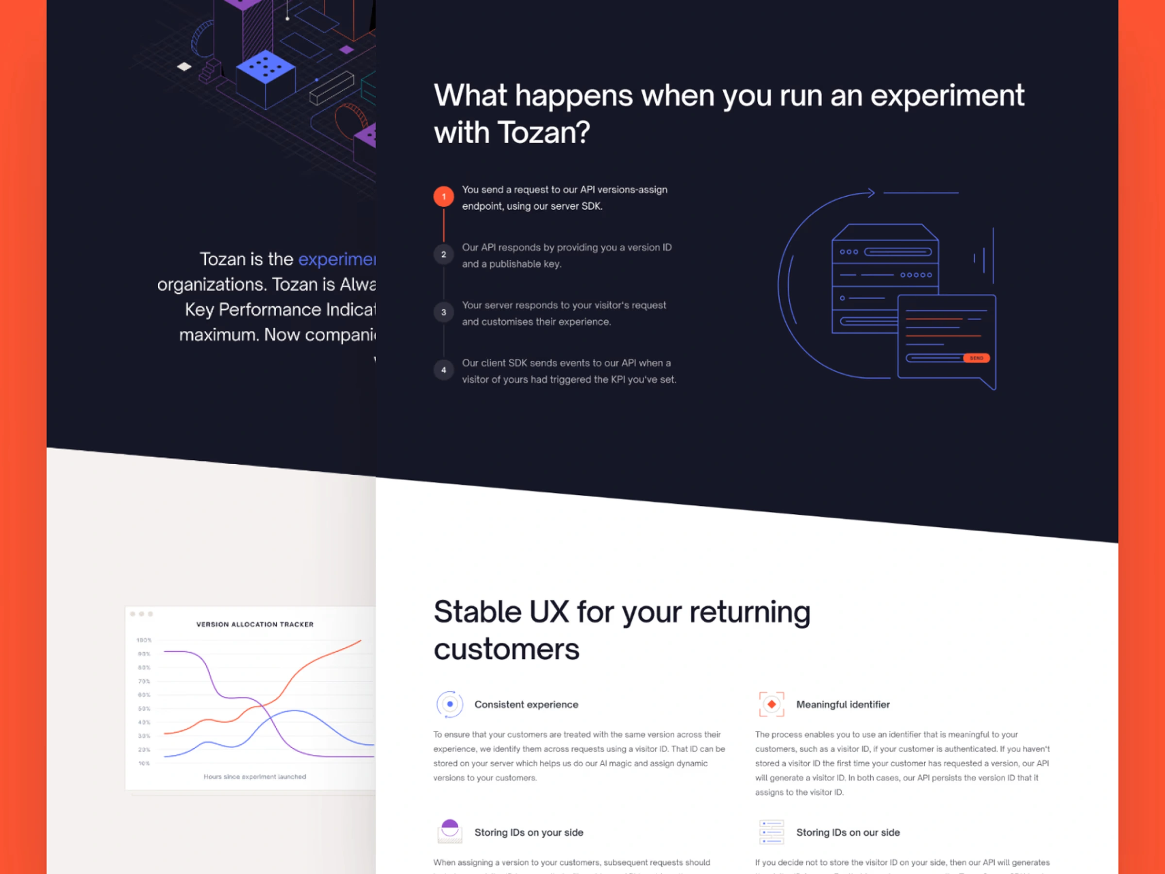
Illustrations as cognitive bridges
Tozan’s early messaging was technically sound but cognitively dense. Even tech-savvy users found it abstract. So I invited Lithuanian illustrator Gintarė to help visualize the invisible—turning concepts like traffic allocation and machine learning feedback loops into line-based visual metaphors that made complex ideas intuitive.
The result was a visual vocabulary that spoke equally to the analytical and imaginative mind.
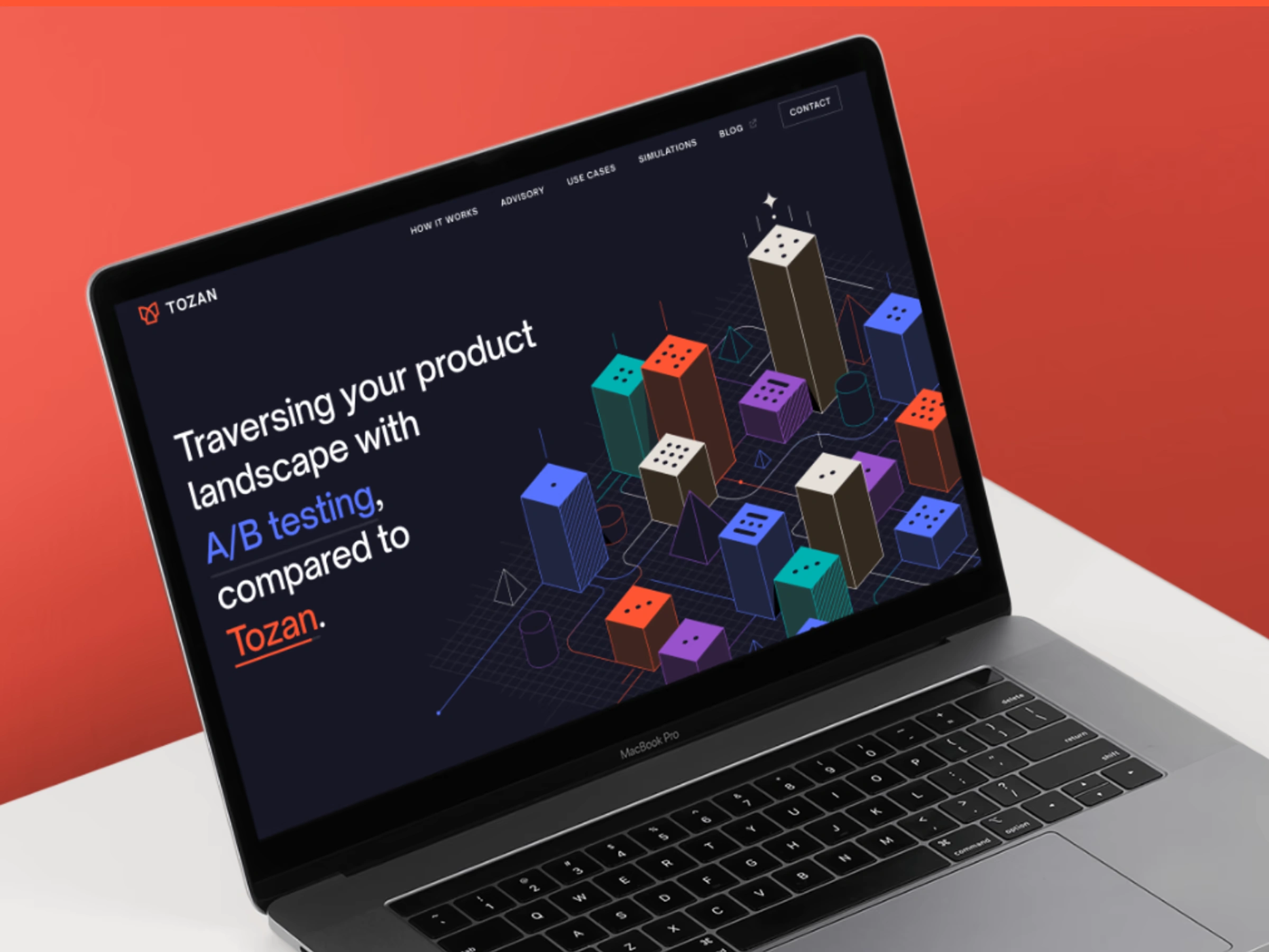
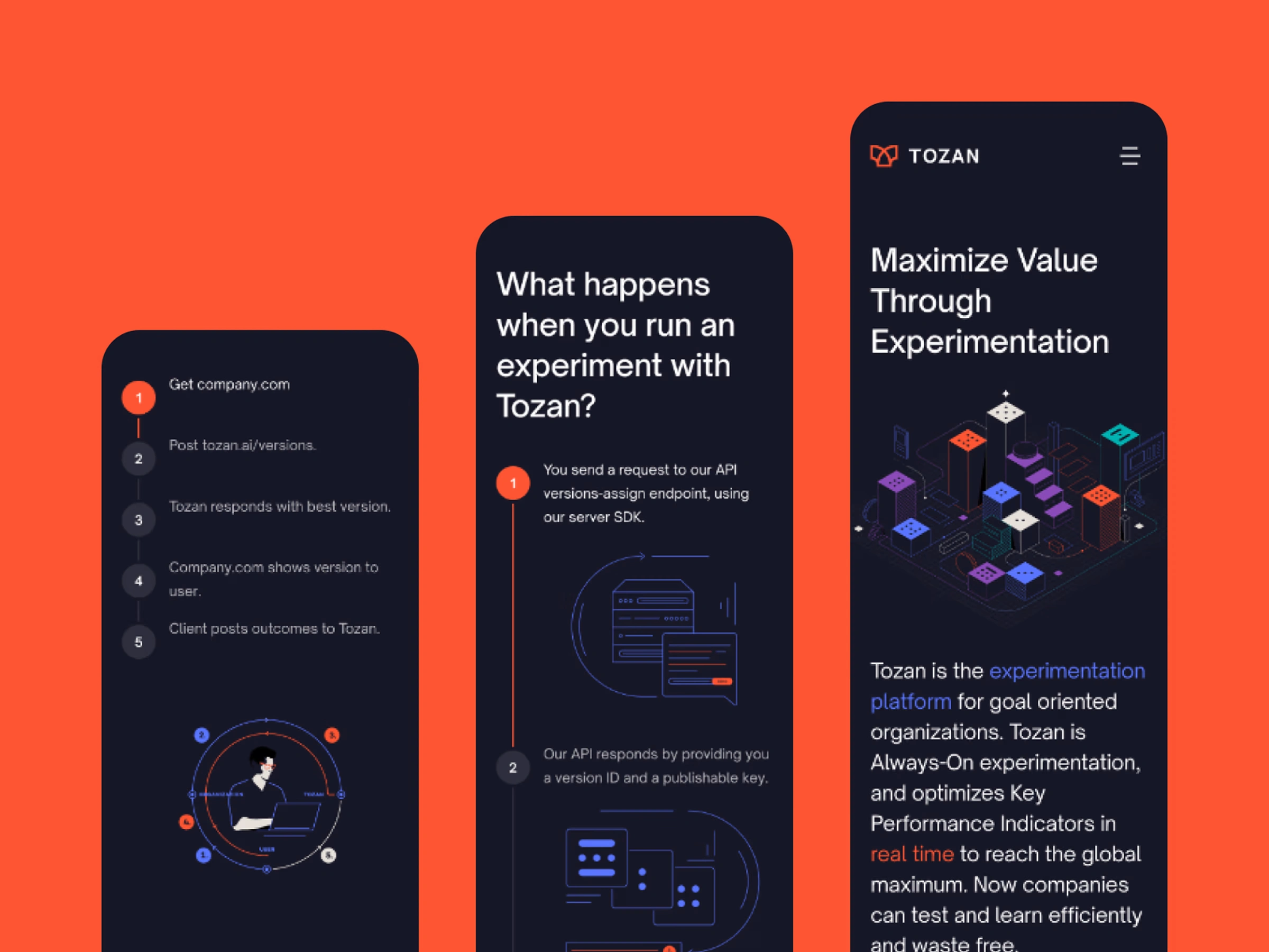
Designing a mobile-first website
Analytics showed that over half of Tozan’s visitors came from mobile. So I flipped the process: design for mobile first, then expanding into wider viewports. This forced me to prioritize what truly mattered—content hierarchy, scannability, and visual clarity.
Working with delicate line illustrations and technical copy, I ensured that every detail—from stroke weights to line density, remained legible even on narrow viewports. What emerged was not a stripped-down version of the desktop design but a complete experience optimized for short attention spans and mental comprehension of technical concepts.
Iteration as a principle
Design doesn’t stop at launch. It evolves with the product and the market. As Drew refined his pitches and investor decks, I constantly adjusted the website to mirror those shifts.
Each update became a feedback loop, much like Tozan’s own platform: analyze, learn, improve. That iterative collaboration built a shared understanding, where design is not a deliverable, but a dialogue.
The Outcome
What began as a landing page turned into a holistic design ecosystem—one that unites strategy, identity, and product expression. Tozan now communicates its complexity with elegance and clarity.
More importantly, the process left behind something enduring: a design system that grows as Tozan grows. The same framework that helped it explain its value now helps it evolve its narrative.
To me, that’s what true product design is about—creating systems that don’t just look good on day one, but stay intelligent for years to come.
His work is very creative, professional, and fast, and he spent energy transforming the business and product development plans into visuals for our web presence.
Featured testimonial
His work is very creative, professional, and fast, and he spent energy transforming the business and product development plans into visuals for our web presence.— Drew Maniglia, CEO - Tozan
Post launch success
Strategic foundation established
Delivered a brand system ready to evolve with Tozan’s go-to-market journey.
From idea to market in 2 months
Evolved from a single screen into a full identity and website system within two months.
Like this project
Posted Nov 17, 2025
Tozan brings real-time adaptive optimisation to A/B testing. I reshaped the brand and site to clarify its story and stand out in a noisy field.
Likes
1
Views
7
Timeline
Dec 16, 2022 - Jan 16, 2023
Collaborators